Branding for Glasgow sushi spot combines the best of Japanese and US culture
Everything Will Be Fine's designs for ICHIGO, a new restaurant on Queen Street, harness multiple cultural influences to sell the idea of Japanese comfort food.
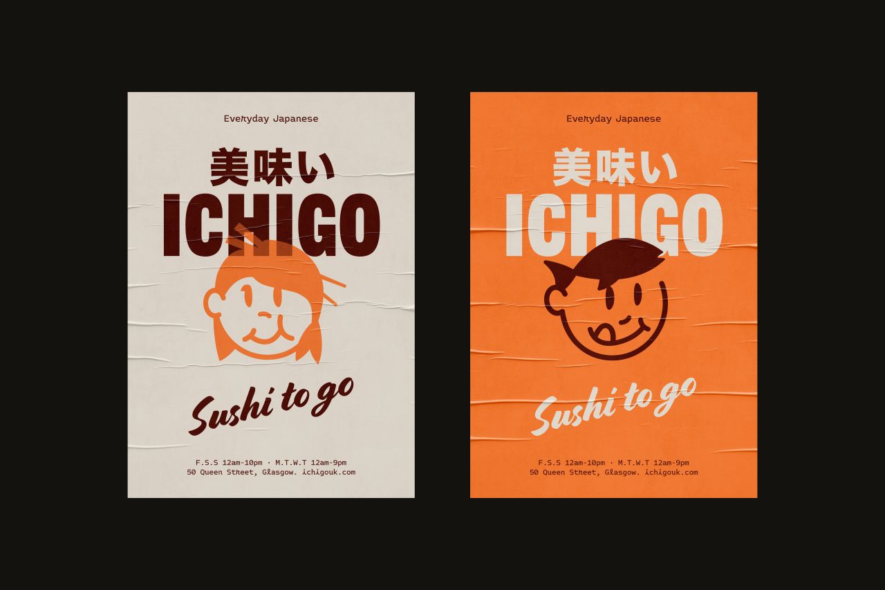
Glasgow's iconic Queen Street is getting a fresh fusion of Japanese and American influences with the launch of ICHIGO, a new casual eatery brought to life through a playful brand identity by local design studio Everything Will Be Fine (EWBF).
EWBF is led by innovative and multi-award-winning creative director Kerr Vernon, whose work is inspired by minimal aesthetics and has served clients including Lost Shore Surf Resort, Bowhouse, Aipple Cider, Glasgow International 2021 and Glasgow School of Art.
It all came about when the owners of the popular Ichiban restaurant, also on Queen Street, asked themselves a question. Was there room for another Japanese canteen concept in Glasgow's diverse food scene?
The answer came in the form of ICHIGO, promising restaurant-quality Japanese comfort food in an everyday format.
The brief
ICHIGO is a space to eat which puts the stress on individuality. "Sushi is made fresh daily in-house and presented behind glass," explains Ichiban's Steven Tsang. "The customer has the option to order by the set or individual piece, allowing for creative mixing and matching to each individual's taste."
EWBF's creative director, Kerr Vernon, collaborated closely with Steven to develop an identity reflecting ICHIGO's vision of delivering an authentic Japanese street food experience for discerning customers.
The resulting branding pays homage to the streets of Tokyo while incorporating a nostalgic mid-century Americana vibe.
Design elements
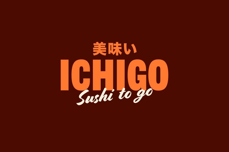
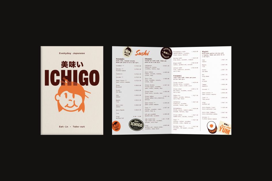
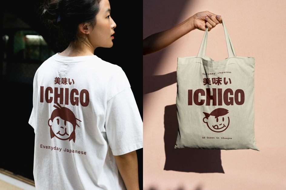
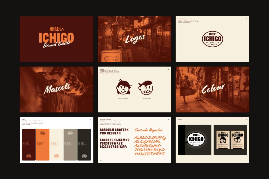
The brand and typography are rooted in the streets of Tokyo. After exploring several experimental type treatments, Kerr settled on Borough Grotesk for display text and Monotalic for body text. Borough Grotesk Pro Regular, used in the capitalised wordmark, is bold and blocky. This is paired to work alongside wording set in Cortado, which brings a hand-painted mid-century Americana vibe.
The strapline, 'Everyday Japanese', is set in Monotalic Medium. Plus, in keeping with the bilingual brand spirit, the designs make space for both Japanese and English text.
Appropriately enough, the Japanese text 美味い spells umai, a casual/slang-ish Japanese word for 'delicious', as opposed to the more standard 美味しい pronounced 'oishi').
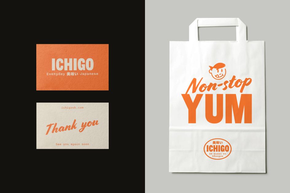
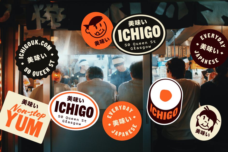
When making decisions about the colour palette, Kerr turned to the unique interior of the canteen. Tones are also carefully balanced for pairings. Duotone background images showing candid Tokyo street imagery are used with overlaid text for use in branded touchpoints. Overall, the identity brings Japanese heritage and Americana ambience into a new era.
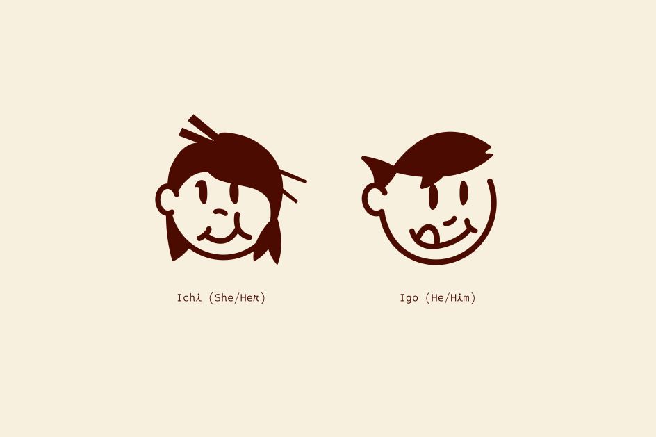
This ethos of playfulness is a quality carried over by Mascots Ichi and Igo, who play a central role in defining the visual language. Ichi and Igo both have hidden ingredients in their hairstyles, adding to their distinctiveness.
Remix culture
We love the identity of this new sushi spot and think it's a smart move to visually mix up cultures in this way. After all, most Brits have still not tried sushi, and many think of it as a "posh" dining experience, even though in Japan, it's cheap and plentiful fare enjoyed by the working classes daily.
Bringing in design elements from the States, the land of casual dining serves as a visual shortcut to disabuse people of this notion. Of course, that's easy to say, difficult to do, and this could have ended up a real mess. In contrast, we reckon EWBF have combined two competing themes masterfully, and we wish the new restaurant every success.
Editor's Picks


Trending


Podcasts


Editor's Picks
Further Reading