Studio Patten blends visual honesty and curiosity across illustration and graphic design
The Madrid-based duo draw on vintage print culture, secondhand bookshops and a disruptive approach to shape their wide-ranging practice.
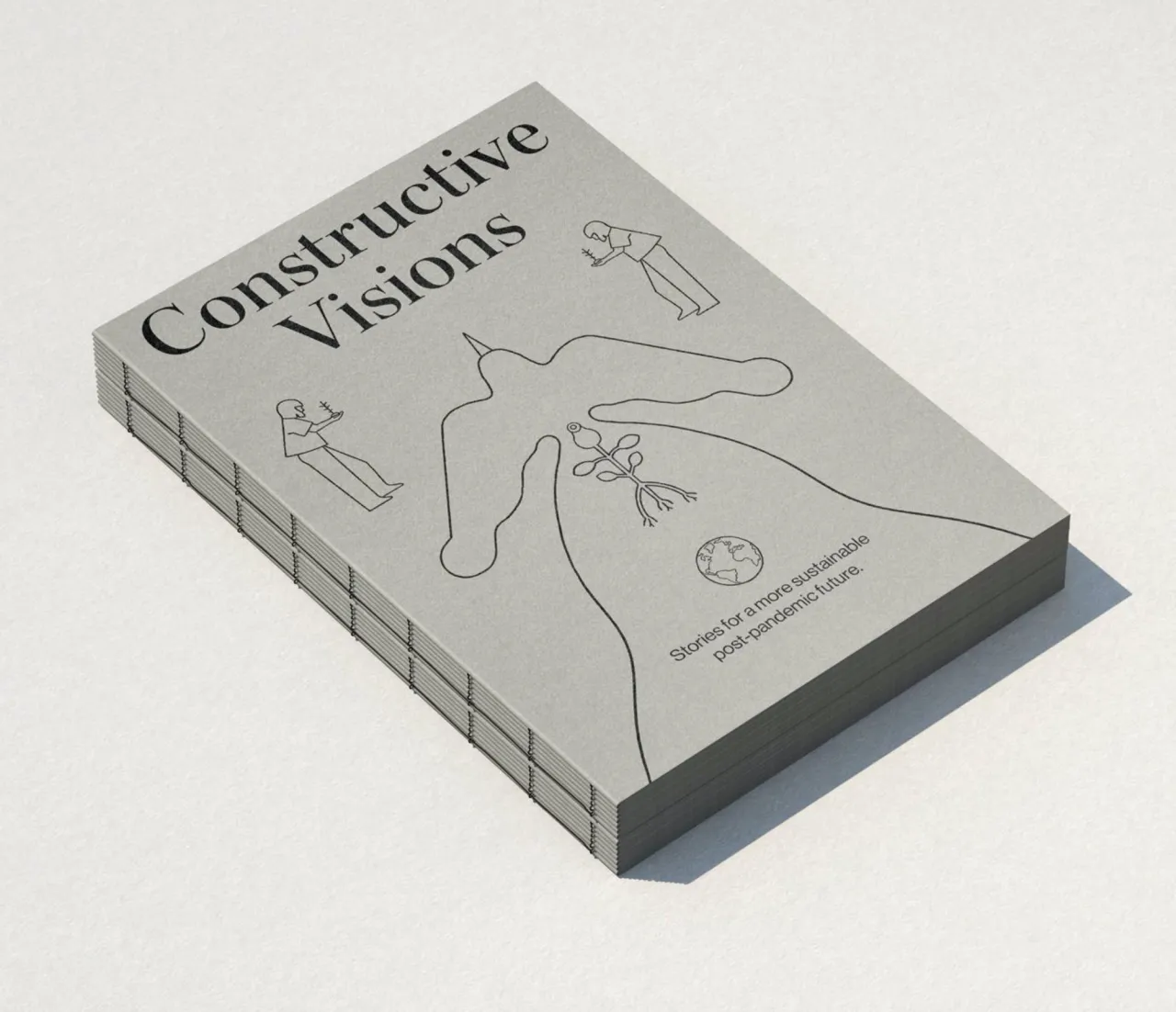
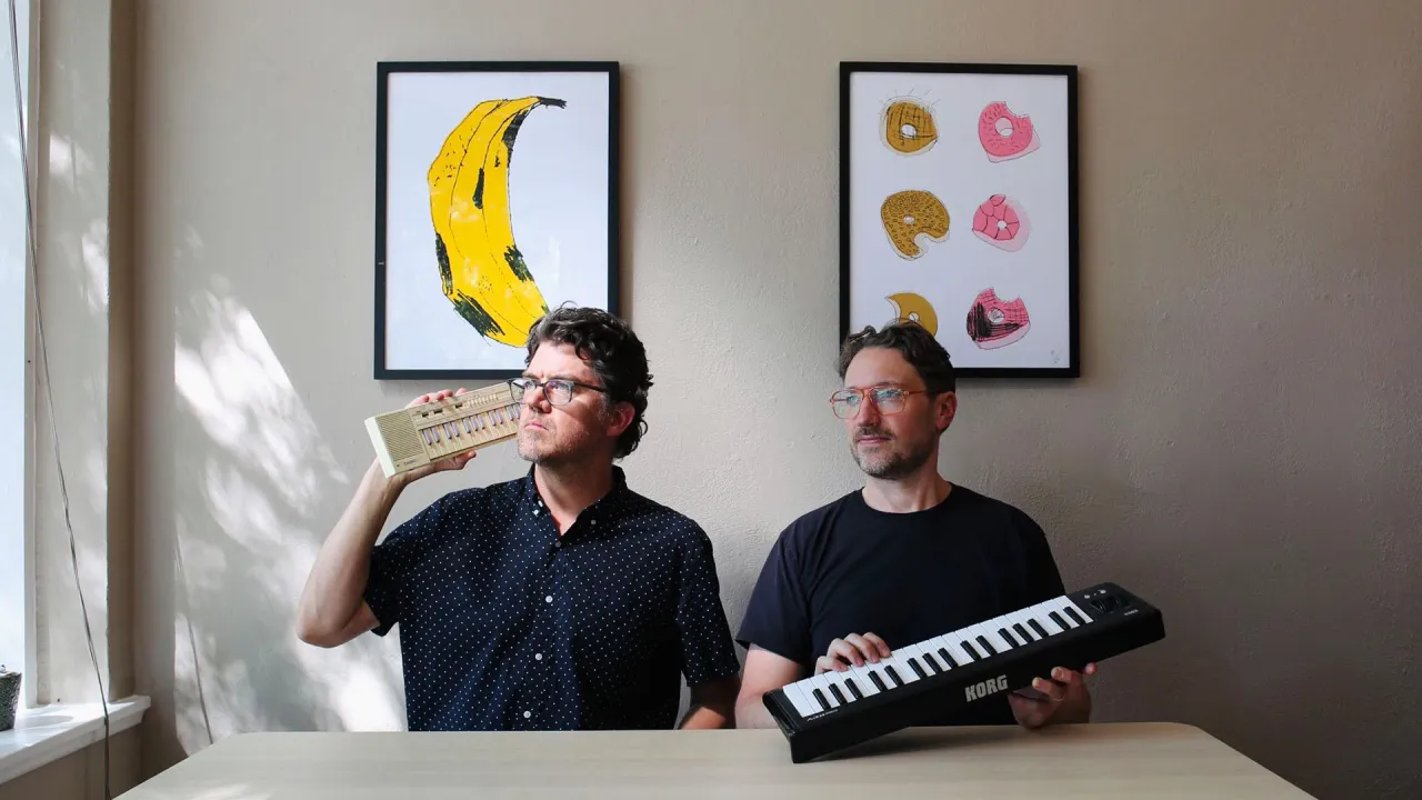
Aida Novoa and Carlos Egan – the duo behind Studio Patten – came from different corners of the world. Aida is from Galicia in northern Spain; Carlos grew up in Buenos Aires, Argentina. They both trained in graphic design, met while Aida was still a student and Carlos was working at an agency, and have been building a shared practice ever since. "This diverse background has given us the necessary experience and confidence to embark on a creative project together," they say.
That confidence took time to develop. Both came from working in design studios and agencies before setting up on their own, and neither has any regrets about the pace of it. "I honestly can't imagine having decided to set up my own studio at 20," Aida says. "Everyone has their own timing." The fields they draw from are deliberately broad, ranging from cinema and architecture to literature, fashion and music – with each bringing a different creative lens to the work. "Design should be a shared effort," they explain, "and that's why each of us brings their own creative lens and passions into the mix."
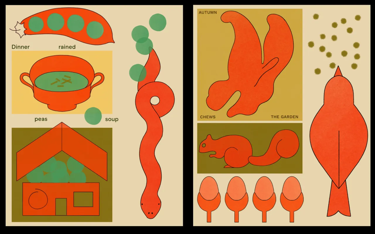
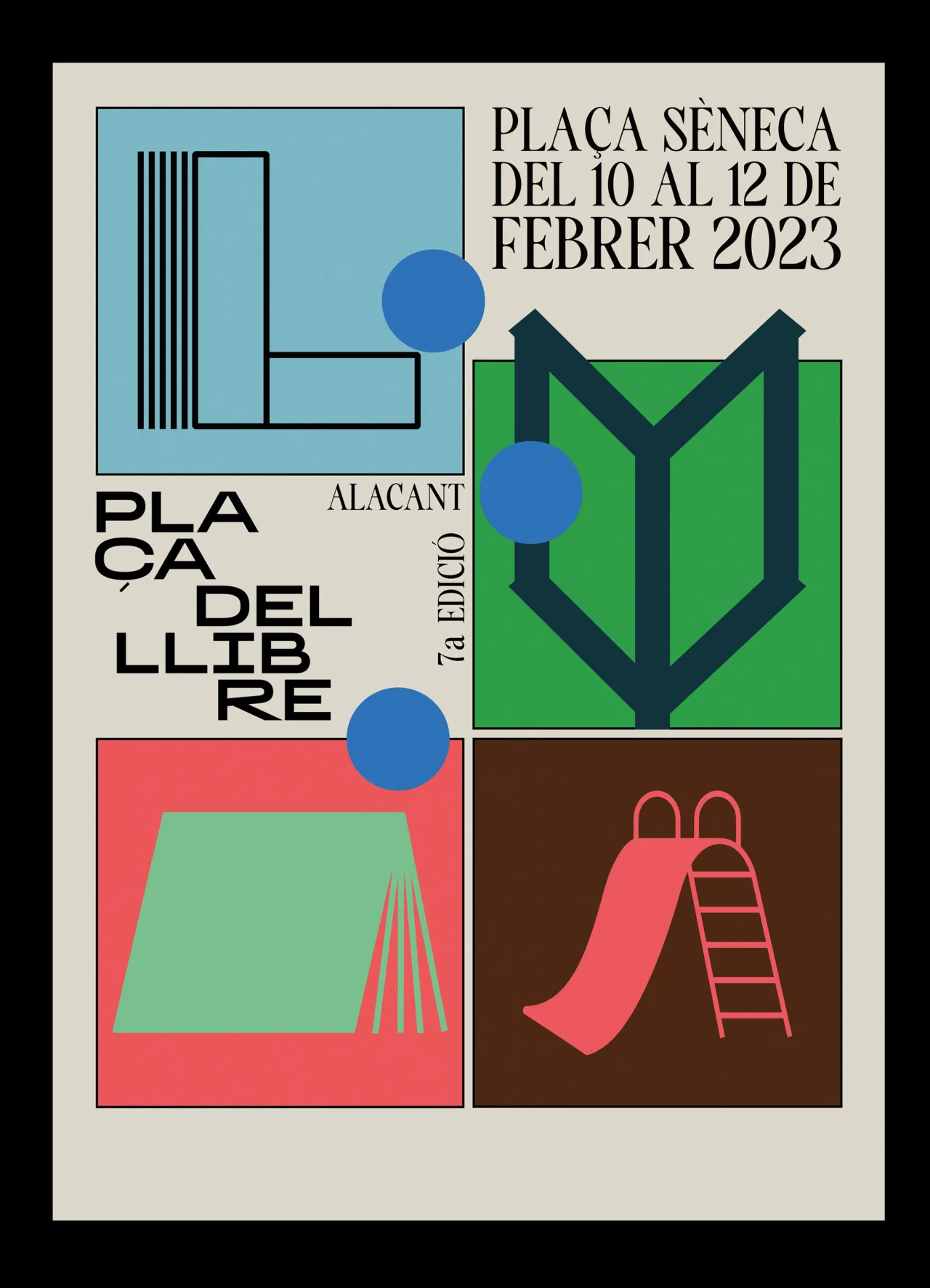
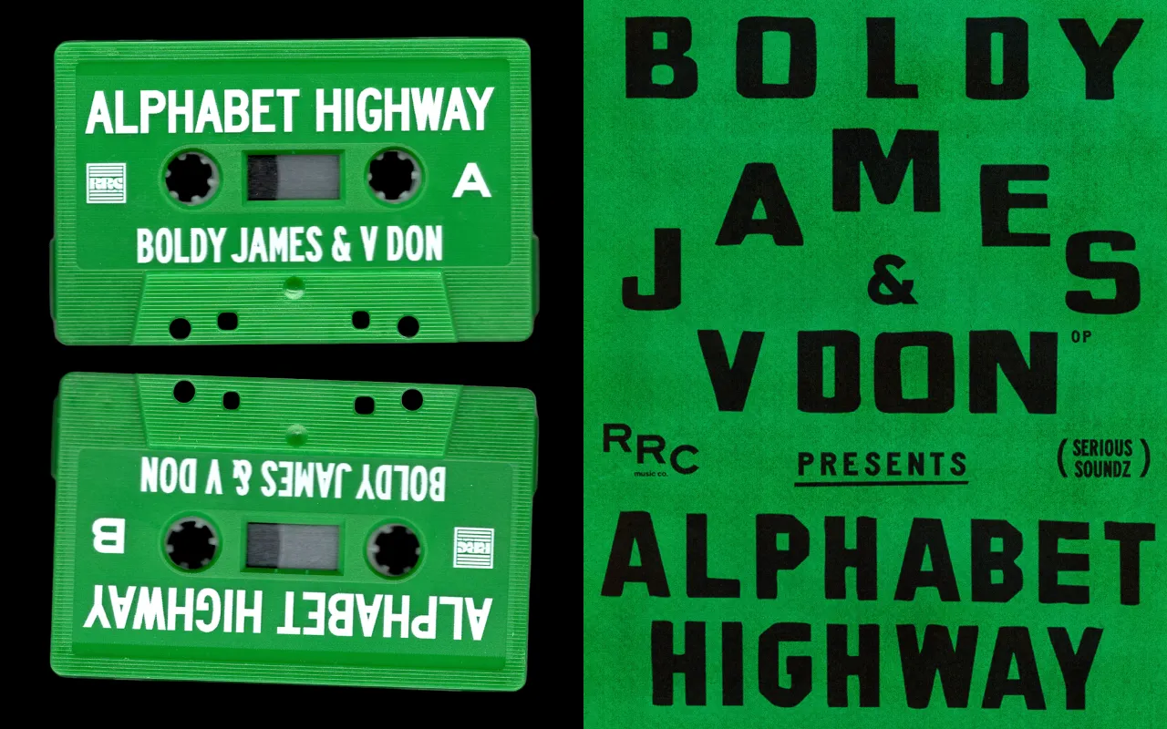
When it comes to finding inspiration, Studio Patten describes itself as a visual archaeologist. They seek out secondhand bookshops, archive websites and blogs devoted to antique publications – like vintage children's illustrations, old technical catalogues and colouring books from the 1930s. "A 1940s French activity book or a vintage cigarette card can be incredibly inspiring," they say, "because they possess a timeless honesty that feeds our soul." What draws them to these objects is the limited colour palettes, charmingly imperfect printing, and the way everyday objects are bold and simplified. Artists like Philippe Weisbecker and Nathalie Du Pasquier are among their reference points, as are plenty of studios working today. Trends get considered, too, but carefully. "We don't shy away from them," they say, "but we don't let ourselves get carried away either."
There are two ways Studio Patten likes to go about things. For illustration projects, the process begins with both working separately – sketching by hand, individually – before coming together to compare, analyse and discard, then sketching again until something clicks before moving the work into digital. "Whether it's design or illustration, we prefer to deliver projects that are nearly finalised," they explain, "as it makes it much easier to visualise the result." Typography is the non-negotiable starting point for design work, which they describe as "the foundation of everything," followed by composition and visual hierarchy. And crucially, time away from a project is just as important as time spent on it; they say that disconnecting is where many of their best ideas begin.
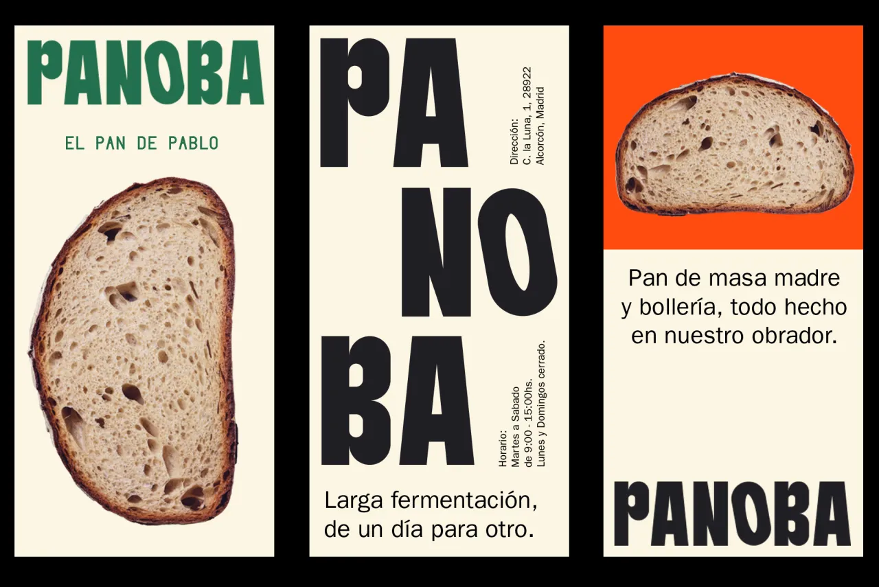
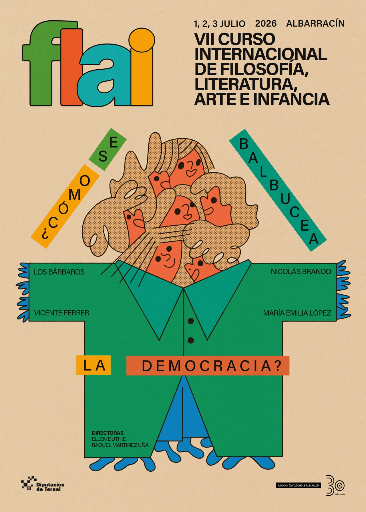
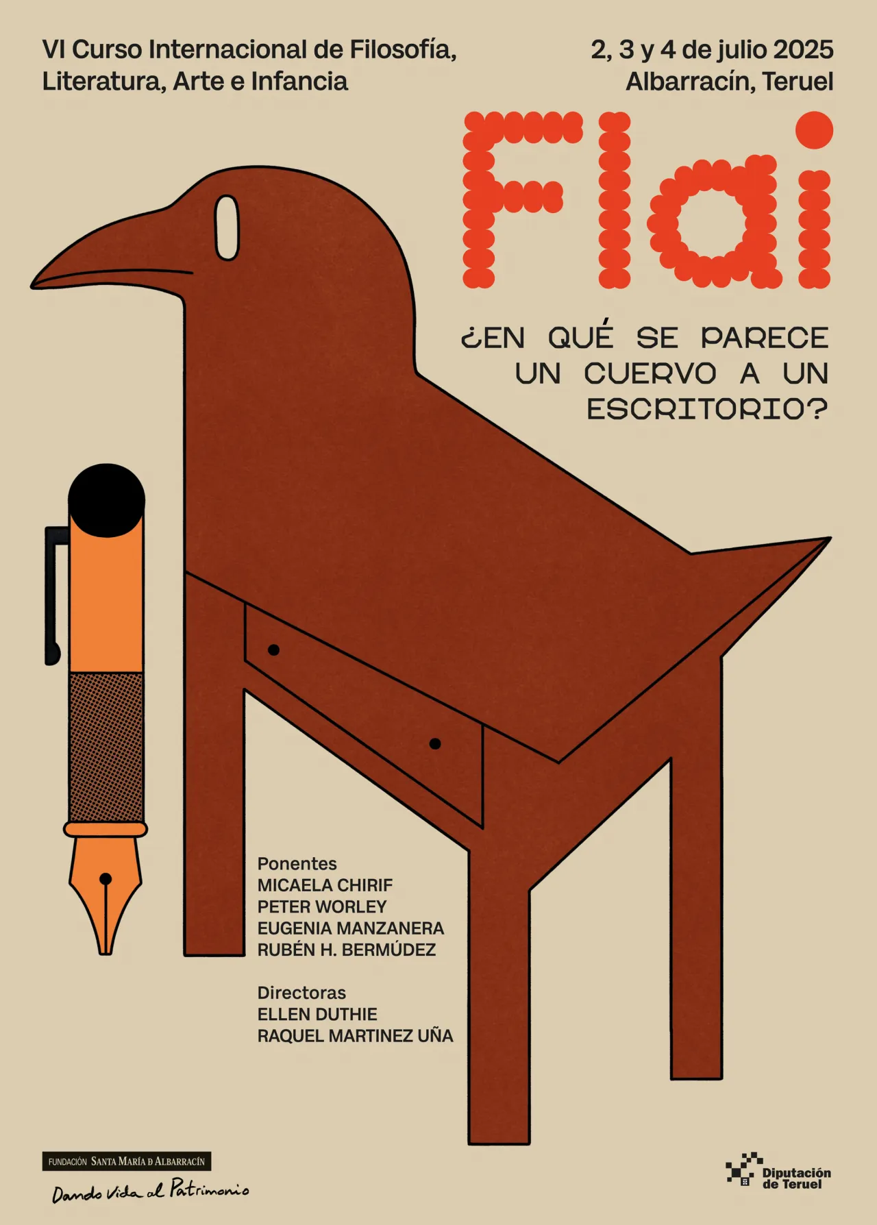
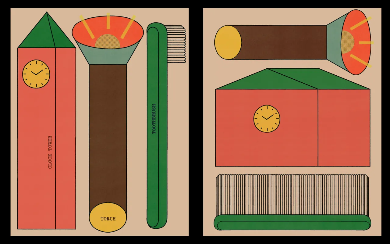
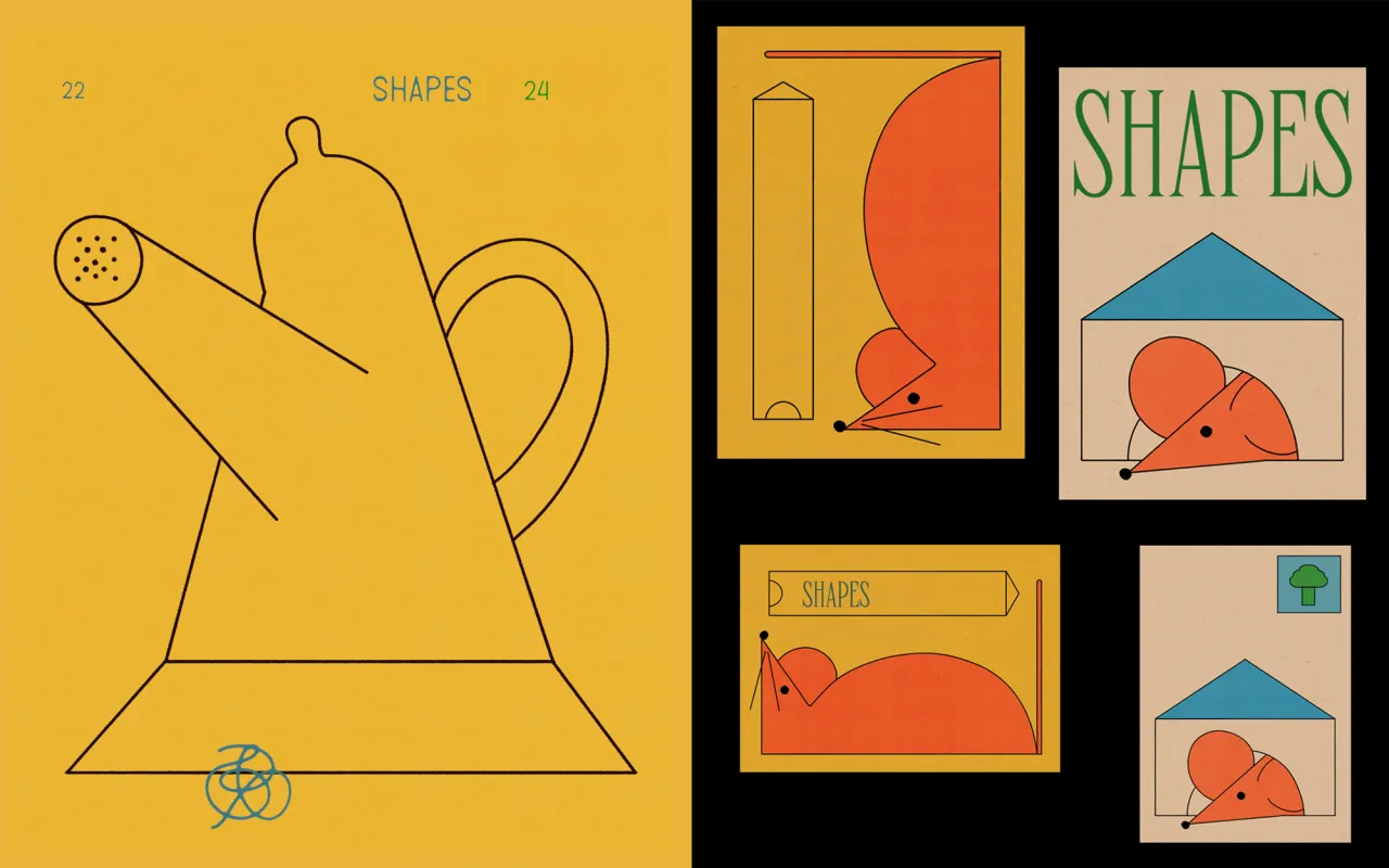
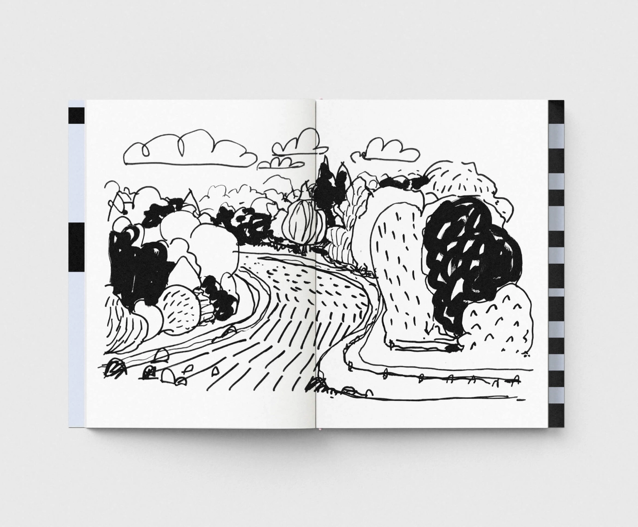
When observing their portfolio, you'll spot two projects that sit at opposite ends of the brief spectrum but share a similar spirit. The first is an ongoing personal project: a book of unexpected shapes and visual mutations that is still in progress. The premise is to omit detail in favour of blocks and forms that challenge reality. "We want to create a point of disruption," they explain, "taking an object or a fact that we considered definitive and shifting it toward another place, another form."
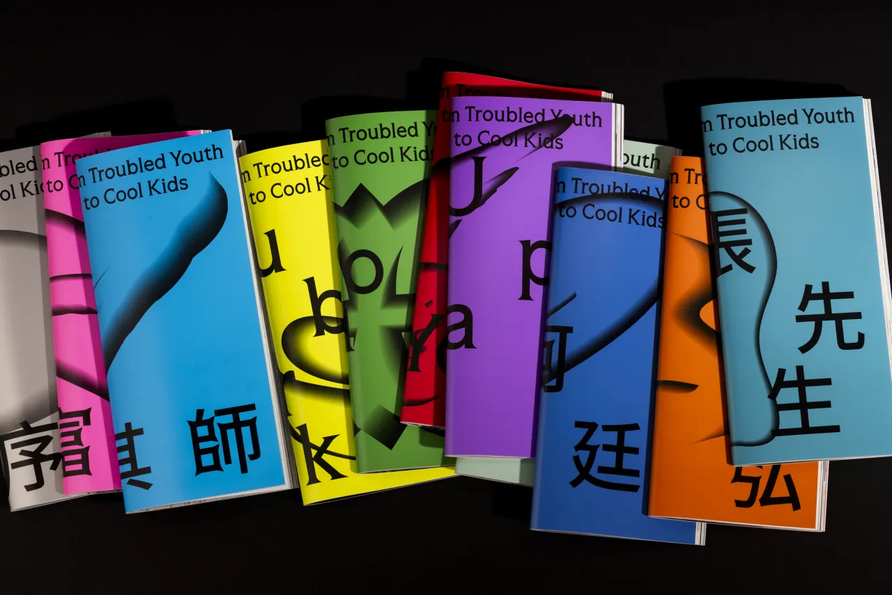
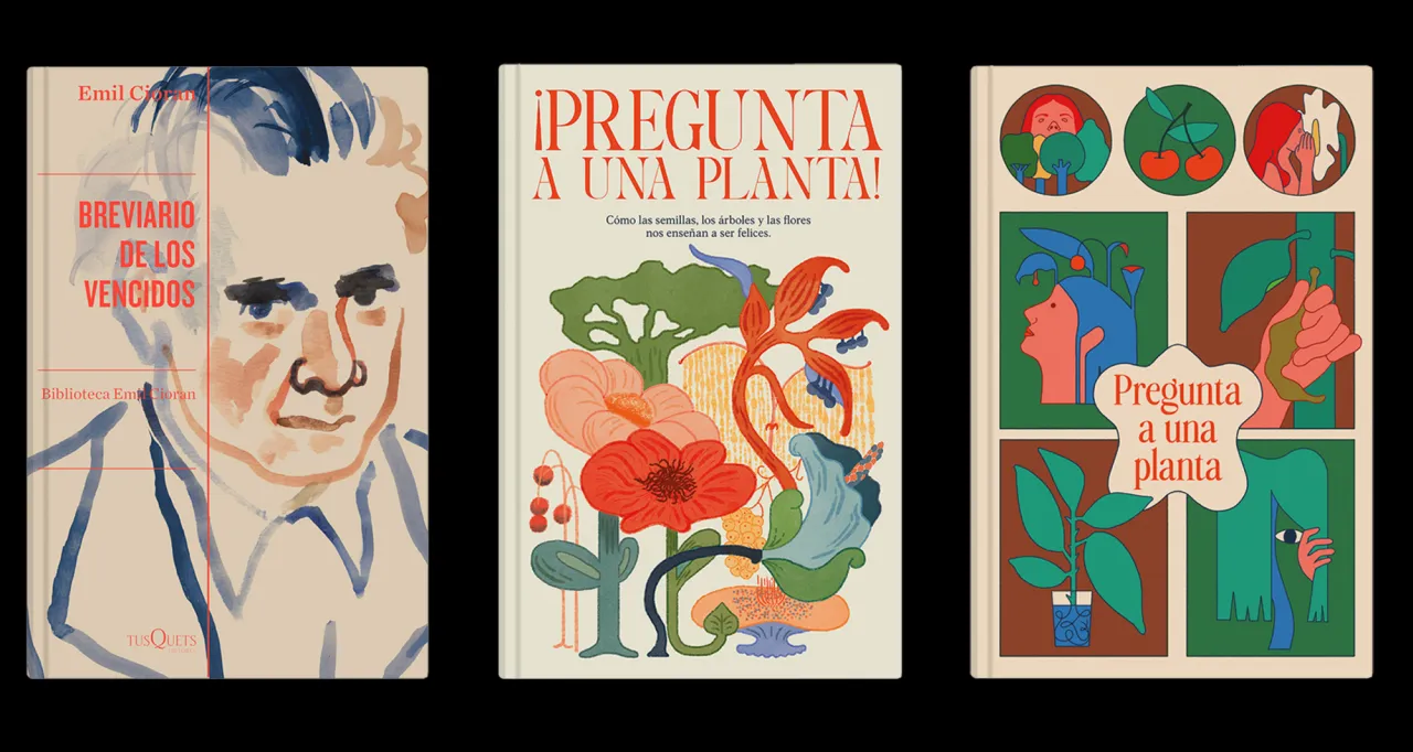
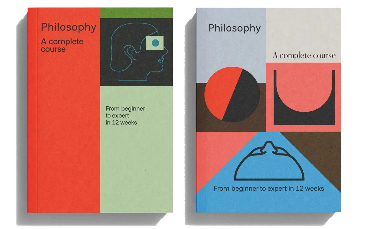
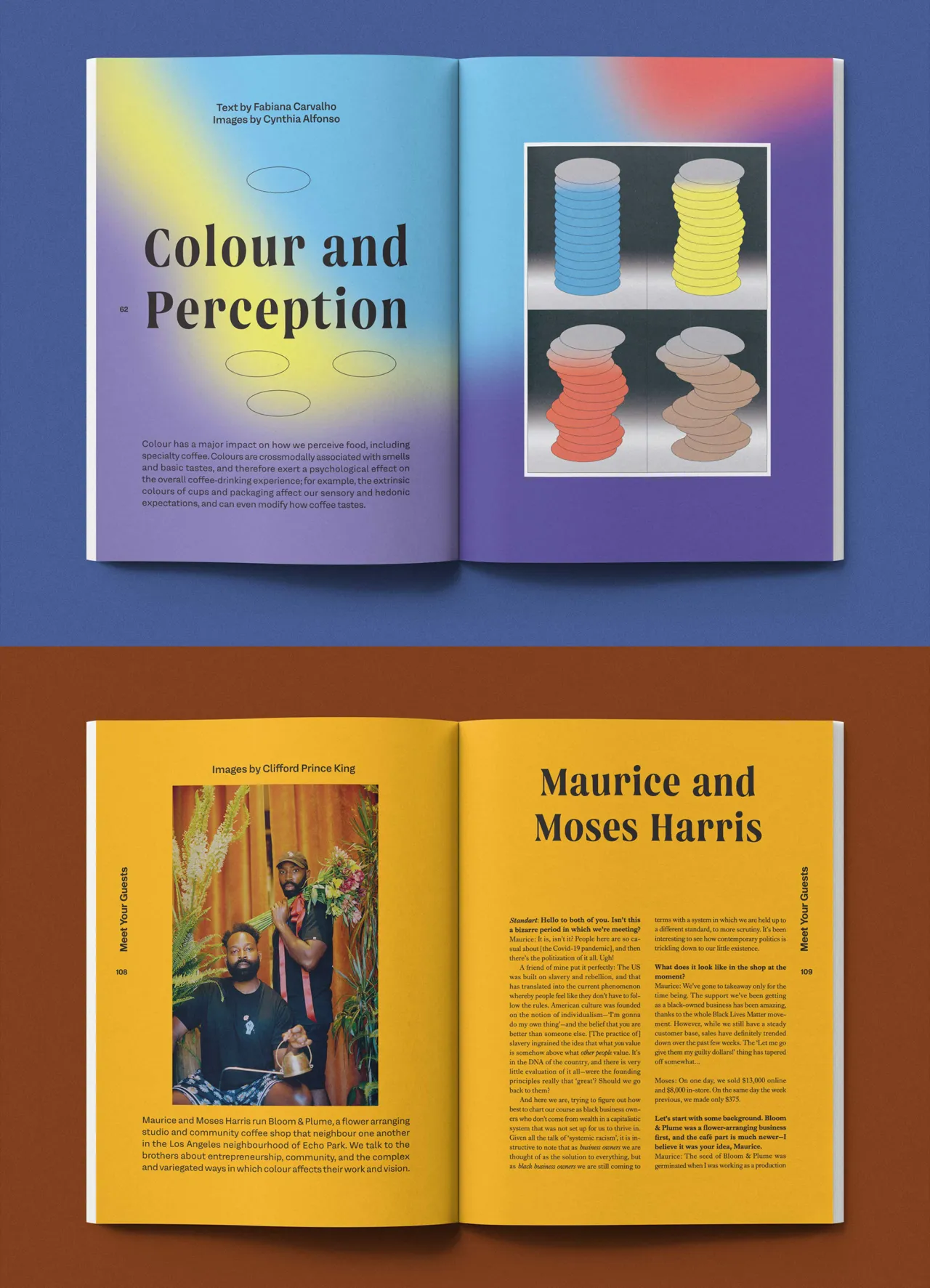
The second is the editorial style guide they developed for DK and Penguin Random House, art-directing and illustrating a series of philosophy textbooks for children and young people. The challenge was making a dense subject feel genuinely accessible. "We wanted to bridge the gap for children and young people so they feel it's something made specifically for them," they say, achieved through bold, vibrant colour palettes and clean, geometric illustration.
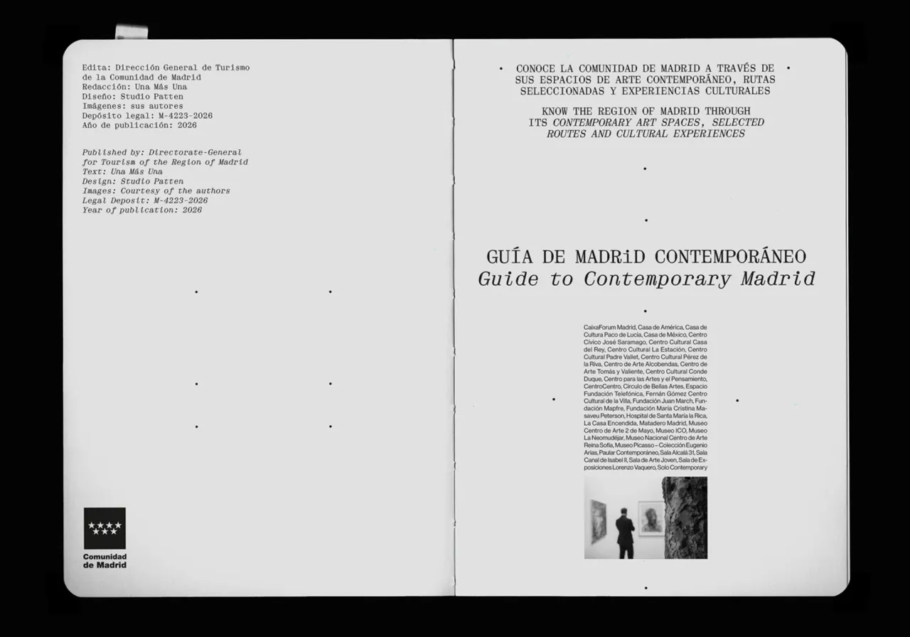
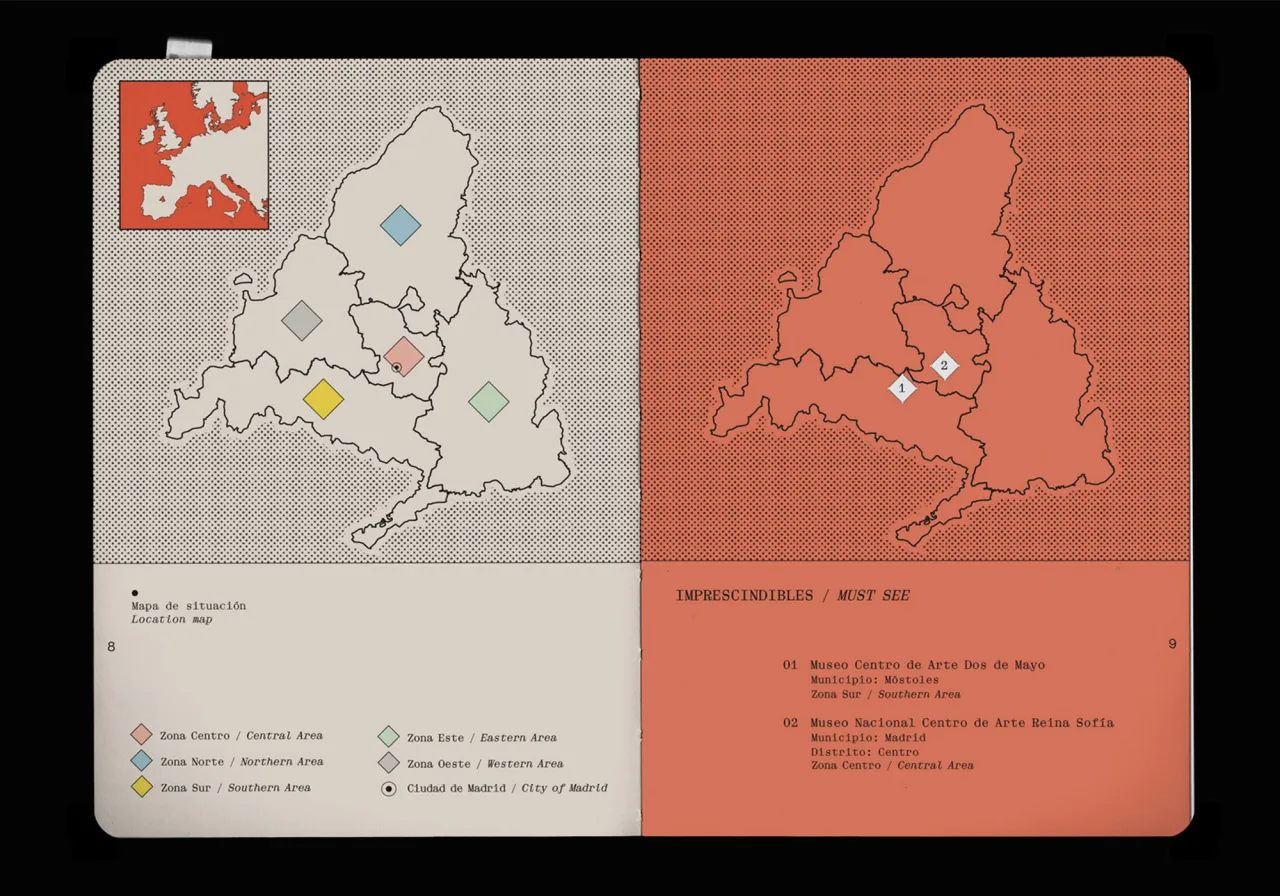
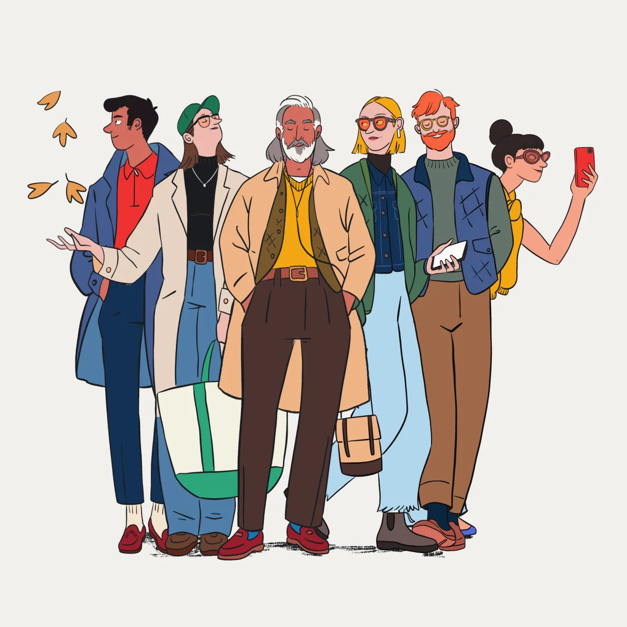
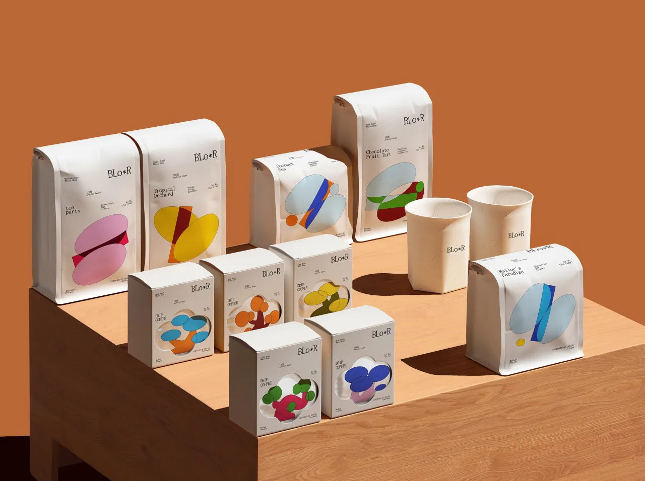
Studio Patten is not interested in being pinned down to a single visual signature. "We don't want to lock ourselves into a rigid visual identity or a single, fixed personality as a studio," they say. "We want to keep evolving." What they do want is for the work to offer more than one reading – to let each person find their own way into it.
Next up, they will continue that personal book of shapes and an exhibition with Wonder Ponder, an educational and philosophical publisher that introduces people of all ages to big questions through play. Commercial projects are in the pipeline, too, though details are being kept hush-hush for now.
Editor's Picks





Trending




Latest Jobs
Senior Designer at Code and Theory
Full-time·New York·$90,000 – $115,000
Digital Project Manager at Proctor + Stevenson
Full-time·Bristol·£32,000 – £36,000
GTA VI Social Lead at Future
Full-time·Bath·£29,000 – £40,000
Brand Designer at Langdock
Full-time·Berlin·€65,000 – €100,000
Staff Brand Designer at Mercury
Full-time·San Francisco·$189,400 – $236,700
Web Projects Executive at Manchester Metropolitan University
Full-time·Manchester·£31,236 – £34,610