There's a particular kind of design hell reserved for brands trying to "do Japan". You know the aesthetic: cherry blossoms scattered like confetti, ornate kanji characters deployed purely for decoration, perhaps a rising sun for good measure. It's the visual equivalent of a tourist gift shop, and it's exhausting.
All of which makes Saint-Urbain's branding for Yoshi—which is apparently the first premium matcha liqueur on the Western market—genuinely refreshing.
Rather than raiding the tired back catalogue of Japanese visual tropes, the New York-based studio has created something that actually understands the assignment: honouring a cultural tradition, not cosplaying it.
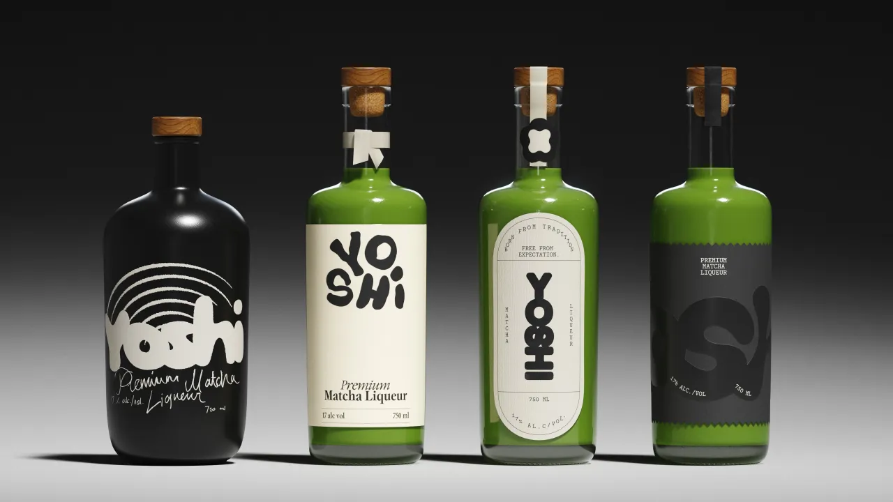
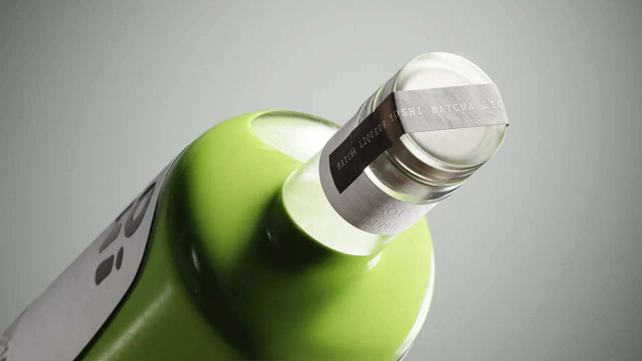
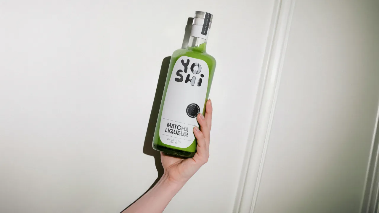
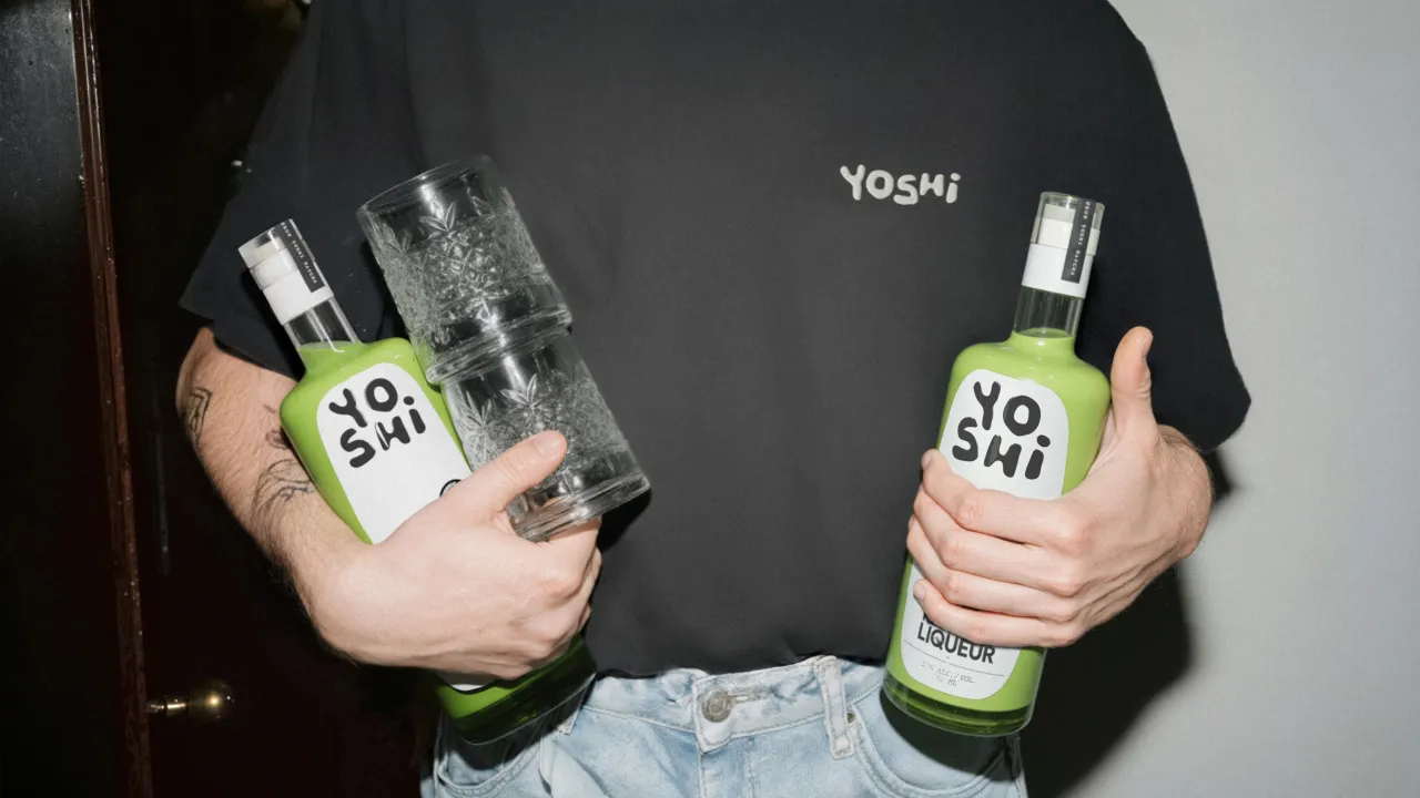
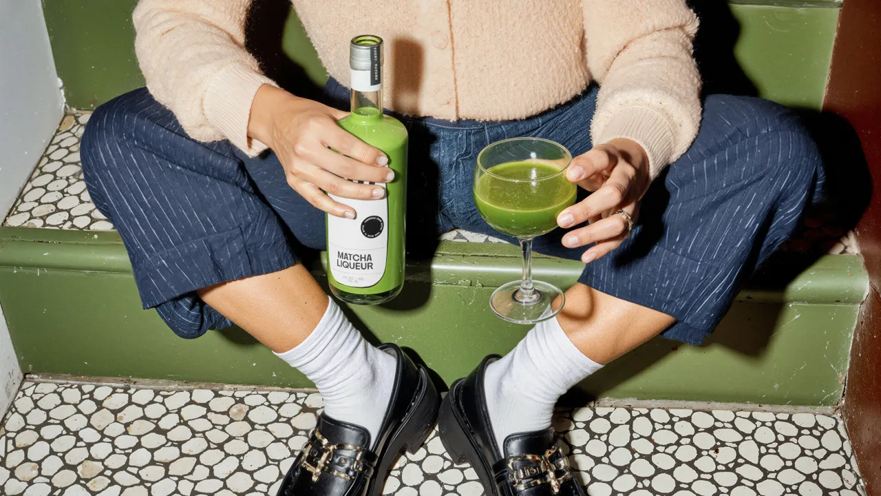
I've got to be honest. I lived in Japan for three years and had to drink a lot of matcha—a surprisingly bitter form of green tea—for social reasons. I honestly couldn't stand it and can't get my head around its current popularity in metropolitan cafes worldwide. But clearly, lots of people like it, because it has truly become a huge, billion-dollar success story.
Matcha-infused booze, though, is a whole other story. The Western liqueur market, after all, remains stubbornly nostalgic, dominated by heritage brands whose packaging hasn't meaningfully evolved since your grandmother's drinks cabinet. Now, into this gap steps Yoshi, attempting to bridge Japanese ritual and taste with contemporary nightlife.
Deceptively simple
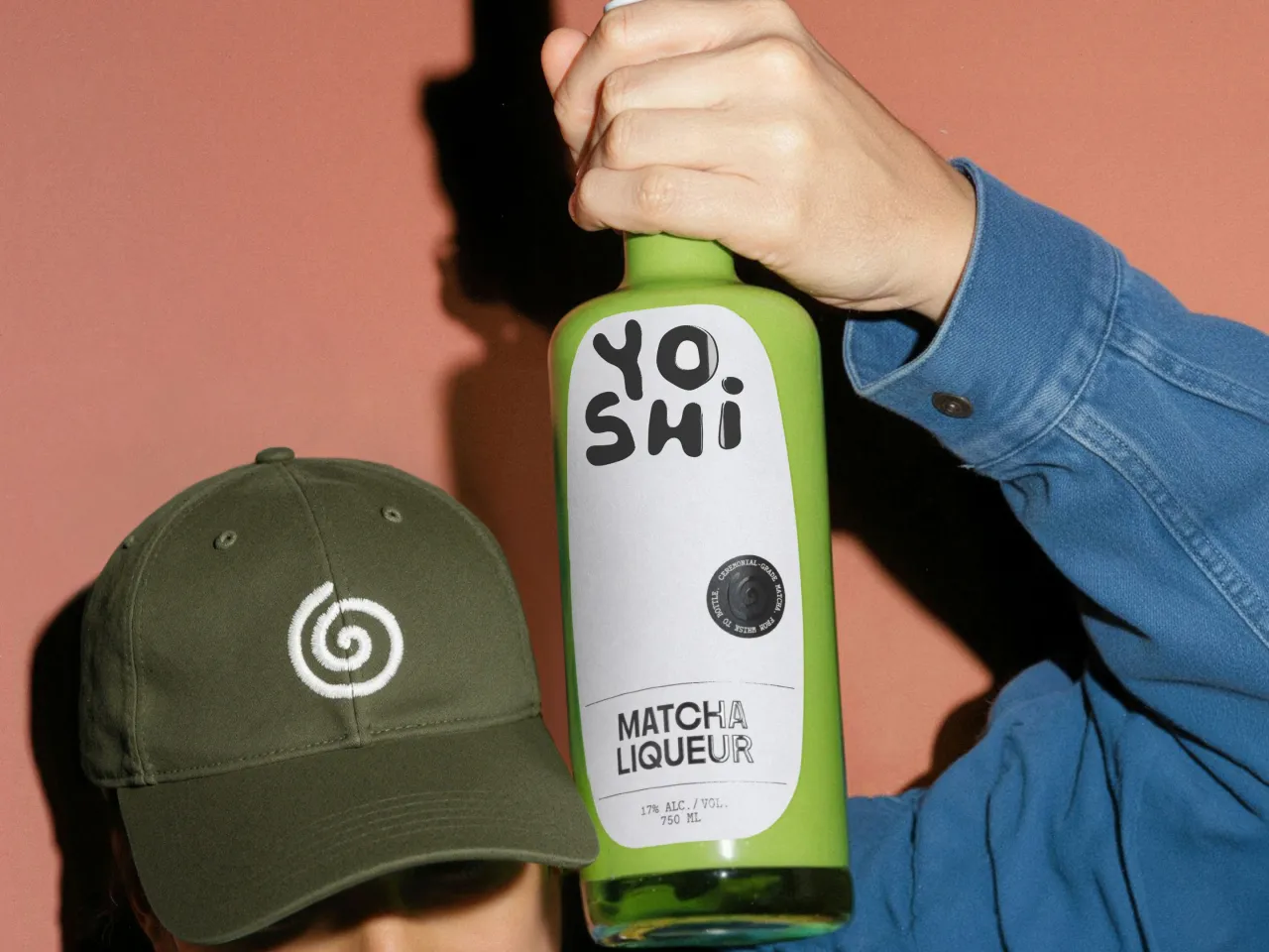
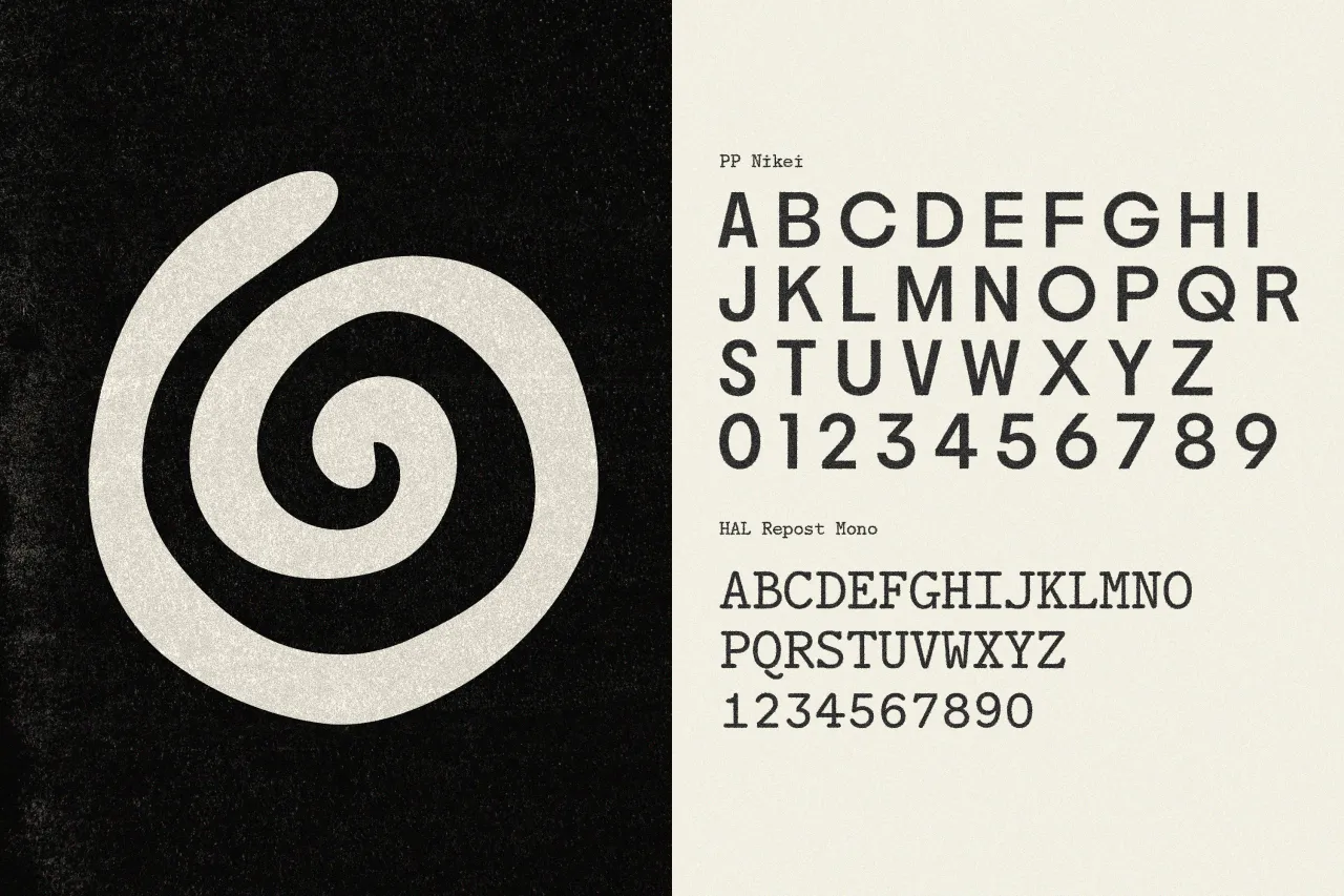
Saint-Urbain's solution hinges on a deceptively simple observation: matcha preparation is highly theatrical. The precise whisking motion, the ceremonial tools, the transformation from powder to liquid; there's inherent drama here that doesn't need orientalist packaging to sell it. So rather than adding cherry blossoms or pagodas, they extracted the essence of the gesture. That circular whisking motion becomes a spiral symbol, both ceremonial and kinetic.
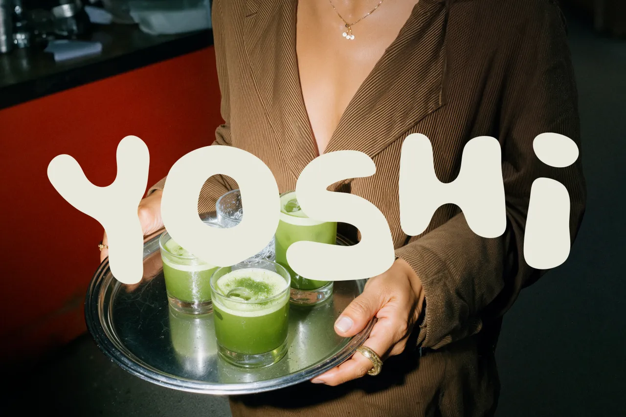
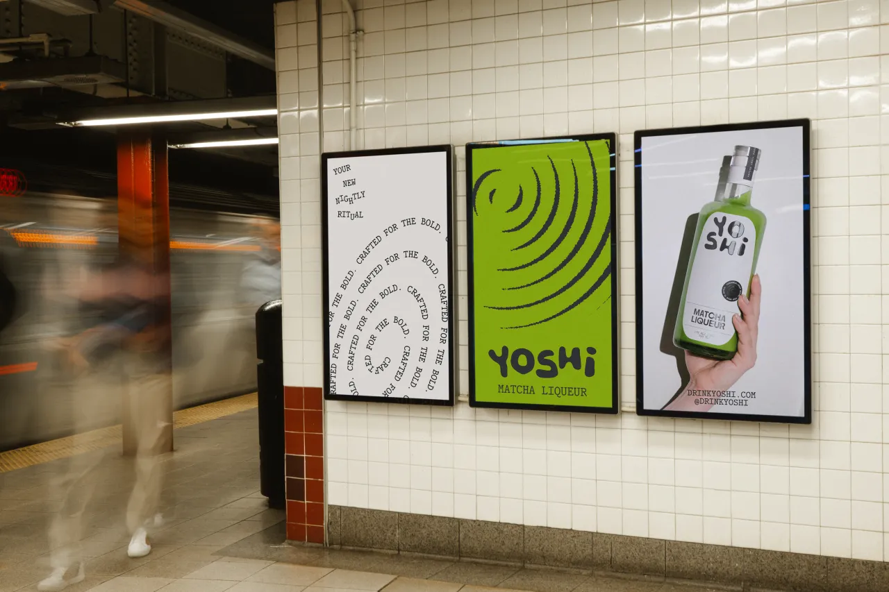
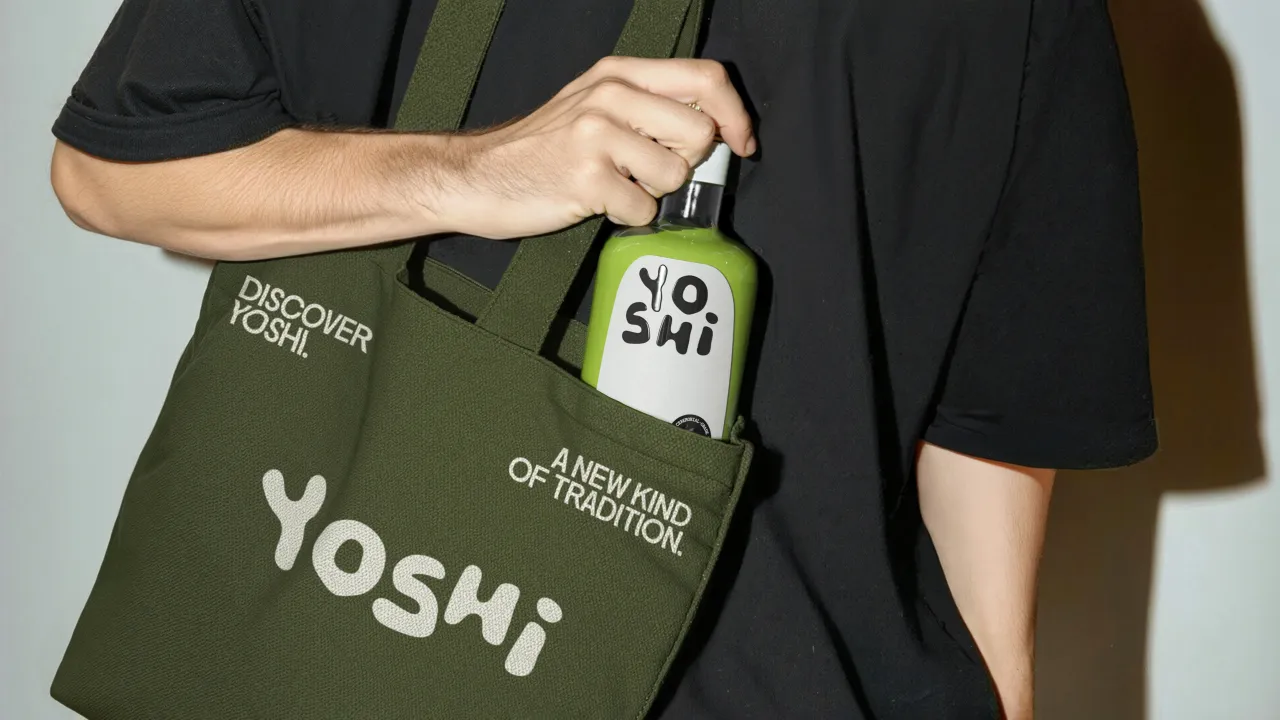
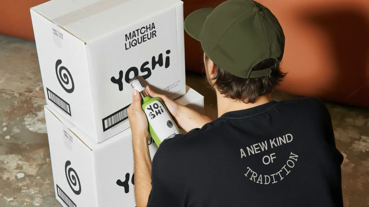
The hand-drawn wordmark, meanwhile, feels deliberately imperfect; its irregular forms introduce warmth into a category that often mistakes coldness for premium positioning. It's confident without being aggressive, playful without becoming frivolous. The sort of mark that works as well on a dimly lit bar shelf as it does in a sun-drenched Instagram story.
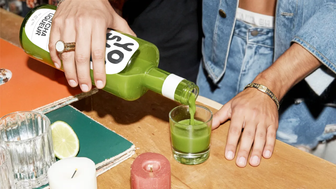
But to my mind, it's the bottle itself that does the heavy lifting here. That opaque green is arresting; not the expected translucent glass of most spirits, but something solid, almost ceramic in its presence. The stark white label creates genuine contrast rather than merely sitting politely on the surface. There's a boldness here that most liqueur brands, trapped in their heritage positioning, simply wouldn't risk.
The photography direction, too, deserves attention. Direct flash, real hands, actual pours… it all adds up to an anti-lifestyle aesthetic. One that, ironically, feels more alive than the usual soft-focus, golden-hour nonsense. This is the visual language of nightlife documentation. When a hand holds the green bottle against a plain white wall, you can almost feel its weight, the coolness of the glass.
Respect, not reproduction
What Saint-Urbain clearly understand—and what many designers miss when working across foreign cultures—is that respect doesn't mean reproduction. You can honour tradition without mummifying it. The spiral symbol references the chasen whisk without depicting it literally. The green is unmistakably matcha without being aggressively so. The overall system feels Japanese-influenced, rather than Japanese-costumed.
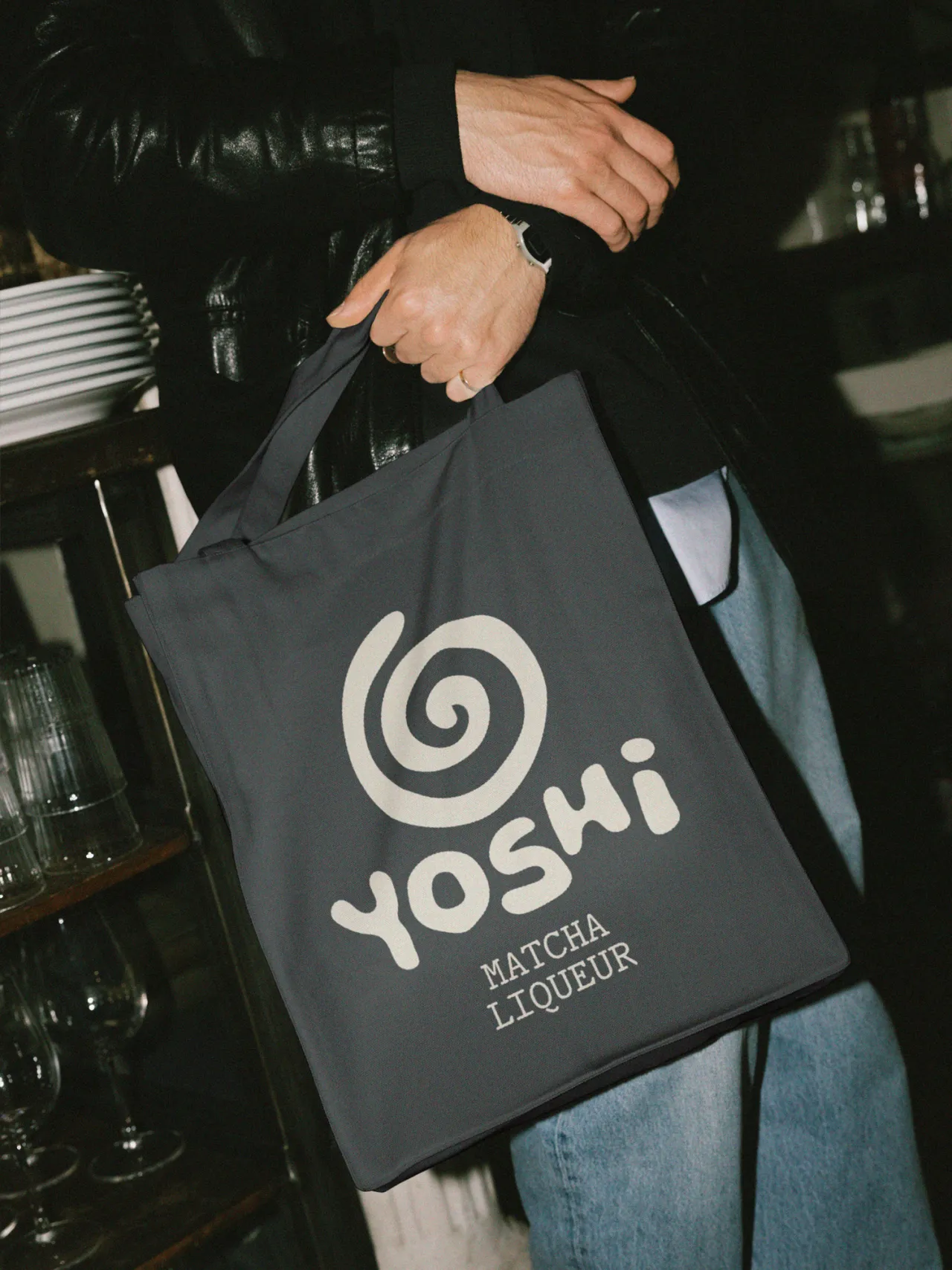
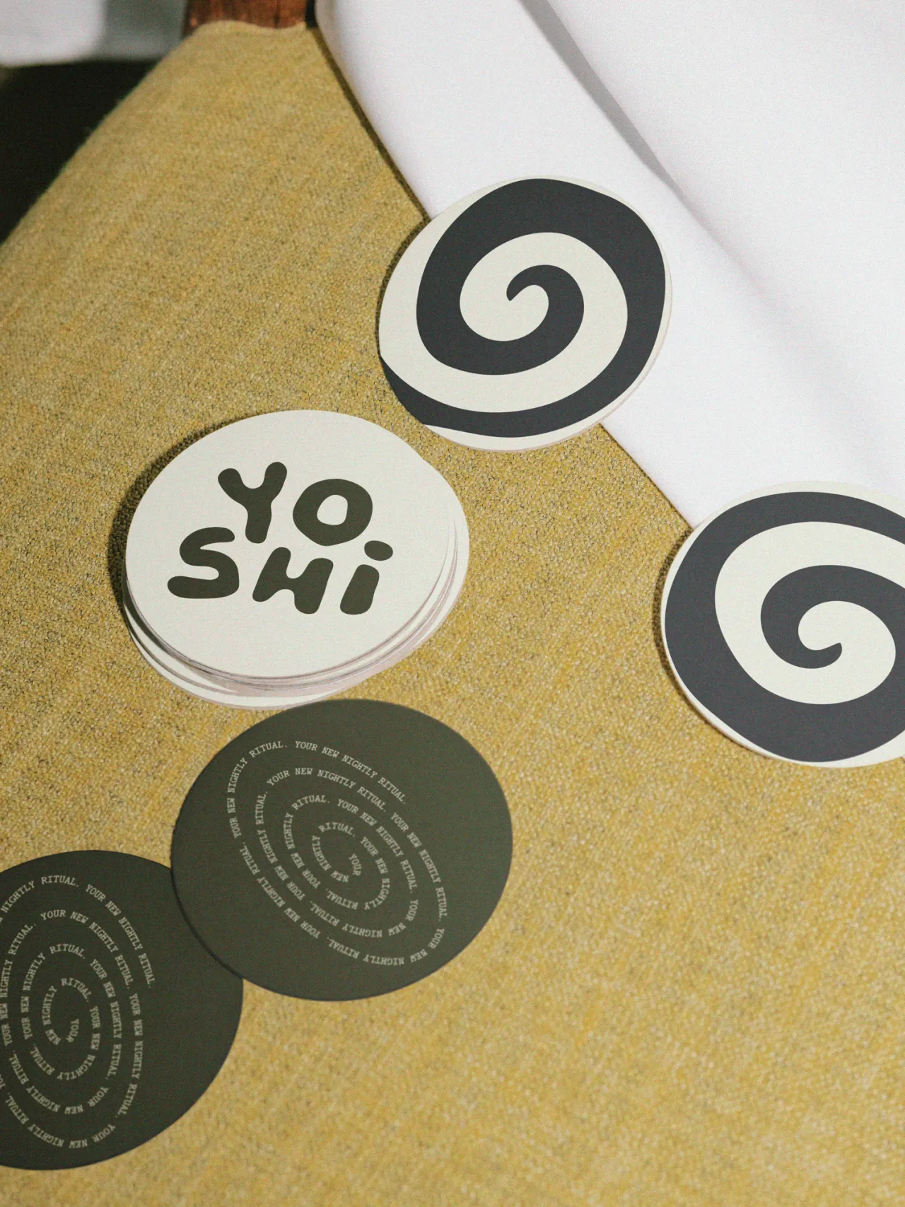
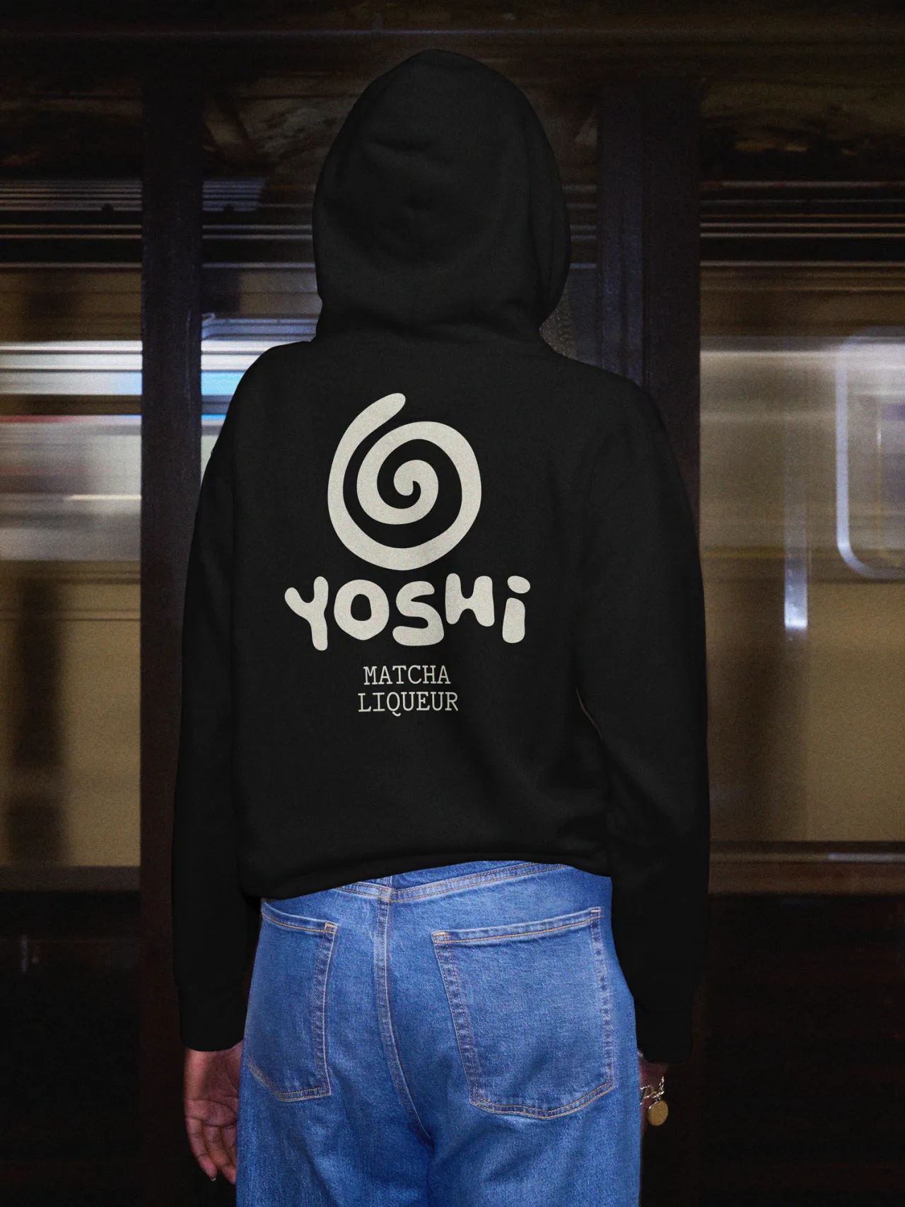
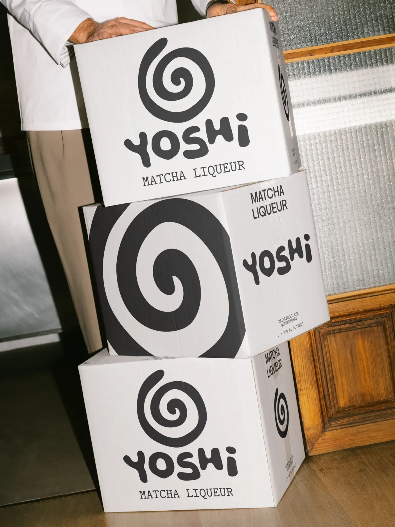
And this matters. While cultural appropriation doesn't typically offend as such, it does make it less effective because it comes across as less authentic. It signals that a brand hasn't done the work of understanding what it's selling. And if you can't be bothered to do that, consumers subconsciously reason, why should we bother buying it?
In contrast, Yoshi's positioning as "a new kind of tradition" works brilliantly because the design demonstrates genuine engagement with both halves of that equation.
Motion and typography
The motion work extends this thinking into kinetic space. Spiralling typography and jazz-influenced rhythm create movement that mirrors both the whisking process and the energy of a busy bar. It's design that understands its context; that these assets will live on backlit screens behind bartenders, not just in static Instagram grids.
There's also smart restraint in the typography. PP Nikkei and HAL Repost Mono are contemporary choices that feel precise without being cold; structured without being rigid. They give the brand a technical backbone that supports rather than dominates the more gestural elements.
Finally, the broader context is worth noting. We're in the midst of a significant shift in how spirits brands present themselves. The old guard of heritage positioning is being challenged by brands that understand contemporary luxury as experience rather than exclusivity, as cultural fluency rather than aspirational distance. Yoshi positions itself perfectly in this emerging space; premium but not precious, crafted but not stuffy.
Ultimately, this is a great example of how cross-cultural design work should be done. With research, restraint, and enough creative confidence to trust that you don't need to hit every obvious visual note to make your point. Sometimes the most respectful approach is also the most interesting one.

Editor's Picks





Trending




Latest Jobs
Growth Marketing Lead at Anthropic
Full-time·San Francisco·$320,000 – $400,000
Communications Strategy Director at David&Goliath
Full-time·Los Angeles·$120,000 – $180,000
Midweight Designer at Pentagram
Full-time·London·£40,000 – £50,000
Multidisciplinary Designer at Formation Games
Full-time·London·£40,000 – £50,000
Social Media Manager at Jam
Full-time·Manchester·Circa £35,000
Brand Designer at Langdock
Full-time·Berlin·€65,000 – €100,000