South London design studio DutchScot's caviar food fight branding
Based in Peckham, South East London, DutchScot is a design and branding consultancy spanning strategy and naming; advertising; signage; art direction; copywriting; identity, print, digital, editorial and interior design, and more.
It works to the goal of creating work guided by "ideas and invention, relevance and difference, intuition and experience, substance and soul." DutchScot has just launched a new website to show off all this and more, featuring a ton of work that exemplifies its belief in creating projects "guided by strong creative thinking that runs deep below a simple and striking surface", and "asking provocative questions and working closely with partners and clients to use refined ideas of modern craft and create unusual work that stands out – regardless of the size of the budget of a project". Standard claims, perhaps, but in their case, they are beautifully true.
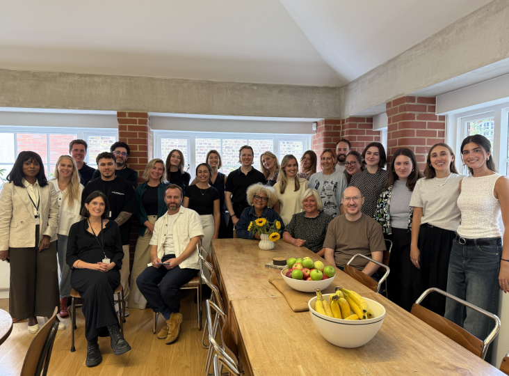
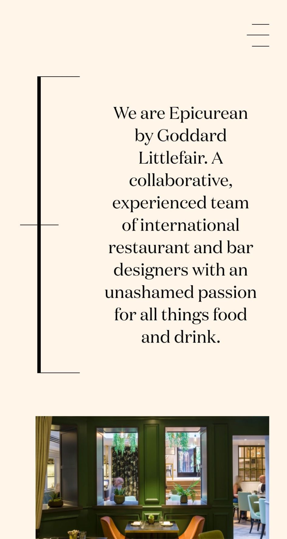
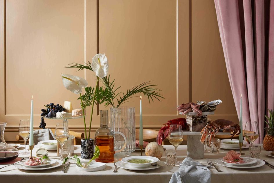
We're keen to highlight its recent work for Epicurean, a consultancy specialising in restaurants and bars that focuses on interior design as well as working on market research, business modelling, menu concepts, staff and branding.
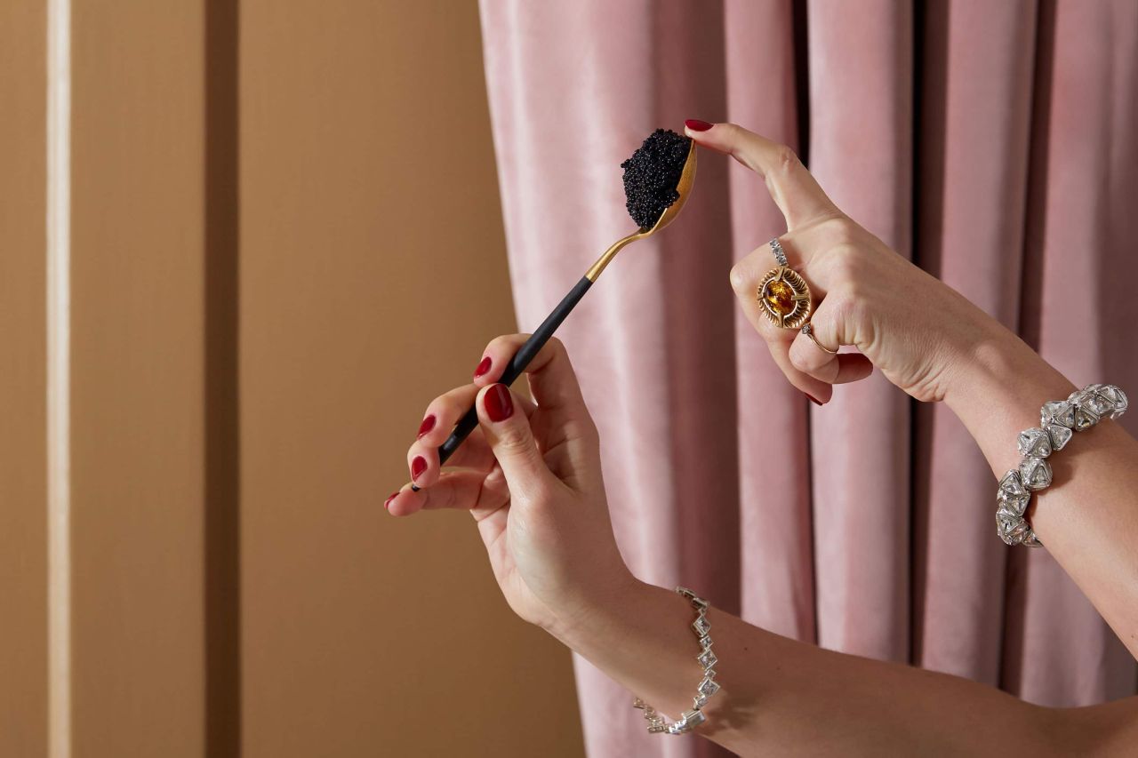
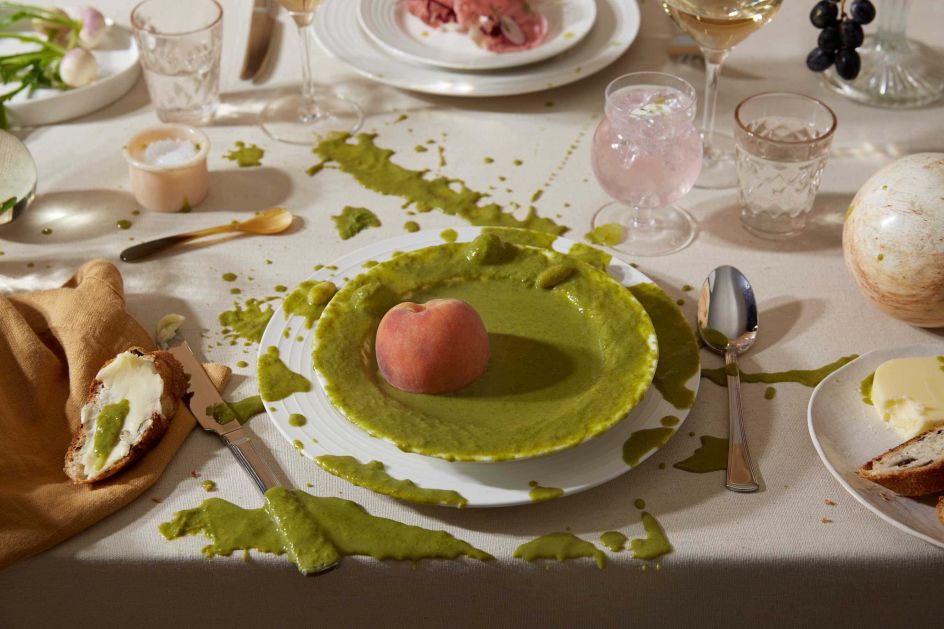
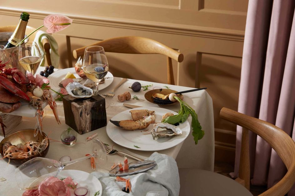
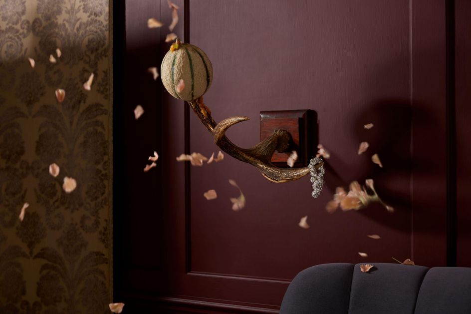
DutchScot's work for the brand was based around the meaning of the word 'Epicurean': a "person devoted to sensual enjoyment, especially that derived from fine food and drink". It created a suite of photographic images shot by photographer Kristy Noble and styled by Olivia Bennett, which show a rather opulent food fight involving flicking generous spoonfuls of caviar and, er, octopuses.
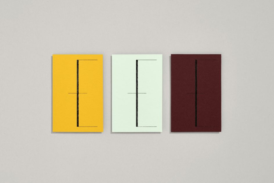
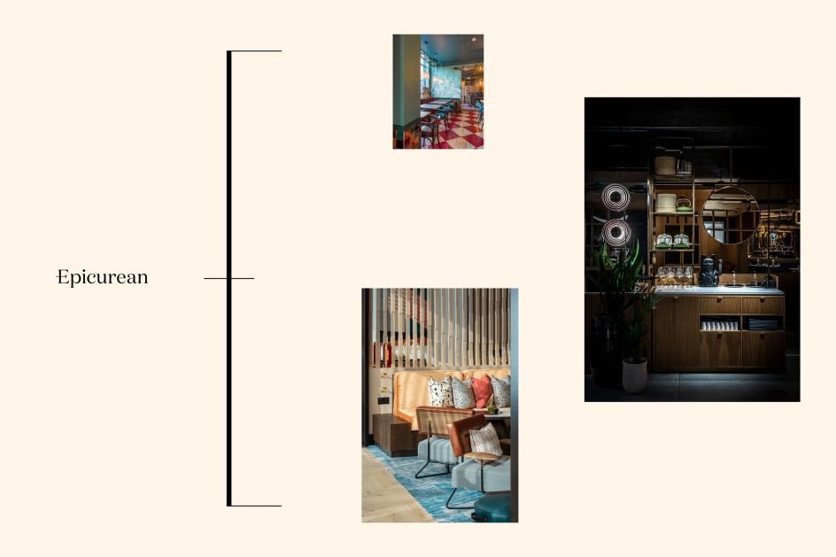
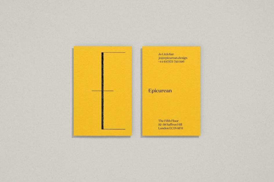
At the heart of its new designs is a logo which is split into two – half of the logo takes the shape of an elegant upper case 'E' which forms a sort of diagram to represent the three main aspects of Epicurean's offer: people, places and food.
The precise, diagrammatic nature of the logo also works as a bracket device that amalgamates and distils a diverse range of portfolio imagery, messaging and other content. Decorative typefaces and expressive logotype are designed to complement the more functional aspects of the logo.
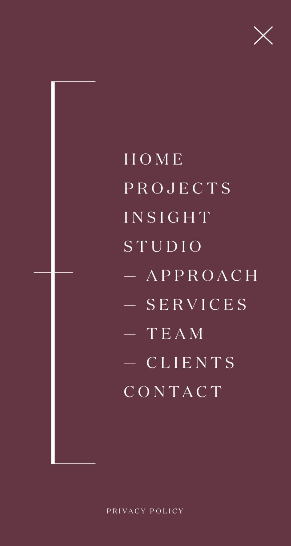
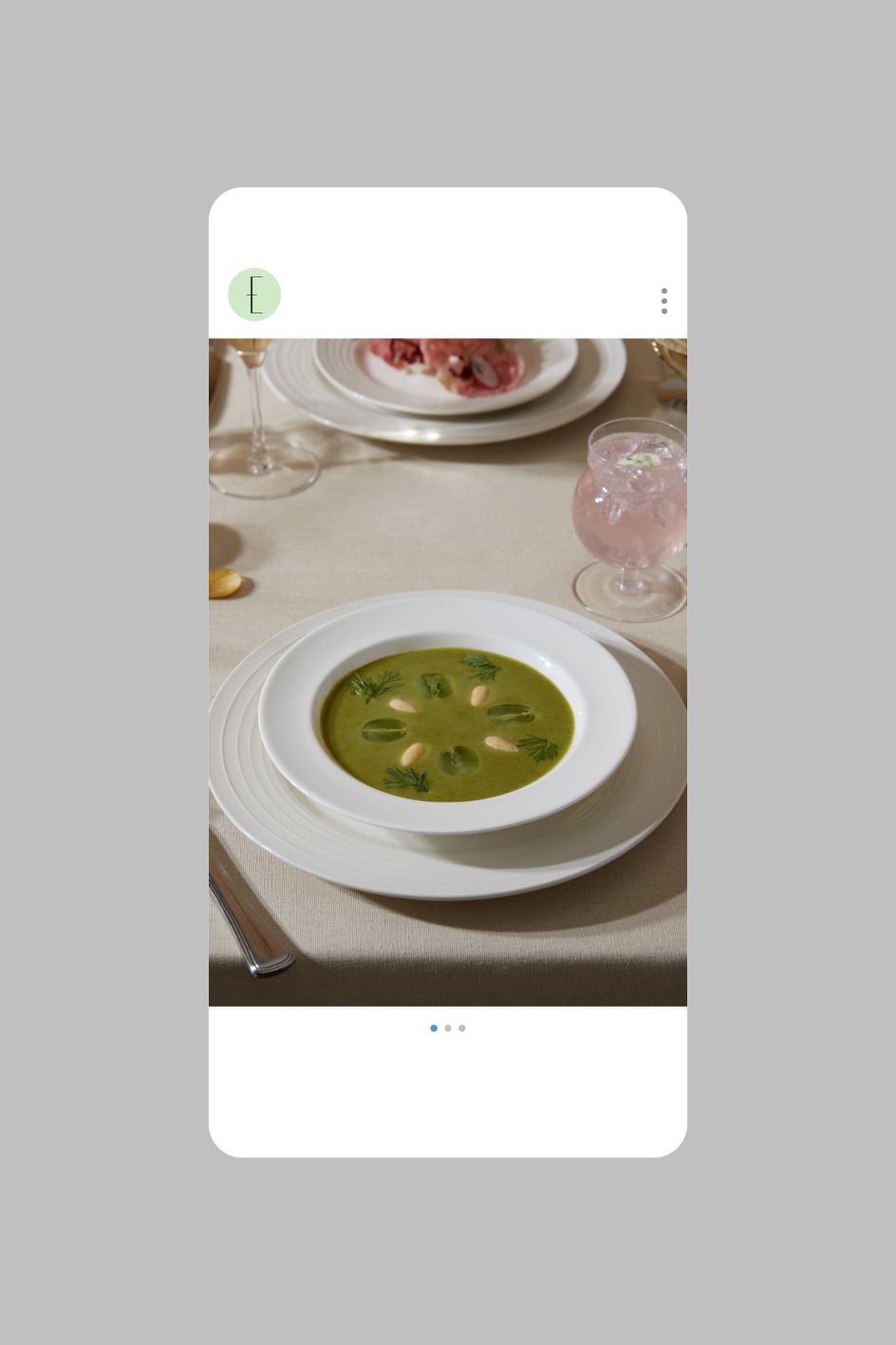
DutchScot also created the Epicurean website, briefed to design "Not just another portfolio site". As such, the homepage aims to give an "explorative" feel, using a "visual collection of all things Epicurean, from sketches through to finished pieces," says the studio. Content is also automatically pulled in from the brand's Instagram feed, meaning the site is under constant evolution to keep the website continually evolving.
The images are brought together to create a short, stop-frame film that was used on a holding website to launch Epicurean to press, potential clients and the industry. Mini sequences are used for social media content.
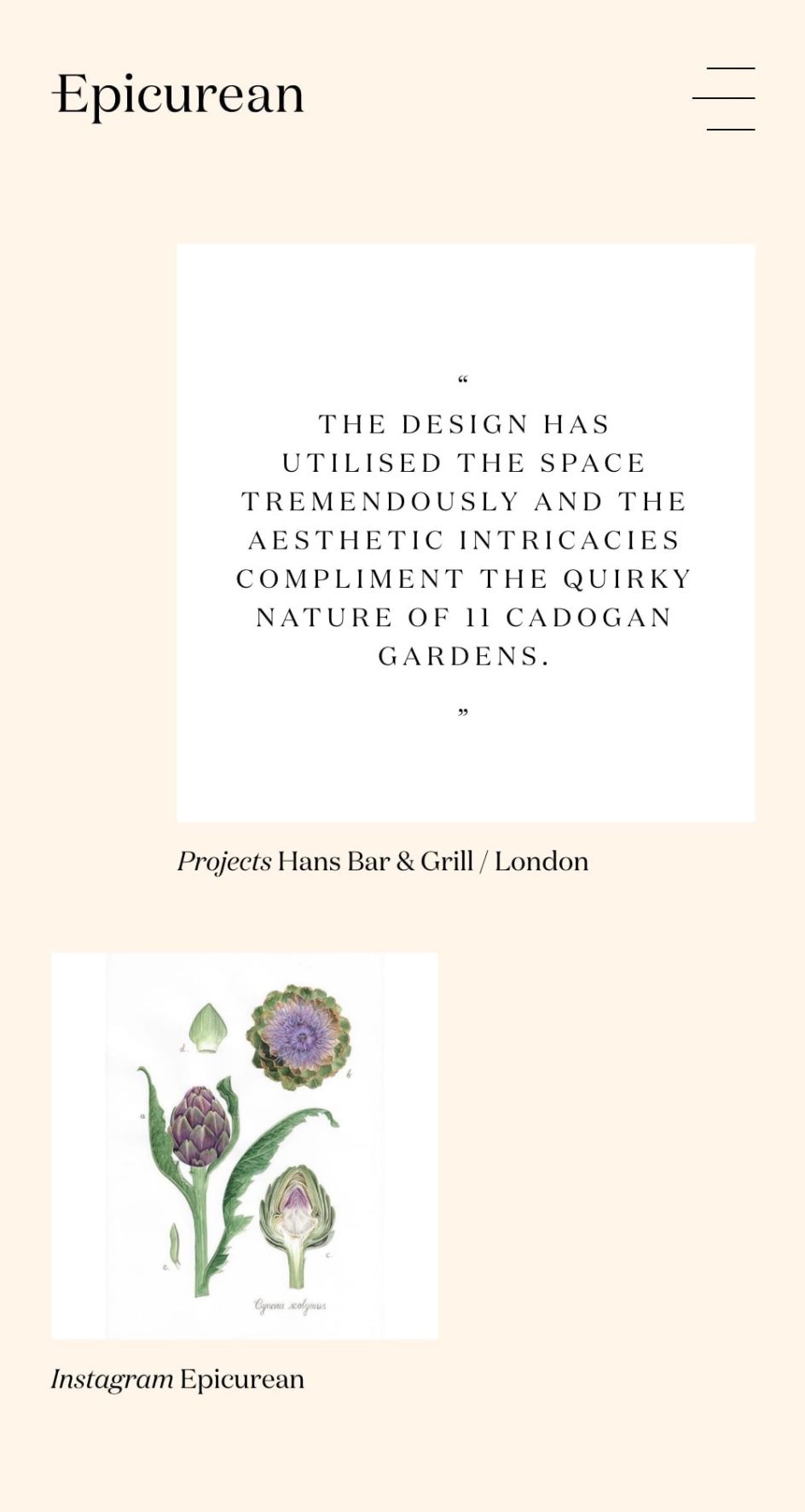
'Not just another portfolio site' was the brief for the website. The homepage is designed to be deliberately explorative with a visual collection of all things Epicurean, from sketches through to finished pieces. Content is also automatically pulled in from their Instagram feed to keep the website continually evolving. Epicurean's case studies are also structured according to the 'people, places and food' philosophy with each one loosely divided into three sections; as are the team member bios, with each person naming their favourite chef, restaurant and meal.
Editor's Picks


Trending


](https://www.creativeboom.com/upload/articles/90/908fdb6378db1e95d12595416f54e6336d5e80b8_732.jpg)
Podcasts


Editor's Picks
Further Reading