Stamp Works' branding for Japanese bakery is packed with fun and personality
Japan is full of great bakeries with amazing cakes and pastries, so how do you make a new business stand out from the crowd? Jin Fujiwara's fun, lively and colourful branding shows the way.
In bustling Kurashiki, a city in Okayama, Japan, sisters Yumi and Hito had grown tired of their mundane jobs. One day, they shared a daring idea: starting a bakery. Driven by this fresh passion, they bid farewell to their old careers. With savings and unwavering determination, they opened Bakery Two.
Early mornings became their routine as flour danced in the air. Yumi's artistic flair crafted delightful pastries and Osouzai bread, while Hito's precision ensured perfection. Locals were drawn to the bakery's warmth and the sisters' genuine smiles.
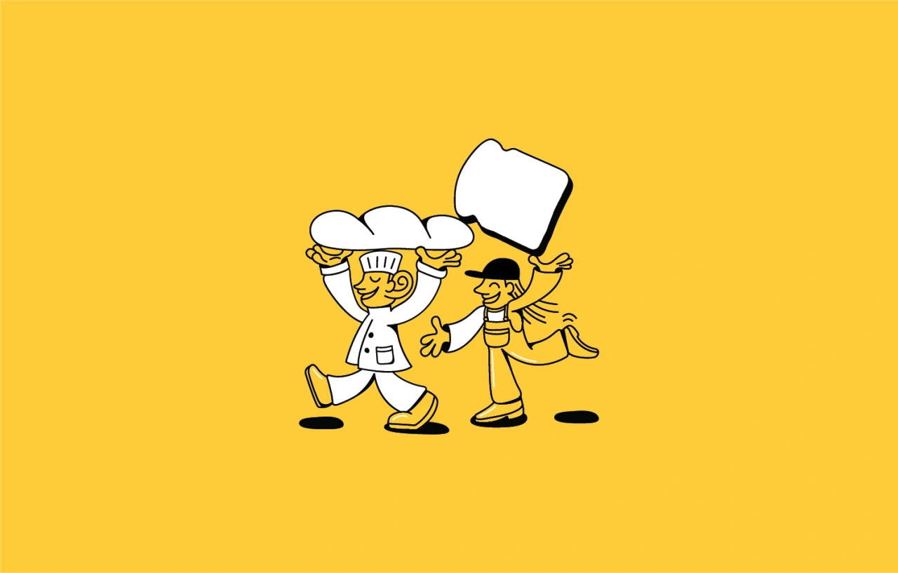
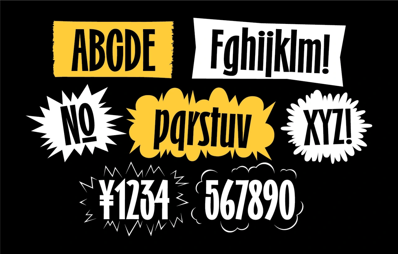
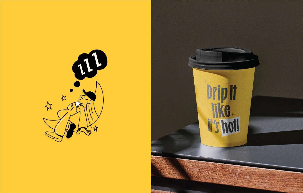
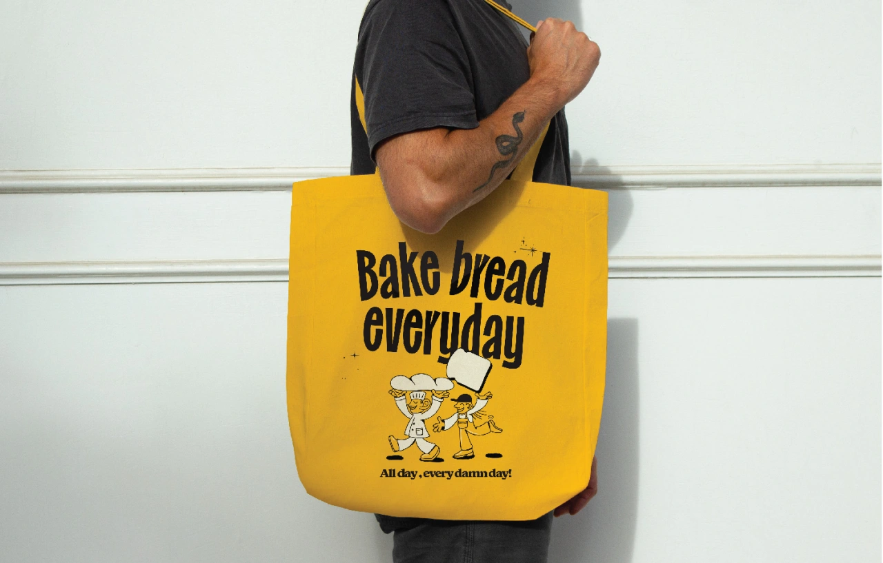
To brand their new project, they turned to Jin Fujiwara of local design agency Stamp Works. "Our brief was to create an identity that reflects the two founders' personalities," he explains. "Yumi is very playful easy going and helps make Osouzai, while Hito is the perfectionist and in charge of the quality of the breads that are sold in the bakery. So, we decided to illustrate these two characters as the centrepiece of the identity.
Incorporating a mascot into your bakery's identity can be a fun and effective way to connect with customers, strengthen your branding, and create a unique and recognisable presence in the local market. And that's just what these fun, colourful and eye-catching illustrations achieve.
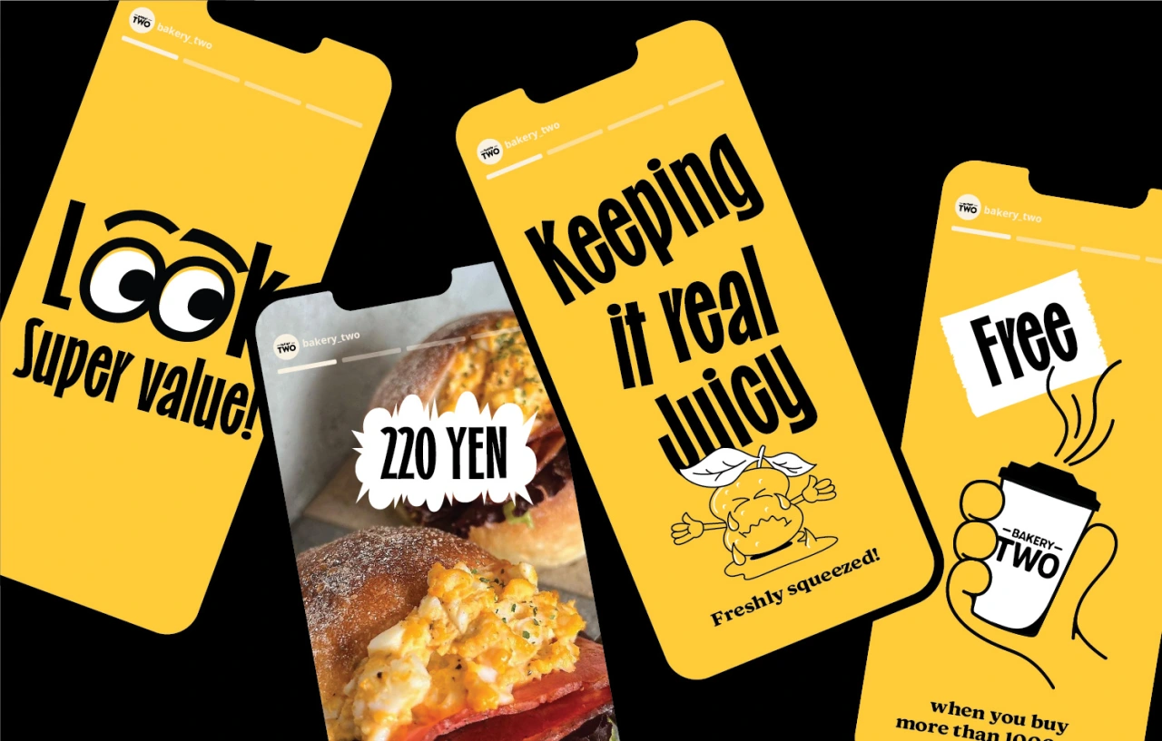
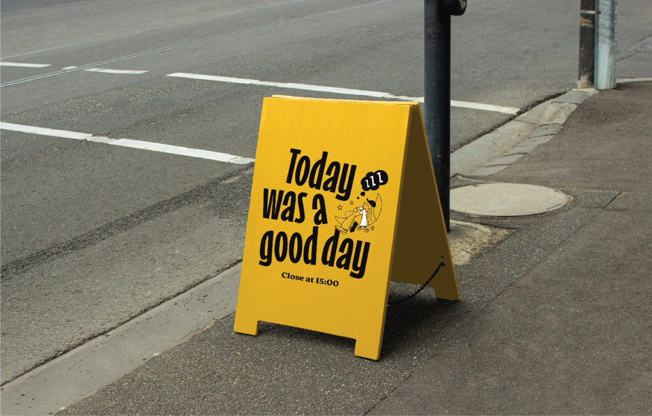
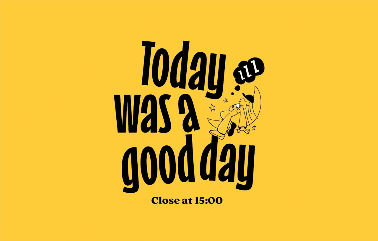
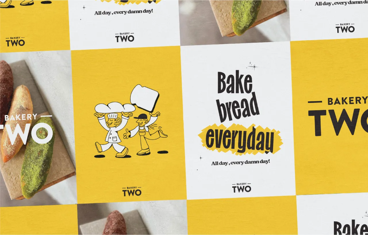
"Our illustrations showcased what Yumi and Hito's daily jobs look like in practice and used them in the different touch points," explains Jin.
Incorporating yellow and black into a bakery's identity creates a visually striking and emotionally appealing brand that sets the establishment apart and leaves a lasting impression on customers.
"As for tone of voice, we wanted to be fun and playful," he adds. "The two sisters play hip-hop in the bakery, so we were inspired by the lyrics of some famous rap songs."
Editor's Picks





Trending






Latest Jobs
Brand Strategist at DNCO
Full-time·London·£45k-£60k
Brand Copywriter at Origin
Full-time·Porthleven, Cornwall·£35k–£40k
Design Director at Human After All
Full-time·London·£66k–£88k
Account Manager at Moxie and Mettle
Full-time·Cheltenham·Up to £35k
Senior Designer at Creative Spark
Full-time·Manchester·£35k-£50k
Brand Designer, Product Launches at Figma
Full-time·New York·$127k–$269k