From Kolkata to Soho: Tangra brings Indo-Chinese flavour and a fresh approach to restaurant branding
Opening this November on Frith Street, Tangra will bring a layered, story-rich experience shaped by a rare four-way creative collaboration between Jelly, Kuba&Friends, Boomranng Studio, and Quadrant Design.
This November, a new arrival on Soho's Frith Street is set to shake up London's dining scene. Tangra, a new Indo-Chinese restaurant named after the Kolkata neighbourhood known as the birthplace of the cuisine, promises fiery flavours, late nights and a multi-sensory experience that blends myth, pop culture, and contemporary design.
Behind the restaurant lies a rare creative collaboration that has redefined how brand identities in hospitality are built. Jelly, Kuba&Friends, Mumbai-based Boomranng Studio and interior specialists Quadrant Design came together not as isolated partners working in sequence, but as an embedded team involved from initial market insight right through to final delivery. The result is a brand experience that feels unified, layered and alive, much like the cuisine it celebrates.
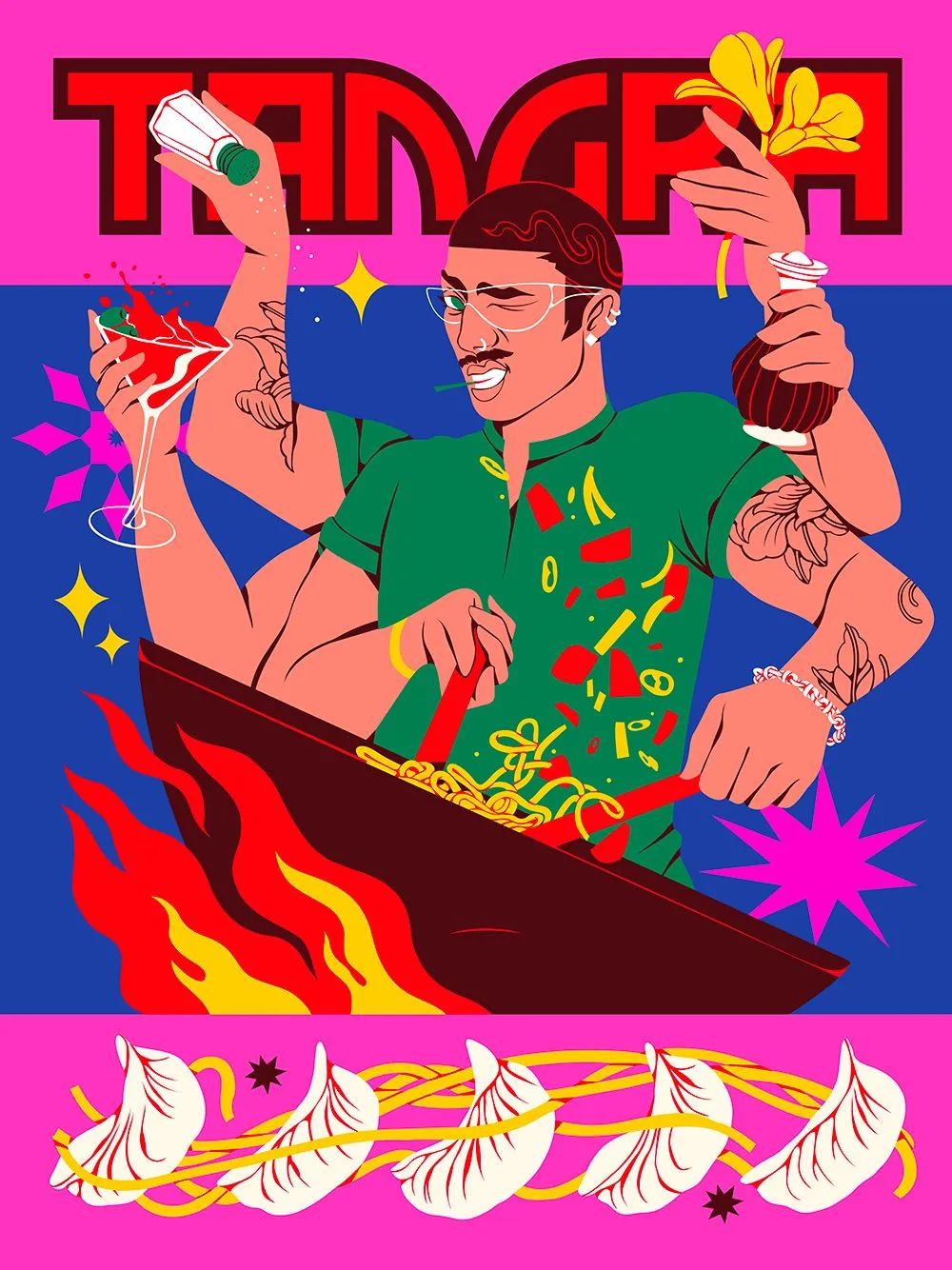
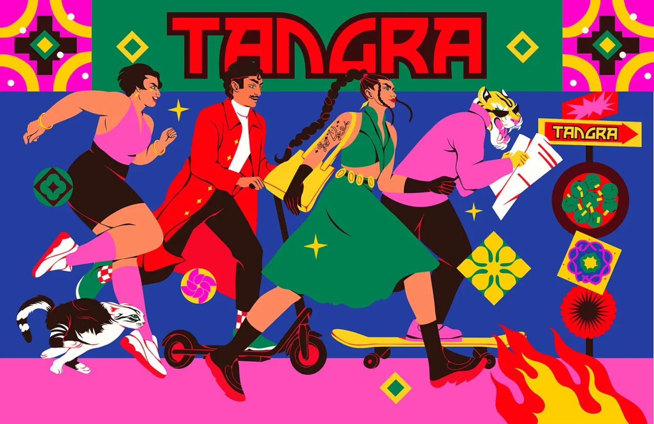
"Unlike conventional inter-agency relationships where strategy, creative and execution operate in isolation, the Tangra project was fully collaborative," explains the team at Jelly. "We were all embedded in the process from day one, which meant ideas flowed freely and every element, from the interiors to the menu design, was built on shared foundations."
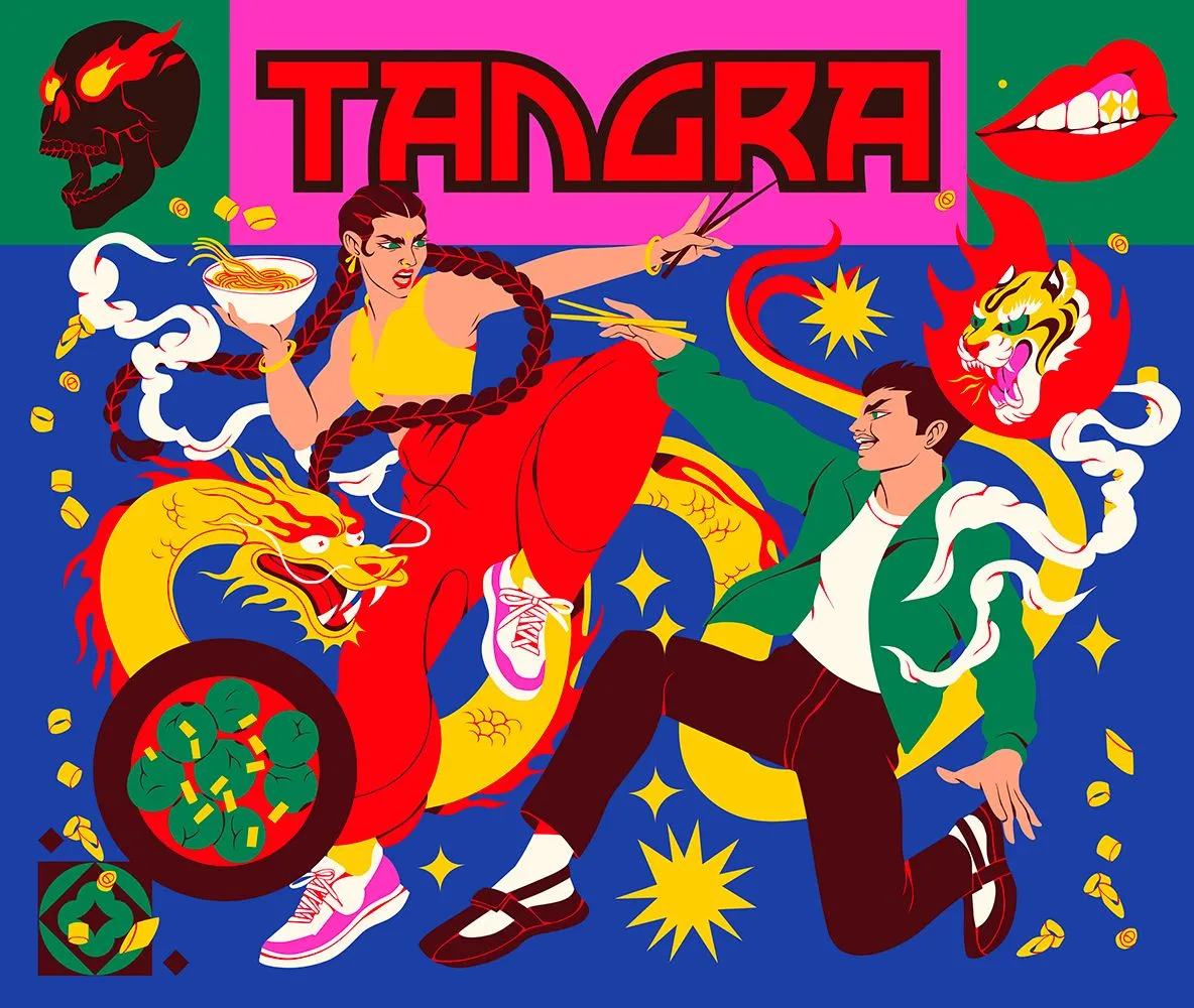
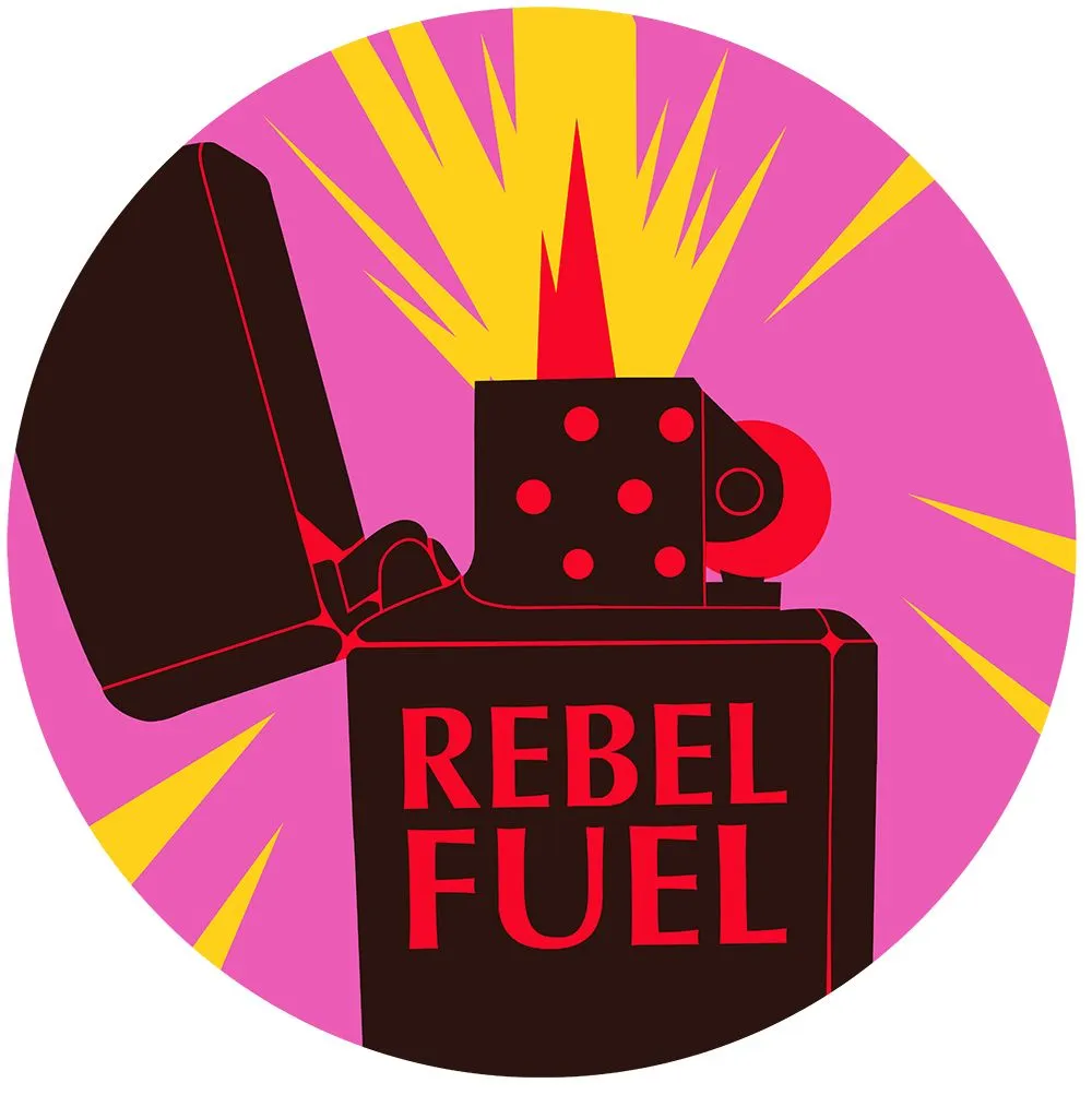
That integrated approach has produced a brand world that extends far beyond the usual restaurant identity. Every element—from a hand-drawn logo and bespoke typography direction to hero illustrations, menu and social media templates, staff uniforms, and even sticker designs—has been carefully crafted not just for Tangra's own use but also with customers in mind. The aim is for people to share, personalise, and love the brand in their own way, making it part of their experience rather than just the backdrop to it.
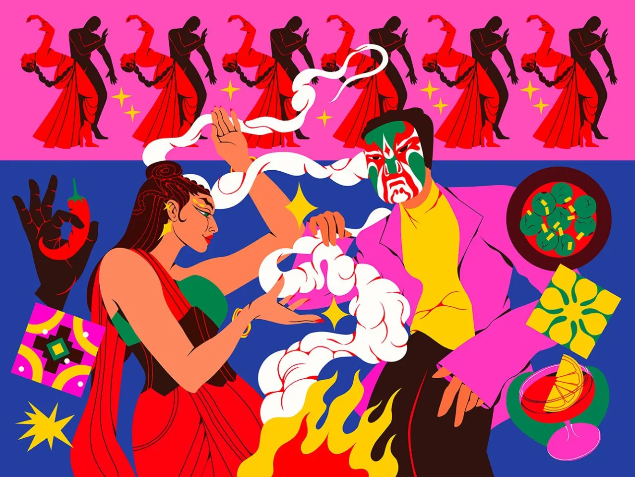
Tangra's story begins with its namesake: the Tangra district of Kolkata, the historic heart of Indo-Chinese cooking. The restaurant's menu, led by Executive Chef Nikesh Sawant, pays homage to that heritage while embracing the evolution of the cuisine across the region. Dishes nod to Kolkata's bustling street stalls, Mumbai's night markets, and the influences of Tibet and Nepal, capturing a hybrid cooking style that's as comforting as it is addictive.
Just as the food celebrates cultural fusion, the design thrives on contrast. As diners move through the space, they're greeted by warm, tactile timber alongside jolts of neon light; matte finishes against glossy reflections; and raw materials colliding with hand-drawn illustrations. Perforated panels, patterned floors, glowing signage and vibrant graphic overlays layer texture and rhythm throughout the interior, creating a setting that feels at once nostalgic and resolutely modern.

Boomranng Studio's contribution brings much of that spirit to life. Known for blending Indian mythology, retrofuturist imagery and joyful maximalism, the studio has infused Tangra's walls with bold graphic posters inspired by Mumbai's dusk skies, Kolkata's silk markets and the saturated hues of Indian spices. These are not decorative afterthoughts – they're woven into the very fabric of the design language, creating moments of discovery that reveal themselves the longer you look.
"Layers of storytelling are built into every detail," say Boomranng's founders. "We wanted to create a space that feels alive – where the colour, illustration and type aren't just surface-level decoration but part of the experience itself."
The palette reflects that philosophy, too. Bursts of vibrant colour punctuate earthy tones, lifting the mood and sparking conversation. Meanwhile, references to Chinese calligraphy, retro Indian cinema, and vintage audio culture add depth and texture to the storytelling. The result is an environment designed to be felt as much as seen – one that echoes the energy and bustle of Indo-Chinese street food culture.




This eclectic energy extends beyond the visuals, as Tangra is designed for motion, for sound, for stories. Whether you're perched at the bar with small plates and a cocktail, tucked into a neon-lit booth for dinner, or gathered at a communal table deep into the night, the restaurant is built to hum with activity.
Strategically, Tangra also marks a shift in how restaurants in London position themselves. Rather than leaning on nostalgia, authenticity or heritage as many Asian dining concepts do, the team embraced an experience-first philosophy that acknowledges how modern diners increasingly choose restaurants based on atmosphere and story, not just taste.
For Jelly and its partners, that meant building a brand designed for interaction, not observation. It's a brand that invites participation and sparks curiosity. It lives as much in the stickers customers take home as it does on the menu or the sign above the door. It's also a brand that feels distinctly of now, even as it nods to generations of cultural exchange.
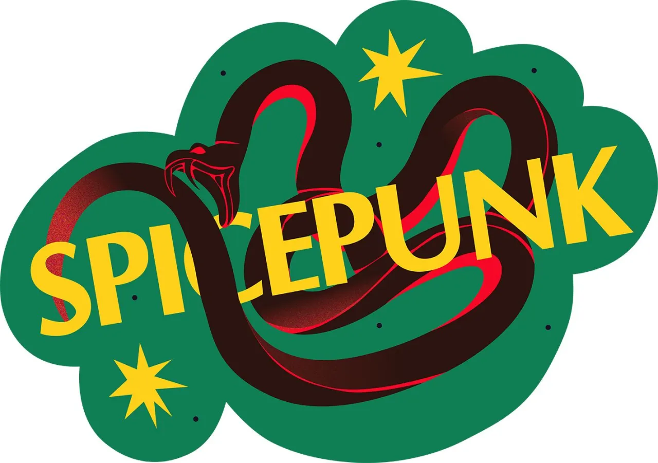

"Everything about Tangra is designed to be shared," says Kuba from Kuba&Friends. "Not just shared on social media, but shared physically – in conversations, in keepsakes, in the way people remember the experience. That's how we think restaurants build real cultural relevance today."
With its layered storytelling, unapologetic design and deeply collaborative creative approach, Tangra is far more than another addition to Soho's crowded restaurant scene. It's a love letter to a cuisine born from cultural fusion, and a glimpse at how restaurant branding can evolve when silos are broken down and creativity is shared.
Editor's Picks





Trending






Latest Jobs
Senior Digital Designer at 3800
Full-time·Sheffield·£40k-60k
Designer at New Genre
Full-time·London·£36k–£48k
Midweight Editor at Earworm
Full-time·Bristol·£28k-£32k
Art Director at The New York Times
Full-time·New York·$120k–$130k
Creative Project Manager at Analogue
Full-time·Leeds·£28k–£35k
Growth and Client Development Director at 3800
Part-time·Sheffield·£60k-80k