Zag rebrands YO! Sushi using traditional Japanese art mediums like woodcut and ink
London agency Zag has revealed a dramatic overhaul of the entire brand for YO! Sushi, to help it adapt to a fast-changing casual-dining scene.
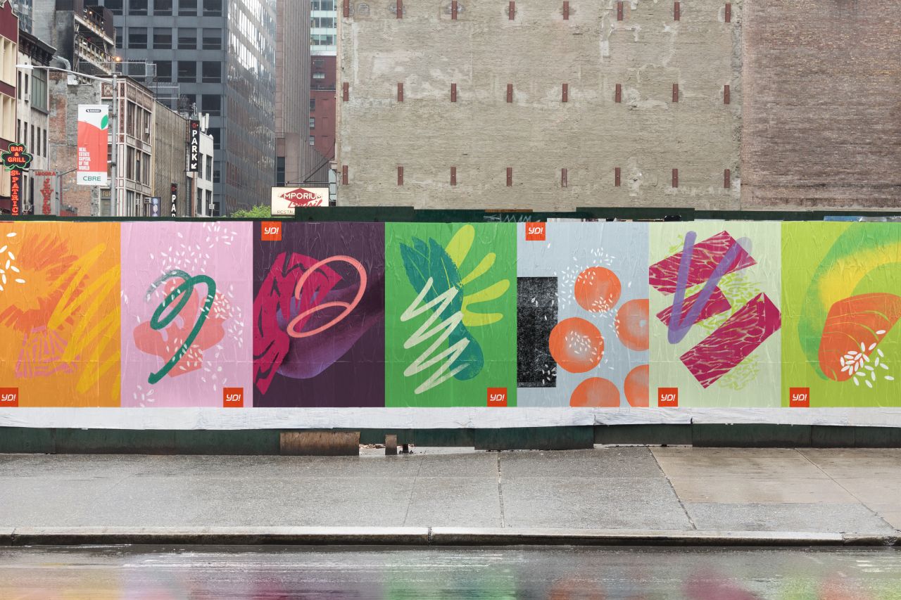
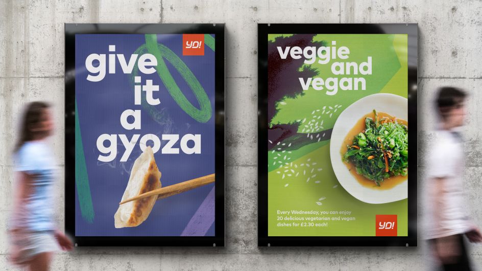
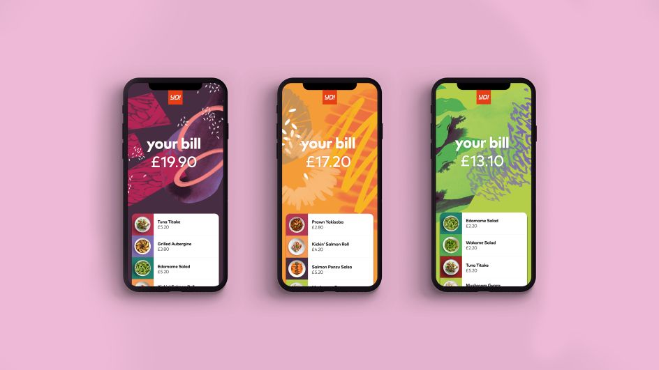
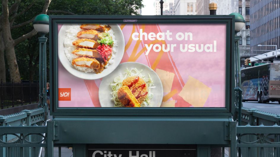
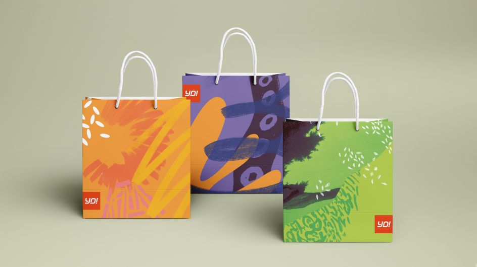
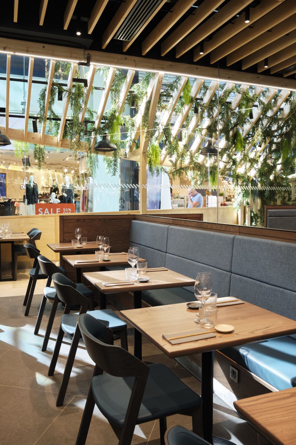
Officially renamed as YO!, the new identity was made using traditional Japanese art mediums like woodcut, ink and digital media to emphasise the freshness, flavours, colours and textures of Japanese food and create a look and feel that is designed to work across a portfolio of new propositions.
Zag's Managing Partner Aran Potkin said: "YO! was the original innovator and fast-casual dining disruptor who brought radical new experiences to the UK 20 years ago. While the YO! brand was still strong; the company understood the need to engage with a new generation of consumers, looking for authentic and genuine food experiences.
"The exciting brand overhaul we undertook with YO! has touched on every aspect of the business from menu design to the steps of service, brand identity to the customer experience as well as a completely new restaurant and dining concepts."
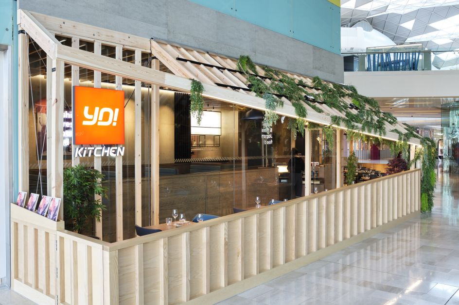
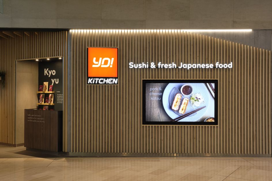
Zag’s work with YO! has also helped to identify new growth opportunities within "out of home dining" for YO! which has led to the development and rollout of new restaurant concepts. This includes a new look Kaiten belt in Ashford, a full-service 'Izakaya' in Westfield White City, which opened at the start of October and its first bespoke "grab and perch" in Manchester Piccadilly.
Editor's Picks


Trending


](https://www.creativeboom.com/upload/articles/90/908fdb6378db1e95d12595416f54e6336d5e80b8_732.jpg)
Podcasts


Editor's Picks
Further Reading