Koto just proved that design for enterprise platforms doesn't have to be beige
The global creative studio behind Airbnb, Discord and Netflix just rebranded a hotel software company, and the result is the most interesting B2B identity in years.
There is a particular kind of blandness that afflicts software companies. You know it when you see it: the gradient hero section, the stock photo of a smiling professional in a hotel lobby, the tagline about "seamless solutions" or "powering your tomorrow." Users of Mews, a Netherlands-based hospitality platform that helps hotels manage everything from bookings and payments to housekeeping and guest experience, knew this feeling all too well.
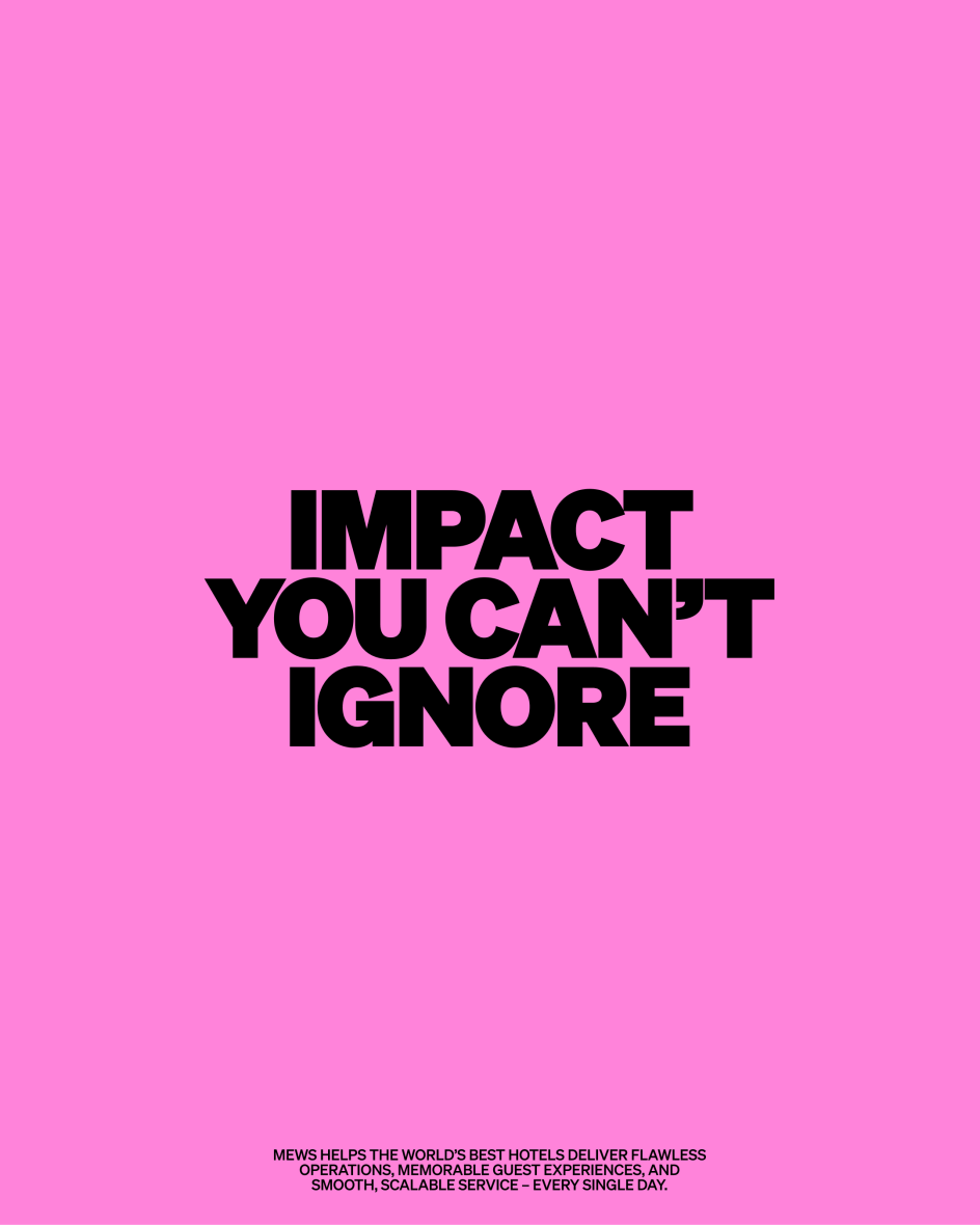
"Mews had outgrown the language of a traditional property management system," explains Cat Hill, senior strategist at Koto. "The platform had become far more powerful, but the brand wasn't helping people see that. 'Impact you can't ignore' gave us a simple yet expansive idea: technology that drives visible growth for operators and creates experiences guests genuinely feel. It became the foundation for a brand that explains complexity more clearly, without losing the ambition behind it."
That tension, between complexity and clarity, between warmth and credibility, was the central design challenge of the entire project. And what makes the Mews rebrand worth studying is not just that it solved the problem well. It's that it solved it in a way some of Mews' rivals probably couldn't bring themselves to do.
The problem with being too sensible
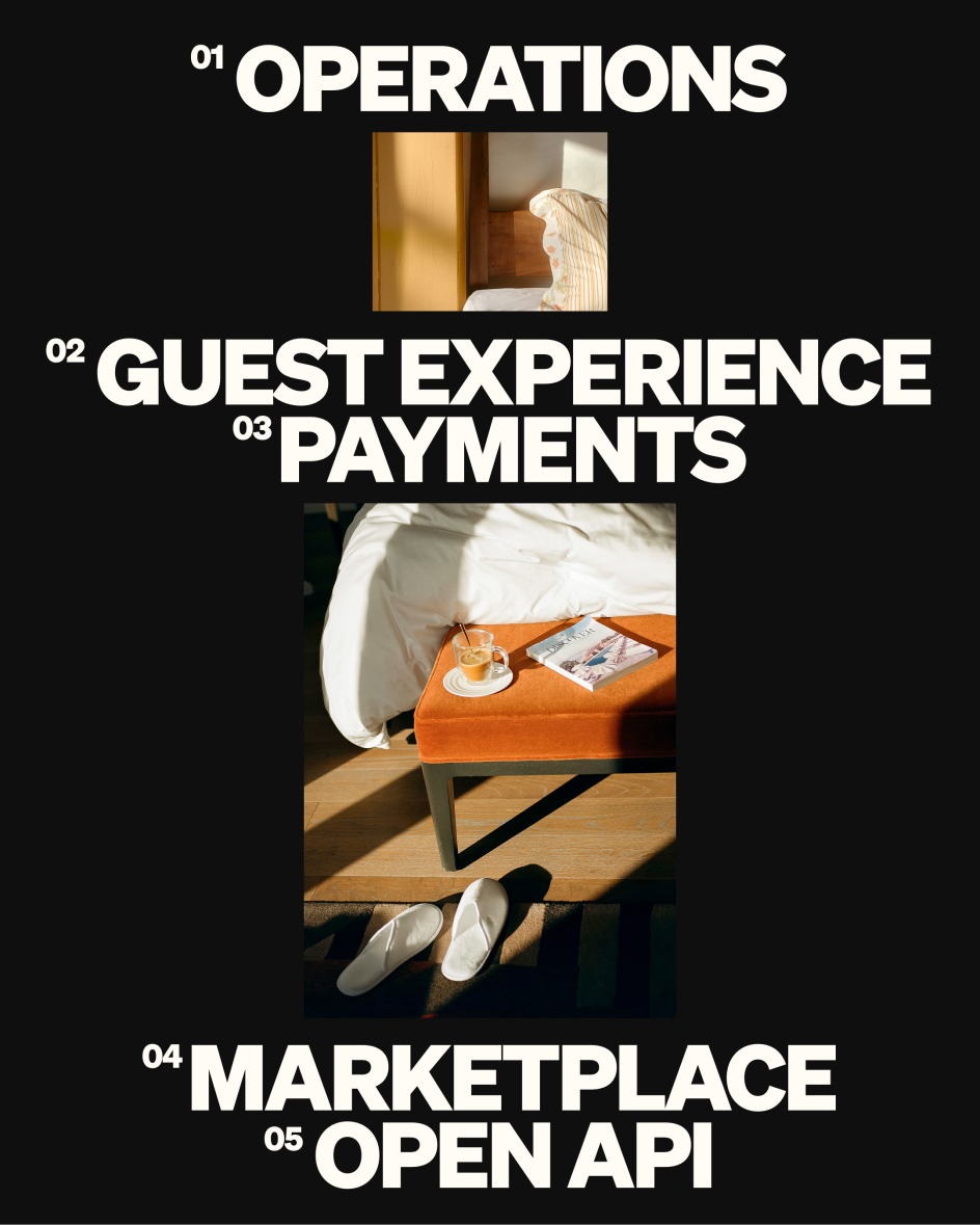
Mews is, on paper, a deeply unsexy proposition. It's an operating system for hotels that covers property management, point of sale, revenue management, housekeeping, payments, and more. Serving over 15,000 customers across 85 countries, it processes enormous volumes of operational and financial data every day. This is the kind of product whose sales process involves procurement teams, enterprise contracts and six-month onboarding timelines.
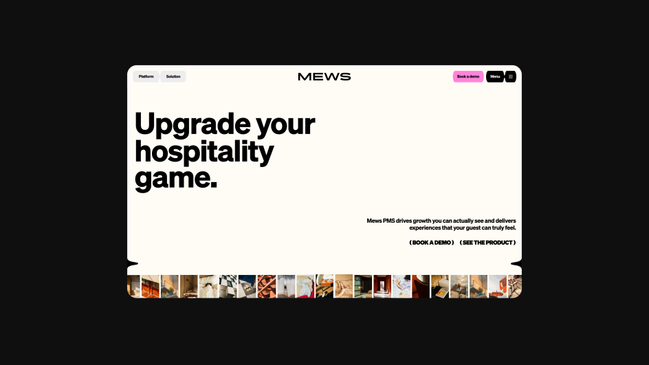
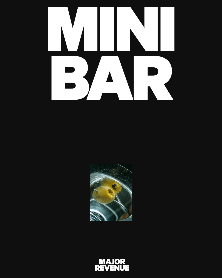
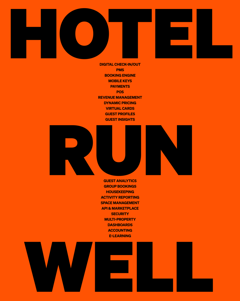
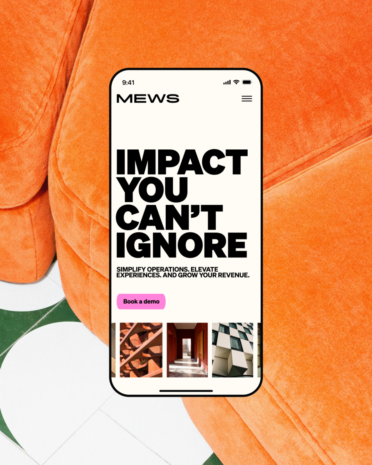
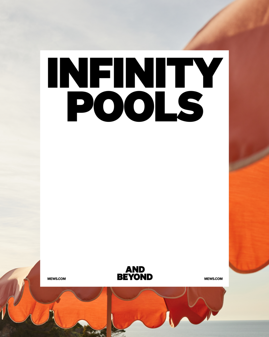
And yet here is the new brand: hot pink, black and white, with enormous condensed type screaming "MINI BAR / MAJOR REVENUE" and "HOTEL RUN WELL" across campaign assets that look more like they belong in a gallery than a SaaS sales deck. This boldness is not accidental, and nor is it superficial. The brief, at its core, was about visibility.
As the hospitality tech category has grown and matured, the noise has grown with it. Every platform is now making the same claims in the same voice. Mews needed to do something visually and verbally distinct enough to cut through, while still being credible enough to close enterprise deals with serious hotel operators.
Pink as a strategic asset
The decision to double down on pink, rather than retreat to something safer, is one of the most interesting choices in the project. Pink was already part of Mews' existing brand, but it was being used cautiously, like a flourish rather than a foundation. The rebrand treats it as the primary asset, amplifying it to the point where it becomes genuinely ownable.
In a category dominated by navy, slate grey and corporate teal, Mews pink is disruptive by default. It signals confidence. It also (and this is no small thing) makes the brand easy to recognise at a glance in a crowded trade show, a busy email inbox or a LinkedIn feed. The colour is not just an aesthetic preference; it is a competitive positioning tool.
The secondary palette and tonal system give the brand enough flexibility to dial back the intensity when the context demands it. Koto developed what they describe as a low, mid and high framework, allowing the system to operate anywhere from a quiet product interface to a high-impact outdoor campaign without losing coherence.
Wordmark, symbol and system
Creative director Issey Conway is clear about the thinking behind the visual system: "Impact you can't ignore isn't just a line, it's something the system has to express," she says. "The symbol set the direction, but its role goes beyond a mark. Its forms carry through layouts, motion and illustration, so impact shows up in how the brand moves, frames and communicates. Alongside that, the wordmark, typography and colour system bring the clarity and control needed for an operating system, balanced with enough warmth to keep it grounded in hospitality."
That articulates something that many brand systems fail to achieve: genuine integration. The Mews symbol, derived from the letter M, is not merely a logo that sits in the corner of a web page. Its curves and forms extend into layout devices, framing calls to action, structuring content and creating visual rhythm across touchpoints. The mark becomes a grammar, not just a signature.
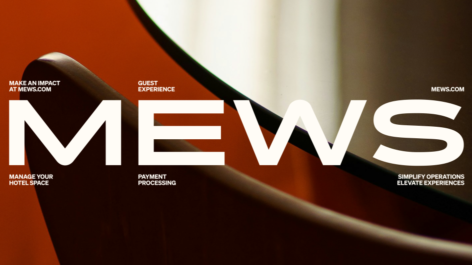
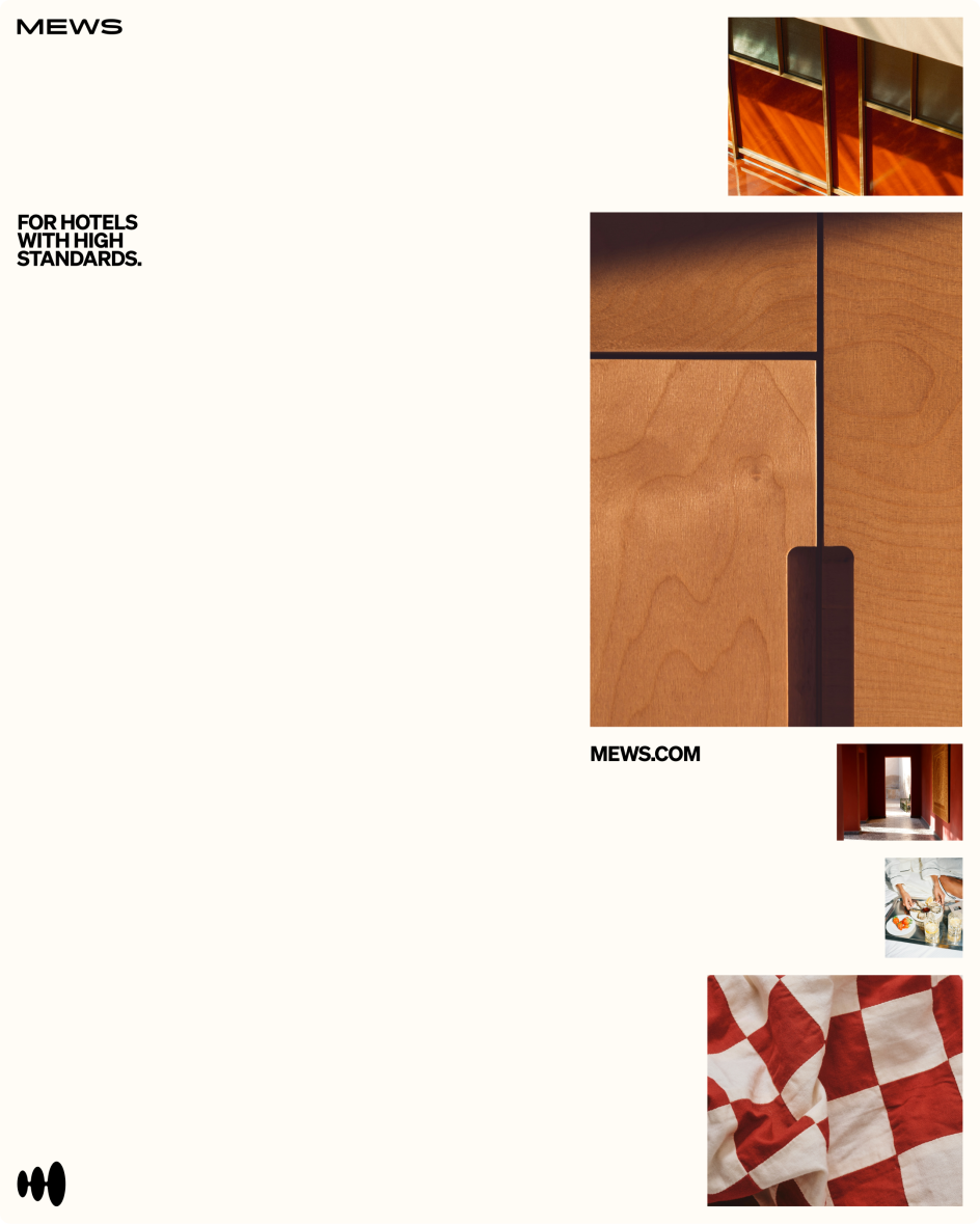
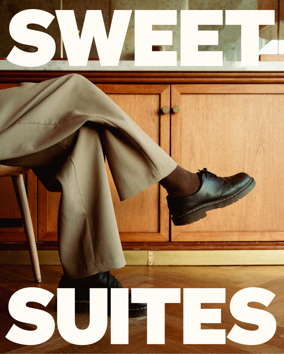
The typography, meanwhile, is built on Söhne, a typeface with enough character to carry the brand at scale and enough discipline to perform in dense product contexts. The use of all-caps, extreme scale and tight leading in campaign work creates an editorial quality that references luxury print and fashion far more than it does enterprise software.
Talking like a concierge
The verbal identity deserves as much attention as the visual system. Koto built the tone of voice around the persona of "your concierge's concierge": fluent, attentive and calm under pressure. This is a genuinely useful construct, and it shows up in copy that is confident without being arrogant, specific without being dry and warm without being cloying.
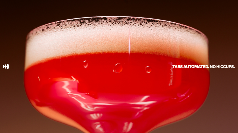
"TABS AUTOMATED / NO HICCUPS" is a better product communication line than most SaaS companies produce in a year. "SWEET SUITES" uses wordplay to make a spatial management feature feel desirable rather than functional. The copy throughout treats hotel operators as intelligent people who appreciate wit and directness, rather than anxious buyers who need reassuring bullet points.
Overall, the Mews rebrand is a useful case study for anyone working in B2B design. The category assumption—that enterprise clients require restraint, that boldness undermines credibility, that warmth and rigour are in tension—is becoming increasingly outdated. Buyers are humans. They respond to energy, to wit, to visual confidence. A brand that refuses to blend in is not a risk; it is a strategy.
The craft here is high. The thinking is clear. But most importantly, Koto has proven that enterprise doesn't have to be beige. They made a bet that the client could handle being genuinely distinctive. Then they built a system capable of making good on that bet at every scale, in a category full of 'sensible' decisions, that takes a particular kind of nerve.
Editor's Picks


Trending


Podcasts


Editor's Picks
Further Reading