Why Pentagram's Samar Maakaroun designed a logo that just won't settle
How do you brand a space that refuses to be pinned down? For Pentagram's Samar Maakaroun, that was the brief.
Most brand identities are built on the premise of stability. A logo should be consistent, recognisable and dependable, arriving at a single point and staying there. The identity that Pentagram partner Samar Maakaroun has developed for The Mosaic Rooms, a West London space dedicated to contemporary culture from the Arab world and beyond, does the opposite. It's designed to never quite settle. And that, it turns out, is precisely the point.
There's a particular kind of bravery involved in designing instability into the foundations of a brand system. Most clients, given the choice, will opt for the mark that feels solid, the palette that feels resolved, the system that feels finished. The Mosaic Rooms asked for something more uncomfortable than that. It asked for a brand that could hold tension without resolving it.
The result is an identity that rewards close attention. On the surface, it's warm, energetic and confident. Look longer, and you start to feel the movement running through it: the letters that won't sit still, the colours that carry an argument, the forms that suggest relation and entanglement rather than arrival.
A space in transition
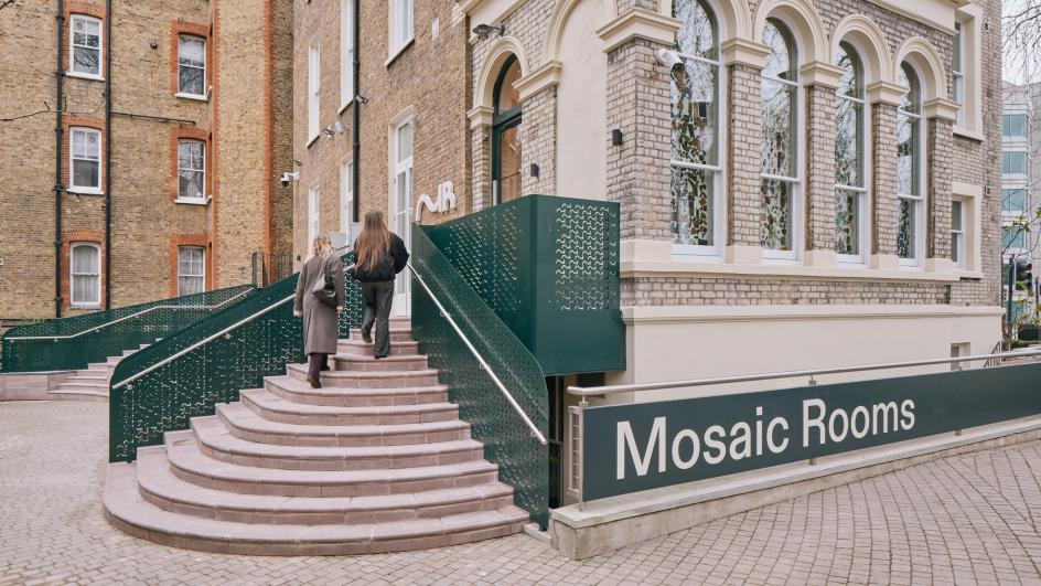
The Mosaic Rooms reopened in Kensington in February 2026 following a major refurbishment by architectural firm A Small Studio, and the rebrand marks a significant moment in the institution's story.
Founded in 2008 by the A.M. Qattan Foundation under director Rachel Jarvis, the space spent its first 15 years as a platform for contemporary culture from the SWANA region, the collection of countries spanning South West Asia and North Africa, steadily challenging reductive narratives around Arab identity and revealing the depth and multiplicity of artistic voices from the region.
Now under the direction of Pip Day and having transitioned from a privately funded initiative to a public institution, The Mosaic Rooms enters a new phase. The redesigned building extends beyond gallery space into a venue for talks, learning, play and gathering: a place, as the institution puts it, where culture is not only shown but lived.
The rebrand had to carry all of this. Not just a new visual identity, but a statement of intent about what kind of institution The Mosaic Rooms is becoming.
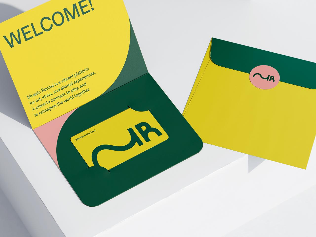
The M that moves
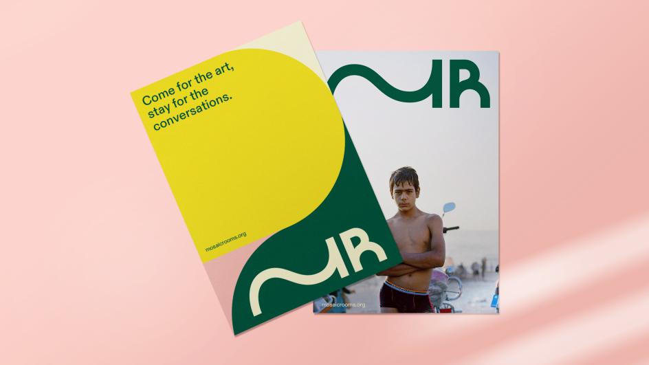
At the centre of the new identity is a monogram using the initials M and R. Simple enough on paper. But look closely at the M, and you'll see something interesting. Rather than settling into its expected form, the letter stretches and extends, moving fluidly from right to left and from left to right simultaneously. The stroke that begins as one side of the M curves away, undulates and arrives, with quiet confidence, as the stem of the R.
It's a mark that encodes movement, linguistic duality and the condition of living between cultures. Arabic reads right-to-left; English reads left-to-right. The extended M acknowledges both directions and commits to neither. It is, in Samar's framing, a fundamental condition of being in between: between languages, between places and between ways of seeing.
In other words, this mark is not trying to plant a flag. It's trying to describe a journey.
Unhomed, by design
To articulate the conceptual territory, Samar draws on the work of Turkish author and political commentator Ece Temelkuran, who uses the term "unhomed" to describe not only the experience of moving between places but also the loss of certainty that comes with it. The sense that home becomes something permanently negotiated, rather than fixed.
It's a condition that runs through much contemporary cultural production from the SWANA region, where displacement and fractured identity are not merely themes but lived realities. The identity, rather than resolving this tension, holds it. The M never arrives. It oscillates. It exists, deliberately, in the space between positions.
For a brief that could easily have defaulted to the visual shorthand of "contemporary cultural institution", this is a brave and specific creative decision. It would have been far simpler to design a stable, elegant mark. The decision to build instability into the system itself is the kind of thing that only works when the concept is genuinely understood (rather than reverse-engineered from the aesthetics).
Colour as argument
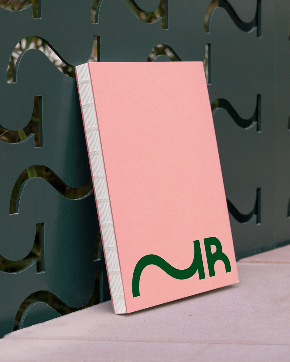
The supporting palette is where the identity makes its most provocative move. Bright yellow and deep forest green anchor the system, with softer, muted yellow and pastel pink in support. The references are loosely drawn from cultivated landscapes: citrus, olive and warm light.
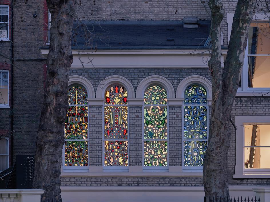
But the pink is the interesting one. In the political and cultural discourse of the SWANA region, pink is frequently avoided, considered frivolous or politically misaligned. Samar brings it forward as a conscious act of resistance. The dusty pink is framed as a challenge to received ideas about what constitutes acceptable visual language, opening space for new narratives within the identity itself.
It's a small gesture, but a deliberate one. And in the context of an institution committed to challenging reductive narratives, it carries real weight.
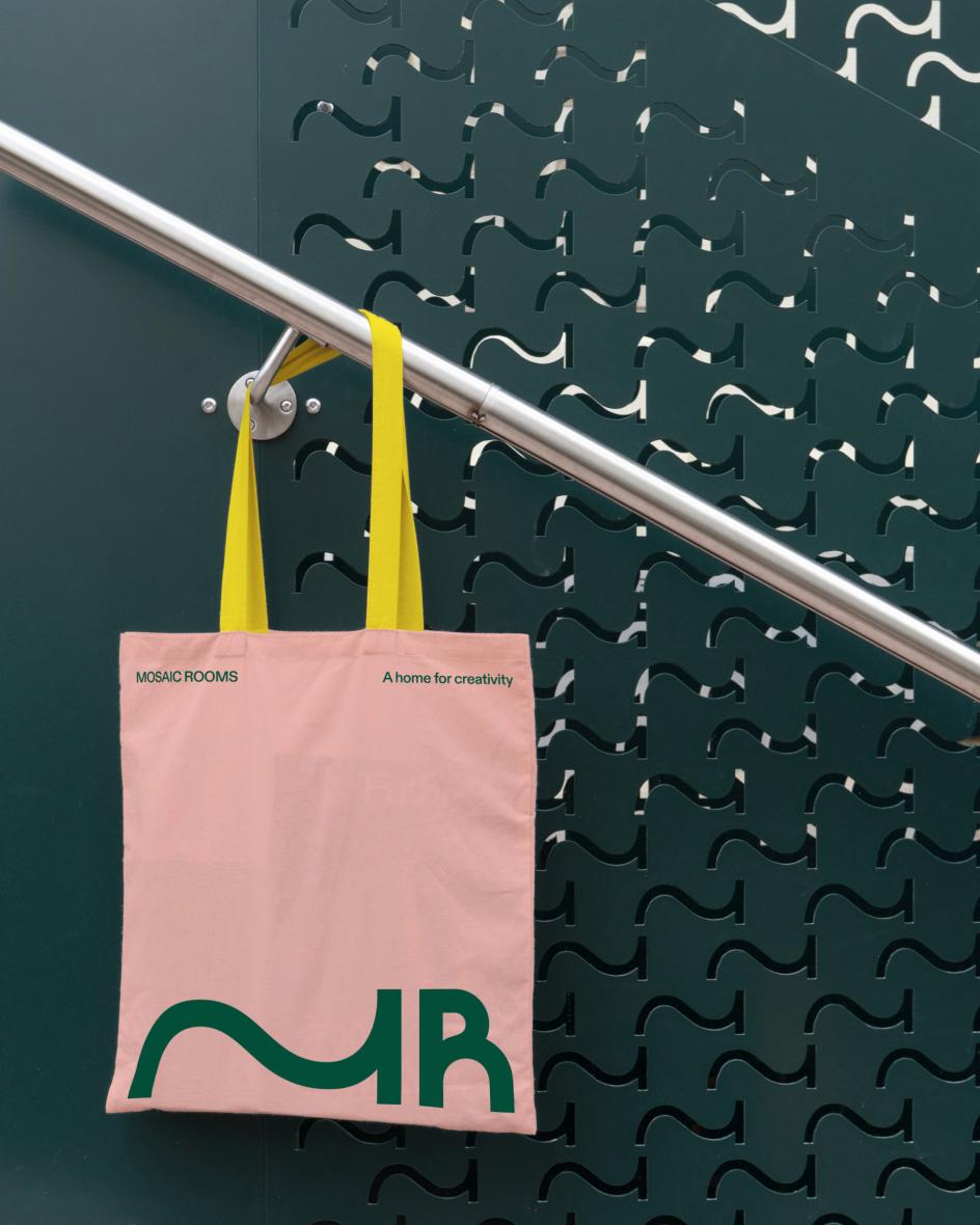
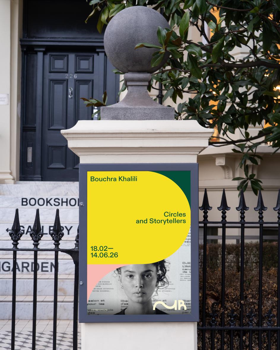
Movement as system
The wider identity extends the logic of the monogram across typography, image treatment and language. Circular forms extend into ovals and interlocking shapes, suggesting movement, entanglement and relation. Everything carries a sense of back-and-forth, inviting audiences to come for the art and stay for the conversation.
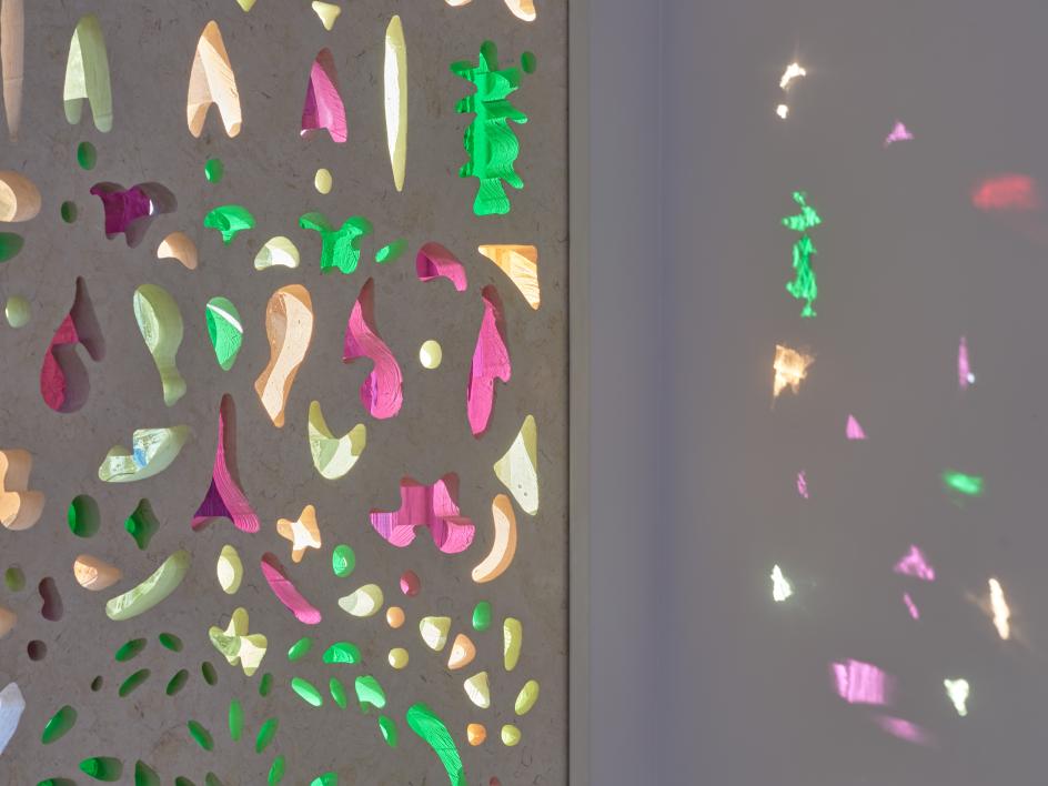
Practically, the system spans a full digital and spatial ecosystem, from website to building signage designed by A Small Studio, whose perforated metal railings echo the wave-like form of the monogram and carry the visual language directly into the architecture. The building and the brand are in genuine conversation: a rare thing, and not an accident.
Photography by Andy Stagg, meanwhile, anchors the palette's warmth and energy in the physical reality of the space, grounding what could easily feel like a theoretical exercise in something warm and immediate.
Key takeaways
The Mosaic Rooms rebrand is worth studying, not because it is flashy or technically complex, but because it demonstrates something easy to say and hard to do: genuine conceptual rigour applied to an identity system.
The mark works because it's not a visual metaphor applied to a concept: it's the concept made visual. The idea of being in-between, of oscillating between positions and refusing to fix or settle, is described by the identity itself.
For creatives navigating clients who want their brand to feel dynamic yet consistent, The Mosaic Rooms offers a useful provocation. Instability, handled with clarity and conviction, is not a failure of design. Sometimes it's the whole point. The M never settles. Neither does the institution it represents.
Editor's Picks


Trending


Podcasts


Editor's Picks
Further Reading