What the rebrand of an Indian café can teach us about the power of one idea
When Rare Ideas branded Handmade Café, they proved that one single clear concept—when applied everywhere—beats a dozen clever ones.
There's a temptation, when you're designing a brand, to reach for the toolkit. Gradients, geometric patterns, a sans-serif that costs a small fortune to license, some photography that looks vaguely like it belongs to a Kinfolk spread. It all says "brand" without necessarily saying anything. The result is a visual system that looks considered but somehow feels like nobody's home.
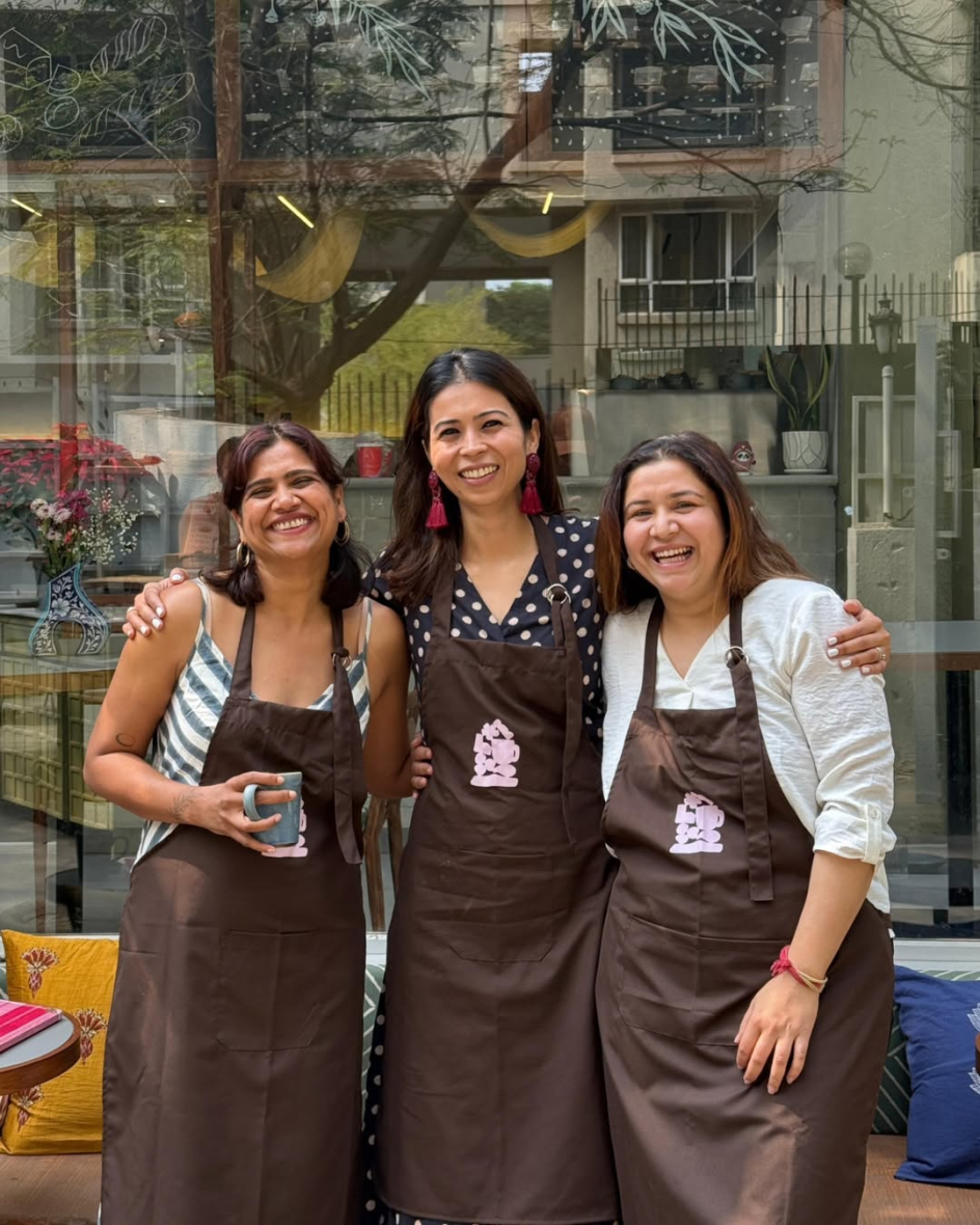
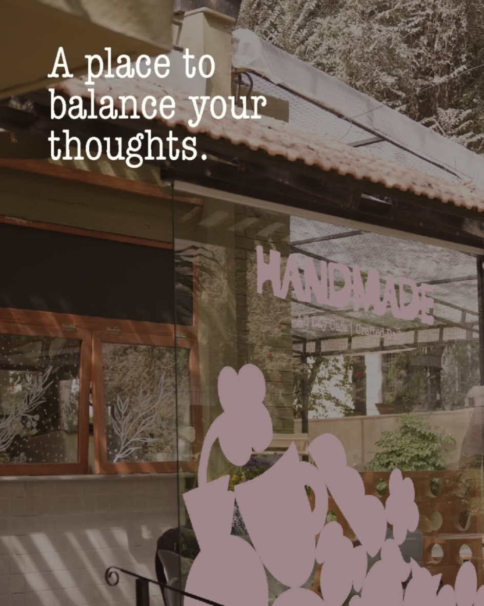
Handmade Café, a neighbourhood all-day café in Kalyani Nagar, Pune, India, is a useful antidote to all of that. Founded by three mothers who wanted to build a space where families could genuinely slow down, the café came to local brand studio Rare Ideas with a brief that was, at its core, refreshingly simple: make the care visible.
The result, launched earlier this year, is a masterclass in what happens when a single idea is allowed to run the whole show.
What's the idea?
The idea in question is "made from scratch". In the food world, it's a phrase that's thrown around so freely it's almost lost its meaning. But Rare Ideas did something interesting with it: they refused to let it stay in the kitchen.
"Made from scratch is commonly understood as a way of preparing food," explains Vijeta Singh, founder and creative head at Rare Ideas. "For Handmade, it needed to function as a broader standard. It reflects a clear choice: effort over shortcuts, consistency over spectacle, and familiarity over constant change."
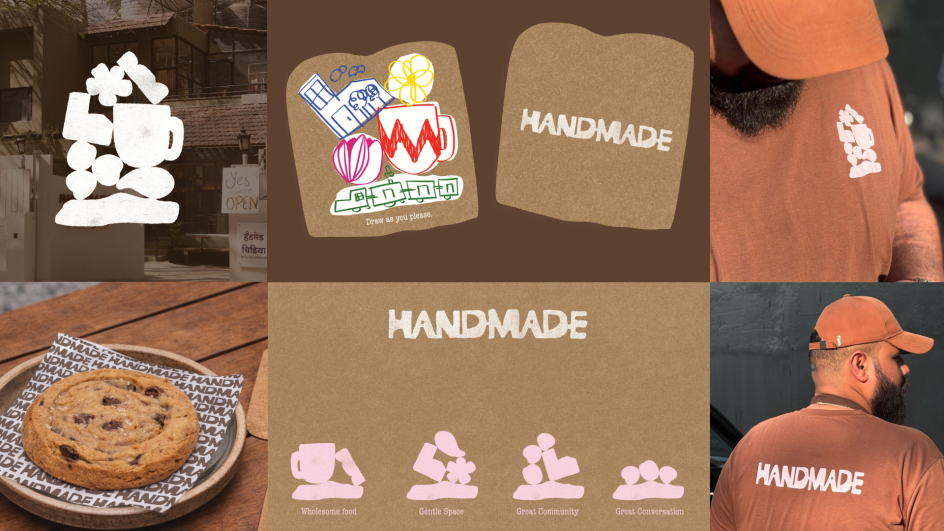
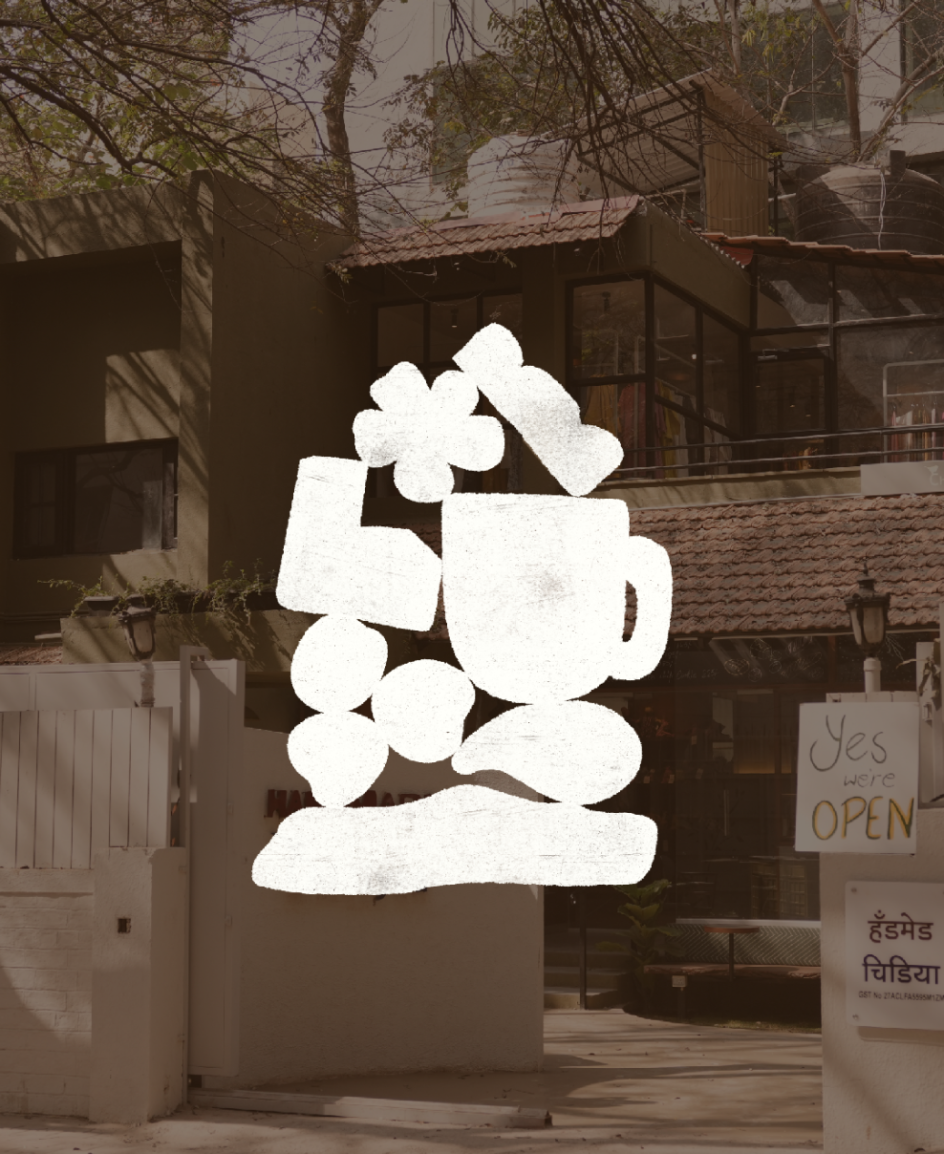
The identity starts with the logo, and this is where the commitment to the founding idea becomes immediately legible. Rather than reaching for a contemporary wordmark with clean geometry, Rare Ideas looked to block-printing and clay-based craft traditions.
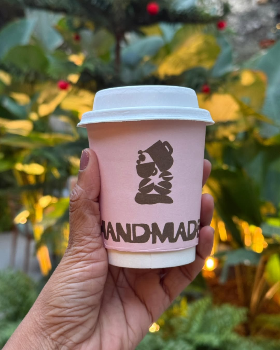
The result is a stamp-like mark with a thick silhouette, softened edges and subtle irregularities that signal, at a glance, that something human made this. "The logo communicates made-from-scratch through structure rather than illustration," Vijeta notes.
That distinction matters. It would have been easy to illustrate the concept literally: a pair of hands kneading dough, a coffee cup with steam curling into a leaf. But instead, the stamp quality of the letterform does the conceptual work without explaining itself—exactly what good design is supposed to do.
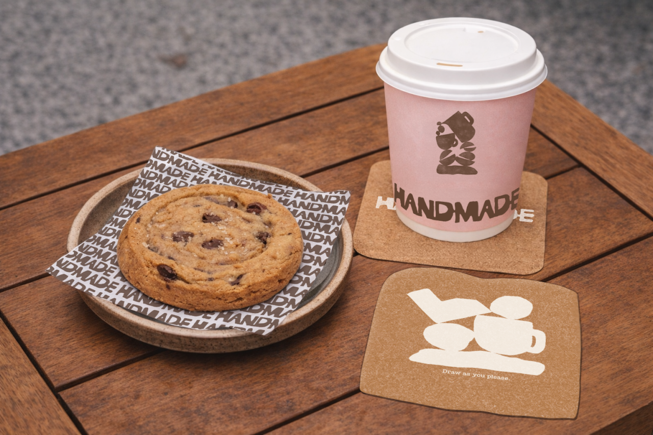
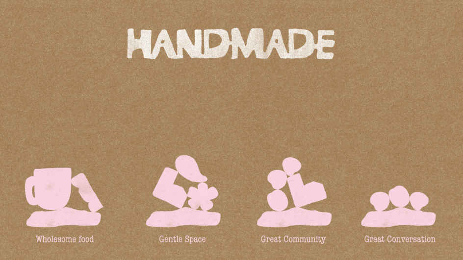
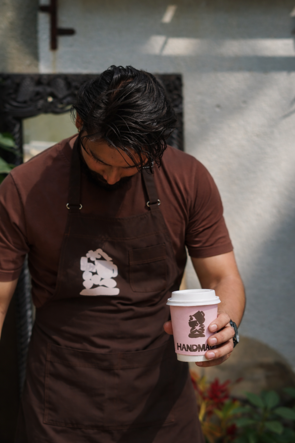
The wider visual system follows the same logic. Organic shapes, stacked in balance and printed with a texture that suggests relief printing, form the backbone of the collateral system. Everything feels slightly hand-touched. The palette—deep browns, off-white and a controlled muted pink—reinforces warmth without tipping into sentimentality.
The coaster became the point
Here's where there's a lesson for anyone working in brand or experience design. Among the touchpoints Rare Ideas developed were coasters, shaped like slices of bread, designed with a generous amount of white space. The instruction printed on them: "Draw as you please."
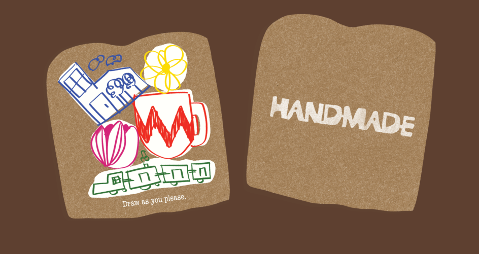
It sounds like a small thing. It isn't. "Children are treated as active participants rather than secondary visitors," Vijeta explains. "Coasters designed to be drawn on transform a functional object into a moment of making. This simple intervention allows children to engage creatively while parents remain present and at ease." Over time, the café has begun collecting completed coasters and displaying them as a wall of guest-created moments: a loyalty programme for families that runs on felt-tip pens and spare time.
This is the kind of idea that only emerges when a studio has truly internalised the brief. You can't brief your way to a participatory coaster. You get there by being so embedded in the founding idea that the logic becomes instinctive: if this café is about making from scratch, then why not make space for guests to make something too?
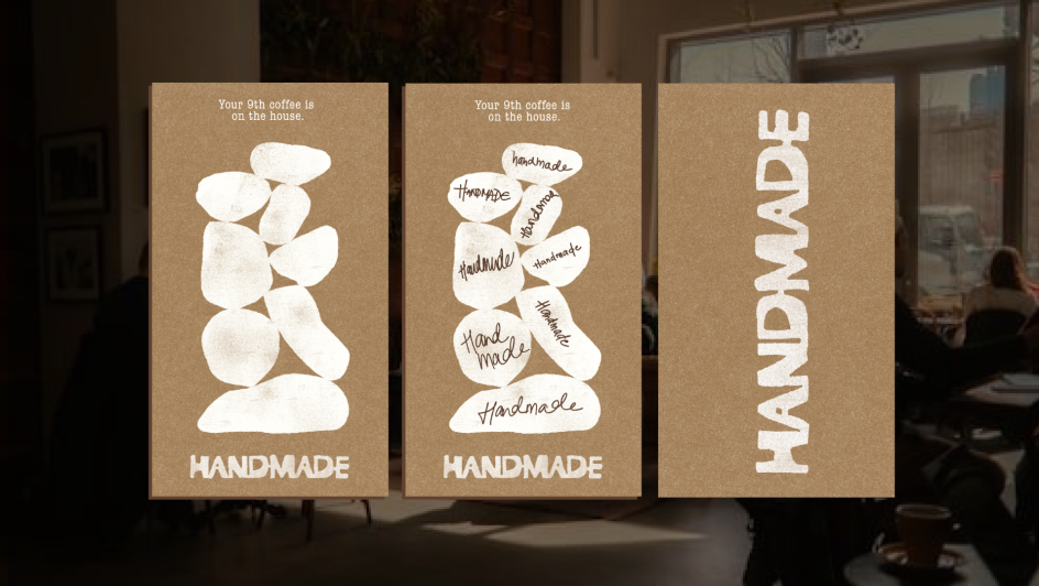
The same spirit runs through the loyalty cards, shaped with the same softened, toast-like silhouette. The message on the back: "Complete a stack to get a coffee on us." Even the coffee cups carry the idea, printed with small, wry character descriptions: "Soft but driven," "Introvert in progress," "Dreamer. Doer. Resting."

These aren't marketing lines. They're the voice of a brand that pays attention to who walks through the door.
One idea, everywhere
What's useful about this project for creative professionals isn't the specific aesthetic choices, handsome as they are. It's the discipline. Rare Ideas had a clear founding concept, and they simply refused to let it go. Every decision, from the texture of a paper cup to the shape of a coaster to the copy on a loyalty card, was measured against one question: Does this make care visible?
That question is a tool. It cuts out a lot of noise. It means you never end up with a beautiful piece of typography that has nothing to do with the brand. It means the experience designer and the visual identity designer are working from the same source. And it means the client, in this case, three mothers who wanted to build something real, can see themselves in every touchpoint. "The narrative, design language, and experience operate as one system," Vijeta says. "Care is not communicated through messaging alone. It is visible and experienced."
The café itself is worth noting as context. Kalyani Nagar is a neighbourhood with no shortage of places to get a flat white, and so Handmade isn't competing on convenience or novelty: it's competing on belonging. The brand system supports longer dwell time, encourages repeat visits, and gives the café the kind of quiet confidence that comes from knowing exactly what it is. In a category that often mistakes styling for identity, that's a meaningful distinction.
Made from scratch, it turns out, is a pretty useful way to build a brand, too. You start with good ingredients, you don't take shortcuts, and you resist the urge to dress it up with things that don't belong. The result might look simple, but that's usually how you know it's working.
Editor's Picks


Trending


Podcasts


Editor's Picks
Further Reading