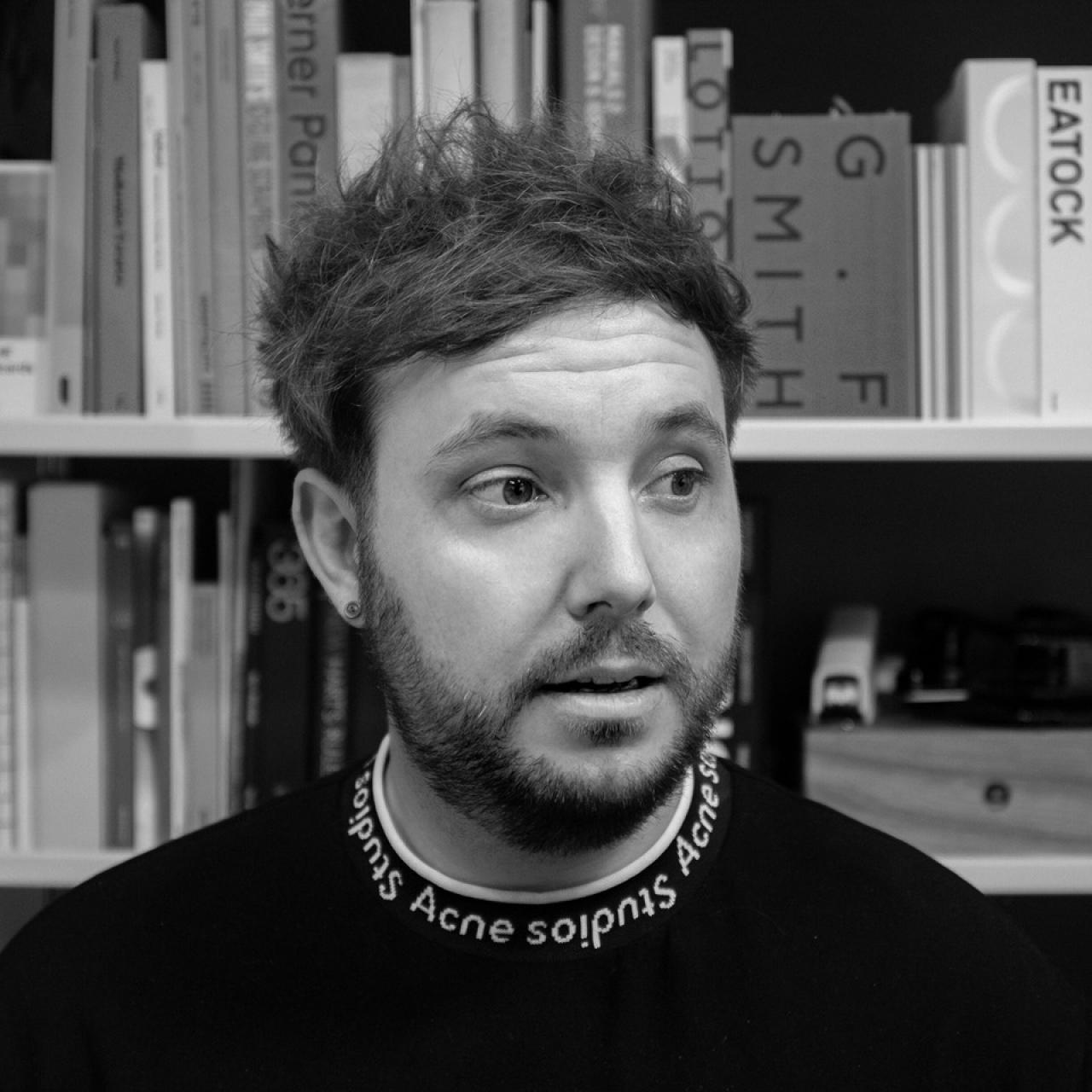
There's a moment in Mark Jones's Studio Session talk when he describes how his studio came to rebrand Ellis Butchers, a two-shop operation in Blackheath. Mark's boss lived nearby, got chatting in the shop, and one thing led to another. They really wanted the project. The client couldn't quite stretch to a full fee. And so, come Christmas, the entire team took home turkeys, gammon and more. "We got paid in bags of meat, effectively," Mark says. It's a good story. But what follows is just as revealing: the Ellis Butchers work gets exactly the same rigour, the same strategic thinking and the same craft as anything his studio does for its biggest clients.
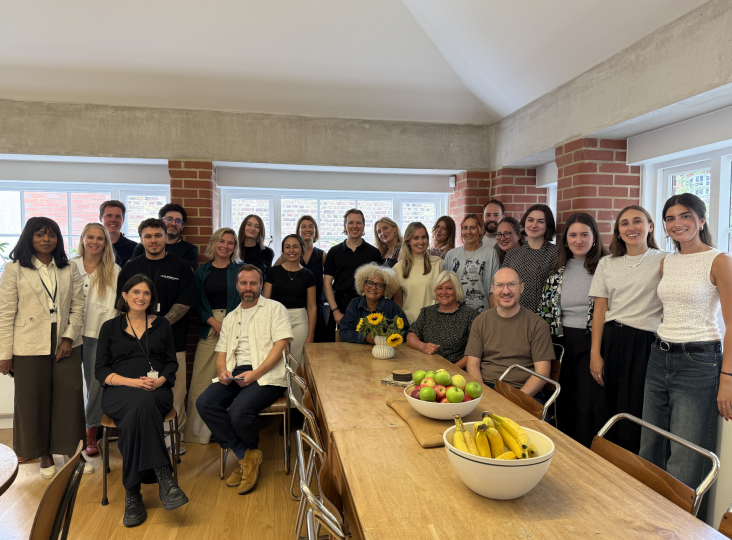
Mark is creative director at Studio Blackburn, a Shoreditch-based brand agency whose client list spans the Olympics, Sky and M&S, but whose philosophy is stubbornly practical. He was speaking at a Studio Session, a live talk hosted inside The Studio, Creative Boom's private membership community for working creatives. His talk, titled The Quiet Power of Good Design, took the audience through three very different branding projects: from the world's most famous folding bike to an energy company that asked its designers to scare them.
If there's a thread running through all of it, it's this: great design rarely announces itself. It fits in just enough. It owns one thing brilliantly. It knows what to preserve. And it has the confidence to resist change for change's sake, even when that's the easier sell. "We have this sort of mantra," Mark says, "that we want to work with people who really care about design."
Fit in just enough, stand out just enough
The phrase Mark keeps returning to is "sector vernacular": the visual language of a given industry, the shared codes that tell consumers they're in familiar territory. The job of good branding, he argues, isn't to ignore those codes but to understand them, work within them just enough to feel credible, and then find the one thing that makes you distinctly yourself.
He uses the Jaguar rebrand as his cautionary tale: a brand that completely stood out and alienated its audience. "We're not talking about that," he says. "We want to fit in just the right amount."
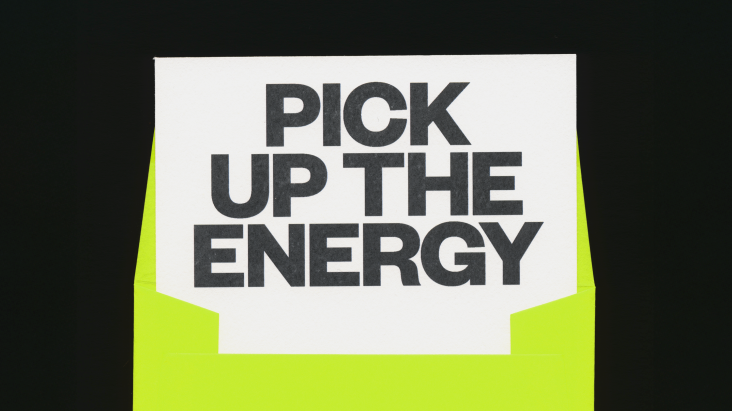
So Energy, a sustainable energy provider, is a good example of what that looks like in practice. When Studio Blackburn returned to refresh the brand in 2025, the brief was simple: stand out, act like a challenger, and stop blending in with the big six energy suppliers. The studio's response was to strip everything back: no mascot, a single bold colour, and a campaign built on the idea that the company handled the energy so customers could get on with their lives.
The result featured a drag queen blow-drying a wig, a man ironing his toasties, a woman on a work call who's smart on top and activewear on the bottom. "We do energy, you do you," says the campaign line. It's simple to the point of being slightly cheeky, but in a good way.
Don't touch the logo
One of the most practically useful things in Mark's talk is also one of the least glamorous: when working on a brand refresh, your first question should be what you're keeping, not what you're changing. Studio Blackburn's approach isn't to rebuild from scratch. It's to identify what's already working and build around it.
With Brompton, this meant leaving the logo entirely alone. It's been around almost as long as the bike itself, and the bike hasn't really changed since Andrew Richie created it in the 1970s.
"We really didn't want to mess with the logo," Mark explains. "When we work with brands on refreshes, we don't always just say, 'Right, let's recreate the whole logo system.' We work with the good elements that we have."
What they added instead was Brompton Blue, a single ownable colour that works across every touchpoint from Instagram to collaboration drops with Palace; a bespoke typeface developed with type designer Sam White that feels genuinely engineered; and a motion language rooted in the bike's own mechanics, mimicking the final flick of the wheel as it unfolds. (The bike needed a moving brand, so they gave it one.)
The same logic shaped their return to So Energy. Studio Blackburn had originally designed the brand in 2020, working from a tiny flat during lockdown, and came back five years later to find it had drifted: fonts added by different teams, a street food-style typeface bolted on at the bottom, the coherence steadily eroded. "It felt like it had lost its way a bit," Mark says. Rather than start again, they anchored everything to a single electric colour and rebuilt from there. Consistency, it turned out, was just one bold choice made repeatedly.
This approach also extended to questioning briefs. "Clients don't necessarily know the best way to write a brief," says Mark. "So as long as you're positive and you've got a good reason for it, it's definitely worth pointing out things that need changing." It's an approach that has served them well: when the International Olympic Committee requested a brand book, the original brief fell well short of what the project needed. They pushed back, and the client was convinced.
Serious play and the Christmas turkey
Which brings us back to Blackheath. Ellis Butchers gets exactly the same treatment as any other Studio Blackburn client: a naming architecture developed from scratch, a considered look at what the sector is doing and how to stand apart from it, and a mischievous cast of meat characters, including a chilled mascot named Ellis. Where the energy sector absolutely didn't need any more mascots, the butcher world turned out to be a space where one genuinely made sense. The insight is characteristic: sector vernacular, applied with precision.
Since the rebrand launched, the client has had a baby, and the studio made a card featuring a new character named after the child. It's still up in the shop. This is what the studio's mantra of "serious play" looks like in practice: not a ping-pong table and a free bar, but genuine warmth and investment in the work at every level, regardless of the fee.
"I actually get the most joy out of doing projects that don't necessarily pay as much as the ones that do pay a lot of money," Mark reflects. "I've always found joy in all of the projects that I've worked on, and that's what you've got to try and do along the way. Then hopefully the bigger ones will come, and you can find the joy in them as well."
It's an outlook that makes complete sense once you understand the philosophy behind it. If you approach every project, from an Olympic brand book to a Blackheath butcher, with the same curiosity and the same commitment to finding the one true thing, the quality tends to look after itself even when the payment is a Christmas gammon.
Further Information
Want to enjoy more of this? Join The Studio, Creative Boom's private community for creatives. It's free, and we host regular Studio Sessions with leading creatives across every field.
Editor's Picks


Trending


Podcasts


Editor's Picks
Further Reading