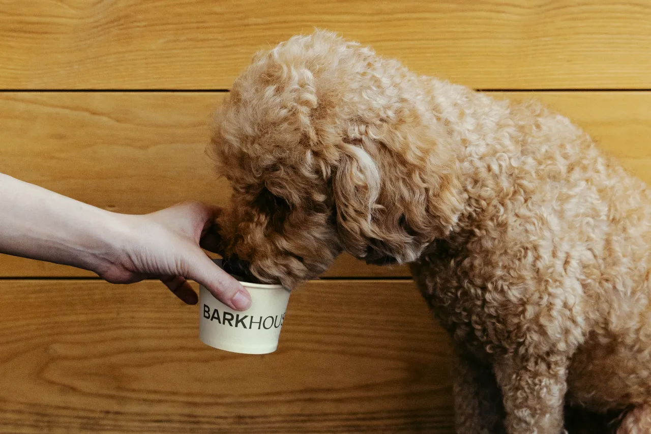
Every creative brief has a tension at its heart. Usually it's something like: make it "premium but accessible", or "bold but timeless". But for Crown Creative's work on Barkhouse, a new luxury dog hotel and daycare on West 25th Street in Manhattan, the tension was rather more literal. Design something that resonates with sophisticated New Yorkers, while also feeling genuinely made for their canine companions.
One of those audiences will never appreciate the kerning. The other will notice immediately if it feels corporate or cold. It's a brief that sounds like the setup to a joke. In practice, it turned out to be one of the more interesting branding problems of recent years, and the solution is worth pulling apart.
The Equinox for dogs
Barkhouse was founded by Jeffrey and Gabriella, real-estate and marketing entrepreneurs who describe themselves as dog obsessives. The concept is membership-based, positioned as the premium alternative to every grim, fluorescent-lit "doggy daycare" the phrase previously conjured.
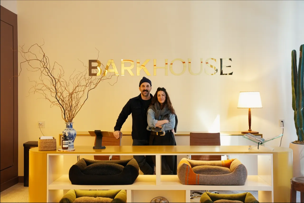
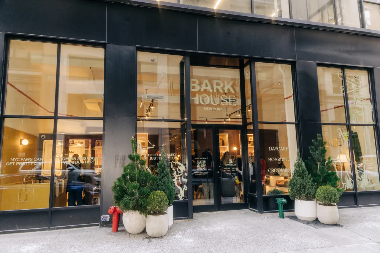
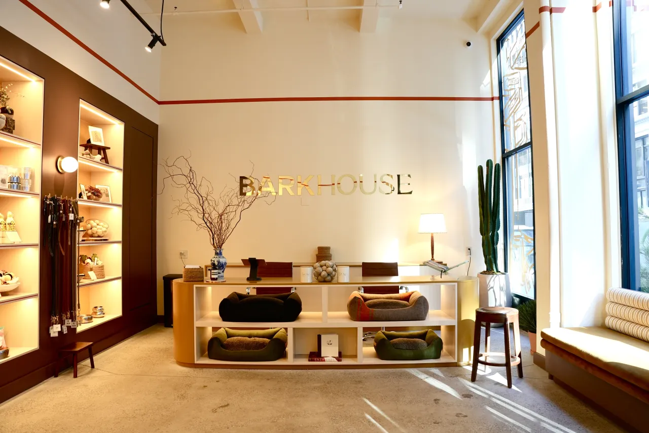
Instead, the founders wanted something closer to a lifestyle club: grooming, boarding, daycare, and a retail offer, all wrapped up in an environment that wouldn't look out of place in a trendy design magazine. The brief for Belfast-born studio Crown Creative, then, was less "make it look nice" and more "invent a new category."
Luxury pet care exists, of course: you can buy a cashmere dog coat in most major cities. But a coherent, considered brand language for it largely doesn't. Most operators in the space either go aggressively cutesy or try so hard to be elevated that they forget the entire point is a warm, muddy, enthusiastic animal.
The trap was obvious. The solution required genuine creative restraint.
Two typefaces, one argument
The logomark does the heavy lifting here, and it's an elegant piece of thinking. Crown used two complementary typefaces (Conforto, a bold sans serif, and Coconot, a refined contemporary serif) to literally split the wordmark between its two audiences. "BARK" arrives loud and friendly; "HOUSE" settles it with authority. Together, they make a single, confident statement without overwhelming each other.
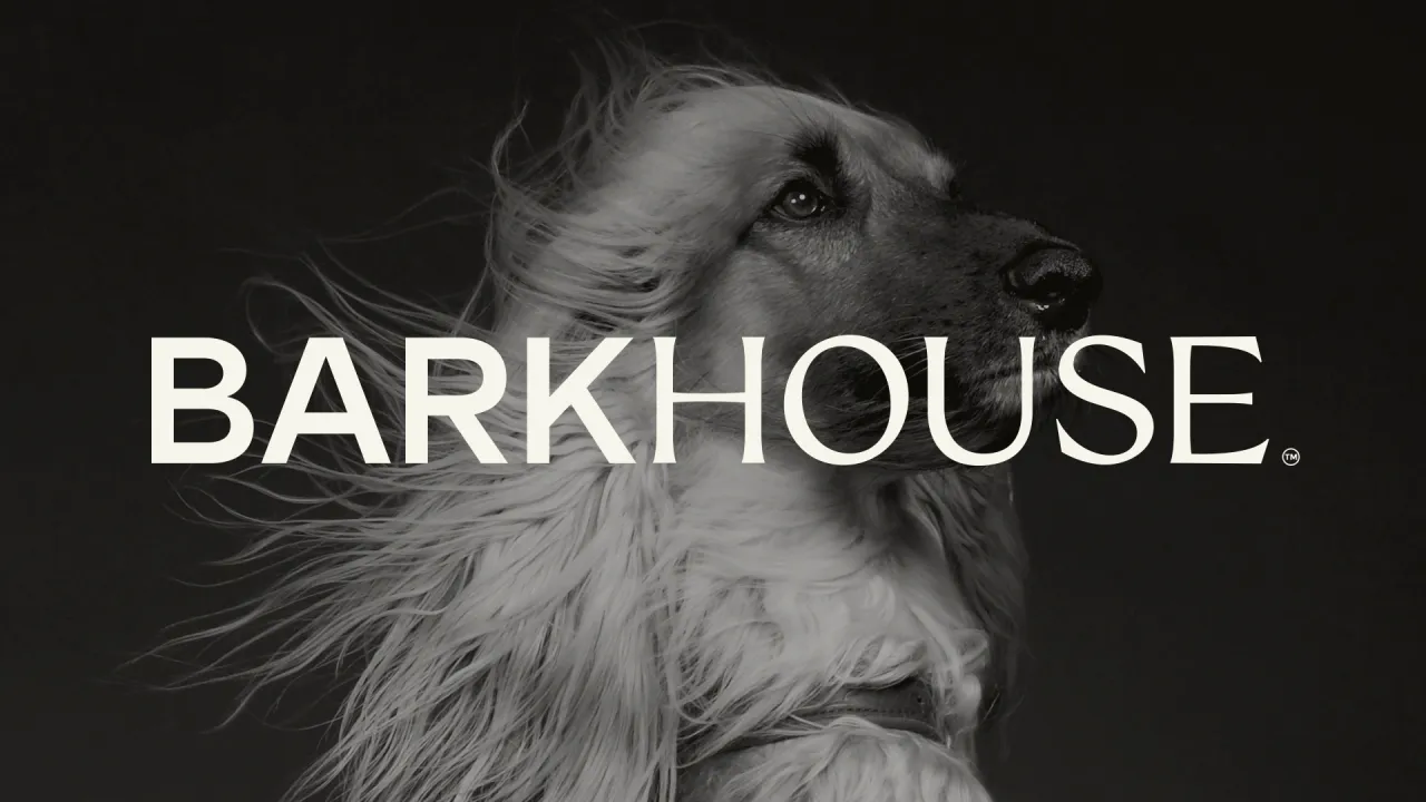
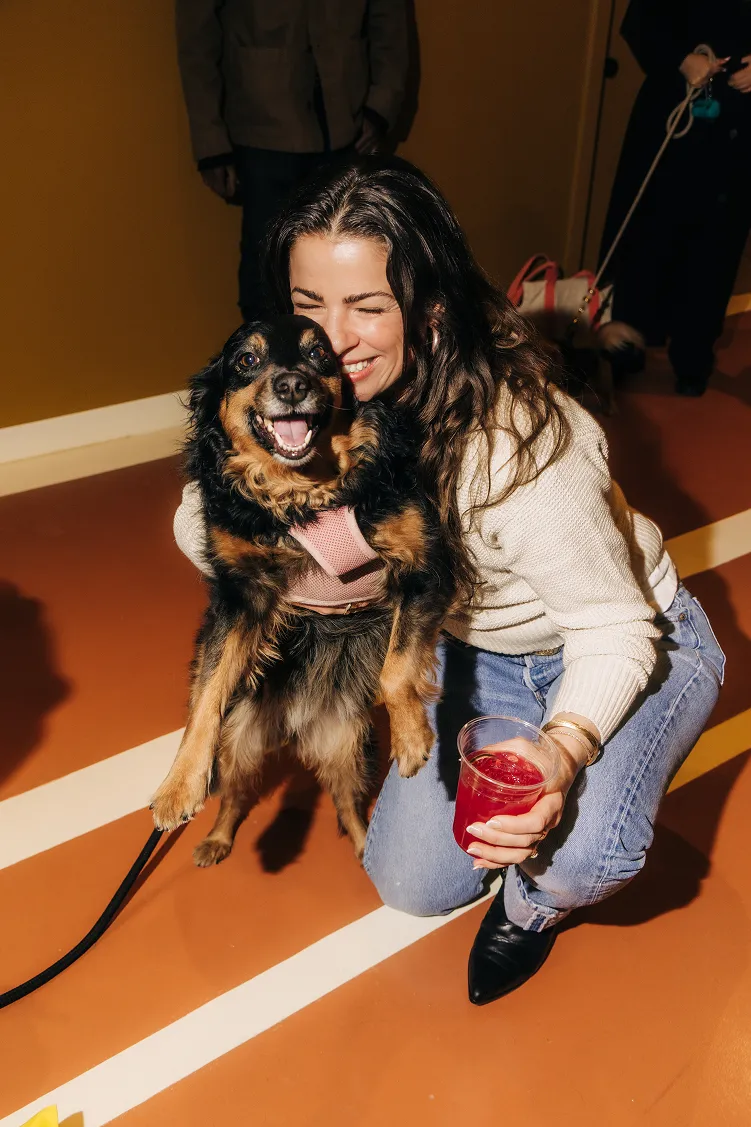
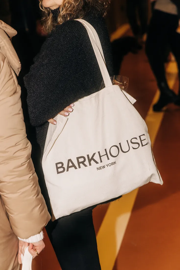
This neatly sidesteps the usual false choice between approachability and prestige. The brand doesn't have to pick a lane because it's built two voices into one mark. Neither typeface is doing novelty: there's no paw print, no bone, no cartoon balloon. But the warmth is still there, baked into the weight and proportion of the letterforms themselves.
This kind of dual-voice identity design is genuinely tricky to pull off. Get the balance wrong, and you end up with something that feels split in two, or worse, indecisive. Crown managed it by making both typefaces feel like they belong together (rather than tolerating each other).
The illustration question
Now here's where the project gets really interesting for anyone who works in visual identity.
The temptation with a dog brand is either hyper-realistic photography (all golden-hour lighting and puppies in slow motion) or overly polished digital illustration that risks feeling like an app icon. Crown Creative went in a different direction entirely, commissioning a suite of loose, textured line drawings from designer Brigid Johnson that sit somewhere between a New Yorker cartoon and a quick sketch in the margin of a notebook.
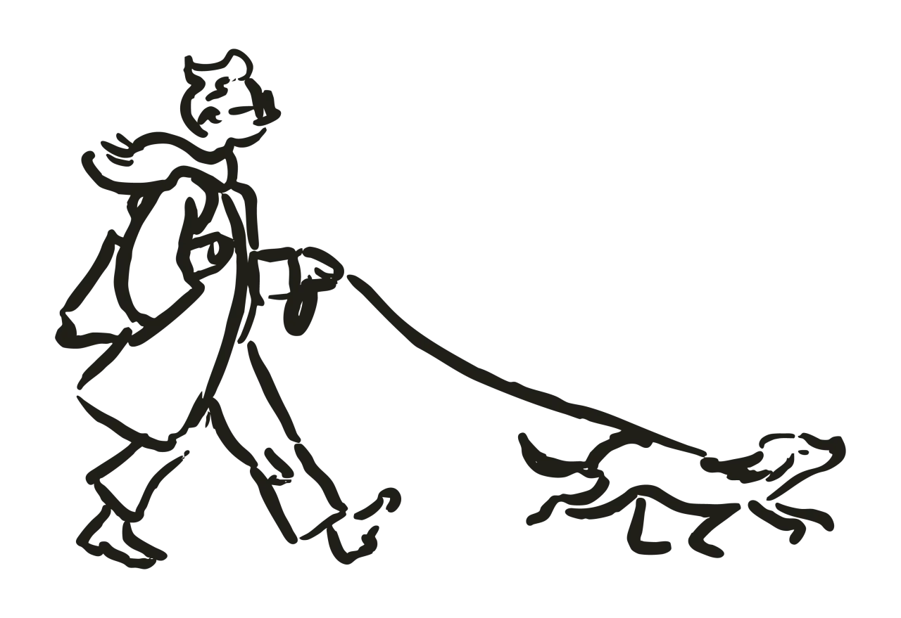
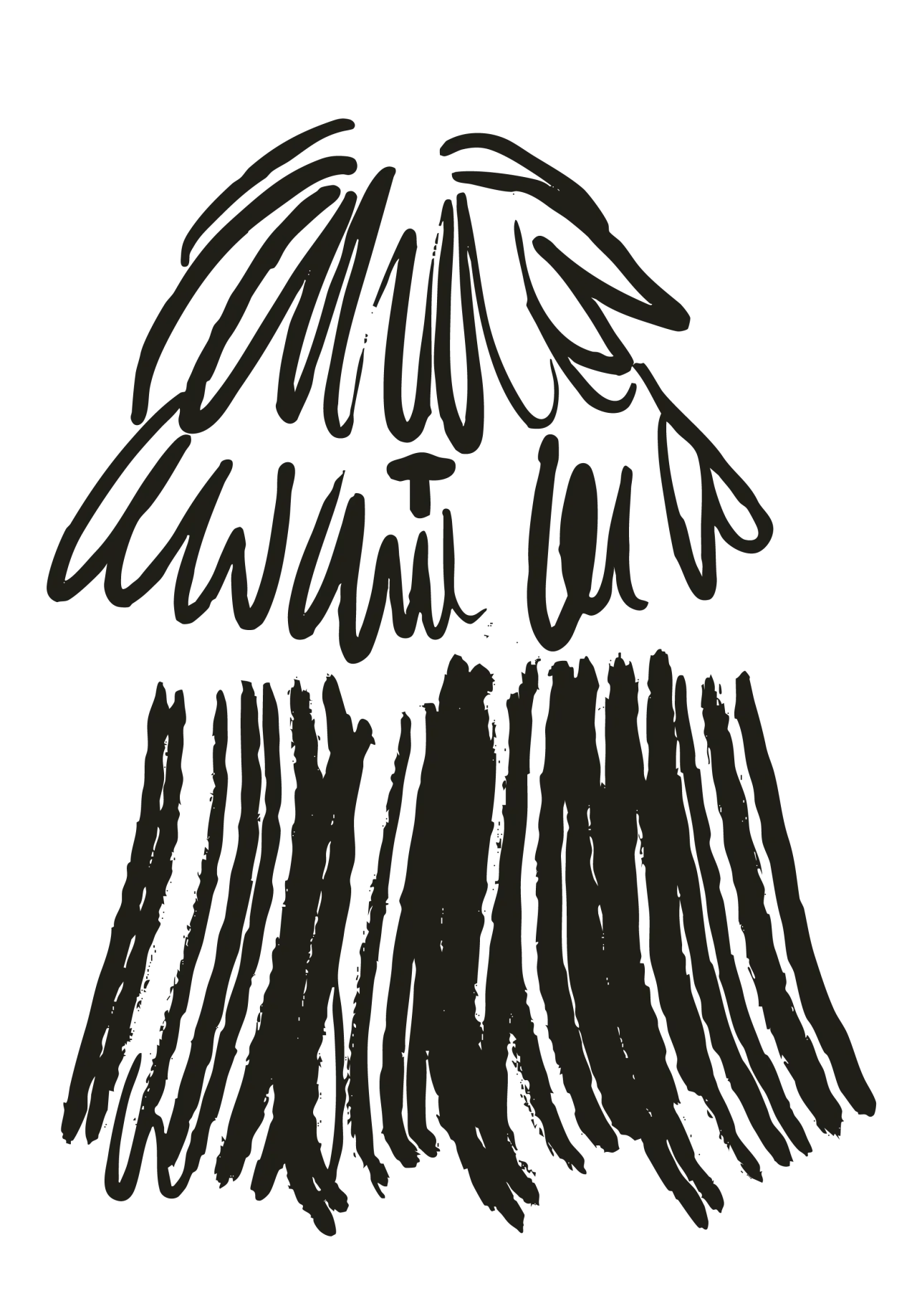
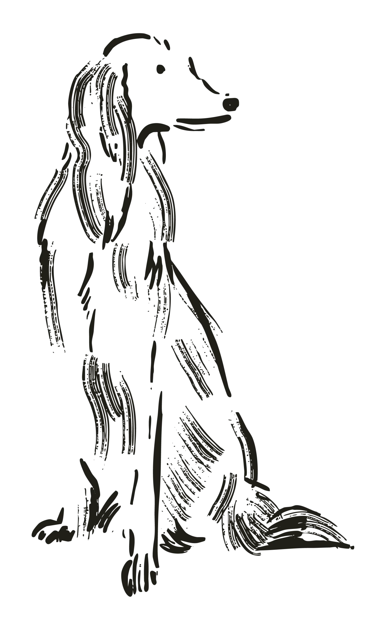
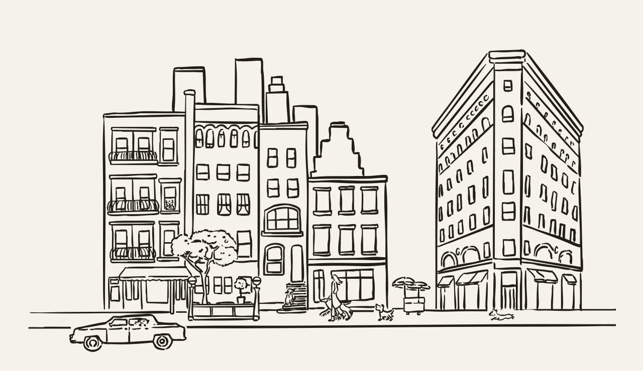
The illustrations feature the founders' own pets and the dogs of members of the Crown team. They appear mid-motion (striding, sitting, stretching), rendered with an economy of line that somehow conveys distinct character and breed without ever tipping into caricature. Location-specific drawings anchor the brand in its neighbourhood, referencing West 25th Street and wider New York landmarks.
The effect is warmth without whimsy. The drawings feel drawn by a human for humans, which is precisely the point. In a category crowded with stock illustrations and AI-smoothed graphics, hand-crafted imperfection reads instantly as premium.
Colour from the dogs themselves
The colour palette is another example of a brief being solved from the inside out rather than being reached for from a mood board. The tones—Weimaraner grey, Husky cream, deep Onyx brown, and a bold accent, the studio named Goldie, after one of Jeffrey and Gabriella's long-haired dachshunds—are drawn directly from dog coats.
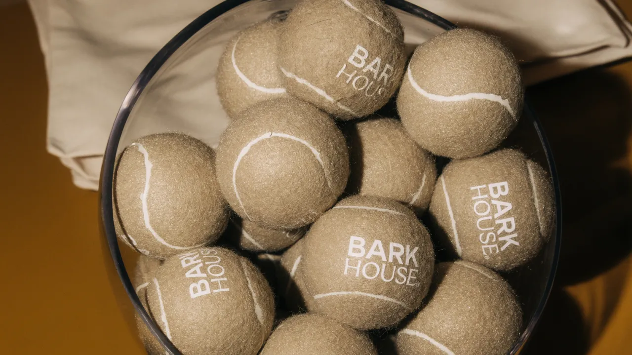
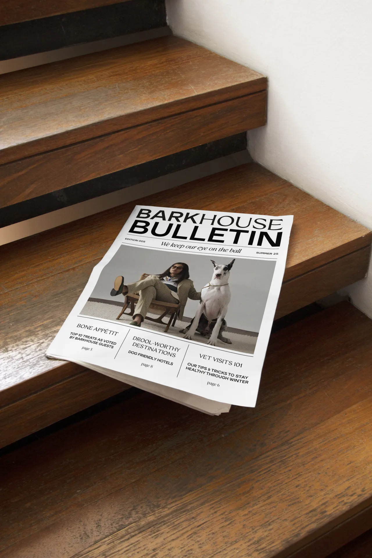
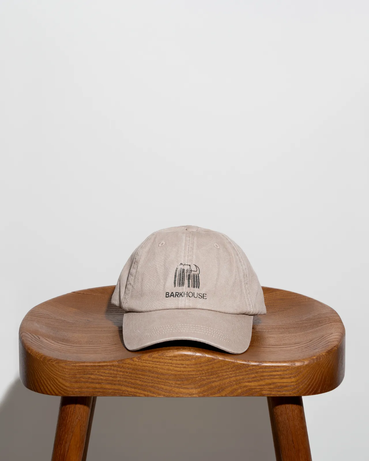
This will chime with anyone who's ever tried to justify a palette to a sceptical client. The narrative here is built in: these colours are here because of the dogs. The muted naturals create the luxury baseline; Goldie gives the system energy without screaming for attention.
Copy that earns the pun
Dog puns are a minefield. Used badly, they signal that a brand doesn't take itself seriously enough to be trusted with your pet. Used well (sparingly, with good timing), they create a sense that the brand is in on the joke without making the joke the whole personality.
Crown's copywriting walks this line with some care. The short-form phrases ("Bone Appétit", "No Ruff Days", "Welcome to the Pack") carry the levity; the longer-form brand copy lands with reassurance and clarity. A hand-drawn accent typeface handles what the case study calls "dog speak", appearing sparingly enough to stay charming. The overall tone is confident enough to carry a pun, without relying on one.
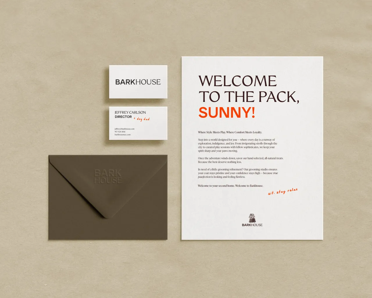
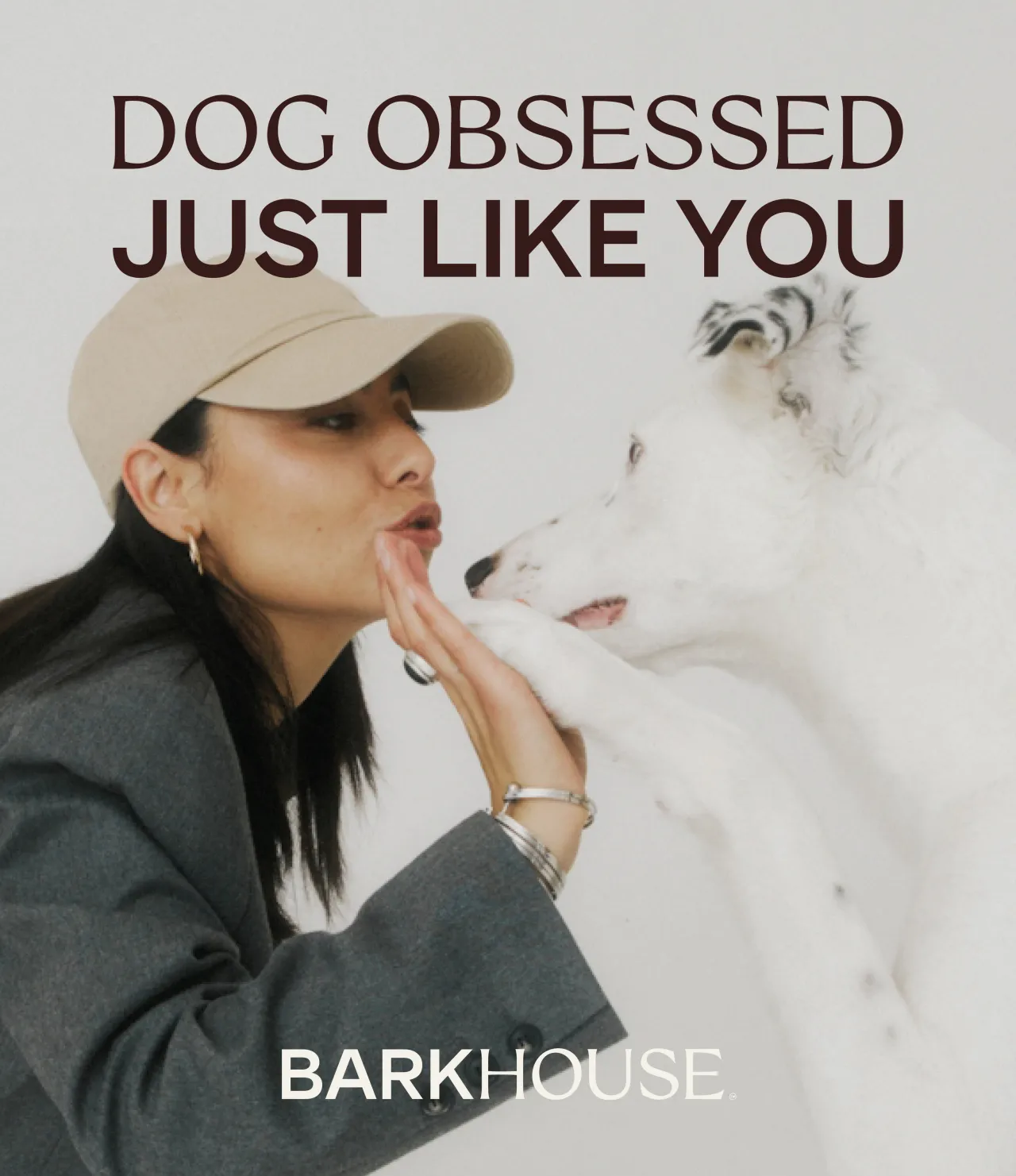
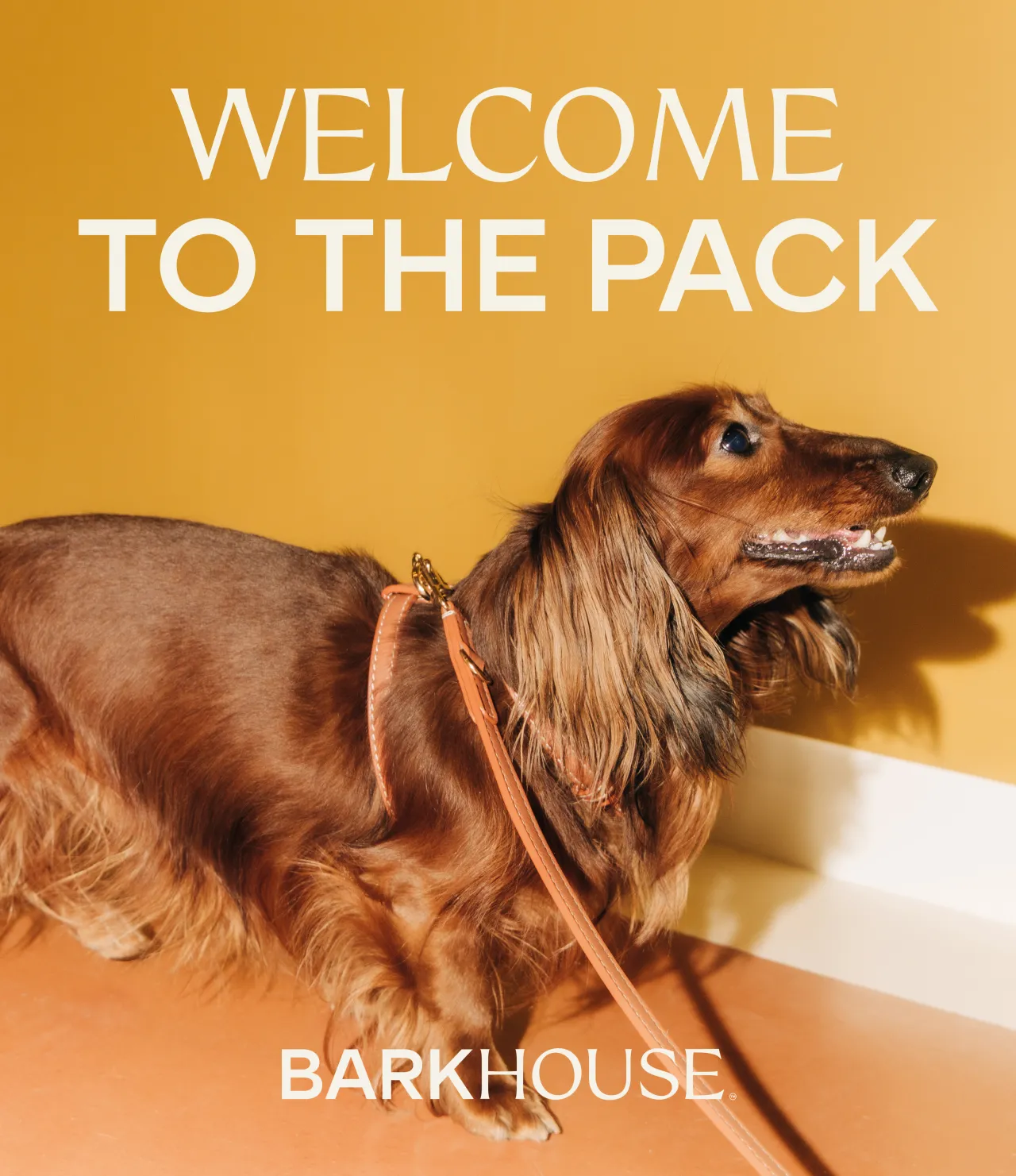
The brand strapline ("Dog Obsessed, Just Like You") is the cleanest expression of the whole strategy. It positions Barkhouse not as a service provider looking down on its customers, but as a fellow traveller in the mindset of someone who cares very much about a dog.
What designers can learn
The premium pet economy is real and growing. Barkhouse is one signal of a broader shift in how consumers relate to pet ownership: less transaction, more identity. And where consumer spending becomes identity-led, brand design must follow suit.
But the lessons here aren't just for pets. Crown's work is essentially a masterclass in designing for emotional adjacency: understanding that the end user (the dog) and the paying customer (the owner) have different needs, and that a genuinely good identity has to hold both simultaneously rather than defaulting to one.
The wider point—restraint over novelty, coherence over cleverness, specificity over generic luxury signalling —applies to almost any brief where the temptation is to reach for the obvious version first. In short, Barkhouse has a brand identity that couldn't have been made for any other client. In a category that barely existed until now, that's the ideal.

Editor's Picks





Trending



Latest Jobs
Graphic Designer & Illustrator at Discord
Full-time·San Francisco·$116,000 – $130,500
Director, Creative Technology at Code and Theory
Full-time·New York·$160,000 – $225,000
Art Director, Opinion at The New York Times
Full-time·New York·$124,980 – $141,000
Senior Graphic Designer at goop
Full-time·Los Angeles·$70,000 – $80,000
Design Director at Koto
Full-time·London·£72,000 – £90,000
Multidisciplinary Designer / Photographer at Boomkat
Full-time·Manchester·£42,000 – £48,000