Boom Brief #7: How you branded Petal & Stem, a florist built on friendship
From folk embroidery to naïve brushwork and ampersands that bloom, our fictional florist brief inspired some of the most inventive branding we've seen yet.
Romario Dudok van Heel
Boom Briefs, if you haven't come across them before, are our monthly creative challenges: fictional briefs designed to get your ideas flowing, stretch your skills, and, if you fancy it, share what you make with a community of like-minded designers. No client feedback, no revisions, no stakes. Just pure creative freedom.
February's Boom Brief asked our community to do something deceptively tricky: brand an independent florist. Anyone who's wrestled with a brief like this knows how easy it is to slide into cliché—the spindly script, the blush-and-sage palette, the predictable petal motif. We wanted to see something better. And our community absolutely delivered.
Our fictional business, Petal & Stem, was founded by two best friends who left their day jobs to follow their passion for seasonal British blooms. No imports, no filler flowers: just what's growing right now. The brand needed to feel warm but not cutesy, independent but not amateurish, modern but rooted in nature. Under the hashtag #cbbriefpetalandstem, designers from London to Budapest, Paris to Warsaw, all brought something genuinely different to the table. Here are the entries that stopped us in our tracks.
Folk craft meets pixel art
The most conceptually adventurous entry came from Swedish graphic designer and illustrator Josefine Jälmevik. Rather than reaching for the obvious visual language, Josefine drew a parallel between two crafts: floristry and embroidery. Both are communal, tactile and generational; traditions passed through hands, not manuals.
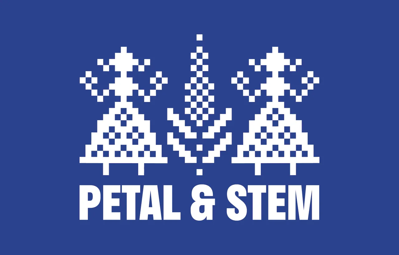
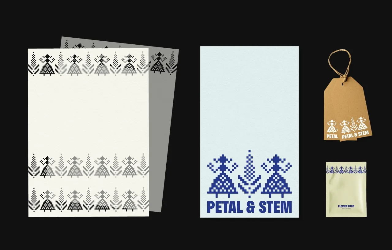
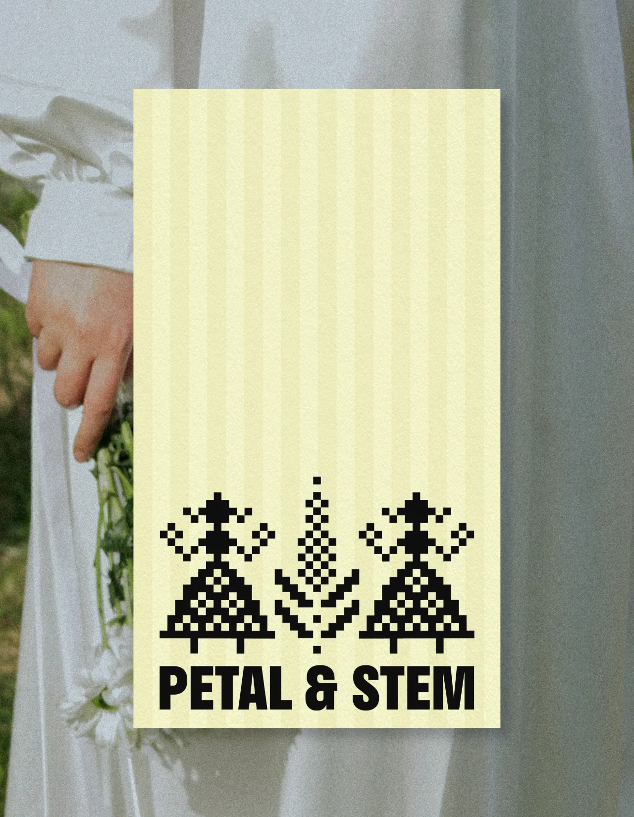
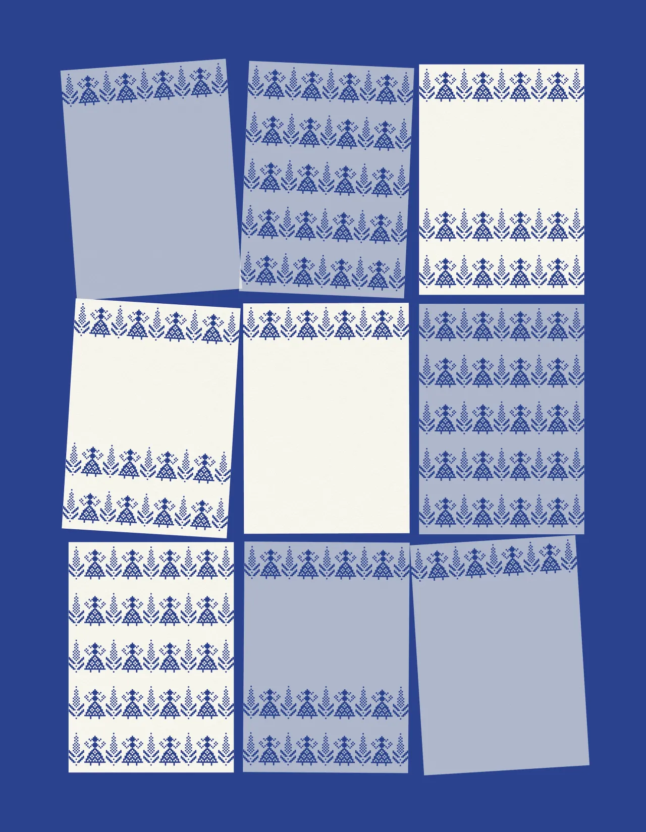
Josefine's central emblem takes the form of a pixelated ornamental motif, referencing cross-stitch and folk pattern-making, with a subtle digital undertone that keeps it from feeling purely nostalgic. Two figures gather around a wildflower at the heart of the design, representing the shop's founding friendship. This is paired with a bold, confident wordmark that anchors the delicacy of the ornamental detail.
Tissue paper, packaging and stationery are decorated with lace-like stencil patterns built from the logo. It's branding that rewards close attention... and that's exactly the point.
Stitches, pixels and a garden in bloom
California-based multidisciplinary designer Srishti Arora arrived at a strikingly similar starting point to Josefine, but took it in a distinctly different direction. Her concept draws on the art of embroidery and cross-stitch as a metaphor for the patience and layering required to "grow something from nothing" – the same careful craft that floristry demands.
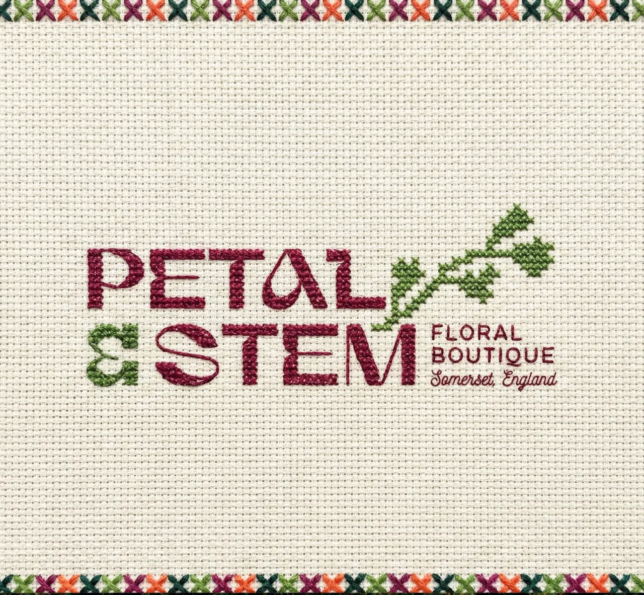
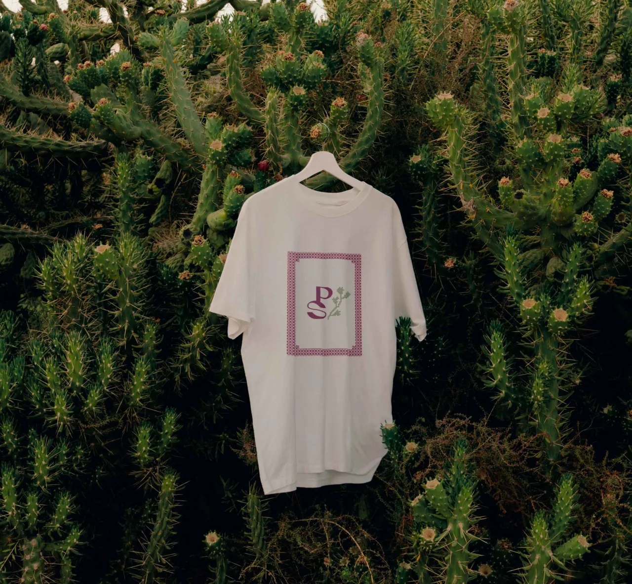
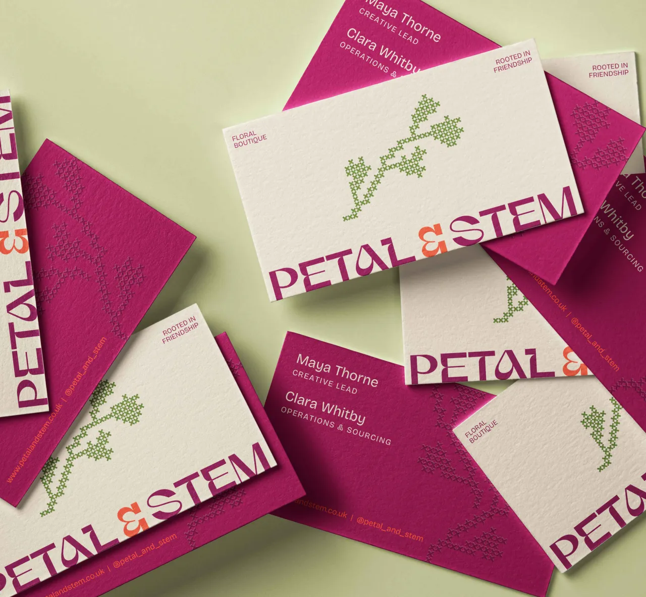
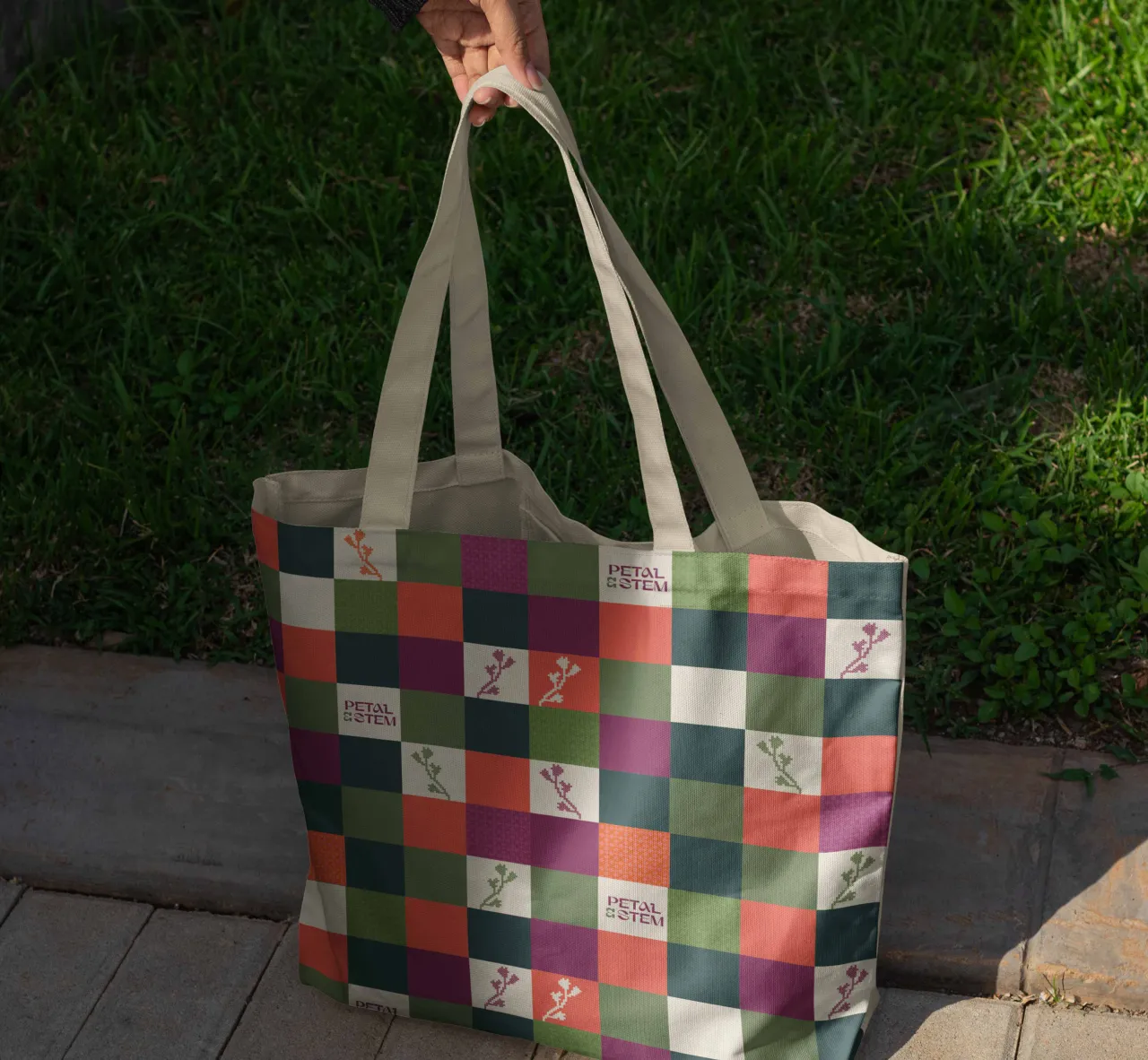
Where Josefine's system leans into folk pattern and digital nostalgia, Srishti's identity is built around a grid-based, colour-blocked structure with a cross-stitched floral icon at its heart. The goal was to "translate the physical stitch into digital pixels, creating a system that scales seamlessly from an embroidered merchandise piece to a business card while maintaining 360° consistency".
Her palette of deep magenta, earthy green, and bold orange was drawn directly from the energy of a British garden in full bloom. What she most wants people to notice is the modular interplay between the floral icon and the colour-blocked pattern: the way the "flower bed" graphics provide structure while the stitch motifs add a sense of handmade craft. It's an identity that, like a real garden, reveals more the closer you look.
The P.S. that changes everything
Perhaps the most emotionally resonant entry came from Kate Ross, a marketing and creative director based in Kansas City. Her concept hinges on a single, quietly brilliant observation: Petal & Stem's initials are P and S. And P.S., of course, is what you write when you can't quite bring yourself to say the most important thing in the body of the letter.
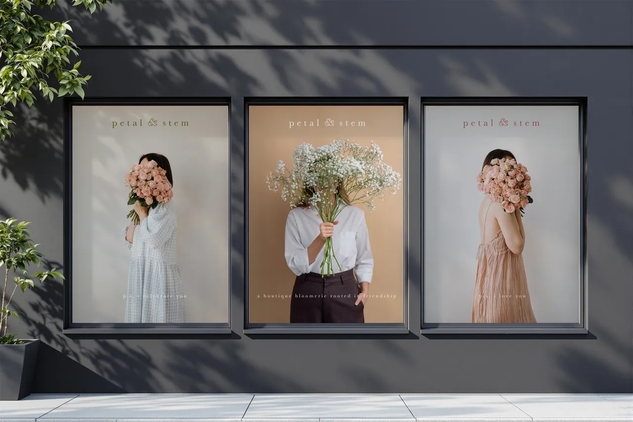
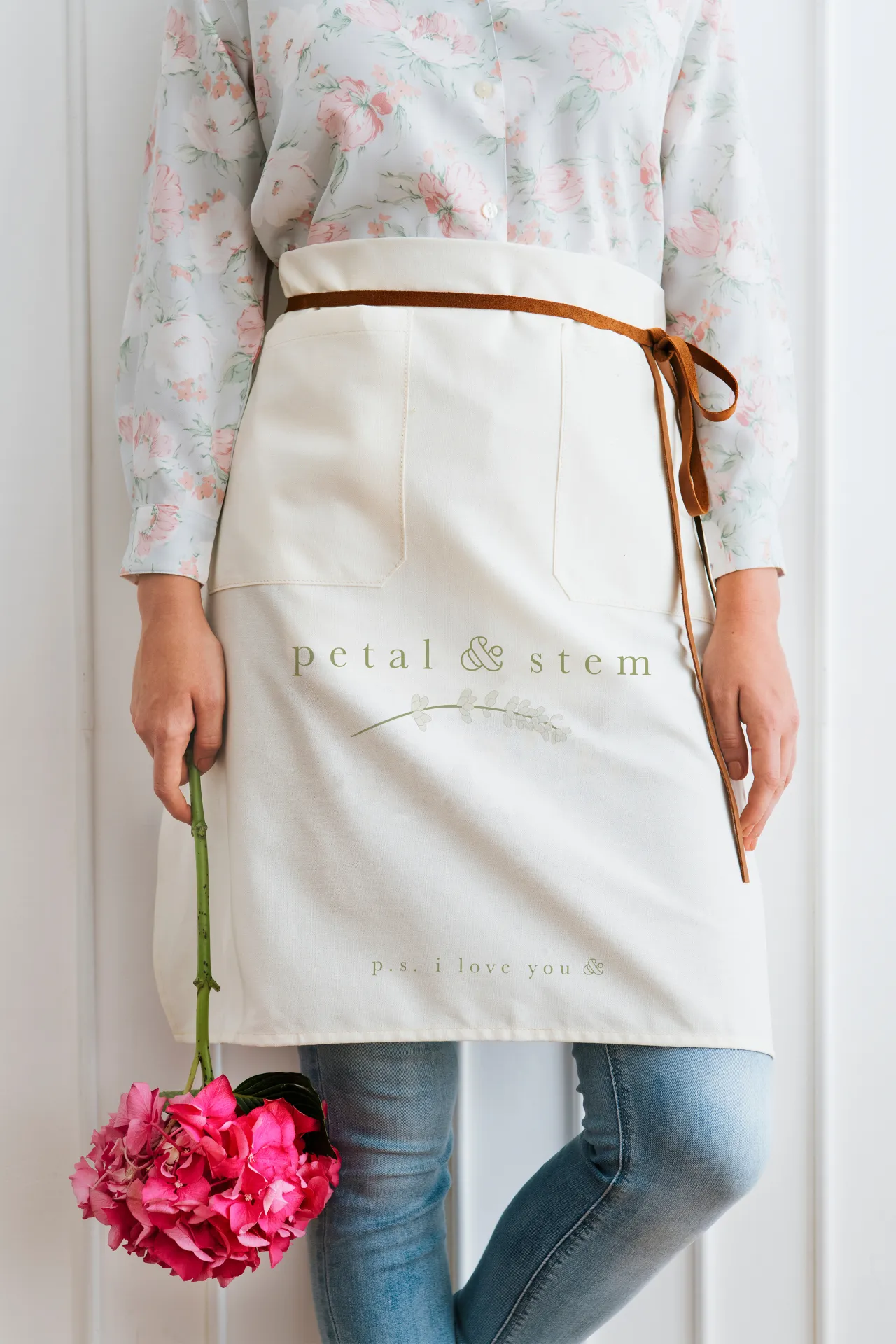
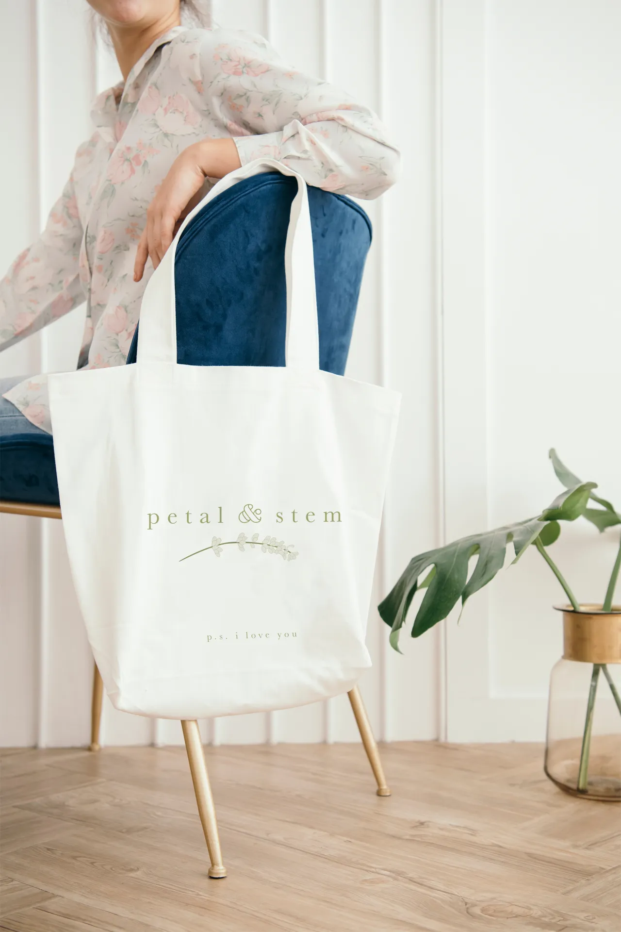
From that starting point, Kate built an entire tonal world around the idea that flowers often say what we struggle to put into words. Her campaign line—"p.s. I love you &"—runs through the identity like a thread, appearing on wrapping paper, ribbon, gift boxes and aprons. The ampersand at the end is doing something clever: it holds open an infinite space for whatever the recipient needs it to mean. The brand speaks for you so you don't have to.
Kate also wove a community dimension into the brand story: every purchase comes with a single loose stem, to be kept or passed to a stranger. It's a small gesture, but it transforms every transaction into an act of connection, which is exactly what the brief was asking for.
An ampersand in bloom
Art direction student Lancelot Bercot-Duflos, who's currently completing his master's at ECV Paris, centred his identity around a single elegant idea: the ampersand as a living thing. Using the typeface Gaya (chosen for its organic, curving letterforms and its reference to the Earth goddess), Lancelot designed a logo where the top loop of the & opens into a flower, while the lower curves reach out like stems. It's a beautiful piece of typographic thinking.
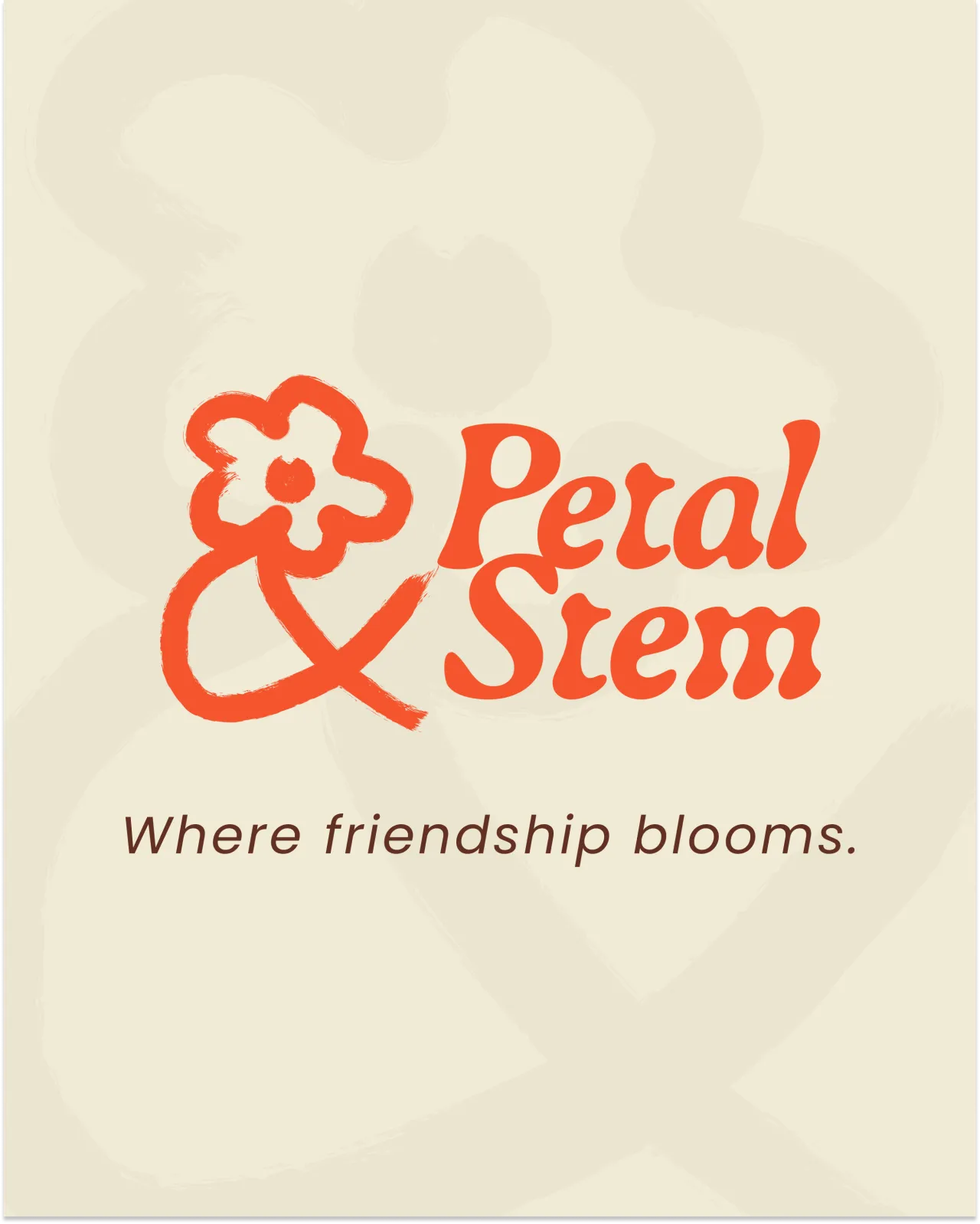
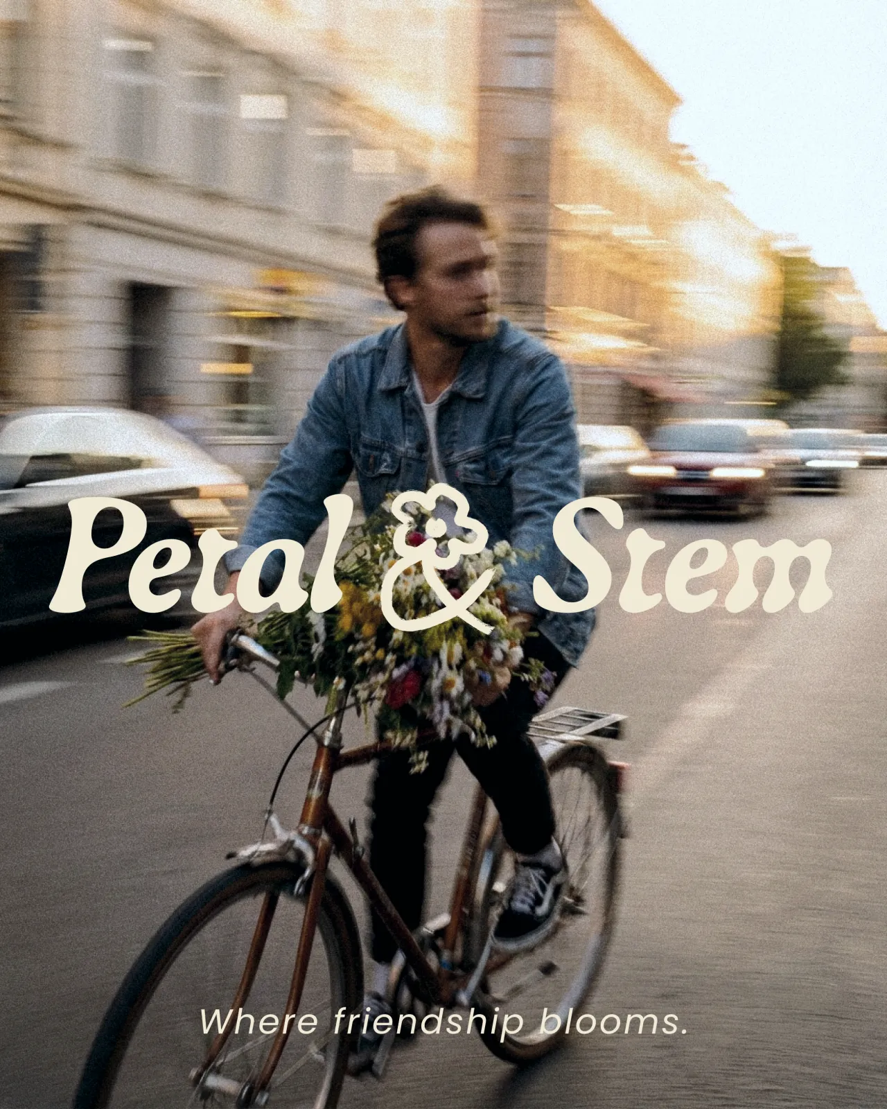
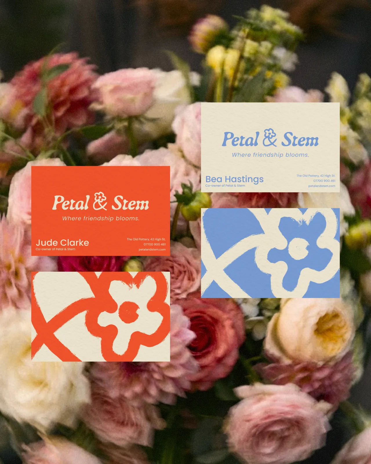
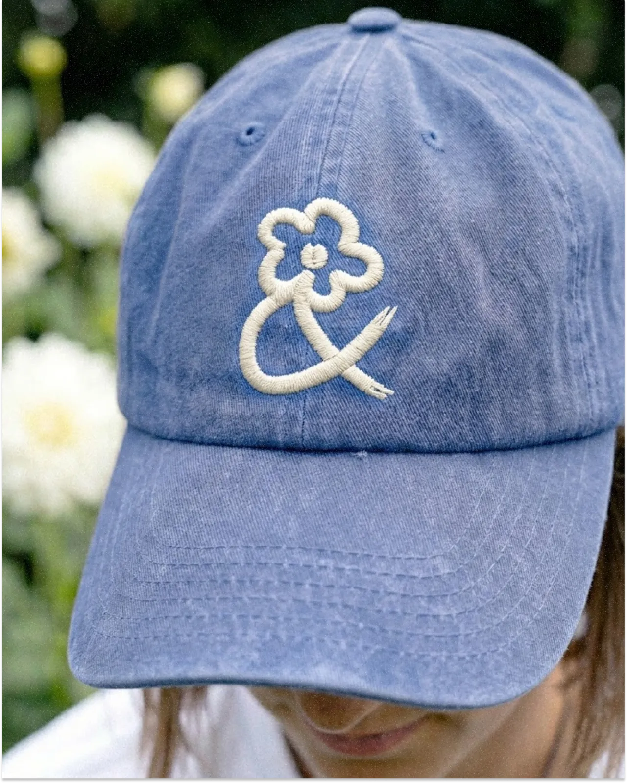
The identity leans into what he calls a "naïve" design approach: hand-drawn illustrations with visible brushstrokes that deliberately step away from the polished floristry clichés of perfect prints and swirling calligraphy. His colour palette is pulled directly from seasonal British flowers, and one detail is particularly worth noticing: the business cards for the shop's two founders each carry their own colour, taken from opposite sides of the colour wheel. Two people, one brand. It's a small touch, but a lovely one.
Seasons in a symbol
London-based senior designer Satvir Sihota made a decision early on that shaped everything: replacing the ampersand with a plus sign. The reasoning is quietly brilliant. A plus divides neatly into four quadrants (one for each season) with a different palette colour representing a flower that blooms at that time of year. Spring's daffodil yellow, summer's lavender, autumn's burnt orange, winter's cool white. It's a system that feels logical and charming in equal measure.
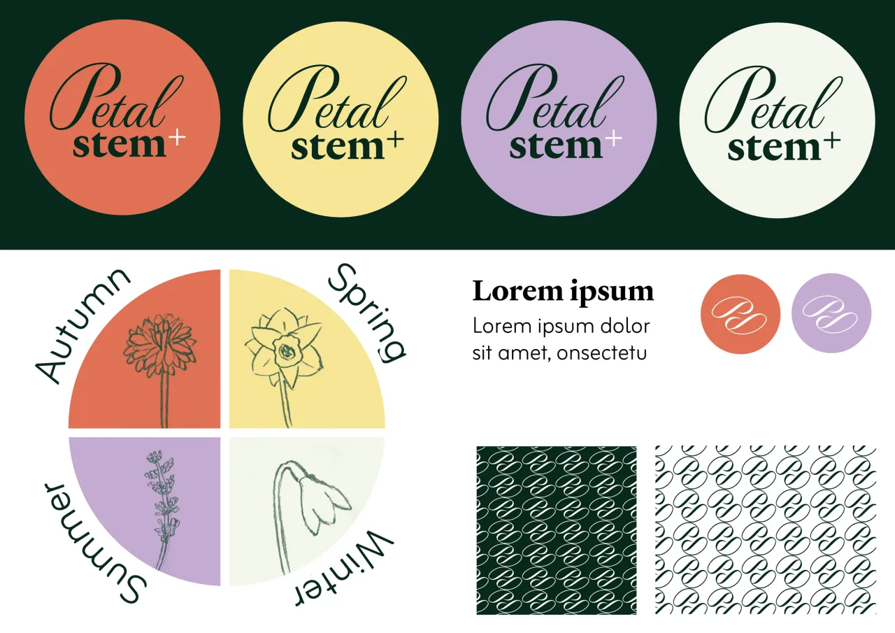
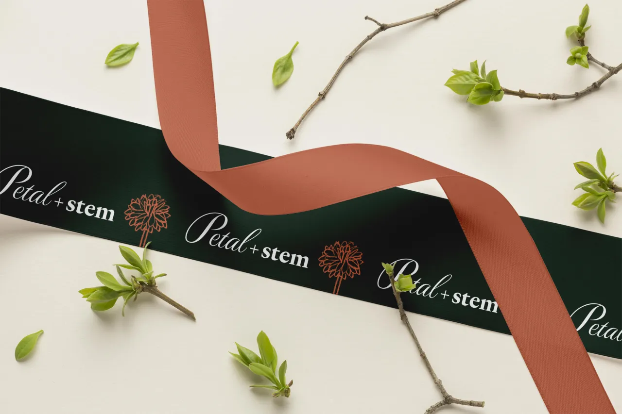
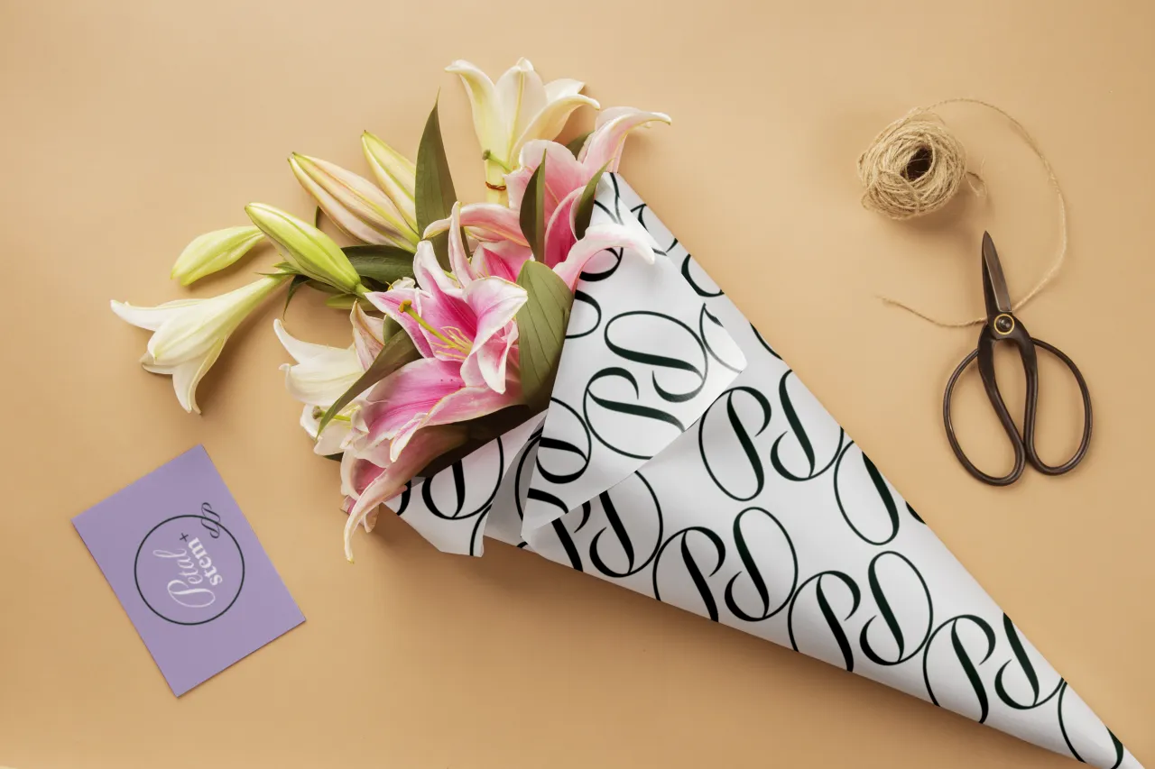
From there, Satvir developed each seasonal flower into a vector illustration that sits comfortably within the brand's graphic style. The P from Petal has a distinctly petal-like form, which she developed into both a standalone mark and a repeating pattern.
The result is an identity that works across wrapping paper, business cards and branded materials with genuine consistency—and a concept that reveals more meaning the longer you look at it.
A wordmark grown from the ground up
Spanish studio Leyma Design, founded by Leyre San Miguel Iribar and Matthew Townsend in San Sebastián, took a typographic approach rooted in restraint and craft. Their central move was designing a custom ampersand that subtly transforms into a flower: not an illustrated addition, but a transformation of the letterform itself. It's elegant, disciplined work.
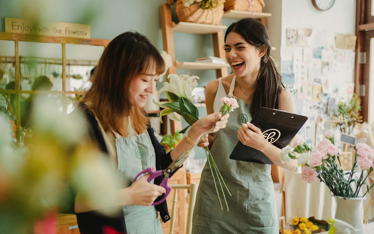
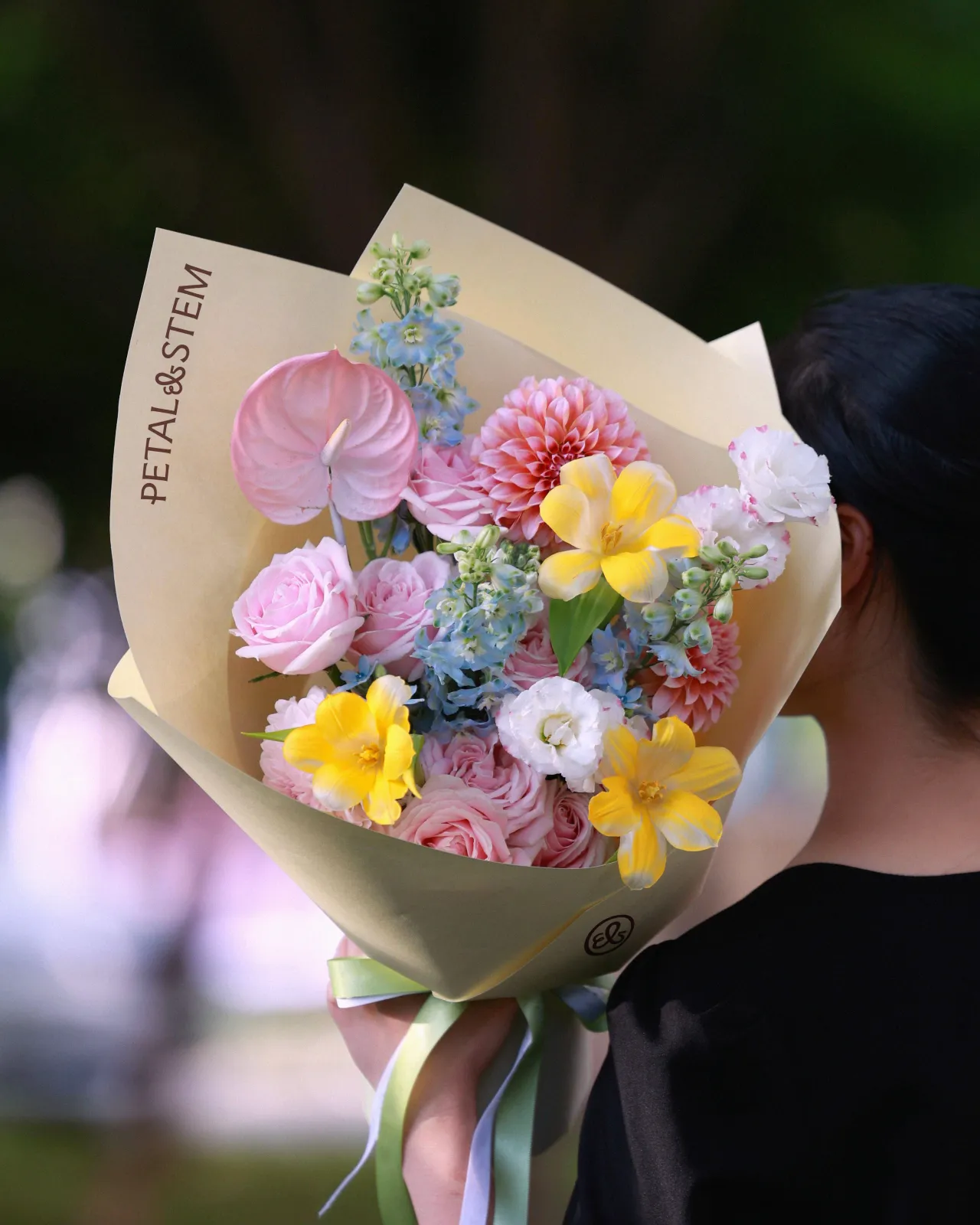
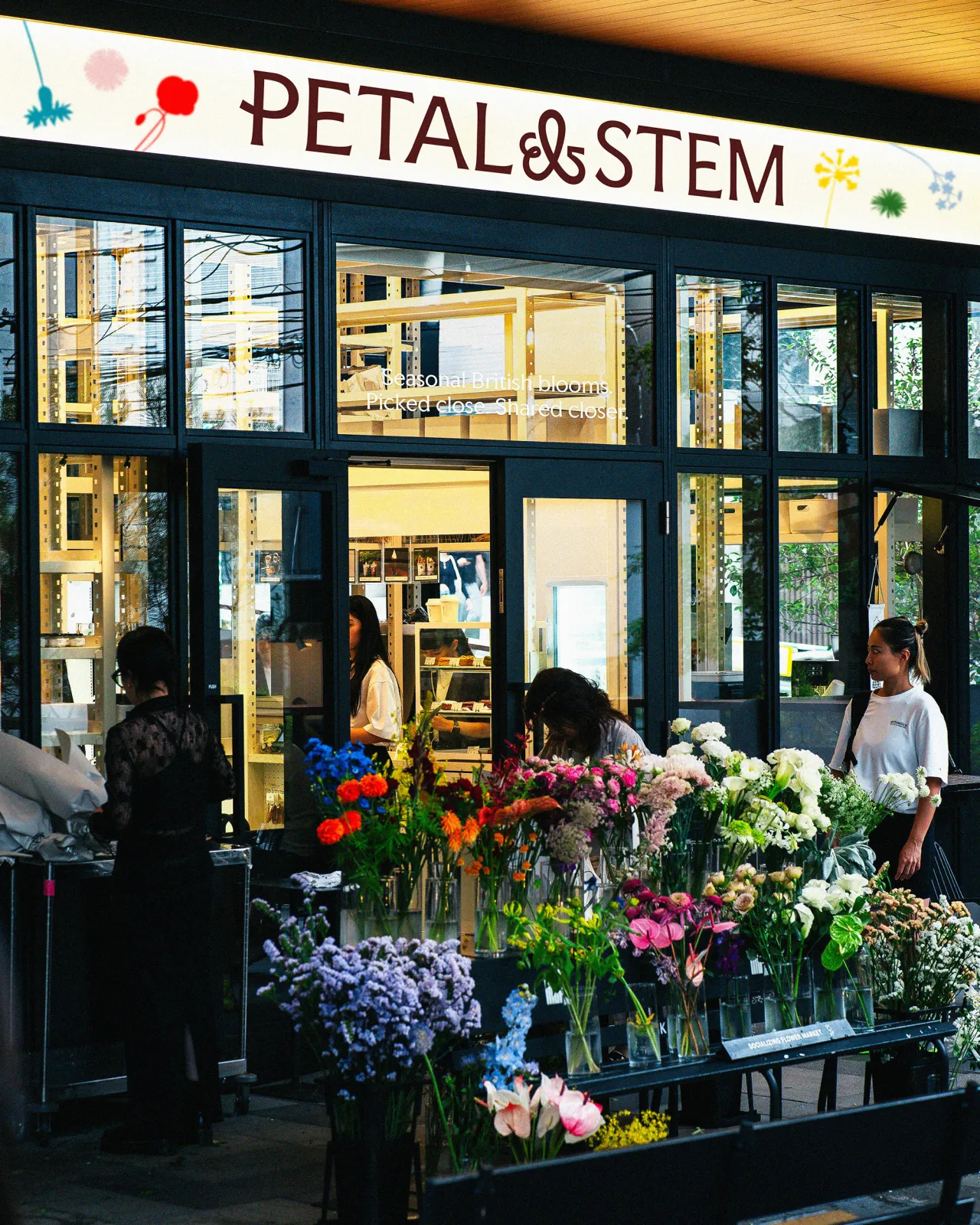
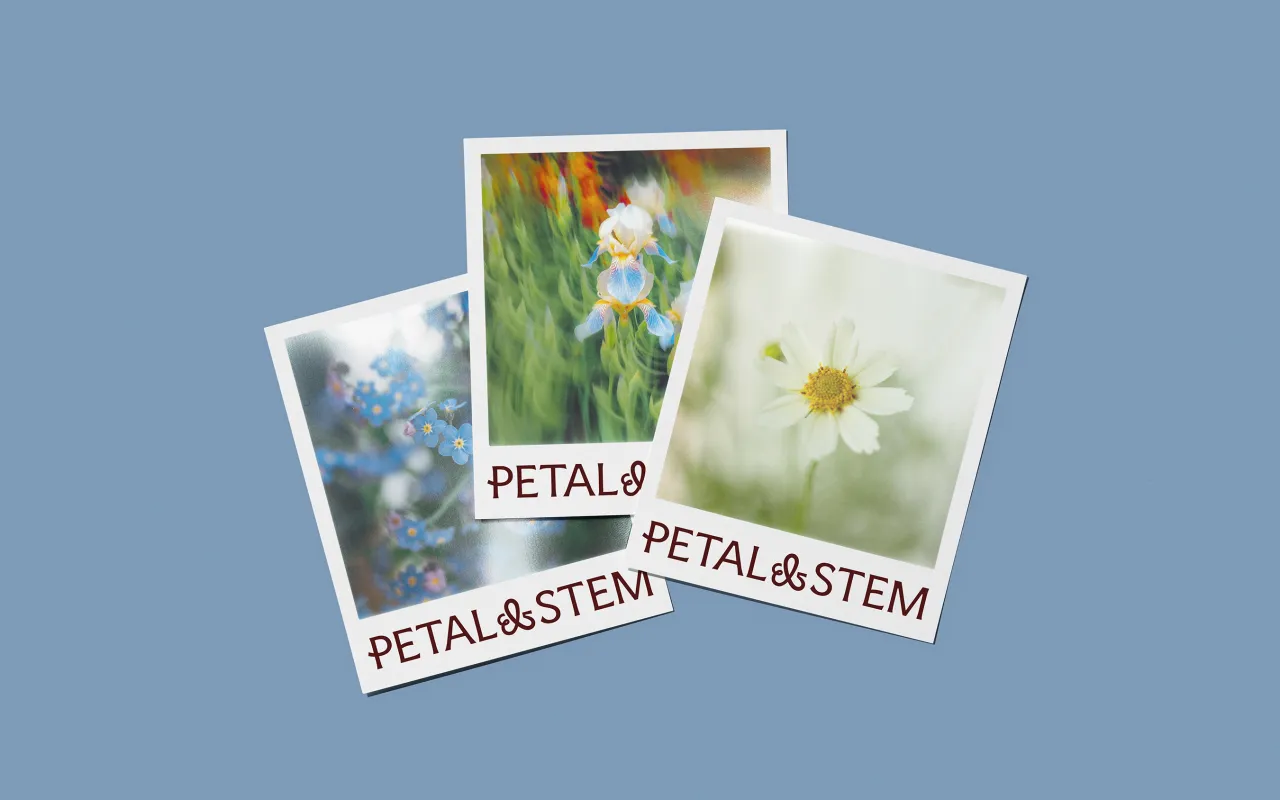
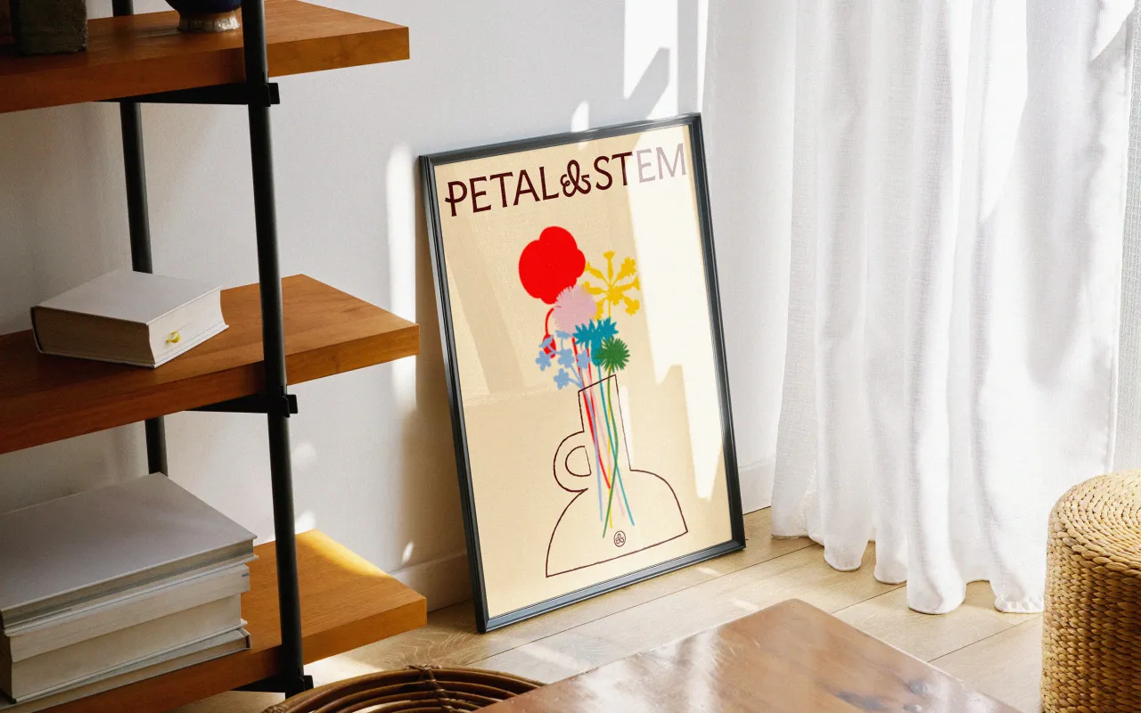
Around this wordmark, they built a flexible visual system: a set of British wildflower illustrations used not as decoration but as a structural graphic layer that carries across packaging, stationery and social content.
Photography was shot with natural light, grain and soft focus to match the seasonal, unpolished quality of the flowers themselves. A serif typeface and an earthy yet warm colour palette keep things grounded. It's the kind of identity that feels like it could genuinely exist on a high street.
Typography as floral arrangement
Budapest-based graphic designer and lettering artist Laura Sásdi found her concept in the letterforms themselves. By aligning the two T's in "Petal & Stem" to serve as the flower's stem, she collapsed the line between typography and botanical illustration into a single, unified mark. It's the kind of idea that sounds obvious once you see it, but requires a particular kind of typographic sensitivity to spot in the first place.
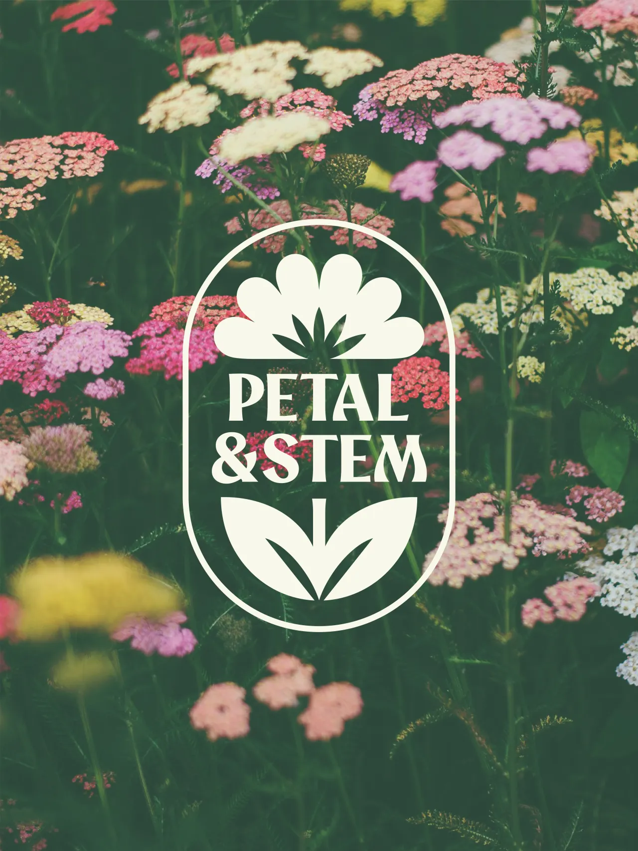
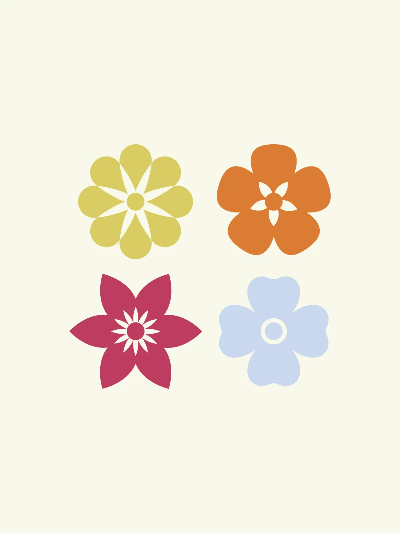
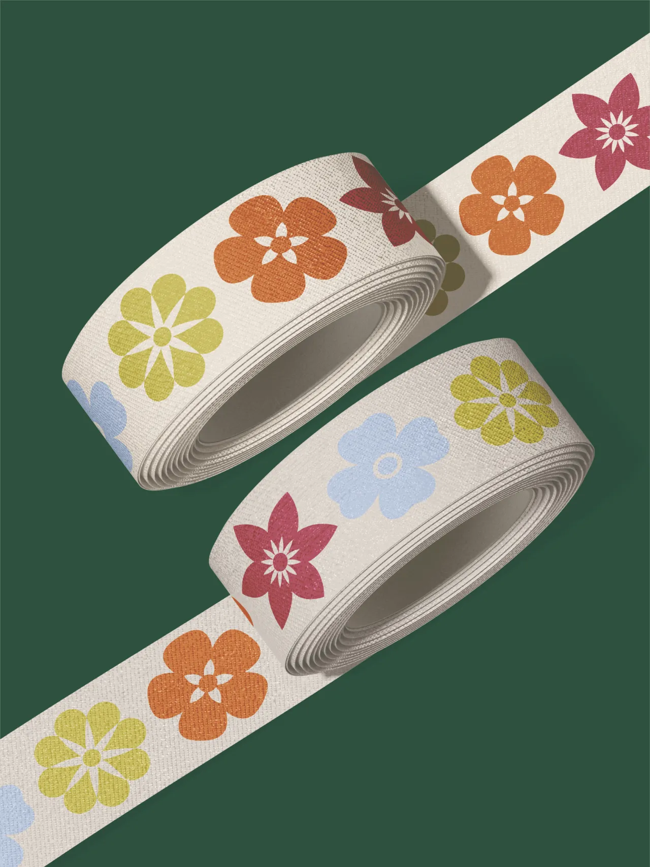
Additional brand assets expand the identity into a set of wildflower icons with varied petal shapes and colours, drawn from the diversity you'd actually find in a British wildflower field rather than a florist's catalogue. Each feels distinct but clearly belongs to the same family, giving the system a joyful, garden-like energy without tipping into chaos. Laura's stated goal was an identity that felt both professional and full of joy, and the balance she strikes between those two things is what makes the work land.
Scarlet tulips and quiet confidence
Warsaw-based designer Kseniya Matusevich, meanwhile, drew her inspiration from an unexpected source: the book Why Women Grow, a collection of honest stories from women about their relationship with gardening. The connection she felt to the brief was immediate: flowers carefully assembled and grown by two female friends who understand their craft on a deeper level.
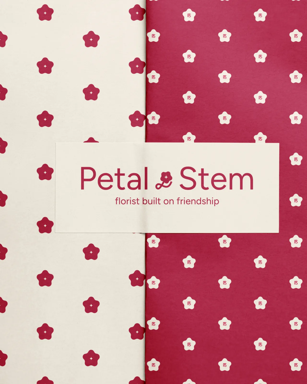
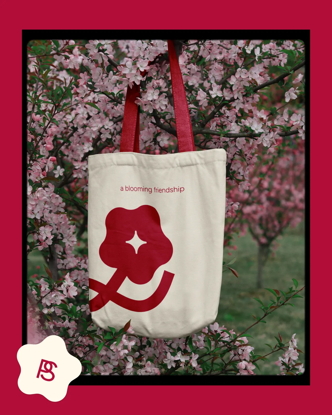
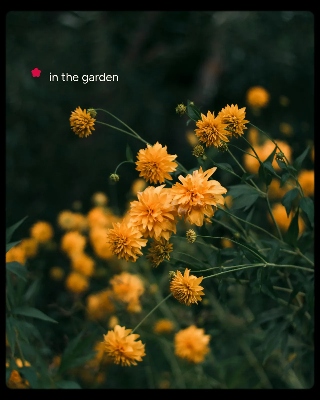
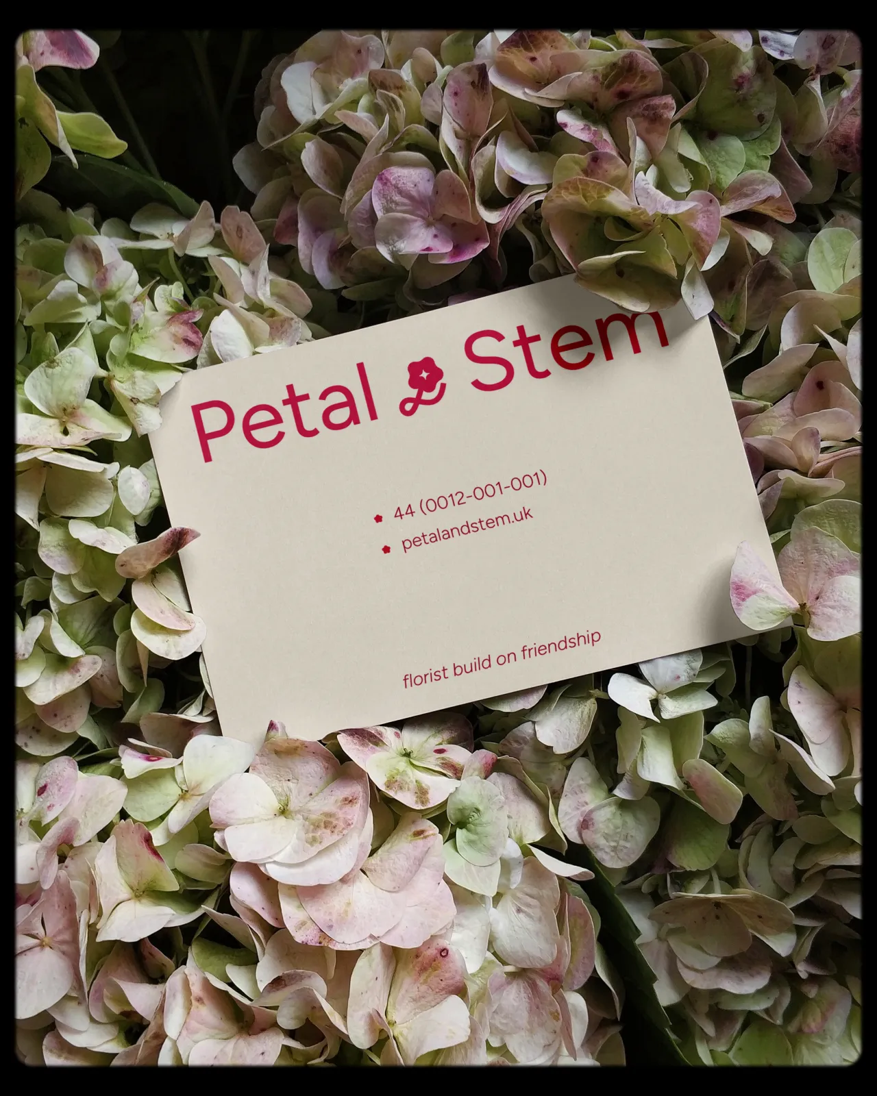
Her response is pared back and considered. A clean sans-serif wordmark in Figtree (organic, serious and friendly) is paired with a simple symbol that unites the petal and stem into a single connected form. The colour palette, a vivid scarlet against calm off-white, arrived intuitively. She had a fresh bunch of scarlet tulips in her kitchen at the time, their centres bleeding into pale butter yellow. It shows: the identity feels lived-in rather than designed from a distance.
An ampersand that holds it all together
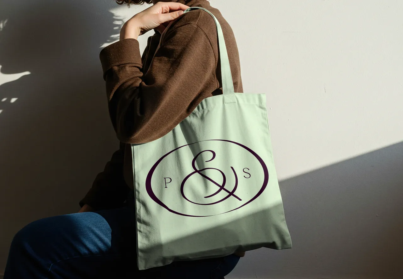
Amsterdam-based brand consultant Romario Dudok van Heel, who last year founded the strategy-led studio NOTGOOD, took one phrase from the brief and ran with it: "Sunday morning farmers market energy meets considered, confident design". That tension between warmth and restraint became the foundation of everything that followed.
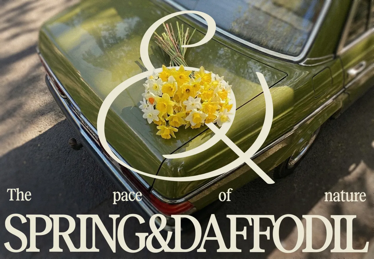


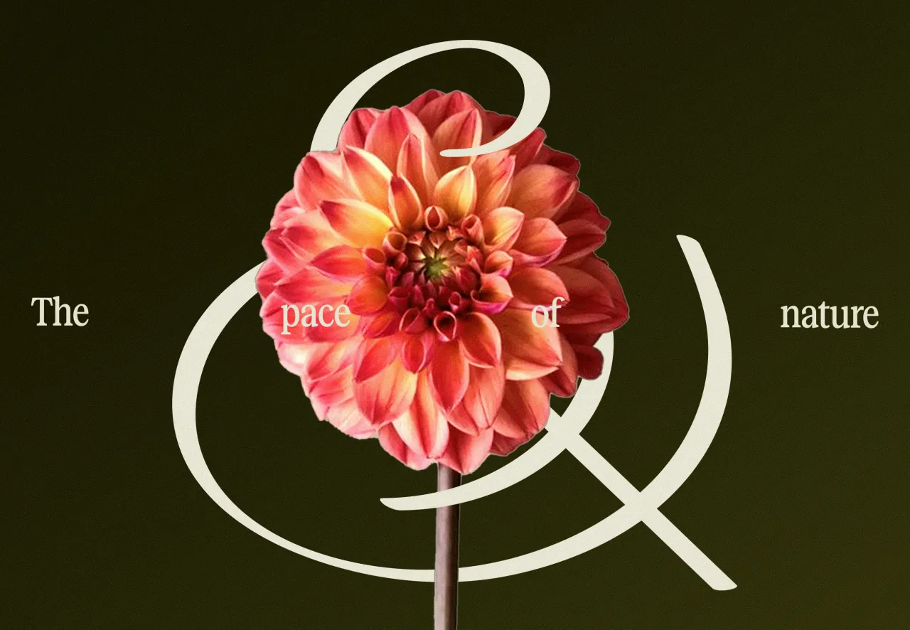
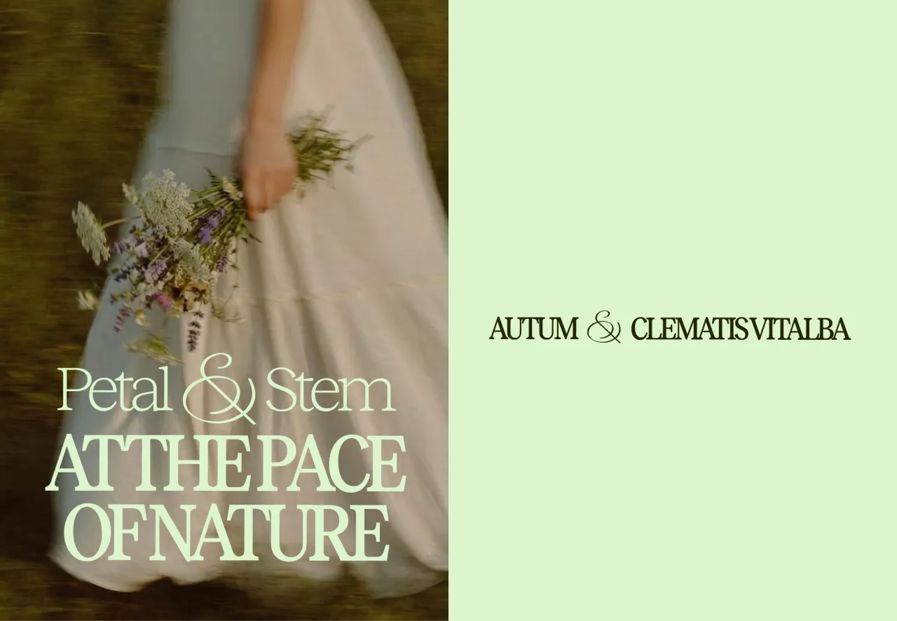
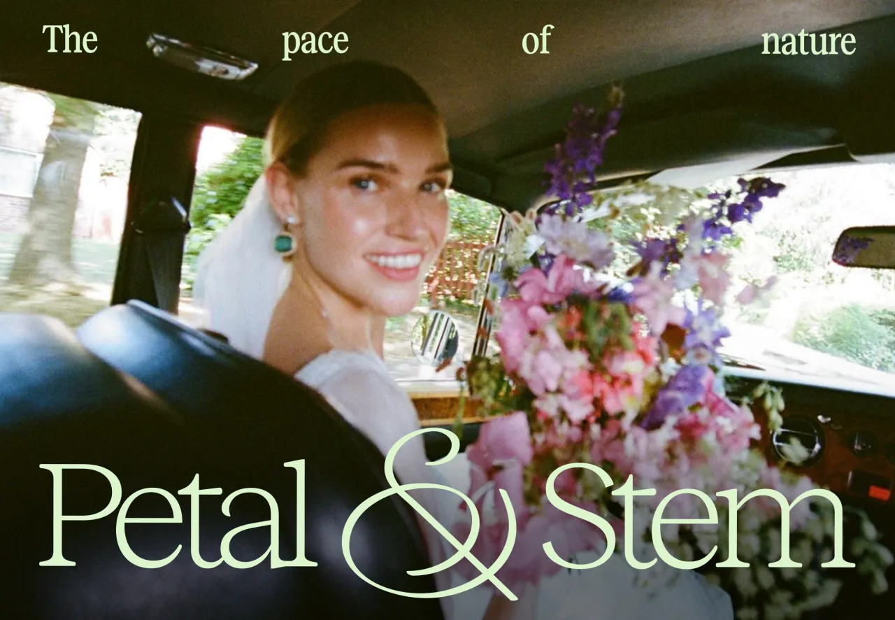
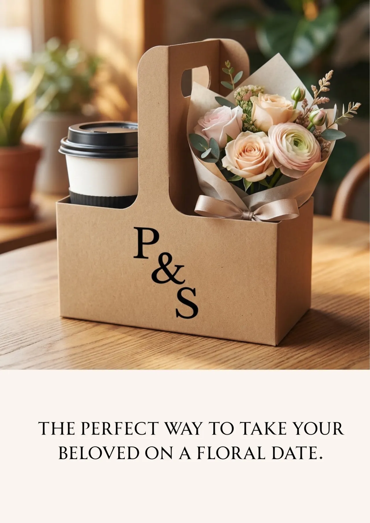
His concept centres on the ampersand as both a typographic element and a visual metaphor. Custom drawn so that the letters P and S are subtly embedded within the form, it also echoes the gesture of stems gathering together... connection rendered as a single mark. From there, Romario developed two logo variations: a compact P&S monogram for smaller applications and a full wordmark for more expressive use.
The ampersand does more than sit in the name, though. It becomes a flexible graphic device, wrapping around objects and interacting with floral arrangements, while a pattern derived from its structure flows organically across wrapping paper, packaging and printed materials. The palette, meanwhile, pairs a deep botanical green with a brighter, fresher tone – grounding the identity in nature while keeping it feeling contemporary. Typography is set in Reckless by Displaay, a serif with calligraphic roots, tightly kerned to create a quiet sense of closeness that mirrors the friendship at the brand's heart.
It's an identity built on reduction rather than addition, and it's all the stronger for it. Another brilliant submission to our monthly Boom Briefs.
The identity that changes with the seasons
London-based junior designer Tommy Walton began where the best briefs demand you begin: with the idea itself. His early process involved stripping the problem back to its essentials, distilling the brand's purpose into just a handful of words: changeable, imperfect, unpredictable, connected, joyful, natural, eternal, and elegant. From there, he built something to suit them all.
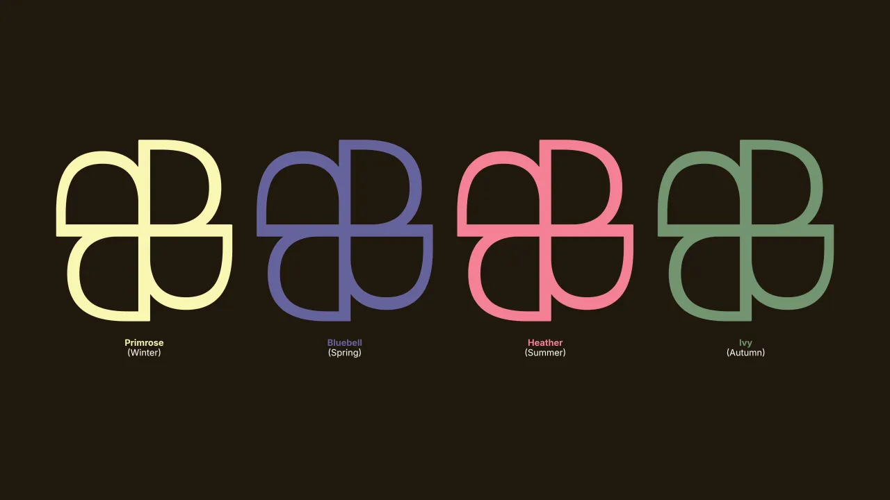
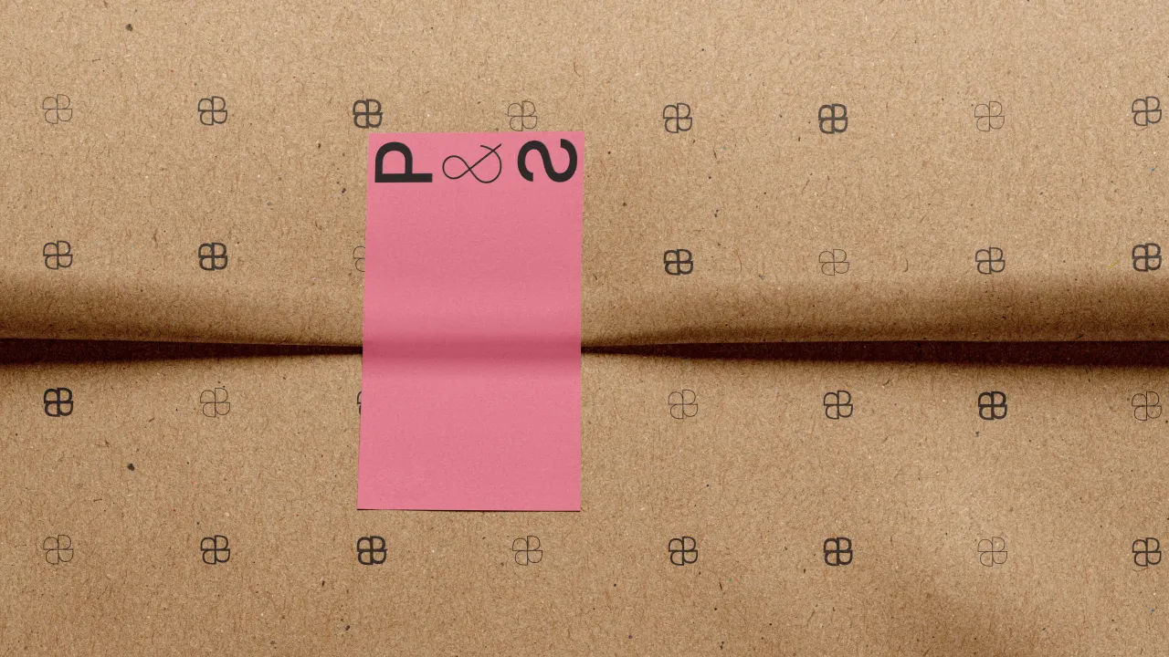
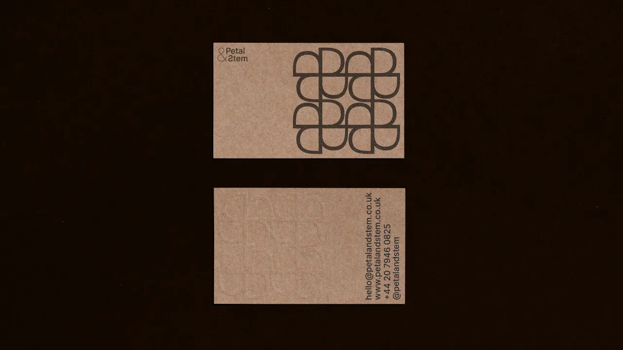
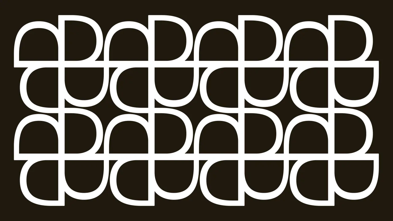
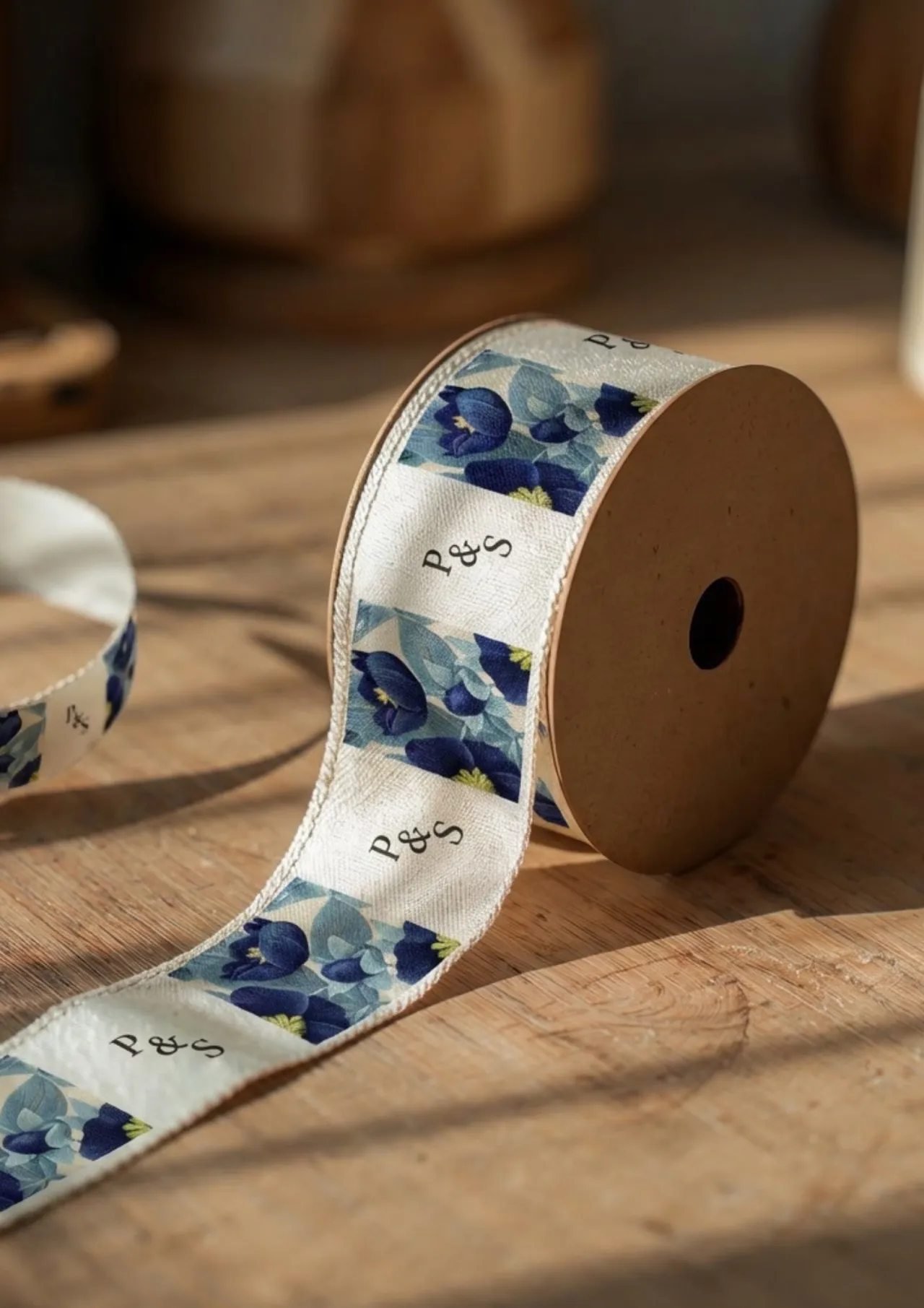
The entire system is purely typographic. The logomark is constructed from the letter P and a reversed S – two letterforms that quietly reference the brand's name without ever spelling it out. The colour palette draws on British wildflowers: Primrose for winter, Bluebell for spring, Heather for summer, Ivy for autumn. Those four colours map onto four petals within the mark, reinforcing the rhythm of the seasons throughout the year.
What's particularly thoughtful is how Tommy approached the question of environmental impact. Rather than treating sustainability as a visual talking point, he built it into the system's logic: unbleached paper across as many outputs as possible, with the only seasonal variation expressed through the tape used to wrap the bouquets. Everything else stays consistent.
It's a considered solution for a real-world client. One that acknowledges the limits of what a small local business can actually maintain, and designs within them rather than around them.
Tommy is currently preparing to relocate to Singapore with his partner, where he'll be looking for his next design opportunity. If the quality of this submission is anything to go by, he won't be looking for long.
A logo that thinks like a flower
Finally, self-taught designer Dana Carron, who's based in Morocco, came to the brief from a different place entirely; she'd only recently begun sharing her work when she found the challenge on Instagram. Her response to the brief is all the more impressive for that context.
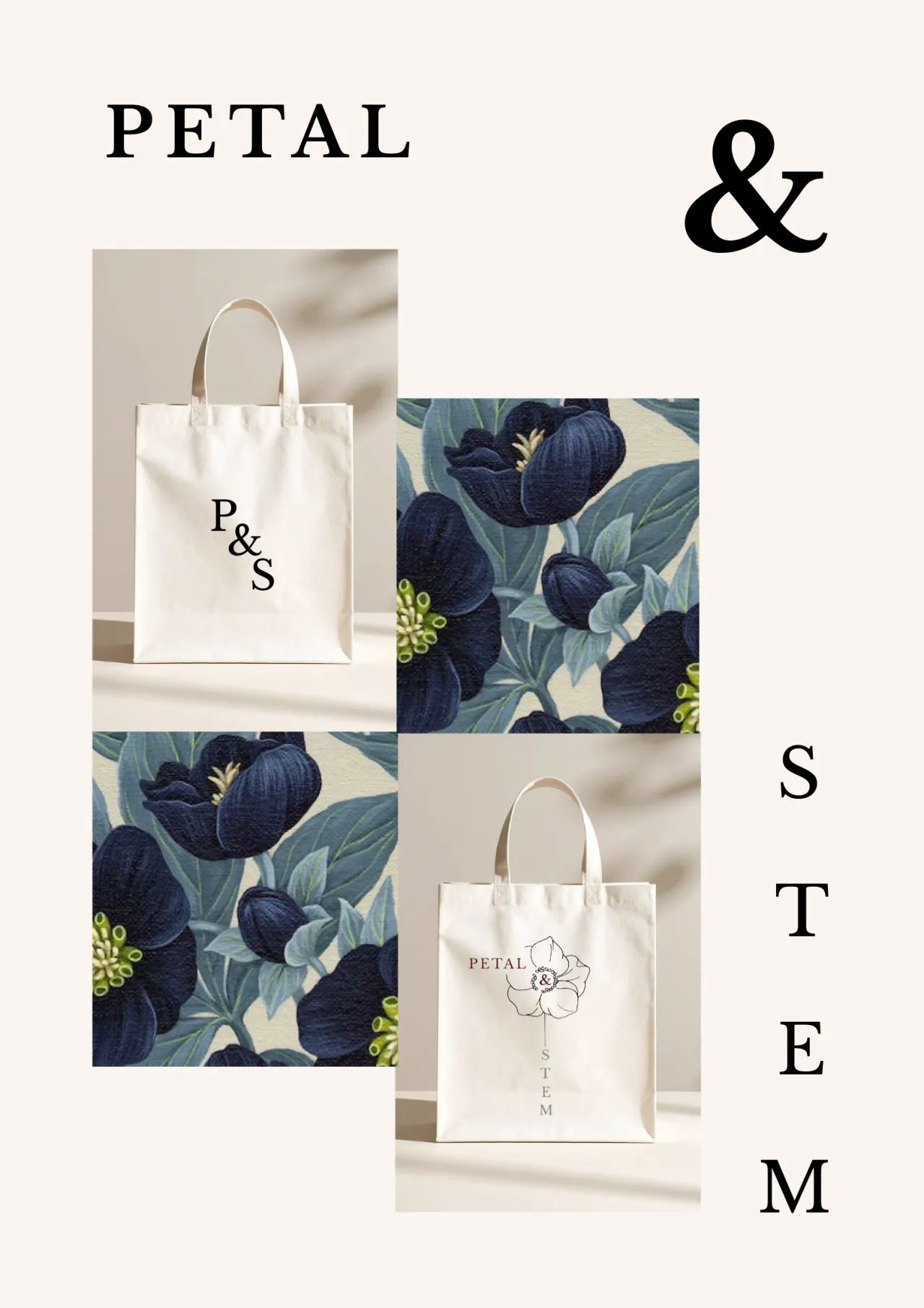
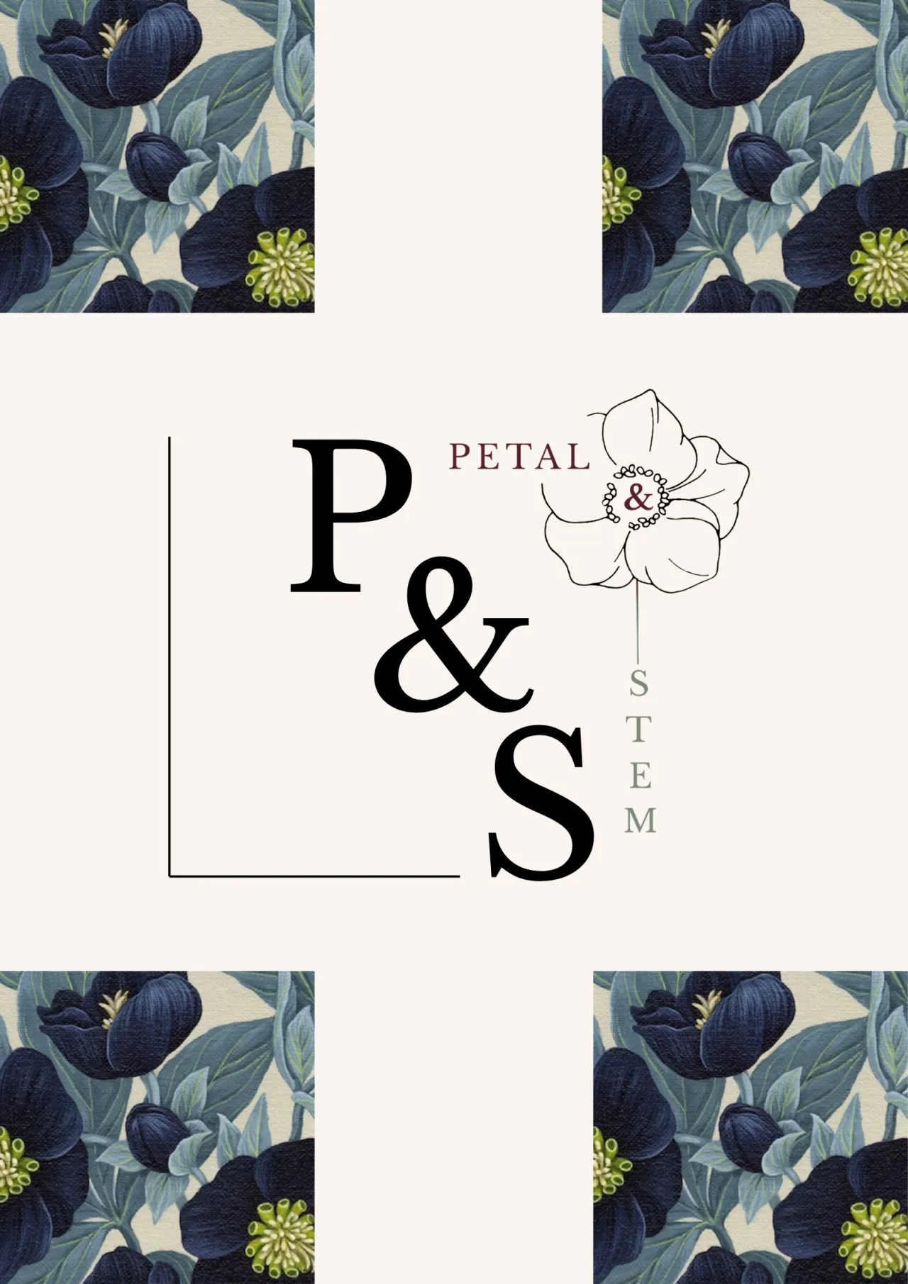
Dana researched which flowers bloom in February in England and landed on the hellebore: rare, beautiful, and slightly unexpected. From there, she worked out a logo structure where the word "Petal" sits horizontally like a petal, while "Stem" aligns vertically along its stem. When it clicks, it really clicks. For someone still at the start of their design journey, that's a strong conceptual instinct.
How to get involved
What strikes us looking across all these entries, and every submission to the challenge, is how the same brief can pull in such genuinely different directions. A florist's brief could have produced a sea of sameness. Instead, it produced folk embroidery, naïve illustration, typographic transformation, seasonal symbolism and quiet botanical restraint. That range is the whole point. You can see the identities featured here in full via the hashtag #cbbriefpetalandstem.
Upset you missed this one? No worries: Boom Brief #8 is out now! Head to our Instagram @creativeboom for the full details and how to enter. No pressure, no expectations. Just you, a prompt, and the freedom to make something that didn't exist before.

Editor's Picks





Trending




Latest Jobs
Design Developer, Opinion at The New York Times
Full-time·New York·$113,946 – $136,000
Director of Product Design at Monzo
Full-time·London·£140,000 – £165,000
Senior Director, Strategy at Interbrand
Full-time·New York·$210,000 – $260,000
Copywriter at David&Goliath
Full-time·Los Angeles·$75,000 – $95,000
Strategy Director at Landor
Full-time·New York·$150,000 – $175,000
Designer, Marketing at The New York Times
Full-time·New York·$85,000 – $100,000





](https://media.creativeboom.com/7a1e2857-b4fe-4532-b27a-44aad620d310/conversions/1534a8a570312292c43f74da9968eac42becfa65-medium.webp)