This redesign of Stokes Coffee is a masterclass in 'change everything, but don't change a thing'
Eat Marketing's new designs for the 124-year-old coffee brand are bold enough to compete, careful enough to keep the soul intact.
Every creative has had that brief. Make it fresh and contemporary, but also timeless. Make it modern but also classic. Make it new, but don't break it. It's probably the most common brief in branding, but also the toughest to execute well.
Eat Marketing, a food and hospitality-focused agency based in Coventry, faced exactly that challenge when Stokes Coffee, the fourth-generation Lincoln-based roaster founded in 1902, asked them to drag the brand into the present. Not rebrand from scratch, not slap a new coat of paint over the old identity, but actually rethink what the brand means, who it's for and how it communicates, while keeping the 124 years of accumulated goodwill and reputation intact.
The result, which is now rolling out across cafés, packaging and social media, is one of those rebrands that looks inevitable in hindsight. That, of course, is the hardest thing to pull off in practice.
The Stokes problem
Stokes Coffee isn't a small artisan outfit that started last Tuesday. It supplies cafés, restaurants and businesses nationwide, runs its own café spaces, operates a training academy and a hotel, and has a roasting heritage that stretches back to the Edwardian era. That's a lot of history, and a lot of stakeholder attachment to how things look and feel.
The brief from managing director Nick Peel was, by his own admission, a "big ask". The challenge wasn't just aesthetic; it was strategic. How do you shift perception from a venerable family business to a commercially literate brand ready to compete in a modern coffee market, without alienating the people who love you precisely because you're a venerable family business?
Eat Marketing's answer was to start not with the logo or the colour palette, but with the people. A full brand audit and discovery phase came first, leading to a new brand strategy and tone of voice before anyone opened Illustrator. The work covered wholesale, retail and café channels, aiming at a unified platform that could flex across all three.
The people are the point
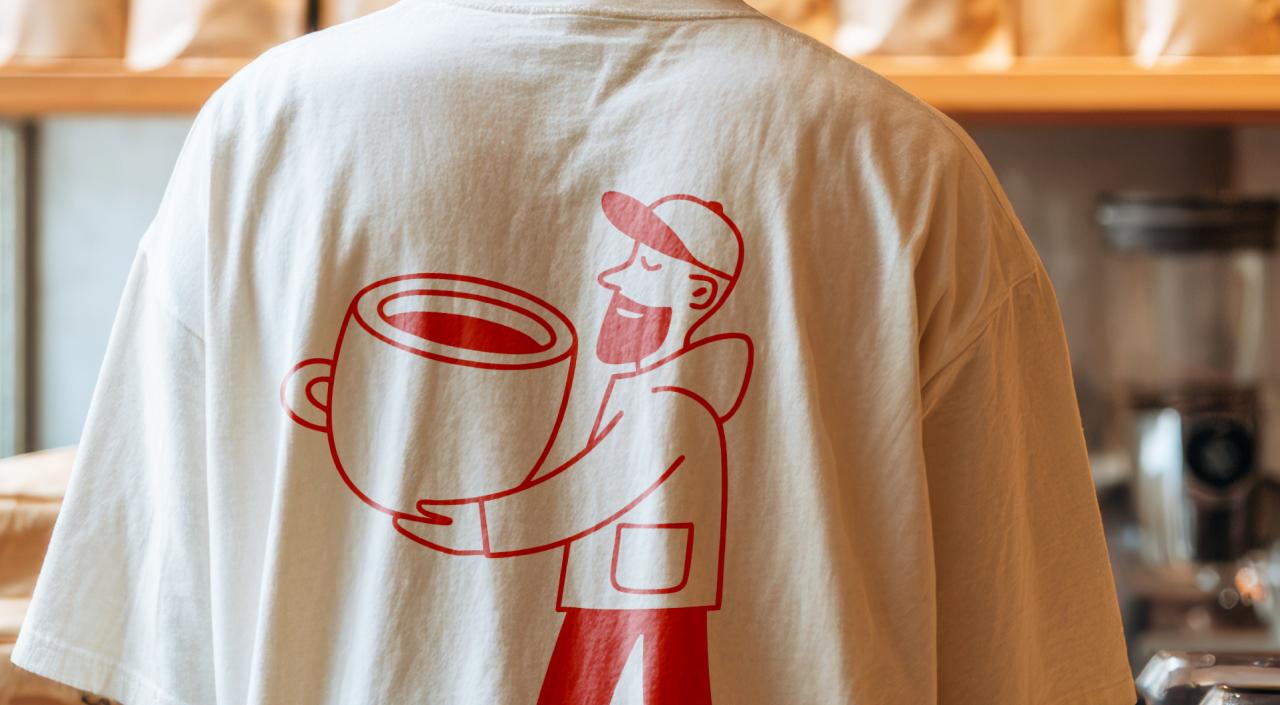
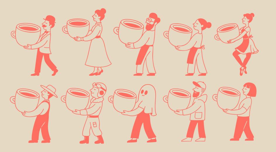
The creative cornerstone of the new identity is the 'Stokes People' character system: a cast of illustrated figures, diverse in age, appearance and profession, each one carrying an oversized coffee cup. There's a dapper chap in a bowler hat, a woman in a 1950s dress, a bearded barista type, a ballerina, a ghost (yes, a ghost) and a dozen more, all rendered in a warm coral-red line style that sits against a creamy off-white or deep burgundy ground.
The illustration style is loose and expressive enough to feel human, but consistent and disciplined enough to work as a system. These characters aren't decorative: they're structural. They appear on cups, tote bags, advertising and in animated social content, providing a visual shorthand for the brand values of approachability, warmth and community that no amount of copywriting alone could deliver.
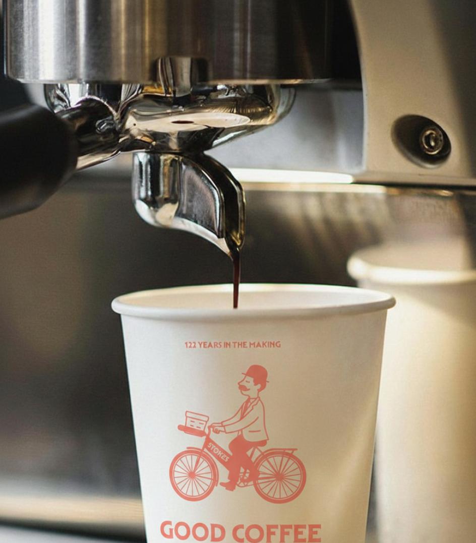
Crucially, the characters are rooted in reality. They're based on real family members, current staff and past generations of the Stokes business, which gives the whole system an authenticity that purely fictional mascots can struggle to achieve. You can feel that it means something, even if you don't know the backstory.
Typography with conviction
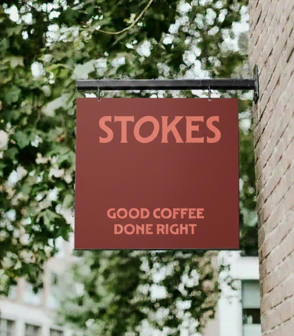
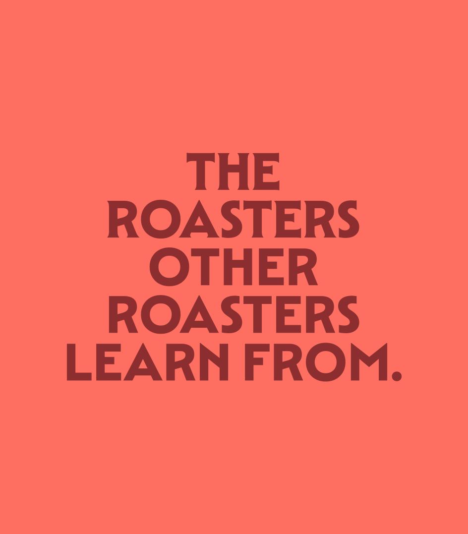
The type treatment also deserves attention. The wordmark is set in a bold, slightly condensed serif that feels both historical and contemporary. The headline copy—things like "Brewed on history. Made for today" and "The roasters other roasters learn from"—is written with the kind of confidence of a brand that knows what it wants to say.
The tone is direct, warm and occasionally self-assured to the point of swagger, which suits a 124-year-old business that has, let's be honest, earned the right to swagger a little.
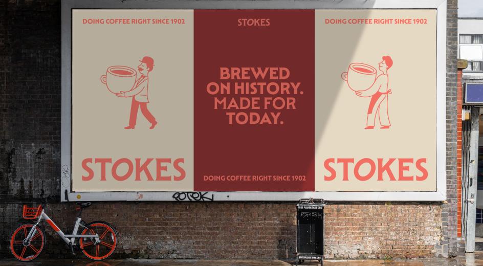
The colour palette, meanwhile—coral, burgundy and cream—is cohesive and distinctive without being shouty. It also photographs beautifully, which matters a lot when your brand needs to live on billboards, takeaway cups and Instagram in equal measure.
Key takeaway
Overall, this rebrand is a useful reminder that the hardest creative briefs aren't necessarily the ones with no constraints, but the ones with invisible constraints: the accumulated meaning, the emotional attachments, the things a client can't quite articulate but will absolutely know if you get wrong. Navigating that requires as much listening as it does making.
What Eat Marketing has delivered here is a brand that respects its past without being imprisoned by it. It's warm without being cosy, confident without being arrogant, and modern without pretending the history doesn't exist. It is, to borrow the brand's own words, good coffee done right. And as briefs go, that's a pretty fine result.
Editor's Picks


Trending


Podcasts


Editor's Picks
Further Reading