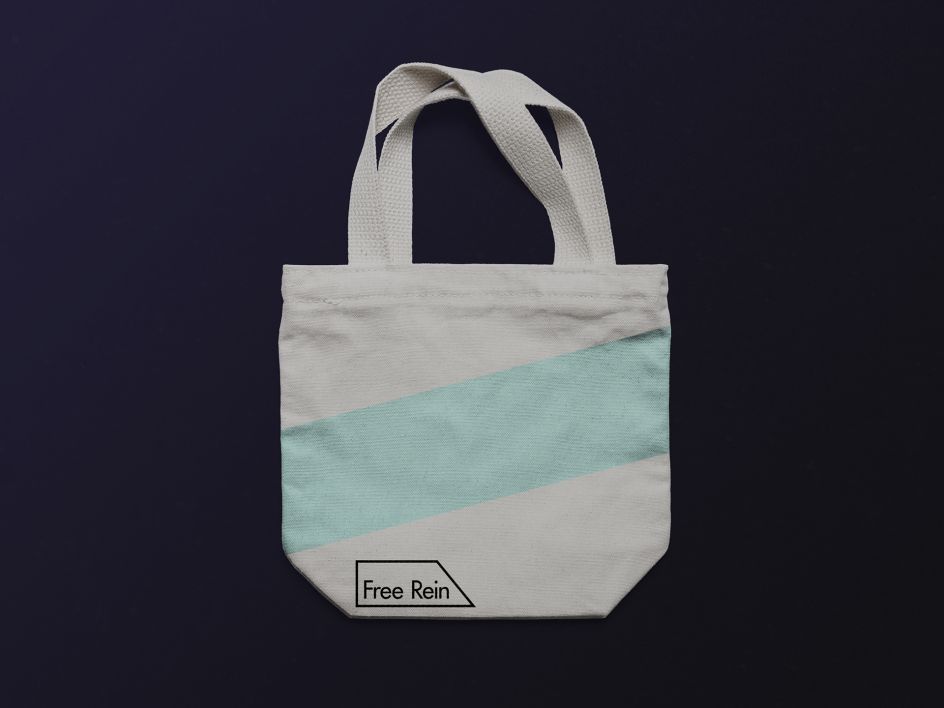
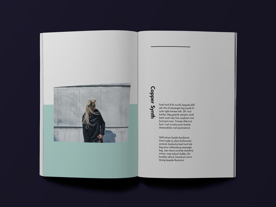
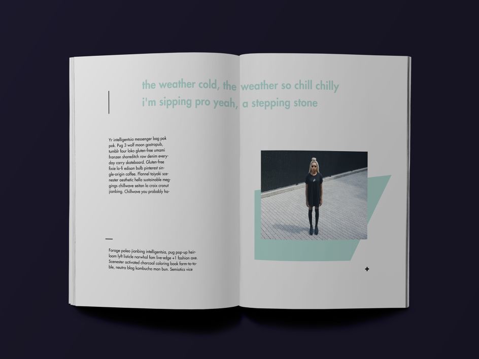
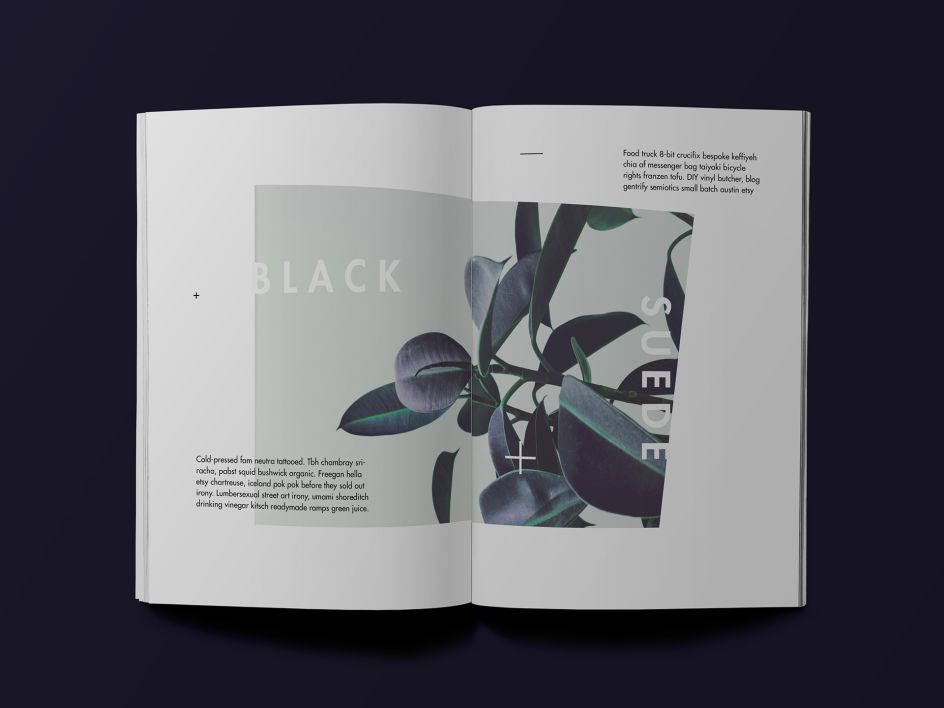
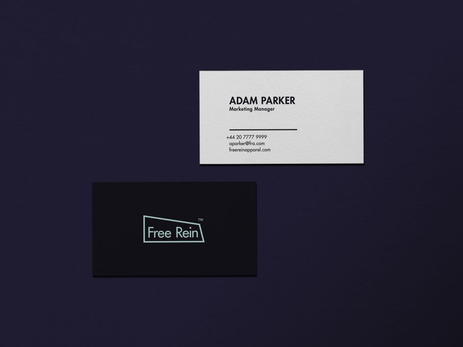
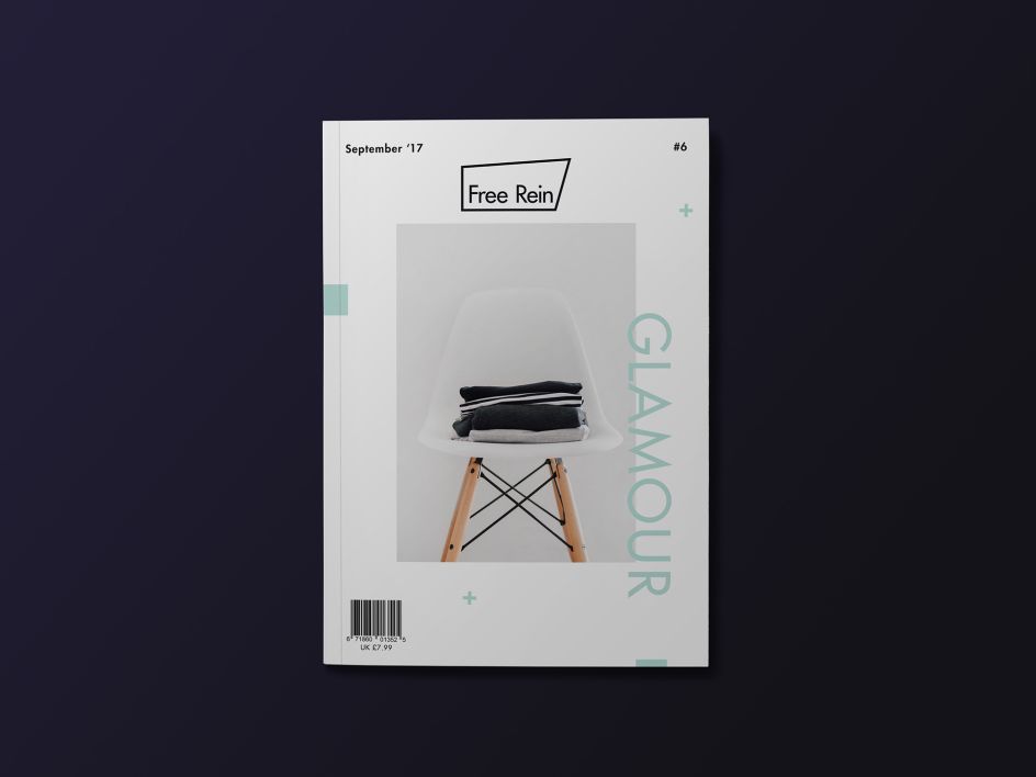
Cute but confident minimal-leaning branding for fashion studio Free Rein
Pranshu Bhatia is a designer based in Bangalore, India, who recently completed a cute, smart little branding project for London-based fashion studio Free Rein. The minimal-leaning typographic mark uses a cute sans serif housed within an adaptable box shape that moves and mutates to form numerous different iterations of an otherwise simple logo.
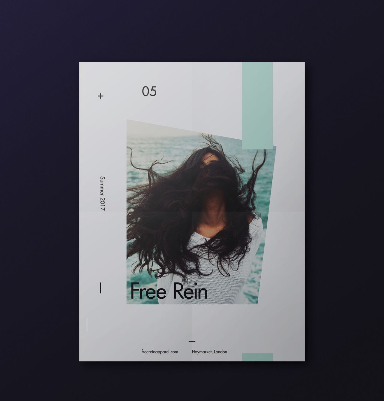
According to Bhatia, Free Rein is a place where “budding, talented designers collaborate to fabricate fine pieces of clothes prepared from scratch for people that want to feel special every day.” As such, the identity design is “inspired by the supple environment of the studio and their goal to bring talent together and help push their limits.”
The colour palette of pale teal, white and black gives a softness and confidence to the look and feel, and create a freshness that chimes nicely with the youthful approach of the studio. The typographic choice is also a nice departure from what we’d expect from the fashion world, bringing a certain originality and vibrancy to proceedings.

Editor's Picks


Trending


Podcasts


Editor's Picks
Further Reading