Studio Build and Reed Words create ‘simplified’ identity for ‘smart leisurewear’ brand Public Rec
Design agency Studio.Build and copywriters Reed Words are behind the new branding for Chicago menswear brand Public Rec, which specialises in ‘smart leisurewear’.
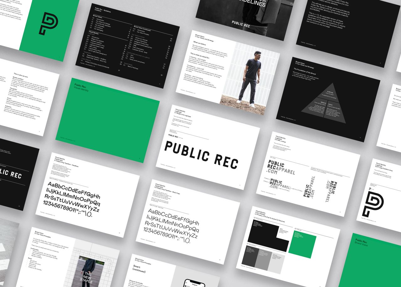
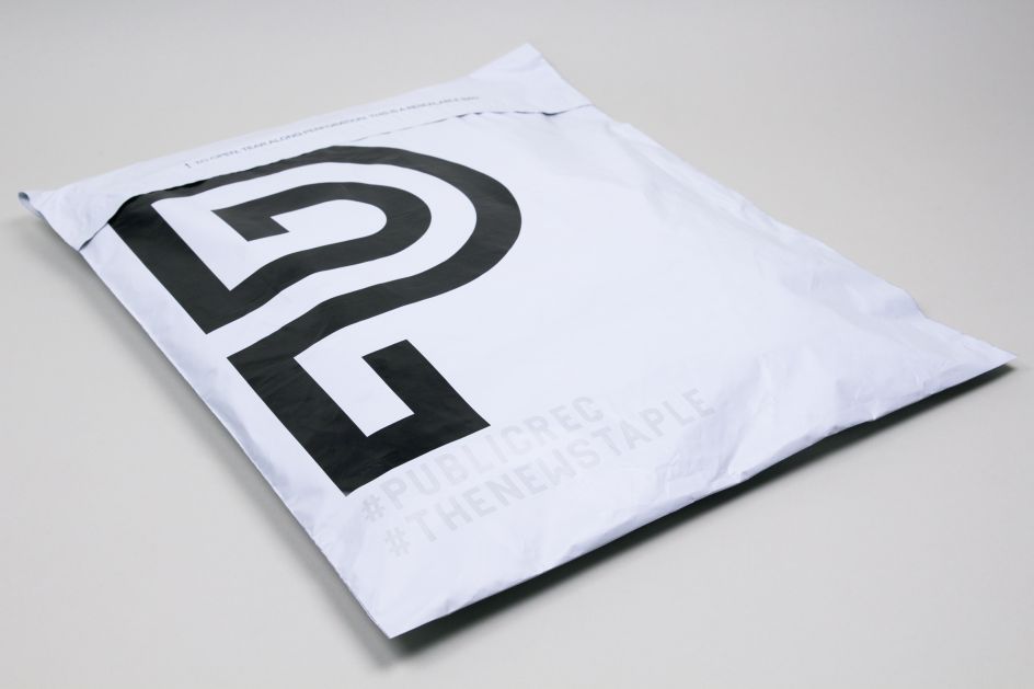
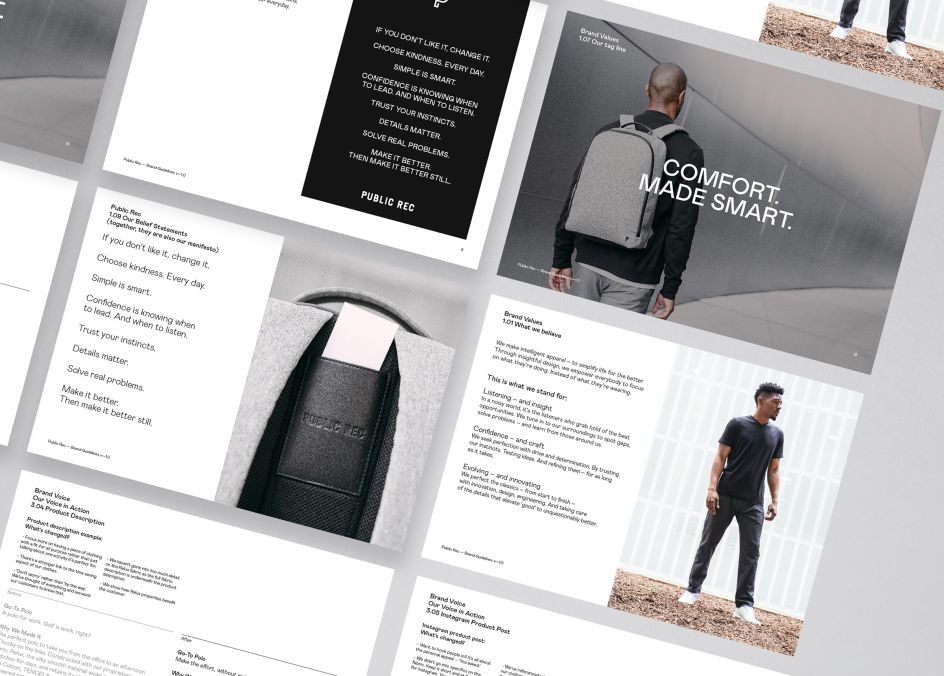
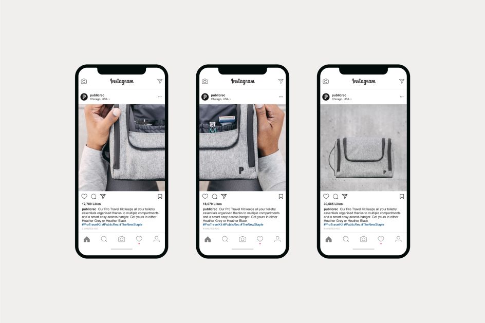
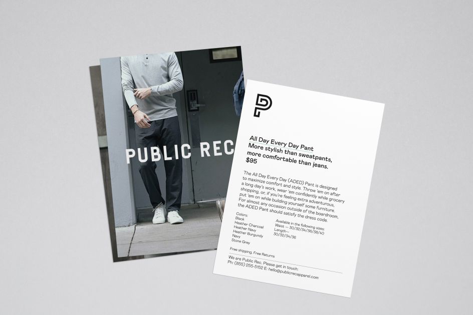
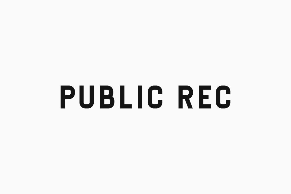
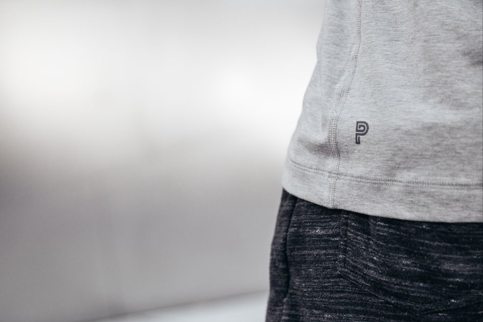
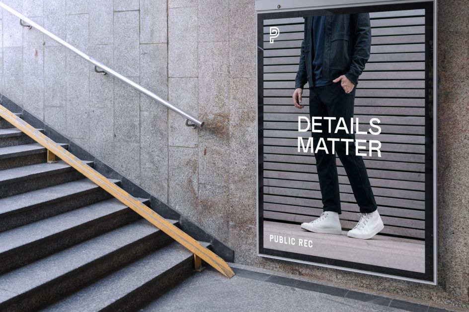
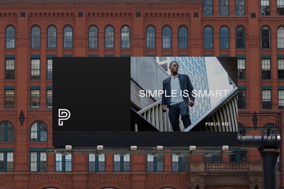
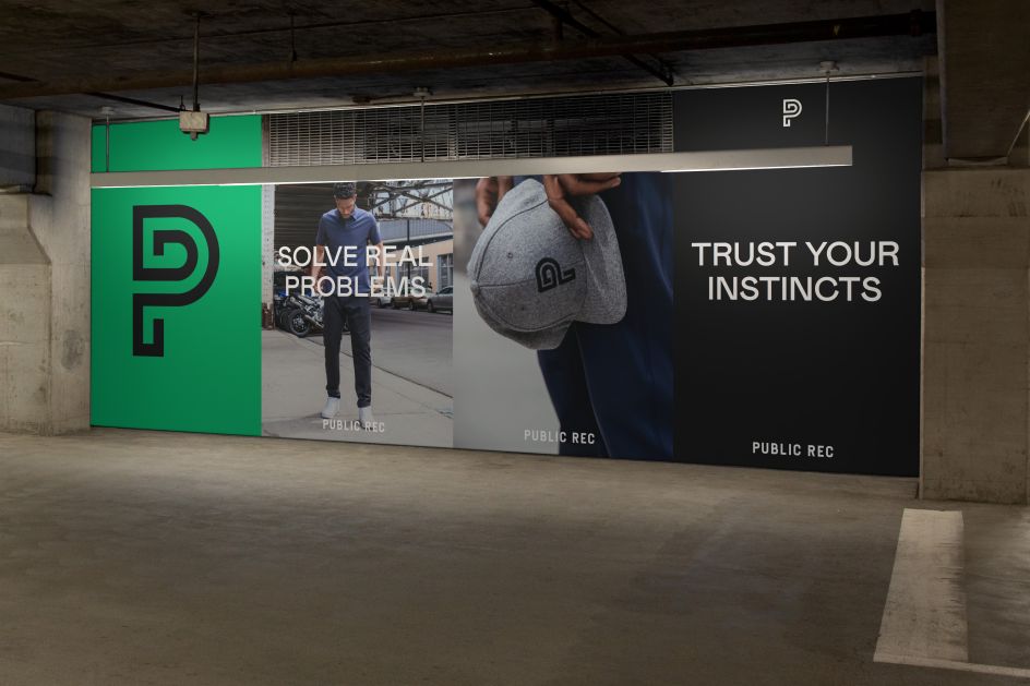
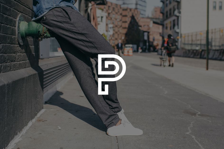
Build's identity is used across all touchpoints, encompassing a new logo, typographic system and colour palettes, image use guidelines and photographic style. The new look and copy approach aims to give the brand an ‘authentic, distinctive strategy, identity and voice’.
Nicky Place, co-founder and director at Studio.Build, says: “Having a simple visual system works so well for a brand like Public Rec – but the simpler the system is, the more perfectly it must be executed. Why use 20 colours when you only need three?
“That means really going deep in the initial research phase, carefully considering the solution and then executing fastidiously, paring back and finessing everything as much as possible.”
Reed Words created the “purpose” for the brand: “To simplify life, for the better.” The writing agency also developed a manifesto, tagline and belief statements that can be mixed and matched on advertising, social media, packaging and elsewhere.
Editor's Picks


Trending


](https://www.creativeboom.com/upload/articles/90/908fdb6378db1e95d12595416f54e6336d5e80b8_732.jpg)
Podcasts


Editor's Picks
Further Reading