Counter Studio creates new identity for designer-maker platform Look Like Love
London-based boutique branding and design agency Counter Studio has created new branding for Look Like Love, a platform that nurtures and promotes new, often graduate, designer-makers, as well as sell their work.
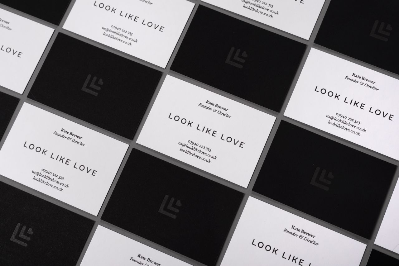
The agency looked to create a “more sophisticated identity to reflect the quality and craft of the products being showcased,” it says.
Look Like Love provides an online selling platform and support, as well as organising pop-ups and hosted events, and offer advice and guidance to emerging designers. “The aim is to help nurture new talent while making a curated collection of high quality, handcrafted, limited edition products available and affordable to a much wider audience,” says Counter Studio.
The agency was brought in by the brand’s new head of creative Charlotte Rushforth, who was looking to help redefine and refresh their identity after eight years since its founding.
“There’s such a high level of quality and care that goes into not only the products themselves but also the support and attention to detail the team at Look Like Love give to the designers, it quickly became clear that the previous identity was starting to show its age and was failing to live up to the aspirations of the brand,” says Counter Studio founder David Marshall.
“While the previous logo captured an eclectic sense of craft, it was lacking the sophistication, strength and flexibility to support the quality of the service, the products and the designers it represents.”
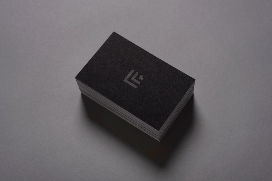
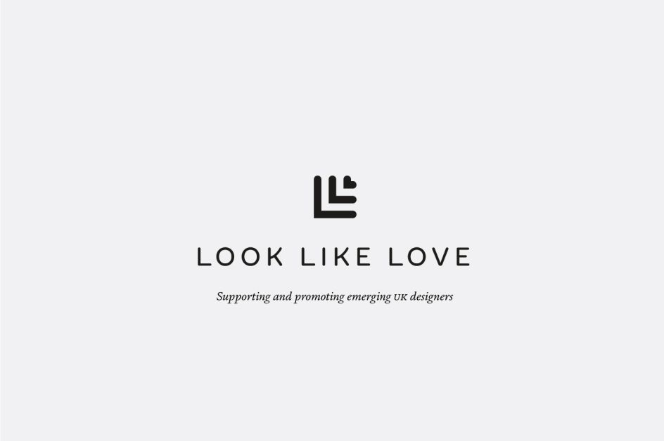
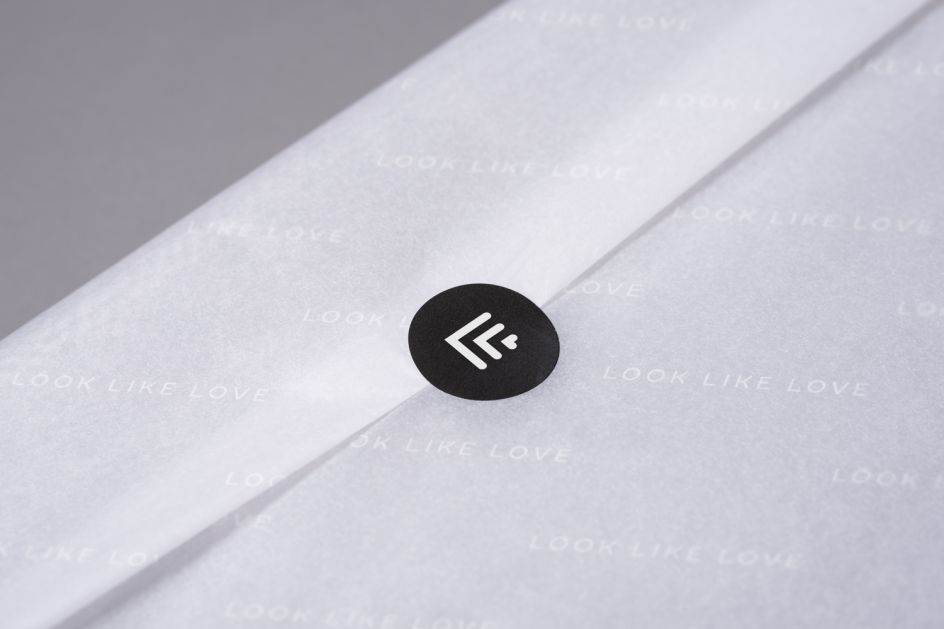
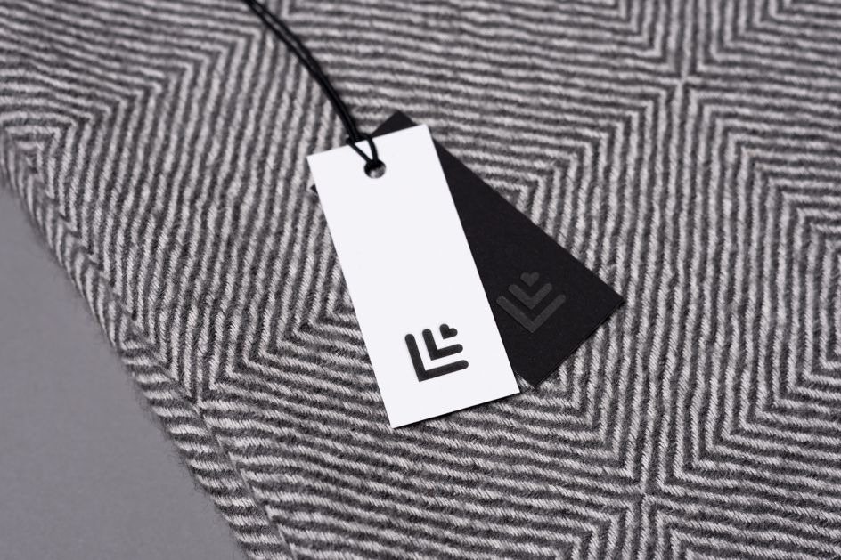
The new identity removed the “faux ‘craftiness’,” says Counter Studio, and moves things in a more sophisticated direction. The designs now use a pared-back monogram symbol created from the letters that make up the brand’s name, and this is supported with a customised logotype based on the Fontsmith typeface FS Aldrin.
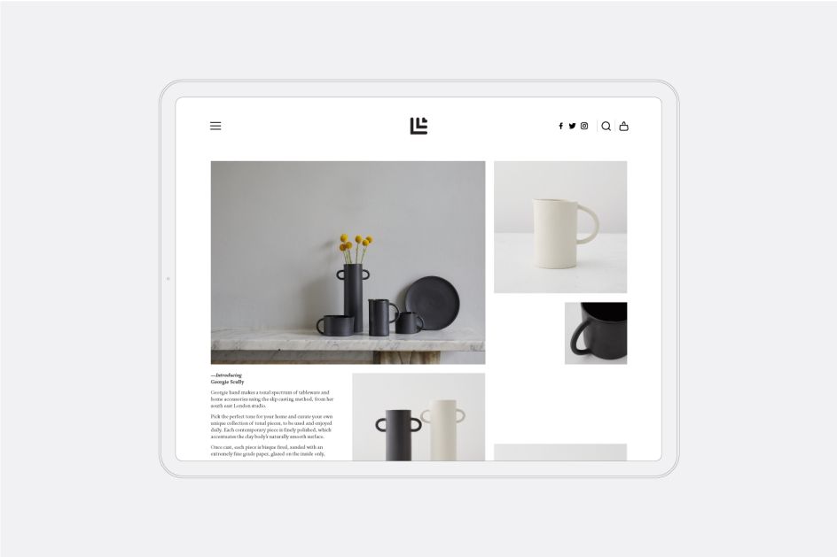
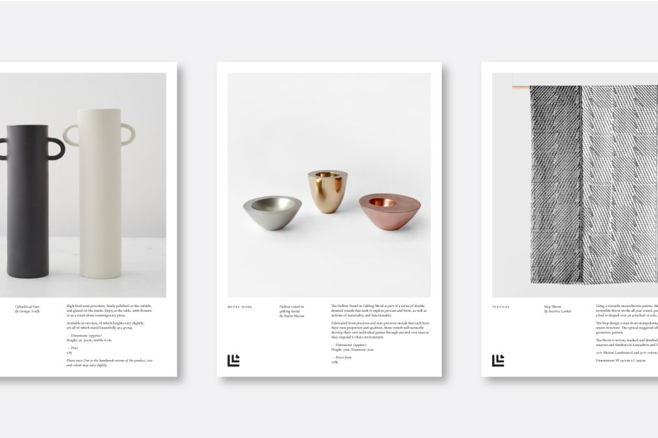
Minimal colours are used in the indemnity system to convey a sense of the quality of the Look Like Love designers and their work. Photography is key to the new identity, along with restrained layouts with more “classical typography,” says Counter Studio, to provides “a clean and elegant visual system that will hopefully help carry the brand forward to greater things.”

Editor's Picks


Trending


Podcasts


Editor's Picks
Further Reading