A simple identity design for demanding golf clients
FL@33 is a wildly comprehensive studio that apparently has more hours in the day than the rest of us, working across everything from print to branding, posters, illustration, moving image, website design, clothing, graphic art and its celebrated annual badge design competition.
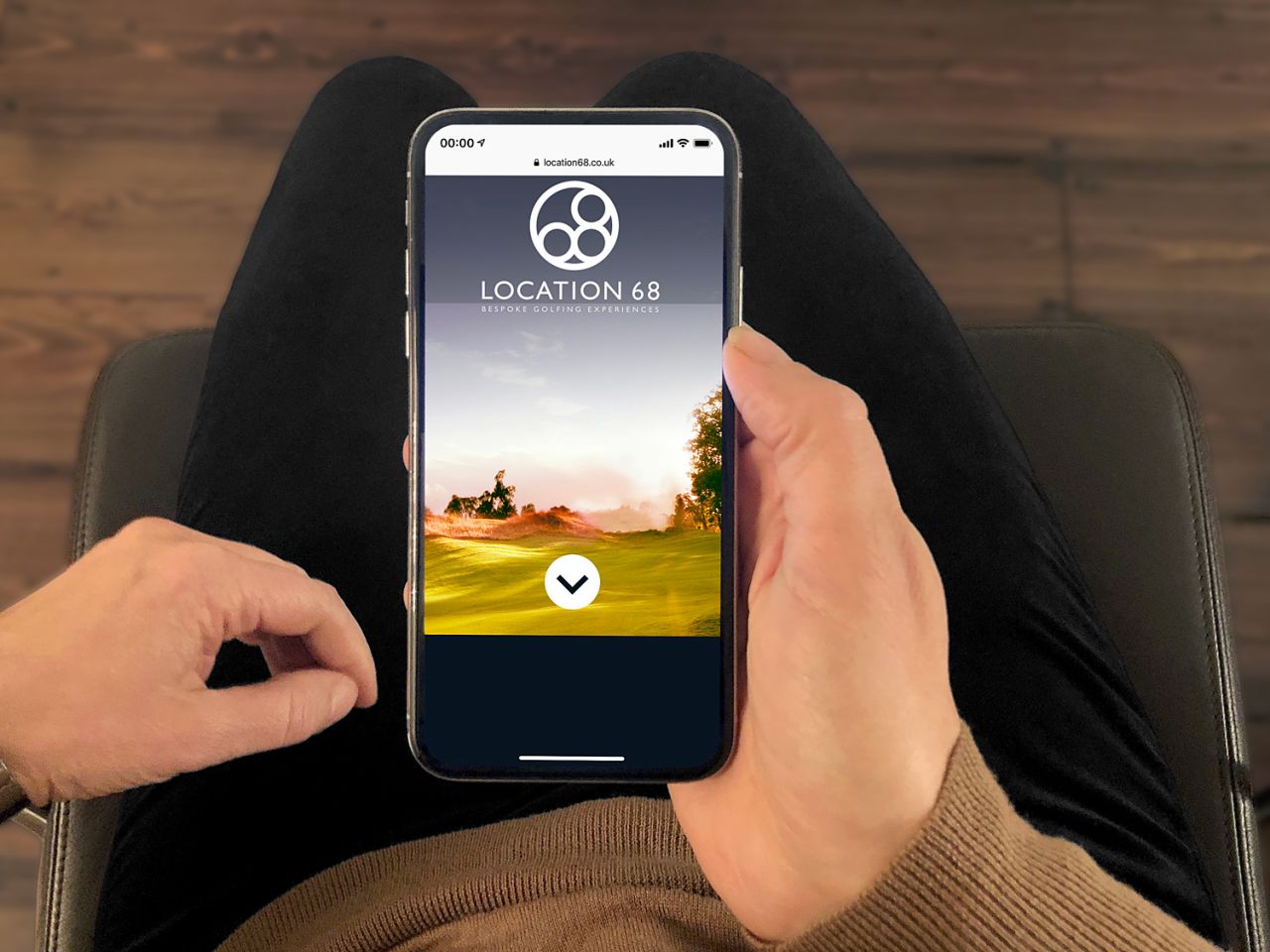
This year marks the design studio's 18th birthday, and one of the many projects it’s showcasing to celebrate finally being able to vote, drink in pubs and so on is its new identity for UK-based Location 68, a new consultancy for bespoke golfing experiences.
The studio was briefed to create a simple, yet sophisticated and versatile new logo for the brand, and a simple, easily navigable website too. The visual identity had to be “appropriately elegant, contemporary, yet timeless”, says FL@33, aiming to help Location 68 “communicate their luxurious bespoke services with the right tone of voice for their demanding clients.”
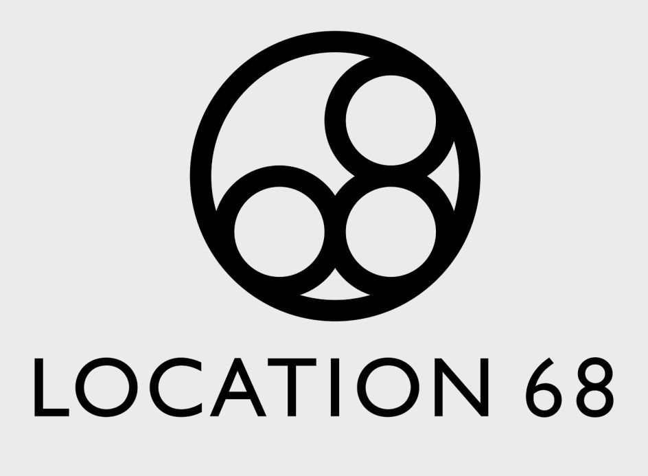
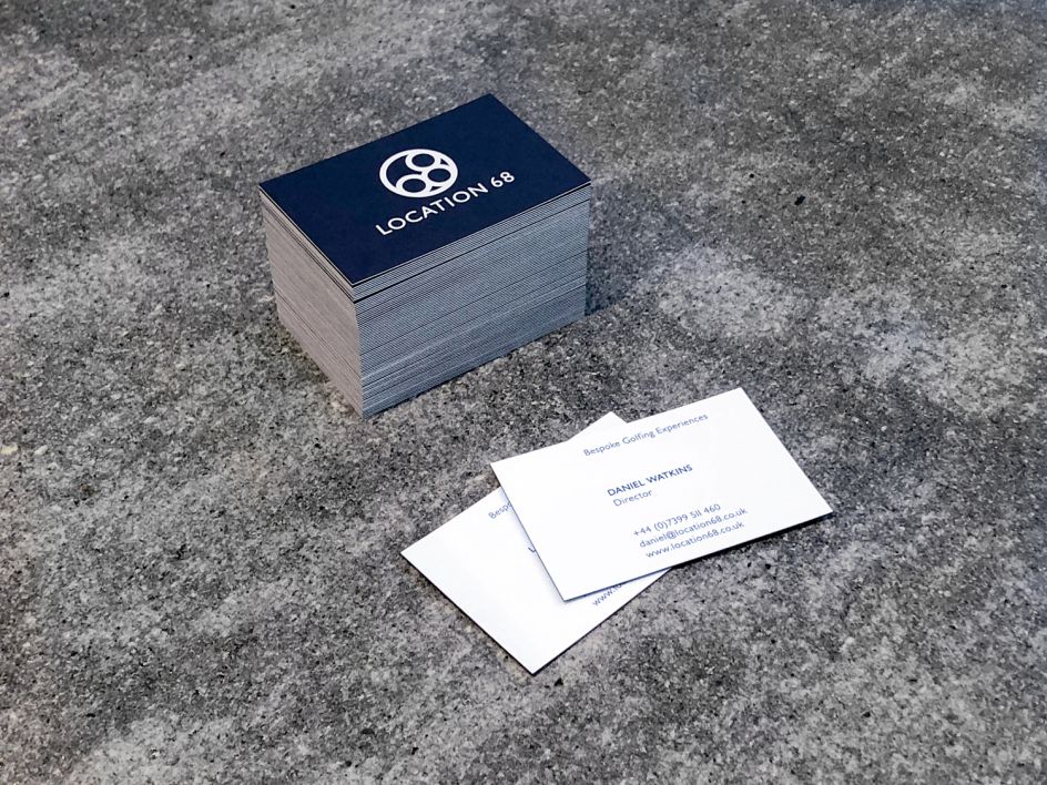
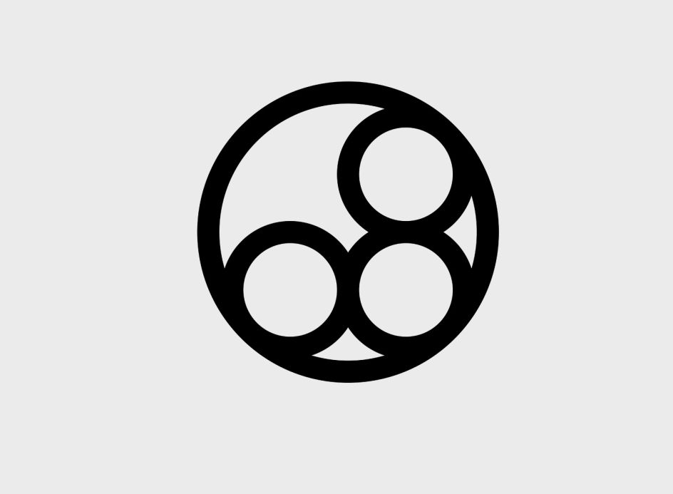
The minimal new logo is striking but powerful and works across a vast range of applications and colour palettes from stationery designs including digital letterhead templates and elegant printed business cards to digital touchpoints.
The website places the logo as part of a wider design overhaul that looks to act as an “online business card for existing and potential customers” to explore the brand’s bespoke services.
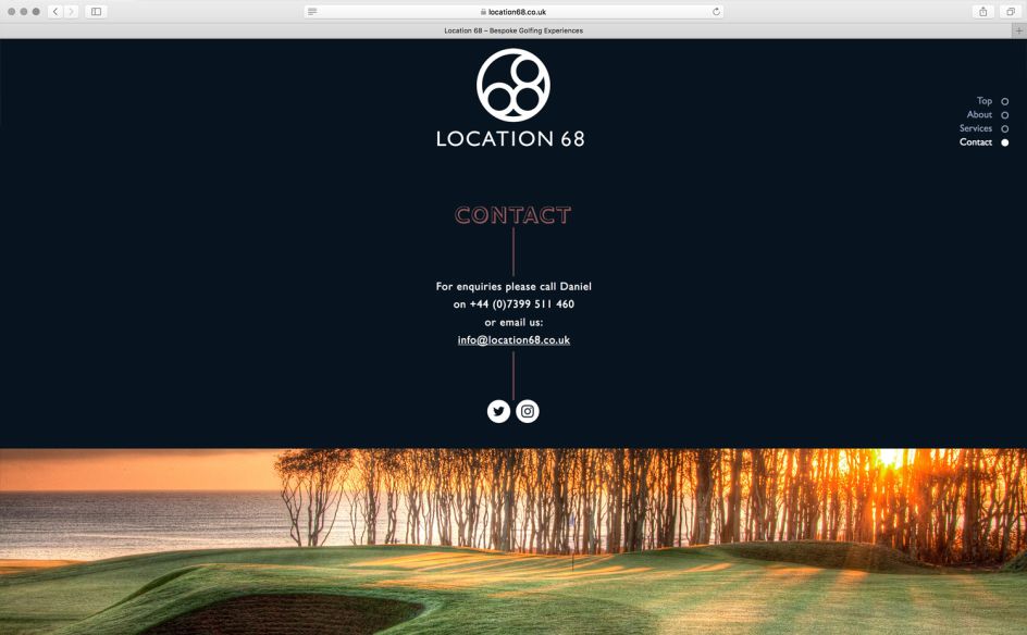
The brand’s key fonts are Gill Sans MT Pro Medium and the playful display typeface Gill Sans Shadow MT Pro, which are also used across the site.
“The responsive website was optimised for desktop browsers where the site's parallax effect adds an extra touch to the design,” says FL@33. A touchscreen version for iPhones was also developed.
Editor's Picks



Trending



Podcasts
Editor's Picks
Further Reading
](https://www.creativeboom.com/upload/articles/90/908fdb6378db1e95d12595416f54e6336d5e80b8_732.jpg)