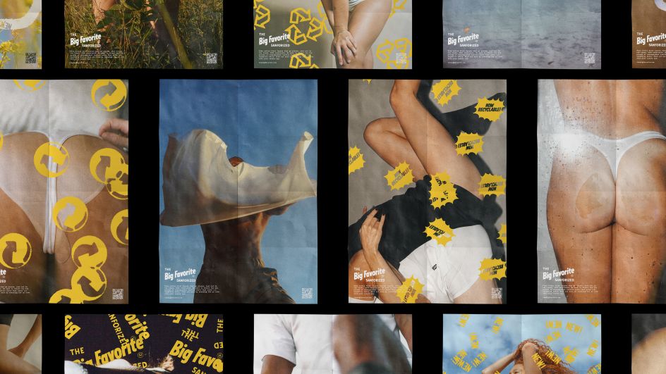
Retro but modern branding for a brand of underpants made of underpants
Based in Boston, Massachusetts, independent design studio RegretsOnly works on brand identities and graphics for clients ranging from the New York Times to 21st Century Fox to Daniel Lopatin (also known as Oneohtrix Point Never), one of Warp Records' many esoteric and rather brilliant acts.
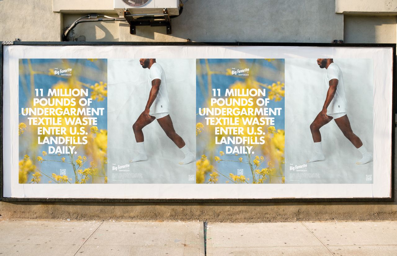
The studio recently launched some lovely new work for The Big Favorite, a workwear brand originally founded in the 1930s, for blue-collar workers—"a brand synonymous with value, craft and durability," says RegretsOnly.
The Big Favorite was acquired by Dickies, though the brand recently re-launched thanks to the founder Lawson Turner's great grand-daughter, Eleanor, with a new focus: circularity.
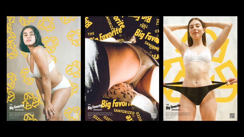
Brand photography by Breanne Furlong Parker
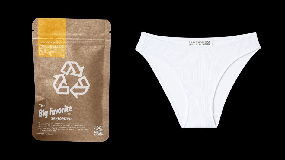
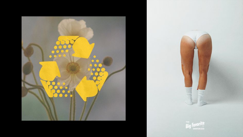
This means that at the heart of its values is helping divert the 11 million pounds of textiles from discarded undies that the US produces each day, which goes into landfill and is a hell of a lot.
"We saw an opportunity to deliver on that mission by creating a brand that isn’t just inspired by circularity, but is itself recycled," says agency founder Caleb Halter. The resulting identity uses a photographic approach, and what Halter describes as a "lively mix of familiar and unexpected."
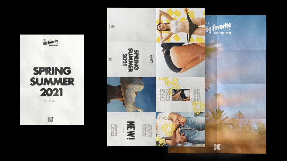
Eleanor provided many references to the original branding in scrapbooks and other memorabilia, and the designers worked from source material presented on a single slide to bring it to life for the relaunch. "By mining graphic ephemera from the past, each piece carries an unmistakable nostalgia, while leveraging randomised generative compositions, brand applications feel anything but—each an exercise in turning found elements into something new and unexpected," says Halter.
The logo was reused from the original, in a nod to the brand's focus on circularity. It's described as a case of "if it ain't broke don't fix it", and the new designs use the spirit and charm of the original to guide the rest of the work. It was important to the team not to impose anything extraneous to the strong foundation of existing elements.
The typefaces used are the typewriter-style font Pitch, from Klim Foundry, and Futura. The idea was to create something that glued together the "distinctly retro" graphics with the very current-feeling photography style. "Futura does a great job of being a very chunky, sturdy headline that doesn't have too much of its own flavour aside from the slightly-worn treatment, while Pitch is meant to serve as a more machined blue-collar sidekick, filling in all the technical details," Halter explains.
"This was really inspired by the treatment developed for rendering all the stamps, a sort of hyper-contrast xeroxing which helped unify the look of graphic elements that ranged widely in style and source-quality (most of the stamps were generated from iPhone photos!). By using the same look on the type, I think it helped all the graphics within the system gel nicely so that the type felt of the same DNA as the stamps."
The colour palette was chosen as part of the brandings' wider aim to keep things simple and "iconic" to establish clarity and create a strong image in people's minds. The yellow band colour is described as "rainbow yellow"; selected for its universality across genders and ages, and the fact it's not directly telling people "what you're meant to feel." Instead, the tone lets the photography do most of the communicating while also adding a sense of character and fun.
Packaging designs also look to be impactful, simple and striking. There was a bit of debate about the prominence of the recycling icon on packs since it isn't "ownable" for the brand, "but in this context, especially next to something like Hanes, that icon is what makes The Big Favorite special," says Halter.
At the heart of the branding is the photography style, which feels very modern compared to the vintage-leaning graphic elements. Campaign imagery was created according to a comprehensive style guide that defined what was shot, the cropping or framing of those images, and the style, treatment and final colour correction.
Editor's Picks


Trending


Podcasts


Editor's Picks
Further Reading