Applied Design gives JFK's Terminal 8 a brand that's unmistakably New York
The local studio has reimagined the terminal from the ground up, with a plane-window-view palette of blues, custom patterns hiding the number eight, and a voice that speaks fluent Queens.
JFK Airport is a bit of a homecoming for New Yorkers. It's also the jump-off point to the rest of the world. Although it's very nice to go travelling, no matter where you're headed or where you're from, you don't want it to be difficult. You want the entire journey to be as smooth as possible.
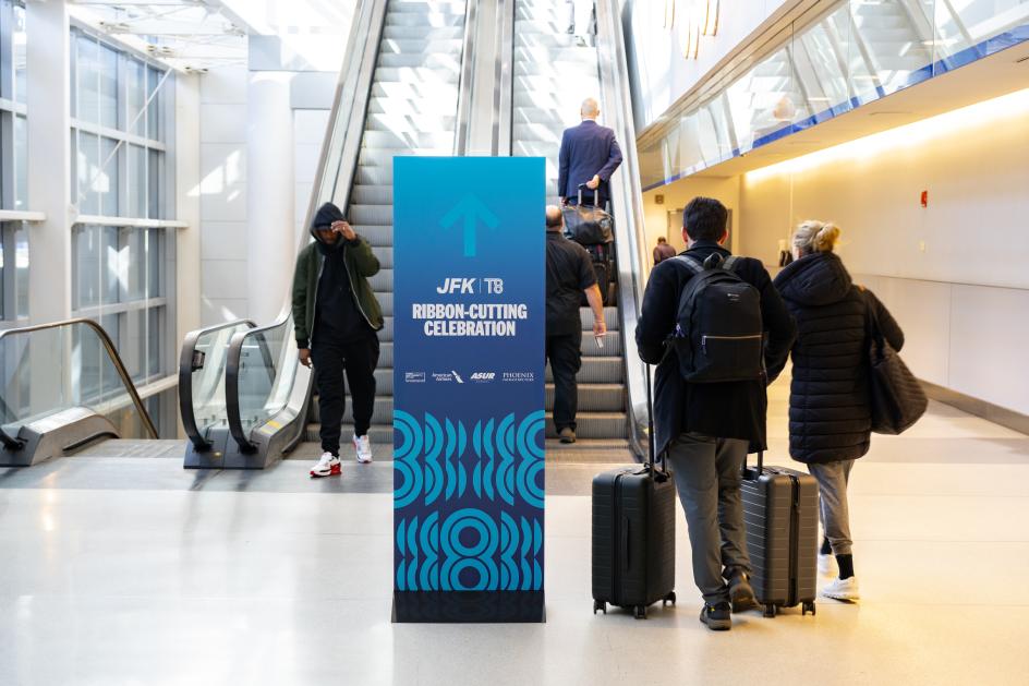
It's why the Port Authority, American Airlines, ASUR and Phoenix Infrastructure have unveiled their transformation of JFK's Terminal 8, as part of a $125 million investment and grand opening. It's the first completed project in a wider $19 billion redevelopment that includes two expanded and modernised terminals, two new terminals, and a new airport roadway network. They certainly mean business.
Whilst that's all well and good, what we're particularly interested in is the refreshed brand, led by Applied Design, and how it's made travel a more pleasant experience for everyone. It was quite the challenge, the studio says, as an existing identity was already in place, requiring a careful audit to determine what should be refined versus what should be replaced.

Call it an evolution rather than a teardown. The result pulls more than 60 retail and dining offerings into one coherent system – from a Dior-and-Chanel beauty hall to the new Boroughs Foodhall – while celebrating the spirit of Queens and resonating with the millions of travellers passing through the terminal each year.
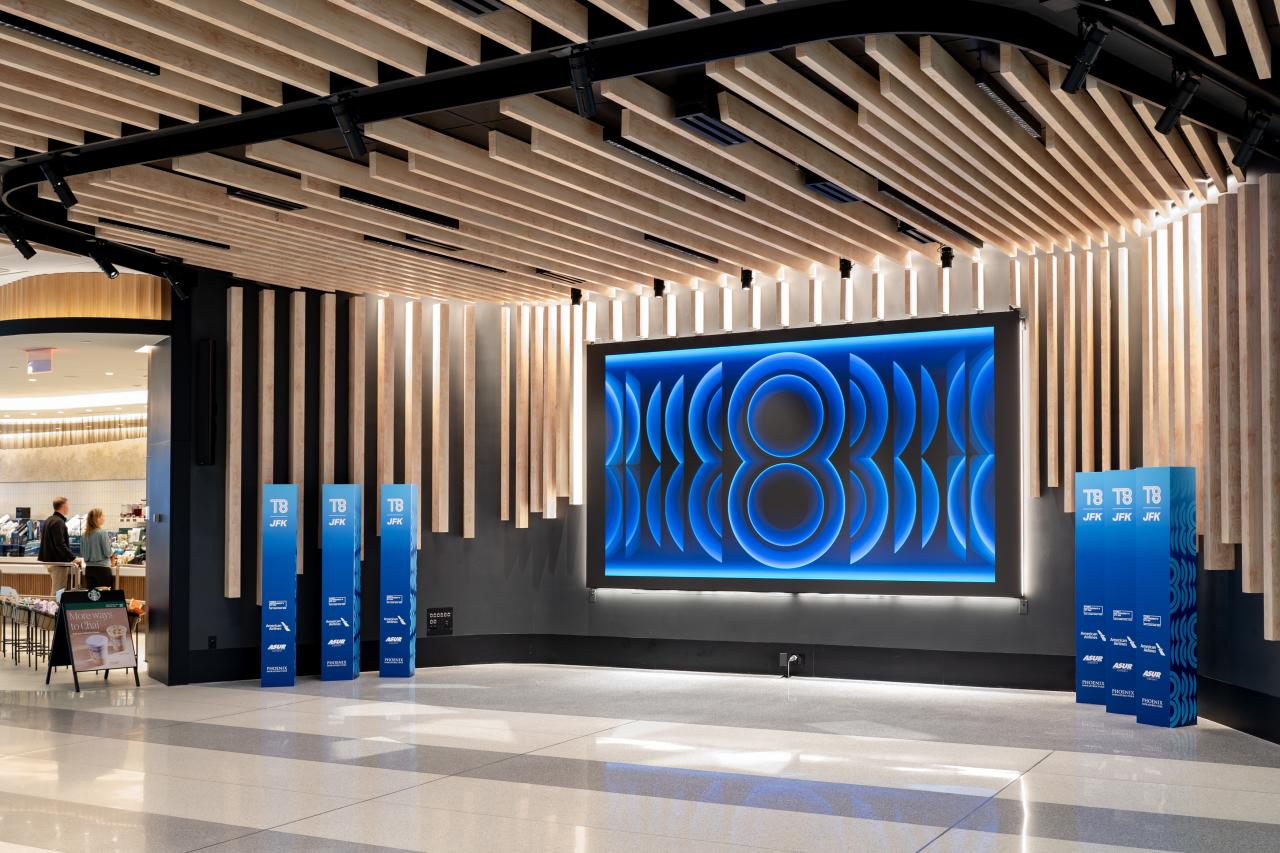
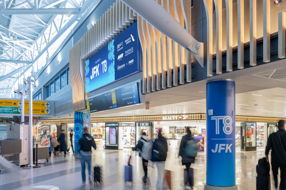
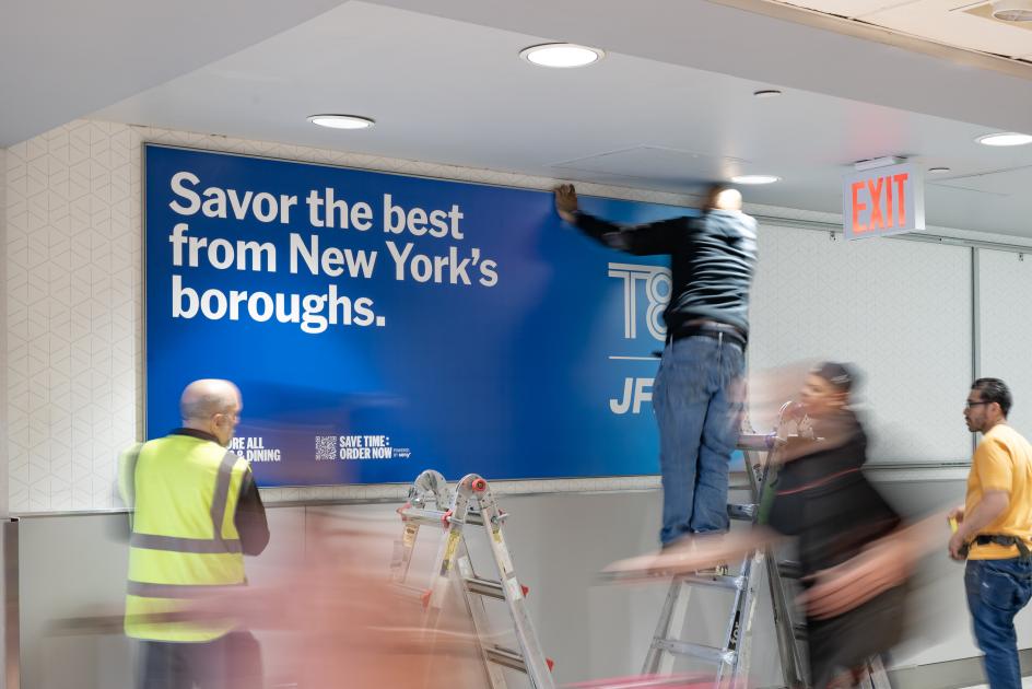
The new branding system is entirely fresh and carries an authentic New York voice both visually and verbally. A colour palette inspired by the view from a plane window (think lots of blues) brings a sense of motion and atmosphere. At the same time, a custom, wavy figure-eight motif runs down the freestanding pylons and wraps the towering 'T8' columns – the number hidden in plain sight throughout.
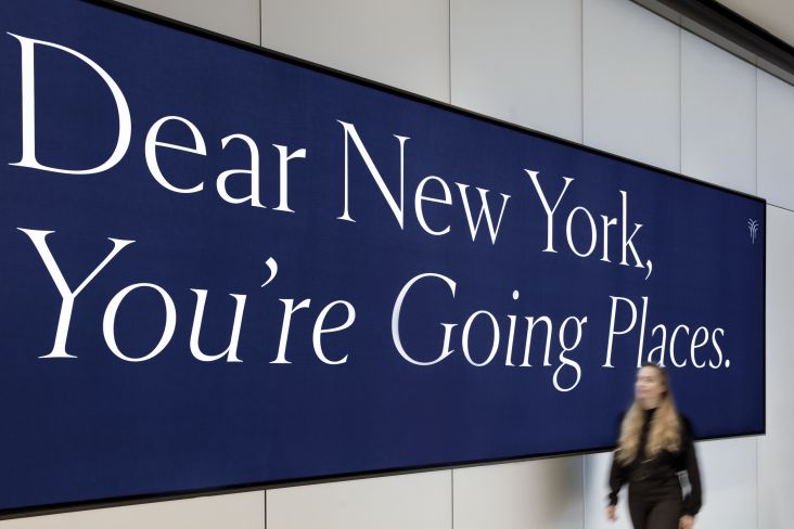
And that New York voice isn't just a claim; it's right there in the copy on the walls. "Savor the best from New York's boroughs," reads one graphic, tying the wayfinding straight back to that Boroughs Foodhall. "From the overarching concept to the smallest detail, every element has been intentionally designed to elevate the traveller experience," the studio explains.
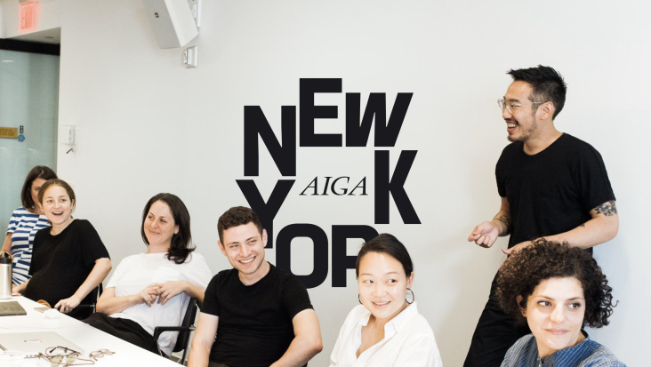
This isn't the first time Applied Design has helped shape New York City's transport hubs. It's reimagined the new World Trade Center as a place full of energy and excitement. It's created the wayfinding and placemaking experience at Grand Central Terminal. Terminal 8 completes a happy trio of projects that touch millions of New Yorkers and global visitors every year. That's something for any discerning design studio to be proud of.
Editor's Picks


Trending


Podcasts


Editor's Picks
Further Reading