Hex's new identity for Black Jays is inspired by the 'subtle chaos' of family life
A venture capital firm aimed at family-oriented startups, Black Jays, wanted a new brand identity to better convey its mission. American studio Hex explains how it responded to the brief.
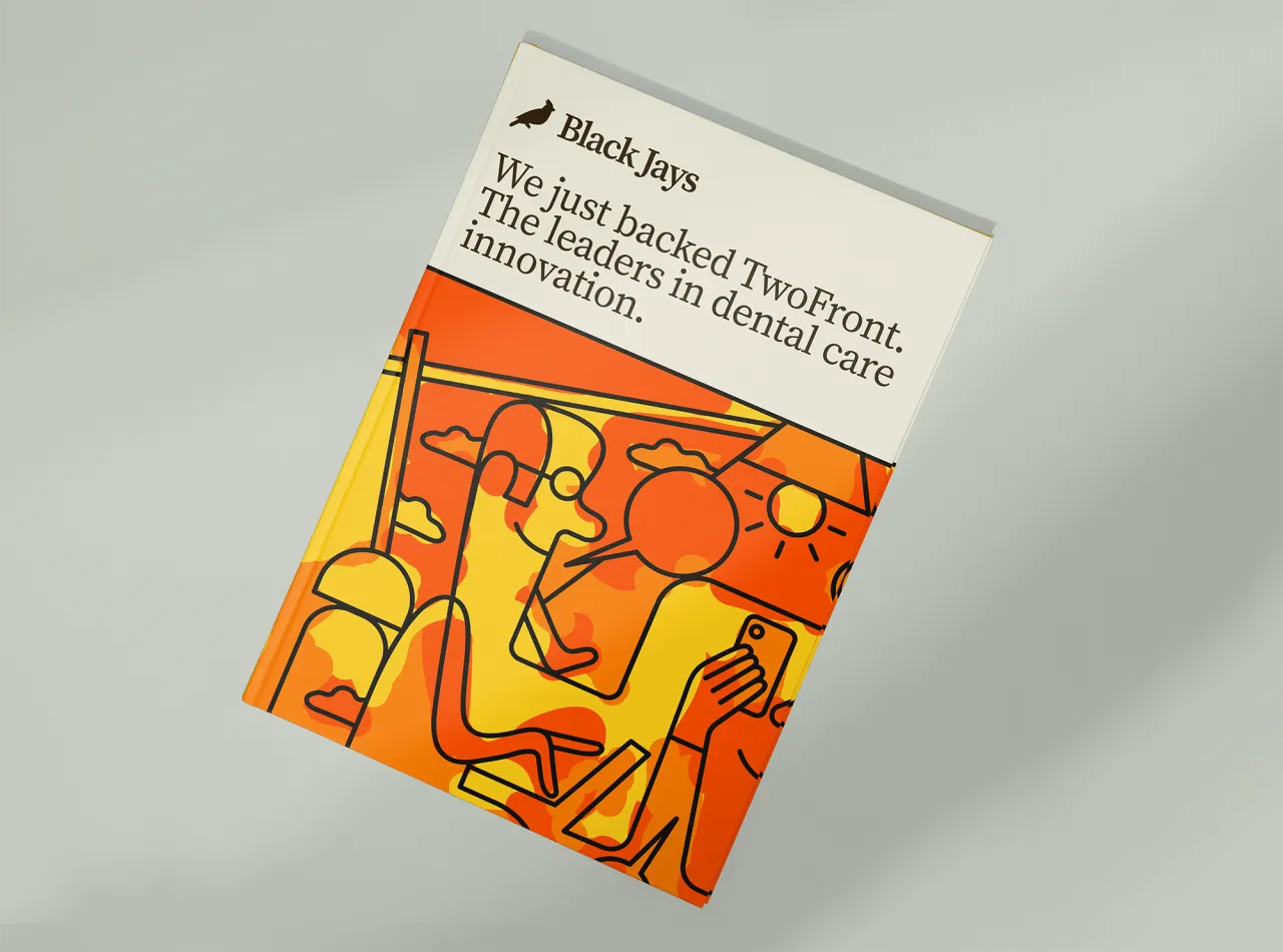
On the whole, our society doesn't spend a great deal of time celebrating financiers. In movies, for instance, they're more likely to be the hero than the villain. Indeed, in real life, even those who helped the movie get made aren't exactly celebrated. There's no Oscar, after all, for producers.
Without these individuals and companies, it would be exceedingly difficult for most businesses to grow and develop. Yet most work quietly behind the scenes, with few people knowing their names.

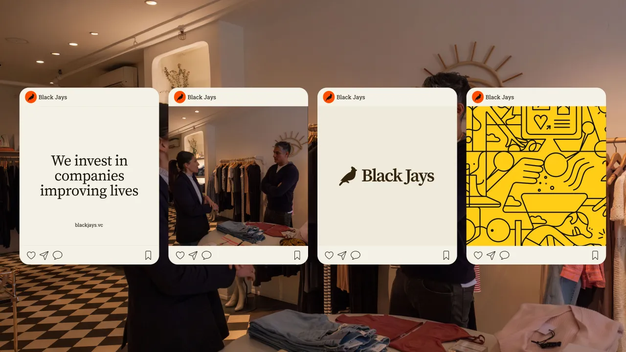

Take Black Jays: a New York-based venture fund investing in consumer companies that are "building the future of the family" in fields such as dental care, pet care, education and family investments.
Playful yet subdued
Recently, Black Jays turned to Hex, a small independent design and brand-building practice founded in 2021, to help them promote and visualise their vision.
"We're an experimental studio working on visually interesting identities, websites, and products," says founder and creative director Ayush Soni. "And we collaborate with a ton of venture funds and tech companies on rebranding projects."
The VC firm reached out to Hex to help them visualise their new thesis with a new brand identity, messaging, fund website, pitch deck, internal collateral and illustration system.



"We took this brief and produced a playful yet subdued identity for the fund that could evolve with their needs," says Ayush. "We refreshed their Jay mark, expanded the colour system, and paired a readable serif with a fancier one."
Subtle chaos
"Black Jays' brand was primarily inspired by what makes families special: subtle chaos," Ayush continues. "We wanted to bring that expressive and playful energy to the brand with those bright colours, paired with subdued and classy serif typography.
"Our aim was to bring this calm, playful balance to all brand touchpoints and create a unique look for Black Jays."

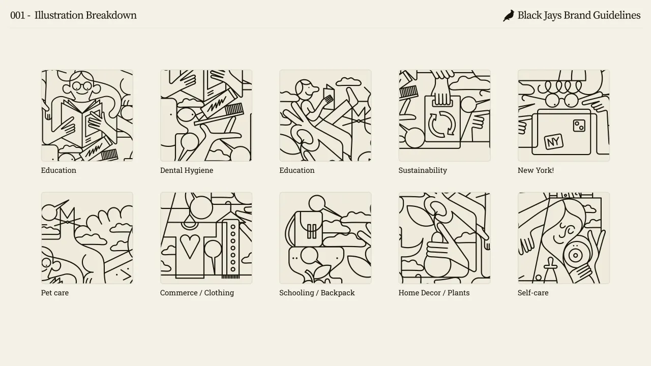

The studio collaborated with illustrator Jonathon Calugi, who brought the brand to life with this expressive yet monotone illustration system.
"The connected line illustrations are a nod to a family's tight-knit environment, with every piece tying into the next in harmony," says Ayush. "School bags, dog collars, diapers, and face creams all intertwined into one another to highlight some of Black Jays' portfolio companies.
"We also worked with Marcella Winograd to capture a fresh series of images with Black Jays that reflected our brand. Their new website is live at blackjays.vc. On a personal note, this was a very exciting project for our small team, and we're really happy with the result."

Editor's Picks





Trending






Latest Jobs
Art Director at The New York Times
Full-time·New York·$120k–$130k
Principal Software Engineer at BBC Media Tech
Full-time·Glasgow·Up to £83,790
Senior Digital Designer at Red Antler
Full-time·New York·$95k-$130k
Art Director at SPOKE
Full-time·London·£55k-65k
Client Partner at Halo
Full-time·Bristol·£30k–£36k
Talent Agent & Producer at The Jacky Winter Group
Full-time·Los Angeles·$70k-$85k