16 of the sweetest business card designs from some of the world's best designers
Business cards were once deemed dead. Not anymore. They're back in a big way. If you're looking to design your own, here are some great examples to inspire.
](https://media.creativeboom.com/7a1e2857-b4fe-4532-b27a-44aad620d310/conversions/1534a8a570312292c43f74da9968eac42becfa65-medium.webp)
We Make Stuff Happen by Maddison Graphic
Haven't you heard? Business cards are making a comeback. Yes, really. The global pandemic, not that we like to mention it, put a stop to all in-person events. But now they're back, and increasingly so, people are out networking again. Myself included.
The one thing I keep hearing from all the recent conferences, festivals, and talks I've been to is how nice it is to hand something real to the people we meet. A little card of information, beautifully designed and printed on the kind of material that makes designers let out a happy sigh (Laura Boast, I'm talking to you).
I came back with dozens of gorgeous business cards from Pictoplasma in Berlin and OFFF in Barcelona. And it got me thinking, perhaps it's time we pulled together a fresh list of excellent business card designs to inspire you to create your own. The following are either classics from the archive or fresh offerings that caught our eye.
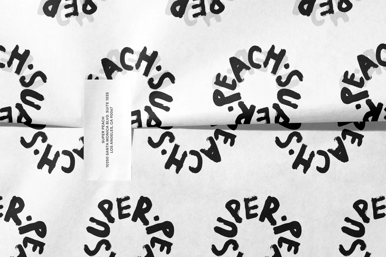
1. Super Peach by Pentagram
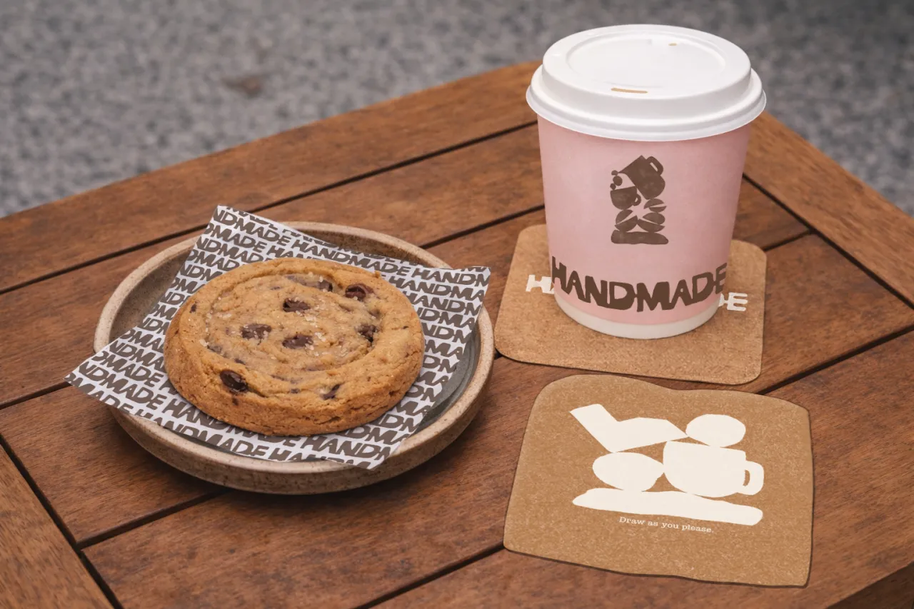
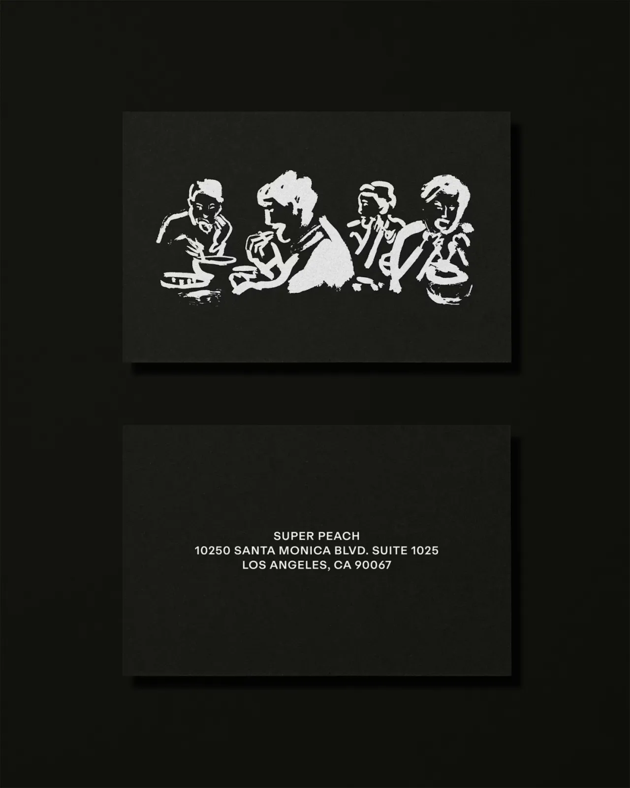
For Momofuku's all-day LA restaurant Super Peach, Matt Willey's team at Pentagram built an identity around contrast – a whole family of hand-drawn, off-kilter wordmarks (with illustrator Pol Montserrat) that stretch, squash and jitter, set against a strict black-and-white palette.
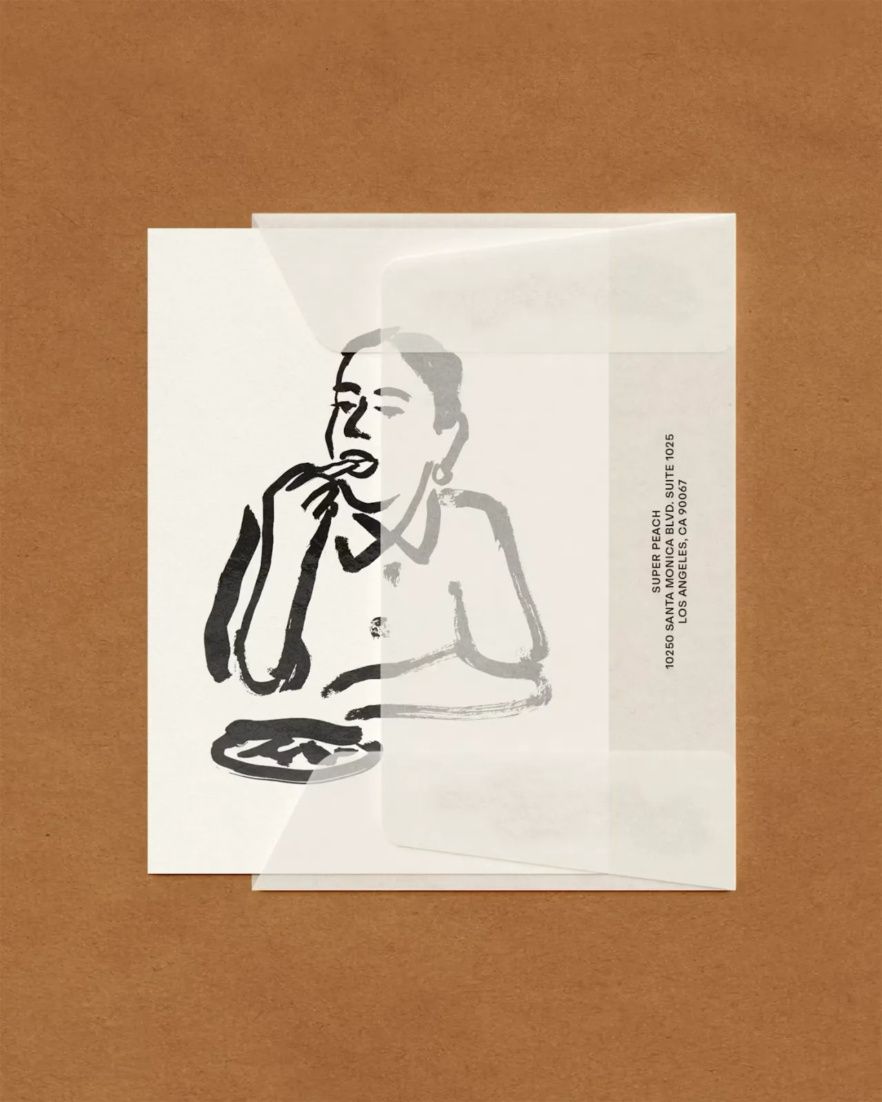
The business card and letterhead keep it gloriously restrained: brown paper and off-white stock letting the wonky lettering do the talking. As the studio explains, the "hand-drawn wordmarks [can be]... used interchangeably throughout the system, creating a dynamic identity that complements the restaurant's energy."
We especially love the accompanying invites and the simple, black-and-white packaging for takeaway food. Not to mention the gorgeous postcards, featuring Pol Montserrat's beautiful work, front and centre.
2. Bec Brittain by Lotta Nieminen
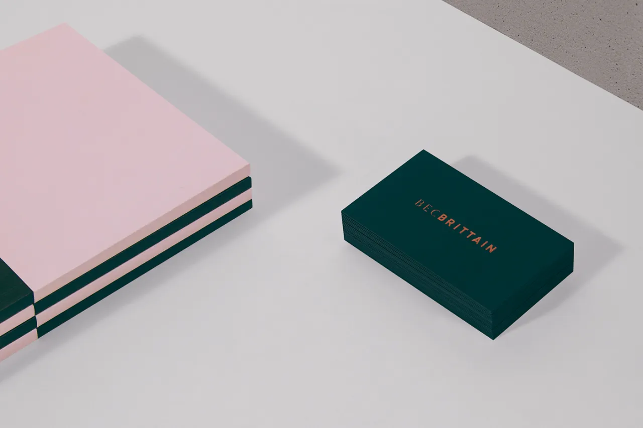
One from Lotta Nieminen's archive, this business card design is for Bec Brittain, a New York-based lighting and product designer who is "driven by luxurious materials, intuitive forms and forward-thinking technology".
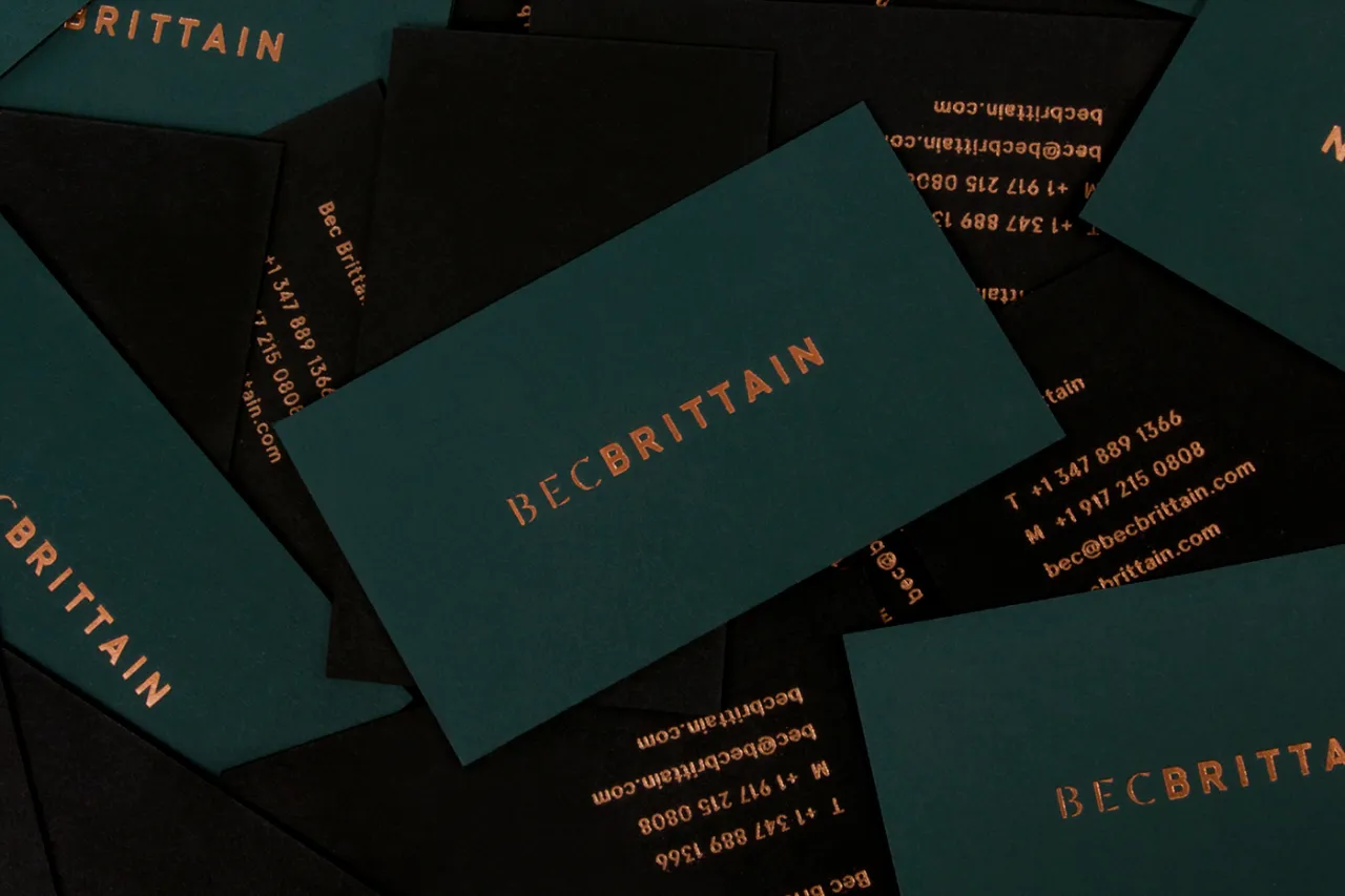
According to Nieminen, the studio explores and experiments with new techniques and materials, "pushing the boundaries of American-made, centrepiece lighting design". As such, the designer opted for luxurious vintage green hues and a gold/bronze foil featuring the uppercase logo, which comprises two different typefaces to highlight her client's name.
Product photography is by Lauren Coleman. Check out Nieminen's website to see the full project in effect.
3. Pino by Bond
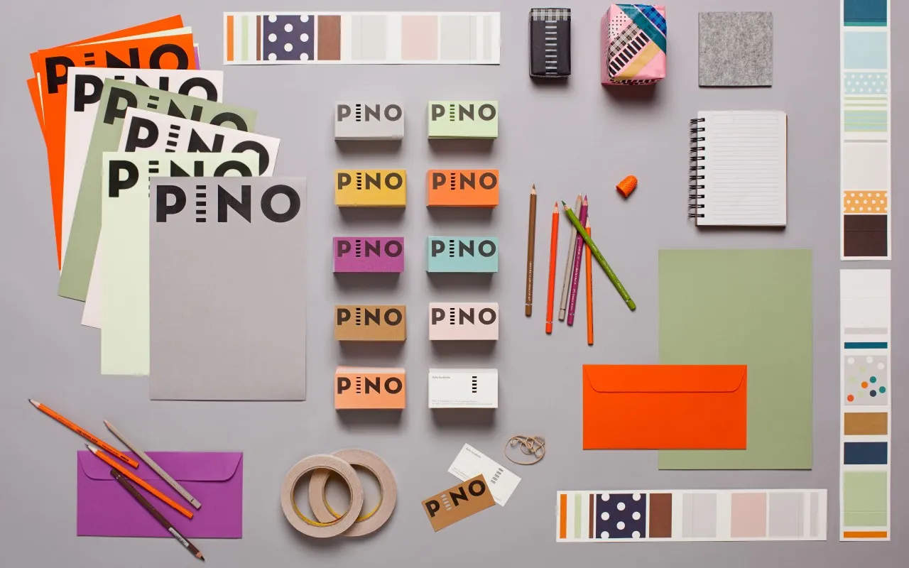
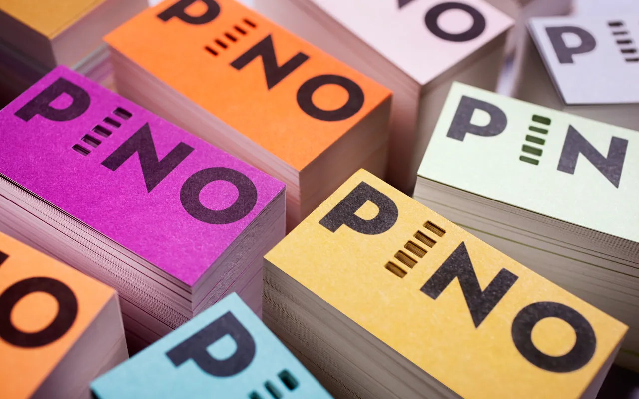
Probably the most colourful example in the bunch, these business cards are for Pino by Bond, a Helsinki-based design studio that is doing some brilliant things in the design world right now.
The work is for the interiors shop Pino, a Finnish word meaning 'stack' or 'pile'. This name inspired the whole store and brand concept, from the logo to the shop fixtures – all crafted by Bond when it was called upon to develop its new identity.
"The interior design, with its subtle colour and material palette, works as a neutral background for the playful, colourful visual identity and products," Bond explained. Photography is by Paavo Lehtonen.
4. Mattias Jersild by BVD
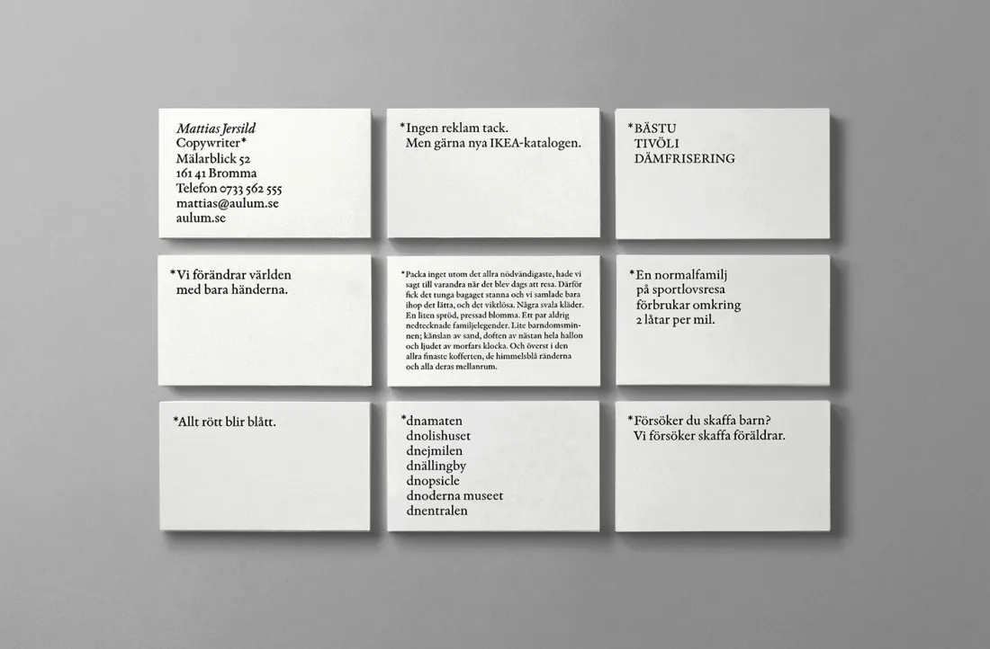
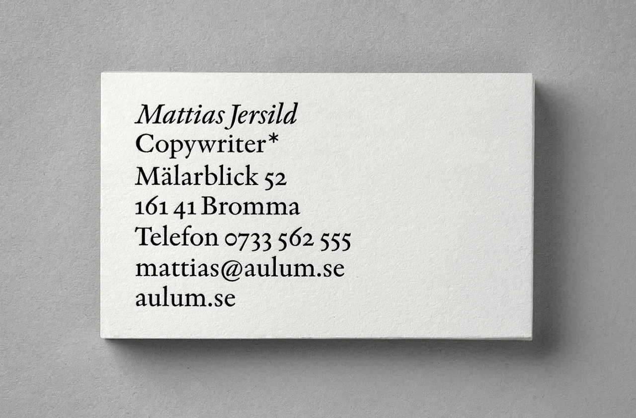
Stockholm's award-winning studio BVD crafted this minimalist design for Mattias Jersild, known locally as "Sweden's best copywriter".
Restrained and beautifully laid out, this business card might not look like much, but to the designer's eye, it's perfect. We're surprised it's no longer on BVD's portfolio. But to be honest, it's a pretty old project. We just had to include the work, as it's such a perfect demonstration of turning something so simple into an elegant piece of art.
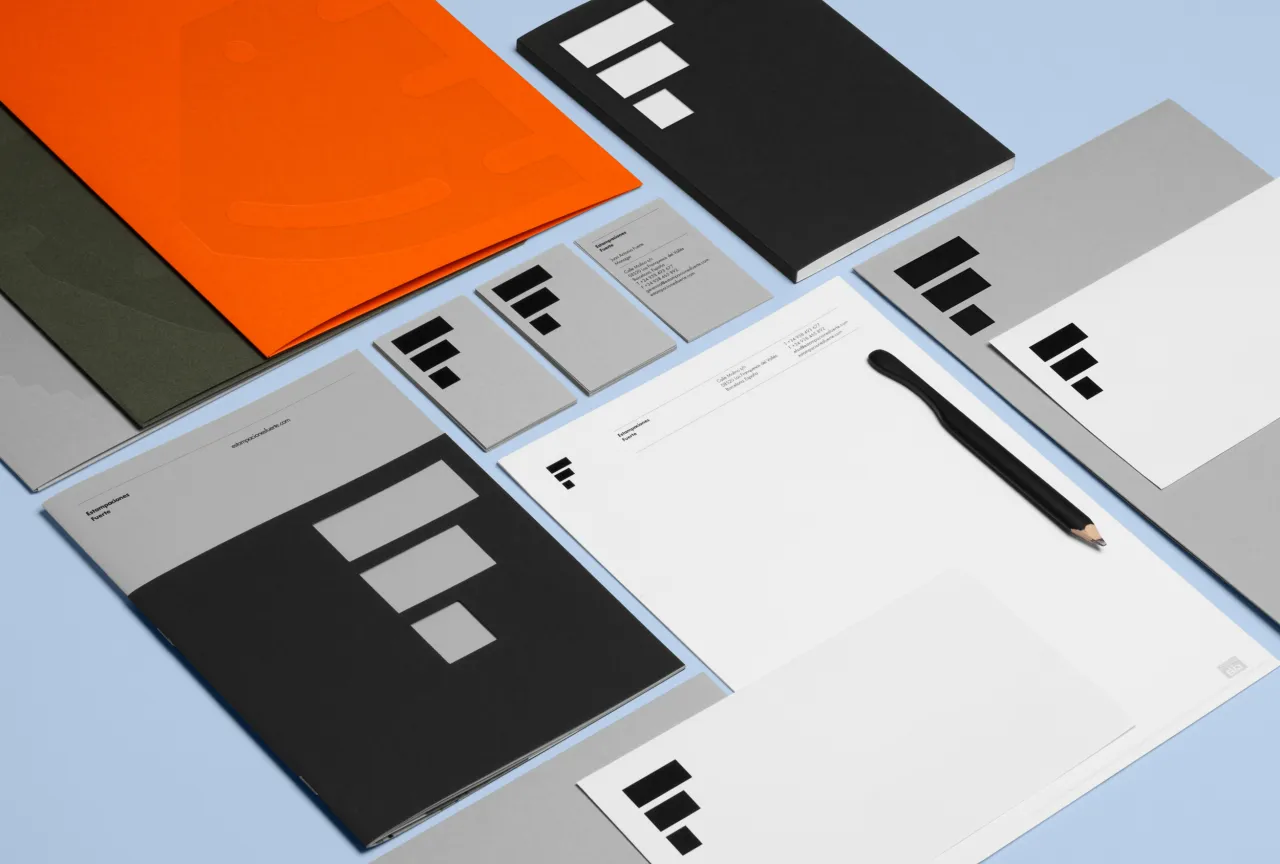
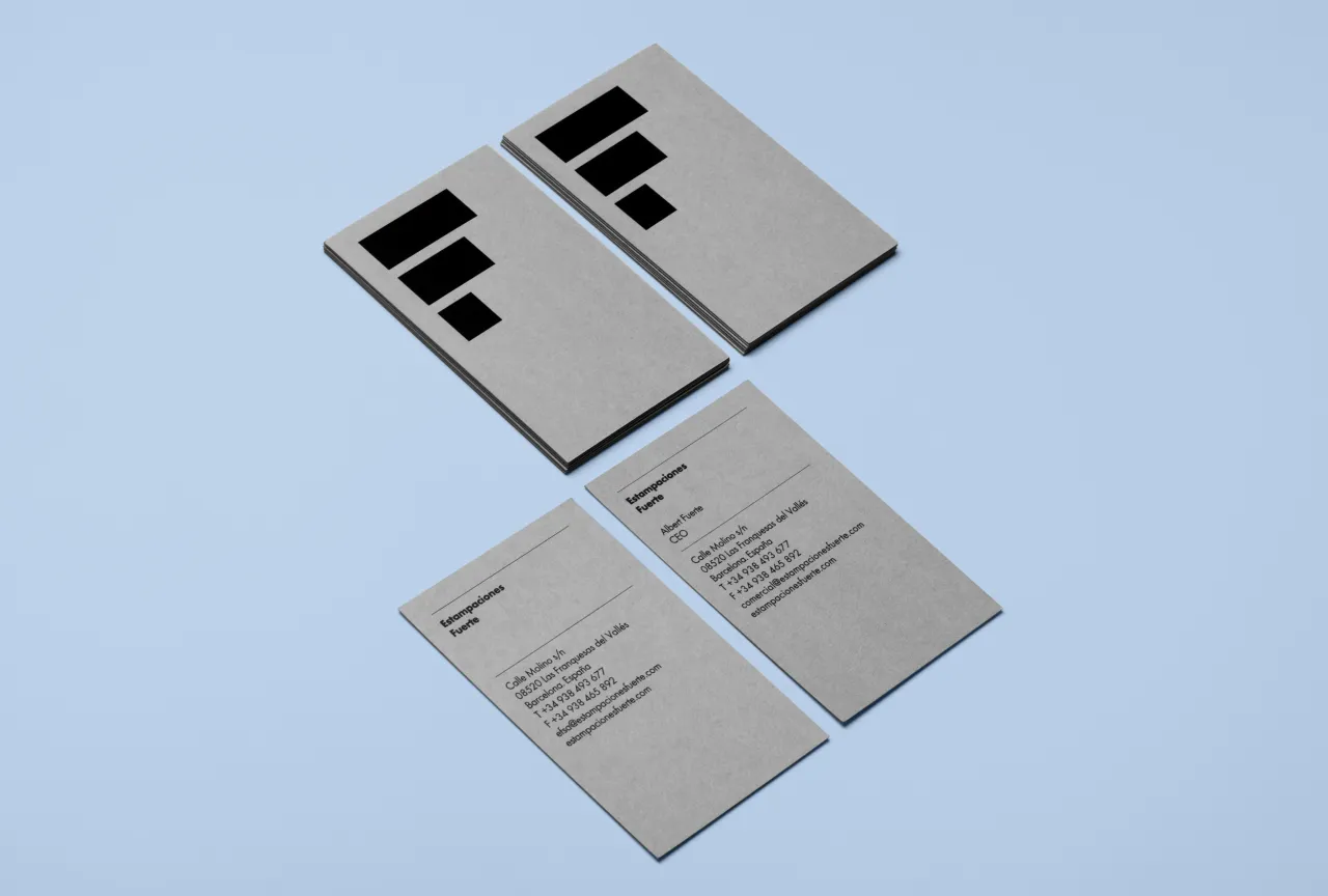
5. Estampaciones Fuerte by Hey Studio
Estampaciones Fuerte is one of the world's leading metal stamping companies and has been around for over 45 years. In 2015, it approached Barcelona-based design studio Hey to create a new, modern identity for its established brand.
"The main objective was to design a new, modern identity for this metal stamping company," said Hey. "Their industrial experience and professionalism are very important to the company and their clients. The identity needed to reflect these values straightforwardly while also showing the technical side of the business."
The resulting logo consists of three metallic strips that hint at the 'E' and the 'F', while the new brand palette evokes the company's industrial heritage: all orange, grey, black and white. For the business cards, Hey played with those three strips on a simple grey background. Elegant yet on point. Photography by Roc Canals.
6. Story Cafe by For The People
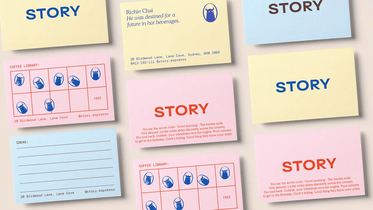
Sydney café Story is built around one idea: storytelling. And so when For The People was appointed to handle its brand identity, it ran this premise through every touchpoint, from cups and packaging to the business and loyalty cards.
The accompanying business cards have a lovely old-library-card charm, set in DM Mono, Blaze Type's Surt and Cooper, in a moreish palette of deep blue, millennial pink, chocolate brown and pale yellow. We especially love the chance to collect stamps on one side that feature the new brand mascot: a monstrous figure with big eyes and horns, yet plenty of warmth.
Proof that a humble card can still tell a whole story.
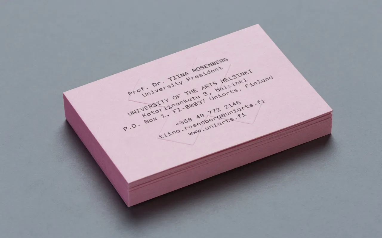
7. University of the Arts Helsinki by Bond
Another great offering from Helsinki studio Bond, this time for Finland's University of the Arts Helsinki.
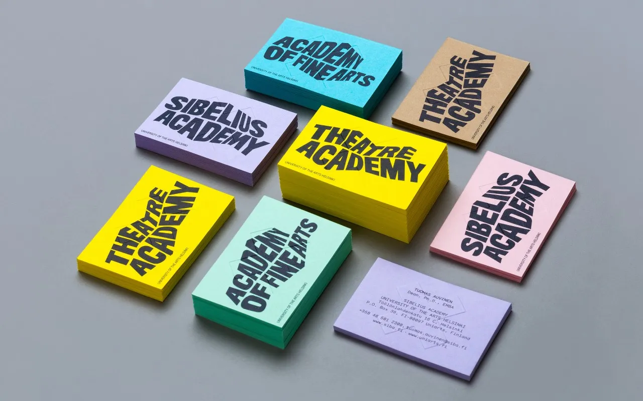
At the beginning of 2013, three of Finland's most prestigious art academies merged into a single institution. Bond was appointed to create a unified brand identity and architecture that also allowed room for the individual academies to build their own profiles.
The solution was formed around deconstructed logotypes that distinguish the university from business and science institutions, while a simple, bold anchor symbol 'X' has multiple meanings, just like art does. "The symbol can be seen, for example, as a starting point, a destination, a meeting place, a location, a signature, an unknown force, a warning, an irritant, a question and a solution. This holistic project covered all brand touch points," Bond explains.
Business cards were included in the rebrand. All wavy, colourful and unconventional. We love them.
8. We Make Stuff Happen by Maddison Graphic
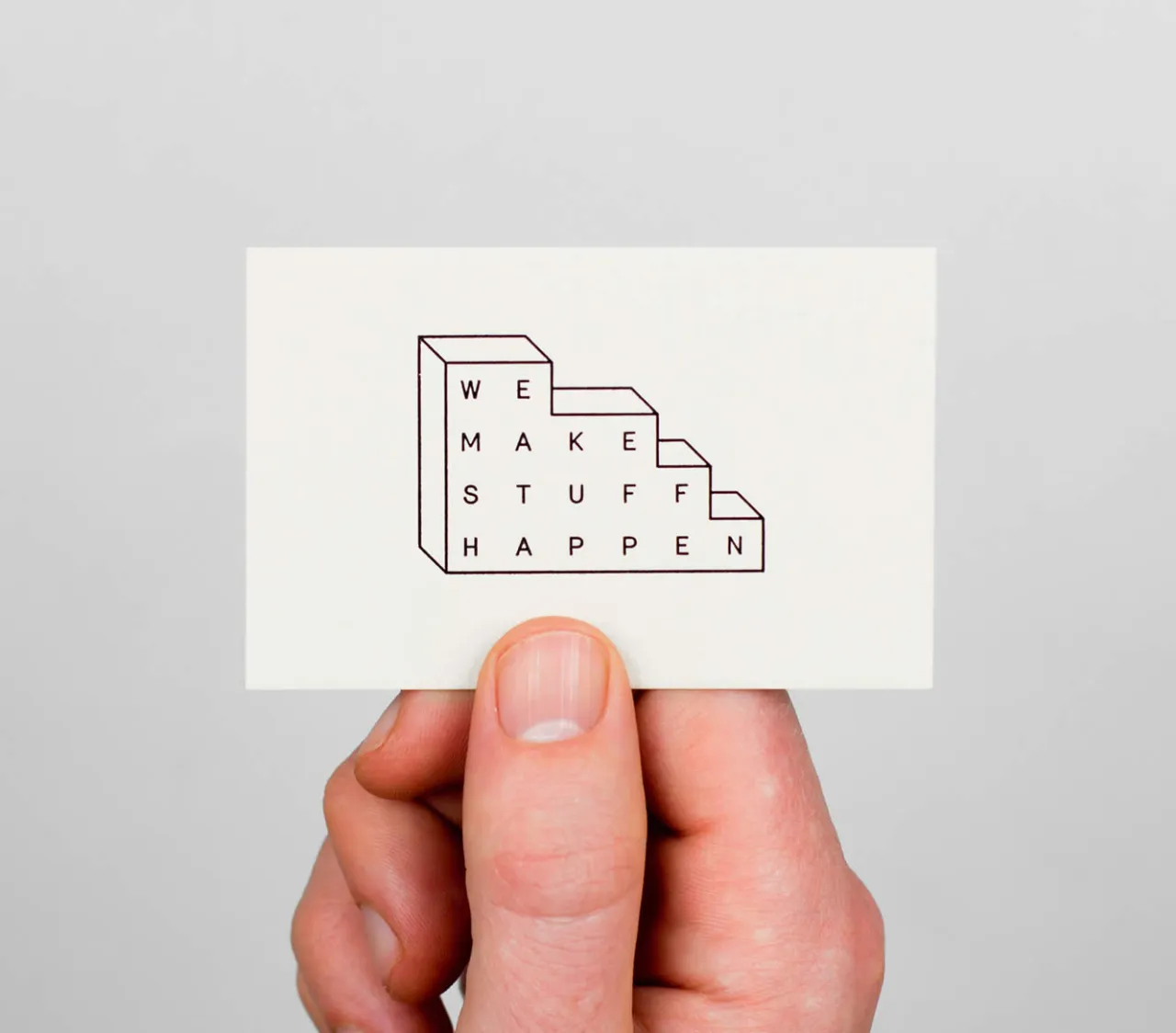
We Make Stuff Happen is a production company specialising in exhibitions and events. Maddison Graphic designed its new identity, stationery and website, including these lush business cards printed with foil blocking on Colorplan using typeface Merkury.
It's one in Maddison Graphic's archive, but it still deserves a place in this list. We adore the logo that suggests a wall of bricks. And visiting its client's website, it's even nicer to see the identity still in use. When something isn't broken, why fix it?
There are two versions of this business card: a black or white logo on one side, and the person's details on the other. We wonder if they're still using them.
9. Sucre by DutchScot
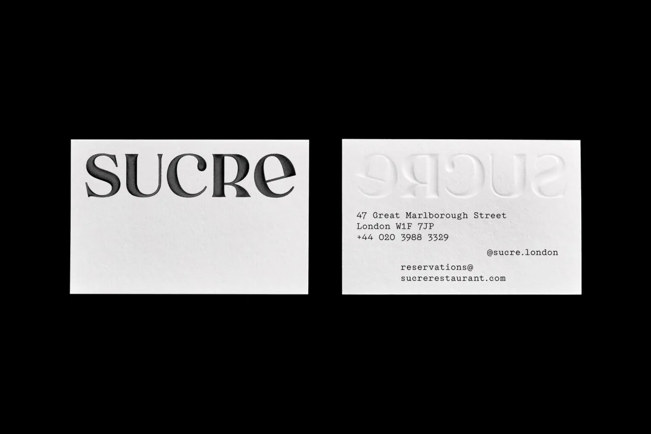
Sucre is a Latin-American-meets-European restaurant inside a 310-year-old former concert hall on London's Great Marlborough Street, and DutchScot's identity tells its story of immigration.
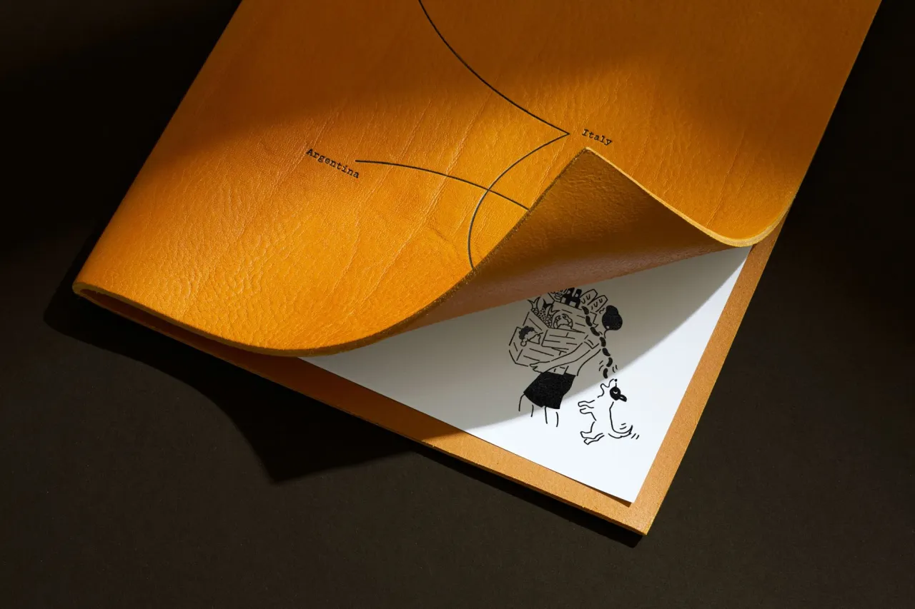
It features Old World references mismatched and rebuilt into something new, with Argentine tango steps used as decorative motifs and illustrations of Buenos Aires porteños by Rebecca Sutherland.
The print suite (cards included) carries that richly crafted, heritage-meets-modern feel. It's the perfect solution for a restaurant headed up by a much-respected Argentine chef, Fernando Trocca. We love that the menu tells the story of his immigrant background and the European adventurers who crossed the Atlantic to make their home in his native Argentina. The wine list makes the same trip. While the business cards keep it simple, leaning into the beautiful serif logo, they are imprinted on one side to show the embossed version on the other.
10. The Future Factory by DutchScot
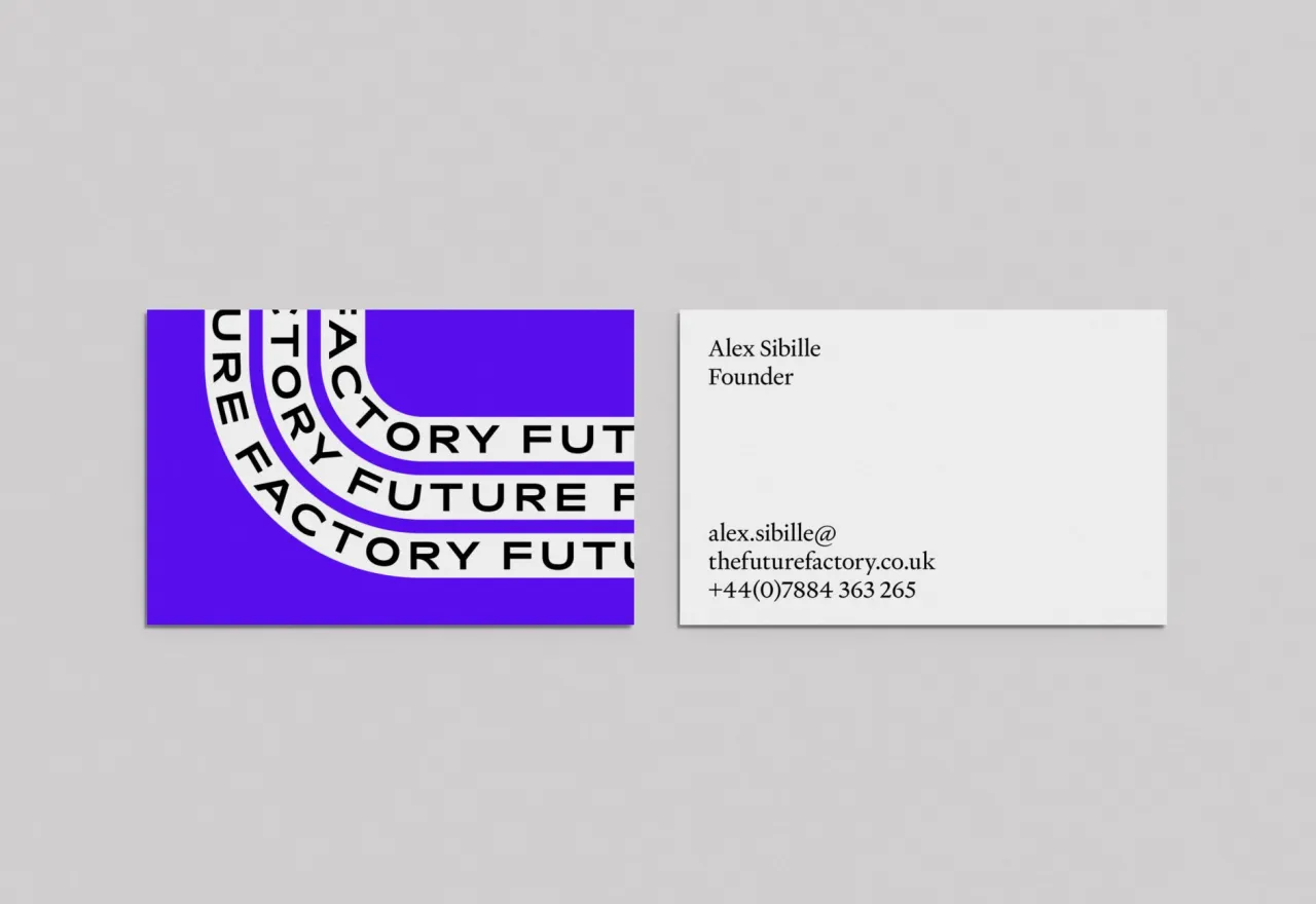
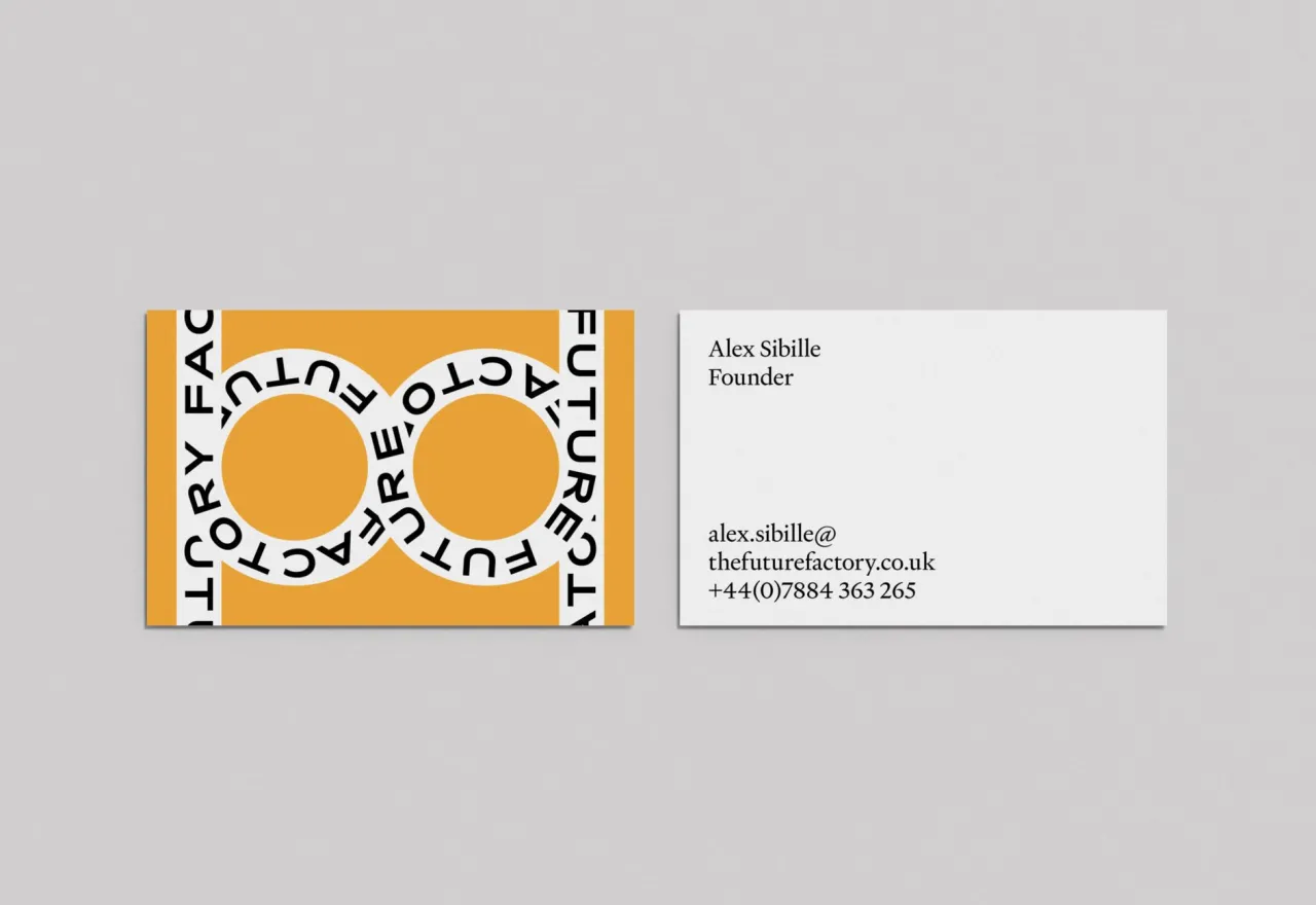
The Future Factory help creative agencies win new business – on the simple principle that people buy from people, not pushy cold calls.
DutchScot leaned into the 'factory' half of the name, building a playful industrial identity where animated typographic 'conveyor belts' ferry the brand's messages, and the logo is an abstracted conveyor-belt 'F'. Witty, kinetic and full of movement, carried right through to the humble business card.
Of course, the business card isn't animated. But you get the hint of movement from the clever use of lines and swirls across its surface. The featured typeface is Rois by the foundry New Letters, while Heldane by Klim is used for smaller body copy.
At the time of its release in 2022, DutchScot confessed it was one of their favourite design projects. We wonder if that still holds today.
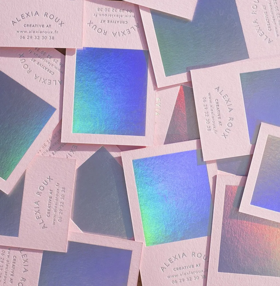
11. Pink and Holographic personal business cards by Alexia Roux
For her personal branding, French graphic designer Alexia Roux created pink and holographic business cards. Dazzling, reflective and pink – what more do you need? Printed by Atelier Bulk, a Bordeaux, with paper by G. F. Smith.
Mind you, these cards were released over five years ago, so we're not sure if they still stand. Looking at Alexia's recent portfolio, though, it's clear she's become renowned for logo identities and crafting beautiful printed materials. We're impressed with these designs for Maison Emilienne – another use of pink as a backdrop and gold-foiled materials.
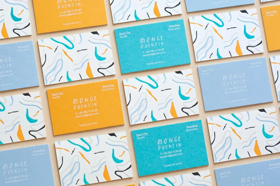
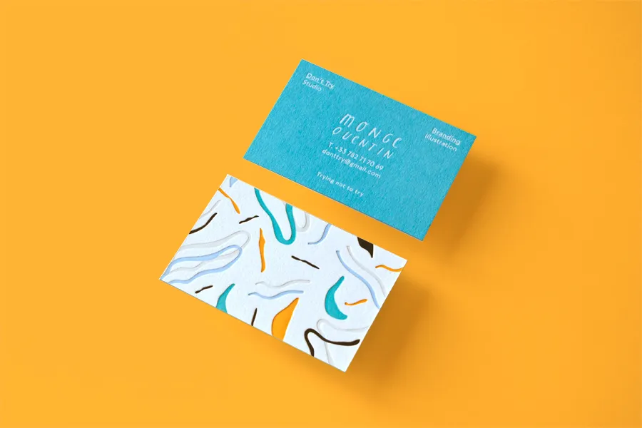
12. Don't Try Studio by Quentin Monge of Don't Try Studio
For his own business card design, Parisian creative Quentin Monge of Don't Try Studio leaned into something tactile and colourful.
The illustrator and art director, known for his muted colours, soft, swirly characters, and distinctive, cheerful style, has graced many magazine covers, product packaging, and posters.
We love the calming yellows and blues of these designs. We're pretty sure Quentin has since updated these bad boys, but they're so nice to look at that they deserve a place in this roundup of inspiration.
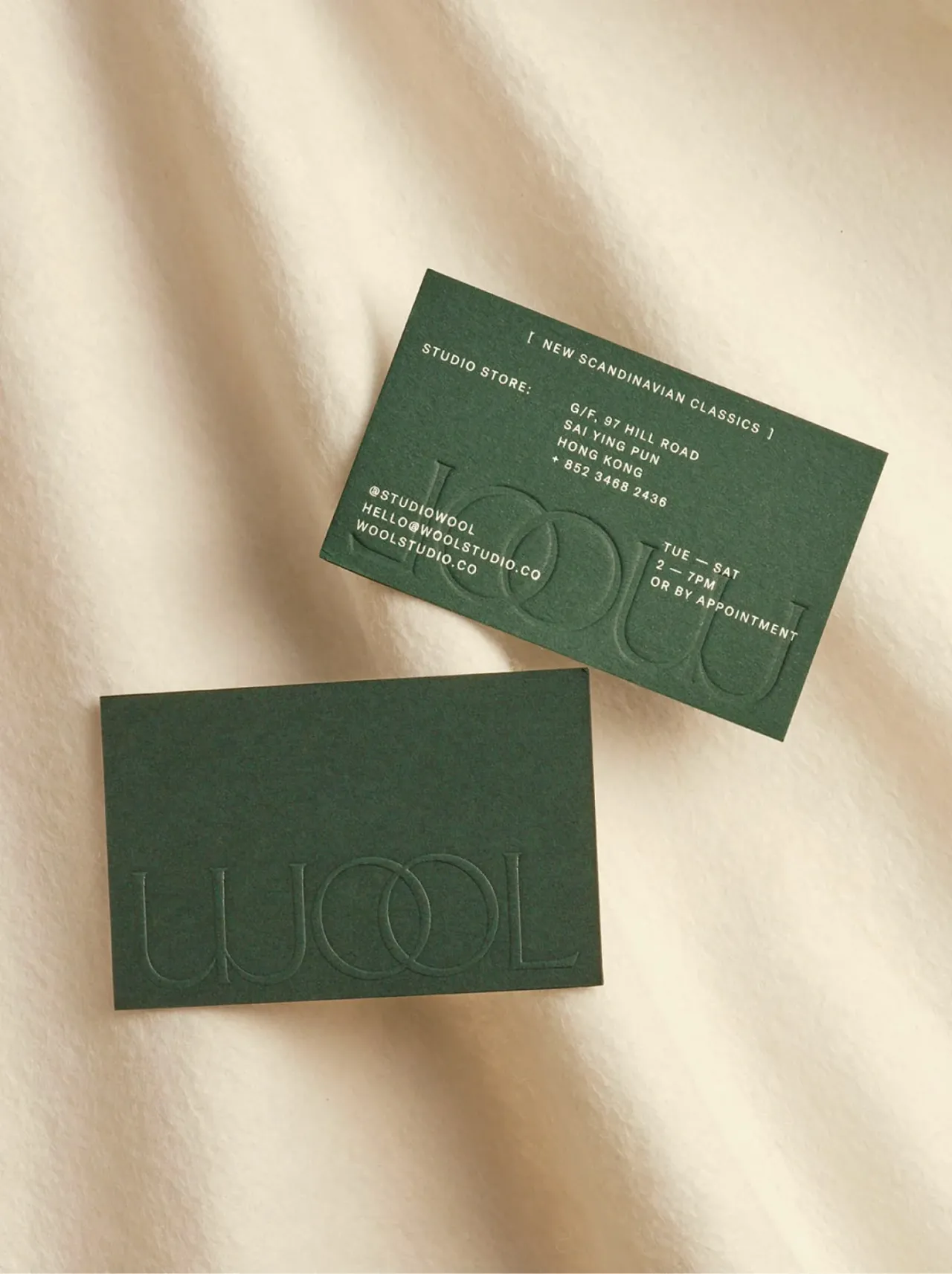
13. Wool by Alex Hunting Studio
Wool brings up-and-coming Nordic brands (think MENU, TEKLA, Santa & Cole) to East Asia from its Hong Kong studio store, and London's Alex Hunting Studio gave it a quietly luxurious identity to match.
A bespoke wordmark sits next to chiselled, sharp lines against soft curves, while the print and packaging add tactile finishes – fabric embossing, a deep, clear-foil deboss, and crisp silver foil – all wrapped in a palette that even includes an official 'Hong Kong Tram Green'. A small, beautifully made business card if ever there was one.
Although released in 2022, the work by Alex Hunting is timeless. Which is no surprise, given he's renowned for design direction on Kinfolk, Footnote, and the John Lewis Foundation.
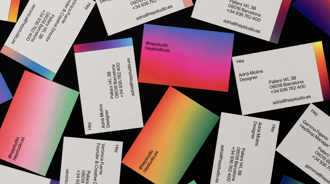
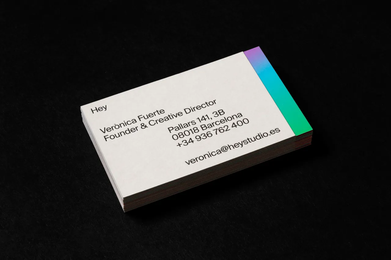
14. Heys Business Cards by Hey Studkoo
Who better to design a joyful business card than the people obsessed with geometry and colour?
For their 10th anniversary, Barcelona's Hey Studio made themselves a set of cards in vibrant colour gradients, across 24 versions, finished in both matt and satin. "It represents Hey's ethos of having a positive attitude and an open predisposition, something fun and expected," says the studio.
Simple, playful and unmistakably Hey – proof a card can be a tiny mission statement.
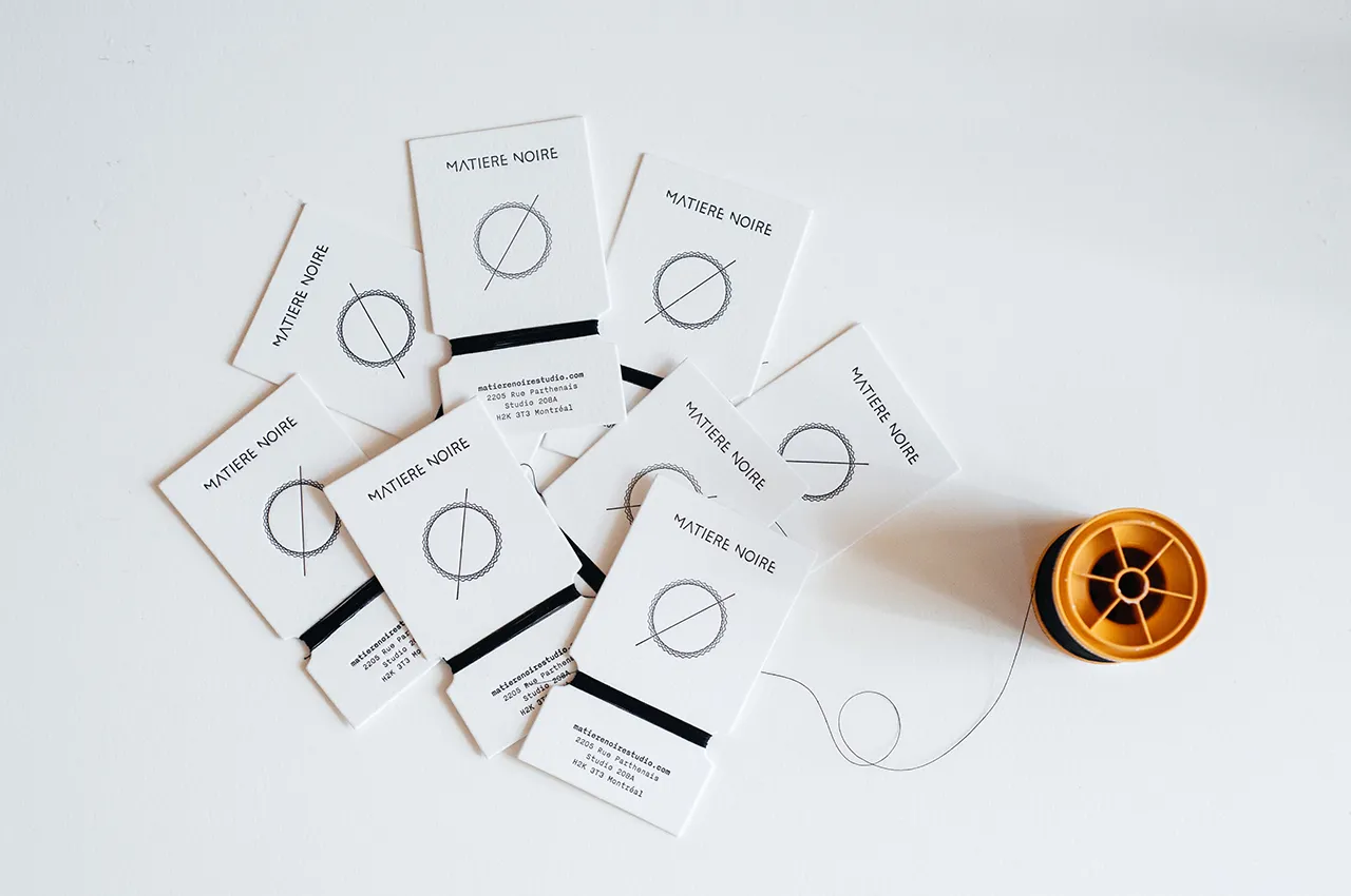
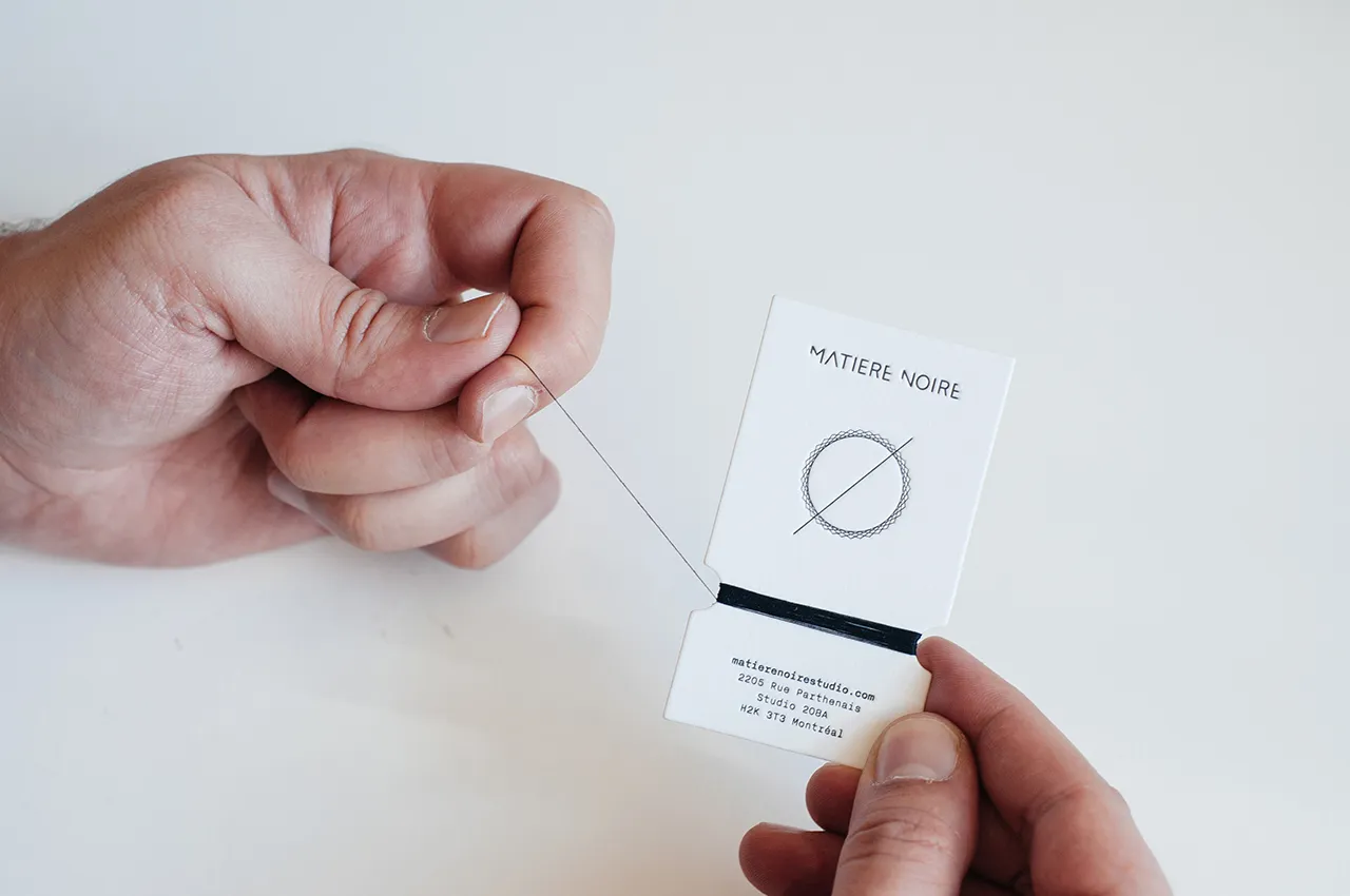
15. Sewing Thread Card for Matière Noire Studio by Burak Kaynak
This limited edition Sewing Thread Card style handmade business card was designed by Burak Kaynak for Montreal-based fashion label Matière Noire Studio.
To match the brand's high-quality, hardworking nature, materials were carefully selected. And that certainly applied to its client's business cards.
Letter-pressed on 100% cotton Lettra Fluo White paper, each card is hand-wrapped with natural black cotton thread, which helps connect the raw materials used in the fashion directly to the brand identity.
This one is probably the most original of the bunch. We love the clever nod to a cardboard spool organiser – something keen sewers use to wrap and store loose thread. Photography is by Ali Inay.
16. Onslow by Davy Denduyver
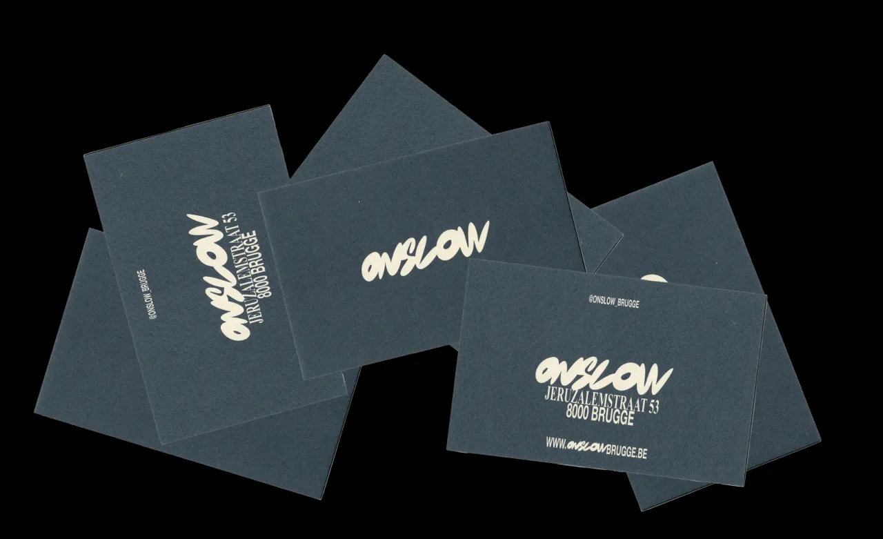
Onslow is a no-nonsense, flavour-first restaurant in Bruges named, rather brilliantly, after the Keeping Up Appearances character. Yes, that's right. The "lower-class" relative of the snob, Hyacinth Bucket (pronounced 'bouquet' to those in the know).
Belgian designer Davy Denduyver gave it an identity to suit: a bubbly handwritten wordmark colliding cheerfully with the two most ordinary fonts going, Helvetica and Times New Roman.
One of our fave picks because sometimes, you don't have to go over-the-top to get the results you want. In this case, nostalgic, contemporary and refreshingly unprecious – business cards and all.
Editor's Picks





Trending






Latest Jobs
Growth Strategist (Ecommerce) at Tribe
Full-time·Exeter / London·£50k + Bonuses
Midweight Graphic Designer at We Are Your Friends
Full-time·London·£36k–£44k
Creative Director at Koto
Full-time·London·£95k-£130k
Design Director, Opinion at The New York Times
Full-time·New York·$160k–$180k
Client Partner at Halo
Full-time·Bristol·£30k–£36k
Designer at New Genre
Full-time·London·£36k–£48k