Five creative projects we loved in November 2025
This month brought a mix of sharp brand thinking, cultural nostalgia, and some much-needed clarity in crowded markets. From workplace art to whiskey cans dipped in '80s gold, here are the projects that caught our attention in November.

From the hundreds of projects submitted to us each month, it's so hard to choose our favourites, but November felt especially full of projects that pushed for clarity, emotion, and a bit of nostalgia. From workplace art with purpose to whiskey cans dipped in '80s gold, these were the ideas that stuck with us, making us look twice, smile, or simply appreciate craft done well.
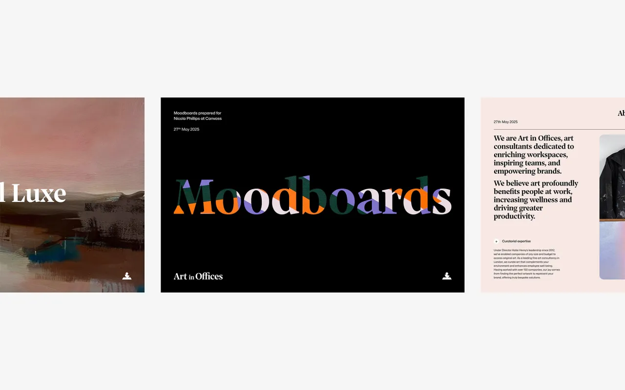
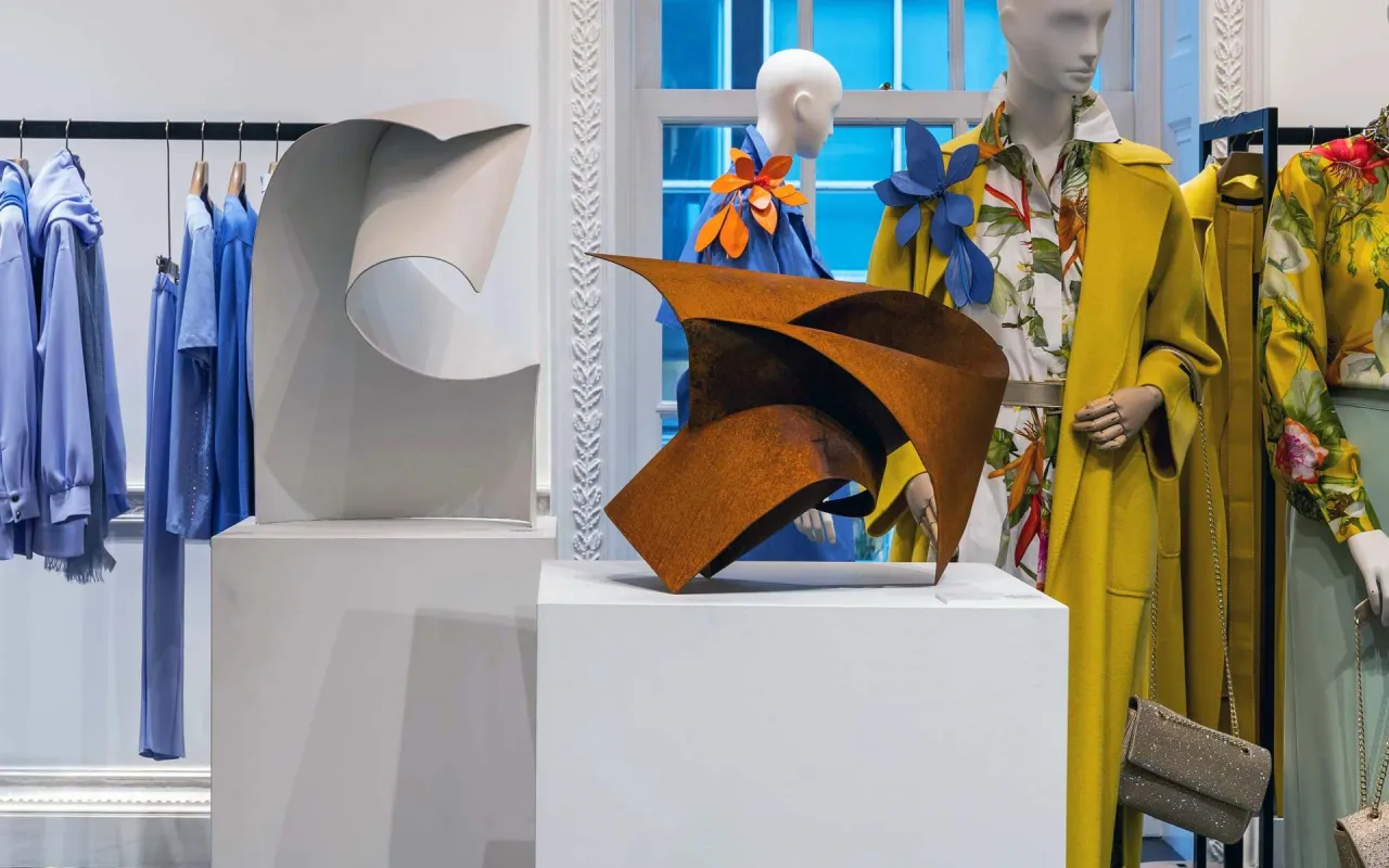
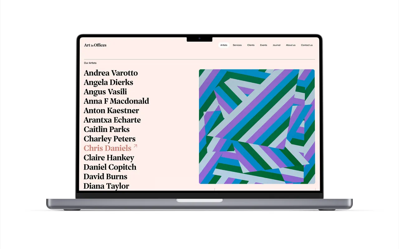
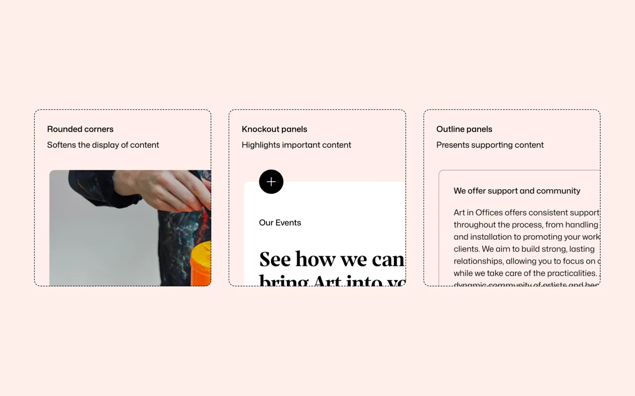
Art in Offices by Canvass
The workplace art sector has become increasingly busy, with countless suppliers offering curation packages and rotating programmes. Art in Offices has always taken a more tailored approach, but its brand hadn't quite reflected that sophistication – until Canvass stepped in.
The studio developed a strategic idea that instantly clicked: "The Art of…". A simple phrase, but one that neatly encapsulates how the organisation approaches curation, consultancy and workplace wellbeing. It's a structure that works everywhere: The Art of Focus, The Art of Energy, The Art of Belonging. Suddenly, everything has intent.
The new identity leans into craft and curation. A refreshed A-mark folds shapes together to echo the act of selecting and framing pieces, while the tone of voice brings their all-female team's personality to the foreground. The palette stays muted by default, then flexes as colours are pulled directly from the 100+ artists they collaborate with. It's a smart way of building visual consistency in a world designed to be constantly changing.
What stands out most is how Canvass has shaped a brand that feels fresh without overshadowing the art itself, which is a tricky balance that many in this space rarely get right.
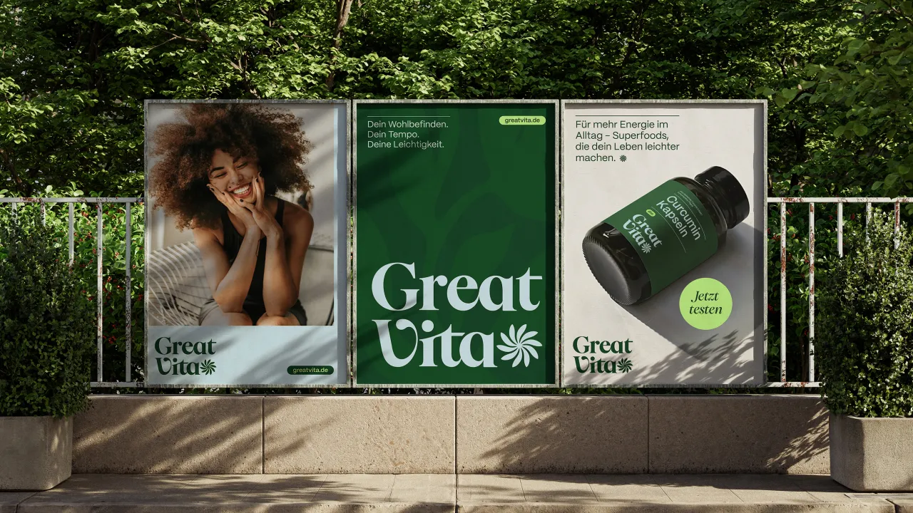
Studio Arndt Benedikt x GreatVita
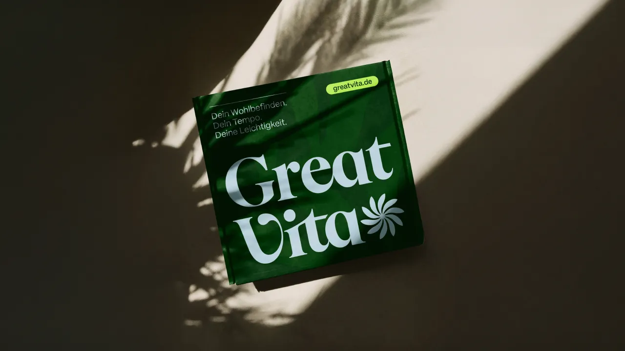
GreatVita had everything on paper – strong products, clean ingredients, and a wide range spanning oils, superfoods and natural cosmetics – but the brand lacked spark. It blended into the ever-growing health-food landscape and didn't quite convey the care that went into each product.
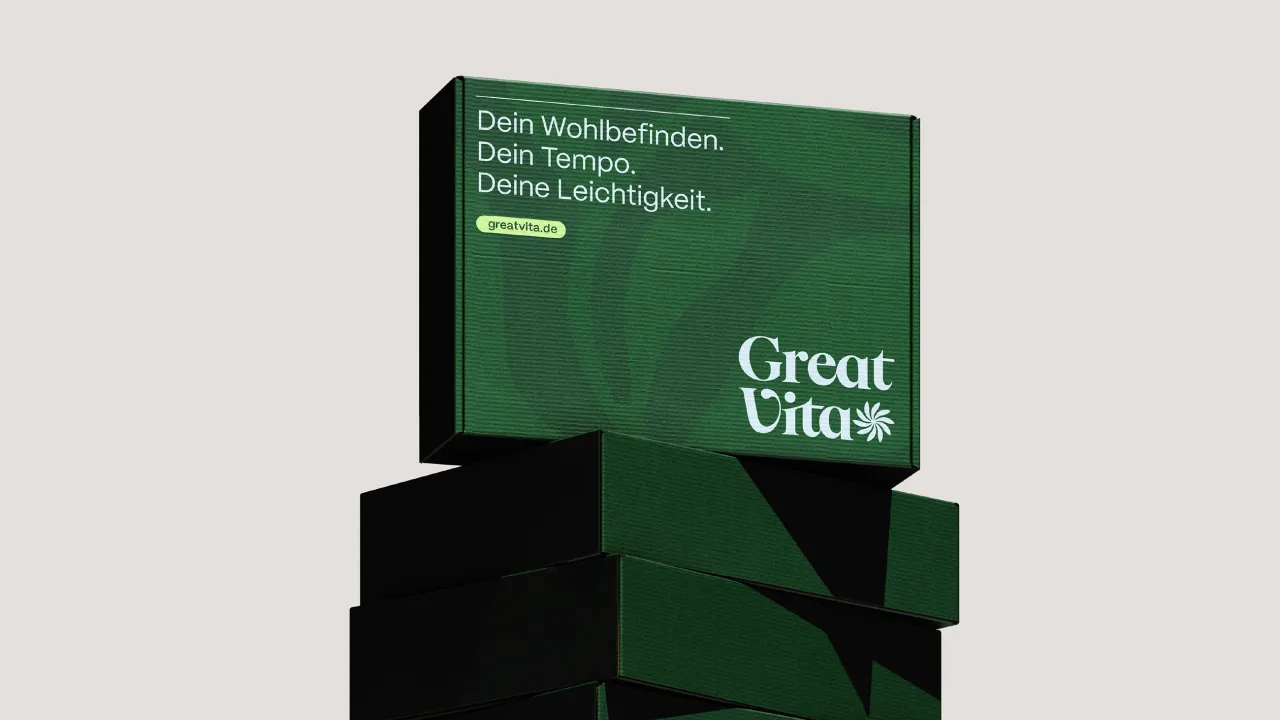
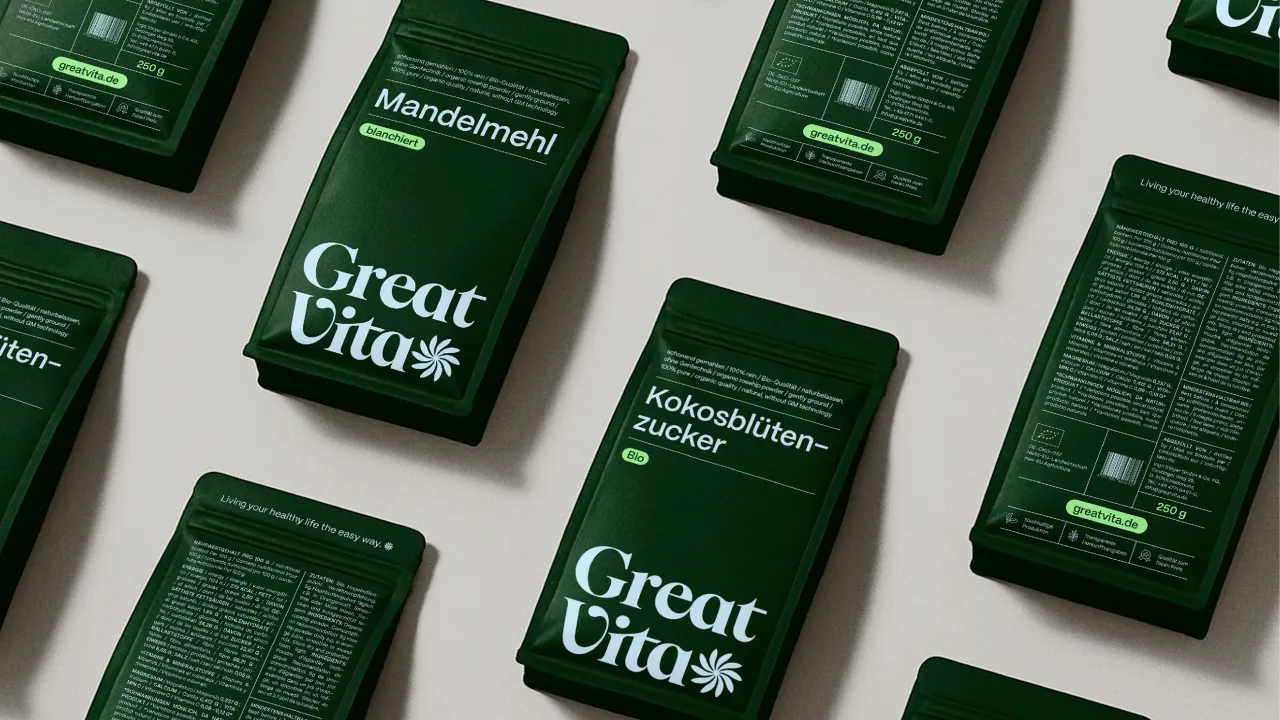
Studio Arndt Benedikt's new identity changes that. Built around the idea that GreatVita brings lightness to healthy living, the brand now feels bright, grounded and unmistakably human. A stylised flower becomes the core symbol, expressing growth and potential, while a deep green anchors the palette. Light blues, limes and warm neutrals soften the edges, creating a sense of calm that feels refreshing in a space that often leans too clinical or too crunchy.
Typography is confident without shouting. Botanical illustrations and natural textures introduce honesty and warmth. There's enough structure to keep things coherent, but plenty of softness to make the brand feel welcoming.
It's a full reset for a brand that deserved to shine and, frankly, we could all do with more identities that make healthy living feel like an invitation rather than a checklist.
dentsu's Human Truths in the Algorithmic Era
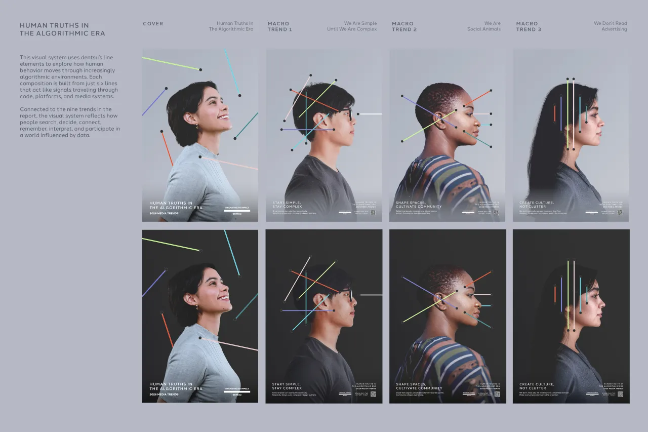
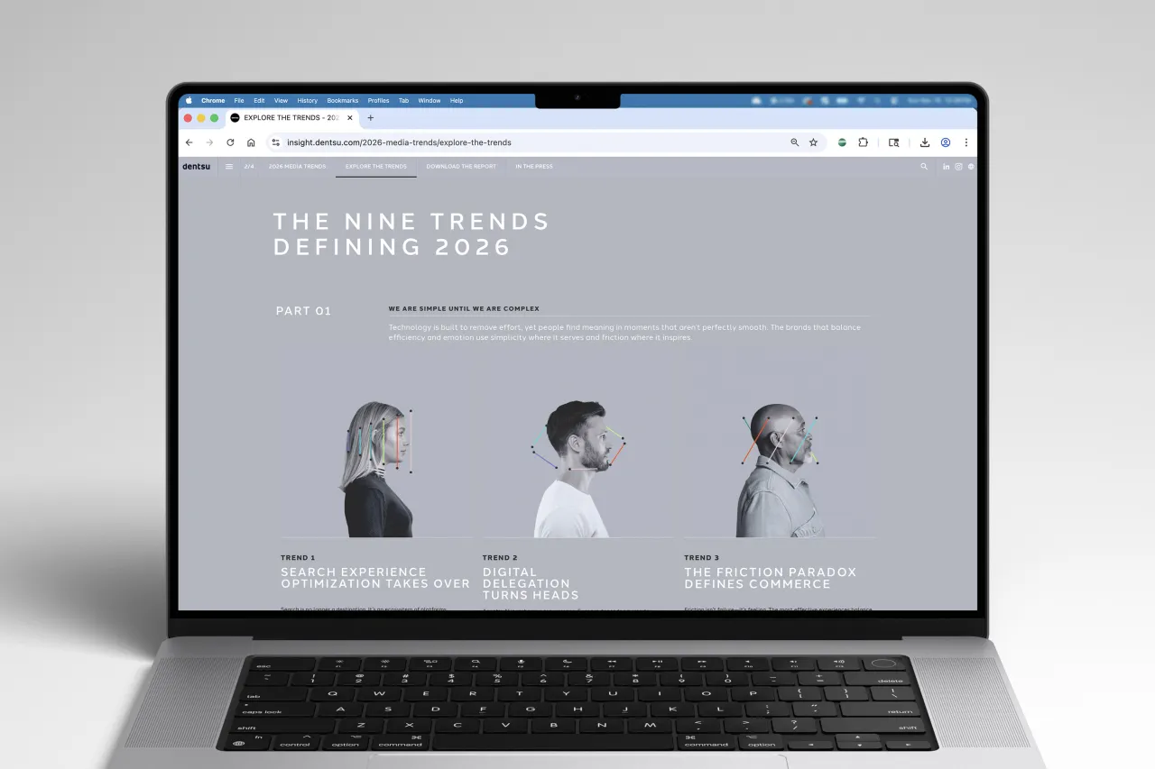
Trends reports can sometimes feel like an exercise in buzzword gymnastics, but dentsu's latest edition takes a different tack. Human Truths in the Algorithmic Era focuses on what people actually need from the media ecosystem, not just what platforms are pushing next.
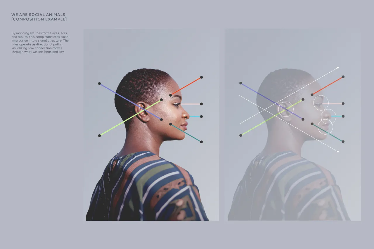
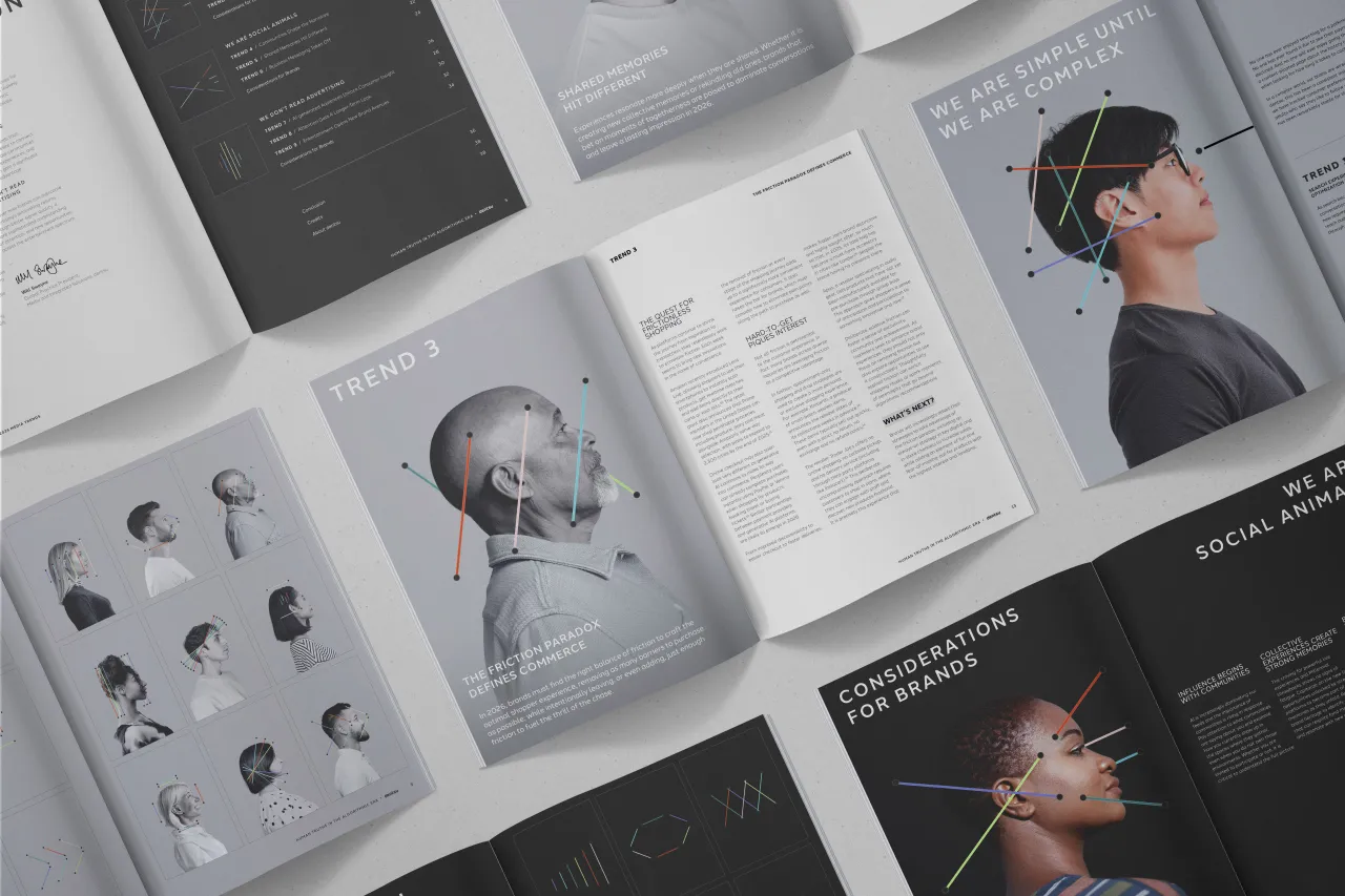
Visually, the creative team translated dentsu's well-known dot-and-line system into a series of kinetic compositions that behave like signals moving across screens, platforms and vast digital voids. Each of the nine trends has its own interpretation, built from a consistent six-line structure. It's mathematical but expressive, with small gestures forming the backbone of bigger ideas.
In one of the macro trends –"We Are Social Animals" – the lines wrap around the eyes, ears and mouth of a silhouetted figure, hinting at how our senses shape the way we connect. Animation brings these behaviours to life with simple, controlled motion that feels appropriately coded.
It's rare for a trends report to look this considered. Most are PDFs with an identity stapled on top, whereas this one feels like a system with something to say.
Gold Bar Whiskey: Double Gold by Thirst
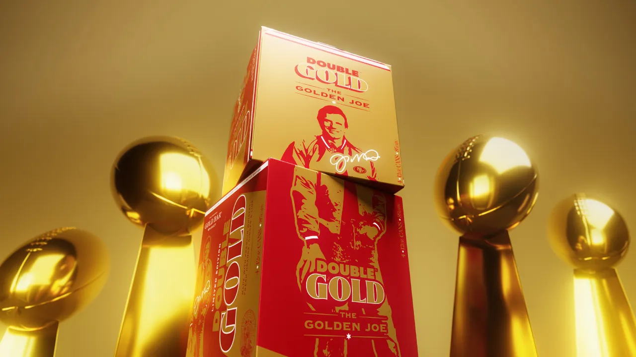
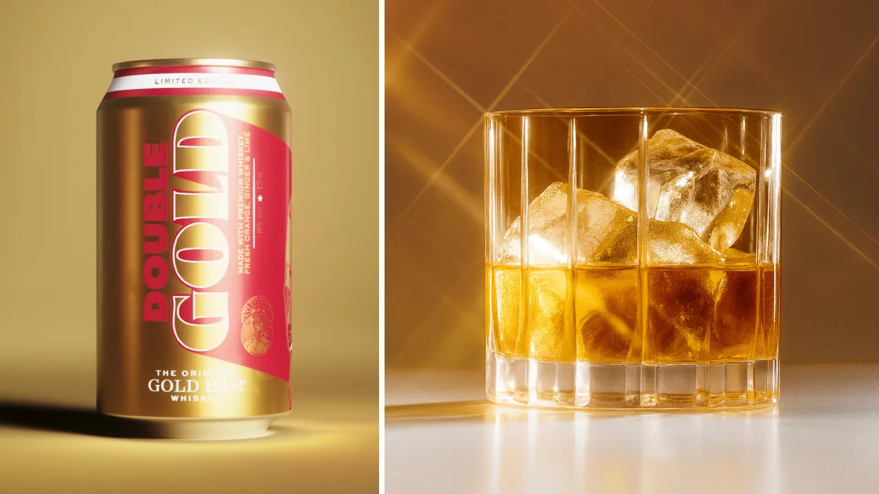
When you tell a design team you're launching an RTD with Joe Montana, there are only two possible outcomes: it either leans into kitsch or it leans all the way in with confidence. Thirst has clearly chosen the latter, and it's glorious.
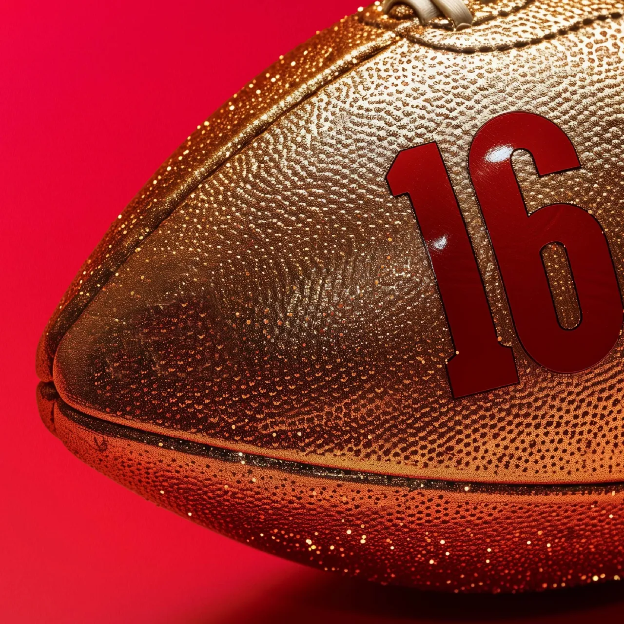
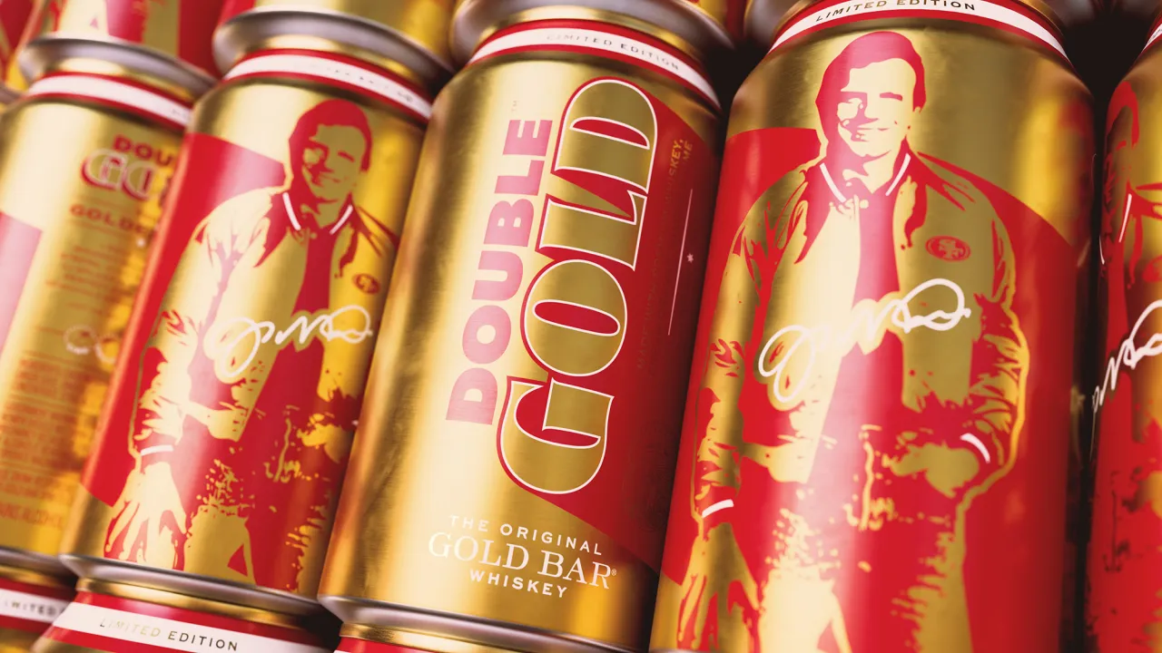
Double Gold celebrates the 40th anniversary of the 49ers' 1985 championship season and revives the visual swagger of the era. Working closely with Gold Bar founder Elliott Gillespie, the studio reinterpreted an original '80s Montana poster into a modern identity drenched in red and gold. The can feels like memorabilia you'd find framed in a bar somewhere on the Embarcadero.
Matt Burns, Thirst's founder, says: "Double Gold captures a feeling – not just a flavour." And he's right. The varsity-jacket cues, the metallic typography, and the gold-on-gold layering all build a sense of optimism and pride that's infectious rather than nostalgic for nostalgia's sake.
The launch has already hit the Bay Area with landmark billboards during the NFL season, proving there's still an appetite for design work that taps into emotion rather than trend cycles. It might just be the most joyful RTD branding of the year.
Faith in Community Scotland by Cole AD
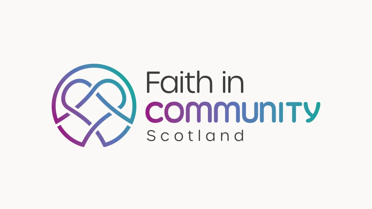
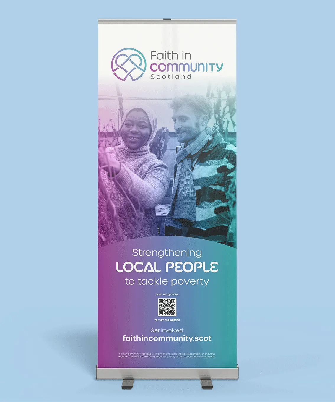
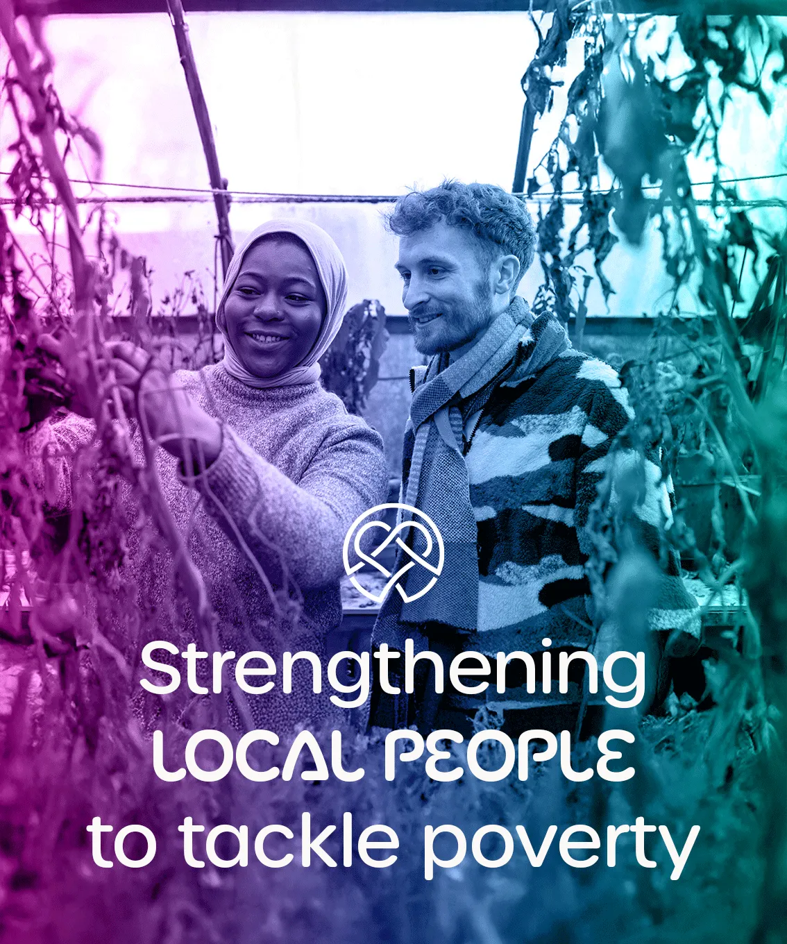
Some rebrands arrive with fireworks, while others work bring a more subtle sense of clarity and approachability where it matters. Cole AD's refreshed identity for Faith in Community Scotland sits firmly in the second camp, and that's exactly why it works.
The charity, which first worked with Cole AD back in 2008, needed a modernised look that remained rooted in its grassroots mission to tackle poverty and build stronger, fairer communities across the country. Designers Garry McCann and Daniel Sheridan created a visual identity that balances professionalism with real warmth. A new symbol hints at unity and connection, supported by a fresh palette and contemporary typography that feels friendly without losing authority.
Director Iain Johnston put it best, noting: "They know what matters to the communities we work with and to us… our trustees and staff feel [the new brand] represents us exceptionally well." It's a reminder that design doesn't always need big gestures. Sometimes the most meaningful work sits in the details, especially when the people it's created for feel genuinely seen.
Editor's Picks





Trending






Latest Jobs
Midweight Full Stack Developer at Bureau for Visual Affairs
Full-time·London (Open to remote)·£35k–£50k
Senior 2D Motion Designer at Art&Graft
Full-time·London·£50k-£65k
Design Director, Opinion at The New York Times
Full-time·New York·$160k–$180k
Mid-Senior Designer at Something Familiar
Full-time·Bristol·£32k–£40k
Senior Copywriter at Human After All
Full-time·London·£48k–£66k
Design Lead at Madeo
Full-time·New York City·$85k–$120k