DutchScot rebrands Future Factory with animated identity that doesn't go with the flow
Design and branding consultancy DutchScot has created a bold and animated identity for Future Factory, which creates playful tension by leaning into the production line process suggested by the company's name.
Production line imagery is at the heart of the rebrand
The creative industry is a personable space, even when it comes to business. That's the thinking behind Future Factory, a lead generation company which helps creative agencies find new business. Instead of relying on pushy selling, cold calling or mass mailing like so many others in the field, Future Factory says it stands apart by leading with relatable people.
Using this philosophy as a starting point, DutchScot co-director Jacob Vanderkar and his team set out to make an identity which captures Future Factory's unique approach with a playful visual language that speaks to the 'factory' nature especially. Cue many animated typographic conveyor belts shaped like the letter 'F'.
The 'F' letter shape gets turned into a conveyor belt
Typography snakes around the brand in the style of a production line
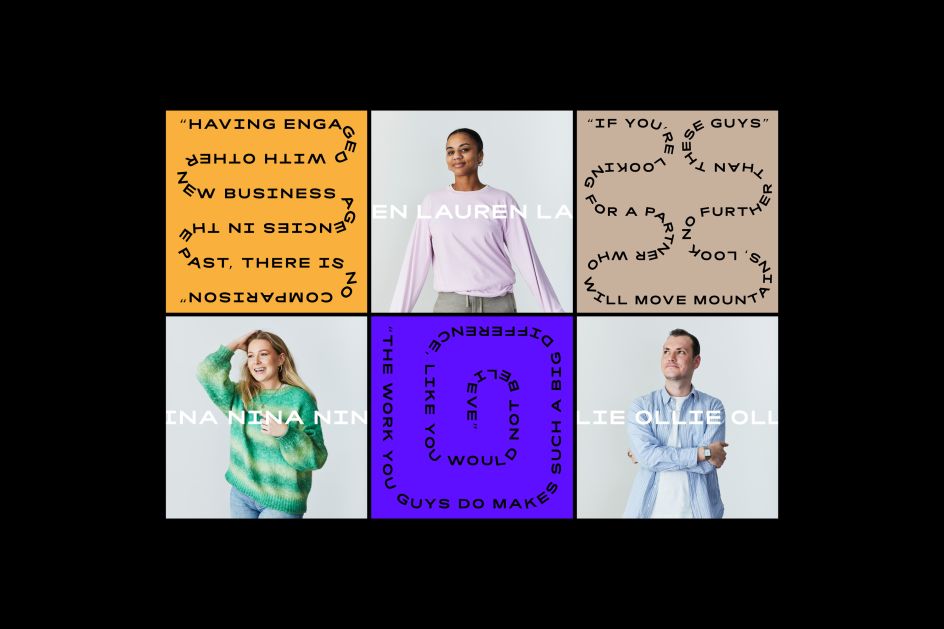
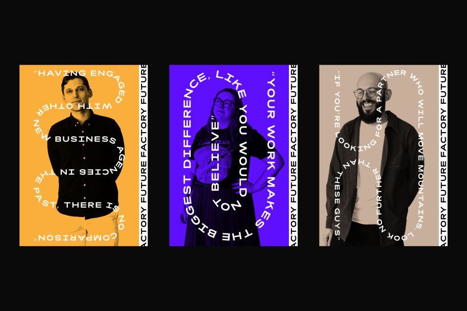
People are at the heart of Future Factory, so it makes sense the brand reflects this
As you might expect from such an experimental company, Future Factory gave Jacob a fairly open brief. Having used its previous identity since it started ten years ago, Future Factory felt it was time for a new look that reflected its position as a modern, forward-thinking business.
"The main objective was to create something that would appeal to people working in the creative industry," Jacob tells Creative Boom. "They wanted the identity to be hard-working and the sort of thing that would look cool on a T-shirt. Brands in their sector tend to have a fairly corporate feel, so they wanted to avoid that and were keen to have something that went against the grain."
Making a brand that wants to stand out without being pushy sounds like a delicate balance to strike, meaning DutchScot concentrated on Future Factory's other unique selling points instead. "Their offer is much more tailored and bespoke, and so our use of the factory conveyor vernacular was designed to be a knowing, tongue-in-cheek way of communicating this," Jacob explains.
The colours were chosen to be bold but not imposing
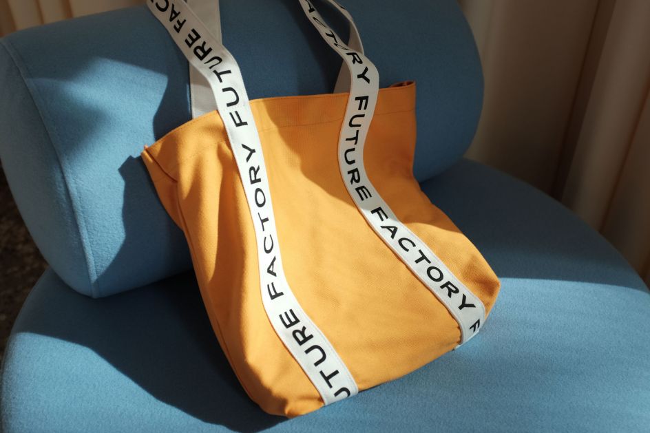
The brand translates well into real life, like with this bag
He adds: "We liked the juxtaposition of the mass-produced, repetitive connotations of the word 'factory' with a tone of voice and language that's completely the opposite. It was that tension that we knew would make for an interesting brand, but it was brave of them to go for it!"
When settling on the bold blues and distinctive oranges of the colour scheme, Jacob admits that there is no deep and meaningful logic behind them. They just needed to have some oomph and to feel fresh and contemporary. There's a bit more going on with the lettering, though.
"The typeface on the conveyors is called 'Rois' by the foundry New Letters," says Jacob. "The Future Factory is based in an old wharf building, and Rois felt similar to some of the signage on the building, which we thought was a nice link. Also, it has quite a square footprint in uppercase, which we thought helped the individual characters look like boxes on a conveyor belt.
The animated identity stands apart from other business agency brands
The team at DutchScot claim this to be one of their favourite projects
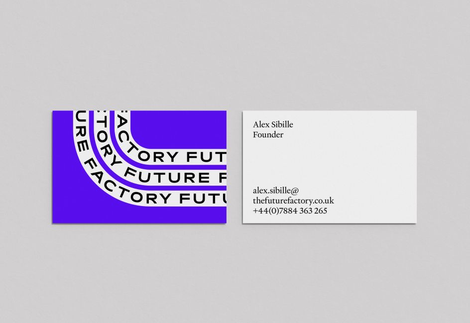
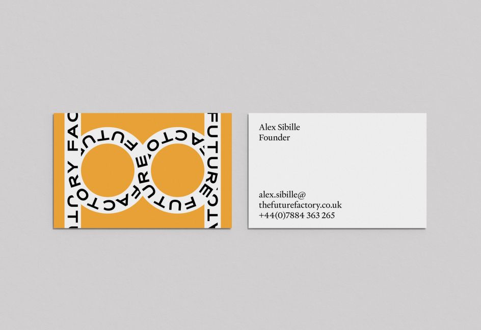
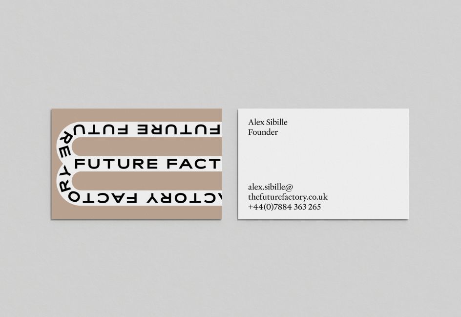
The bold colours stand out on business cards
Letters from the Future Factory brand name get worked into the graphics
"We used Heldane by Klim for smaller, body copy. We liked the combination of the sans Rois and the serif Heldane. They felt like they complimented each other nicely."
Concrete approaches like boxes and production lines help anchor Future Factory as a company, which Jacob says is useful because its services are not necessarily tangible. They don't have a portfolio to rely on. "The brand had to work quite hard and provide a lot of the content for things like the website," he says. "This turned into a positive, though, and we spent time trying to find interesting ways of styling what assets they did have.
"For example, we gave their client testimonials a 'conveyor' typographic treatment, and client logos were animated a bit like boxes on a production line. We enjoyed finding other ways the brand could express the factory theme."
All of these fun elements add up to a project which Jacob regards as one of his favourites that the studio has ever done. "A big part of that was the process," he reveals. "Alex and Dan (co-founders of The Future Factory) were ambitious and open-minded from the get-go and stayed that way throughout. They are also really lovely people, which helps!
"They bought into the idea from the moment we presented it and trusted us to do our thing. We also enjoyed the fact that the identity was predominantly animation based. Once we had the idea, it was good fun coming up with the various conveyor layouts and behaviours."
Future Factory were very open to an identity which went against the grain
Editor's Picks


Trending


](https://www.creativeboom.com/upload/articles/90/908fdb6378db1e95d12595416f54e6336d5e80b8_732.jpg)
Podcasts


Editor's Picks
Further Reading