One of the biggest challenges in branding can be to reset assumptions that stick in people's brains, even when the facts on the ground have changed. For instance, I still know people who think of Škoda as a cheap and nasty car brand, based on the time in the 1970s and 1980s when they were manufactured under Czechoslovakia's communist regime. Even half a century later—and a quarter of a century on from the Škoda Fabia winning What Car?'s Car of the Year.
Eventually, though, such misconceptions will die off. Most right-thinking people now see the Škoda Dacia, for example, as a highly desirable motor. And the time when Marlboro was perceived as a women's cigarette, or Lucozade a drink for invalids, is now long past us.
But overcoming ingrained beliefs is never easy, and we're not just talking about huge brands. It happens on a local scale too.
The Spar shop in the village I grew up in has changed hands countless times, yet for many long-time residents, it will forever be known as "The Spar". And a hotel that was owned and operated by YWCA BC in downtown Vancouver was having this exact problem.
Need for a new name
The hotel had been upgraded to become a boutique property. It was rated among Vancouver's smartest stays. Every booking funded YWCA BC's community programmes. So the offering overall was a strong one: a quality hotel that does some good on the side.
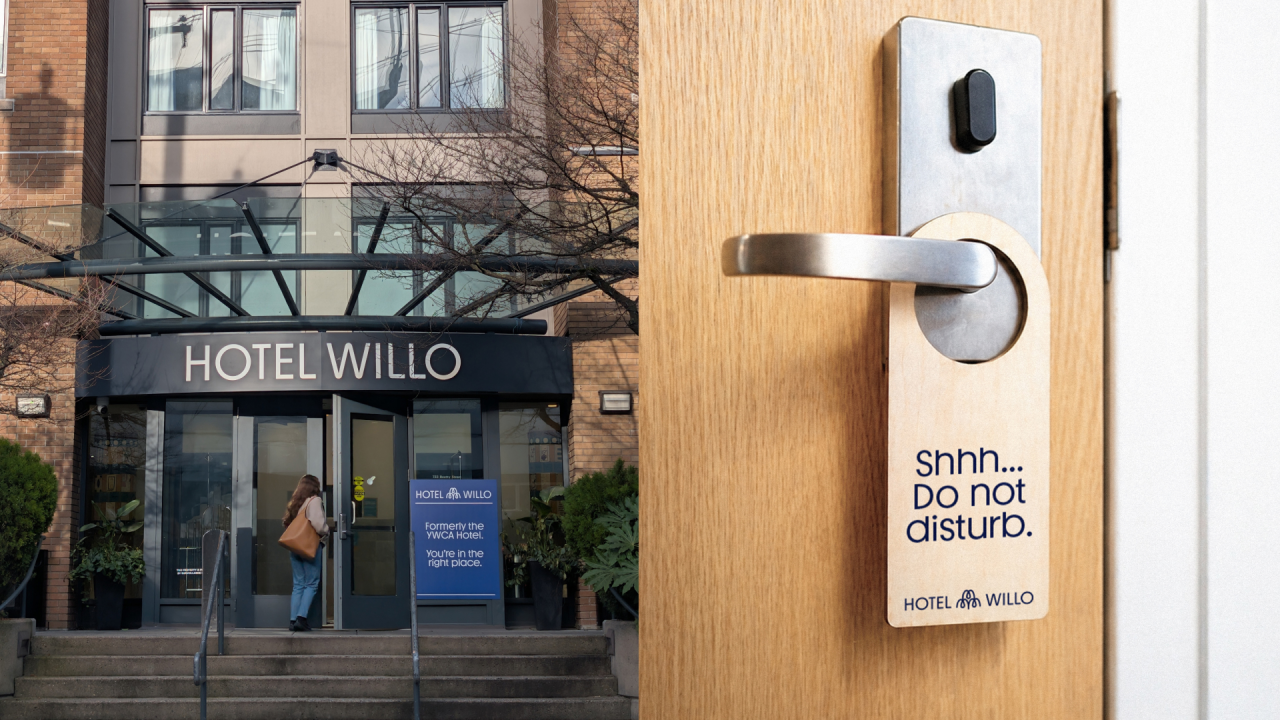
The trouble was, not only did people remember when it was a traditional YWCA, it still bore the name "YWCA Hotel". So many potential customers assumed it was either operating a shelter or a women's residence, or both; no matter how many times you told them otherwise.
Toronto agency Rethink, which led the rebrand, could have tried to soften or explain the YWCA association. It was, after all, still owned by the YWCA organisation. But instead they went for something completely new: Hotel Willo.
The new name evokes the willow tree, which is native to Vancouver and, as the agency puts it, "known for its charm and shelter". A fitting theme for a hotel, for sure.
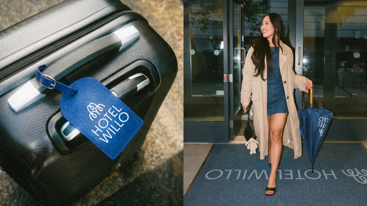
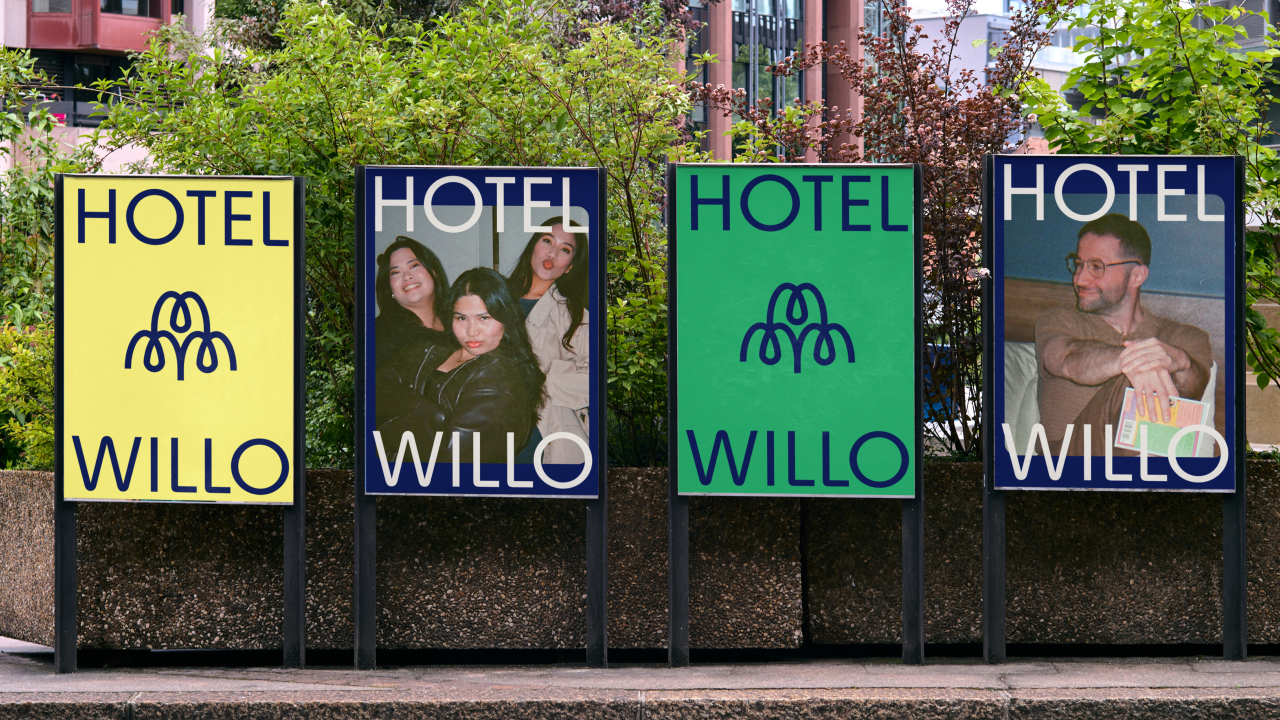
The lockup features a symbol inspired by the willow's silhouette, built from balanced, looping strokes that read a little like drooping branches. It's minimal and abstract to look contemporary, while enough like a tree to avoid veering into being meaningless.
Why the design works
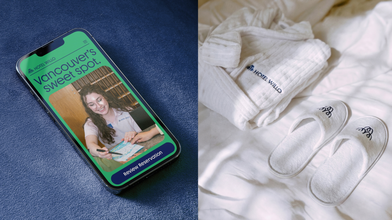
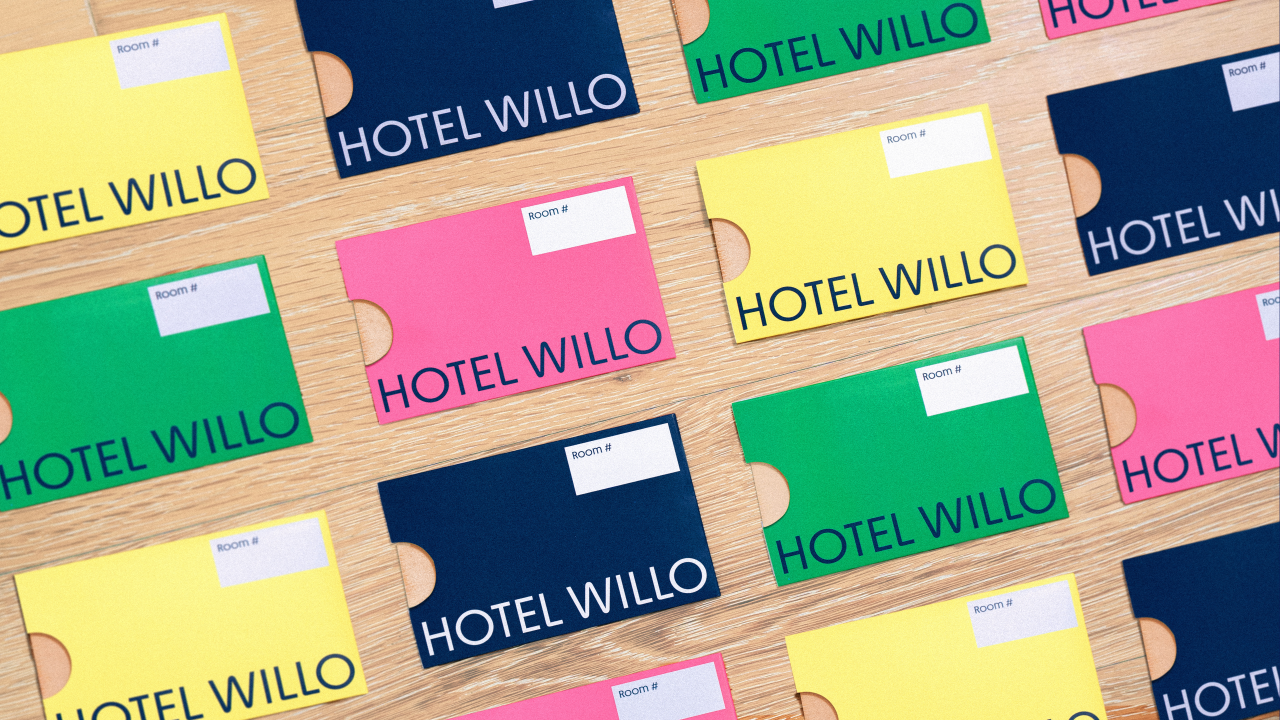
This symbol ticks three important boxes. It gets the theme across simply and efficiently. Its lack of complexity means it works at small sizes; on a key card sleeve or a door tag, for instance. And it's distinctive enough to anchor a wider identity system built from related typography and iconography, along with vibrant colour and upbeat photography.
What's admirable here is the level of restraint. This isn't a rebrand drowning in overwrought concepts that need acres of explanation, or over-engineered brand architecture that demands a hundred-page style guide. Rethink has kept the system to the necessary basics: a straightforward palette, a confident wordmark and a set of icons that streamlines the guest experience.
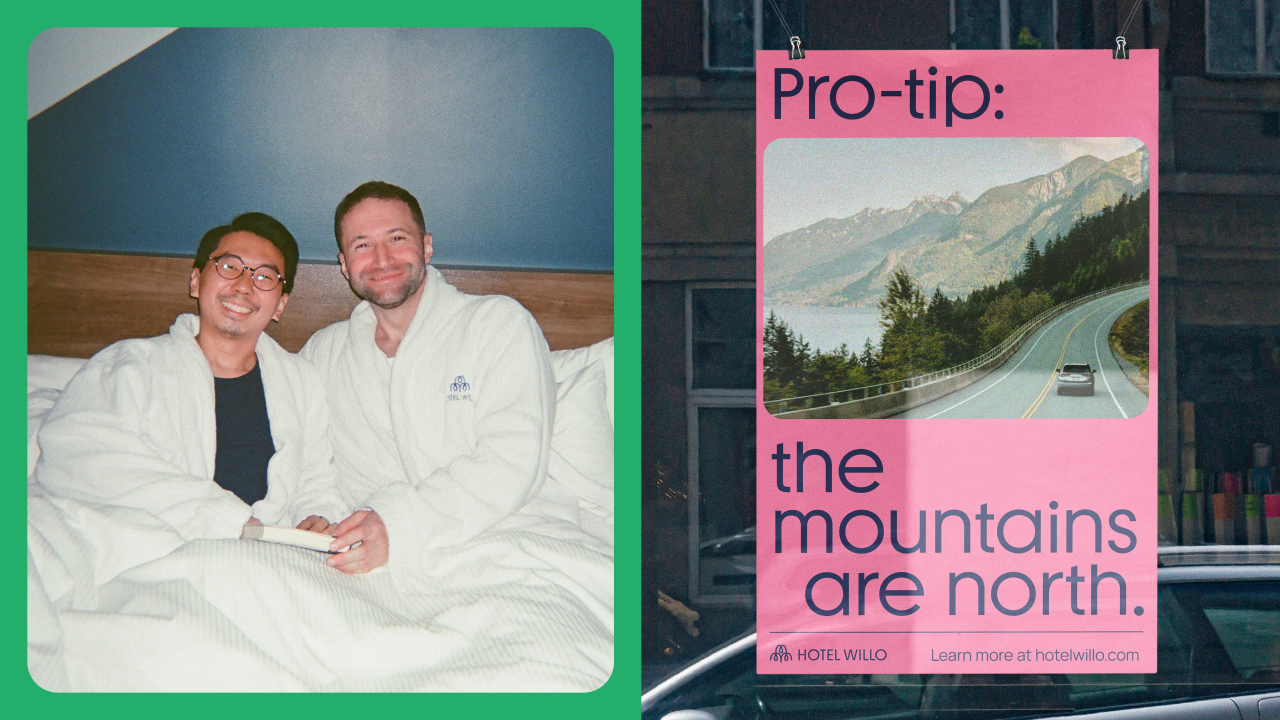
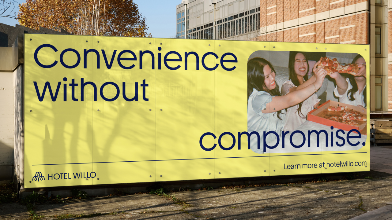
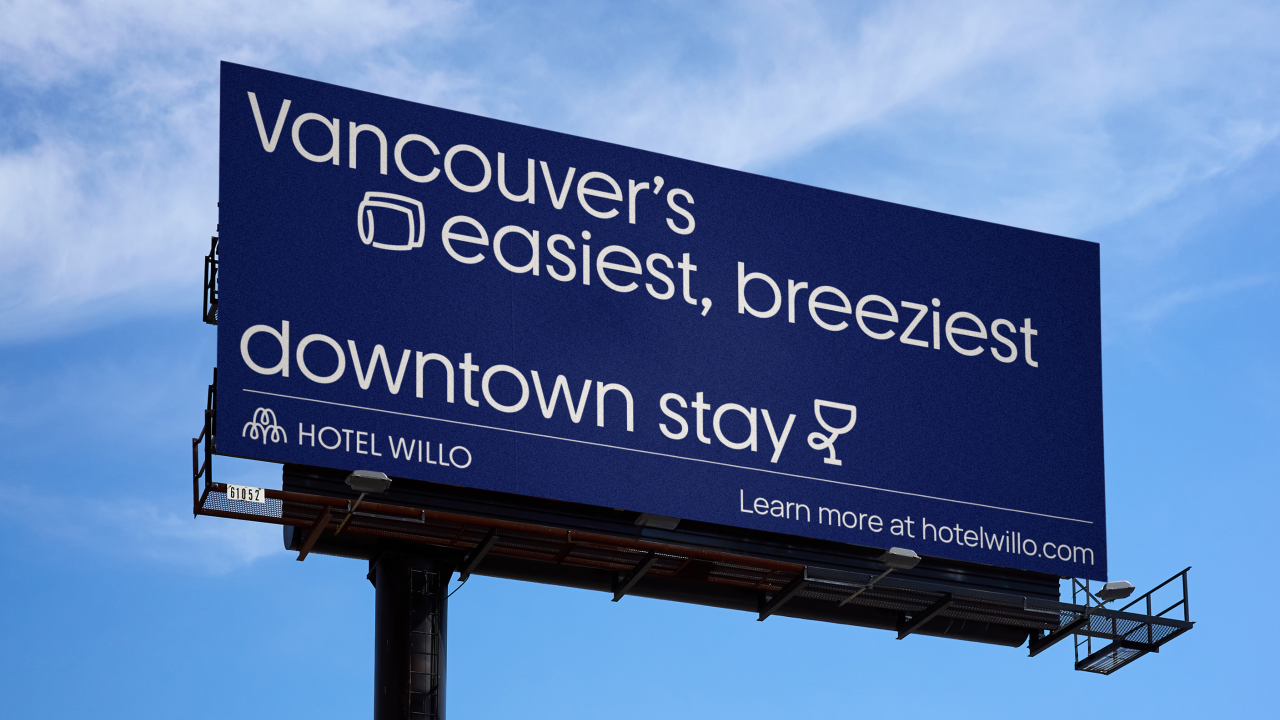
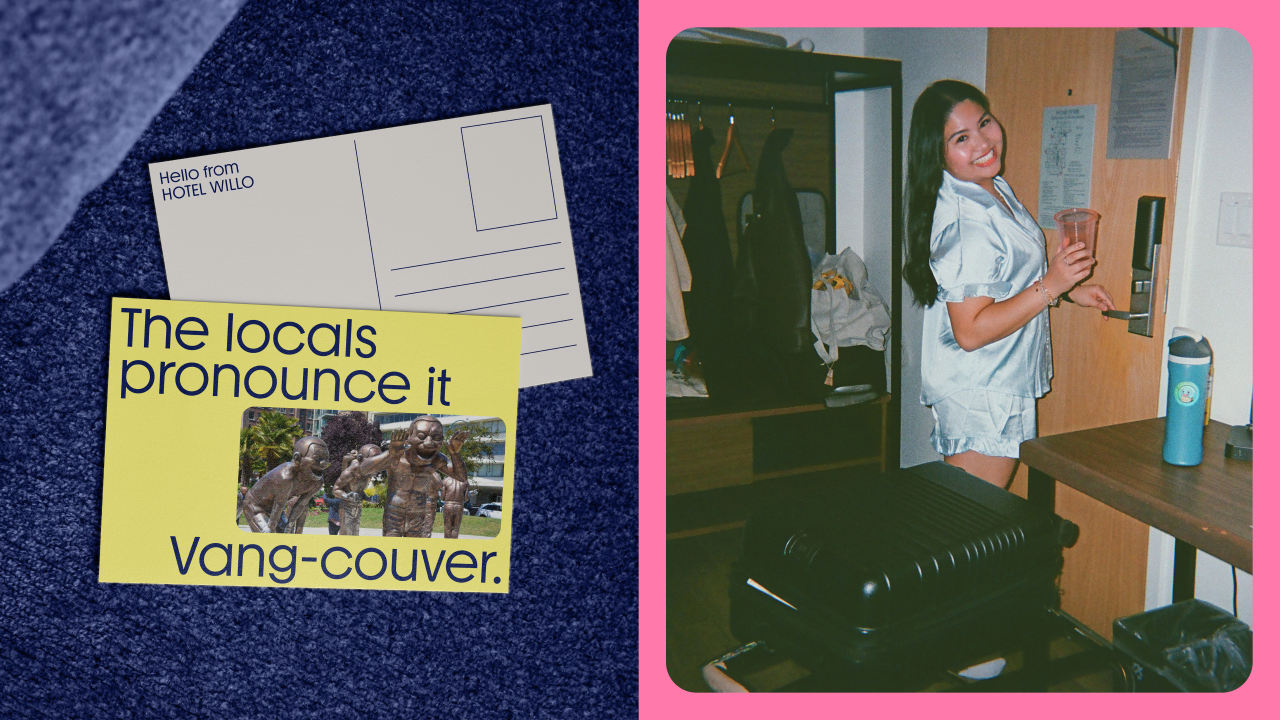
Key cards, housekeeping cards, door hangers, luggage tags and umbrellas all carry the mark consistently, while out-of-home designs lean into a chatty, relaxed tone. A billboard with the words "Vancouver's easiest, breeziest downtown stay", a poster noting that "the mountains are north" to help visitors get their bearings: the brand voice is down-to-earth, practical and just a little bit playful.
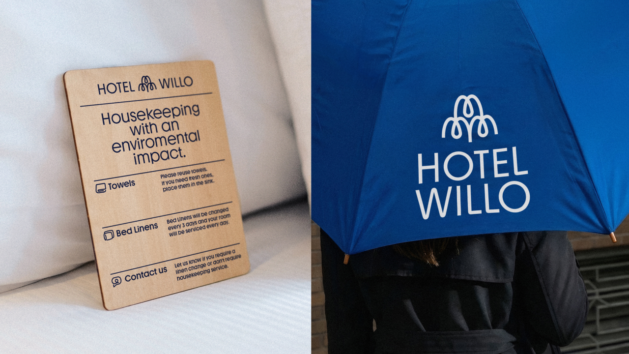
In short, the identity delivers just what it needs: no more, no less, which is to signal an affordable, accessible, enjoyable destination—as opposed to a luxury, exclusive one—with enough personality to be memorable.
And that's largely because Rethink the whole project understood exactly what problem it was solving. Not "make this hotel look nicer", but "stop this hotel's name from actively working against it". A problem they have now decisively resolved.
Editor's Picks





Trending





Latest Jobs
Midweight Designer at Catalyst Creative
Full-time·London·£32k-£36k
Senior 3D Motion Designer at Art&Graft
Full-time·London·£50k-£65k
Lead 3D Designer at The British Museum
Full-time·London·£51,623 per annum
Art Director at SPOKE
Full-time·London·£55k-65k
Art Director at The New York Times
Full-time·New York·$120k–$130k
Senior Operations Manager at BIG Partnership
Full-time·Glasgow·£45k–£50k