Venturethree gave the Young Vic a blurry logo: here's why
The new branding for one of London's most celebrated theatres breaks the first rule of logo design... and does it brilliantly.
There's a set of rules in brand design that seem so obvious, they barely seem worth stating. Your logo must be crisp. It must work at any size. It must survive reproduction on a Post-it note and a billboard equally. It must be legible, precise and technically robust. It must, in short, be nothing like the new Young Vic logo.
The Young Vic is a theatre on The Cut in Waterloo, south London, with a reputation built on uncompromising, director-led work and unusually intimate spaces where the distance between performer and audience collapses. It's the kind of place that sends productions to Broadway and the National Theatre, while also running community programmes rooted in Southwark and Lambeth.
It matters, in other words, both locally and internationally. So the identity that venturethree has just launched for it is probably raising quite a few eyebrows.
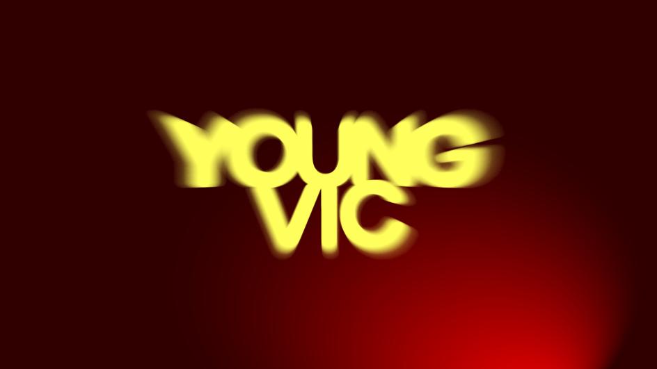
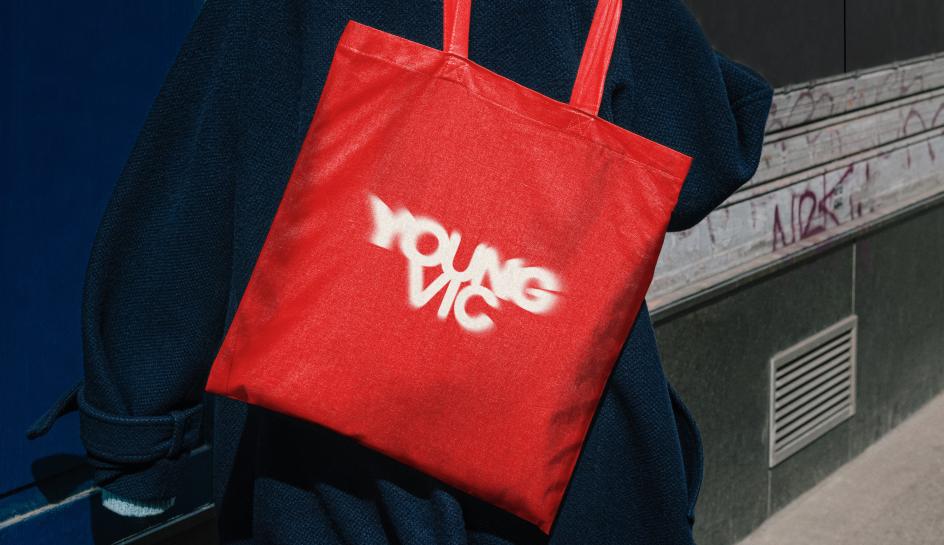
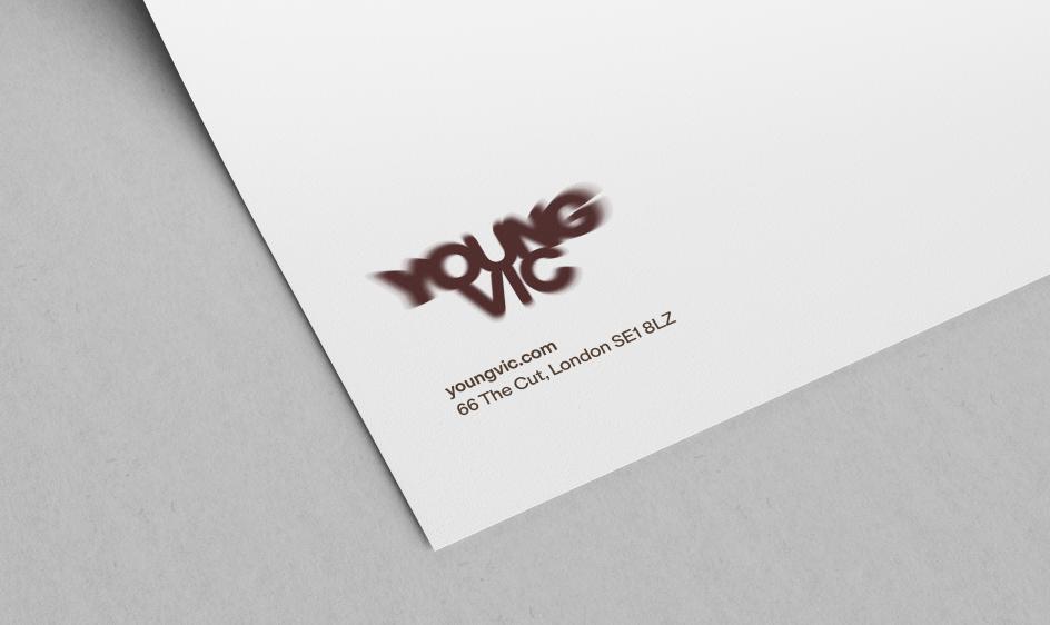
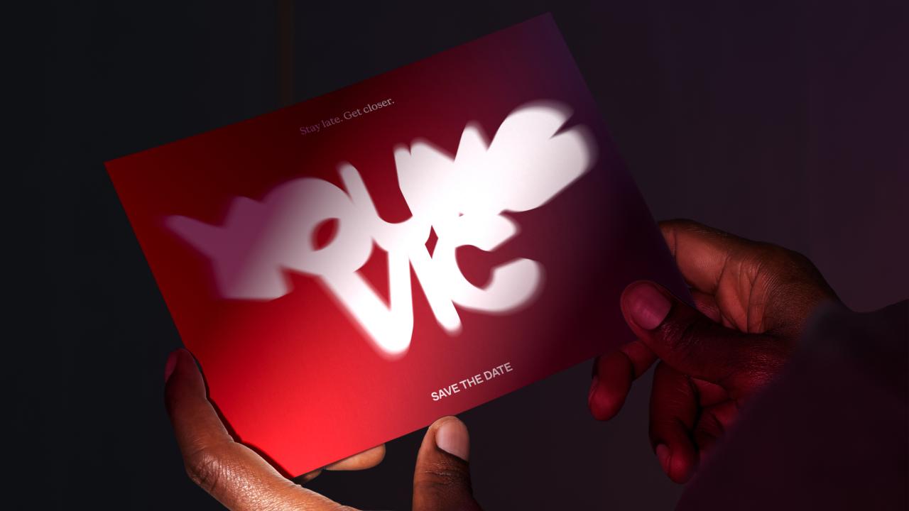
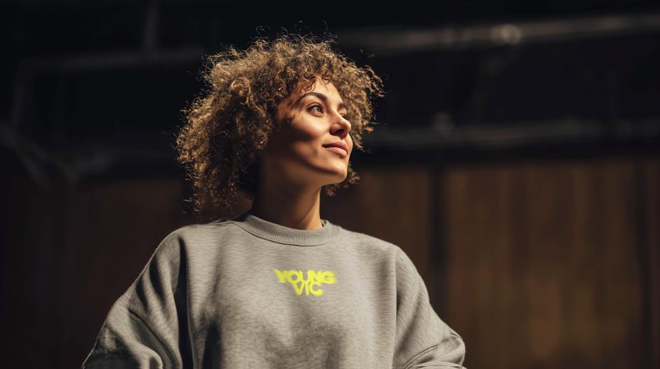
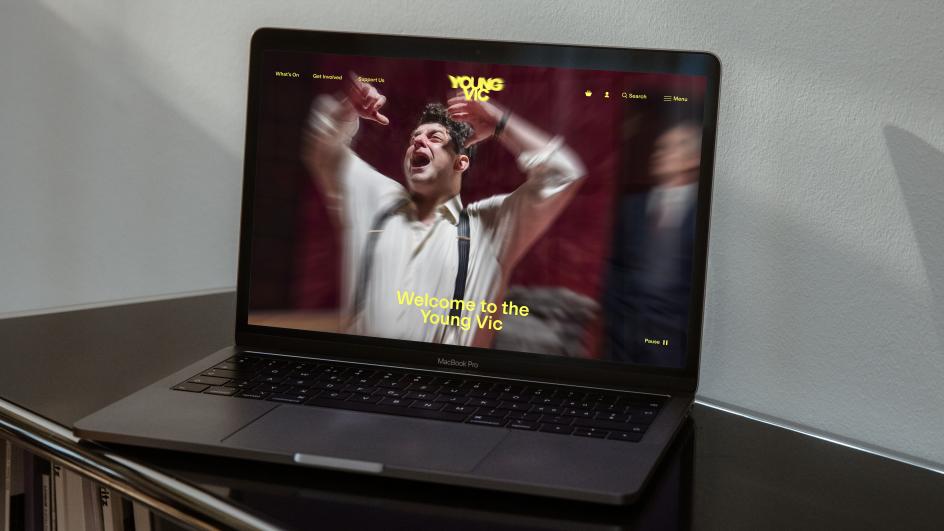
On the yellow-on-dark version, the logo glows like a stage light seen through theatrical haze. On a red tote bag, it looks spray-can immediate, as if someone has just stencilled it there. On a white letterhead, it sits small and soft, somewhere between a smudge and a signature. It doesn't behave. That, of course, is entirely the point.
The brief, as venturethree's creative leads Laura Oakden and Regine Stefan-Aboud put it, was deceptively simple: "The Young Vic's spaces pull you closer than you expect. We wanted a brand that did the same thing before you'd even walked through the door."
Achieving that with a wordmark is harder than it sounds, though. What you're really being asked to do is encode a physical, emotional and spatial experience into two words and a typeface. And then make it work on a ticket, a programme cover, a tube station billboard and a projected logo on a brick wall at midnight.
Against the algorithm
The strategic thinking behind the rebrand is where things get genuinely interesting, because venturethree has done something relatively rare here: it's positioned a cultural institution not just against its competitors, but against an entire technological moment.
The briefing document is frank about the context. "Algorithms determine what people watch, read and listen to, often reinforcing existing perspectives rather than challenging them," it notes. The Young Vic's positioning is built as a direct rejoinder to that condition.
Sarah McGuigan, strategy director at venturethree, articulates it clearly: "The Young Vic isn't about safe or expected theatre. It's about work that challenges people, that confronts them with new perspectives, and invites them to see the world differently." That might sound like marketing copy, but the strategy commits to it in a way that goes beyond sloganeering.
The core positioning—an invitation to artists to make "disobedient theatre that breaks the distance between people"—frames the Young Vic's civic role as something no algorithm can replicate. A live, shared encounter that puts you in a room with lives and viewpoints you didn't choose.
Rather than competing with Netflix on entertainment terms, or with the West End on prestige terms, venturethree has found a differentiated territory that's both honest and defensible. Theatre can't be personalised, skip-forwarded or consumed alone in the dark. It's inconvenient by design, and that inconvenience is its strength.
Architecture as brief
The visual identity grew out of the building itself. Haworth Tompkins' distinctive facade and the theatre's unusually intimate interiors, where the distance between performer and audience collapses, are embedded in the logo through perspective.
Look at the letterforms, and you'll notice the way they seem to draw the eye inward. It's a subtle thing, as visual effects in logomarks tend to be, but it reinforces the spatial quality that makes the Young Vic distinctive. You don't just watch a show here, you're inside it.
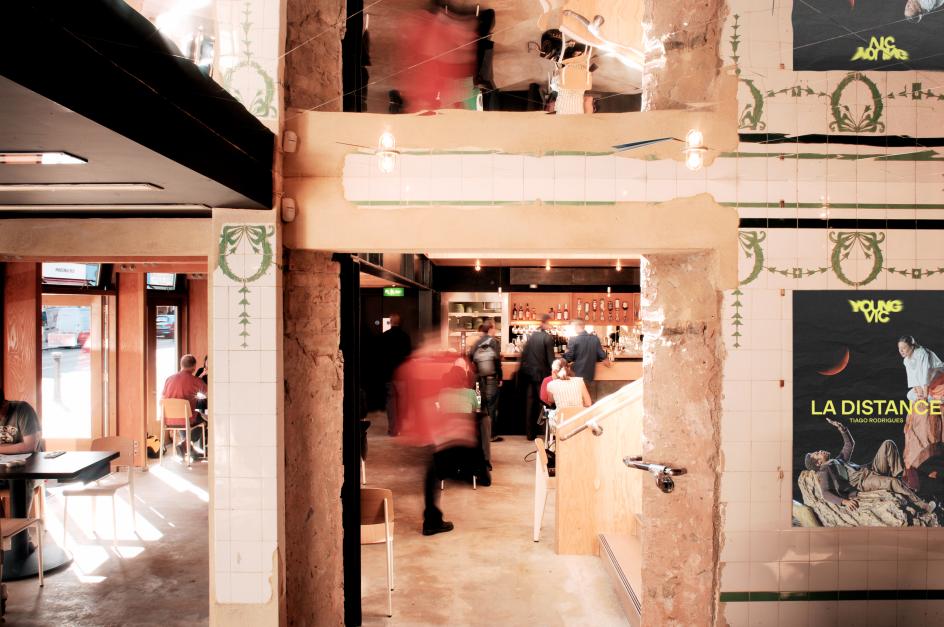
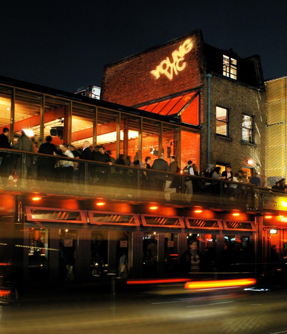
The deliberately handmade quality of the identity honours what the theatre actually is: a director-led, artist-first organisation whose spaces can reconfigure from production to production. A slick, corporate-feeling identity would have been a category error. The fuzziness of the logotype, which can read as motion blur, a projection or a spray-can stencil depending on context, gives it a liveness that polished work would have killed.
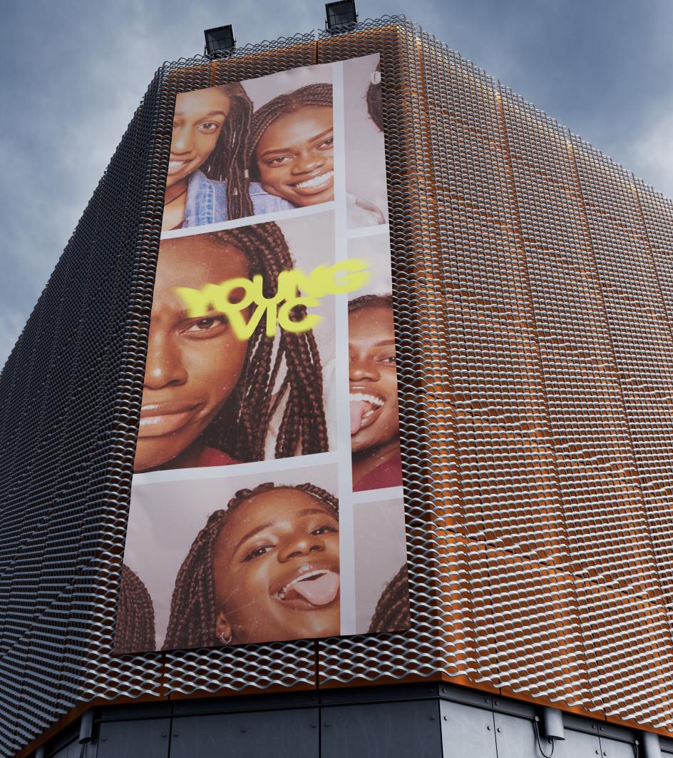
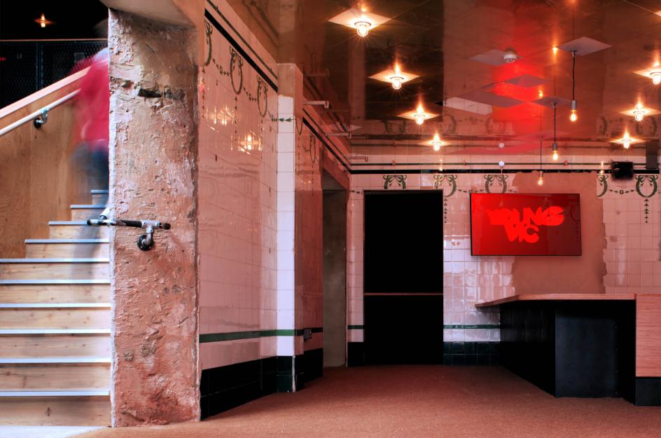
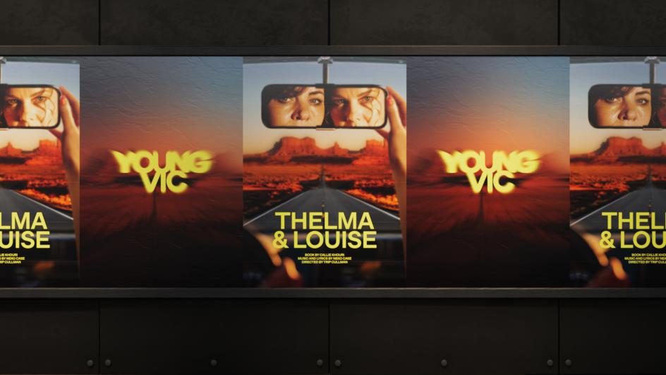
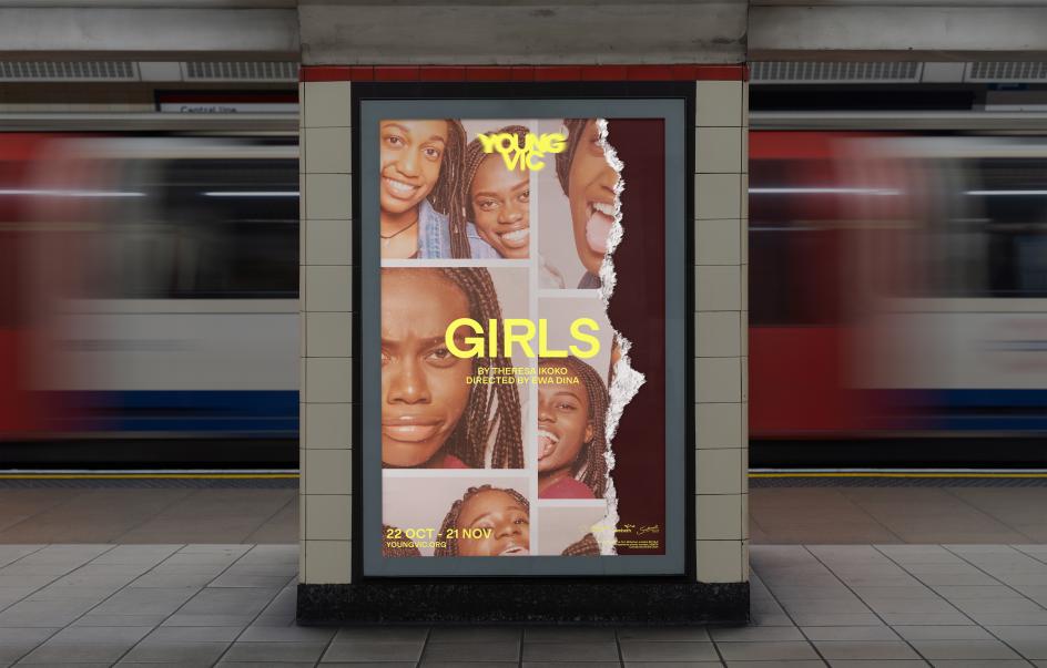
What's also impressive is how well the system scales. Look at the Tube station poster for the show Girls, with its photobooth-strip collage of young women's faces and the blurry yellow logo locked top-left, and it's immediately coherent. Look at the tickets for Thelma & Louise, with the logo overprinted large and glowing yellow across the white stock, and it's joyful. Look at the foyer screen, the red ground with the red logo barely visible against it, and it's atmospheric. A brand system that can do all of those things without feeling inconsistent has been built from a very strong conceptual foundation.
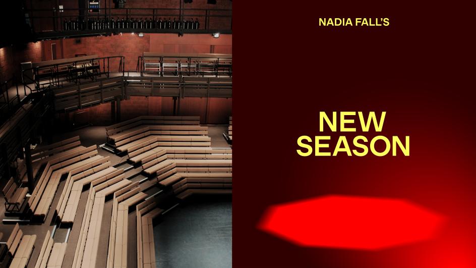
The timing of the project matters too. Nadia Fall took over as artistic director, and the rebrand launched in parallel with her first full season announcement—which meant venturethree was working with a leader who was articulating a new vision for the theatre. That kind of alignment, between strategic positioning and institutional leadership, is often where rebrands succeed or fail.
Nadia Fall herself is straightforward about the collaboration: "The venturethree team have ensured that the process of working on our new brand has been a hugely collaborative and insightful journey," she says. "We couldn't be happier with our new look and feel it perfectly captures the youthful, raw and immediate essence of the Young Vic."
The word "raw" is the telling one there. It's not a quality most organisations voluntarily claim for themselves. Rawness implies unfinished edges, potential pitfalls, and exposure. For a theatre that's built its reputation on disobedient, director-led work with genuinely flexible spaces, though, it's exactly right.
What other studios can learn
For creative studios watching this project, there are a few things worth noting. First, the willingness to break a fundamental logo rule, crispness, in service of a stronger conceptual truth. The blur isn't a stylistic accident; it's the whole argument.
Second, the restraint of the colour system: the near-neon yellow works because it's used boldly and consistently, not sparingly. Third, and perhaps most importantly, the quality of the strategic thinking that underlies the visual work. The positioning against algorithmic culture gives the identity a reason to be urgent that goes well beyond "here's a new theatre season".
Rebrands are often judged purely on aesthetics, but the ones that last are those where the visual language is inseparable from what the organisation believes and how it behaves. This feels like one of those.
Editor's Picks


Trending


Podcasts


Editor's Picks
Further Reading