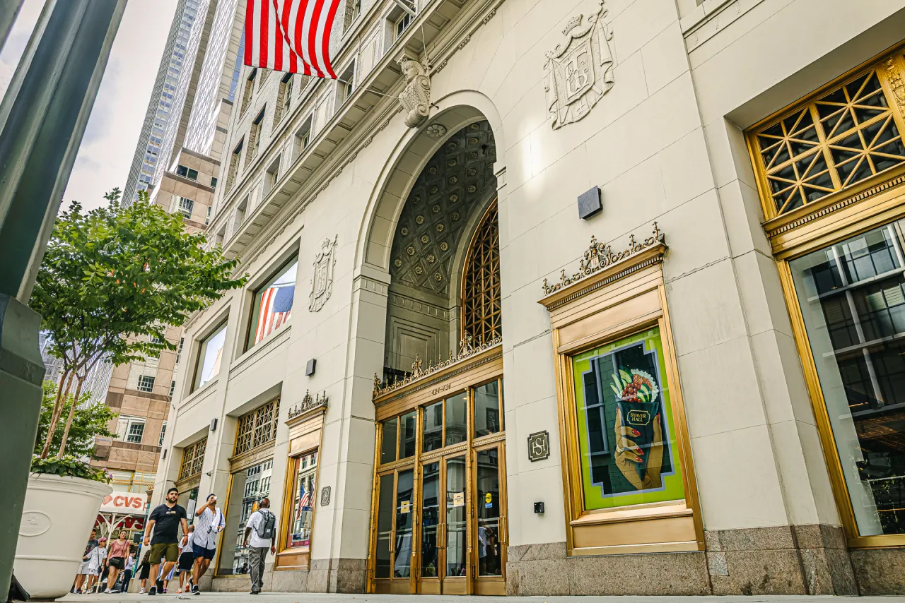
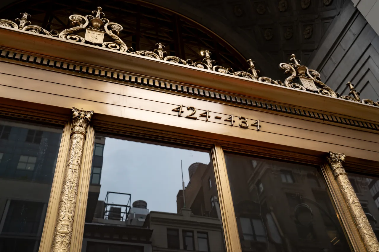
Every city has at least one building everyone walks past without really looking up. The Lord & Taylor flagship on Fifth Avenue is one of New York's: a 1914 limestone hulk with gilded entrances and crests carved into the stone. It's the kind of place that's been there so long, it's almost stopped registering as a place at all.
Now, though, boutique consultancy Love & War has given people a reason to look again. Its branding for Shaver Hall, a new culinary and cultural destination opening inside the old department store, takes a familiar adaptive-reuse problem: how to make a heritage space feel alive without flattening it into another generic food hall. And it solves it by going looking for a person, rather than a mood board.
As such, it's a useful case study for anyone working on legacy buildings, hospitality or naming projects. Because it shows what happens when a brand digs past the architecture and finds a story that has been hiding in plain sight the whole time.
Starting with the name
The key move was made before a single colour or typeface was chosen. Rather than inventing a fictional concept or leaning on the address, Love & War named the venue after Dorothy Shaver (1893–1959), Lord & Taylor's pioneering former president, whose work reshaping American retail had long slipped out of public memory.
As partner Peter Tashjian puts it, this connected the project to an inspiring figure who championed creativity, design and the arts, giving the brand a foundation that's classic in its foundation, but with a contemporary pulse.
It's a reminder that naming isn't just a branding exercise; it can be a strategic shortcut. A made-up name needs a backstory built from nothing. A real one—especially a forgotten one—arrives with built-in texture, credibility and a reason for journalists and customers alike to care. To put it another way, Dorothy Shaver did the heavy lifting decades before the agency turned up.
Borrowing the building's own grammar
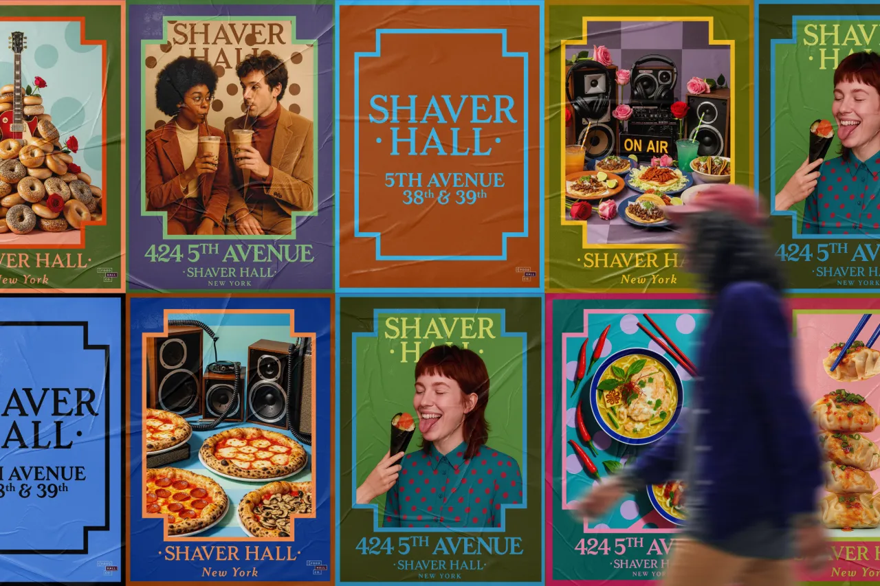
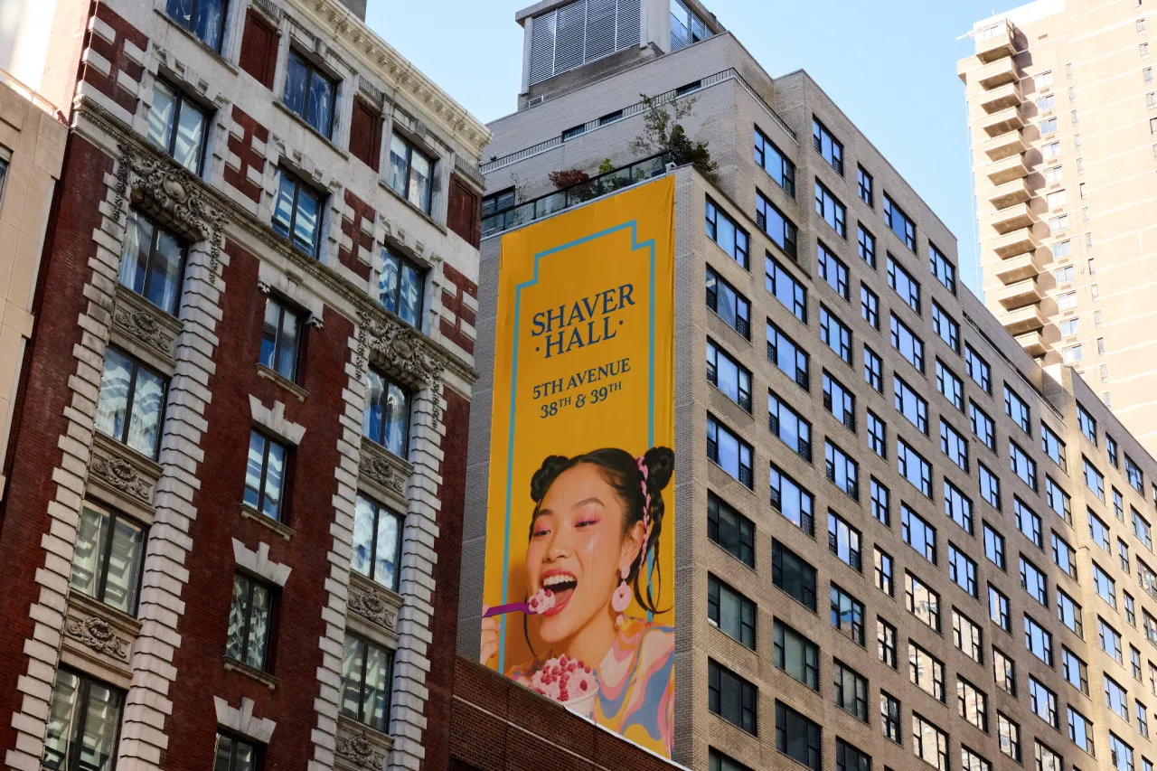
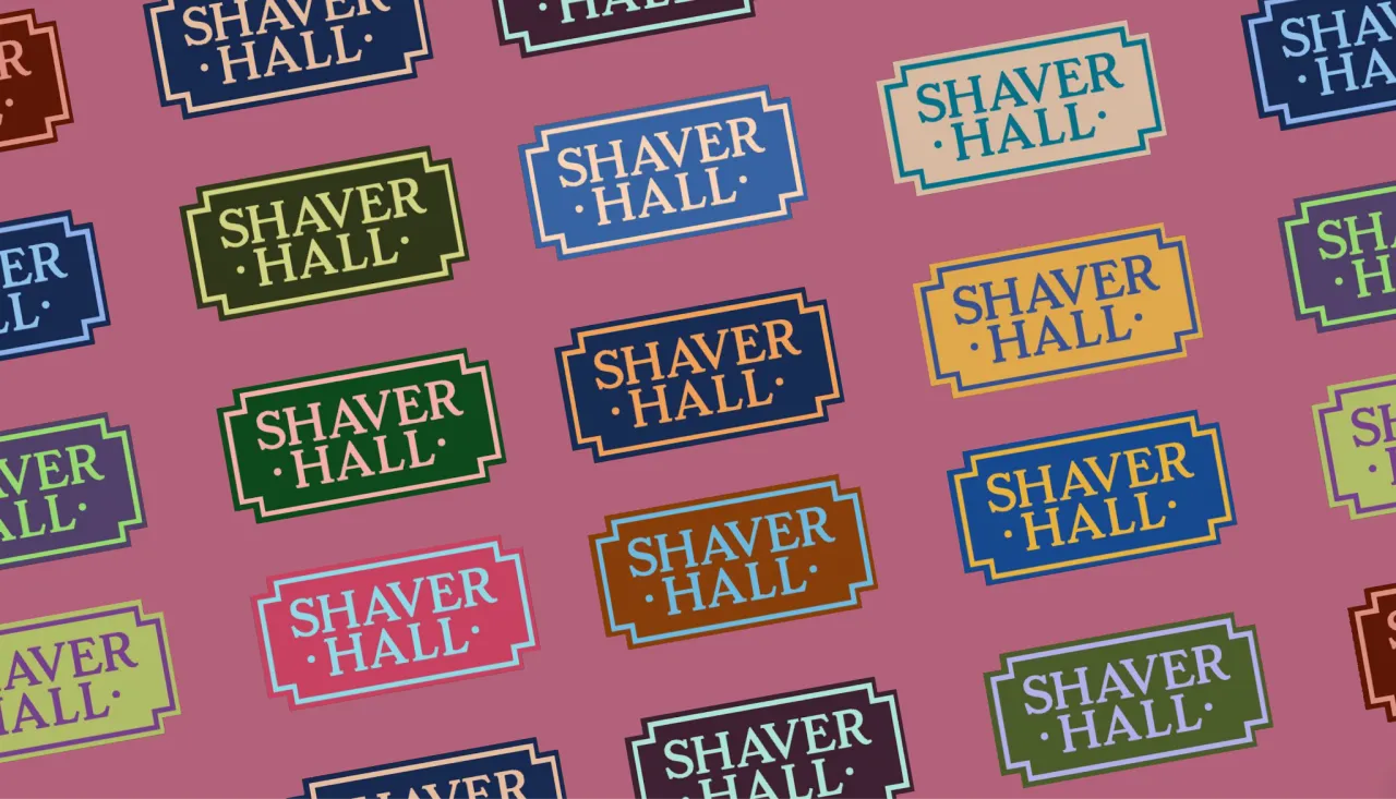
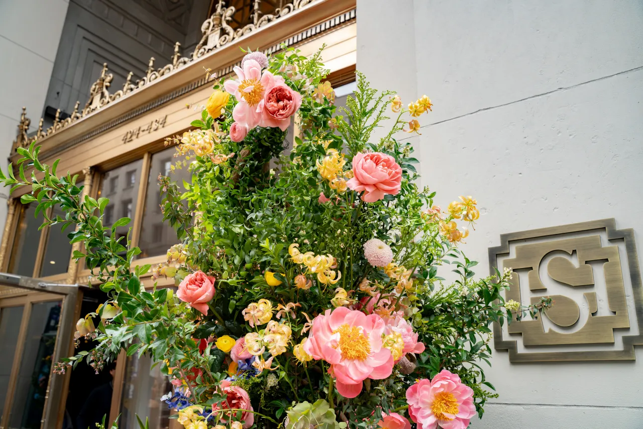
Visually, the identity doesn't try to compete with the building. Instead, it borrows its grammar. The signage uses stepped, art deco-inspired frames that echo the stone crests and bronze fretwork above the original entrances, while the wordmark sits in a chunky serif that nods to the period without tipping into pastiche.
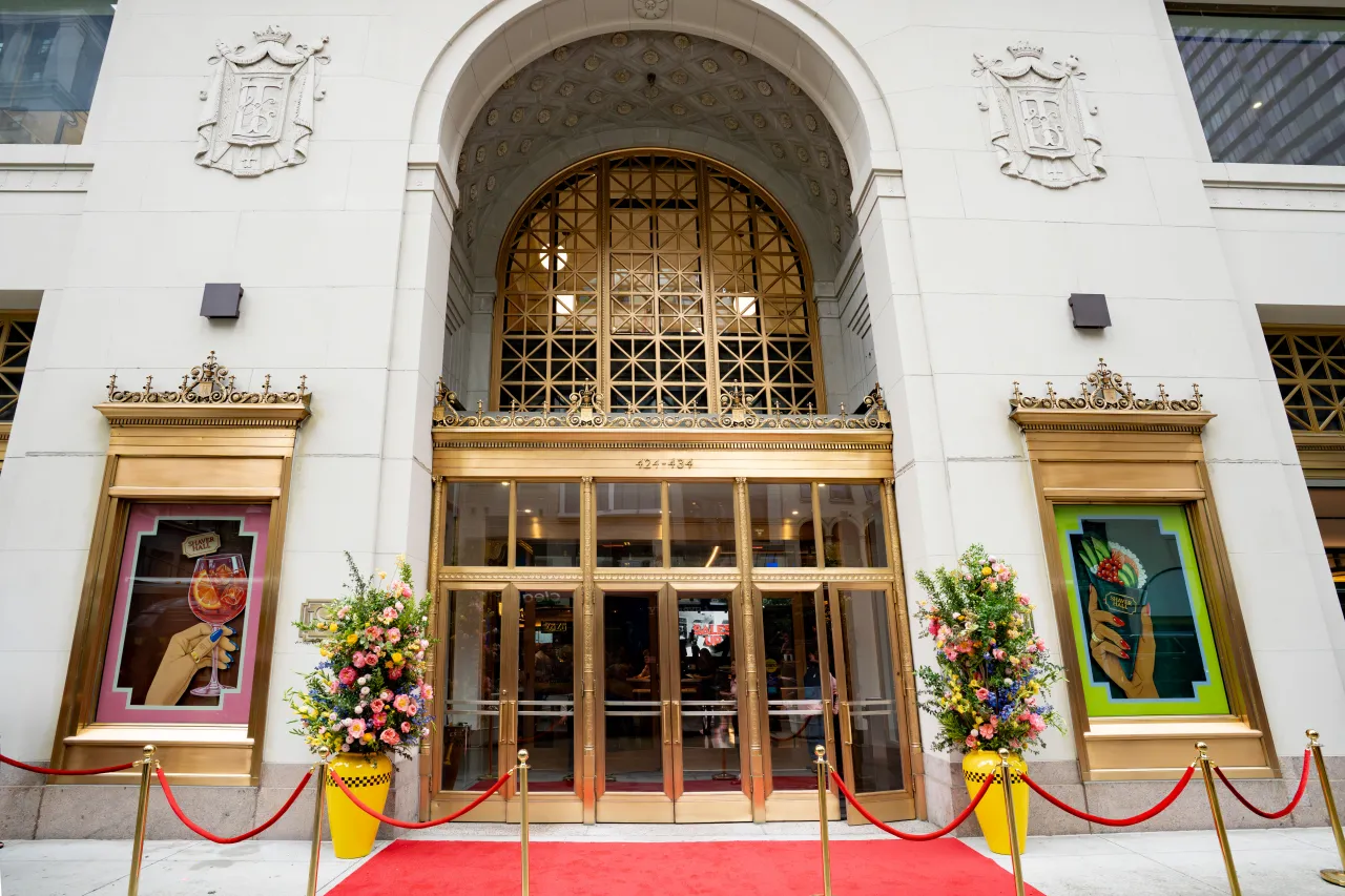
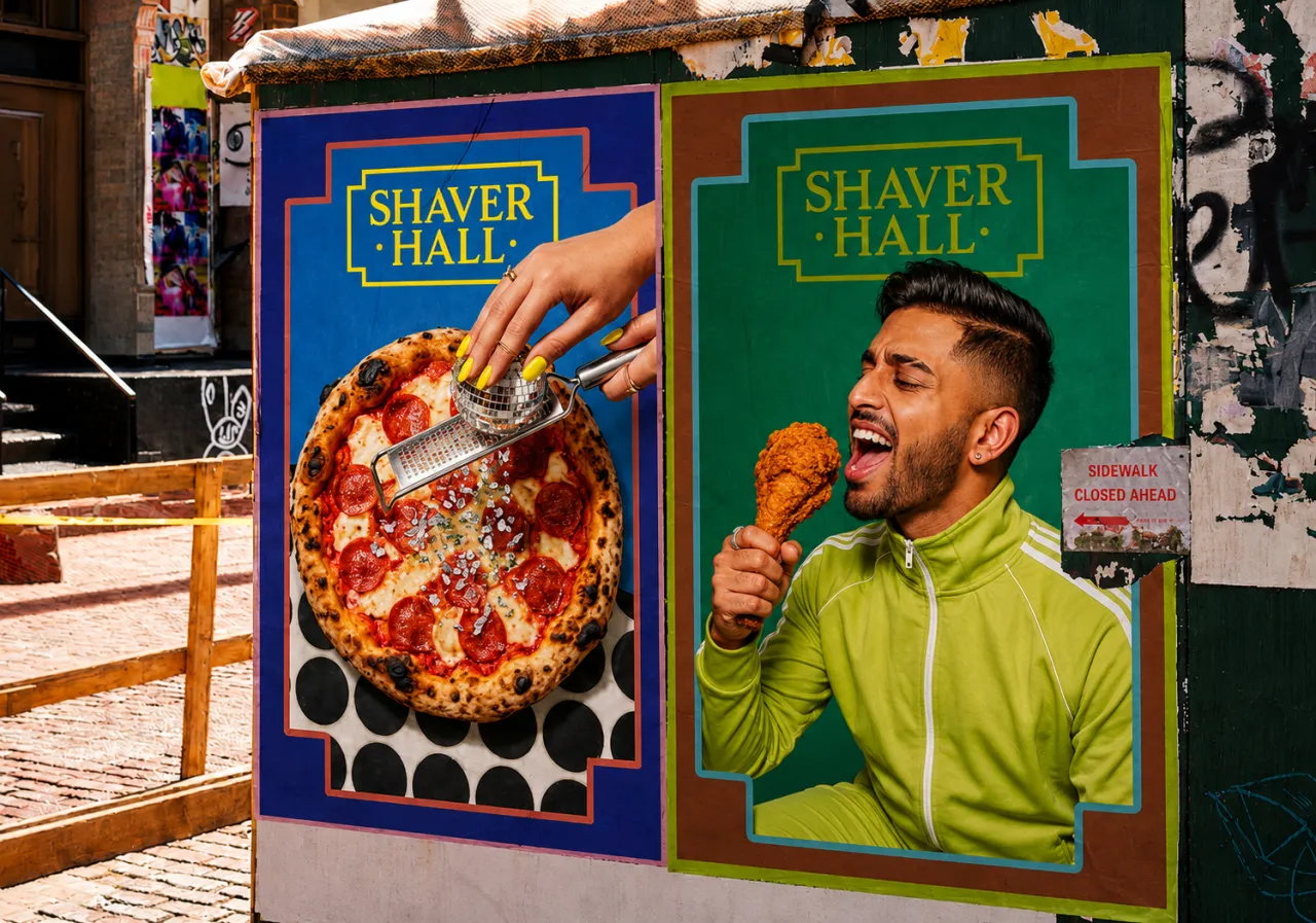
Where the building is grand and golden, the supporting campaign work goes in the opposite direction entirely. We're talking Pop Art colour blocking, polka dots, retro illustration and cheeky food photography, including a tower of bagels styled like a wedding cake, and a couple sharing bubble tea through straws like it's a 1970s soda advert.
That contrast is the whole trick. The architecture supplies the gravity; the campaign supplies the fun.
Plenty of heritage rebrands choose one or the other, either smothering a building in heritage cues until it feels like a museum, or stripping it back so aggressively that the history disappears altogether. Shaver Hall's identity holds both at once, letting the gold leaf and the gelato posters share a wall, without either one looking like it's apologising for the other.
Keeping things loose
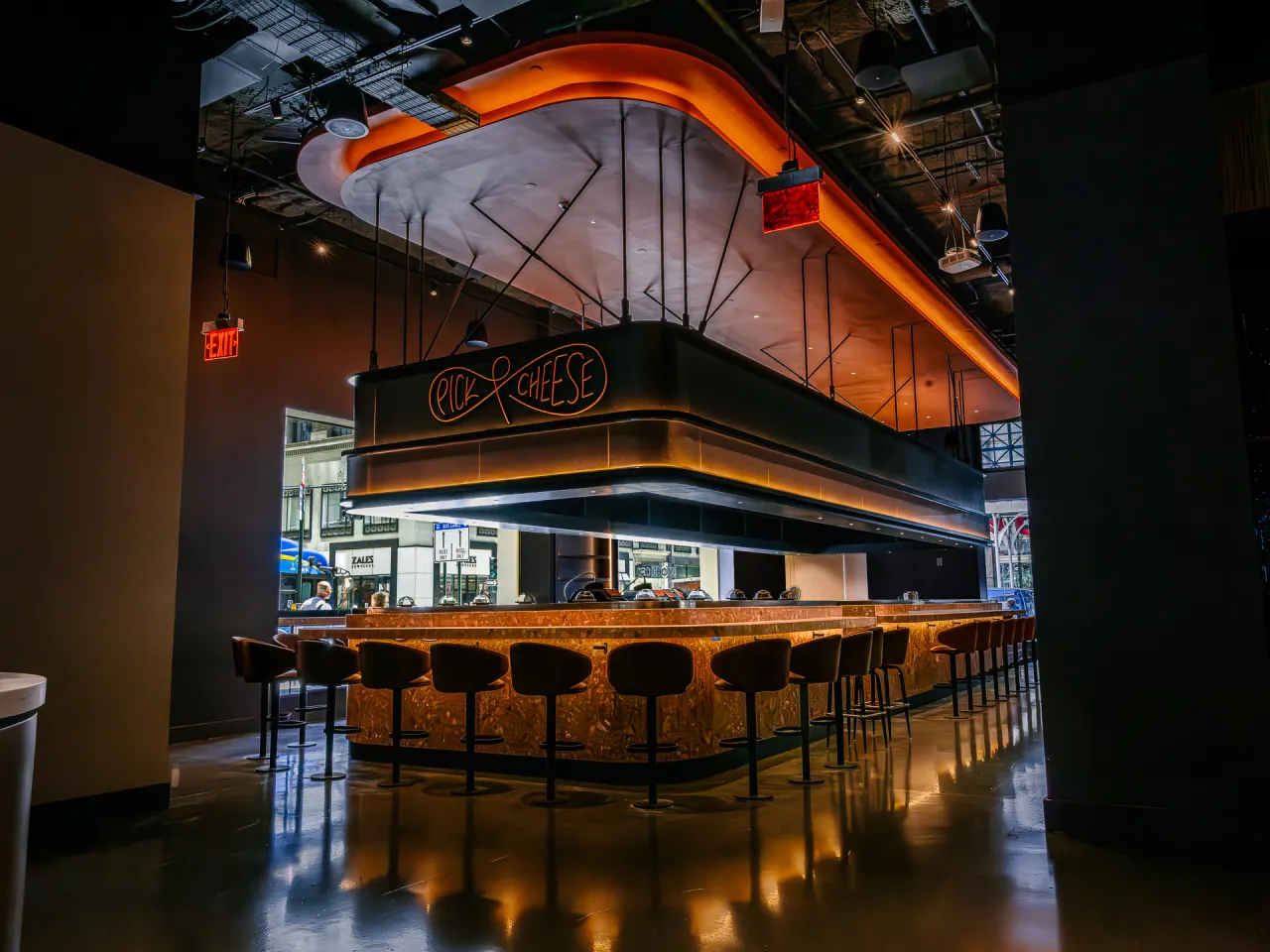
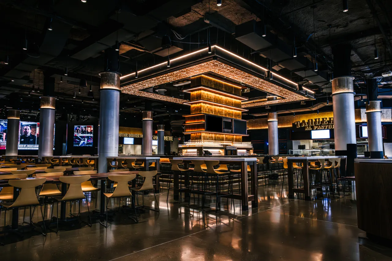
A food hall isn't one brand; it's dozens of them sharing a roof. And so the identity had to flex across the whole thing. A steakhouse called Tallow occupies the building's old jewellery-flagship corner. A cheese counter with its own neon signage. An ice cream stand, taco counters and a central stage for live performance, rather than forcing every vendor into an identical template, Love & War built a system loose enough to host that variety, while still feeling unmistakably like one place.
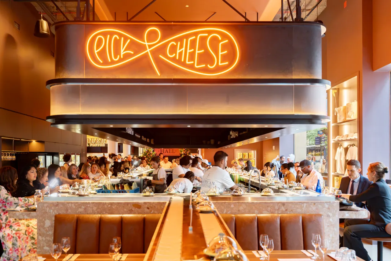
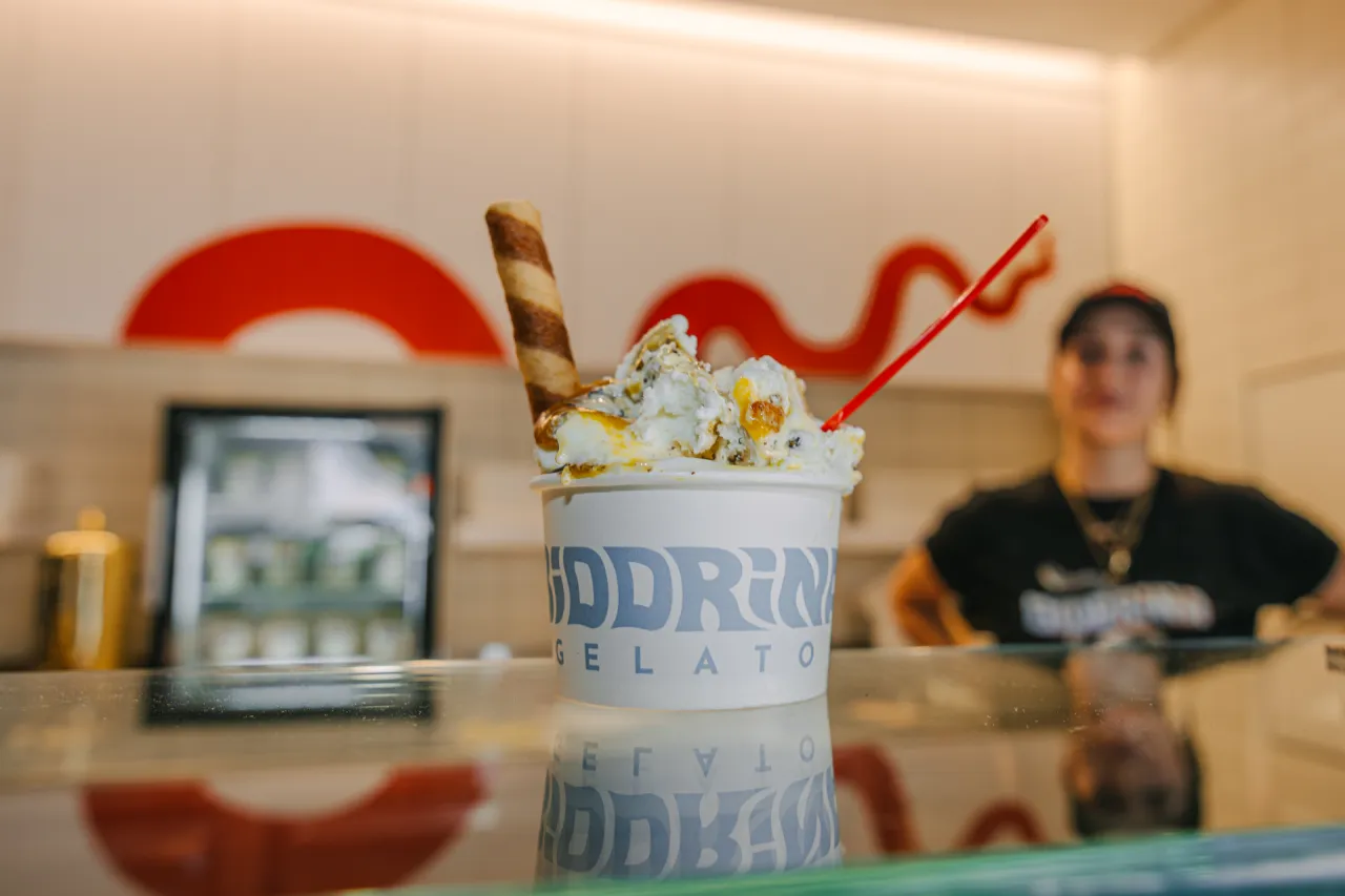

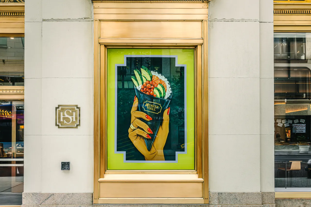

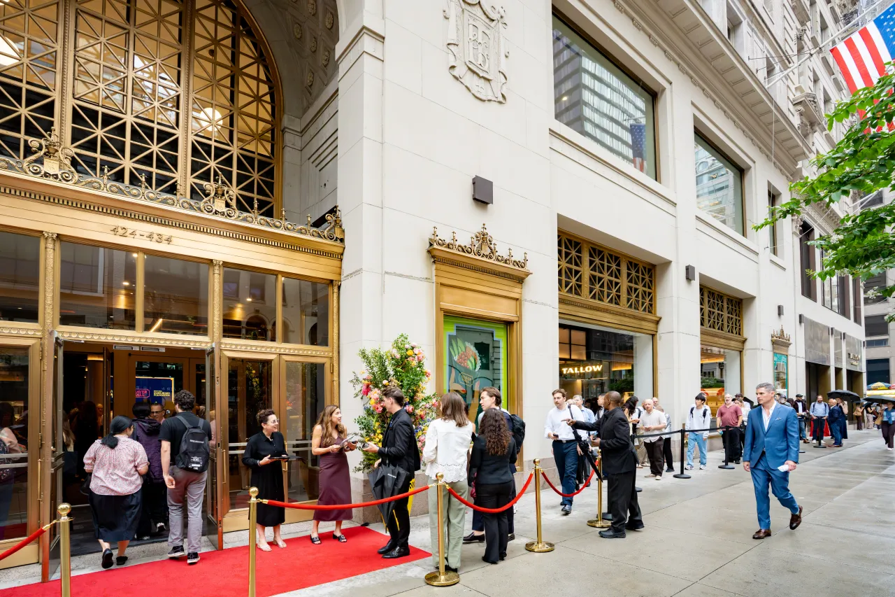
The result is a brand that honours the history of this landmark building while introducing Shaver Hall as an entirely new experience for Midtown Manhattan. The launch images back that up: a red carpet and topiary-sized floral displays at the gold-framed entrance, queues stretching down Fifth Avenue, and a hall packed with diners under a Pick & Cheese neon sign. All proof that a 110-year-old building can still pull a crowd when the welcome feels right.
For anyone asked to redesign a heritage site this year, the lesson isn't really about typefaces or taxi-yellow vases, satisfying as those details are. It's that identity work that often starts with research rather than design. Find the person, the moment or the detail a building has forgotten about itself, and one of those things may do the work a logo never could.
Editor's Picks





Trending





Latest Jobs
Art Director at The New York Times
Full-time·New York·$120k–$130k
Senior Operations Manager at BIG Partnership
Full-time·Glasgow·£45k–£50k
Creative Content Executive at Cognition
Full-time·Birmingham·£28k–£35k
Deputy Head of Stage at Factory International
Full-time·Manchester·£35,015
Client Success & Growth Director at Revolution Growth
Full-time·Manchester·£60k-£70k
Senior Designer at Jubba
Full-time·London·£50k-£60k