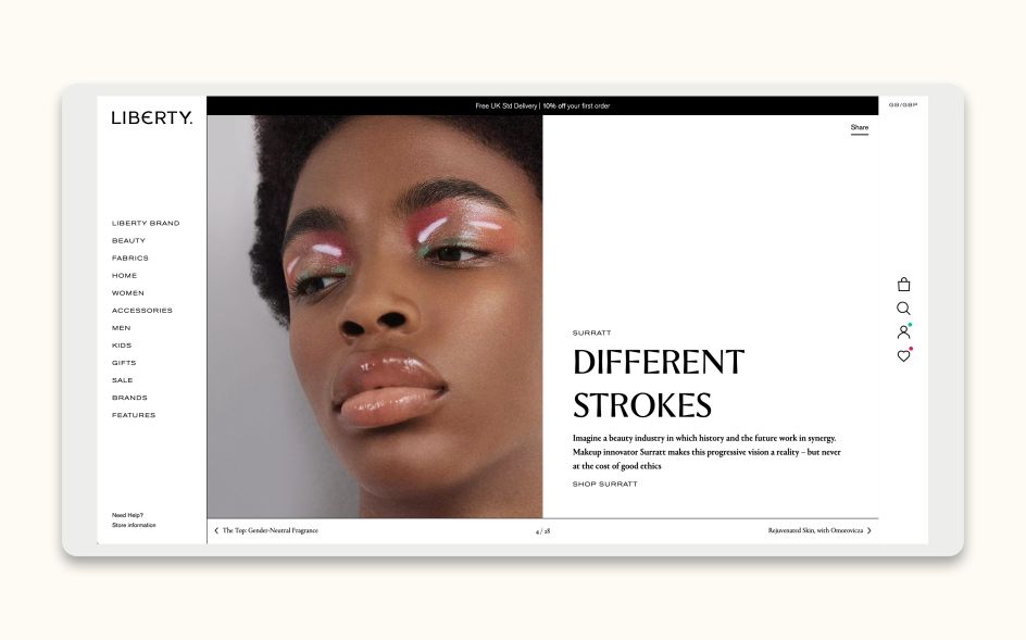
Pentagram creates the 'most authentic' logo in iconic department store Liberty's history
For Londoners, at least, any reference to the department store instantly conjures up a mental picture of busy floral prints that somehow avoid tweeness in favour of luxury. Of striking dark timber interiors and an imposing Tudor-revival exterior that's something between a romantic novel and an early gothic horror film.
With such a rich heritage, it can't be an easy job to create a new brand identity for Liberty; but that's exactly what Harry Pearce and his team at Pentagram London have been up to.
Founded at a different location to its current Great Marlborough Street home, where it's been since 1924, Liberty was founded by Arthur Lasenby in 1875. Then, as now, the store sells a range of items across fashion and homeware; all carefully selected for their striking features and craftsmanship.
According to Pentagram, the new identity had to both reference Liberty's rich heritage and "embody Liberty's forward-thinking ethos" to "take it confidently into its next chapter". And while Liberty has retail outlets outside the capital; the designs also had to nod to a sense of place, and the fact that the Liberty brand is synonymous with London.
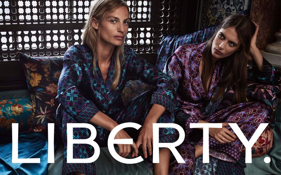
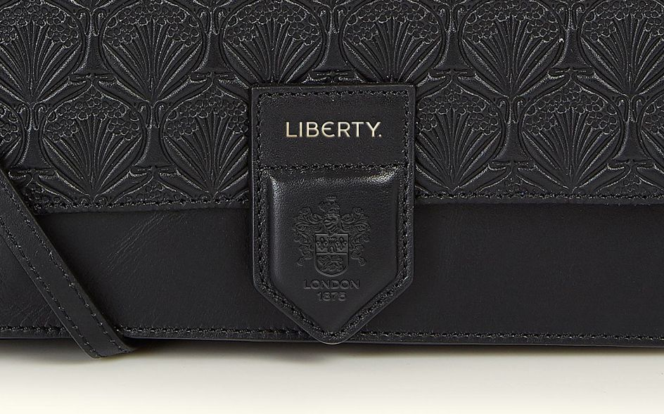
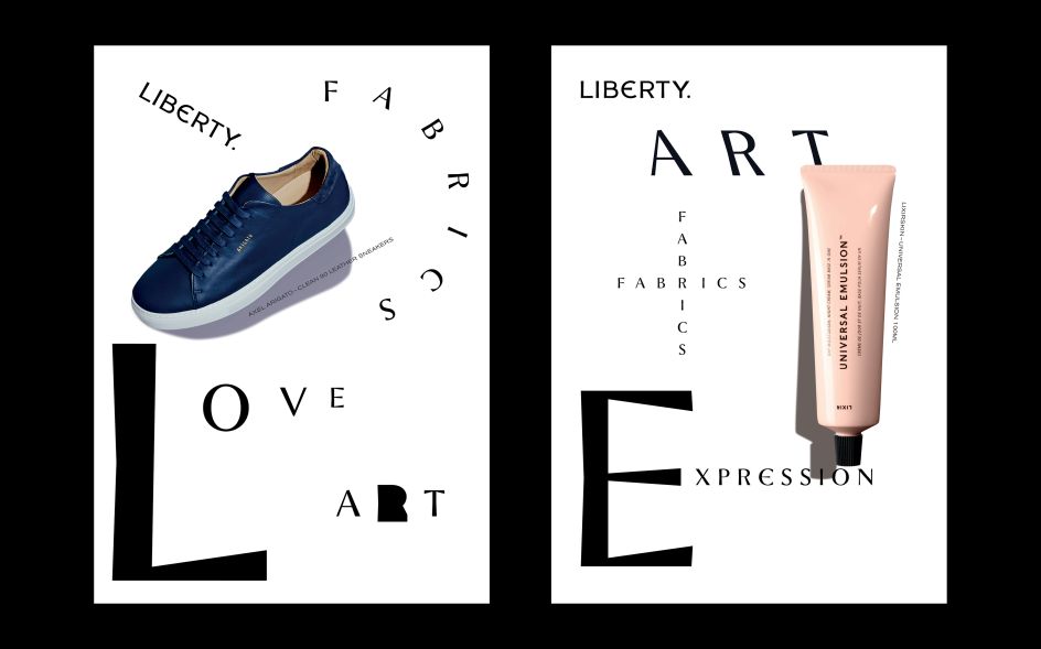
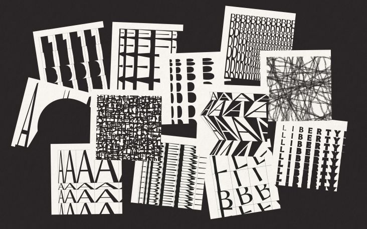
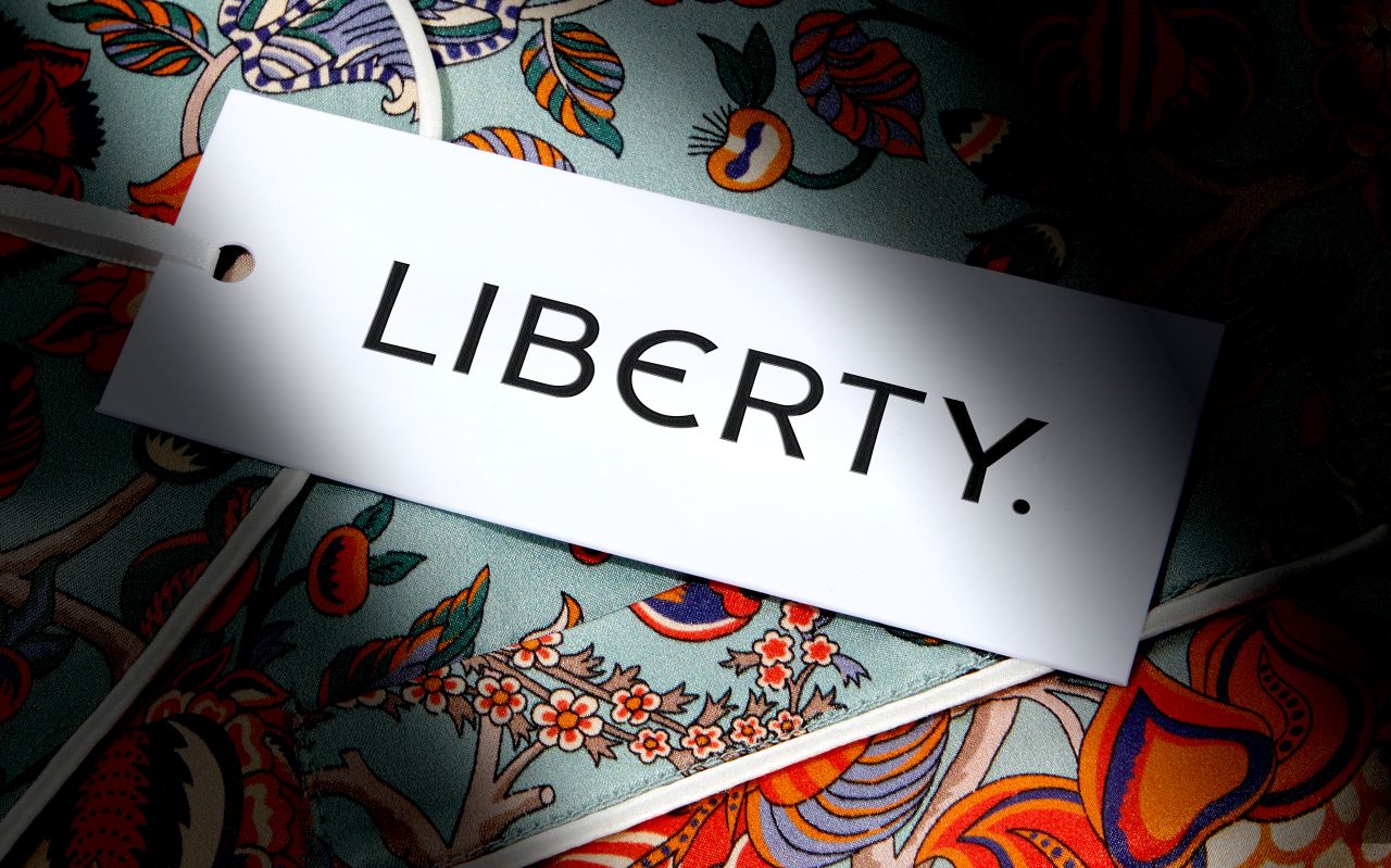
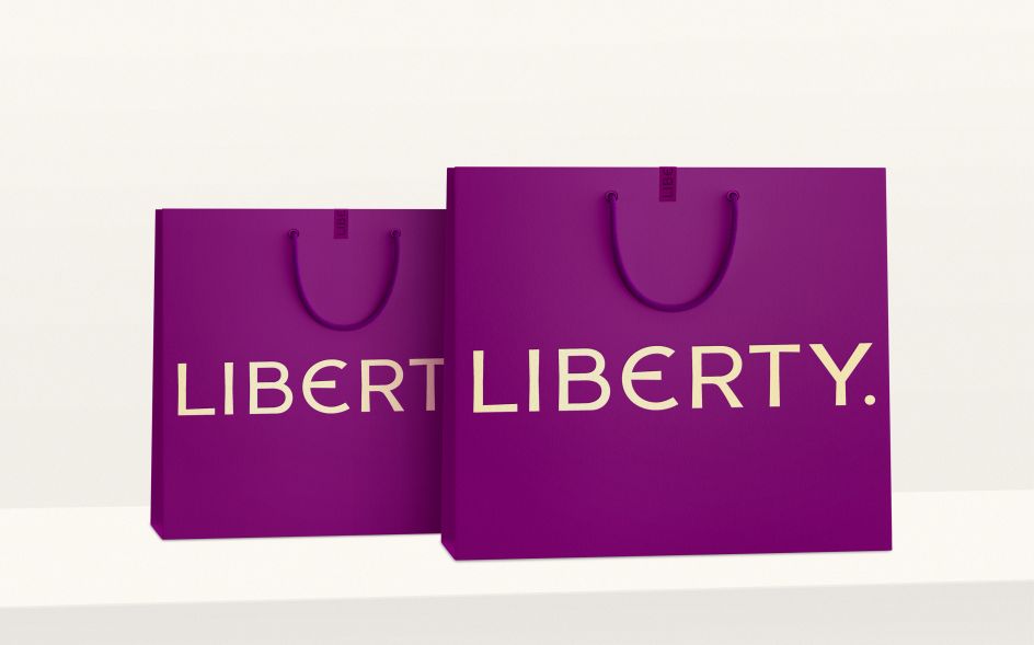
A new flexible logotype was created, which can be "repeated, layered and bent" according to various applications such as packaging, campaigns and prints. According to Pentagram, this is the "most authentic" logo in Liberty's history: "carefully redrawn and refined from the original sign that still hangs above the store's Great Marlborough Street entrance, it now includes the full-stop which appears on the sign".
Pentagram also redrew the Liberty crest "to give a subtler, more modern effect" while retaining the much-loved icon alongside the strapline 'London 1875'. The new design strategy looks to use these assets as "embellishments to the brand rather than part of the brand itself," says the studio. "Working alongside the retail brand without dominating it, both can be used sensitively to add a sense of heritage, place or 'added' value, especially for the overseas market."
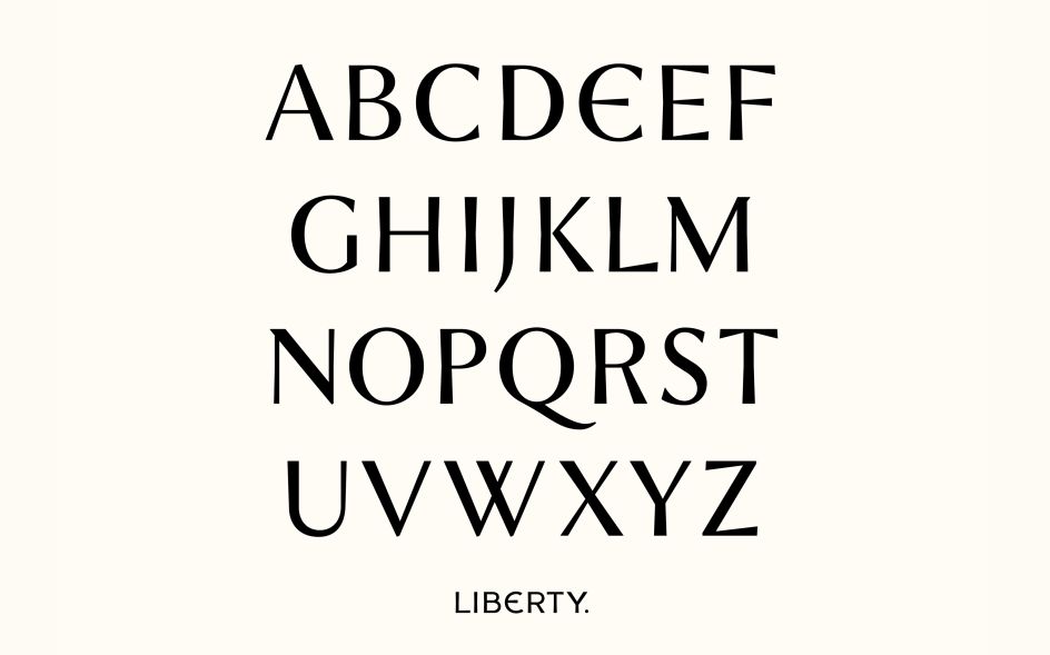
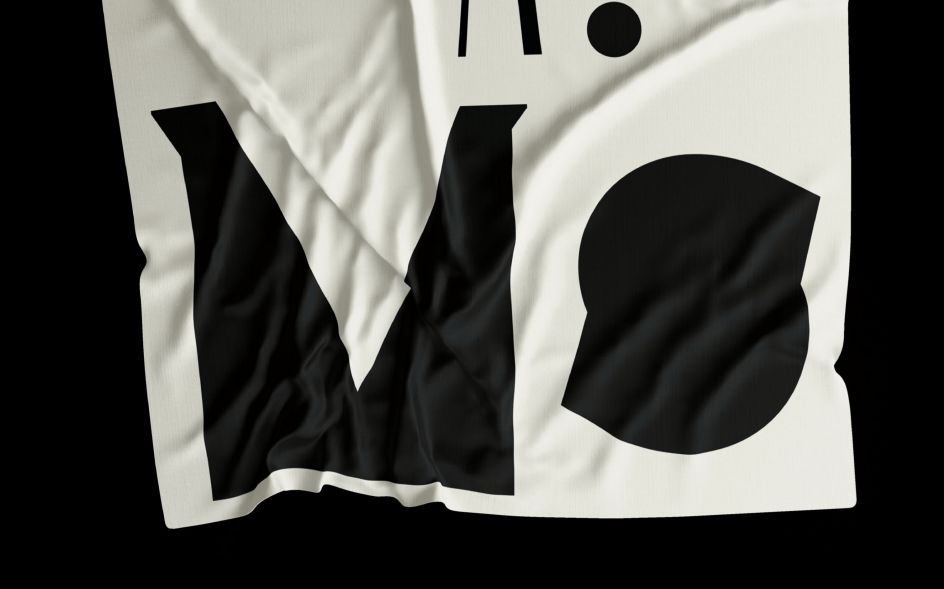
The new logotype was used as inspiration for a custom display typeface, Lasenby Sans, named after Liberty's founder and created in collaboration with Colophon type foundry. Among the distinguishing features of the "idiosyncratic and crafted" are tapered line endings, a low x-height and a distinctive curved 'Epsilon' style letter 'E'. Although idiosyncratic and crafted, it still feels effortlessly modern.
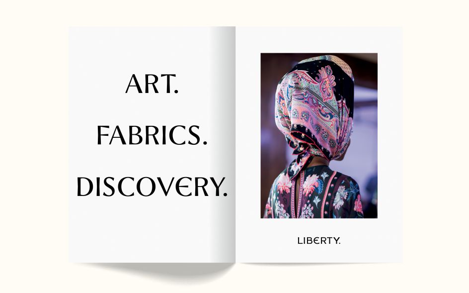
"Lasenby Sans is adaptable and designed to be used in many different contexts, which allows for a wide array of expressive forms," says Pentagram. "The design team created a series of playful and unexpected typographic executions which perfectly capture the spirit of the 'unapologetically eccentric' brand." Commercial Type's font Portrait, a serif, and Akzidenz Grotesk BQ from Berthold are used alongside Lasenby Sans for running text and body copy.
The reworked colour palette retains Liberty's iconic purple hue but adds in a new primary colour palette that 'mixes tradition, luxury and modernity; with subtle gold, black and white supporting colours.
Pentagram's new branding for Liberty is being rolled out gradually. It will eventually be used on all touchpoints including carrier bags, swing tags, print collateral and across the website and app.
Editor's Picks


Trending

Podcasts

Editor's Picks
Further Reading