Koto rebrands the Norton Museum of Art with an identity where art truly meets life
Drawing from the museum's archives, architecture, and vibrant community, Koto has crafted a new identity designed to help it grow its national presence while staying connected to everyday local life.
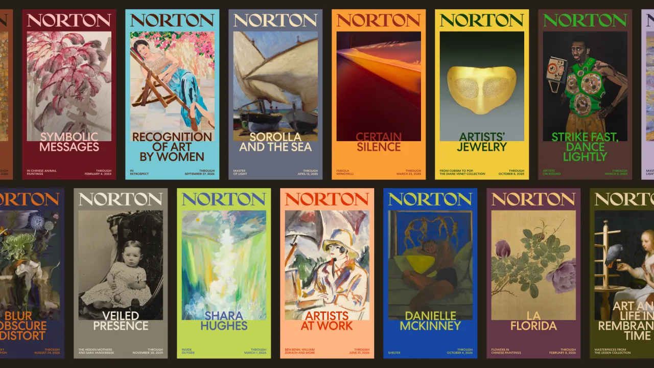
Since 1941, the Norton Museum of Art in West Palm Beach has blurred the lines between gallery and gathering place. Visitors might come for a John Singer Sargent, but stay for Friday evening events, a stroll through the gardens, or lunch at the museum restaurant. It's an institution where art has always existed alongside everyday life, rather than separate from it.
That unique spirit became the starting point for Koto, the global creative studio tasked with overhauling the Norton's identity as it looks towards a more ambitious national future. The challenge wasn't simply to modernise its image, but to capture the warmth, openness and sense of community that have long defined the experience of being there.
The brand strategy revolved around the premise "Where Art Meets Life". To uncover it, Koto dug through the museum's archives, attended events such as Art After Dark, took guided tours, spoke with staff and volunteers, and just spent time within the many spaces. What they discovered was an institution that had done the groundwork of making art feel inclusive and open.
The Norton's new voice takes its cues from the people who know the museum best: its own community of curators and docents. Warm, curious and knowledgeable, the verbal identity reflects the way its trained guides have always spoken about art – as something personal, alive and worth getting close to. That same voice now runs across every touchpoint, from exhibition labels and captions to digital content and wayfinding.
The identity itself is built around the energy of art and life meeting in one space—old and new, institution and community. Rather than fighting these two worlds, Koto layers them together. At its heart is the new Norton wordmark, a revived piece drawn from the museum's archive and slightly refined for today.
Something else uncovered during the research phase was The Diana Seal, a 50th-anniversary mark inspired by Paul Manship's Diana statue and originally commissioned by Ralph Norton in 1941. It's been brought back to life and redrawn for clarity across screens and smaller formats, and it will appear intentionally during celebratory moments, historical references, and subtle brand details.
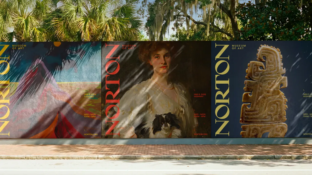
Colour-wise, the core palette draws from the distinct tones of housed artwork alongside the surrounding landscapes of West Palm Beach. Think saturated yellows, sky blues, and oranges creating energy and visibility, while Klein blue, olive green, and warm black add depth and contrast. An extended palette allows more hues to be pulled from the art in Norton's collection and temporary exhibitions, allowing the new identity to shift over time.
Looking at the typography, Centra No. 2 was chosen for its clean geometry and circular forms, designed to echo the modern architecture of a recent Foster + Partners expansion. "It has a distinct point of view while remaining open and welcoming, much like the museum itself," explains Koto.
Art direction completes the picture. Photography uses natural light, rich colour and open compositions to make the Norton feel welcoming and alive. Close-up details, expressive gestures and candid moments capture the Florida light, gardens and local community at their very best.
"There's a version of this project where you lean into the gravitas, the architecture, the collection and the history," explains Katie Hughes from Koto. "The Norton has all of that in spades. But when you spend time there, something else becomes impossible to ignore: the tour guides talking about art as personal experience rather than art history, the community showing up for Art After Dark, for lunch, for the garden. The brand idea had to hold both the institution and the life happening around it."
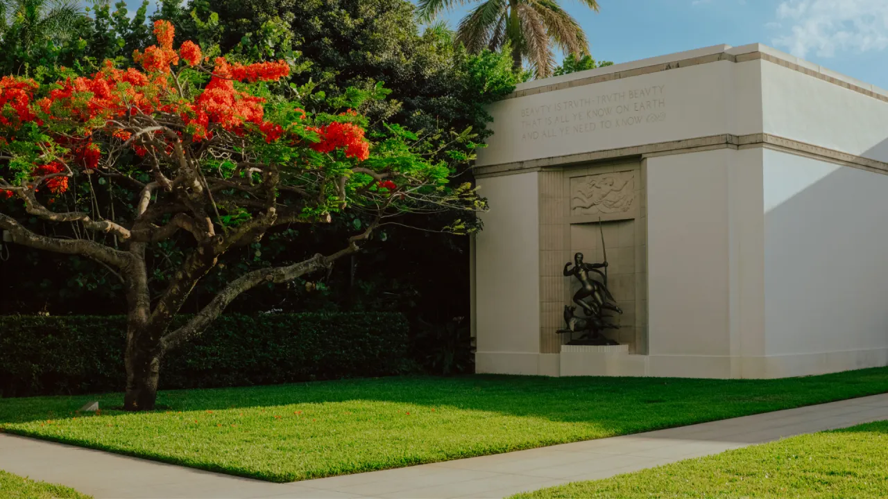
David Shatan-Pardo, design director at Koto, adds: "We were inspired by a place that felt like it was always changing in communication with itself and its surroundings, and worked to craft an identity to match."
The Norton never needed reinventing. And Koto seems to have understood that. The new identity reflects the life already happening within its walls.
Editor's Picks





Trending


Latest Jobs
Client Director at Koto
Full-time·Berlin·€70k-€85k
Design Director at Koto
Full-time·London·£72k-£90k
Account Director at How&How
Full-time·London·£73k-£79k
Lead Digital Designer at Together
Full-time·£55k–£75k
Senior Account Manager at Consider
Full-time·London·£42,500
Junior Project Coordinator at Colorido Studios
Full-time·Twickenham·£28k–£32k