Pentagram's new identity for Camden Art Centre celebrates its heritage and local importance
Pentagram has designed a sophisticated and modern new identity for Camden Art Centre, one of London's most respected spaces for showing groundbreaking contemporary art.
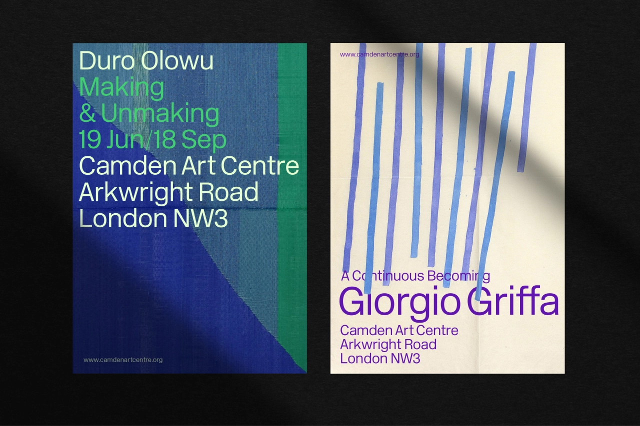
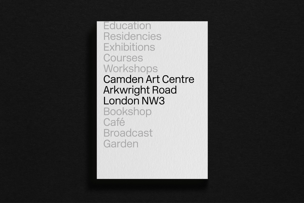
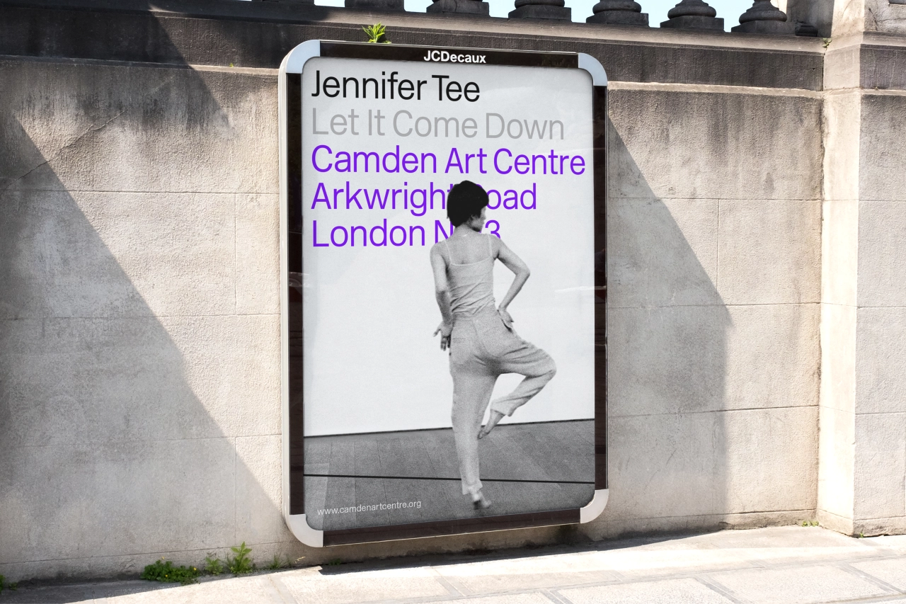
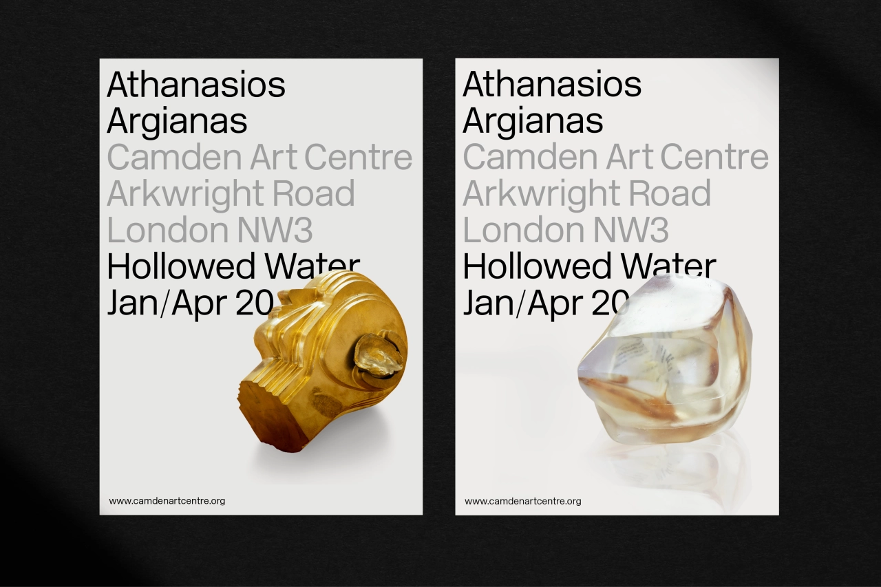
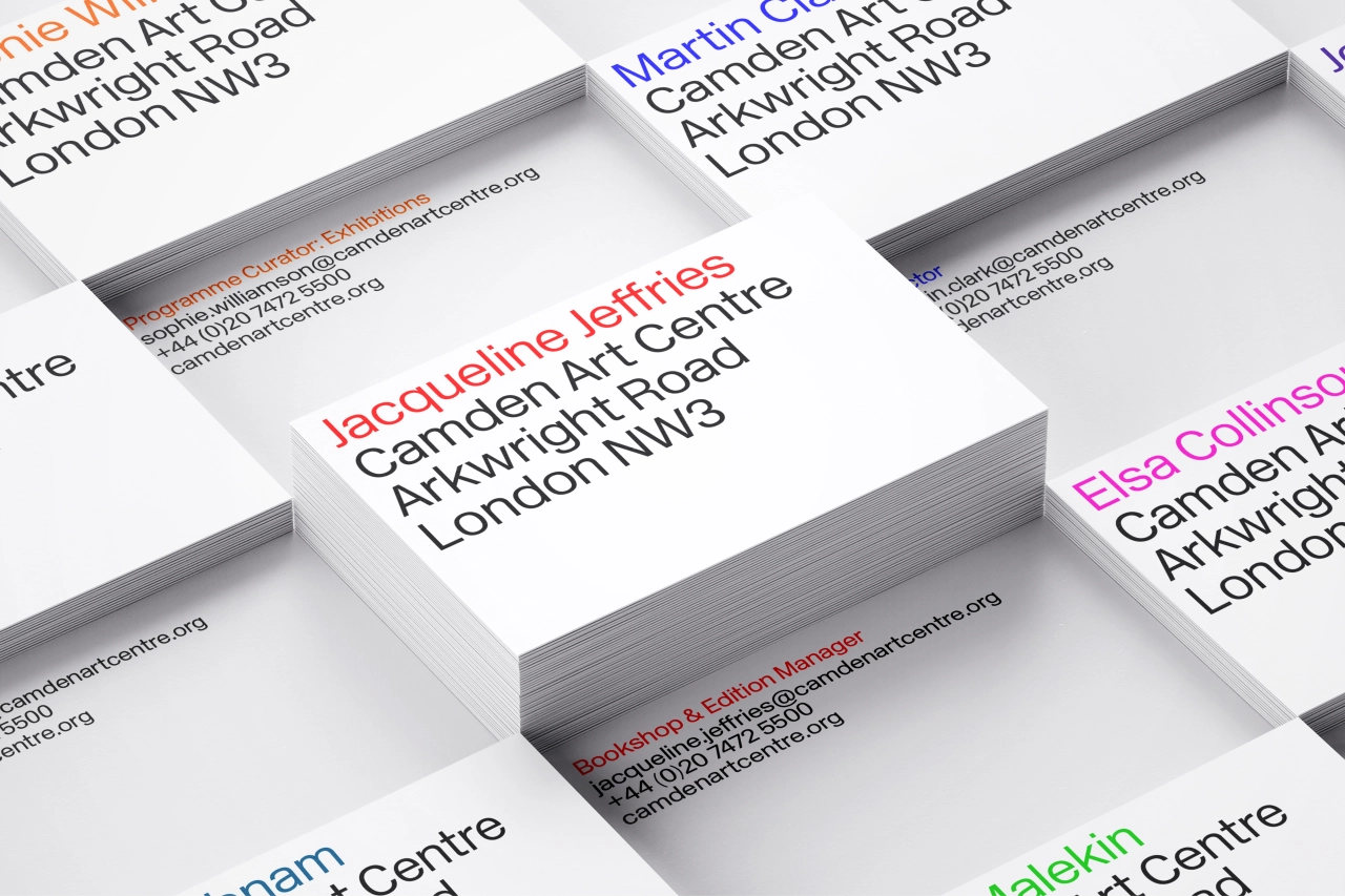
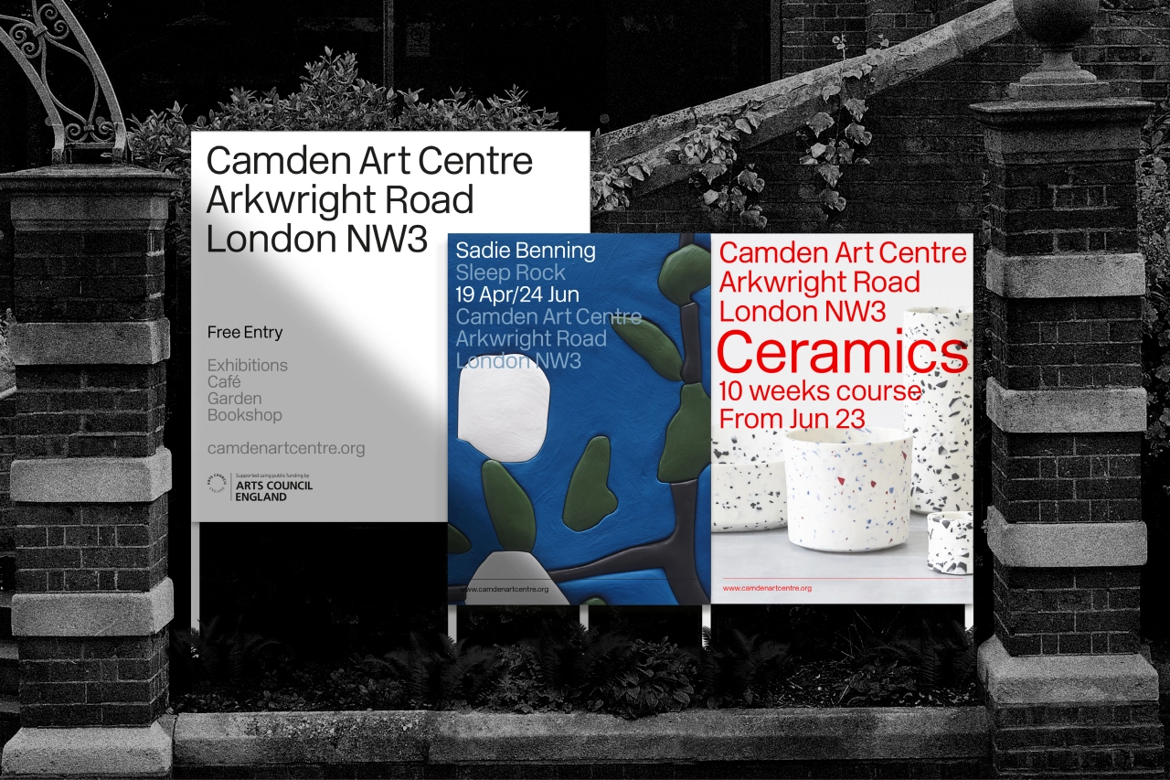
From business cards to signage and all of its digital applications, the London studio collaborated with the centre's staff, trustees, artists and patrons to create the refreshed brand, starting with clarification on the gallery's location and the streamlining of its name from Camden Arts to Camden Art. As such, Camden Art Centre's Arkwright Road address is now an intrinsic part of the new logotype, celebrating its sense of place and cleverly removing any confusion about where it's based.
Pentagram looked to material found in the centre's archive as inspiration for the new logotype which is clean and understated, referencing its modernist principles. "The graphic work we found in the archives illustrated a clean modern aesthetic, particularly strong in the 1960s and ’70s. We did nothing more than, re-establish and continue that approach," Pentagram's Harry Pearce told Creative Boom.
It also gives equal weight to each element of the brand name to emphasise its independence and remove any misconceptions that the centre is funded by the local authority.
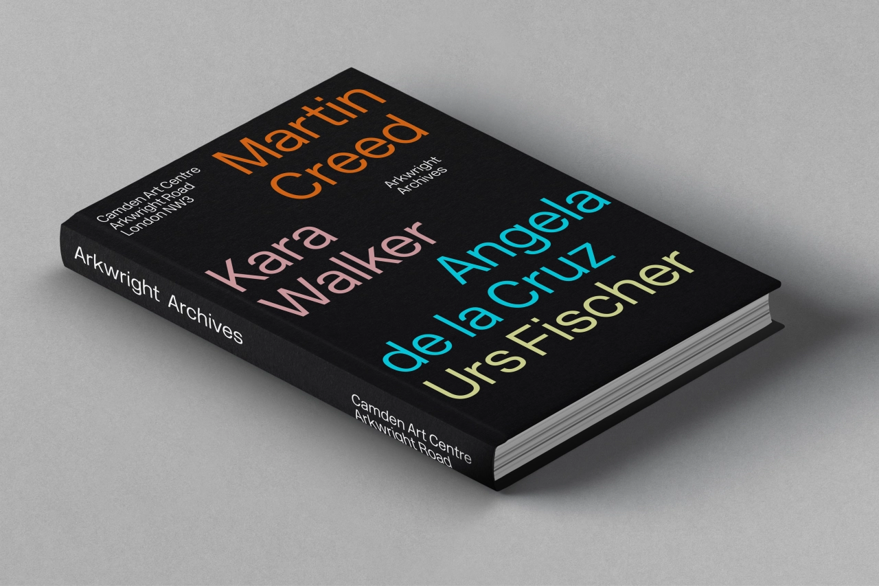
The logotype is designed to complement the primary typeface, New Rail Alphabet, which is used solely in Light and Light Italic. A collaboration between A2 Type Foundry and Margaret Calvert, New Rail Alphabet has a uniquely British feel. The original version of the typeface (designed by Margaret Calvert and Jock Kinneir) was used for the Design Research Unit's rebrand of British Rail in 1965, the same year that Camden Art Centre was established.
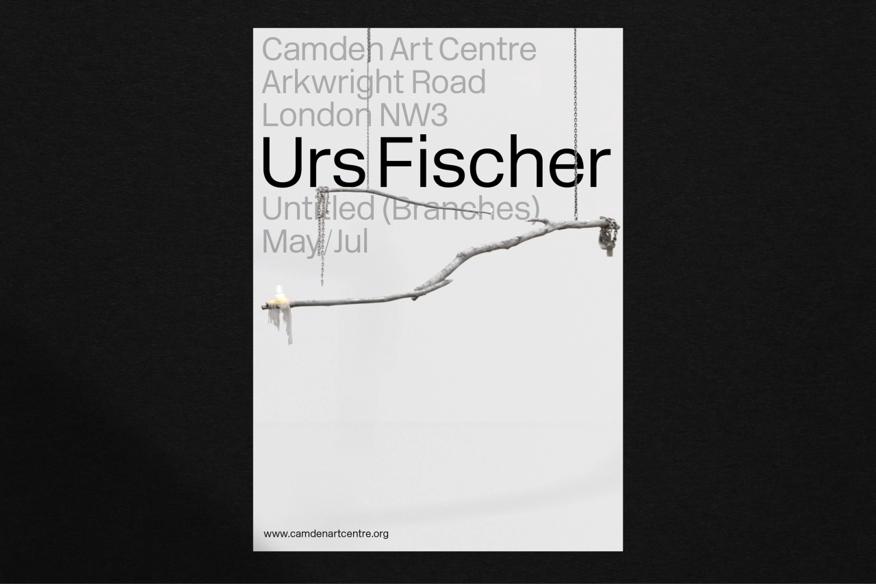
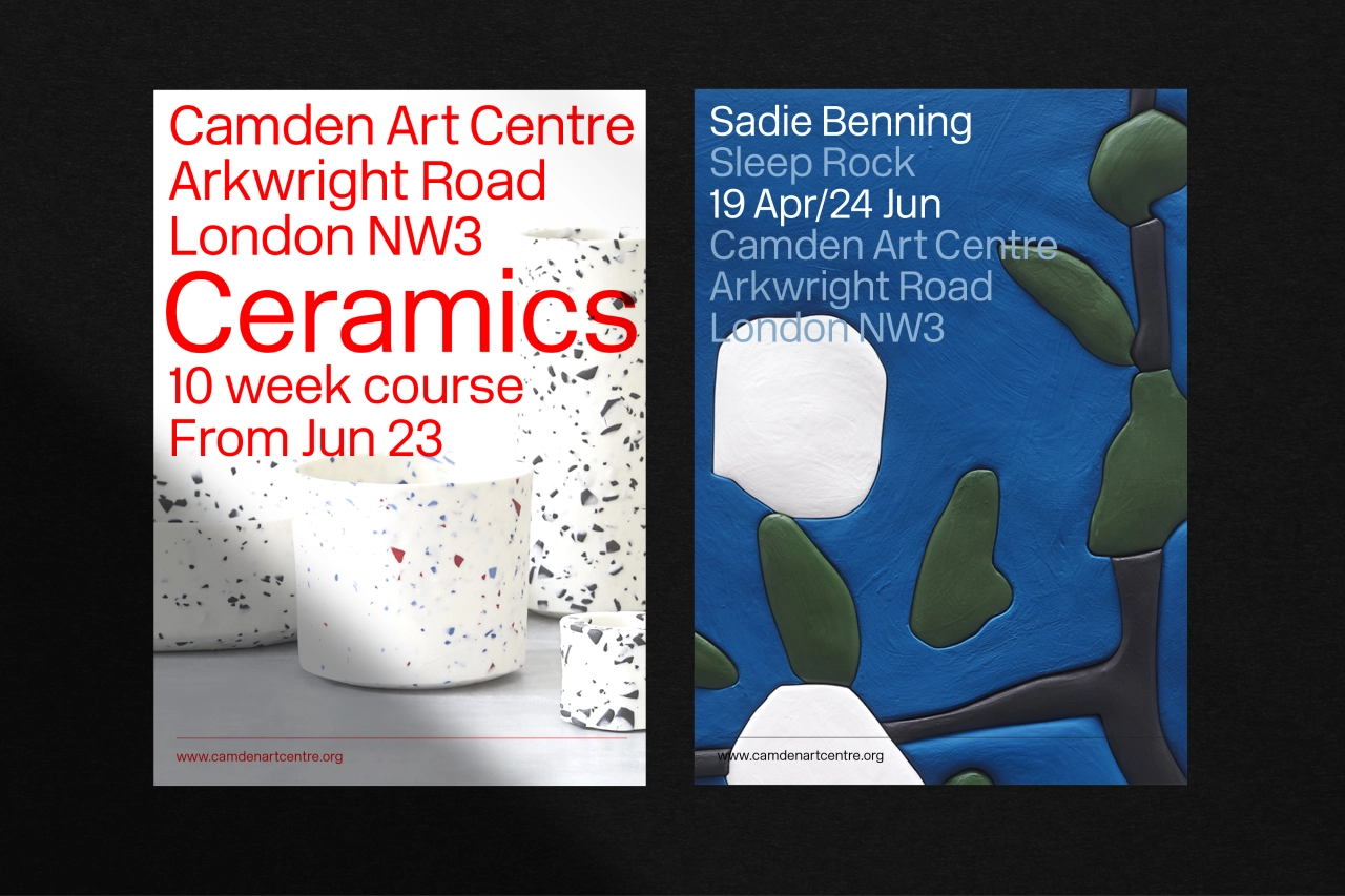
A typographic system has been introduced for exhibitions, courses and events – "This is a flexible system which allows for the position of the Camden Art Centre logotype to change," explains Pentagram, "depending on the priority of messaging, it can lead, sign off or support within the hierarchy of information."
Speaking of the things that stood out the most when trying to celebrate the centre's heritage, Harry Pearce told us: "Firstly, the impressive legacy of influential artists given their first major shows here since the sixties. The second was the intimacy between the gallery and the artists. This, amongst other things, stood out and we wanted to maintain that spirit in the new identity. Hence the understated nature of the new graphic language which, rather than dominating, works in harmony with the artist mirroring their relationship with the gallery."
Editor's Picks





Trending






Latest Jobs
Designer at New Genre
Full-time·London·£36k–£48k
Marketing Copywriter at ustwo
Full-time·London·£40k-£50k
Creative Project Manager at Analogue
Full-time·Leeds·£28k–£35k
Design Lead at Madeo
Full-time·New York City·$85k–$120k
Head of design at Cog Design
Full-time·London·£55K
Brand Strategist at DNCO
Full-time·London·£45k-£60k