Pentagram helps to unify the brand identities for John Lewis and its partners
Pentagram has designed three new unified brand identities for the John Lewis Partnership and its much-loved retail brands, John Lewis and Waitrose – created to support the commercial ambitions of the two retail brands, and elevate the overall Partnership’s defining characteristic: its employee ownership model.
The John Lewis Partnership was set up by John Spedan Lewis in 1929 to hold his business in trust for the benefit of its employees. This structure continues to empower the Partnership’s employees – who are all Partners in the business – by giving them a say in the running of the business and a share in profit, knowledge and power. A democratic ethos that lies at the heart of the Partnership, and is one of the key factors in cultivating its distinctive service experience: every customer interaction takes place with an owner of the business.
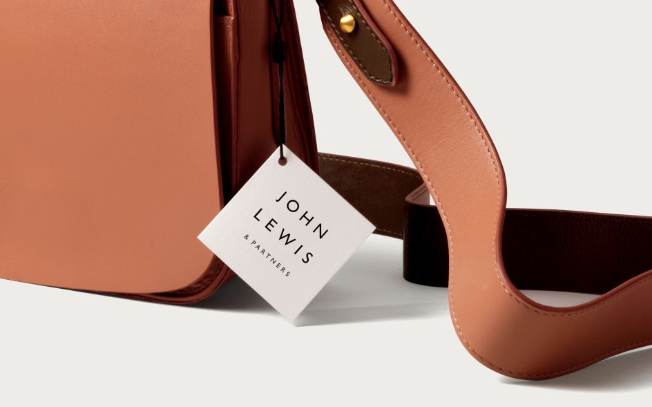
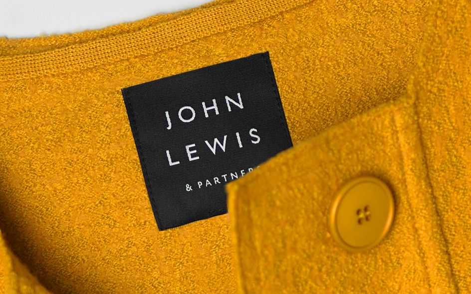
In an age where consumers increasingly expect brands to be principled and good, the Partnership’s commitment to John Spedan Lewis’ original model is an authentic differentiator that it can be proud of. The new identity celebrates this by enshrining the Partners into the forefront of the John Lewis and Waitrose brands, with the addition of ‘& Partners’ to their logotypes.
Working closely with the Partnership’s leadership on the project, Pentagram created brand identities that are informed by a shared design system, bringing coherence, clarity and flexibility to the three organisations and their full suite of products and services.
"Crucially, the brand identities work in harmony with the Partnership’s vast offering of products and services; bold and pronounced in some contexts, quiet and subtle in others," says Pentagram.
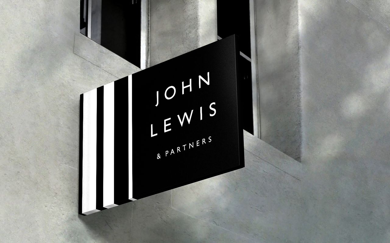
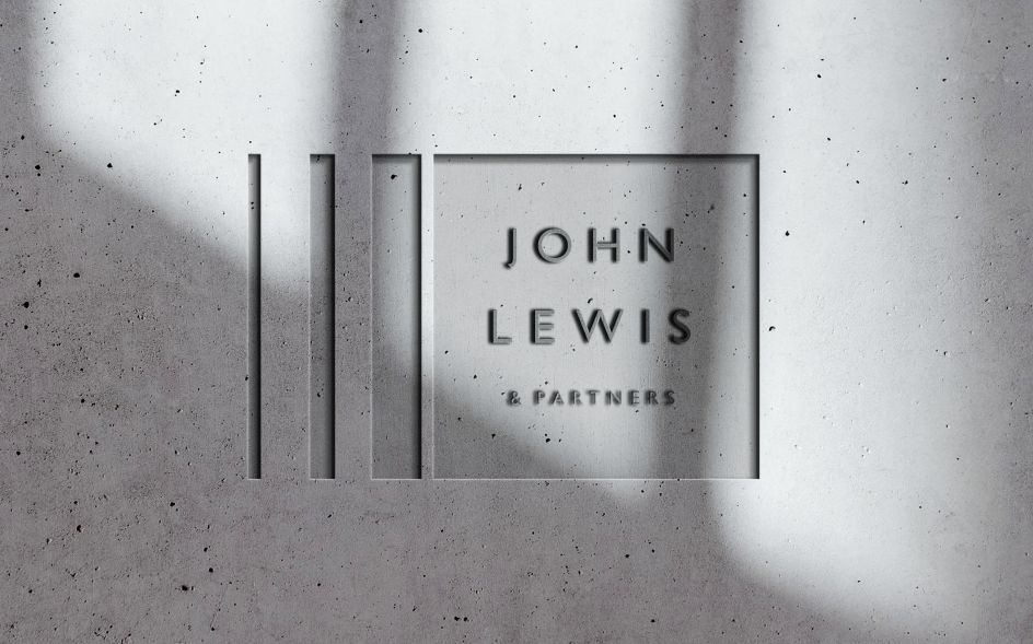
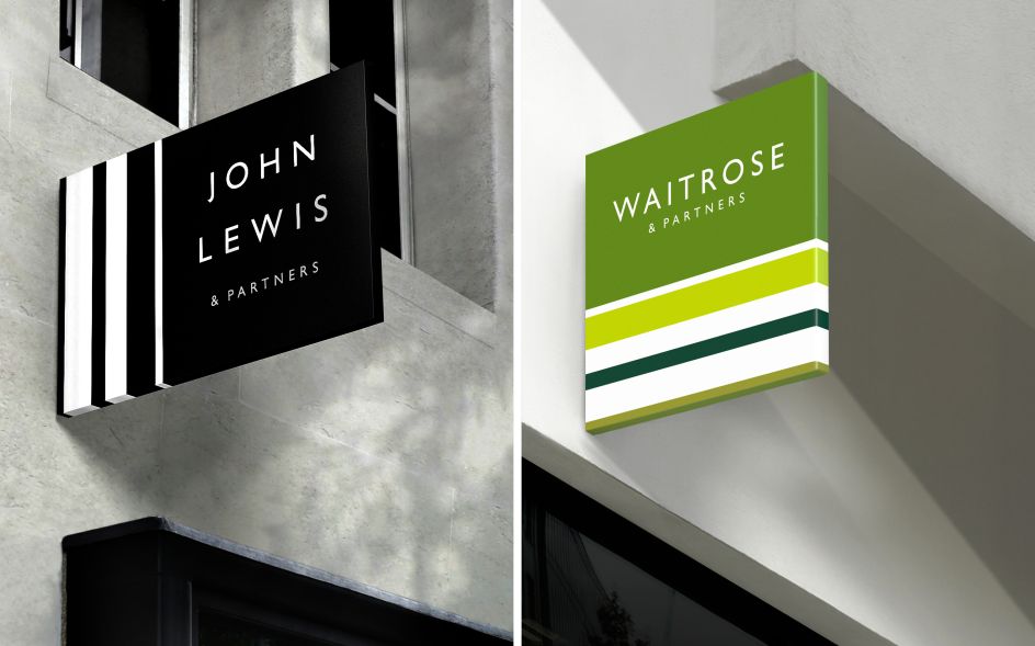
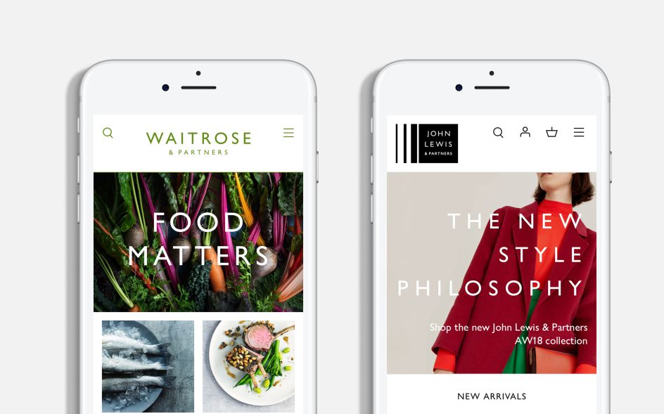
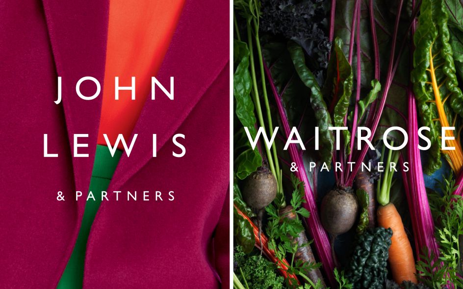
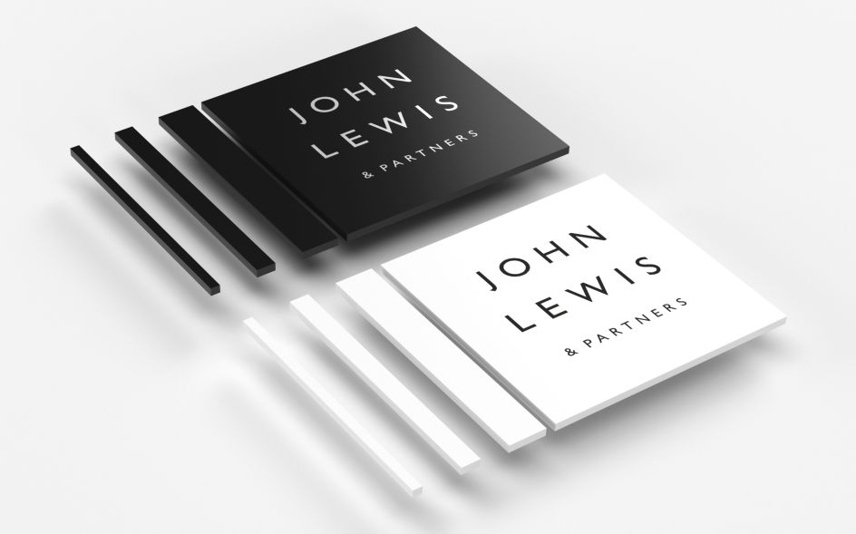
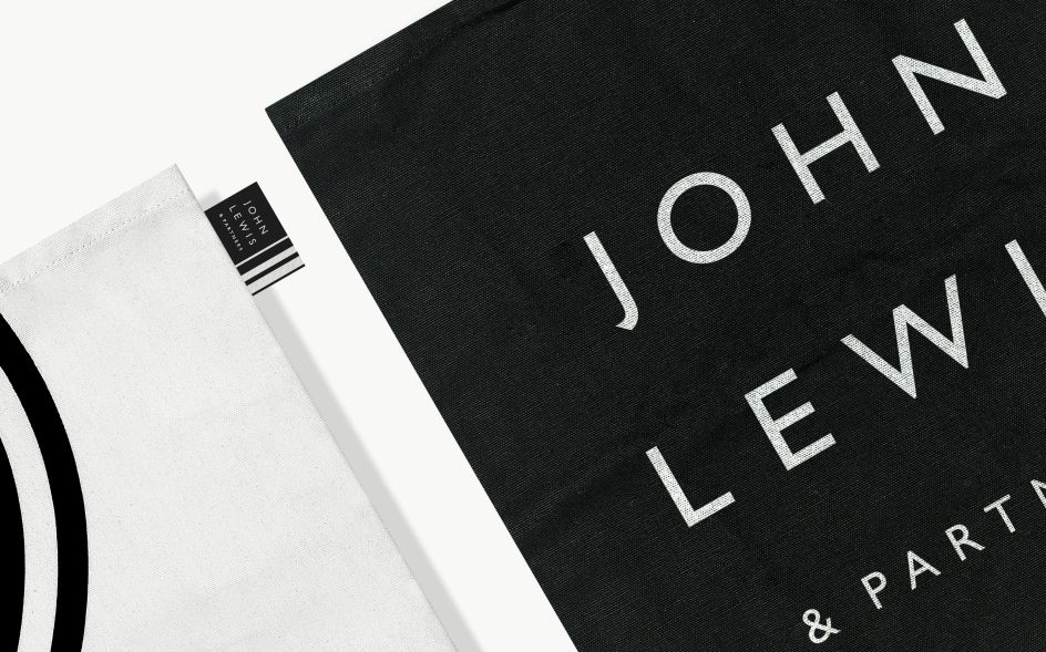
Retaining the Gill font that has become synonymous with John Lewis, Pentagram created more of a "mark" by stacking the wordmark. The three wordmarks have been redrawn to thrive at various scales, from mobile phones to billboards and retail installations.
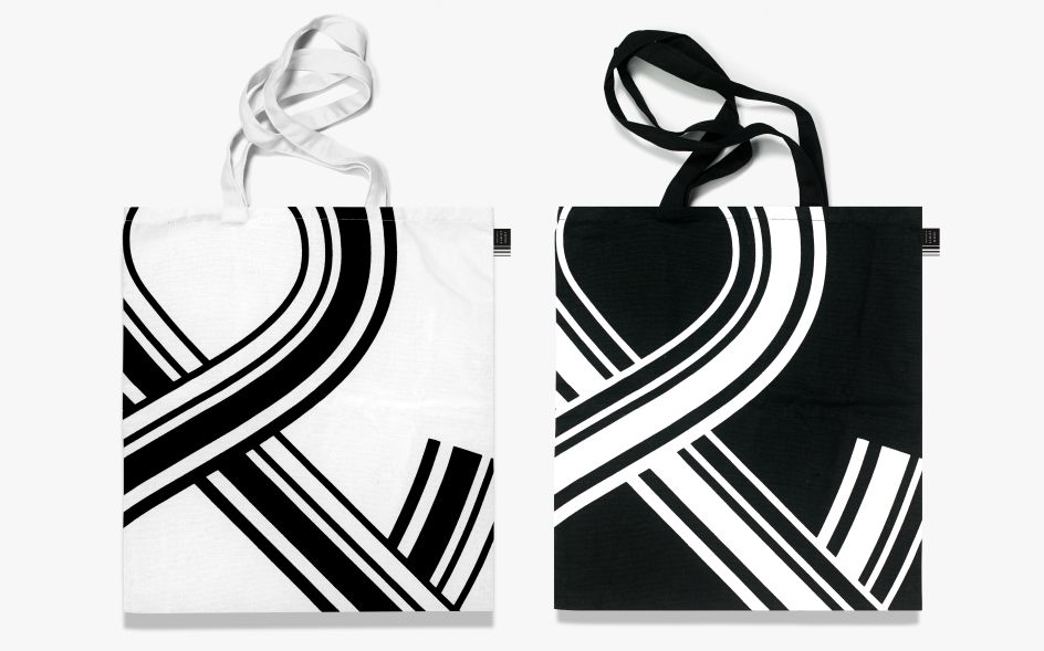
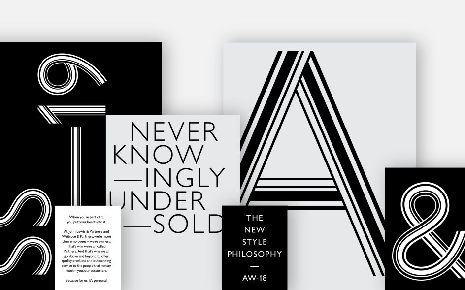
The Partnership also has a distinguished legacy with pattern and pattern-making. "From John Spedan Lewis’ beginnings as a haberdasher to the Hans Schleger/Peter Hatch identity – era of the '60s and '70s, the Partnership’s history with patterns is vast," says Pentagram.
"The new ‘Brandlines’ logotype is inspired by a Peter Hatch pattern created for the John Lewis Partnership in the 1960s. It is based on precise proportional relationships derived from the original pattern."
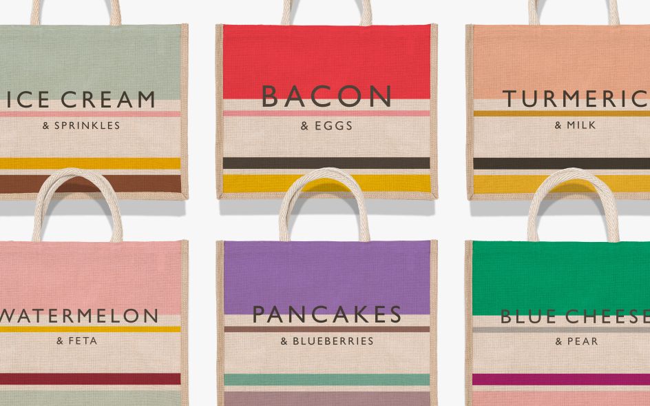
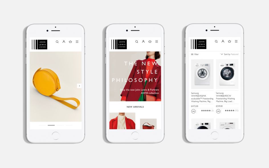
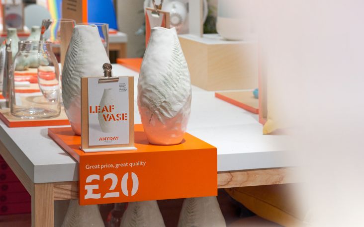
Applied across both the John Lewis Partnership parent brand and the trading brand identities of John Lewis and Waitrose, differing variants of the logo have been designed to be used depending on the requirements of the application; responding to a wide range of products, communications and customer experiences while maintaining recognition and building a cohesive customer experience.
"The pattern can also be softened and integrated with product imagery through blurring, giving an impression of depth and dimensionality in film," explains Pentagram. "Colour can also be introduced to the pattern within this approach, to enhance the sense of integration with the product. The result is a flexible and distinctive visual language that communicates the full spectrum of activity associated with each of the Partnership’s retail businesses: both separately, and in the moments where they come together."
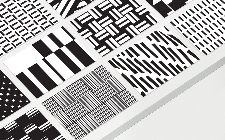
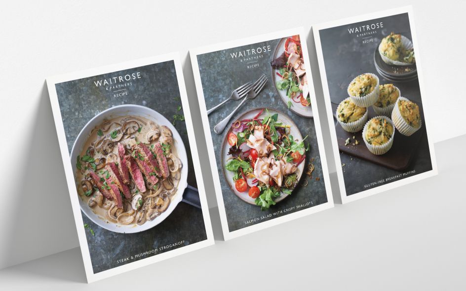
Typography is another key part of the Partnership’s new brand identity. Pentagram has developed a typographically confident style that will be used in tandem with the patterns to create impactful campaigns. A hand-drawn headline font, "brand lines alphabet", is taken from an old version of Gill and incorporates Hatches’ pattern lines.
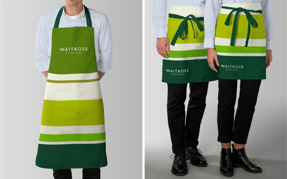
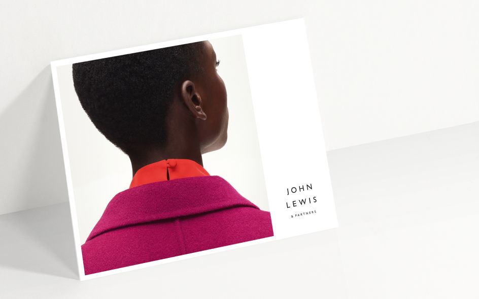
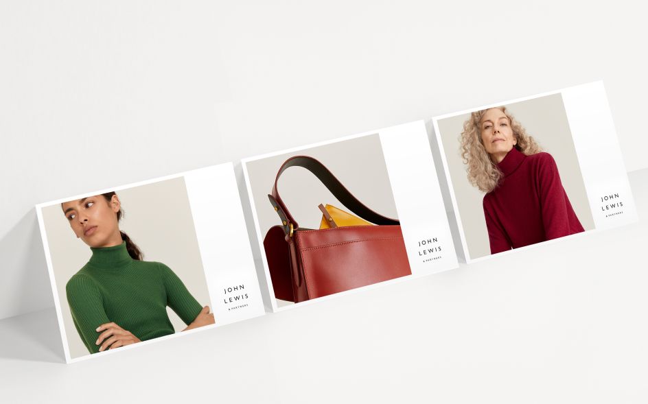
Distinctive colour palettes provide a striking singularity through the use of neutral colours, allowing product and content to take centre stage. Monochrome for John Lewis, and a rich green palette for Waitrose. The colour scheme is flexible and infinitely adaptable, particularly for Waitrose, which operates in the louder world of supermarket retail.
Since the Partnership’s foundation, various shades of green have been used for many of its customer touch points across the decades. As well as this, green ink was famously used by founder John Speden Lewis to sign his correspondence.
Taking inspiration from Spedan Lewis’ iconic ink, Pentagram has created "Partner Green", a distinct accent colour that will be exclusively dedicated to Partner activity and communication. It'll be applied deliberately and sparingly across the three identities, and never for decoration. Instead, it is a heartfelt tribute to Partnership’s most important asset: its Partners.
Editor's Picks


Trending


Podcasts


Editor's Picks
Further Reading