Apple's new Sports app shows us exactly what good data visualisation looks like
With the World Cup just weeks away, Apple Sports' expanded tournament features are a masterclass in visual communication.
There's a moment, usually somewhere around the group stage, when following the football World Cup stops being fun and starts feeling like unpaid admin. Sixteen groups, 48 teams, dozens of simultaneous results, knockout permutations that require a maths degree to untangle… Yes, the tournament is spectacular, but keeping up with it can quickly become an exhausting headache.
Apple, it turns out, has been working on solving just this problem. And the solution it's arrived at is worth paying attention to, even if you hate sport, because it's a wonderfully elegant piece of design thinking.
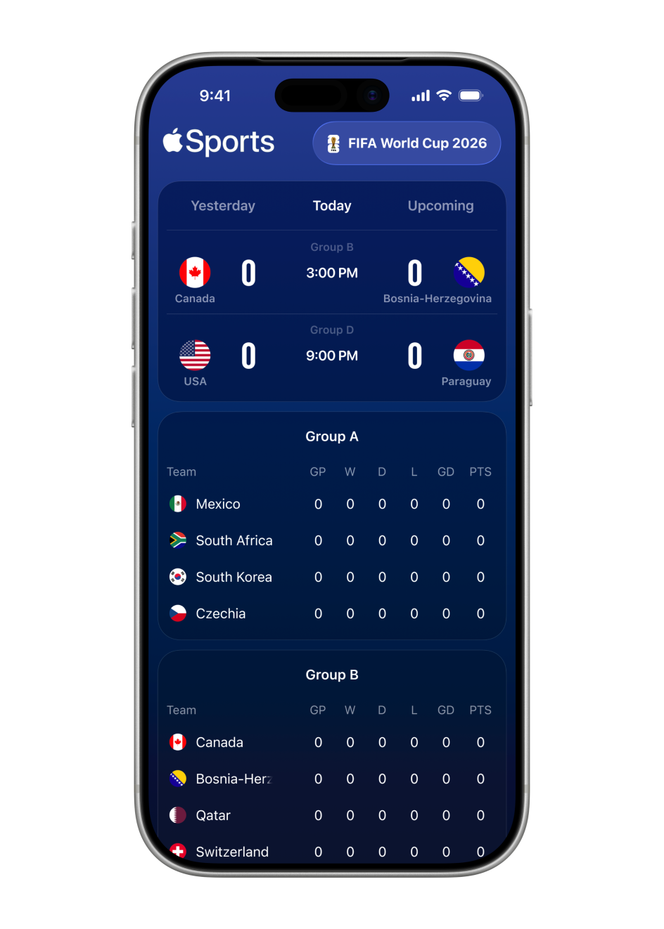
Apple Sports, the company's free iPhone app for real-time scores and stats, has just announced a substantial expansion ahead of this summer's FIFA World Cup 2026, growing from its existing markets to more than 170 countries and regions worldwide, including over 90 newly added territories. Heady stuff.
But the most interesting part, for anyone who cares about design and how information gets communicated, is what Apple has built into the product itself. Namely, a suite of new World Cup features that demonstrate, with typical Apple restraint, exactly what good data visualisation looks like.
The World Cup kicks off in June, and between that and the summer's other major fixtures, we're heading into one of the most densely packed sporting calendars in years. Millions will be reaching for their phones mid-match, between matches and during the frantic final weeks of the knockout rounds.
The design challenge, then, is real and immediate. How do you serve up that volume of information to that many people, quickly, without overwhelming them with stuff?
Clarity as a design value
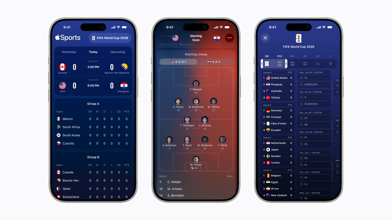
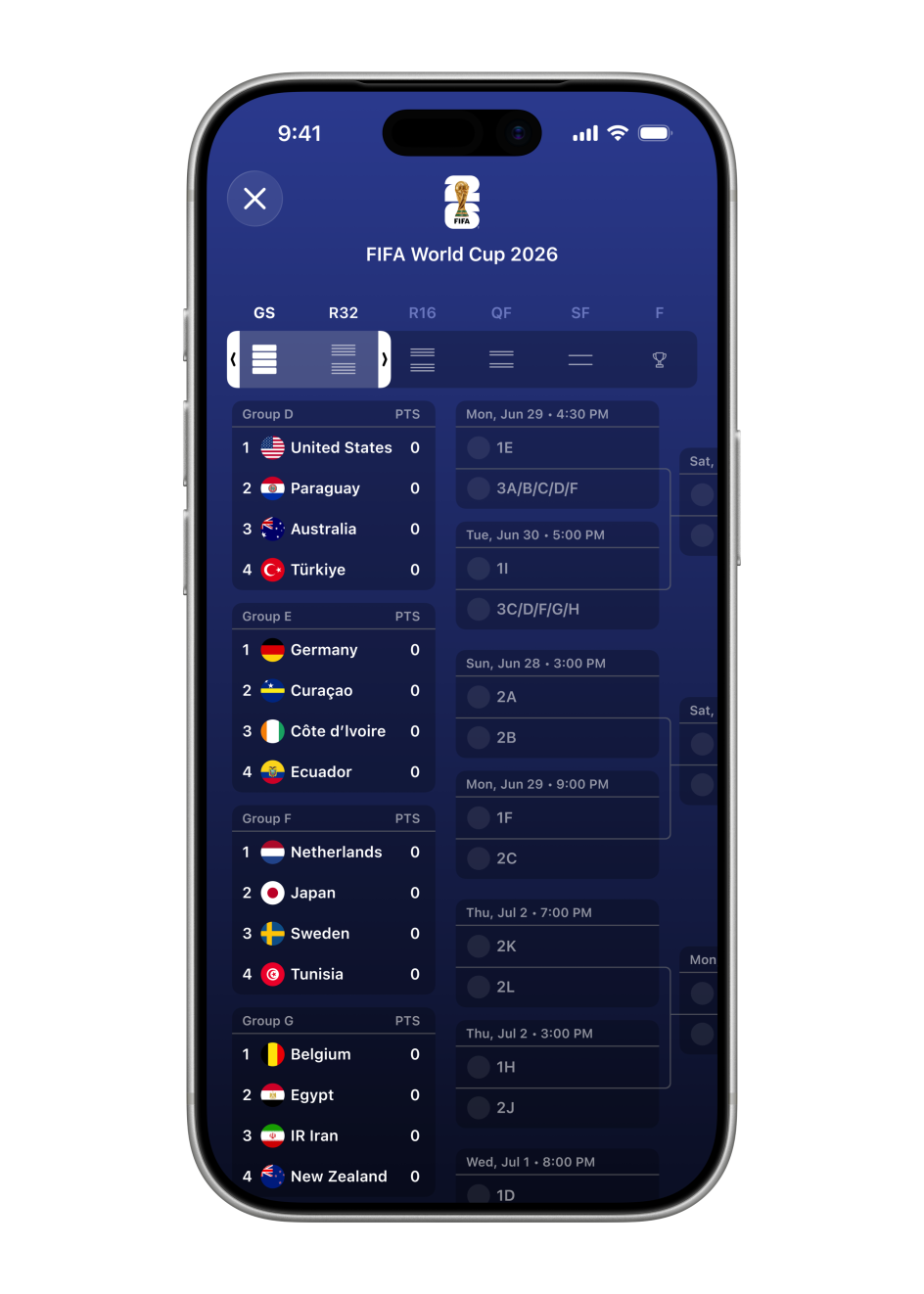
The app's new tournament bracket view is a scrollable overview of the entire competition, from group stage through to the final, laid out so you can track a team's progression at a glance. That might sound straightforward, but anyone who's tried to reproduce a World Cup bracket in a spreadsheet, on a whiteboard, or anywhere else will know how quickly these things become cluttered and confusing.
Apple's version, though, is clean and navigable, with a tab system separating the group stage, round of 32, round of 16, quarter-finals, semi-finals, and final. It's an object lesson in information hierarchy: knowing not just what to include, but how to sequence and layer it.
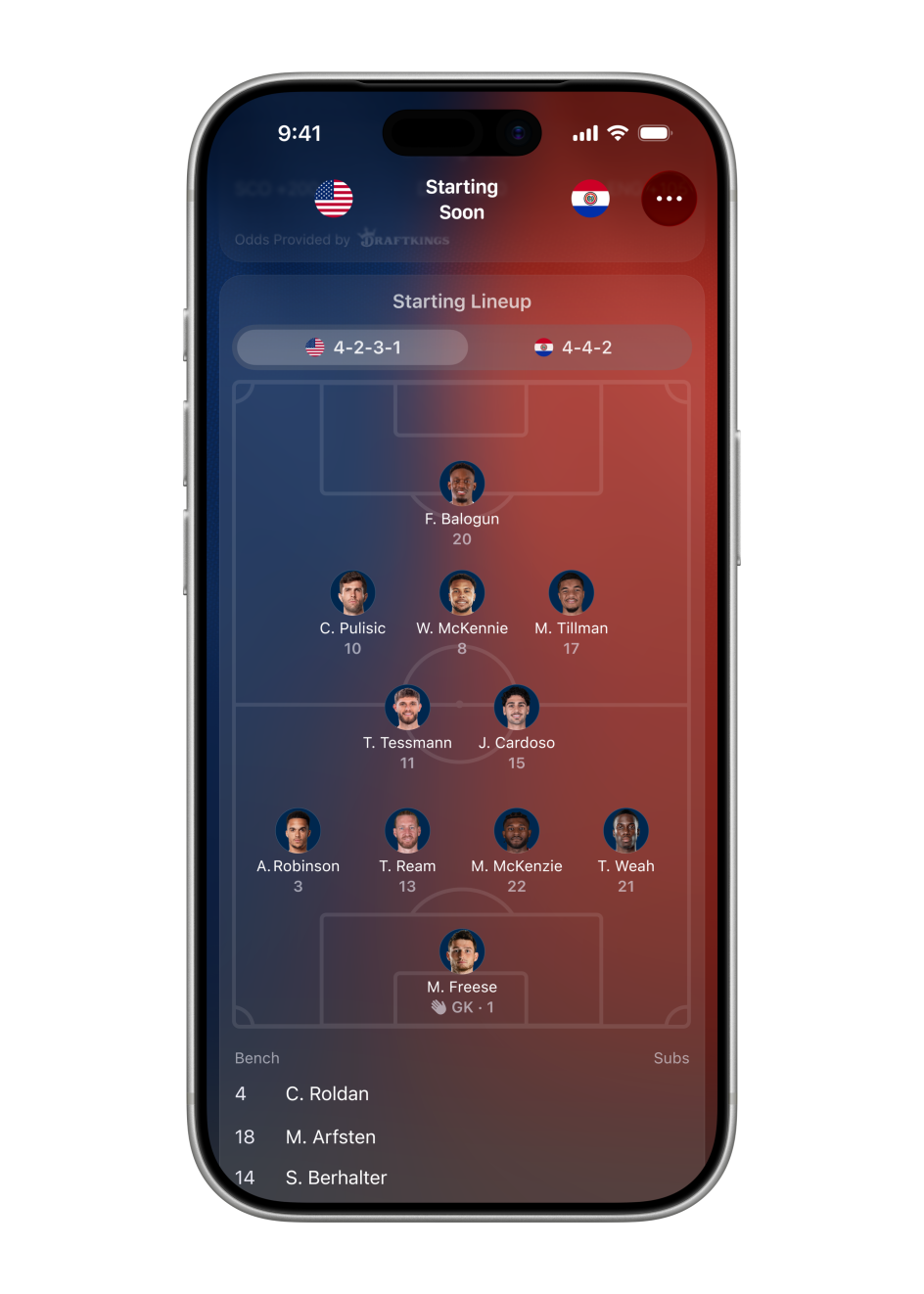
The visual formations feature is particularly thoughtful. Enhanced game cards now show each team's starting lineup, laid out on a pitch graphic, complete with player photos, names and squad numbers positioned according to their actual tactical formation.
For the opening USA vs Paraguay fixture, for instance, you can see at a glance that the US are lining up in a 4-2-3-1 and Paraguay in a 4-4-2, with individual faces attached to each position. It's the kind of information that used to require hunting across multiple websites or waiting for a pre-match TV broadcast. Here, it's immediate and easy to access.
Speed as a design principle
As you might expect, Apple Sports borrows much from Apple's broader design philosophy: the dark blue palette, the generous whitespace, the preference for iconography over text wherever possible. But it's the speed of the thing that feels like the real design decision.
Making that a reality is not just about clever coding. It's about designers making genuinely difficult calls about what to include and what to leave out.
In this case, that includes Live Activities integration, so a match can be tracked from the iPhone lock screen or an Apple Watch without opening the app at all. It includes home screen widgets for tournament tracking. It includes a single-tap link through to Apple TV to find live matches on connected streaming services. But most importantly, each of these additions has to earn its place without complicating the core experience, and to my mind, the balance feels right.
Key takeaway
For creatives, even those who don't care about football, there's a useful lesson in all of this. Apple Sports is essentially the answer to a data visualisation problem: vast quantities of live, unpredictable information, delivered to users who want answers instantly and don't want to think hard to get them. And the solution it demonstrates—layered hierarchy, visual metaphor over text, meaningful use of colour and restraint—can be applied far beyond sport.
With a summer of football, athletics, and plenty more on the horizon, many designers will be producing their own sporting content. If that includes you, it's worth taking a look at what Apple has built here first. Because sometimes the best start you can get is watching someone else solve your problem for you.
Editor's Picks


Trending


Podcasts


Editor's Picks
Further Reading