Pentagram shakes up the art marketplace with new Art Republic identity
Leading online art retailer Art Republic has collaborated with Pentagram to create a new strategy and brand identity. Designed to build on Art Republic's success, the new approach also aims to challenge the status quo of the art sales marketplace.
Initially set up in 1999, Art Republic is the go-to place for selling affordable, limited edition prints, photography, and pop culture-related artworks online. And a big part of its appeal is that it works directly with a few carefully vetted galleries, dealers and curators to help artists produce new and exclusive editions.
With this in mind, Pentagram's Angus Hyland and his team used Art Republic's unique position as the basis of its rebrand. Settling on the idea of a more playful and accessible approach, the new strategy and brand identity are designed to bring Art Republic to the attention of mainstream audiences. The new look's focus on championing exciting, inspiring and affordable art is summarised in Art Republic's new mantra: 'Rebel against band interiors'.
Helping to prop up the flashy visuals is a new tone of voice that's purposefully unstuffy. It's something of a rarity in the world of buying and selling art. This comparatively breezy tone gives Art Republic the freedom to be engaging and opinionated at the same time and helps it to communicate with customers openly and conversationally.
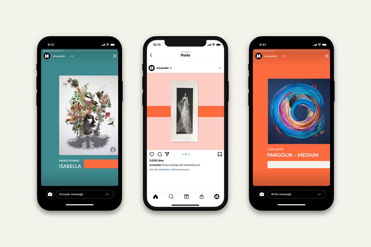
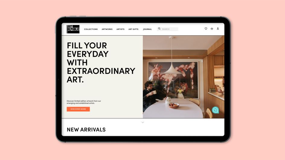
Straplines such as 'fill your every day with extraordinary art' and 'every wall needs a story' are perfect examples of this new voice in action and signal a departure from Art Republic's peers.
Underlining this messaging is Art Republic's firm belief that every artist needs the opportunity to succeed. And by supporting its community of artists and helping them produce, market, and distribute their work, Art Republic can do exactly that. As well as giving them opportunities to develop their creativity and their careers.
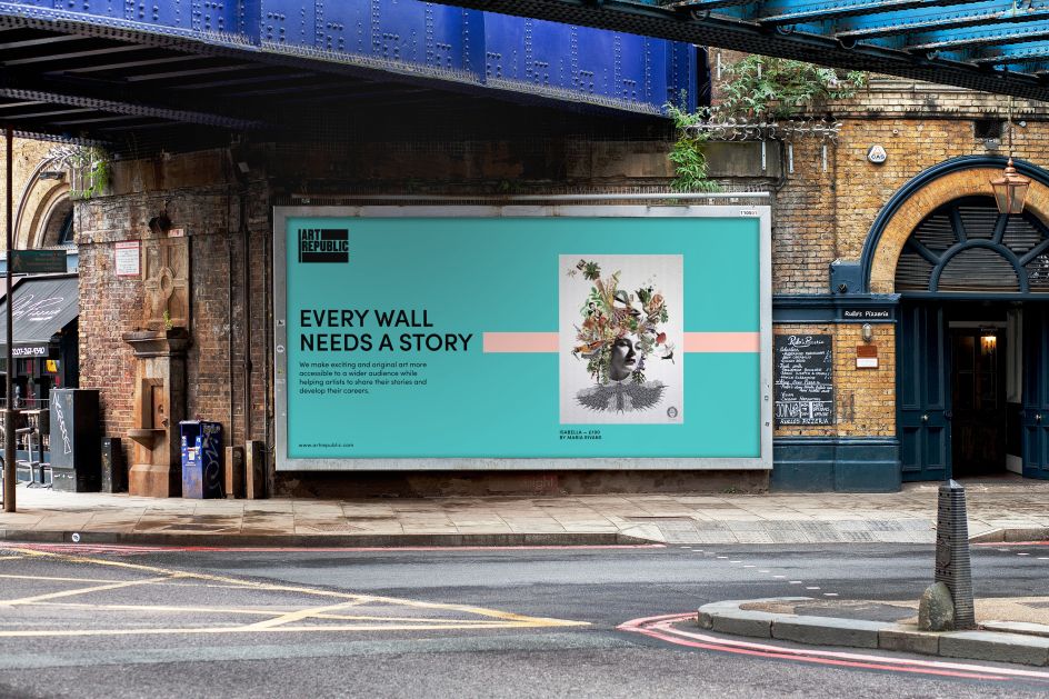
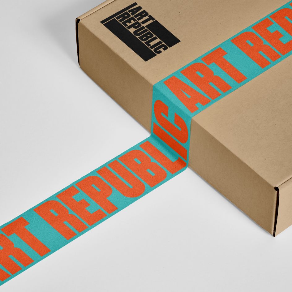
It's the bold graphics of Art Republic's new identity that really set it apart from the pack, though. Just take its logo, which comprises hand-drawn elements, including uppercase typography on a flag-inspired symbol. Striking, confident, and edgy without overdoing it, this design is an effective distillation of Art Republic's new strategy.
"A distinctive graphic language was created using the bold horizontal bars which form part of the logo," says Pentagram. "This acts as a functional and decorative device and gives the opportunity to create a branded space without simply relying on the logo.
"Olivier Gourvat's Sofia Pro is used throughout as the primary typeface. Accessible and welcoming, the contemporary geometric sans serif typeface is modern, elegant and highly legible across all applications and at all sizes."
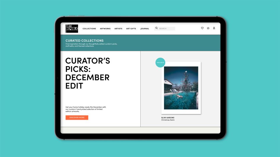
As well as voicing a logo design, colour is the third pillar of Art Republic's new identity. Angus and his team wanted a palette that could work with many different styles and forms of artwork. They settled on orange and teal for the palette's primary colours, with rose and dark teal backing them up as secondary colours.
Black, white, and three different shades of grey help to round off the new colour scheme, and the dynamic yet somehow soothing contrast of these hues create a suitably dynamic and eye-catching aesthetic.
"Art Republic stands for art and people," adds Pentagram. "Angus and team's new brand identity perfectly encapsulates Art Republic's mission to provide art for everyone by giving a voice to artists and buyers and ensuring that art lovers everywhere have easy access to 'Great art that makes you think and feel'."
Editor's Picks


Trending


](https://www.creativeboom.com/upload/articles/90/908fdb6378db1e95d12595416f54e6336d5e80b8_732.jpg)
Podcasts


Editor's Picks
Further Reading