Pentagram redesigns Virgin Money as a 'playful, joyful' brand
Partners at Pentagram's London office have rebranded Virgin Money. The project came about following the announcement of the merger of Clydesdale Bank, Yorkshire Bank and app-based bank B, with the trio going on to become Virgin Money thanks to the rebrand.
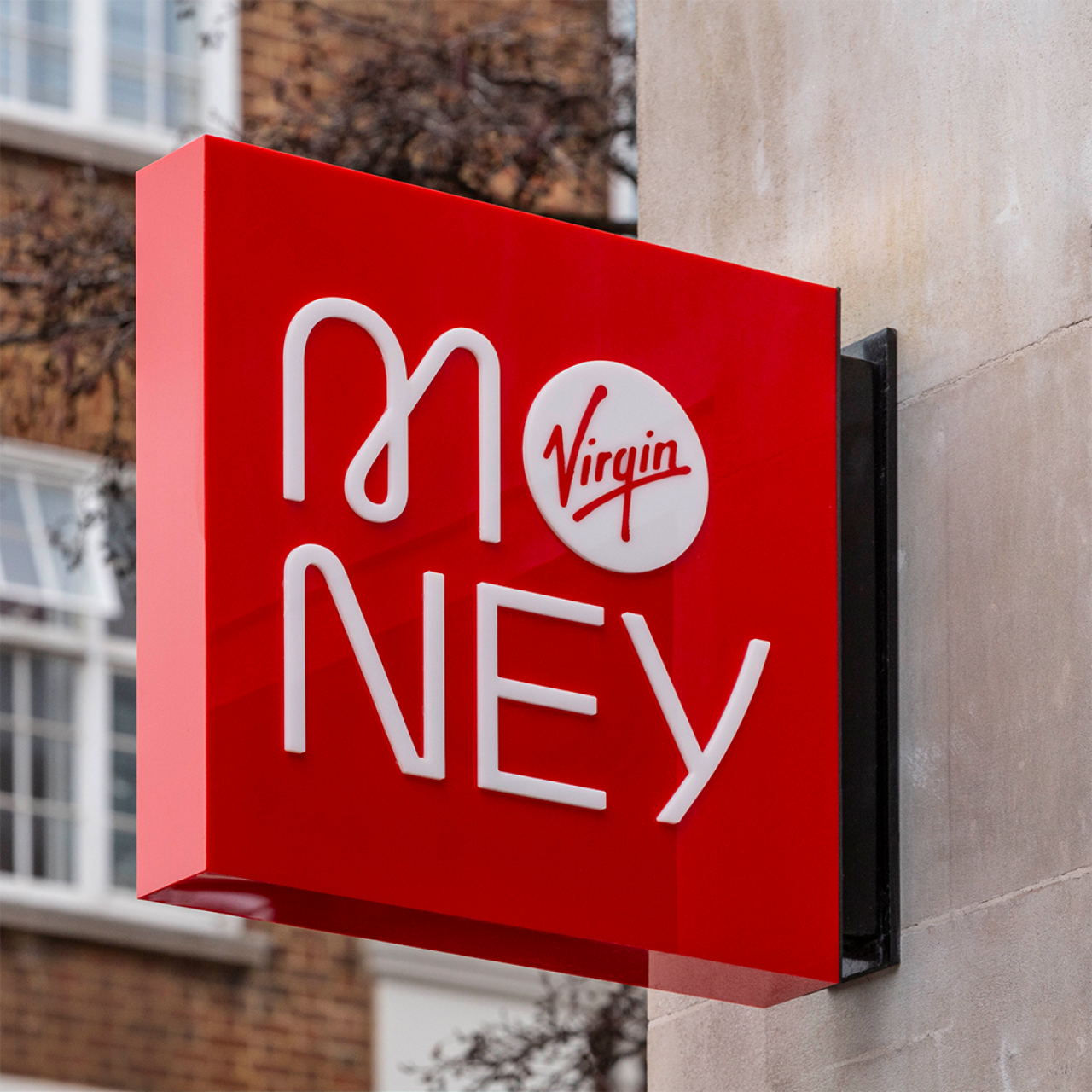
Pentagram was briefed to create a brand that didn't "feel or look like a bank", and an identity that moved away from "expected corporate, rigid bank identities." Partners Jody Hudson-Powell, Luke Powell and Domenic Lippa helmed the project and created designs that say aimed to make people "feel happier" about money.
The designs aim to be playful, vibrant and joyful; suited to appeal to individuals and businesses alike. The identity also had to reflect the idea of Virgin Money as a modern, digital-first branding brand that reinforces its nature as a symbol of change in the business.
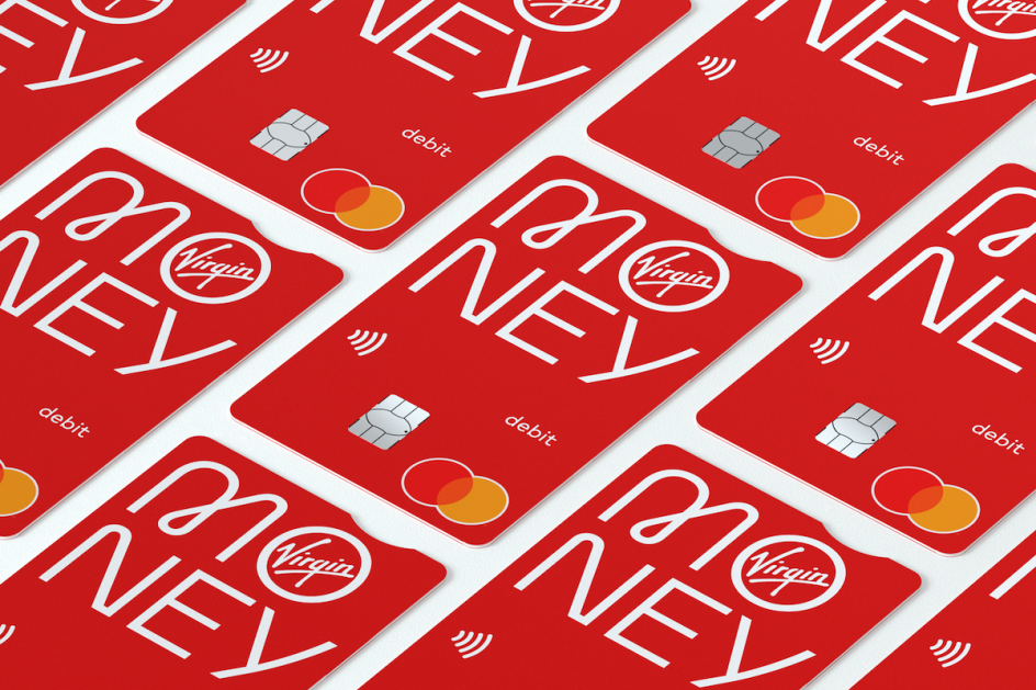
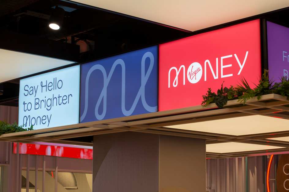
The new Virgin Money wordmark uses a bespoke, mono-linear, geometric typeface—Virgin Money Sans, designed by Luke Prowse—which also acts as the logo. The lettering designs are drawn from the wider Virgin Money headline font family and was chosen for its balance of curved forms with harder angles to convey a "humanist" feel as well as underlining the modern, forward-thinking values the brand sees as its core. "This creates a visual form that references the functional pragmatic side of our brand whilst portraying our people-centred, warm approach," says Pentagram.
The central wordmark type used as a "stacked logo" for applications in which those seeing it are already familiar with the Virgin Money brand: on cards, customer communications for those already using the brand and in physical stores. It’s particularly useful on "narrow format applications where horizontal space is limited," says Pentagram.
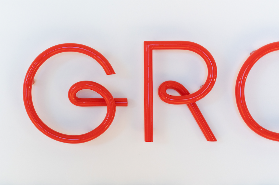
The Virgin Money Sans typeface was created in five distinct weights—Thin, Light, Regular, Medium and Bold—and two styles, Virgin Money Sans and Virgin Money Loop, to enable the tone of voice to adapt to different uses. The font is optimised to be legible across all sizes and applications.
The 'M' of Virgin Money was placed as the key feature of the wordmark, and uses a loop shape to reflect the "energy and ambition of the organisation, making you feel happier about money," the studio adds. Other looping characters can be used within a word or phrase to dial-up or pare back the "personality" conveyed by the visual identity.
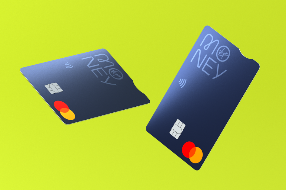
The palette is based around the signature 'Ret Hot' primary colour, ensuring Virgin Money aligns with the rest of the Virgin brand DNA. The secondary brand palette is similarly vibrant and energetic, and was designed to "respond and adapt to every brand message".
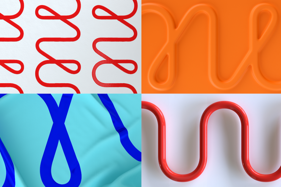
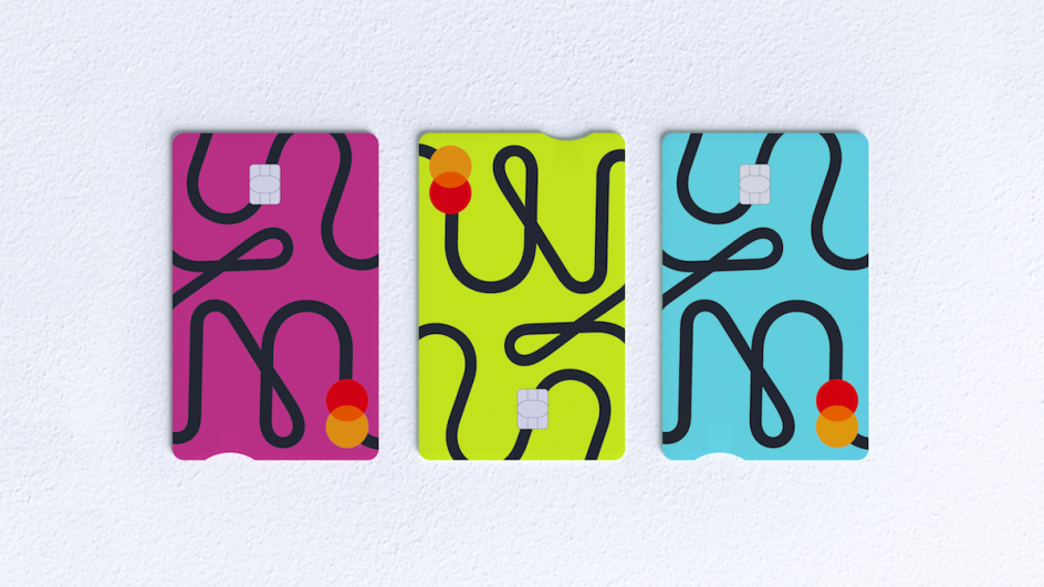
Three linear patterns were introduced, which are based around the 'M' of the wordmark. This M is used as a repeated element or in variations around its scale or crop, sometimes layered over photography.
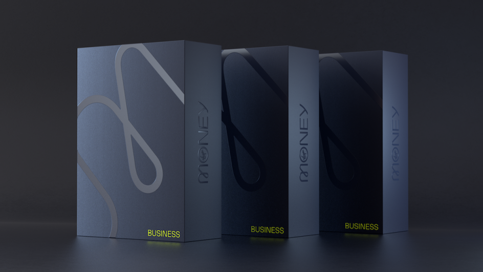
The Business arm of Virgin Money draws its design style from the main brand, though the use of the looped typeface is more restricted. It distinguishes itself from the main identity using a lighter version of the patterns and a reduced colour palette based on lime green and charcoal tones to create what Pentagram terms "its own modern and elevated visual language".
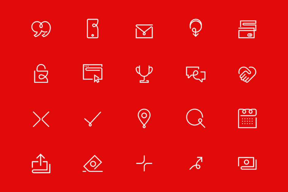
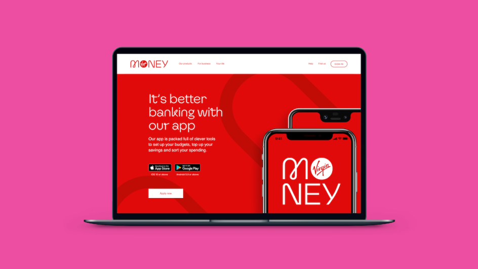
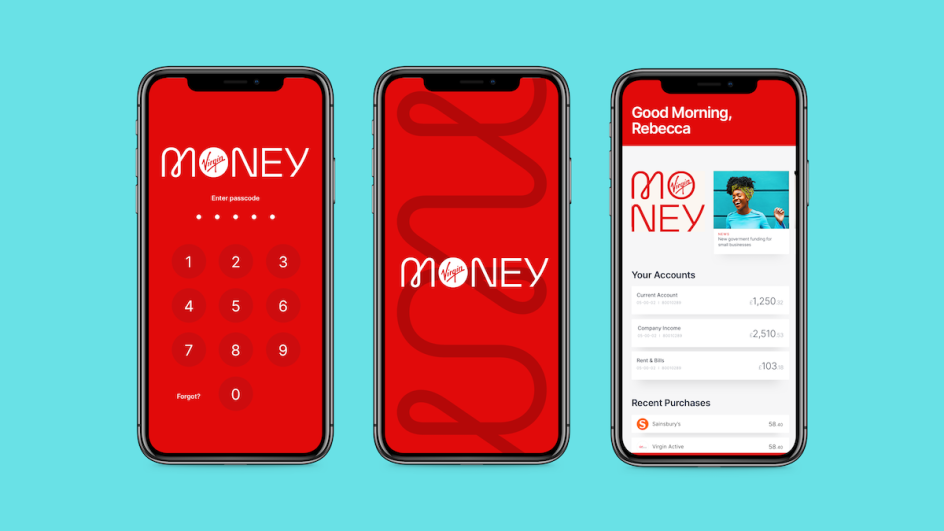
Pentagram's work extended to the digital assets for Virgin Money, such as its redesigned website and app. These feature a new set of icons "designed to mirror the existing brand assets through the use of loops and humanist geometric curves".
The Virgin Money physical stores and lounges were designed by IAM architects. They feature free workspaces that are open for the public to use, with the Manchester branch also offering a recording studio and private meeting rooms available for customers and their guests to use. Other stores that have been refurbished with the new visual identity are found in London's Kensington branch and Birmingham.
