Lock by Mark Bloom and Diana Ovezea
As autumn settles in, winter approaches, and we all start to spend more time indoors, it's a great time to think about refreshing your design toolkit. And when it comes to typefaces, there's always cool new stuff to discover, from fresh releases to undiscovered classics.
In fact, there's so much typographical inspiration to explore that it can often be tricky to know where to start. That's why, every month, we at Creative Boom curate a quick and easy-to-use selection of typefaces.
From architectural marvels to playful experiments and modern reinterpretations of classic forms, we've pulled together a collection of standout typefaces from leading foundries and designers. Each of these new releases brings its own unique character and functionality to the table, offering plenty of scope to reinvigorate your design work this October.
So, whether you're working on branding projects, editorial layouts, or digital interfaces, check out these brilliant typefaces and discover how they can enhance your creative projects. And if you're looking for for further ideas, our recent roundup of fresh new fonts for September is well worth checking out too.
Rose Fang by Tommy Øberg
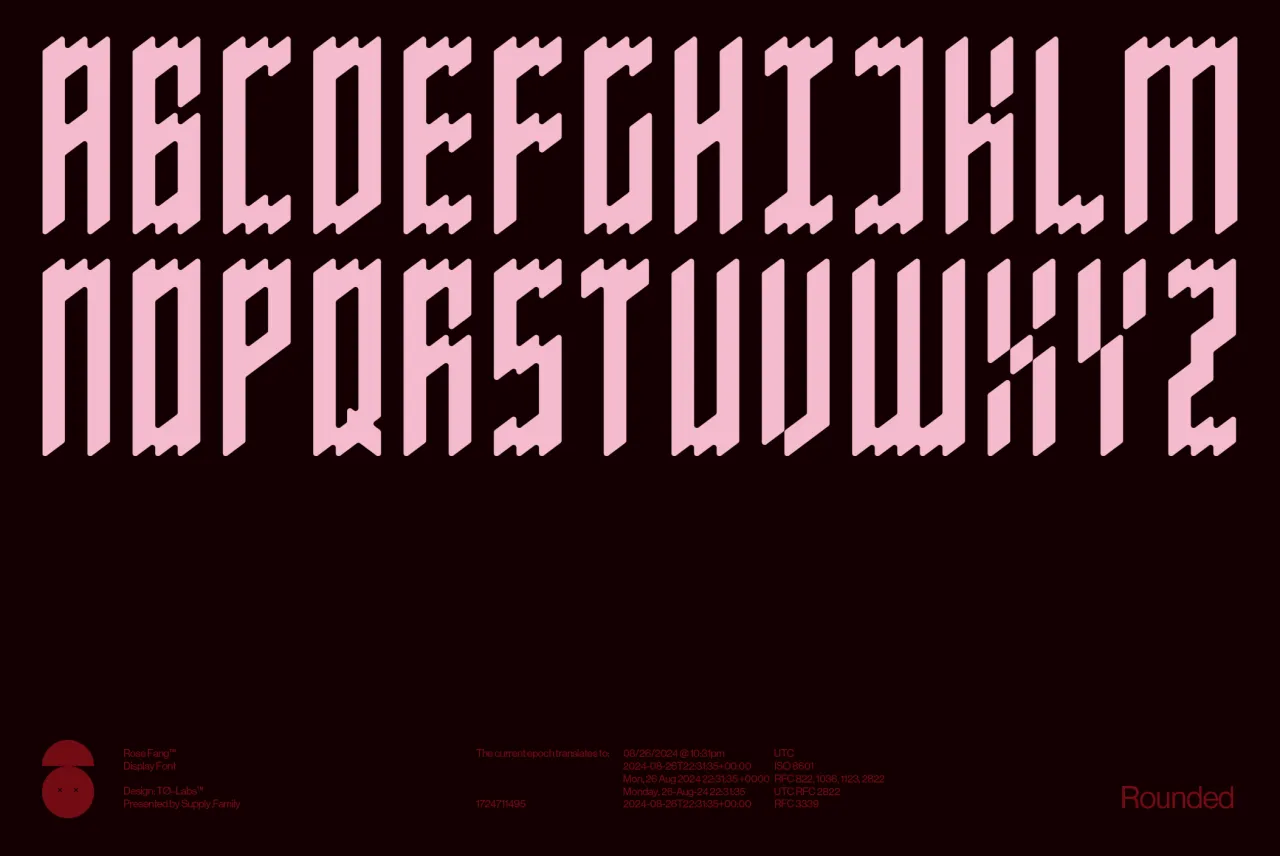
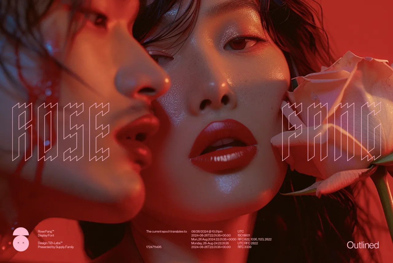
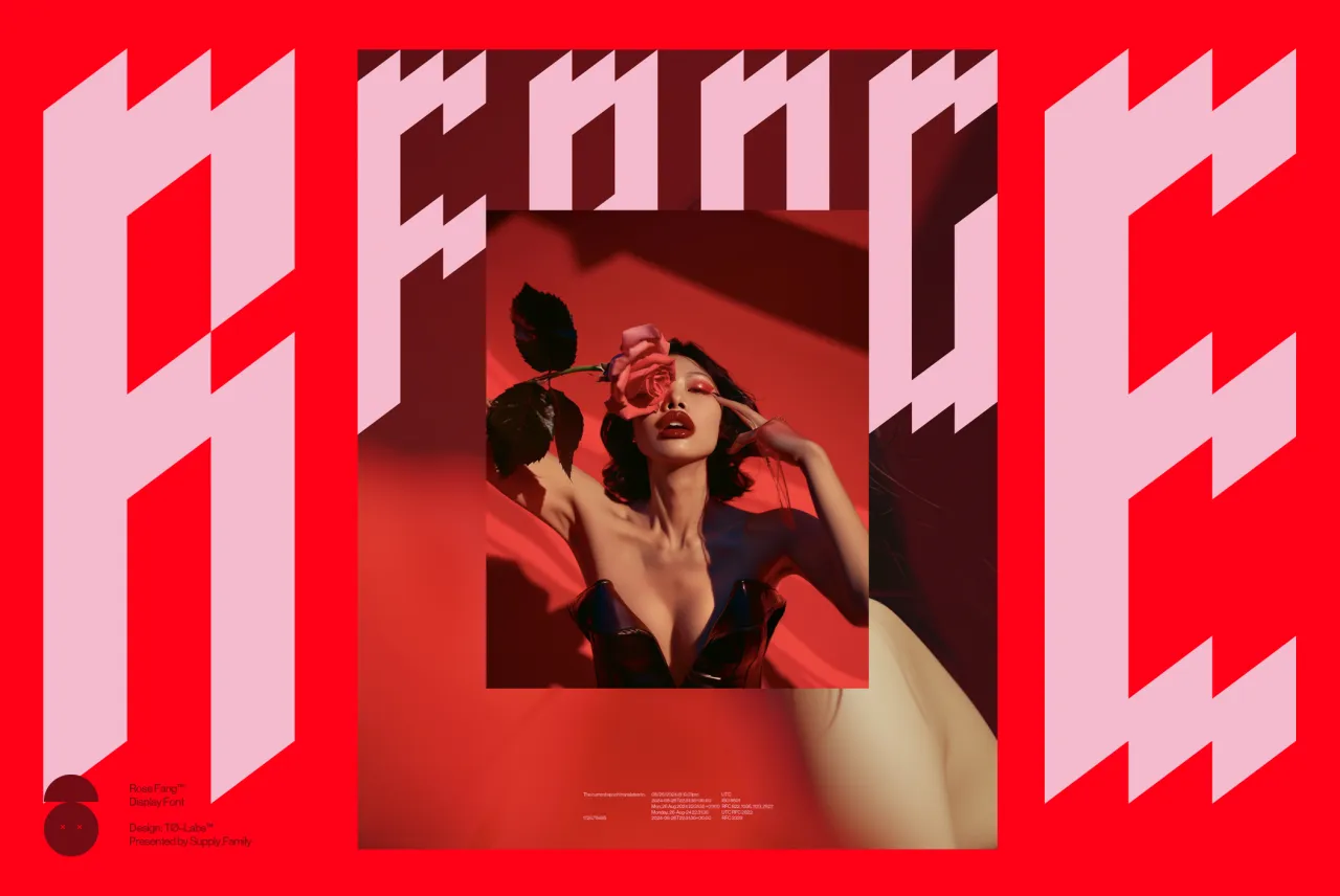
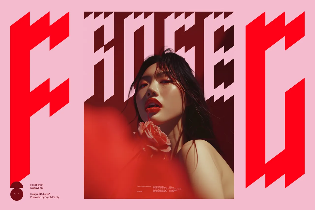
Looking to convey a sense of bold fierceness in your design projects? Then consider Rose Fang, which marries sharp elegance with dark allure.
Inspired by the interplay of light and shadow, this striking display typeface captures both structure and emotion in its angular forms. As the name suggests, its jagged, precise strokes resemble vampire fangs or rose thorns, giving it a sense of predatory grace.
Rose Fang is designed by Tommy Øberg of TØ—Labs and has four distinct styles: Sharp, Sharp Outlined, Rounded and Rounded Outlined. We feel it's particularly well-suited for fashion branding, album covers and edgy magazine layouts. More broadly, its strong personality makes it ideal for headlines and logo designs that need to make a statement.
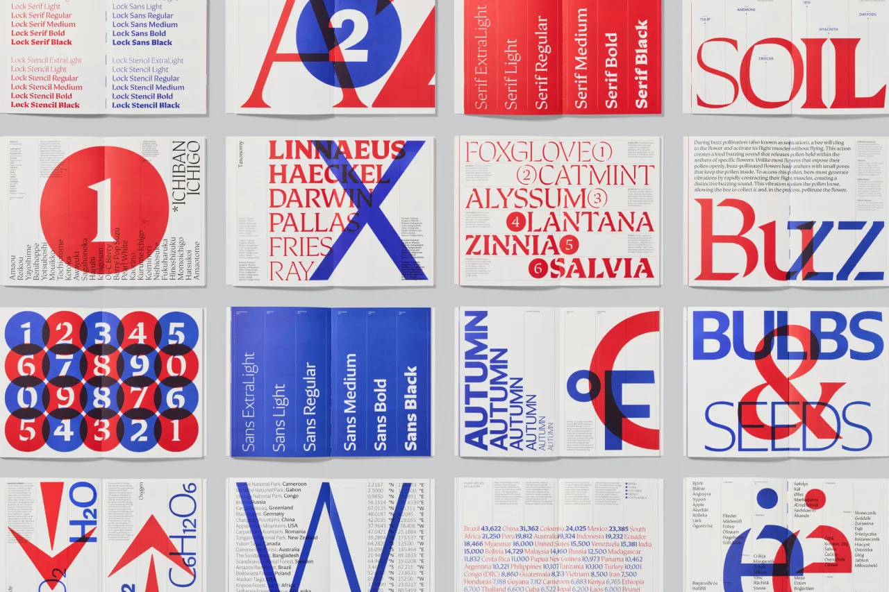
Lock by Mark Bloom and Diana Ovezea
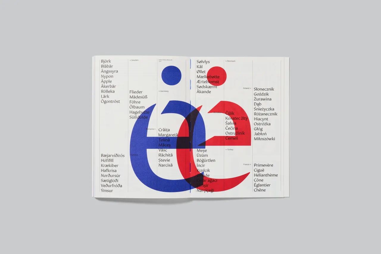
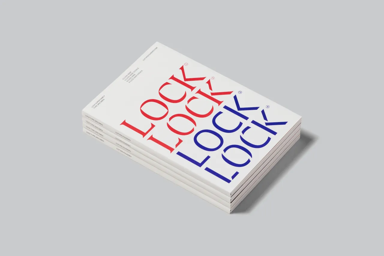
Lock, a superfamily designed by Mark Bloom and Diana Ovezea for CoType Foundry, achieves a feat many type designers aim for but rarely achieve: seamlessly blending tradition with contemporary style.
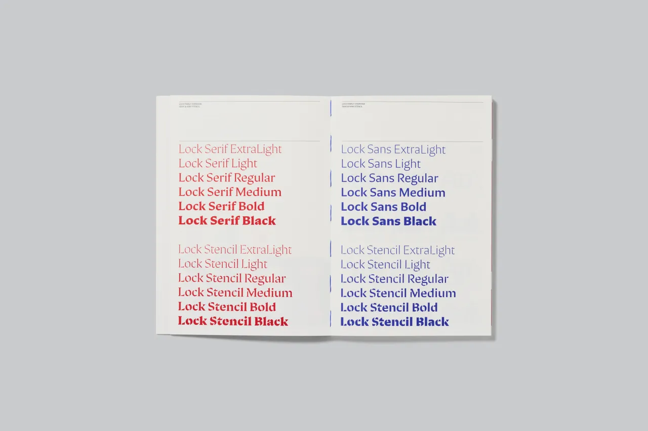
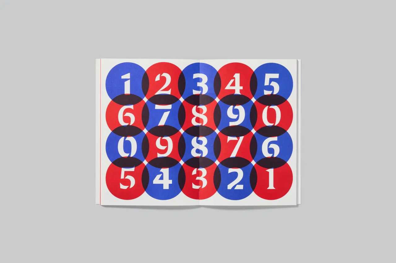
Drawing inspiration from calligraphic strokes, Lock's letter shapes have been carefully crafted to achieve a modern humanist design. The family comprises four subfamilies – Serif, Serif Stencil, Sans, and Sans Stencil – each featuring six weights and glyph alternates and arrows. The Serif version is sharp and outspoken, while the Sans is blunt and understated. Each version offers a playful stencil companion, completing this comprehensive type system.
Overall, Lock's versatility makes it suitable for various applications, from editorial design to branding projects. Its blend of traditional and modern elements helps designers bridge the gap between classic and contemporary aesthetics, making it a valuable addition to any toolkit.
Penelope by Timothée Berger
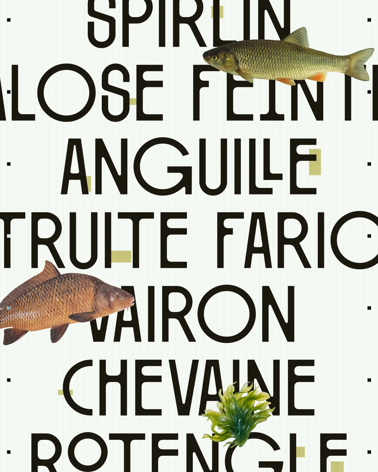
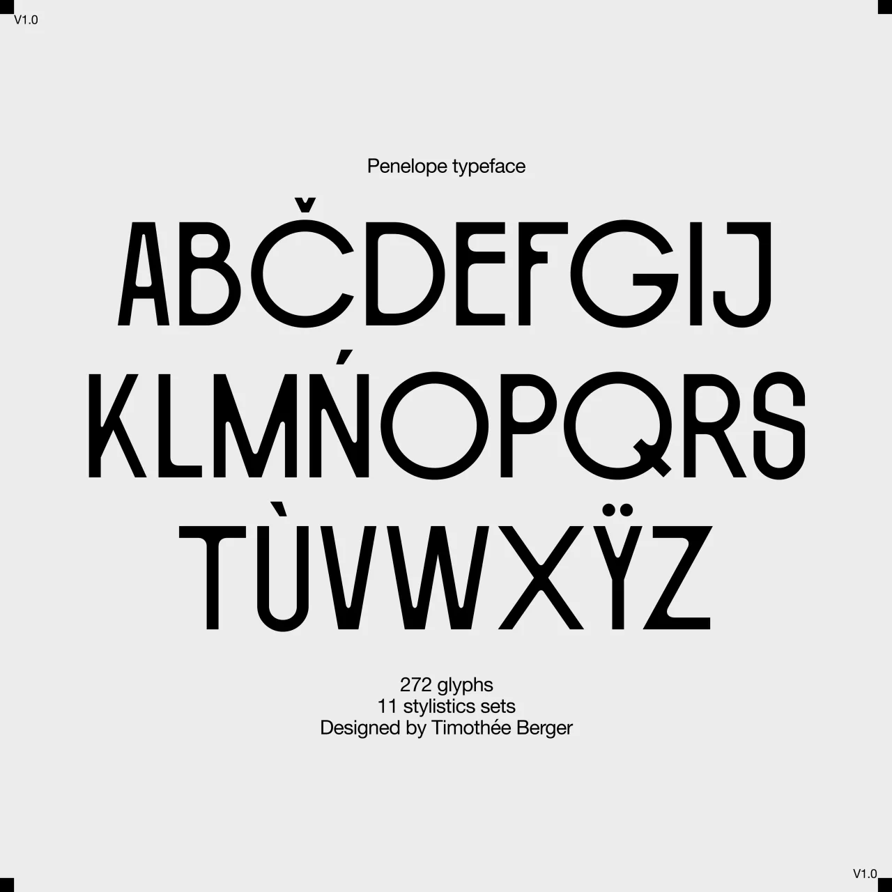
Created by self-taught designer Timothée Berger, Penelope is a distinctive typeface inspired by an unexpected source: a game of billiards and an old billiards manual.
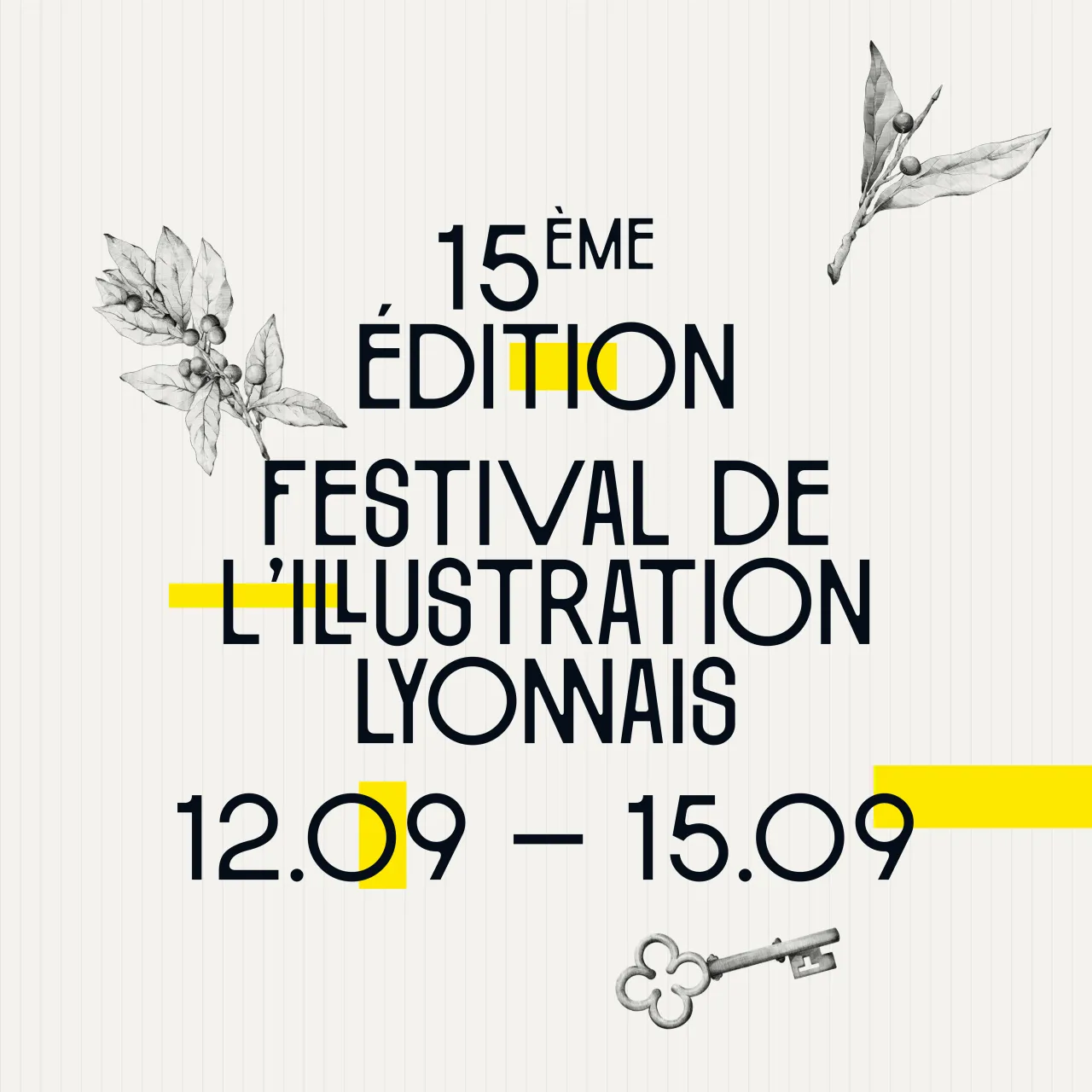
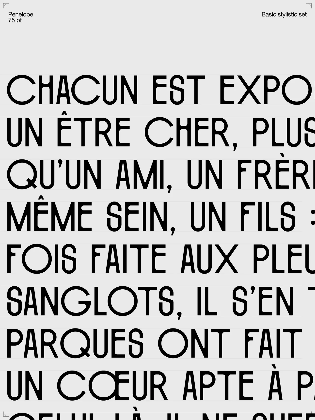
This capital font features bold curves and a mix of narrow and wide lettering for added rhythm. It incorporates both rounded and sharp corners, creating a delightful irregularity. It also offers several alternative letters and ligatures, providing designers with a wealth of graphic possibilities.
We feel this font would shine in display applications, such as posters, headlines or logo designs. Its unique character makes it particularly suitable for projects in the sports, entertainment, or lifestyle sectors, where a blend of retro charm and modern flair is desired.
GT Pantheon by Tobias Rechsteiner & Noël Leu
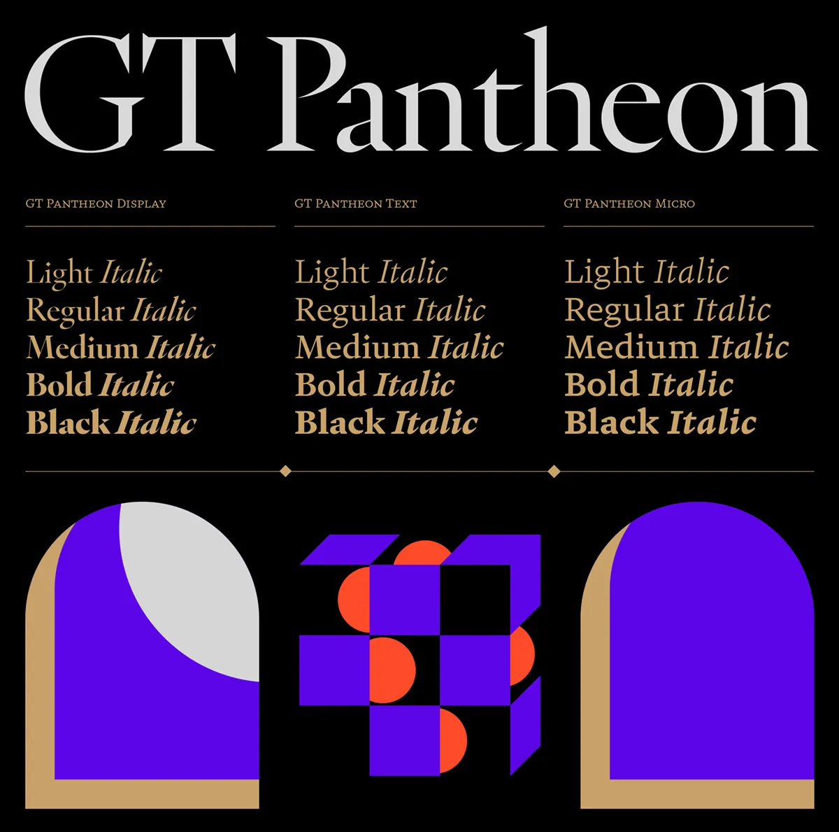
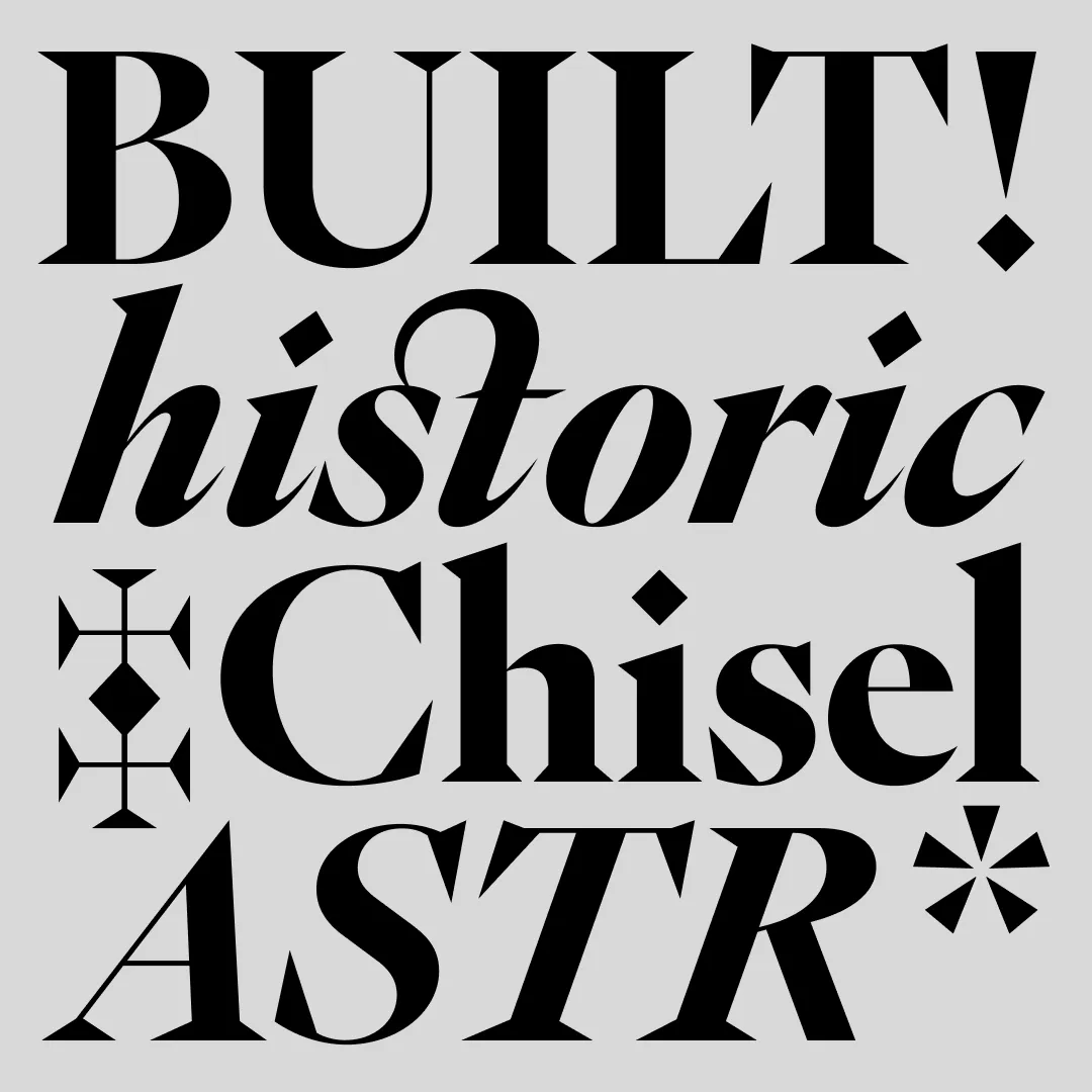
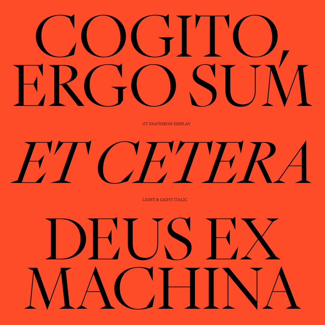
GT Pantheon, designed by Tobias Rechsteiner and Noël Leu for Grilli Type, is an innovative typeface that reflects a harmonious blend of traditional ideals and modernist shapes.
Inspired by the Pantheon in Rome, GT Pantheon is characterised by sharp, chiselled, and crisp forms and has a distinctly architectural quality. It is built around three archetypes: Display, Text, and Micro, each crafted to perform optimally across different size ranges.
This versatile font excels in editorial design, particularly for architecture or design magazines. Its range of styles makes it a strong choice for branding projects, especially in fields such as design, construction, or cultural institutions.
Nestor by Julien Fincker
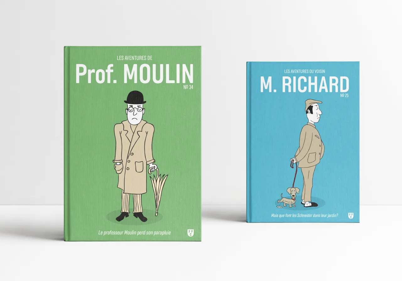
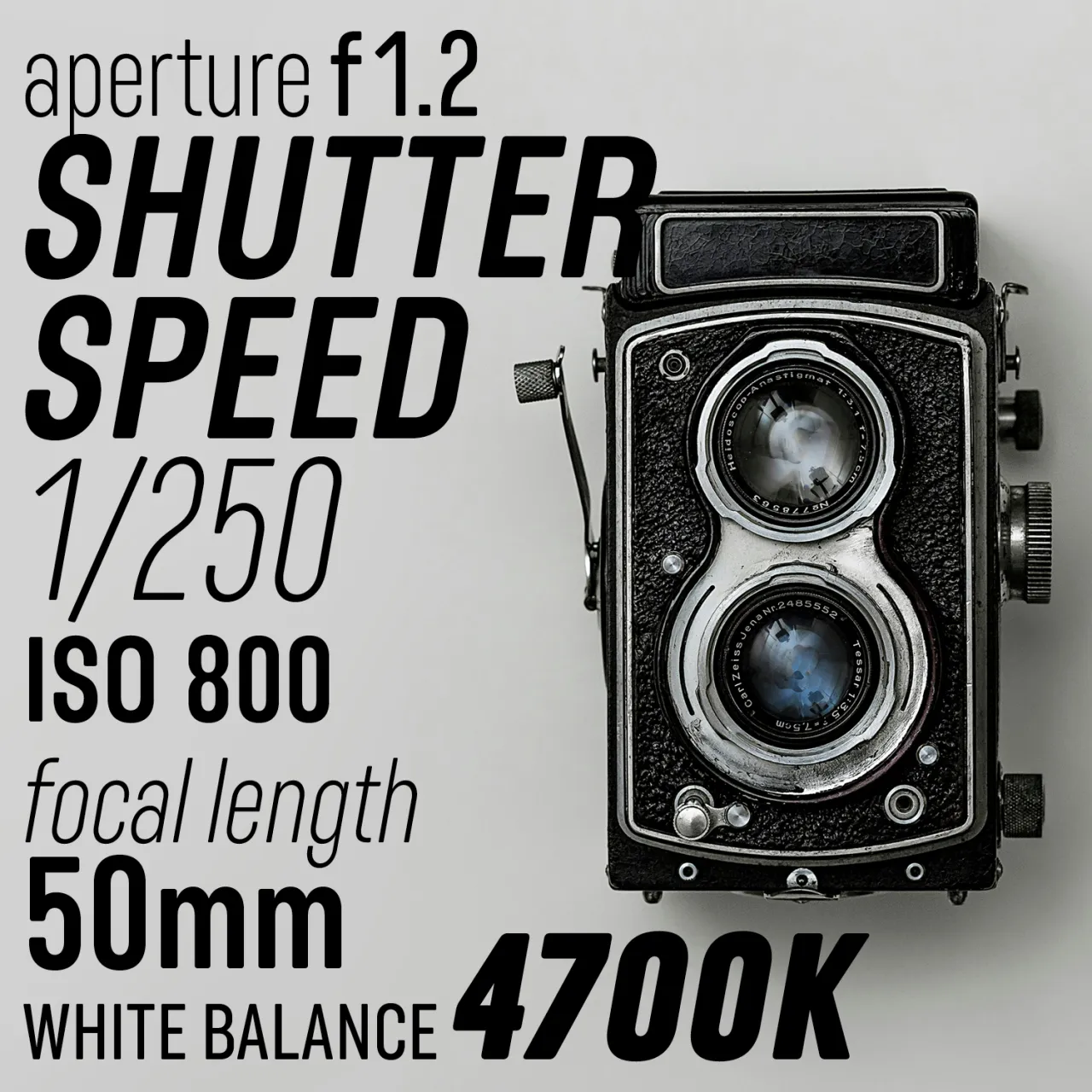
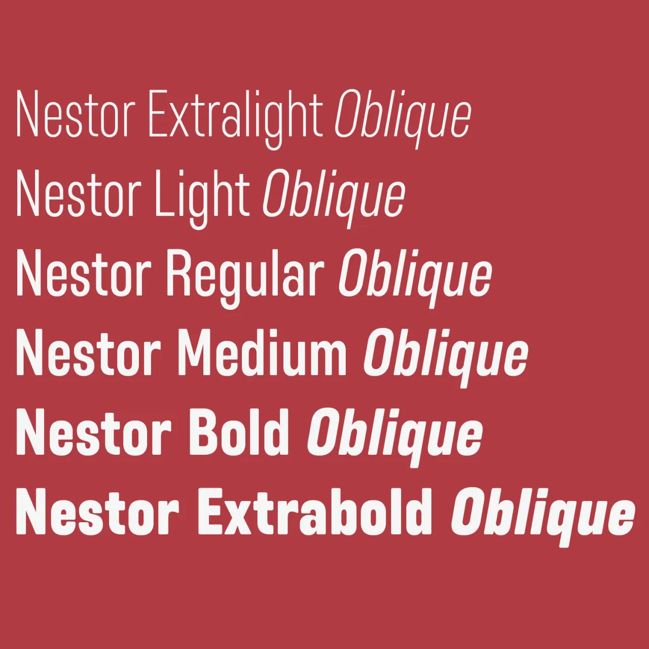
Designed by Julien Fincker, Nestor is a soft and narrow sans-serif that marks the launch of his new foundry, Font Cuisine. This typeface draws inspiration from early 20th-century advertising and family history and balances confidence with a touch of playfulness.
With its rounded corners and narrow width, Nestor stands upright and exudes self-confidence. Its clear and distinct appearance makes it highly suitable for strong headlines, editorial work, packaging, branding, and advertising. Its soft character, combined with its confident stance, allows it to convey a message with both authority and approachability.
The family includes 12 styles, from Extralight to Extrabold, with matching italics. It also features a range of OpenType features, including alternative characters and automatic fractions. Nestor is available exclusively at Font Cuisine at a 50% reduced price until 31 October: use the coupon code Nestor50.
Pivot Grotesk by Anton Studer
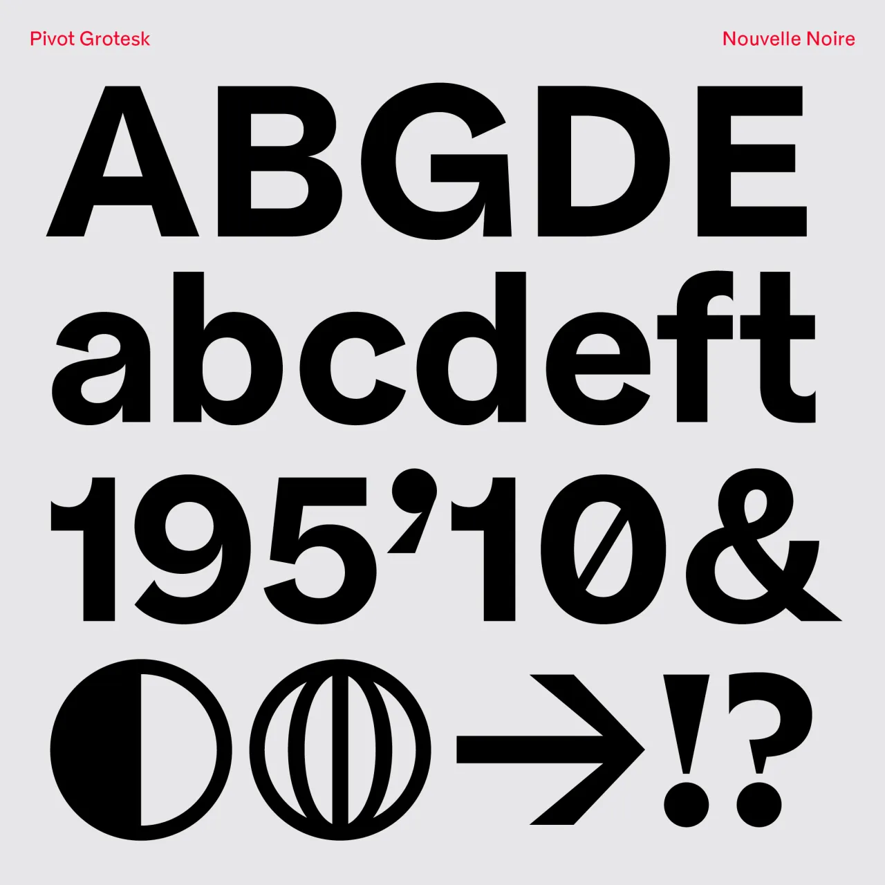
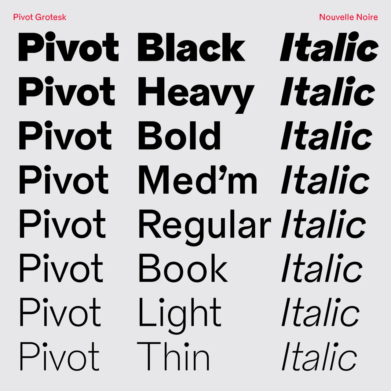
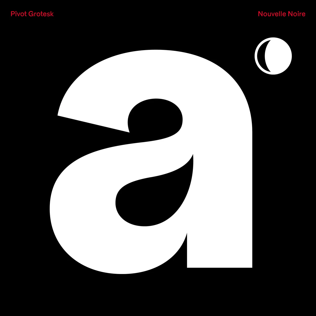
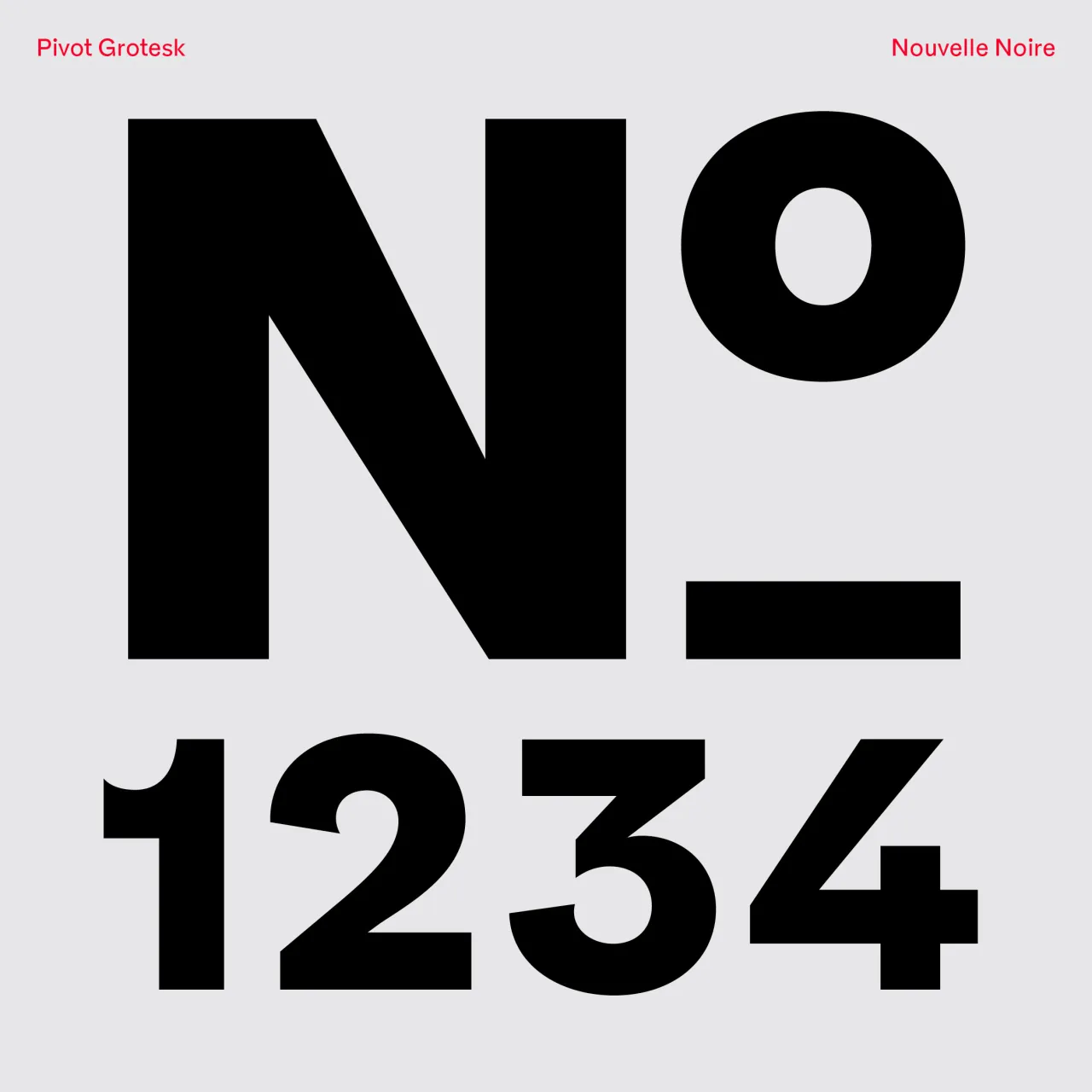
Designed by Anton Studer for Nouvelle Noire, this font blends visual principles from timekeeping, walking visualisations, and logarithmic spirals found in nature. This unique combination merged with the unrestrained style of early grotesques, results in an energetic and distinctive typeface.
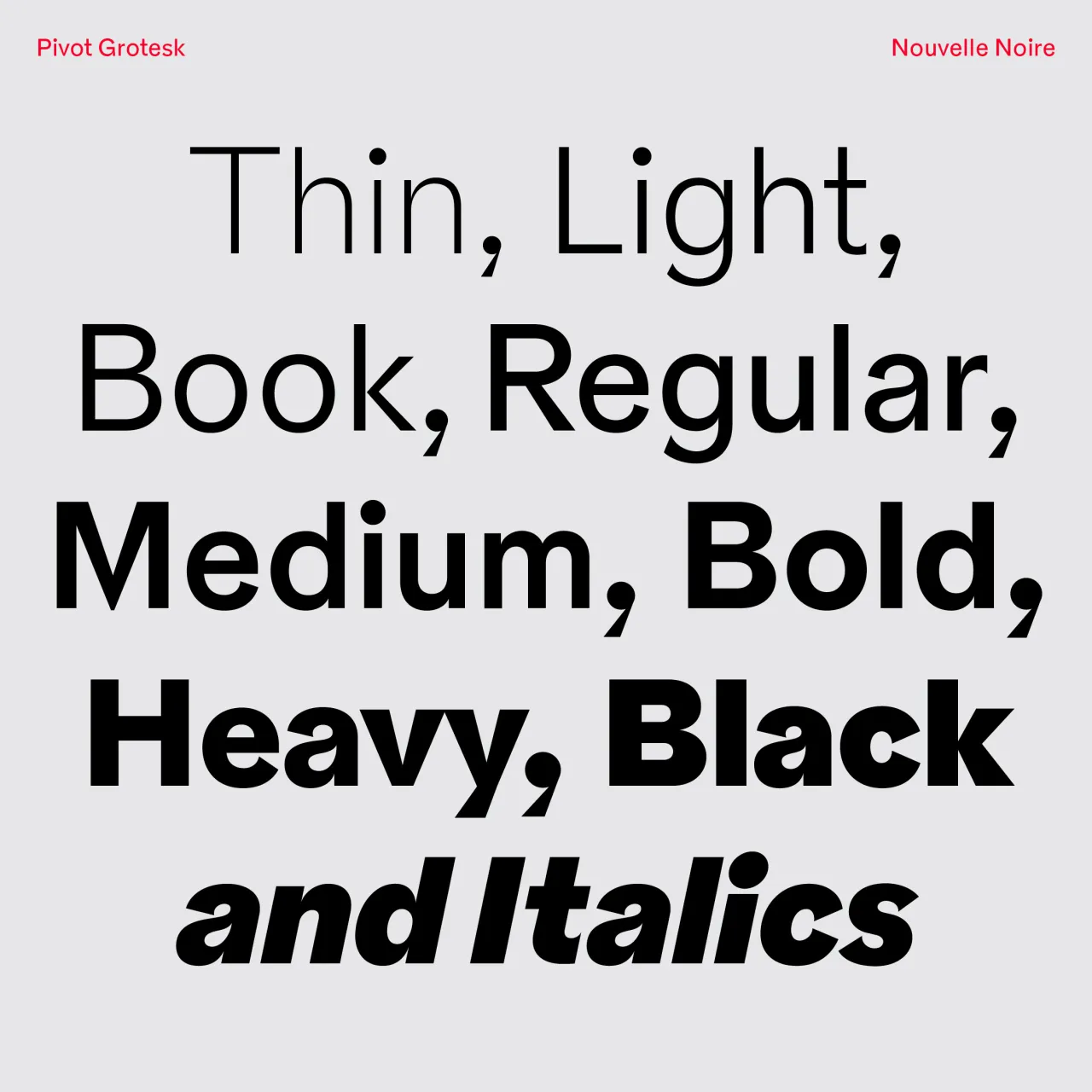
Originally designed for Theater Basel in 2020, Pivot Grotesk has been refined and expanded for its 2024 retail release. The family includes eight weights from Thin to Black, each with matching italics, providing a wide range of expressions.
It would excel in projects that require a balance of rationality and dynamism and is particularly well-suited for cultural institutions, contemporary art galleries and forward-thinking tech companies. More generally, Pivot Grotesk's unique character makes it a strong choice for editorial design, especially in magazines or websites covering design, technology or contemporary culture.
Caxa Display by Estúdio Caxa
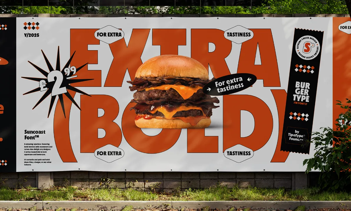
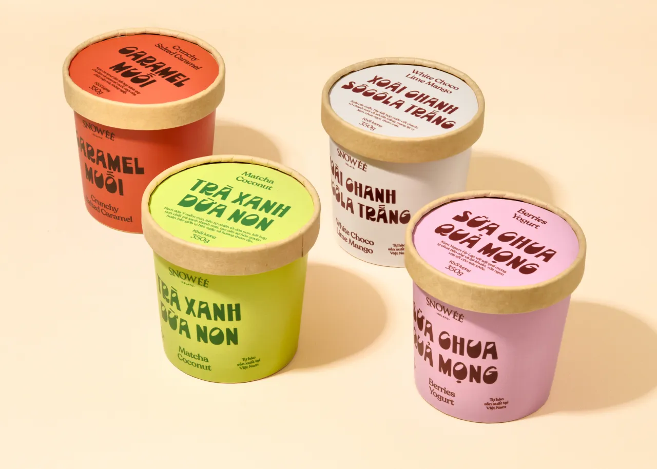
Want to add a touch of South American flavour to your layouts and illustrations? This playful typeface is a great choice.
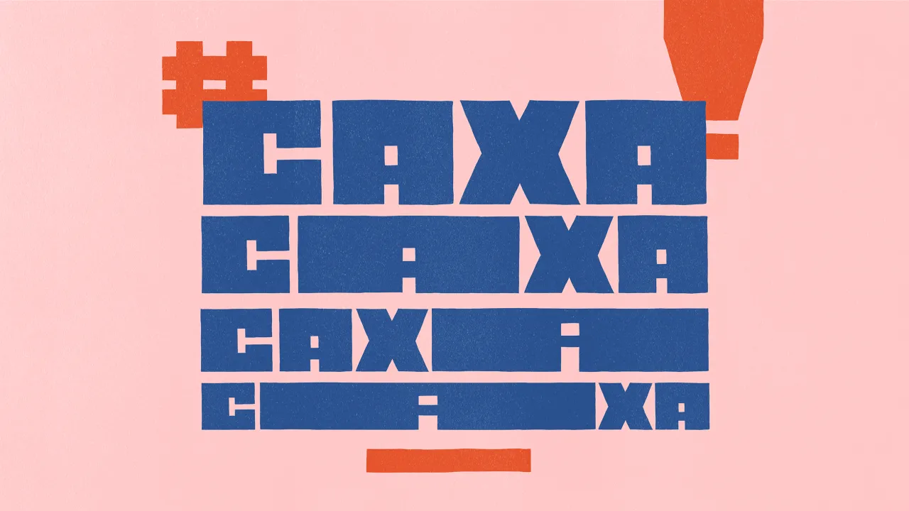
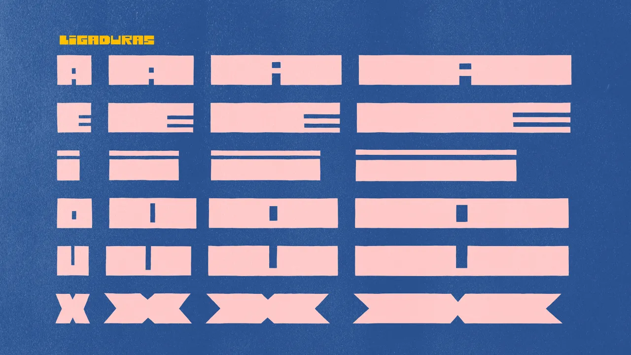
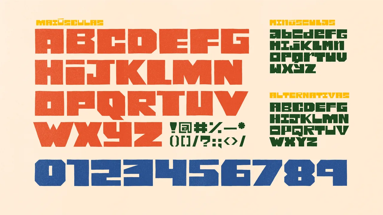
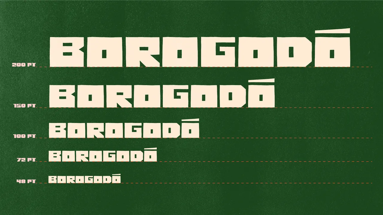
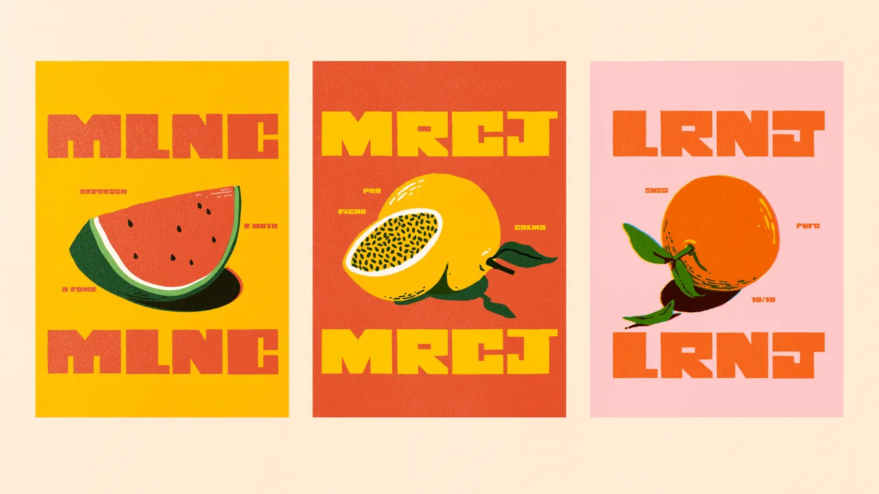
Created by Estúdio Caxa, Caxa Display is heavily inspired by Brazilian and Latin American design. Drawing inspiration from woodcut typography, it features hard and sharp forms that give the impression of being physically carved. Its letters are designed to fit and fill spaces both in height and width, giving weight and presence to layouts.
This font is ideal for use in large sizes in a blocky and bold manner. It's particularly well-suited for projects that aim to capture a sense of cultural vibrancy, such as posters for cultural events, packaging for artisanal products, or branding for businesses that want to emphasise their Latin American roots. Its fun sense of personality also makes it a great choice for children's books or educational materials focusing on cultural themes.
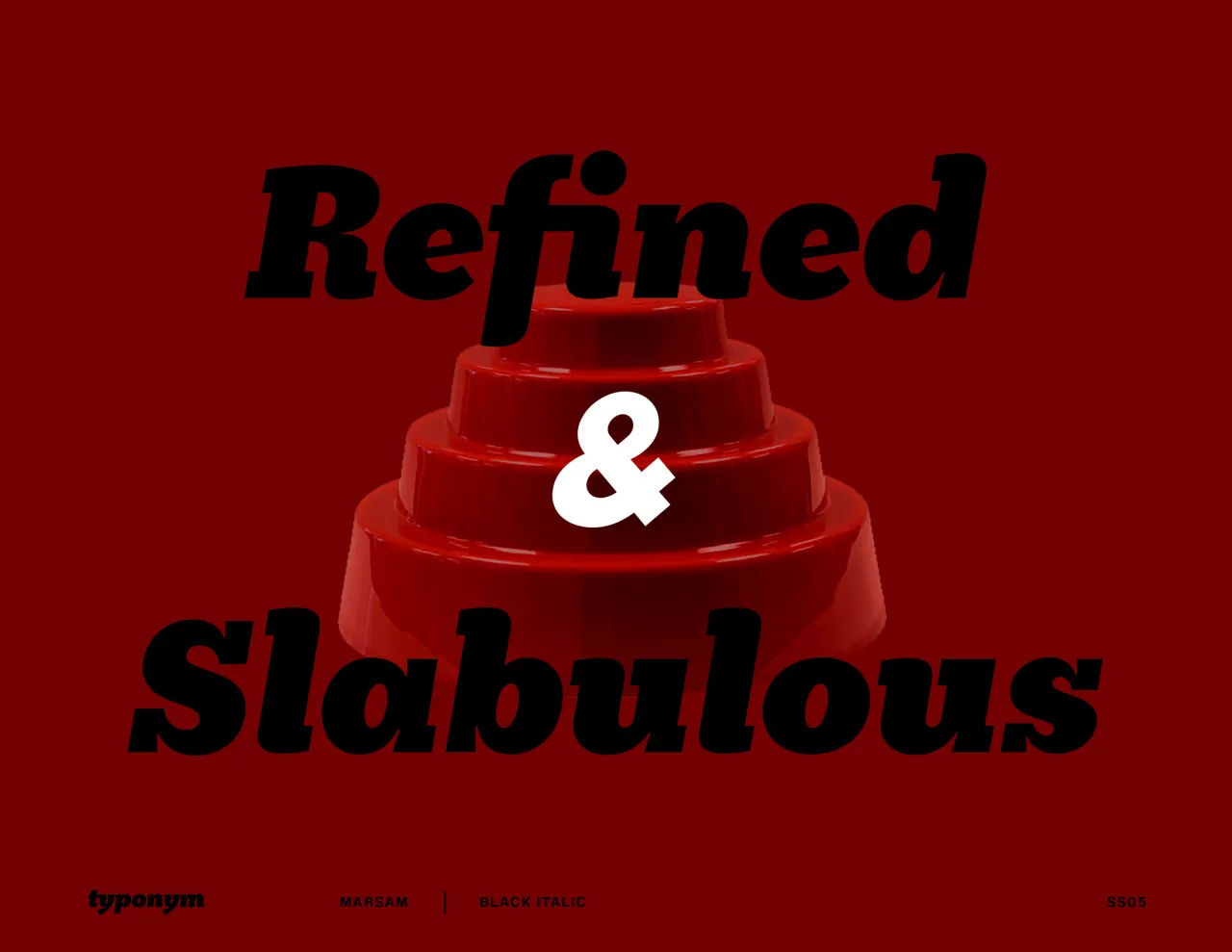
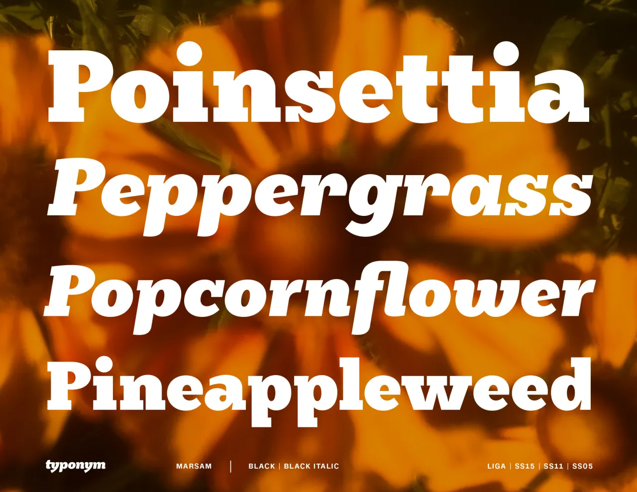
Marsam by Evan Deterling for Typonym
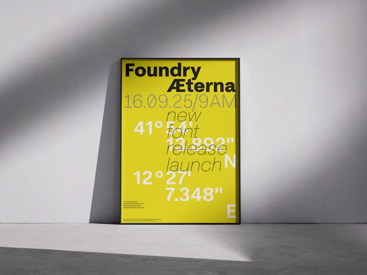
Marsam is a sans-serif designed to be paired with Newsam. A distinctly modernist font, it features a level of refinement that's often missing in slab serifs; this is particularly apparent in the 'a,c,g,r,s' glyphs and numerals.
Its italics, meanwhile, are true italics with a cursive emphasis, and the slanted spurs and joints, with modest 'ink-traps' give it a distinctive, modern feel. And the punctuation is convertible between oval and square forms. In the words of its creator, Evan Deterling: "Marsam roams that arid desert between the severe, emboldened geometry of the 'Egyptian' neo-grotesque slab serifs and the graceful, bracketed serif forms of traditional Clarendon.
Marsam is the advanced release of an expansive 20 font typeface family intended for both commercial and editorial applications.
Editor's Picks





Trending






Latest Jobs
Creative Content Executive at Cognition
Full-time·Birmingham·£28k–£35k
Account Manager at Moxie and Mettle
Full-time·Cheltenham·Up to £35k
Brand Designer at Adfin
Full-time·London·£30k–£50k
Senior Operations Manager at BIG Partnership
Full-time·Glasgow·£45k–£50k
Graphic & Motion Designer at The SHARP Agency
Full-time·Leeds·£26k–£33k
Client Success & Growth Director at Revolution Growth
Full-time·Manchester·£60k-£70k