Foundry Æterna by The Foundry Types
Autumn is a time of renewal, and it's natural for designers to start looking further afield for new fonts. Thankfully, this month has delivered a bumper harvest of typographic innovation to expand your options.
The standout theme this September has been the marriage of historical reverence with contemporary functionality. Some of our favourite foundries have taken iconic designs and expanded their reach; whether through multiscript development, variable font technology, or carefully considered optical sizing. Others, meanwhile, have chosen to forge entirely new paths, crafting typefaces that prioritise personality and warmth over clinical neutrality.
So whether you're seeking a workhorse grotesque for extensive branding systems, an expressive display face for impactful headlines, or something with distinctly European character, read on and discover eight new releases that could help bring your creative projects to life.
1. Futura 100 by TypeTogether
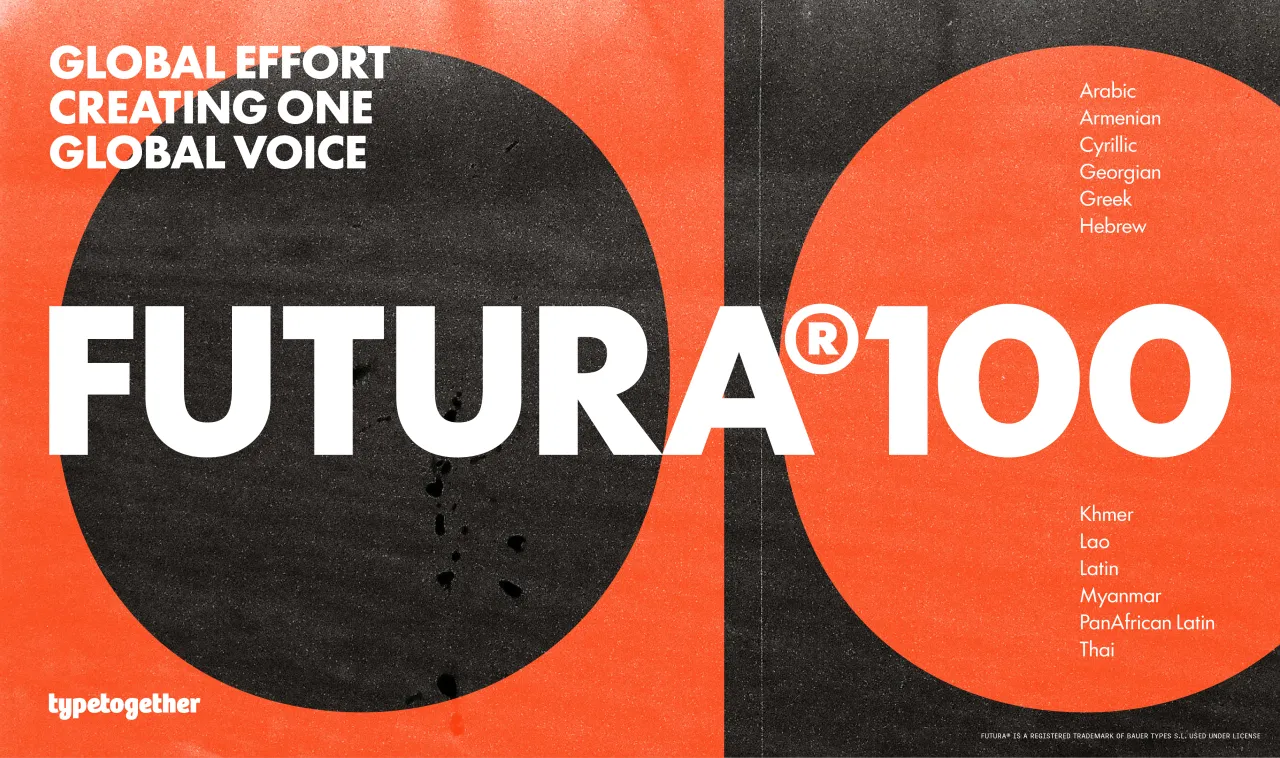
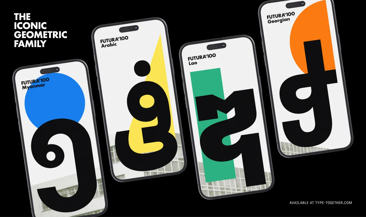
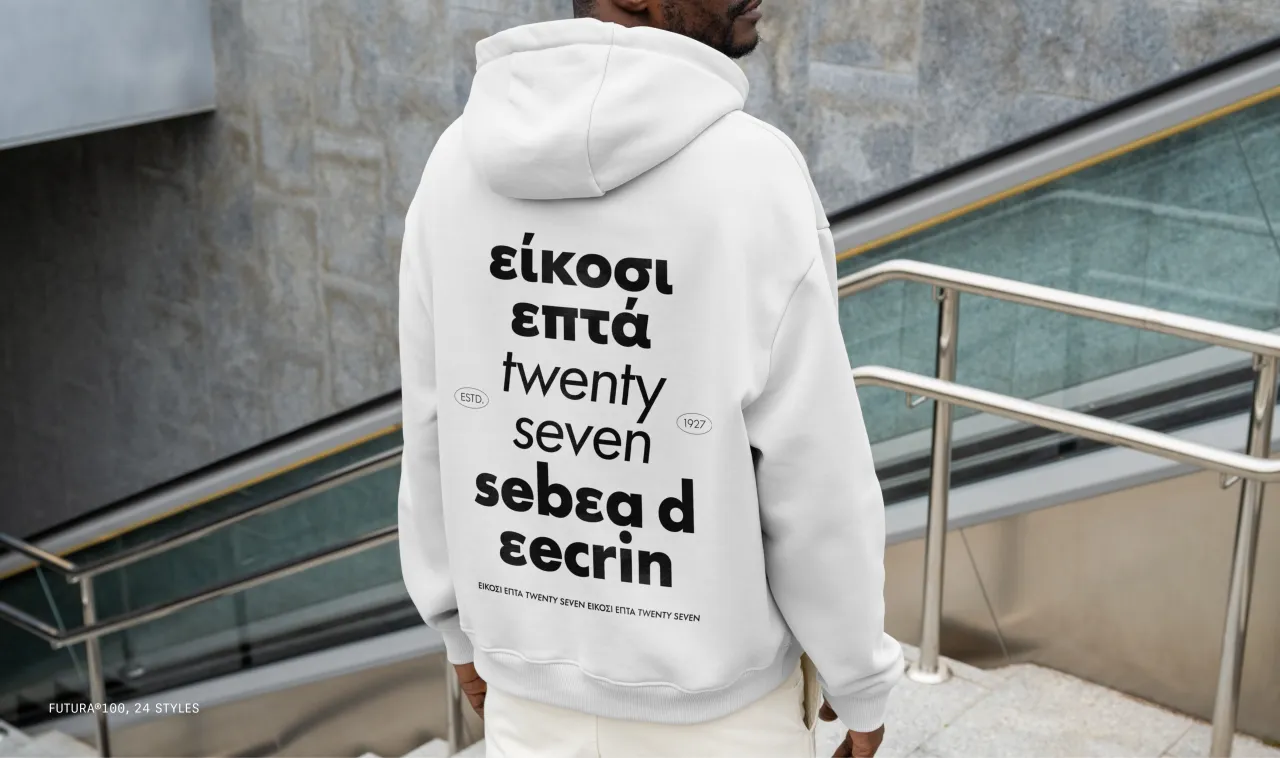
Marking a century of Futura, designed by Paul Renner and released in 1927, Futura 100 represents an ambitious reimagining of the iconic geometric sans-serif for modern global communications. TypeTogether's extensive two-year collaboration with Bauer Types has resulted in a multiscript typeface that supports 23 writing systems, covering over 90% of the world's population.
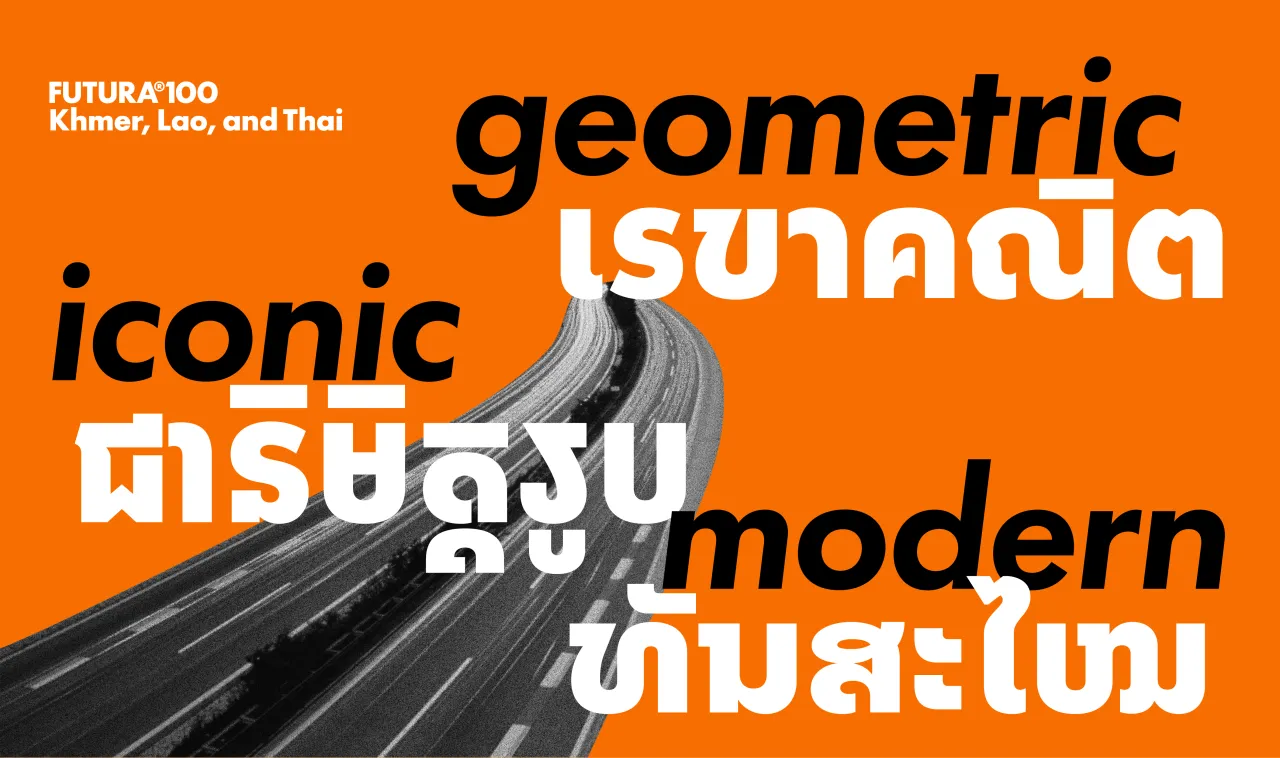
Futura 100 maintains Renner's constructed shapes and warm spirit whilst addressing contemporary digital publishing requirements through optimised readability and flexibility across devices. This first phase includes Arabic, Armenian, Cyrillic, Georgian, Greek, Hebrew, Khmer, Lao, Latin, Myanmar, PanAfrican Latin, and Thai scripts. With major Indic scripts, Simplified Chinese and Hangul to come, Futura 100 promises to become one of the few truly global typefaces.
2. GT Era by Grilli Type
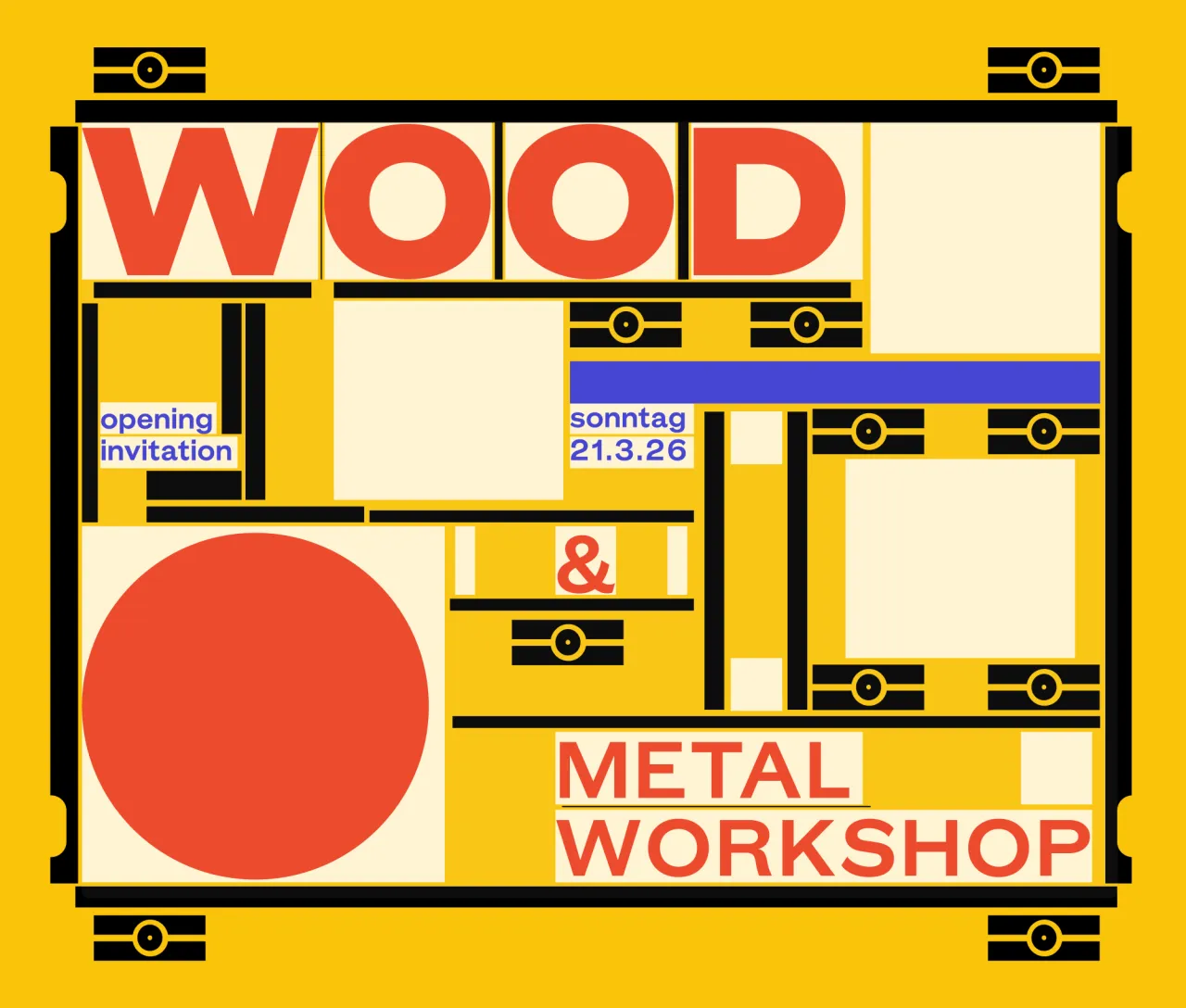
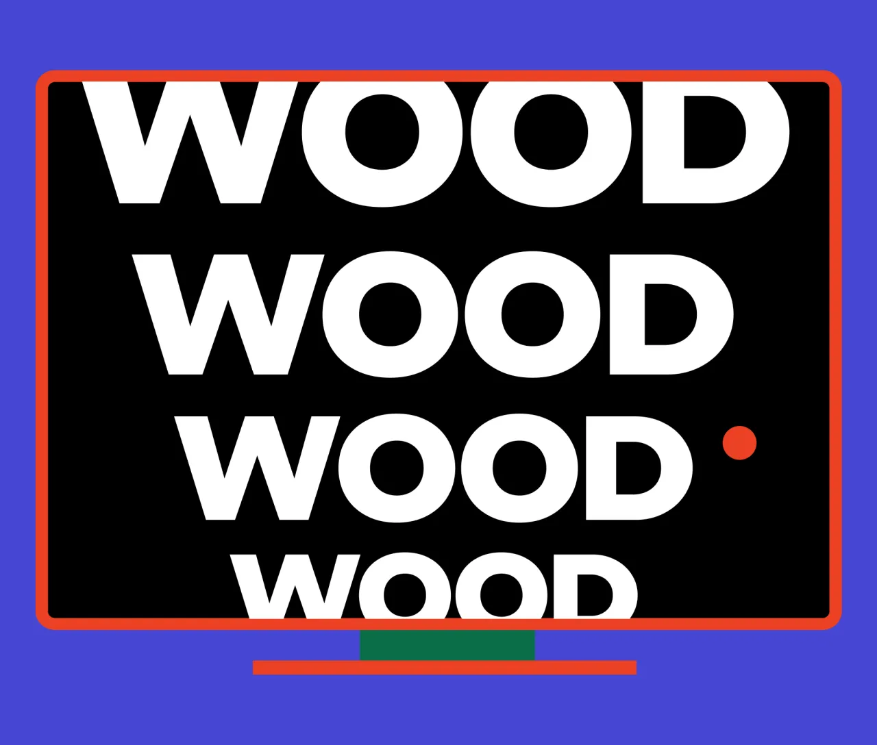
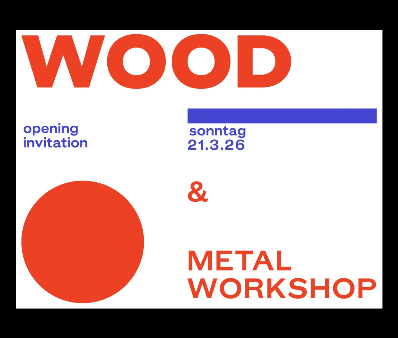
GT Era deliberately shuns the algorithmic neutrality of contemporary grotesques, instead drawing inspiration from the warm, idiosyncratic character of pre-modernist designs such as Breite Fette Grotesk, Venus, and early Akzidenz Grotesk. Thierry Blancpain's design for Grilli Type also embraces friction, championing recognition over uniformity and flavour over conformity.
The family comprises Display and Text styles with matching obliques, connected through an optical size axis. Unlike typical optical sizing that makes subtle technical adjustments, GT Era offers genuinely different levels of expressiveness; the Display echoing bold historical personalities whilst the Text performs comfortably in reading applications and digital interfaces.
This approach creates a design system that provides both maximal display impact and utilitarian functionality, celebrating the texture and character that modern design often sanitises away.
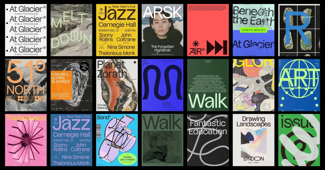
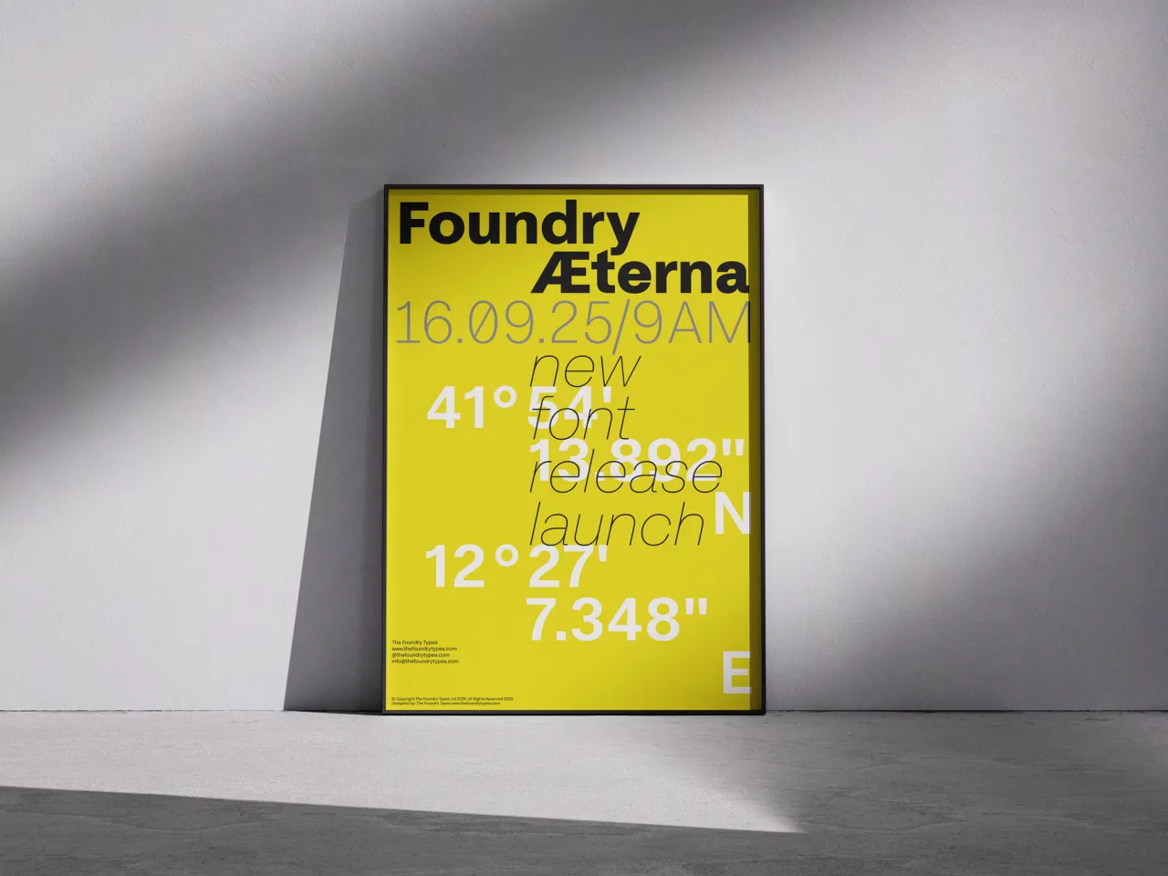
3. Foundry Æterna by The Foundry Types
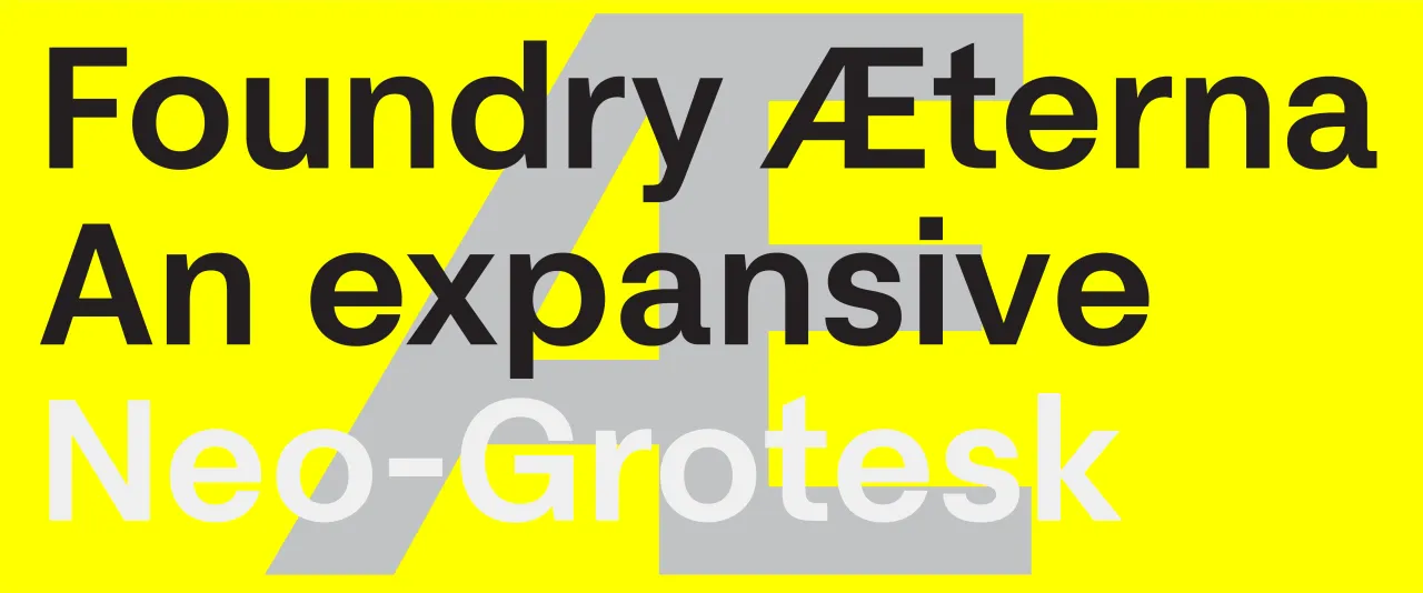
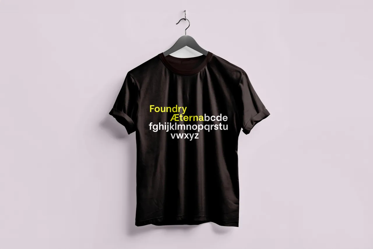
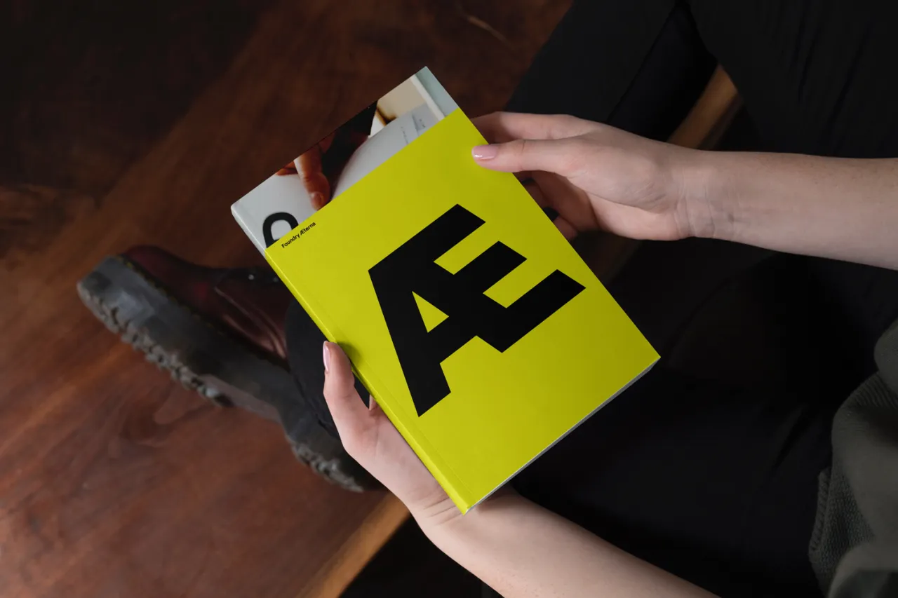
Foundry Aeterna is a neo-grotesk typeface with a workhorse aesthetic. Responding to what David Quay, one of the principals of the Foundry Types, describes as the "persistent reliance on ubiquitous, overused Neo-Grotesk typefaces," this font isn't just another revival, but a thoughtful synthesis of modernist principles for the digital age.
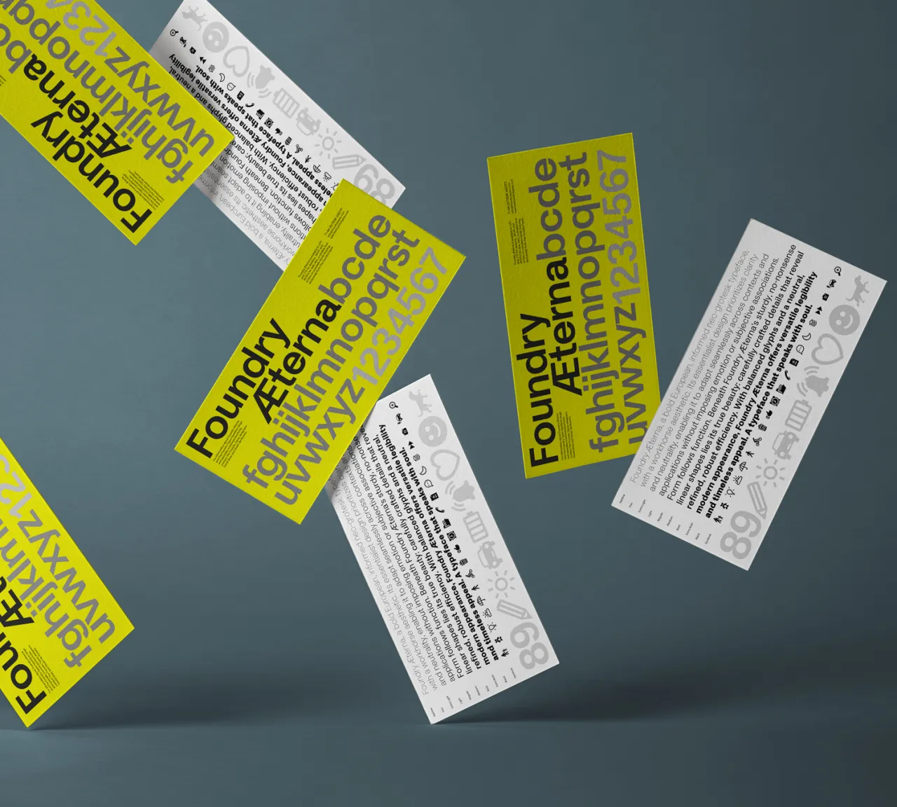
The design prioritises clarity through harmonious letterforms, a large x-height and compact spacing. Distinctive details include subtly extended terminals on A, C, G, and S, as well as horizontal shaping on A, F, J, T, and Y; quiet expressions of the font's contemporary character that avoid the sterile uniformity of many geometric sans-serifs.
Alongside the typeface, Foundry Aeterna includes over 290 icons and symbols, designed to support a broad range of applications, from transport and user interfaces to information systems and wayfinding. The Symbol set is built on the typeface's capital height, aligned to the baseline, and centrally spaced for seamless integration.
4. Urbolyt by Mostardesign Type Foundry
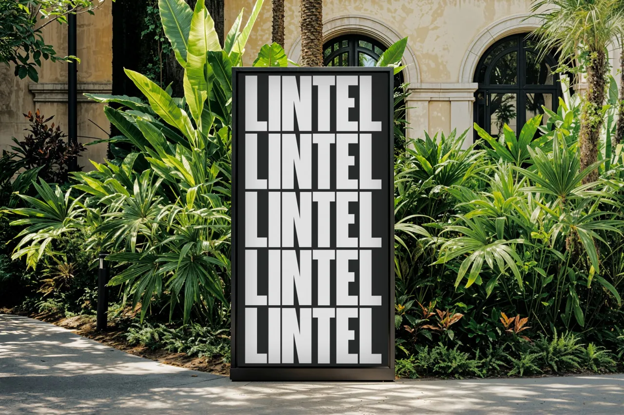
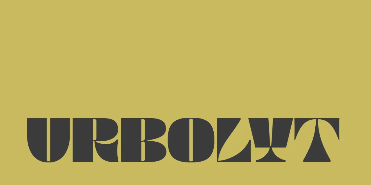
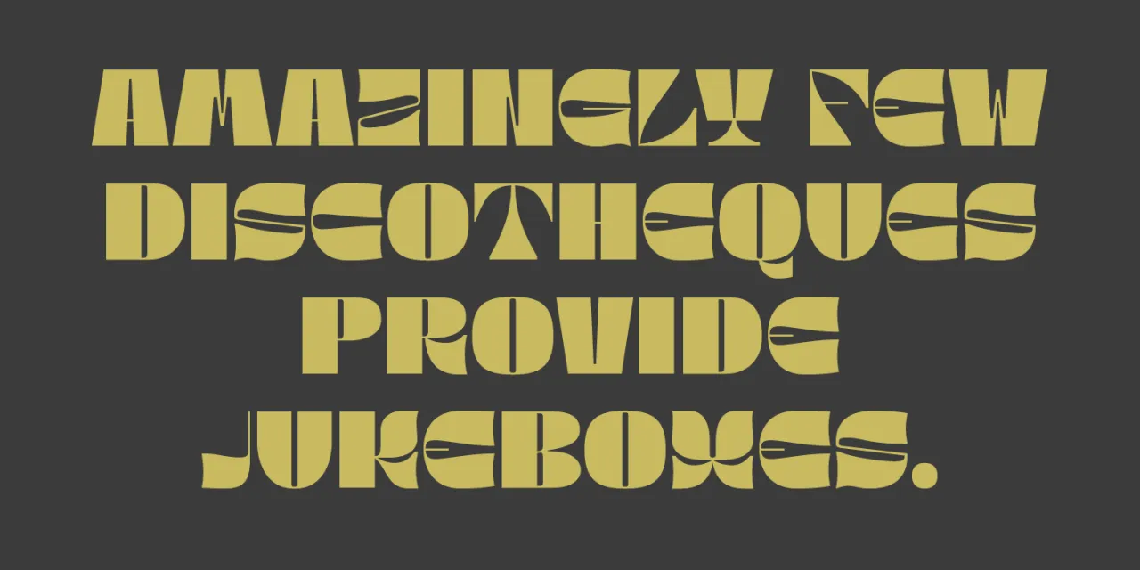
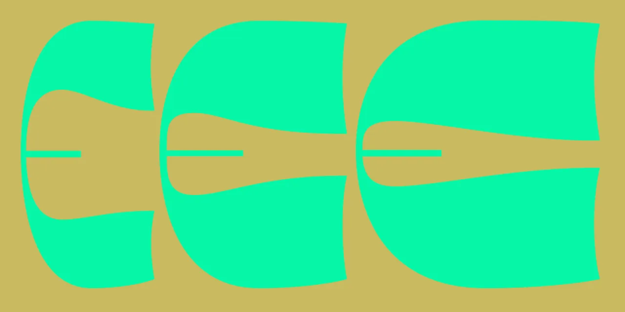
Urbolyt is a variable font that represents a clash between geometric rigour and organic forms. Each letter is described as raw architecture where razor-sharp angles meet unpredictable curves. Characters like N, A and M rise like concrete skyscrapers, whilst X, C and E breathe with natural movement.
This constant tension between solidity and delicacy creates a singular identity that would be a good choice for impactful headlines, brand logos and event posters. The variable version ranges from 75% to 150% width, enabling designers to sculpt word density and transform headlines into visual manifestos. Overall, this font would be a suitable choice for any design project that requires a strong and memorable visual identity.
5. EE Piscina by errorerror.studio
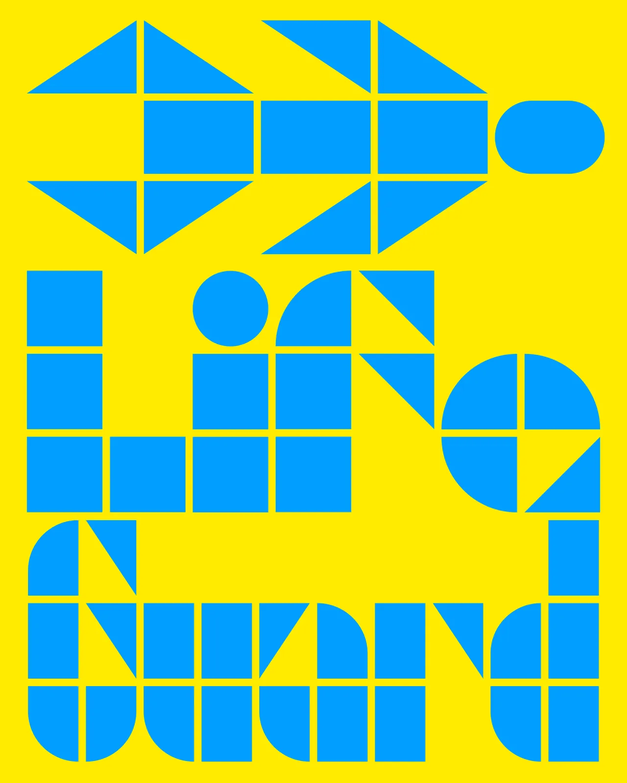
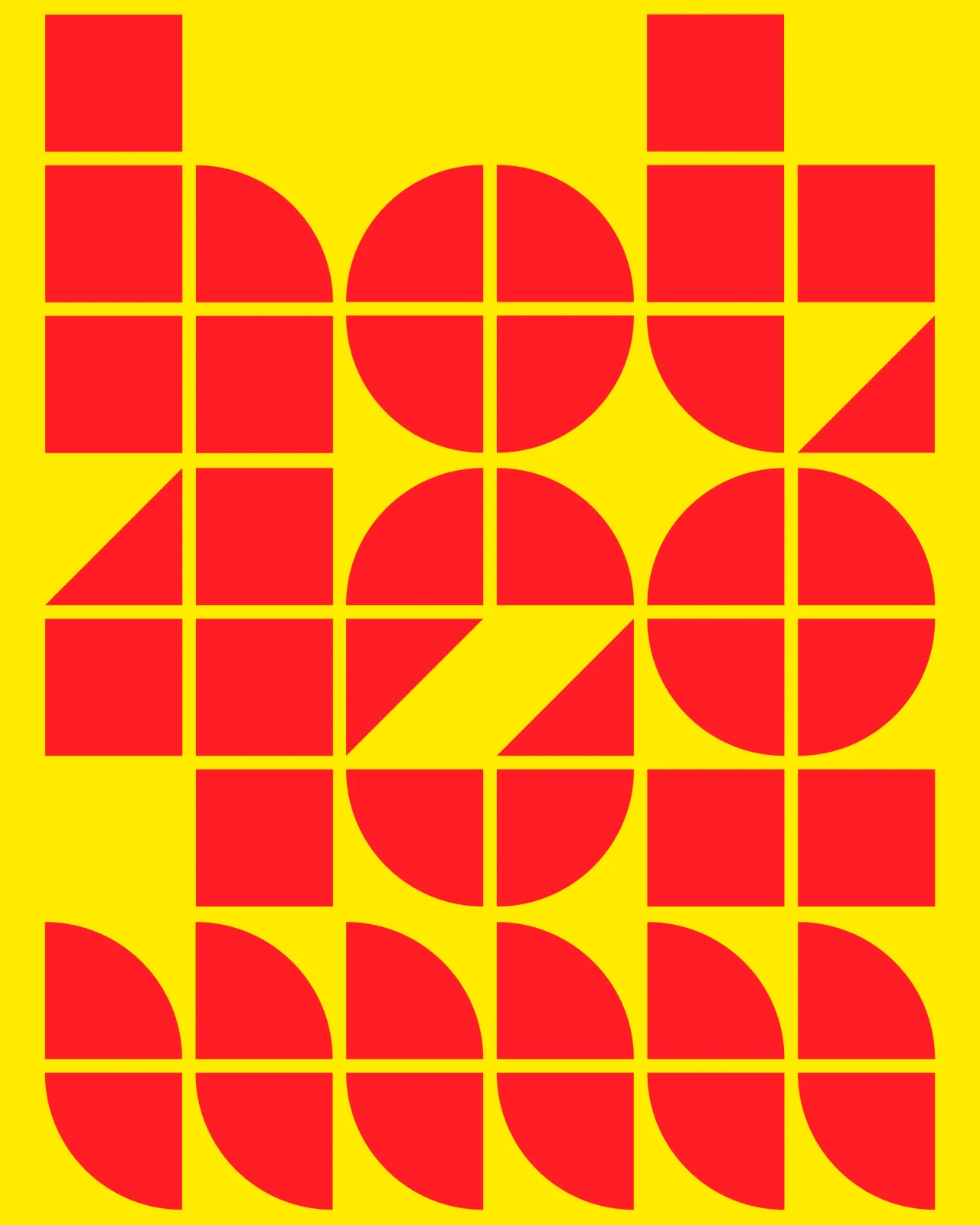
From the València-based errorerror.studio comes EE Piscina, a modular typeface that, in the words of designers Paloma + Luismi, "brings hints of pool water and aftersun, tastes like ice-cold lemonade and smells like freshly cut grass". Available in three styles (S, M, and L), this release represents the duo's focus on "creating another type of types".
Rather than pursuing neutrality, Paloma + Luismi prioritise storytelling and soul in their typographic work. EE Piscina, in turn, embodies their philosophy of creating typefaces that carry emotional resonance beyond mere functionality; described as "a fan-blown breeze for overheated designers". In more practical terms, the font's modular construction offers flexibility whilst maintaining distinctive character, positioning EE Piscina as an antidote to algorithmic design thinking.
6. LL Unica77 by Lineto
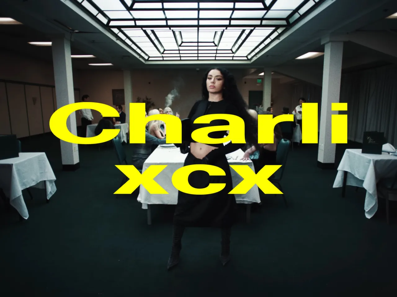
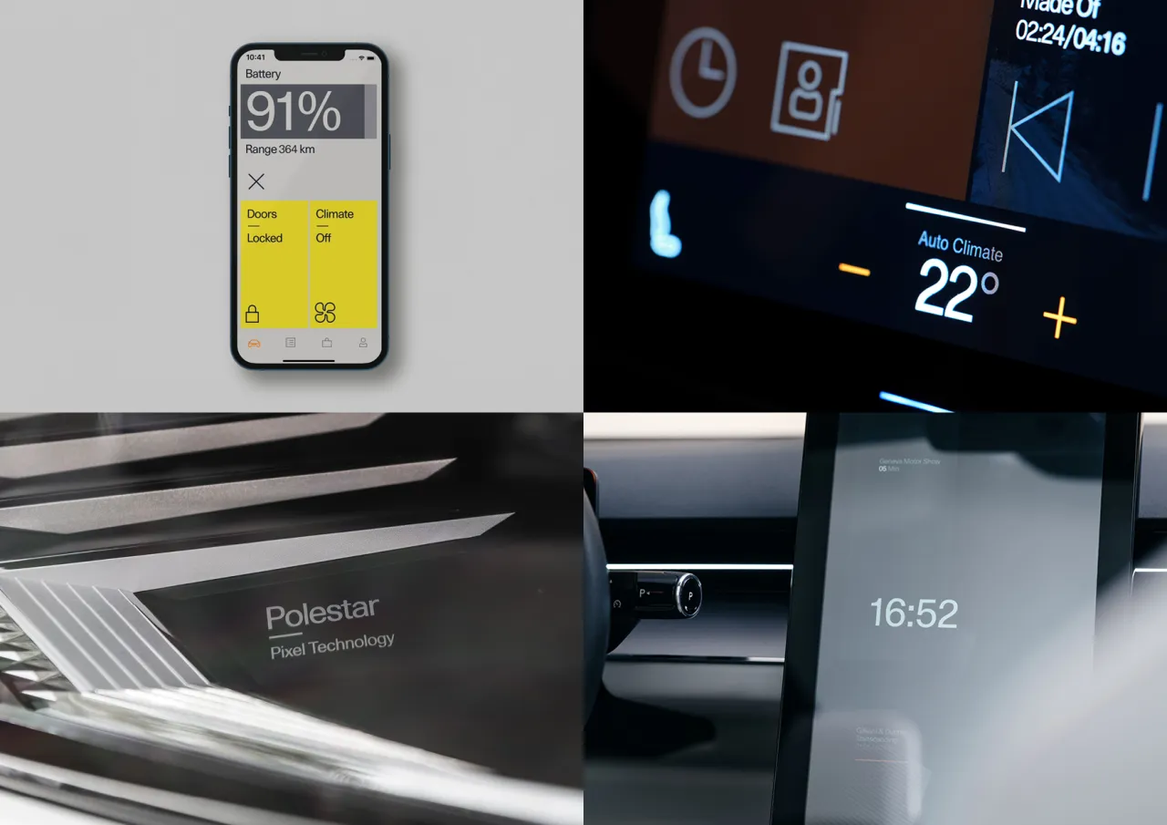
Haas Unica was created in 1980 as a response to licensing restrictions around Helvetica. It's regarded by many as the pinnacle of modernist type design, but it gradually disappeared in parallel with the decline of phototypesetting. Now, LL Unica77 represents its authorised digital revival.
Remastered by original Team '77 member Christian Mengelt from their own drawings, and developed in collaboration with specialist designers, LL Unica77 includes a fully condensed family, rich OpenType features, stylistic sets, full Cyrillic and Greek support, and a fully variable counterpart with three axes for weight, width and slant manipulation.
7. Djaggety by Typeland
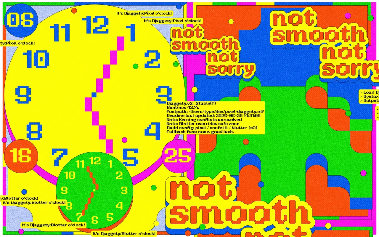
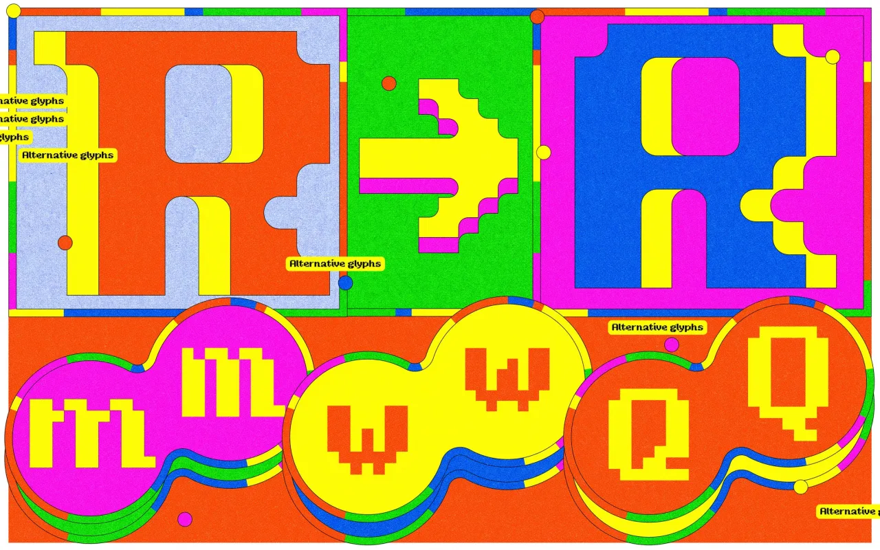
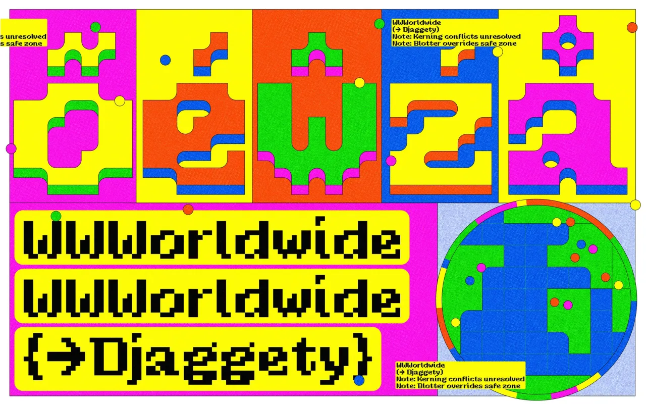
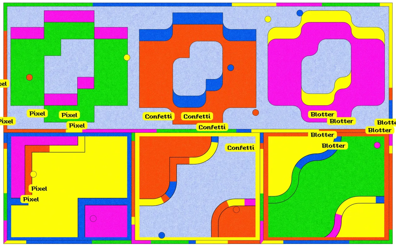
Born from a classroom exercise using an 8×8 pixel grid, Djaggety celebrates the beauty of productive constraints and the creative potential found within rigid systems. What began as a teaching tool—where students must build working alphabets using only simple modules—evolved into a three-style display family that embraces rather than refines its inherent coarseness.
The typeface's charm lies in its acceptance of systematic limitations. Every letterform emerges from the same pixel module, creating unexpected quirks and formal solutions that would be impossible through traditional design approaches. Instead of smoothing away these irregularities, Typeland has expanded the concept, allowing the grid's influence to generate character rather than constrain it.
Djaggety's development process reveals fascinating insights into contemporary type design practice. Kerning becomes a maze of compromises when working within such strict parameters, forcing decisions between maintaining character-defining details (like distinctive tails) and achieving rhythmic consistency. The result demonstrates how digital constraints can generate a distinctive personality, offering designers a modular system that's both expressive and deliberately unruly.
8. Gregory Grotesk by Typemates
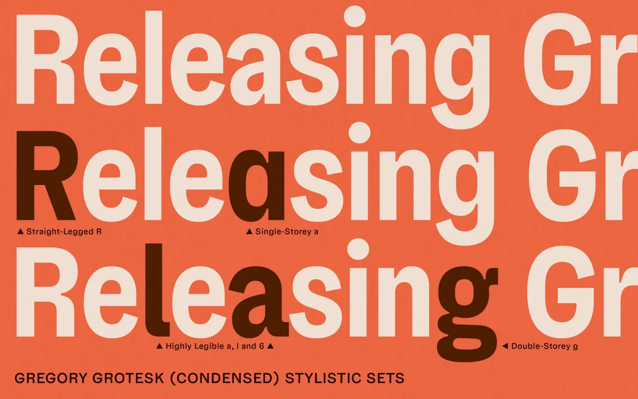
Designed by Jakob Runge and Antonia Cornelius, Gregory Grotesk strikes a balance between distinctive personality and functional reliability, creating a charismatic typeface that works well in both branding and UI design. It's a great demonstration of how contemporary grotesques can maintain character whilst delivering the smooth texture expected from system fonts.
Gregory's personality emerges through charming quirks embedded within solid structural foundations. Top-heavy letterforms combine with rounded inner corners at angular junctions, creating a handmade patina that humanises digital environments. These trapped-ink effects reference wood type printing traditions whilst serving contemporary aesthetic sensibilities.
The typeface's technical specifications support ambitious typography, featuring 24 individual styles that span compressed to normal widths across typical weight ranges, unified within a single variable font. With Greek and Cyrillic scripts approved by native designers and support for over 270 languages, Gregory Grotesk demonstrates how personality-driven design can maintain global functionality.
Editor's Picks





Trending






Latest Jobs
Design Director at Koto
Full-time·London·£72k-£90k
Junior Project Coordinator at Colorido Studios
Full-time·Twickenham·£28k–£32k
Account Manager at BUILDHOLLYWOOD
Full-time·London·£34k–£38k
Senior Creative Lead at Random Studio
Full-time·Amsterdam / Paris·€90k-€110k
Paid Media Executive at Munro Agency
Full-time·Glasgow·From £27,000
Designer at New Genre
Full-time·London·£36k–£48k