Haltung by Order Type Foundry
Wow, where does the time go? We're well into a new year and an astonishing quarter of the way through the 21st century. Meanwhile, the creative scene continues to develop at breakneck speed, and typographic innovation shows no sign of slowing down, either.
This month, type foundries and designers are bringing their A-game with releases that push the boundaries of form, function and artistry. From neo-grotesques with a modern edge to culturally significant designs preserving endangered languages, these typefaces reflect the diversity and depth of contemporary typography.
So read on as we present six of the best new font releases of January 2025. We hope they inspire you to experiment typographically and reinvigorate your design toolkit in the year ahead.
1. Place by Commercial Type
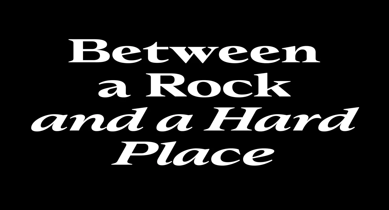
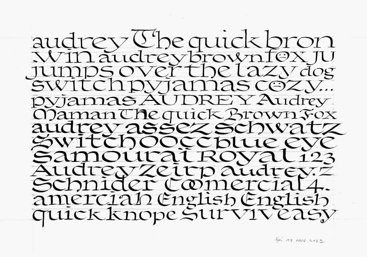
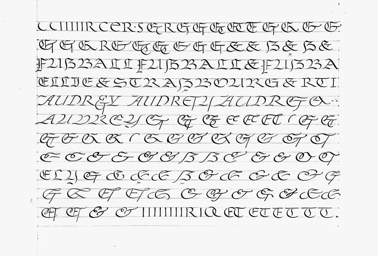
Commercial Type designer Julien Priez's latest typeface marries elegance with versatility. Place is inspired by historical forms, from 16th-century French Renaissance types to Blackletter structures while introducing forward-looking, inventive shapes.
With low stroke contrast and two full sets of capitals—Latin and Blackletter—Place shines as a display face and a workhorse for complex typography. Key to its appeal is sharp, minimal terminals, which ensure adaptability across design contexts. Overall, it's a celebration of the balance between aesthetics and functionality, making it ideal for logotypes, headers, and page navigation.
2. SLTF Bergamot Grotesk by Silverstag Type Foundry
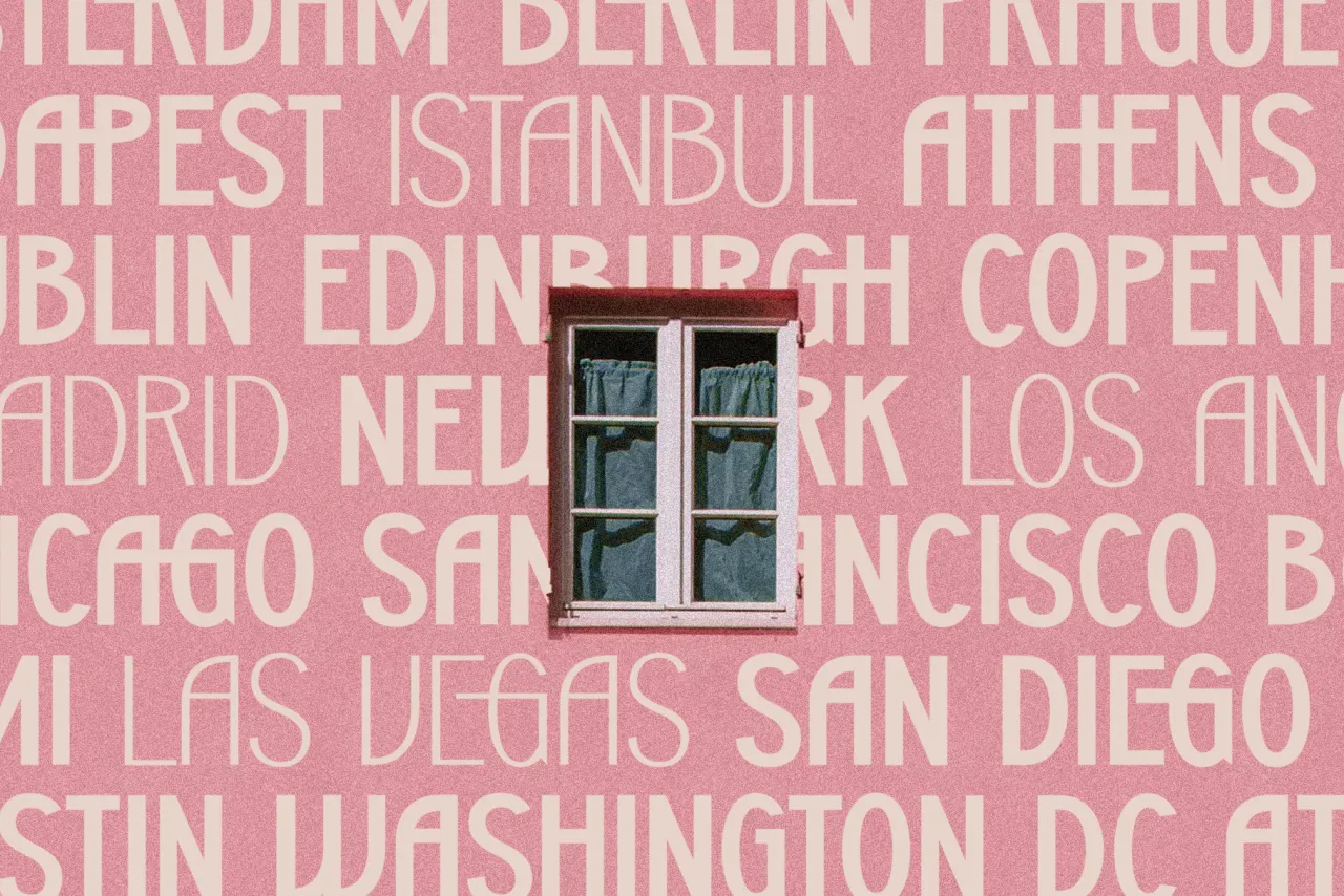
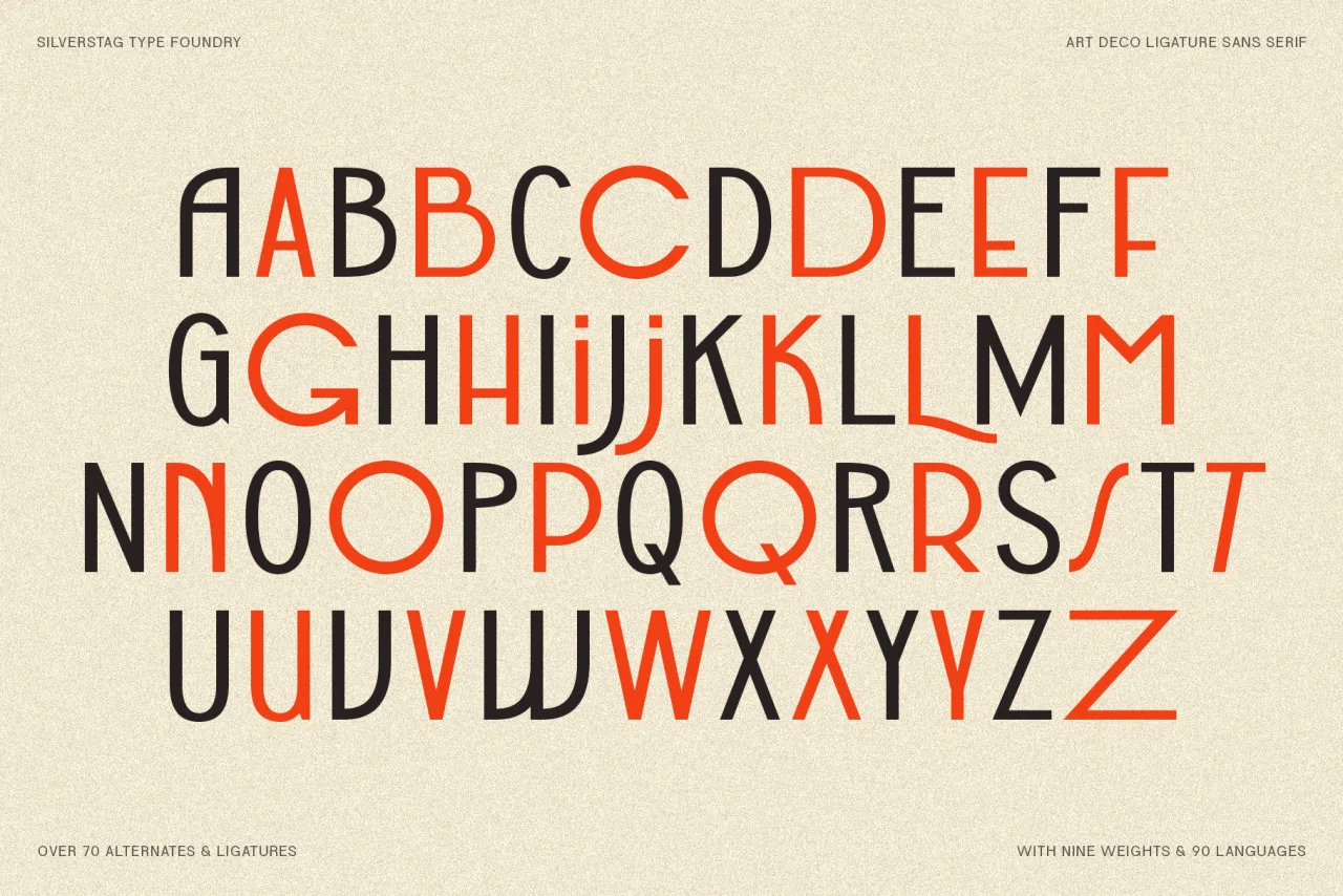
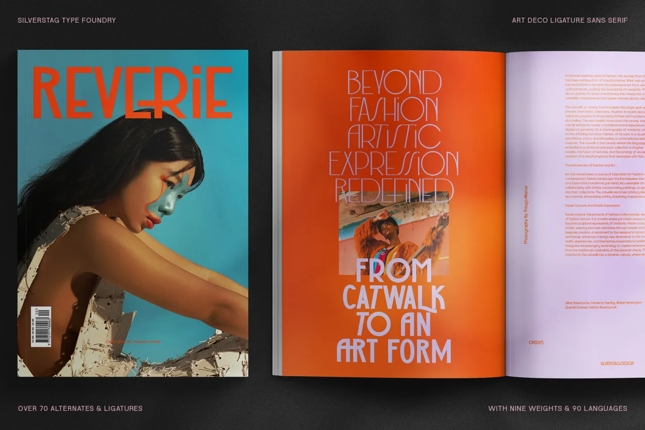
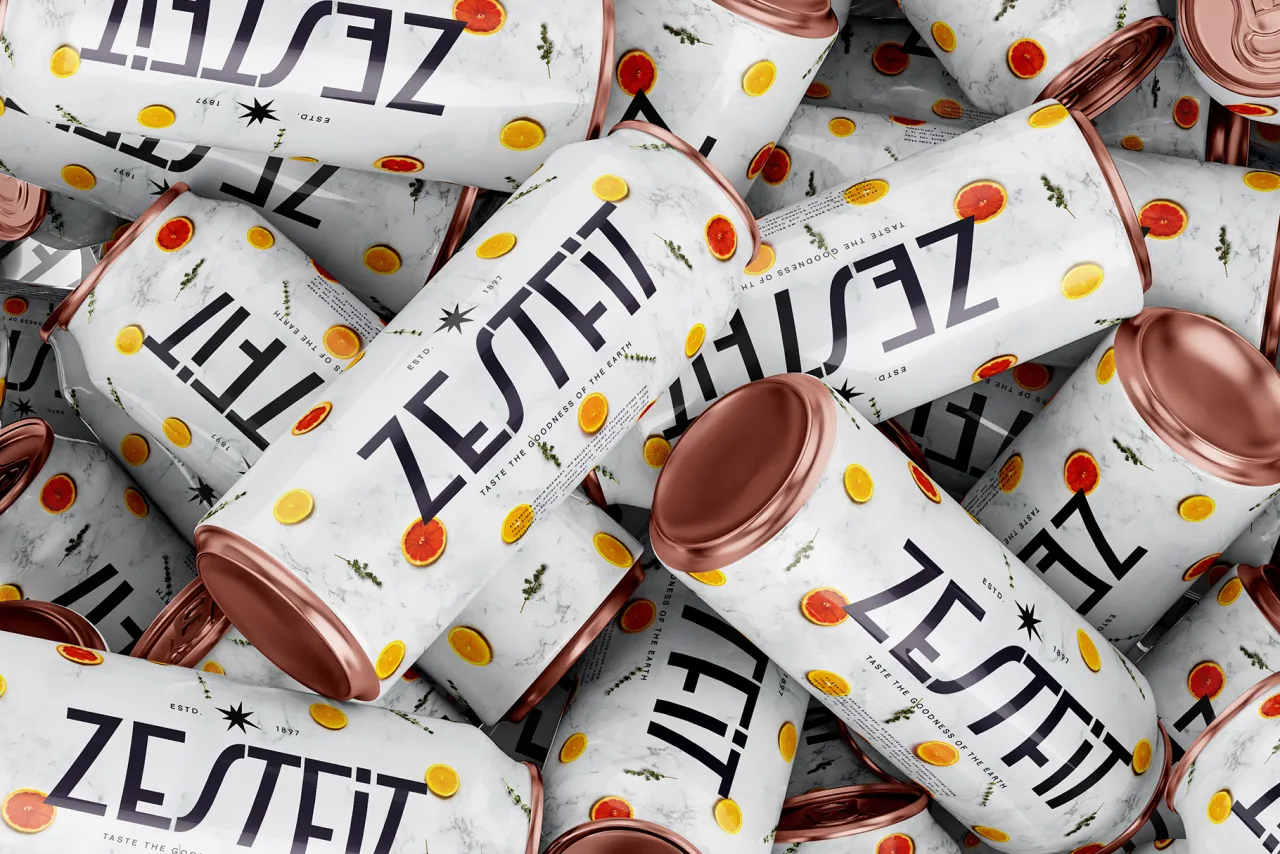
A bold statement in uppercase elegance, SLTF Bergamot Grotesk draws from Art Deco's geometric sophistication. Its nine weights, from Thin to Black, along with more than 70 custom ligatures, make it a standout choice for luxury branding, editorial layouts and digital campaigns.
This typeface combines vintage charm with modern precision and is available for free for both personal and commercial use. Its multilingual support for over 90 languages ensures global versatility, while its sharp lines and distinctive ligatures will help you add flair to any design project.
3. Munegascu by Bruno Bernard
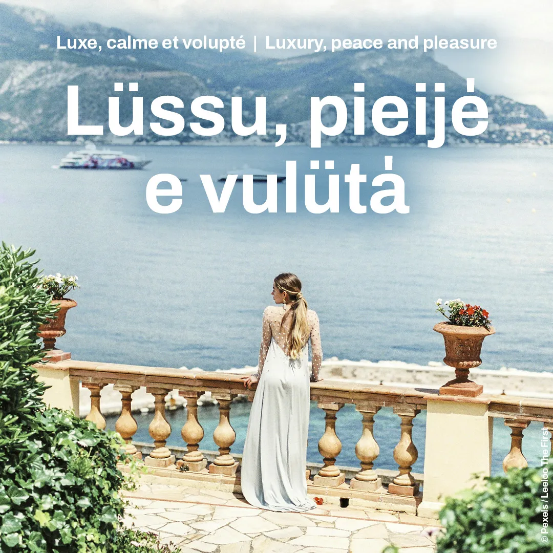
Designed to preserve Monaco's endangered Monégasque language, Munegascu is a triumph of cultural and technological innovation. Developed by Bruno Bernard in collaboration with the Centre Scientifique de Monaco and the Comité National des Traditions Monégasques, it addresses the language's unique tonal accents with an intuitive input system. It's available to download for free.
Rather than starting from scratch, Munegascu was developed as a fork of the open-source typeface Archivo, created by Héctor Gatti and distributed by the Argentine foundry Omnibus Type. To this, an innovative feature was added to overcome the lack of Monégasque-specific characters on standard keyboards. By typing a vertical bar (|) after a vowel, the system automatically transforms it into a tonal accent, correctly positioned above the letter. This simple yet intuitive solution works with most software without requiring special hardware.
Overall, Munegascu bridges tradition and innovation, supporting multiple languages and offering a free, accessible solution for educators, publishers and cultural advocates. A fabulous project that underscores typography's power in safeguarding heritage.
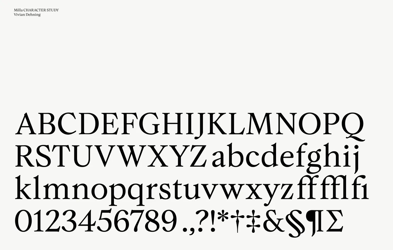
4. Milla by Vivian Dehning
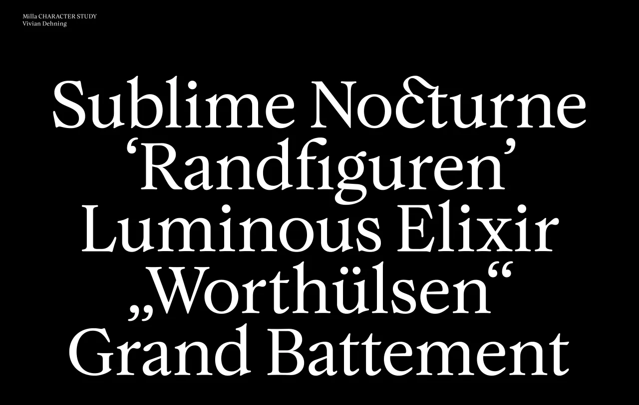
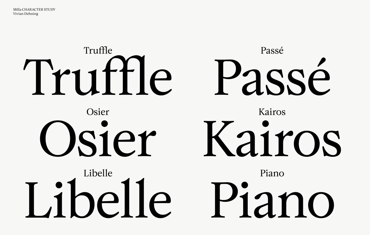
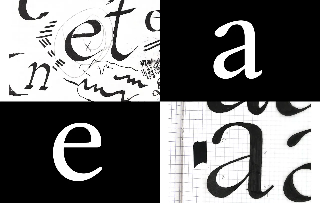
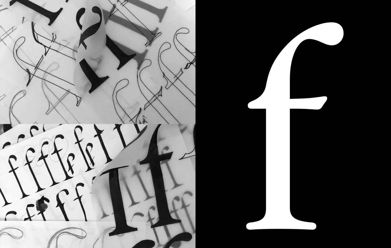
Milla is a labour of love from German designer Vivian Dehning. It blends classical letterforms with hand-drawn details, evoking the warmth of handwriting and the texture of letterpress. Inspired by music, botany and rococo ornamentation, Milla strikes a perfect balance between timelessness and individuality.
With its robust glyph set supporting major Latin languages and succinct ligatures, Milla is as versatile as it is expressive. Whether used for editorial design or branding, this typeface offers a natural, authentic feel.
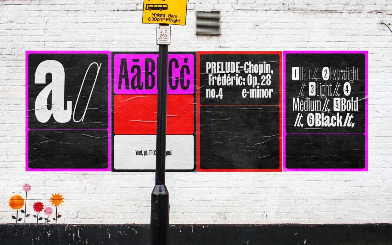
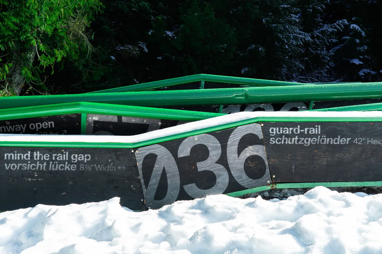
5. Haltung by Order Type Foundry
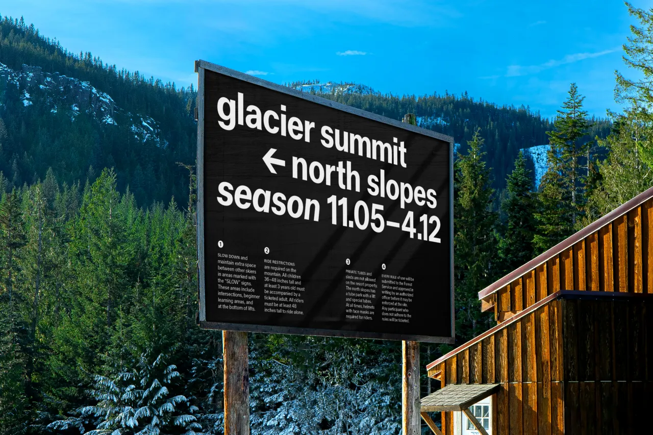
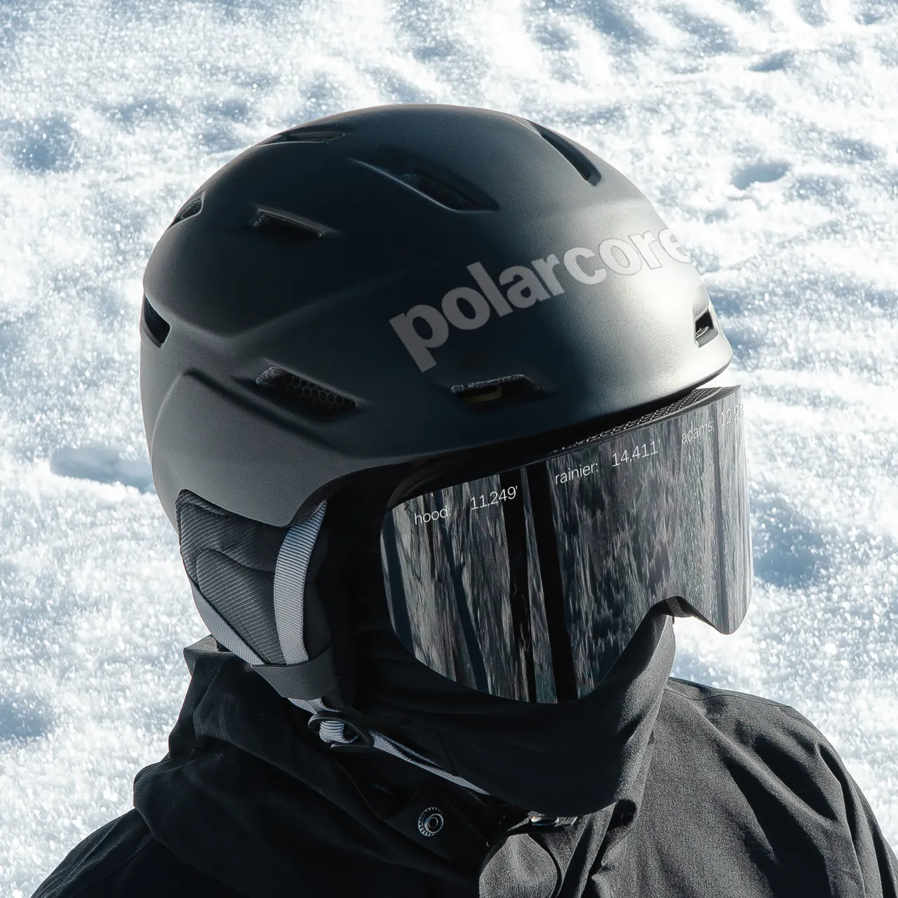
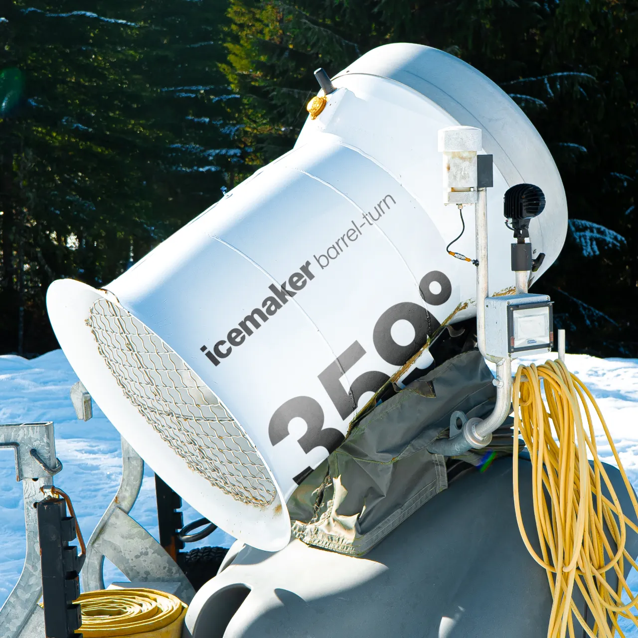
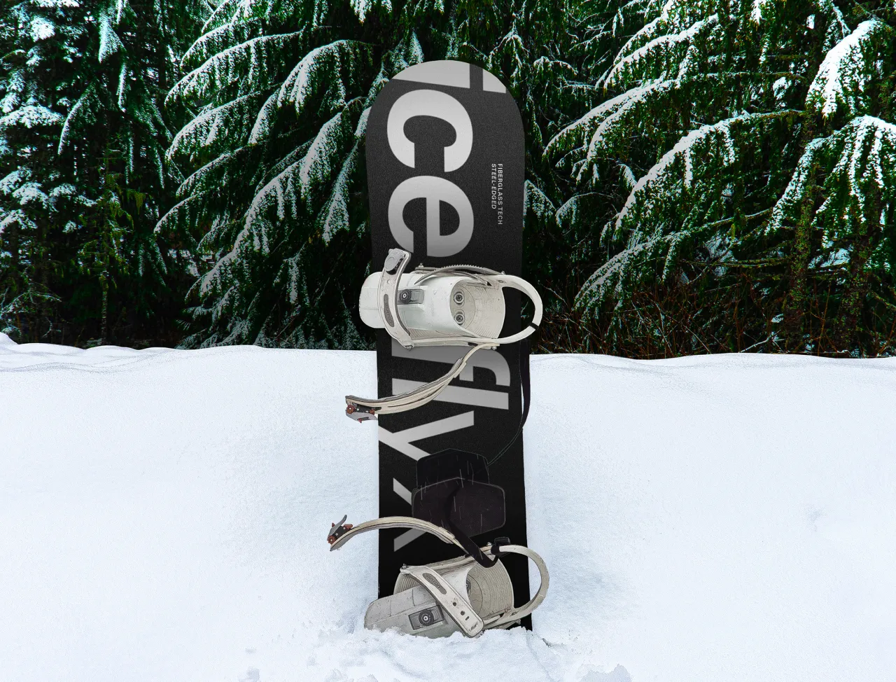
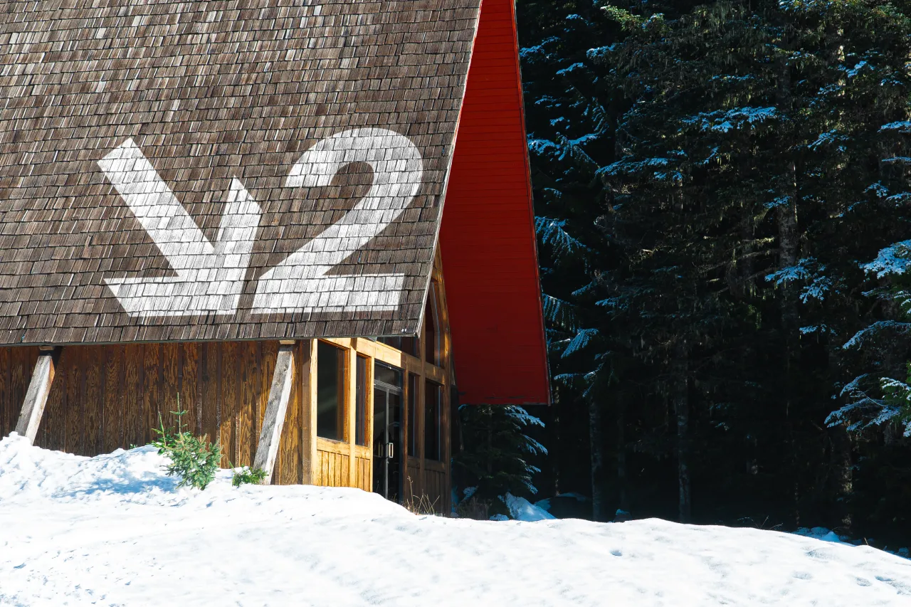
Drawing inspiration from mid-century neo-grotesques such as Helvetica and Univers, Haltung reimagines the genre with added "air" in its letterforms. Designed by Joe Moore, the typeface combines influences from Walter Käch, Emil Ruder and Adrien Frutiger, resulting in a refined, contemporary sans serif.
Its open apertures and subtle contrast create a sense of lightness, while its roots in classical Roman lettering bring humanist warmth. Haltung is a sophisticated tool for modern graphic design, elegantly bridging past and present.
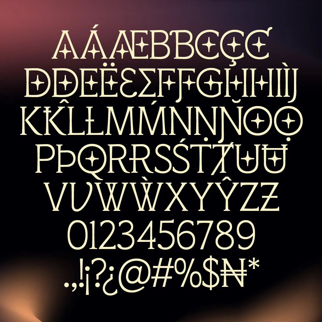
6. Starborne by Chisaokwu Joboson
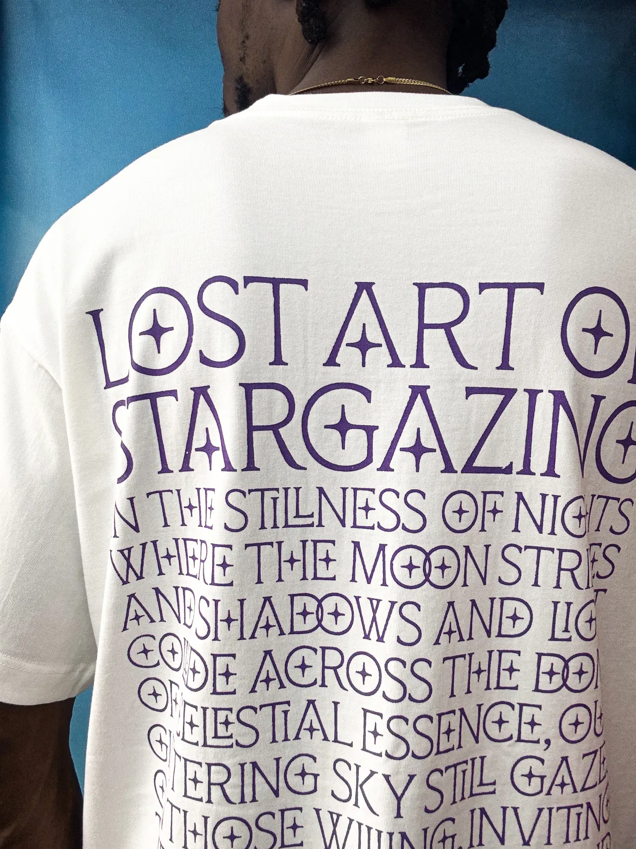
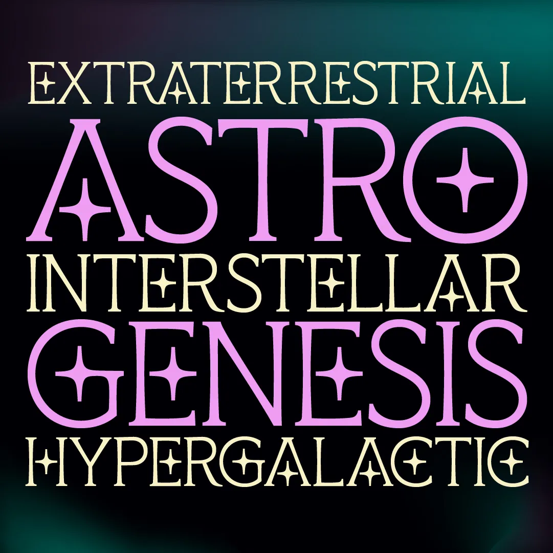
Inspired by the cosmos, Starborne is a decorative serif that dazzles with star-like details and intricate ligatures. This all-caps typeface supports over 160 languages and would be a good option for editorial design, branding and poster work.
Designed by Nigerian type designer Chisaokwu Joboson, Starborne combines cultural resonance with celestial beauty, making it a standout choice for expressive projects.
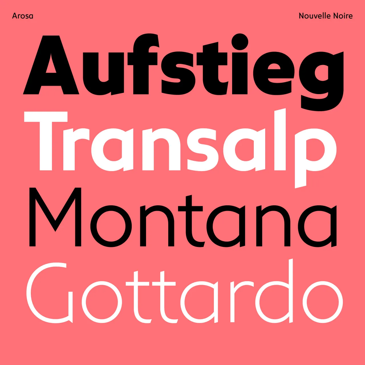
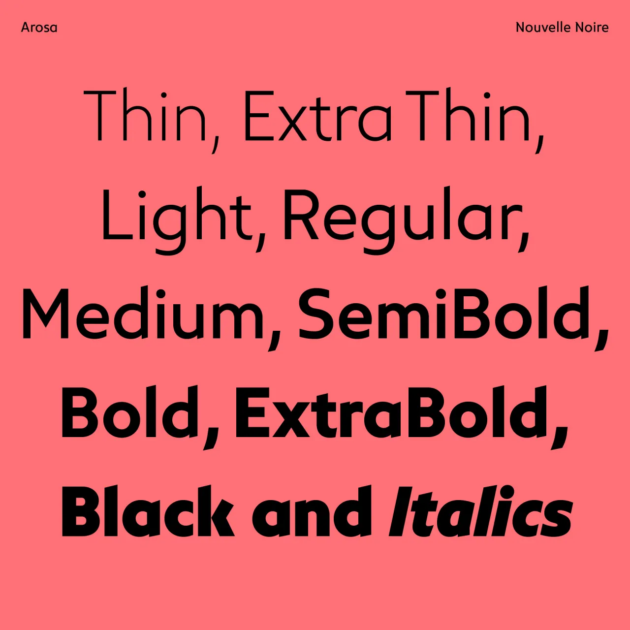
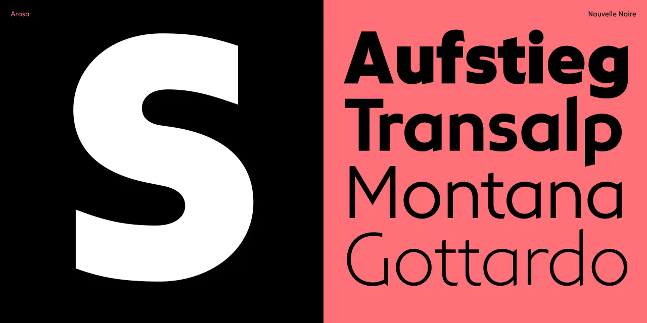
7. NN Arosa by Nouvelle Noire
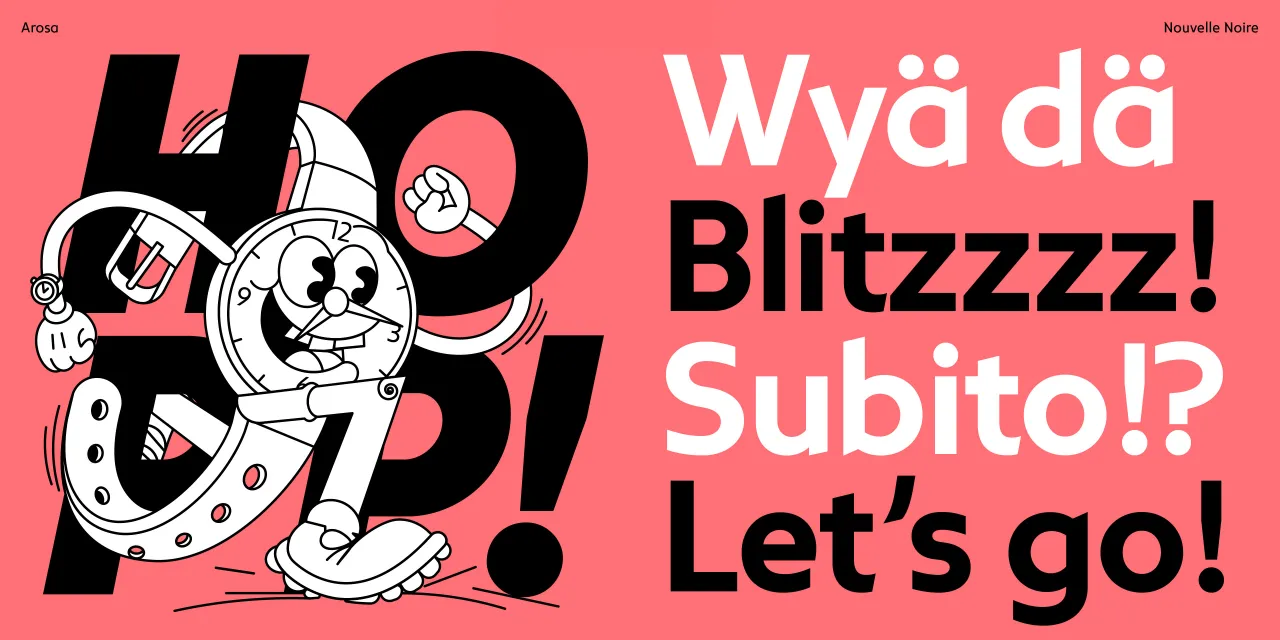
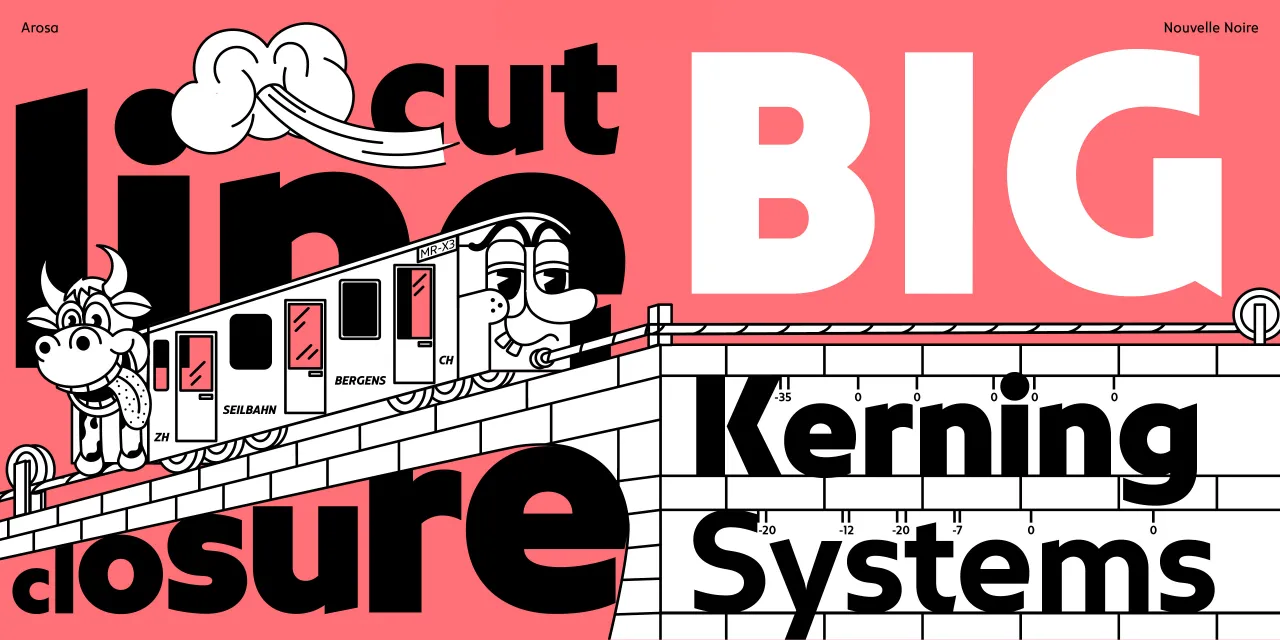
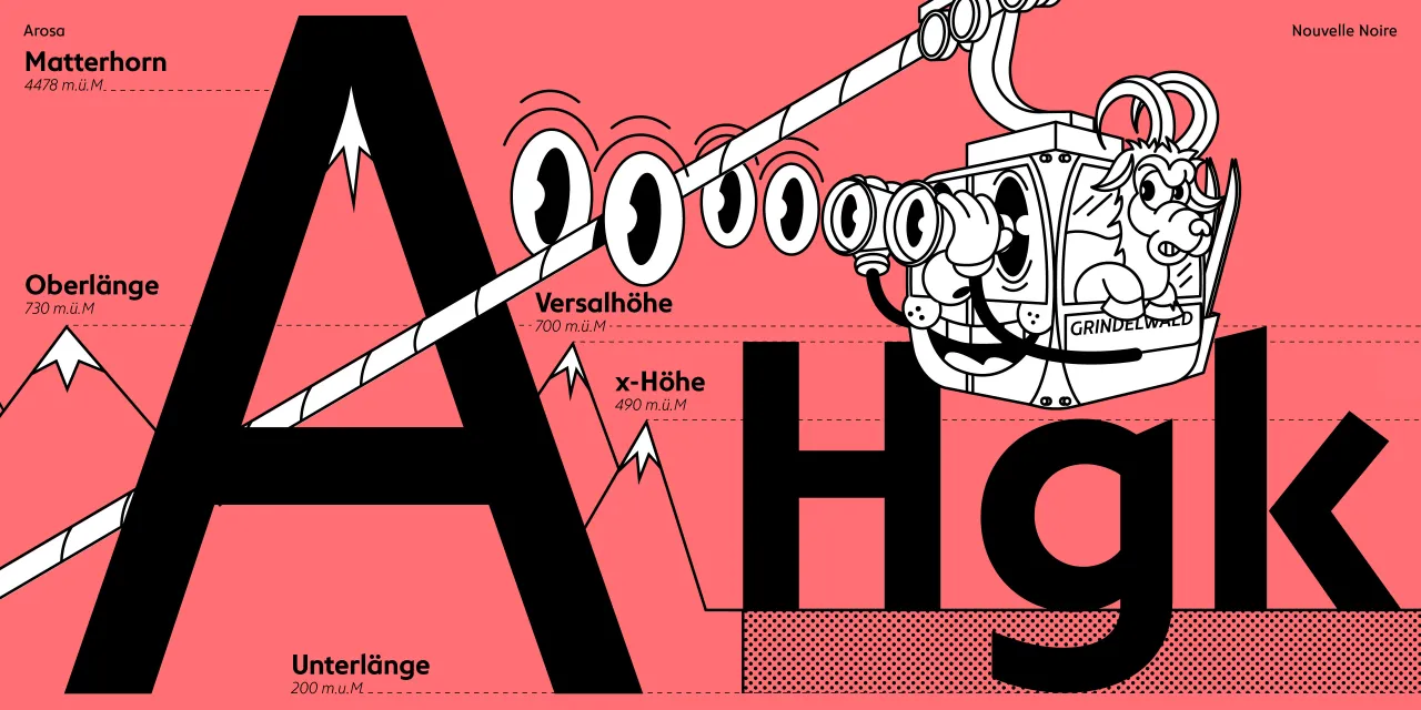
The NN Arosa typeface family, designed by Edgar Walthert, draws inspiration from the charm and craftsmanship of classic Swiss tourism posters. Originally commissioned by a Swiss client who provided a book of vintage travel art as a starting point, Walthert set out not to revive these classic type styles but to create a fresh interpretation that captures the essence of Swiss graphic heritage.
Rather than relying on calligraphic traditions, the letterforms in NN Arosa are inspired by the pragmatic yet expressive hand-drawn styles favoured by early 20th-century Swiss graphic designers. Designers like Hugo Laubi, Karl Bickel, and Carl Böckli crafted bold, clear, and uniquely vibrant letters unbound by strict typographic conventions, a legacy Walthert honours in this humanist sans serif.
The NN Arosa family is conceived as a superfamily, with three distinct versions—Text, Display, and Script—to be released over time. The Text version refines intricate characteristics for versatility and legibility, making it suitable for a broad range of typographic situations. With support for central and eastern European languages and meticulously crafted small caps, it celebrates Swiss heritage while offering a fresh perspective on contemporary design.
Editor's Picks





Trending






Latest Jobs
Senior 3D Motion Designer at Art&Graft
Full-time·London·£50k-£65k
Senior Front End Developer at Crown Creative
Full-time·Belfast·£50k–£60k
Client Director at Koto
Full-time·Berlin·€70k-€85k
Agent & Producer at The Jacky Winter Group
Full-time·London·£35k–£40k
Senior Graphic Designer at MoMA Retail
Full-time·New York·$72k-$80k
Principal Software Engineer at BBC Media Tech
Full-time·Glasgow·Up to £83,790