Big Hug gets a rebrand from JDO that puts purpose at the heart of craft beer
Independent brewer Big Hug has unveiled a new identity by JDO, designed to unify its range and amplify its mission of becoming a 100% positive impact business.
Quirky craft beer brands with big personalities have flooded the shelves in recent years, with everything from playful names to kaleidoscopic labels. There's no doubt that the competition has become fierce in this category, particularly in terms of shelf space and consumer attention.
As a result, Big Hug – a UK brewer with social purpose baked into its DNA – realised that goodwill alone wasn't enough after a decade in business. To scale its mission and become a fully positive impact business, where every pint contributes to both people and the planet, it needed an identity that carried both clarity and credibility.
JDO's task was to give Big Hug a visual system worthy of its ambitions. The resulting rebrand was unveiled at the London Craft Beer Festival, and places purpose front and centre while maintaining the wit and individuality that made the brewery stand out in the first place.
"It's great being able to support organisations like Only A Pavement Away and YMCA DownsLink Group with two of the beers in our range," says founder Matt Williams. "But in order to become a 100% positive impact business – where every beer makes a difference – it was crucial to get the rebrand and messaging right."
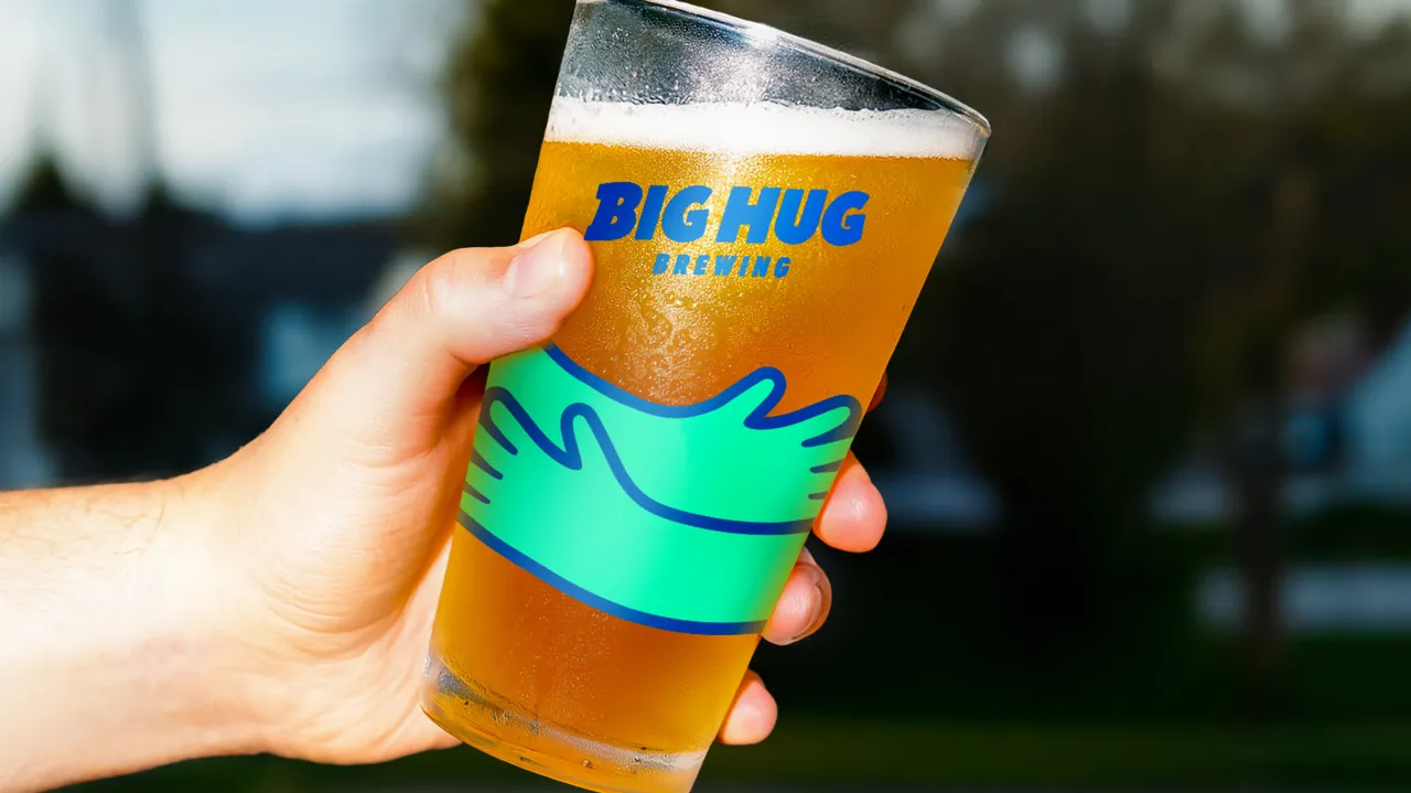
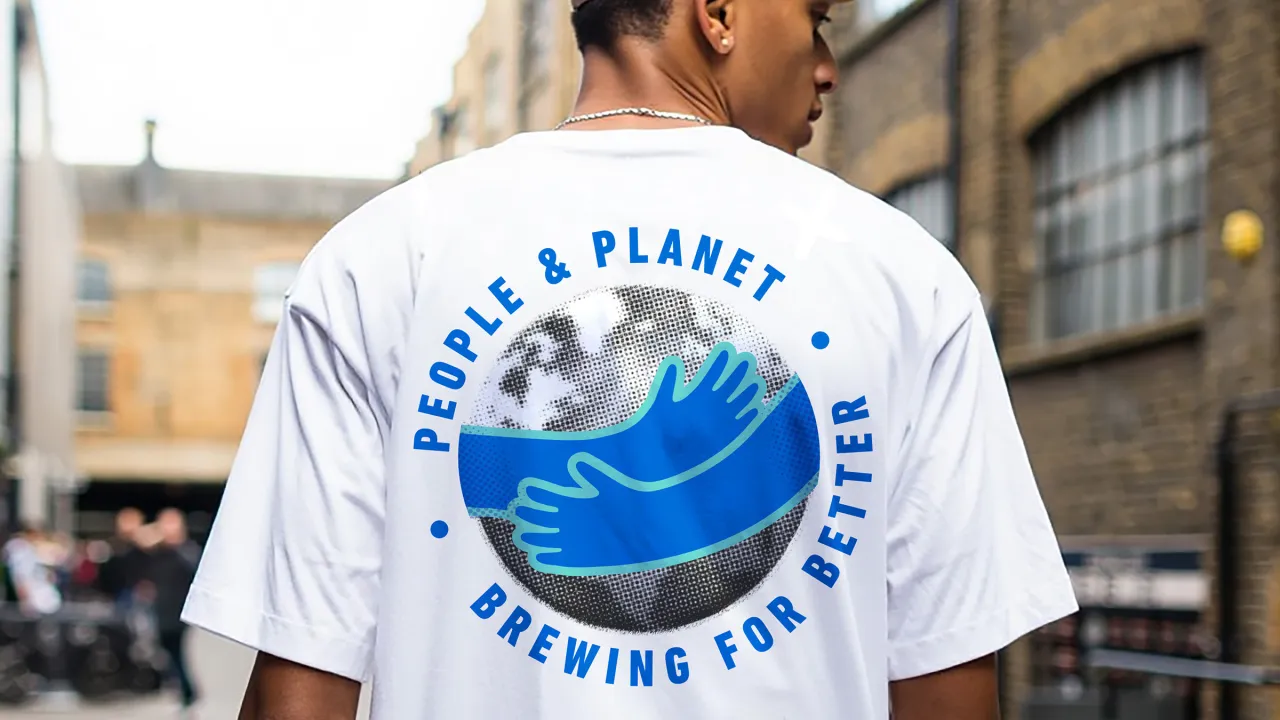
Since its launch, Big Hug has donated a portion of the profits from selected beers to charities addressing homelessness and youth disadvantage. The new brand platform, summed up in the tagline 'Brewing For Better', expands that ethos across the entire business. Every beer now has a story and a cause, communicated as a defining feature of the design.
"Big Hug came to the table with a strong purpose and loads of personality," explains JDO design director Dan Bowstead. "Our task was to set the brand up for growth with a bold, clear identity that stayed true to Big Hug's roots. It was about taking all that wit, energy, and passion for making a difference – and making the brand impossible to ignore."
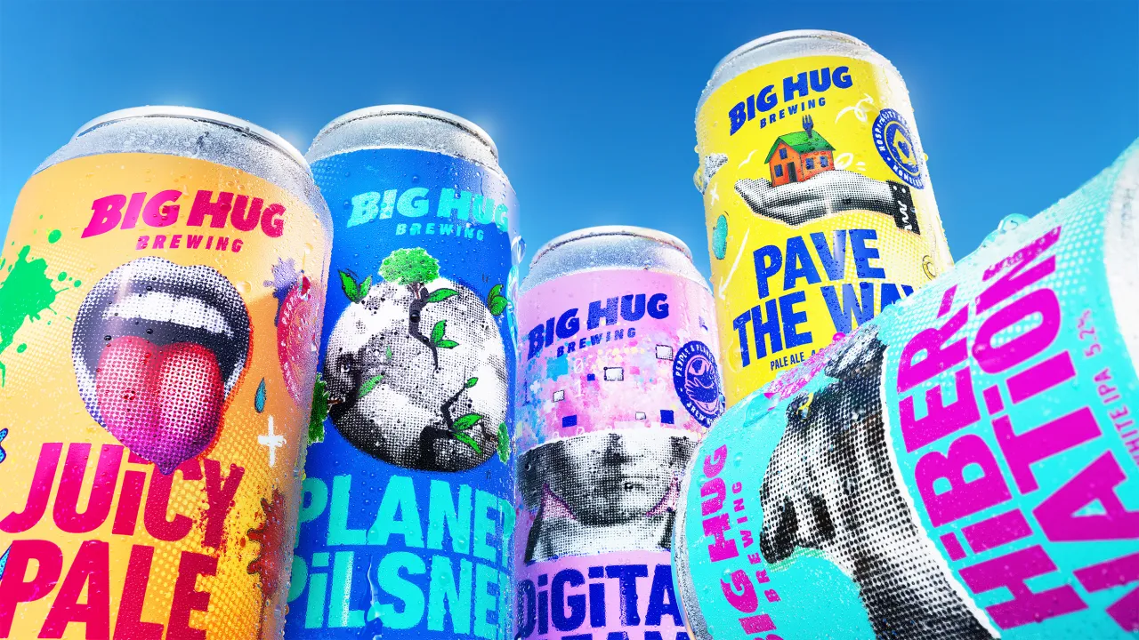
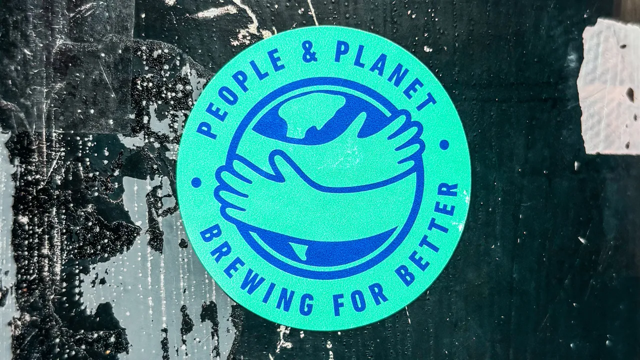
Central to the new system is the 'World Hug' logo, a graphic mark that doubles as both a rallying symbol of optimism and a stamp of social good. It's supported by a brand world full of vibrant collage elements and halftone illustrations, nodding to DIY poster culture while staying modern.
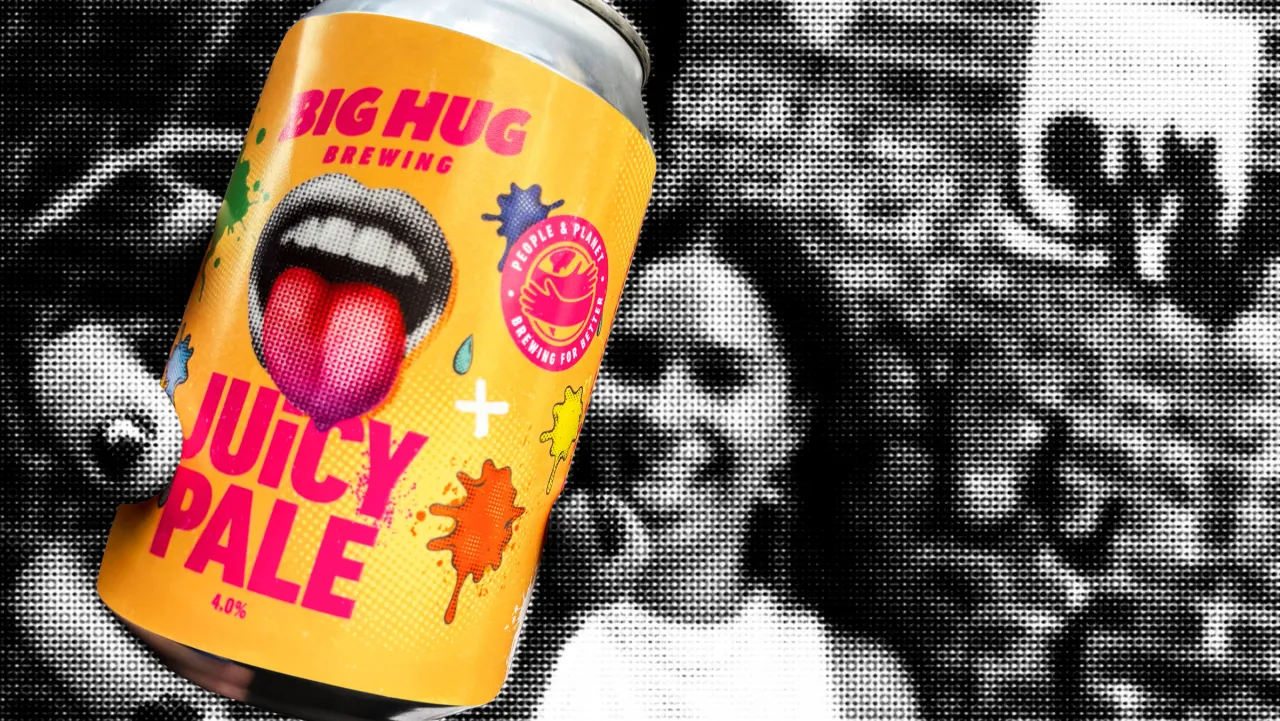
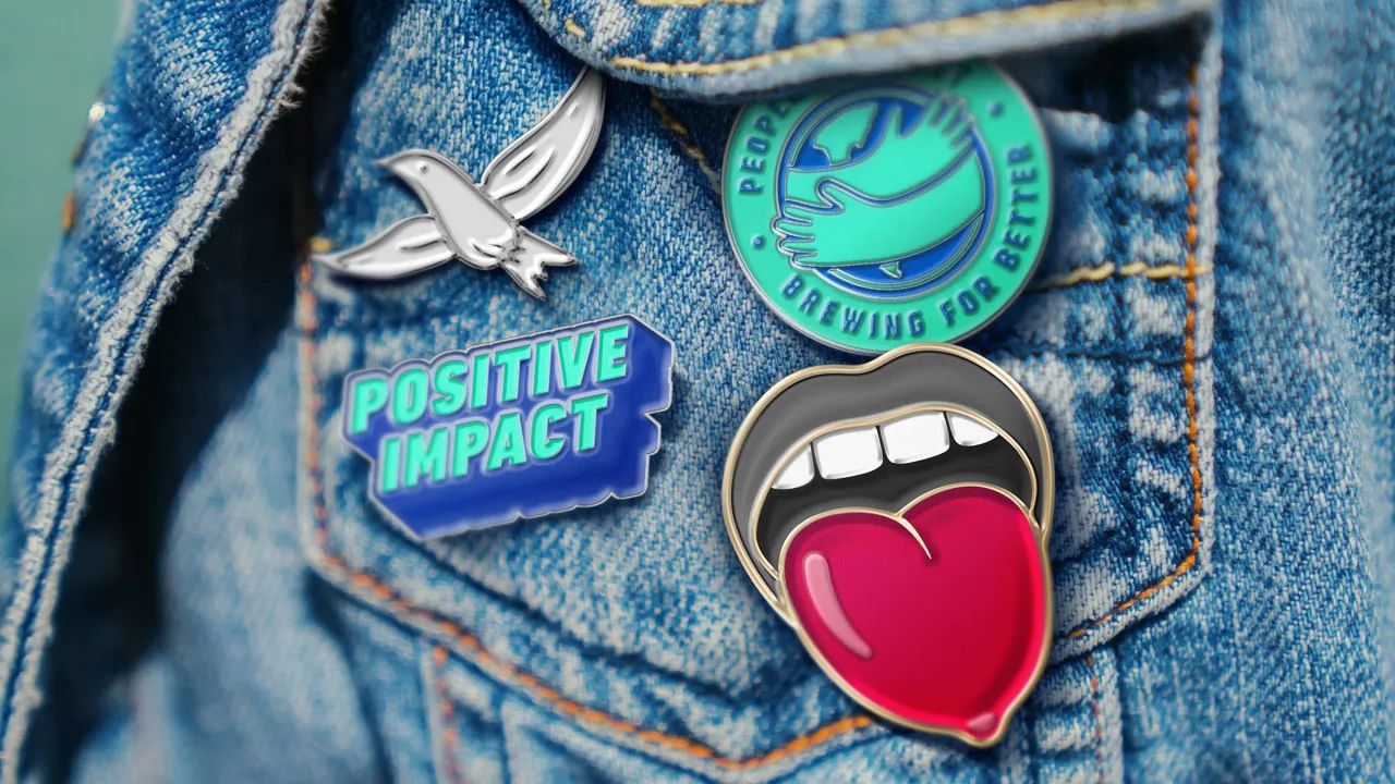
The UK craft beer scene has become synonymous with eclectic illustration, offbeat typography and fearless colour. Big Hug's new identity embraces that energy but channels it through a more coherent system.
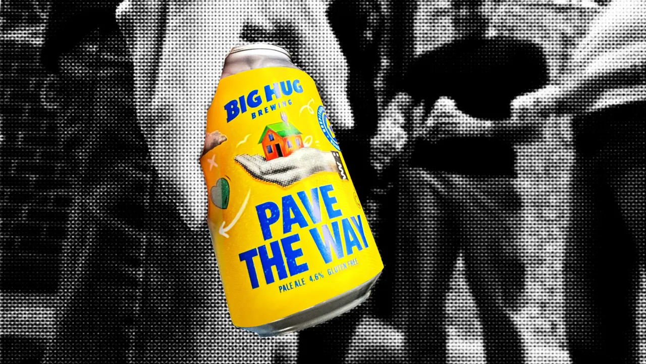
Where previous iterations lacked consistency, the rebrand introduces a unified architecture across cans and bottles, making the range instantly recognisable. Each pack now celebrates flavour and personality, but also carries the narrative of the social cause it supports. It's a packaging strategy that blends the attention-grabbing instincts of craft with the transparency and purpose increasingly expected by today's discerning drinkers.
The move reflects wider trends in the craft beer world, where design has become a primary vehicle for storytelling. From Beavertown's comic-book style to BrewDog's stripped-back typography, brands are defined as much by their visuals as their recipes. For Big Hug, weaving empathy and activism into that visual language offers a distinctive point of difference.
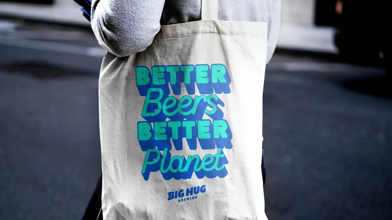
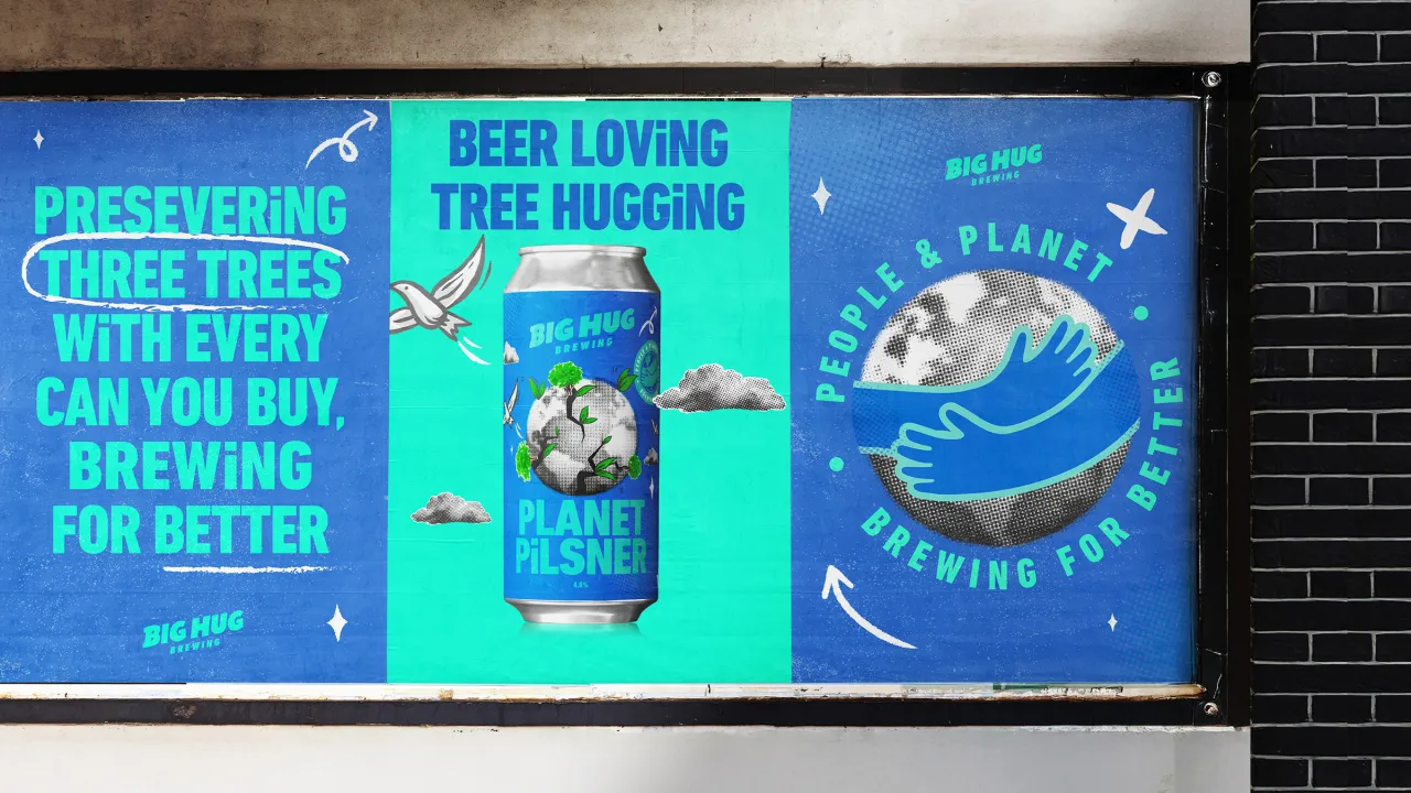
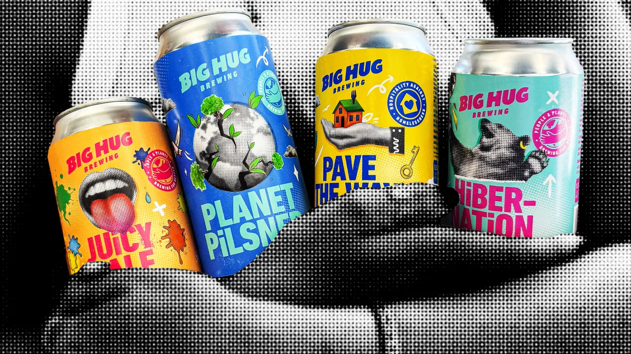
Williams says: "One of the things JDO told me early on is that they help brands deliver on their promises, bringing ideas to life through powerful, effective experiences that people can see, feel, and believe.
"For me, that's exactly what they've done. Whether it's on-trade, off-trade, online or in the real world, Big Hug now reflects our mission with endless optimism and a powerful punch."
The work arrives at a moment when the UK beer industry is balancing pressures on both ends, with craft saturation on one side and consolidation by global brewers on the other. Independent players must not only compete on taste but also carve identities that resonate emotionally and ethically, and Big Hug's rebrand positions it firmly in that territory.
The new look rolled out across pubs, retailers and online this month, and with it, Big Hug is hoping to inspire not just repeat purchases, but repeat acts of good.
Editor's Picks





Trending





Latest Jobs
Account Director at How&How
Full-time·London·£73k-£79k
Senior Front End Developer at Crown Creative
Full-time·Belfast·£50k–£60k
Graphic & Motion Designer at The SHARP Agency
Full-time·Leeds·£26k–£33k
Midweight Designer at Catalyst Creative
Full-time·London·£32k-£36k
Digital Marketing Executive at Arise
Full-time·Sheffield·From £23,750
Mid-Senior Designer at Something Familiar
Full-time·Bristol·£32k–£40k