Earthling Studio enhances Jubel's 'dangerously refreshing' proposition
The peach beer brand's refreshed identity plays on codes of hazard and warning signs that seek to subvert the language of danger.
From traditional lagers and blond beers to hoppy IPAs and zesty ciders, you're spoilt for choice when you walk into any modern bar or pub. It seems like new and eccentric brands are emerging on taps almost every week, but Jubel peach beer is positioning itself as the ultimate category disruptor in its recent brand refresh.
Founded by Jesse Wilson in 2018, Jubel is known for merging the crisp refreshment of cider with the "sessionability" of lager. According to Earthling Studio managing partner Tom Bruce, Wilson had real clarity on what his brand was about on a product level and an emotional level. This came from his conversations with consumers in pubs, at Jubel events, and at festivals.
While Jubel already had somewhat distinctive packaging, it lacked flexibility as it didn't have a suite of assets beyond this. Bruce says the brand had also started to "stray into being childish, silly, gimmicky or naff".
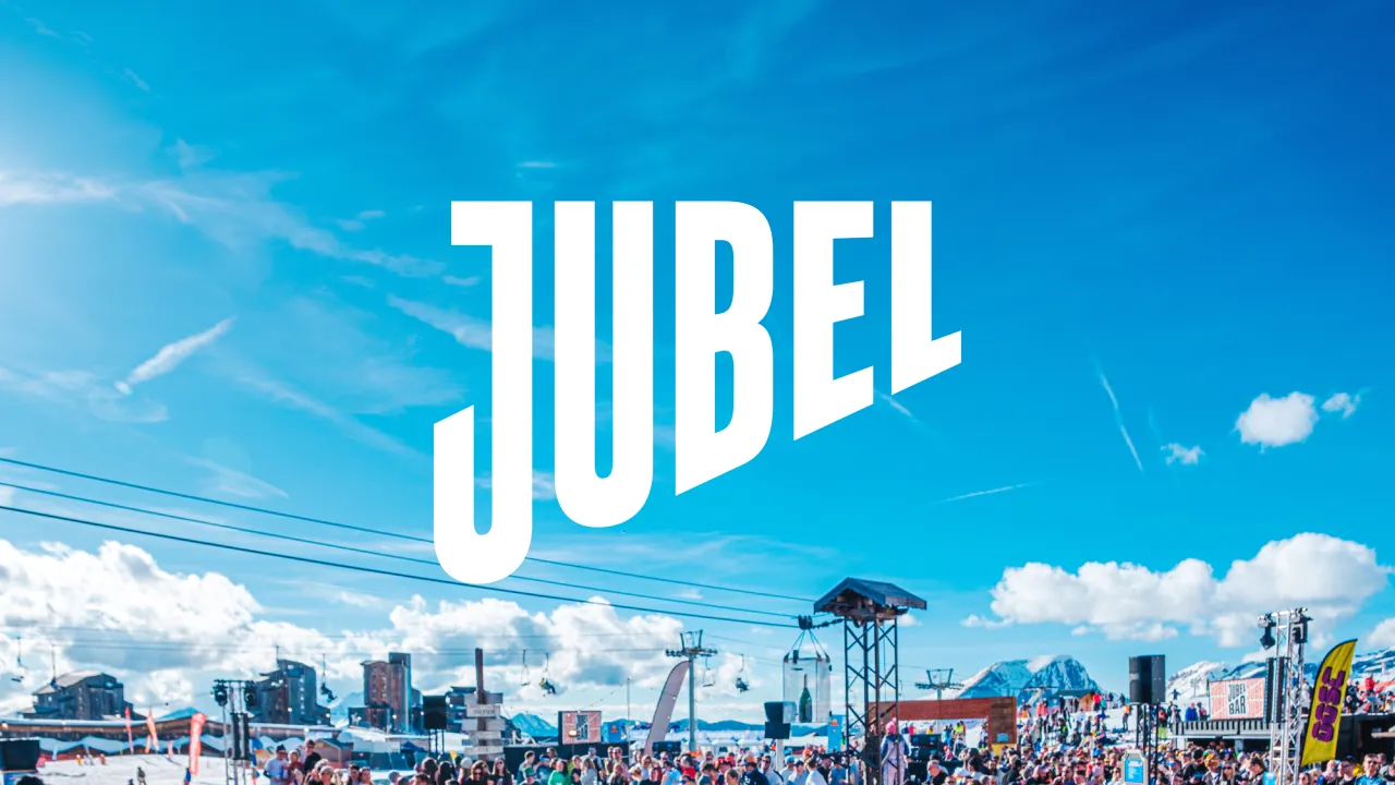
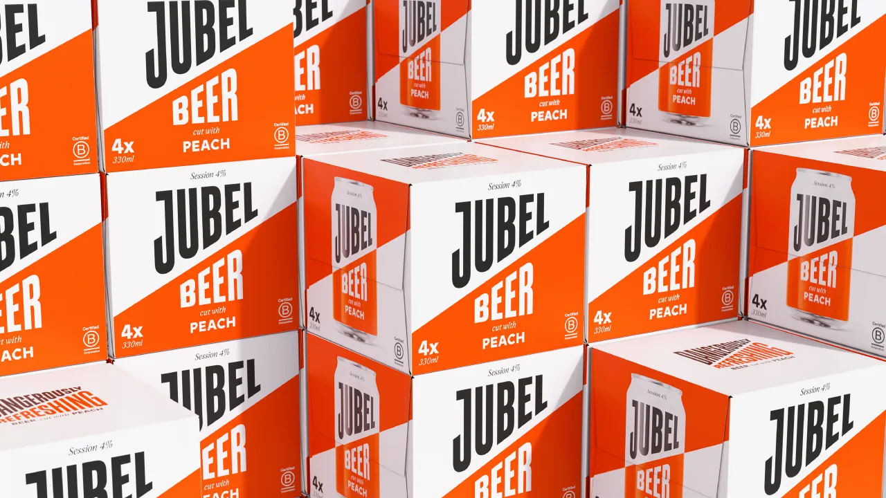
Since the brand is tripling its investment in festivals this summer and growing at triple-digits in both the on-trade and off-trade, Bruce adds that it essentially needed to "grow up and start looking like a brand that belongs on the national level".
He notes that one of the biggest design challenges was restraint, as "it's very easy to fill a space when you don't need to". The solution was to instil simplicity and freshness into the brand while creating enough key brand assets to ensure longevity and make enough time for the creation phase within the design process.
"You need some time for thinking to wear in and to know you've made the right decision," says Bruce.
"It meant we needed to move rapidly in the delivery phase, but this is easier when you're comfortable with the decisions you've made along the way."
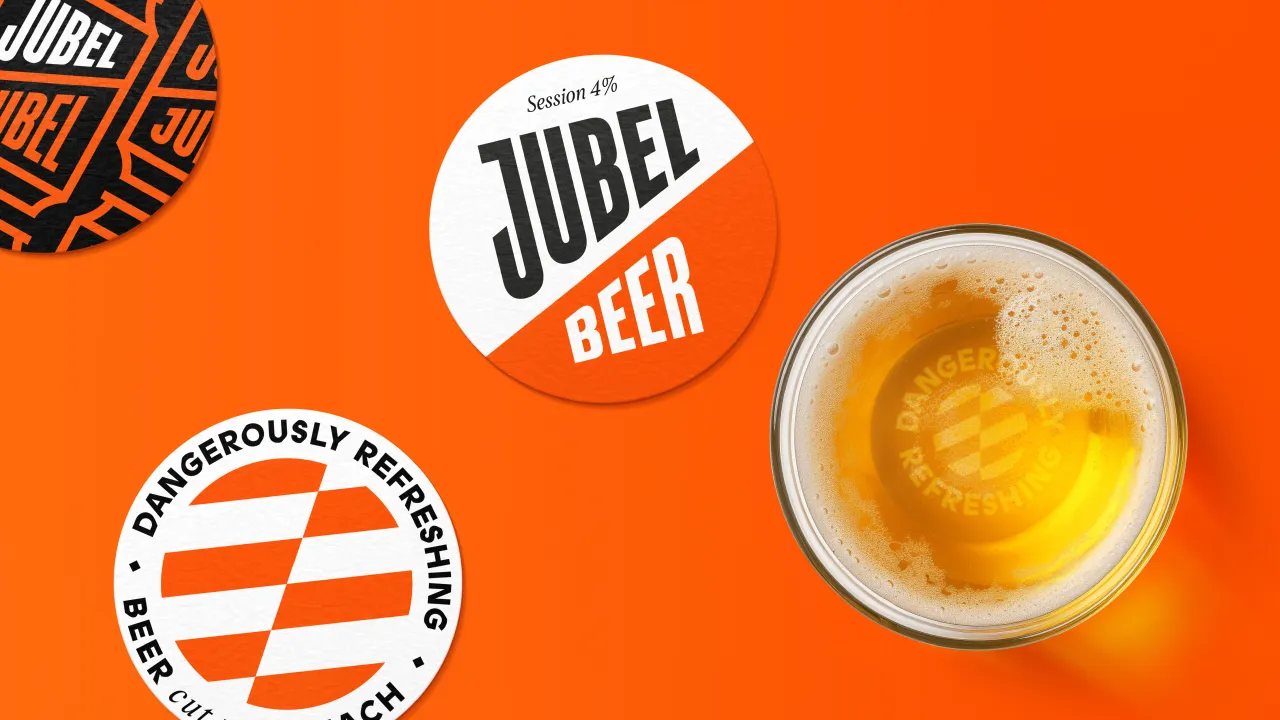
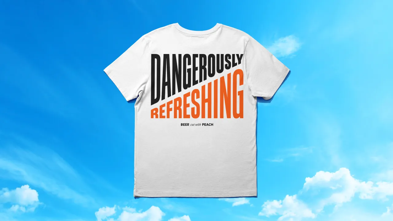

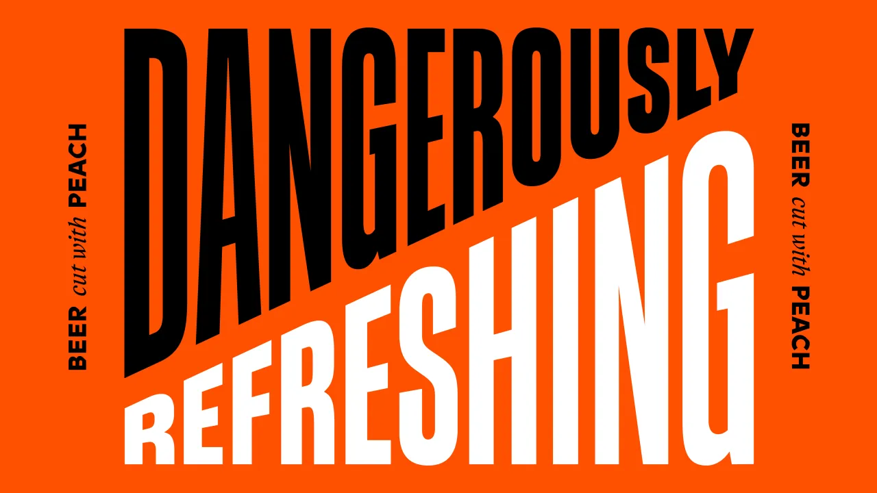
Wilson often described Jubel as "dangerously refreshing" in early conversations with the Earthling team, an idea that the studio wanted to express more through its identity. Bruce describes it as a phrase "layered with tension", giving the design team a tangible brief to move Jubel towards "a more explicit visual expression".
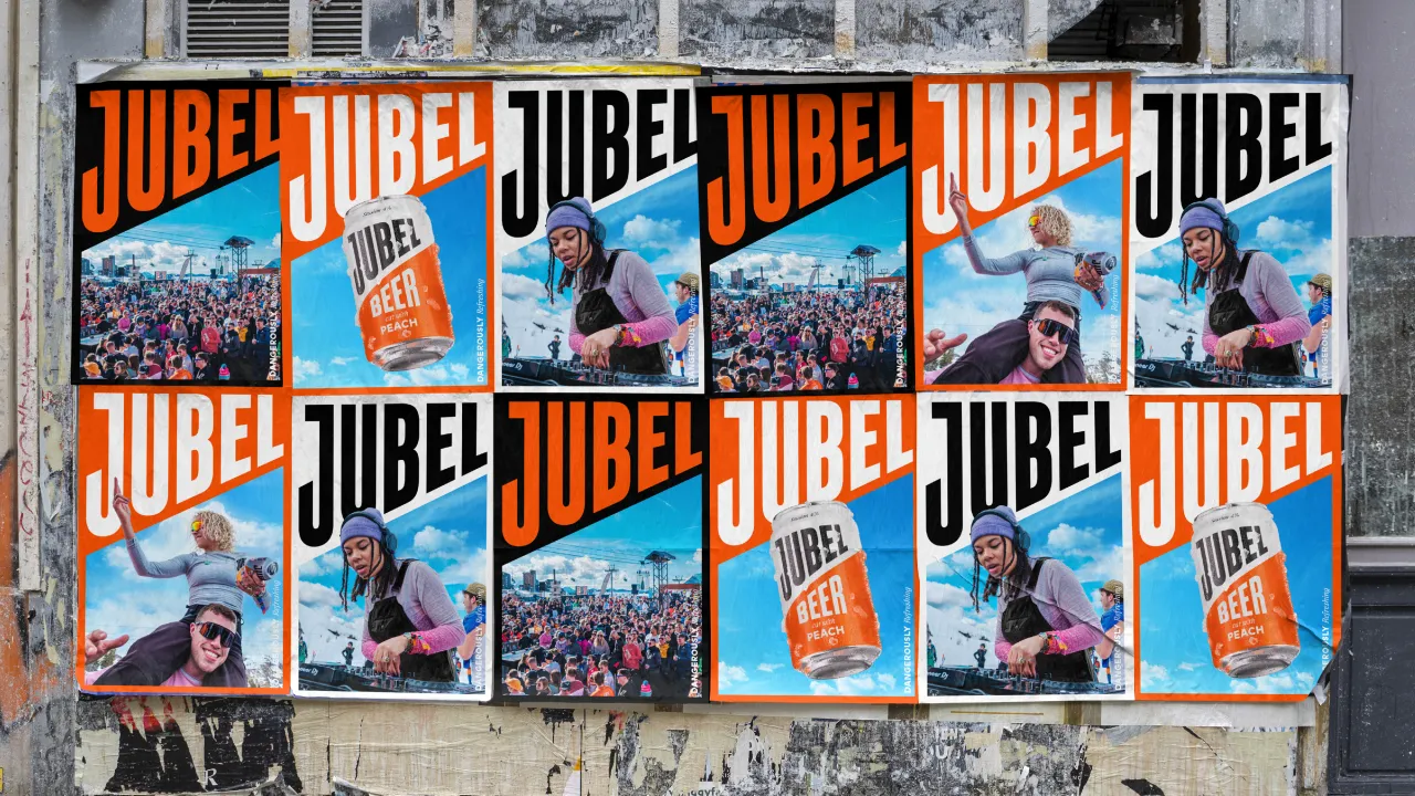
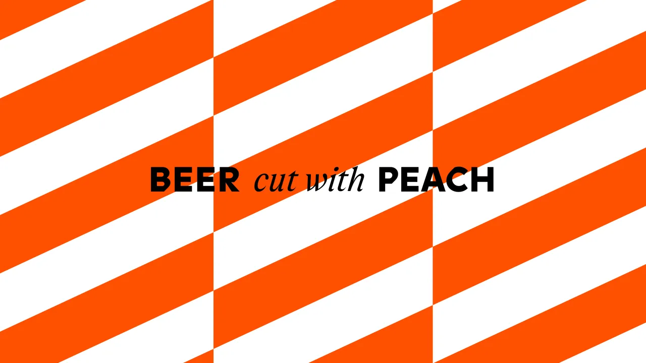
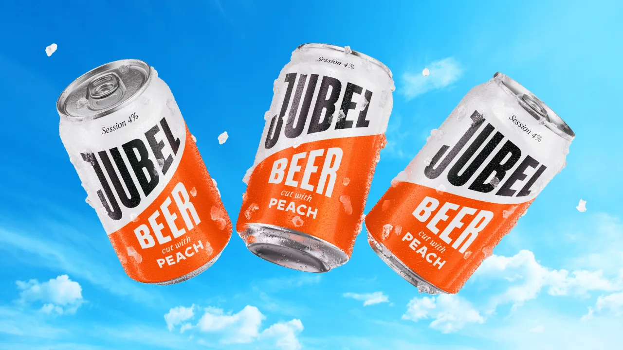
JUBEL's "Dangerously Refreshing" tagline is now illustrated through codes of hazard and warning signs that seek to subvert the language of danger by making it a positive. "This started with elevating Jubel's most distinctive asset, which is a diagonal cut that makes the viewer subliminally stop and take notice when paired with the impactful palette of orange, white and black", Bruce explains.
The brand mark was designed to work in harmony with this key asset, but Bruce says it had to be delivered in a way that was "visually appealing, drawing people in as opposed to pushing them away".
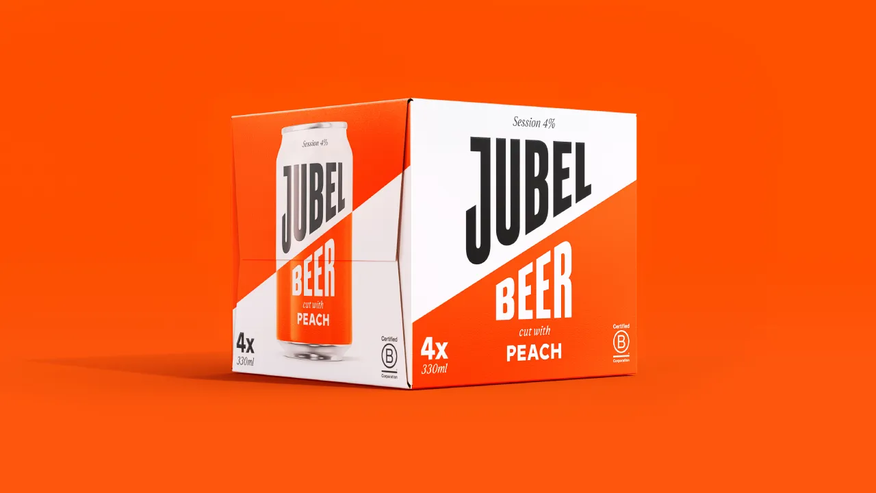
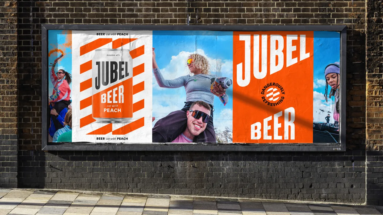
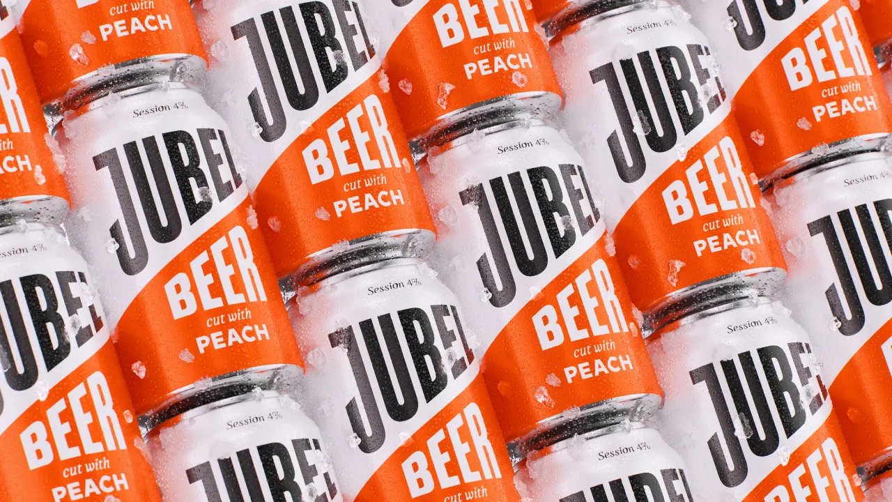
Earthling Studio opted for a combination of typefaces that work in tandem with the brandmark and the cut. The primary typeface is a sans serif headline font with "height and authority", says Bruce, while the secondary font embodies "edge". Finally, Earthling Studio introduced an italicised font to signify craft and quality.
Jubel's signature orange hue has not fundamentally changed but has been optimised to retain its brand equity and recognition.
To help the brand stand out both at festivals and on shelves, Earthling Studio created a new suite of illustrations for the brand. The style is evocative of "an everyday premium" that is "clean and elevated but still has a little edge", says Bruce.
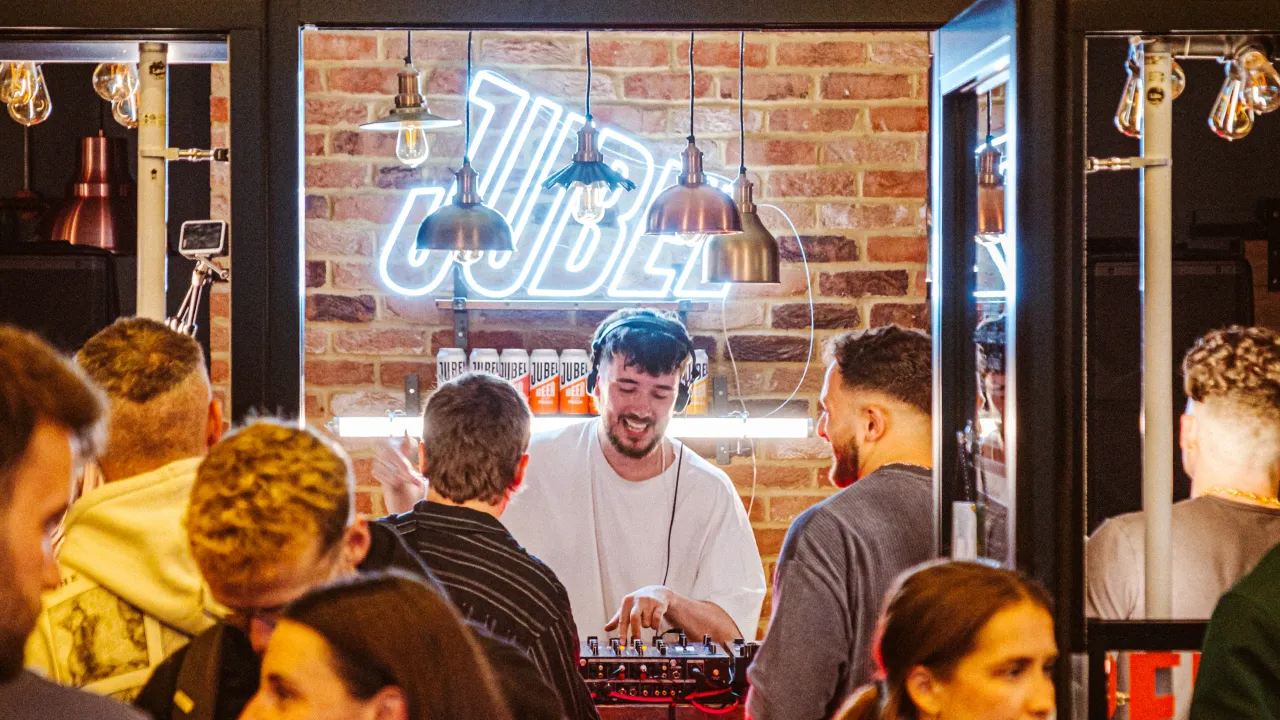
Jubel's new kit of assets will inform packaging, website, social media, merchandise, pop-up activations, on-trade collateral, campaigns, and more.
Editor's Picks





Trending






Latest Jobs
Art Director at The New York Times
Full-time·New York·$120k–$130k
Art Director at SPOKE
Full-time·London·£55k-65k
Senior Copywriter at Human After All
Full-time·London·£48k–£66k
Senior Graphic Designer at MoMA Retail
Full-time·New York·$72k-$80k
Client Partner at Halo
Full-time·Bristol·£30k–£36k
Brand Copywriter at Origin
Full-time·Porthleven, Cornwall·£35k–£40k