How Mother Design turned a séance into a new identity for Purple Garden
The London studio began rebranding the psychic services platform with a chakra reading and a little charcoal, and the result is a rich, purple-hued brand world that feels alive.
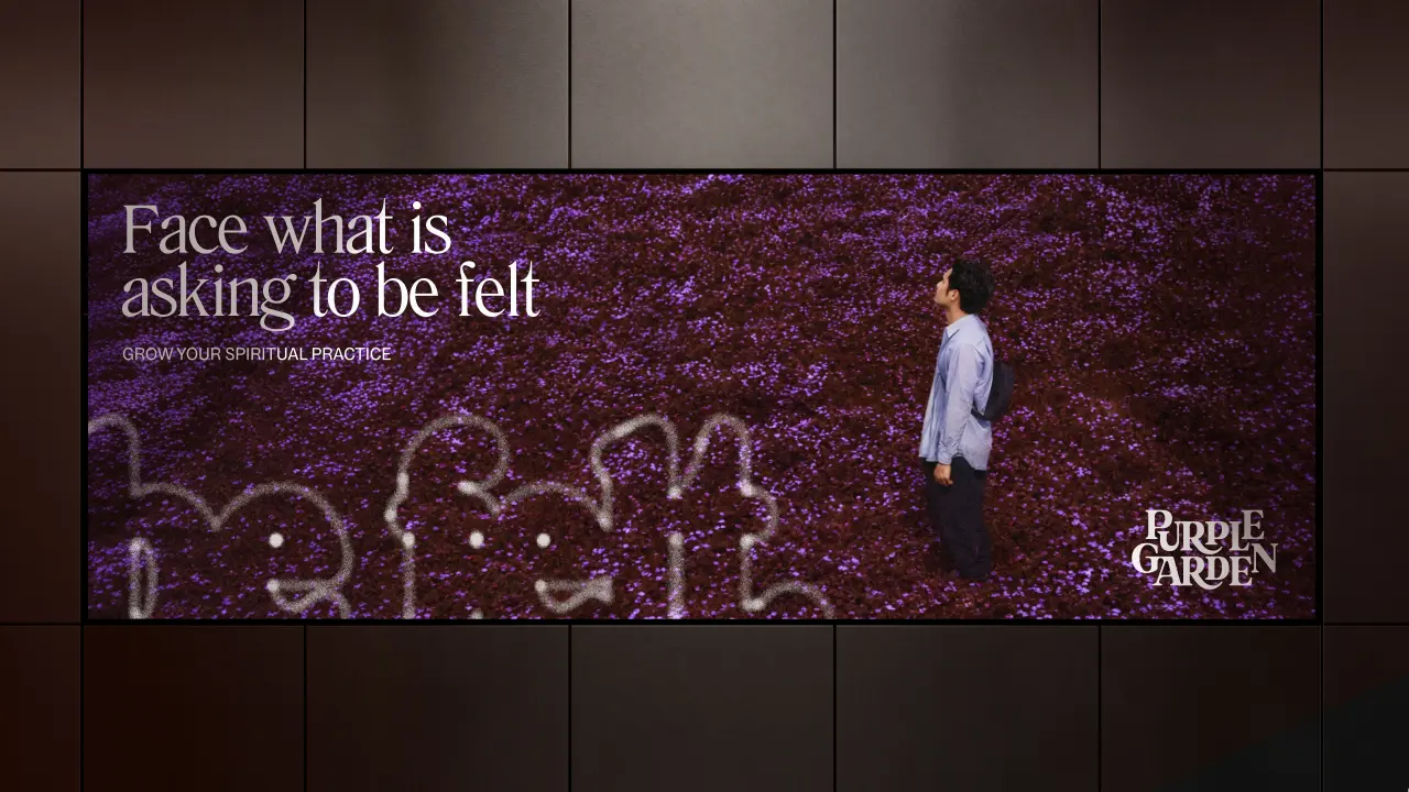
It's almost Halloween, so forgive me if, on discovering that a branding project began with a séance, I immediately thought of that brilliant 'Day-O' dinner party scene in Beetlejuice. You know, the one with the late great Catherine O'Hara? I presume no one at Mother Design was forced into an impromptu calypso number, but it's a wonderful mental image.
What actually happened involved way less dancing and uncontrolled lip syncing. The independent design studio, part of the Mother Family, has crafted a new identity for Purple Garden, the mobile and online psychic services platform. Fittingly, the team decided to lean into a more spiritual approach to get there.
The brief was to "bring the feeling of spiritual practice into the digital world", which was no easy task. The spiritual services industry is worth around $2.3 billion, and apps and online platforms are opening up new ways for people to connect with guidance. But things can get lost in translation on screen: the atmosphere, ritual, and energy – it's hard to replicate online when you're not in the room. Mother Design's job was to fix that.
The new brand therefore reframes Purple Garden from somewhere you visit for a one-off reading into a home for ongoing spiritual practice. It's built on a rather lovely insight: some questions keep returning no matter how much life changes. The audience, which Mother calls 'Believers of the Bigger Picture', are "seasoned seekers" looking for growth and meaning. So the creative idea, 'A Living Practice', moves from passive advice to active clarity through repetition and growth.
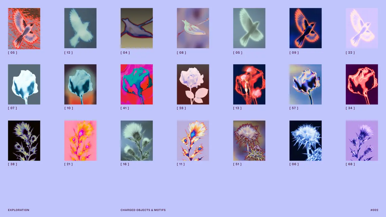
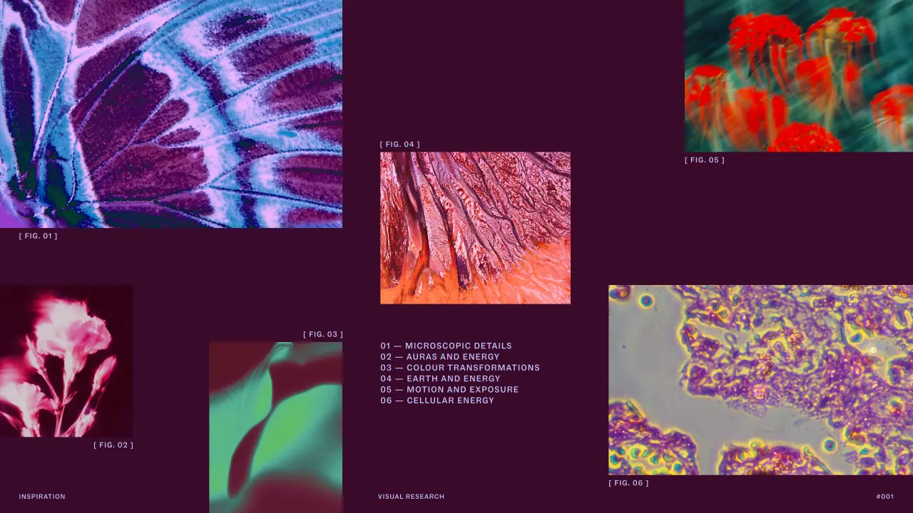
How did Mother Design figure all this out? They staged a séance and a chakra reading, alongside an automatic drawing and writing workshop led by one of Purple Garden's holistic practitioners. It's what we've come to expect from the studio, as it encourages its team to experiment with unfamiliar disciplines. Armed with paper and charcoal, they worked instinctively, trying to ignore and bypass conscious thought. The forms and feelings that emerged from the session then became the foundation of the identity.
"So much of spiritual practice is about things you feel rather than things you can see – energy, intuition, connection and those moments when you feel altered somehow," says Joanna Tulej, creative director at Mother Design. "The challenge was how you translate that into a brand experience without falling back on the visual clichés of the category.
"We realised that if we wanted the identity to feel spontaneous and alive, we needed to allow some of that spontaneity into the way we designed it too. Starting with the séance and automatic drawing session gave us permission to step away from the screen and the rational design process. Some of the textures, energy and unexpectedness that came out of that experience found their way into the final identity."
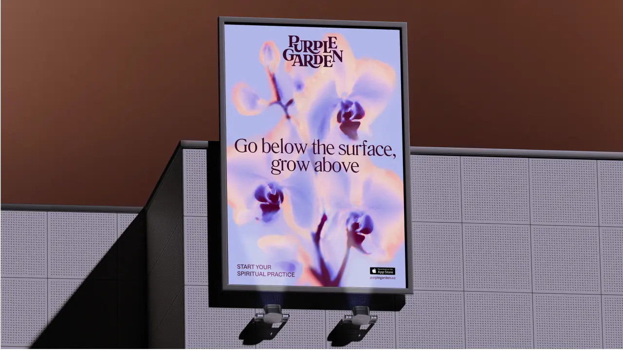
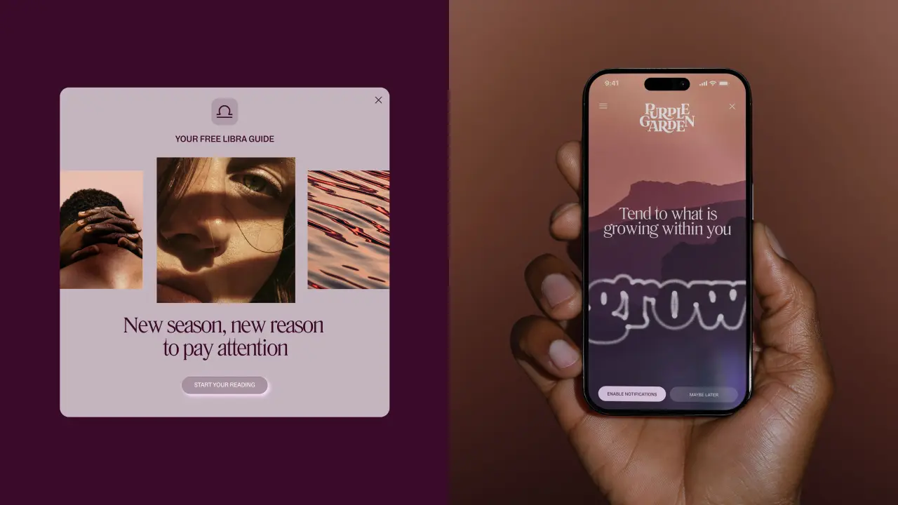
I absolutely love this. Whatever you make of spirituality, it's nice to remember that the best work comes from being experimental and having fun. I think we need that now more than ever.
I was also fascinated to learn that the approach was partly inspired by the Swedish artist Hilma af Klint and The Five, the collective of brilliant women who experimented with trance-like states and automatic drawing to ignore conscious thought and let images and words emerge freely. (If you've not heard of her, look her up! Her paintings are considered to be among the first major abstract works in Western art history.)
But the inventiveness didn't stop at charcoal. During development, Mother Design moved back and forth between traditional design software and AI tools, iterating constantly to generate unexpected visuals and add more unpredictability to the process.
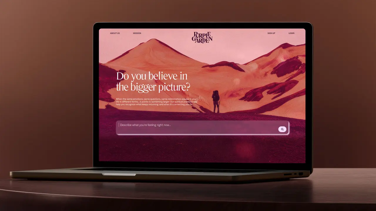
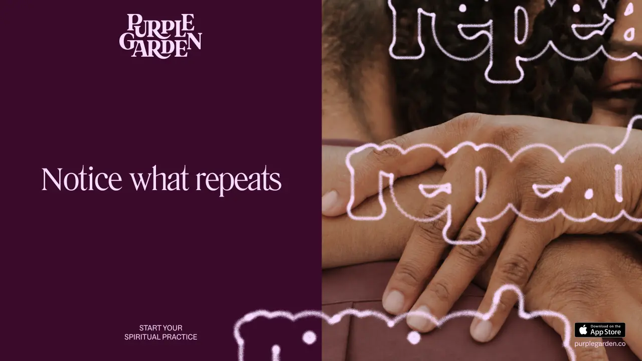
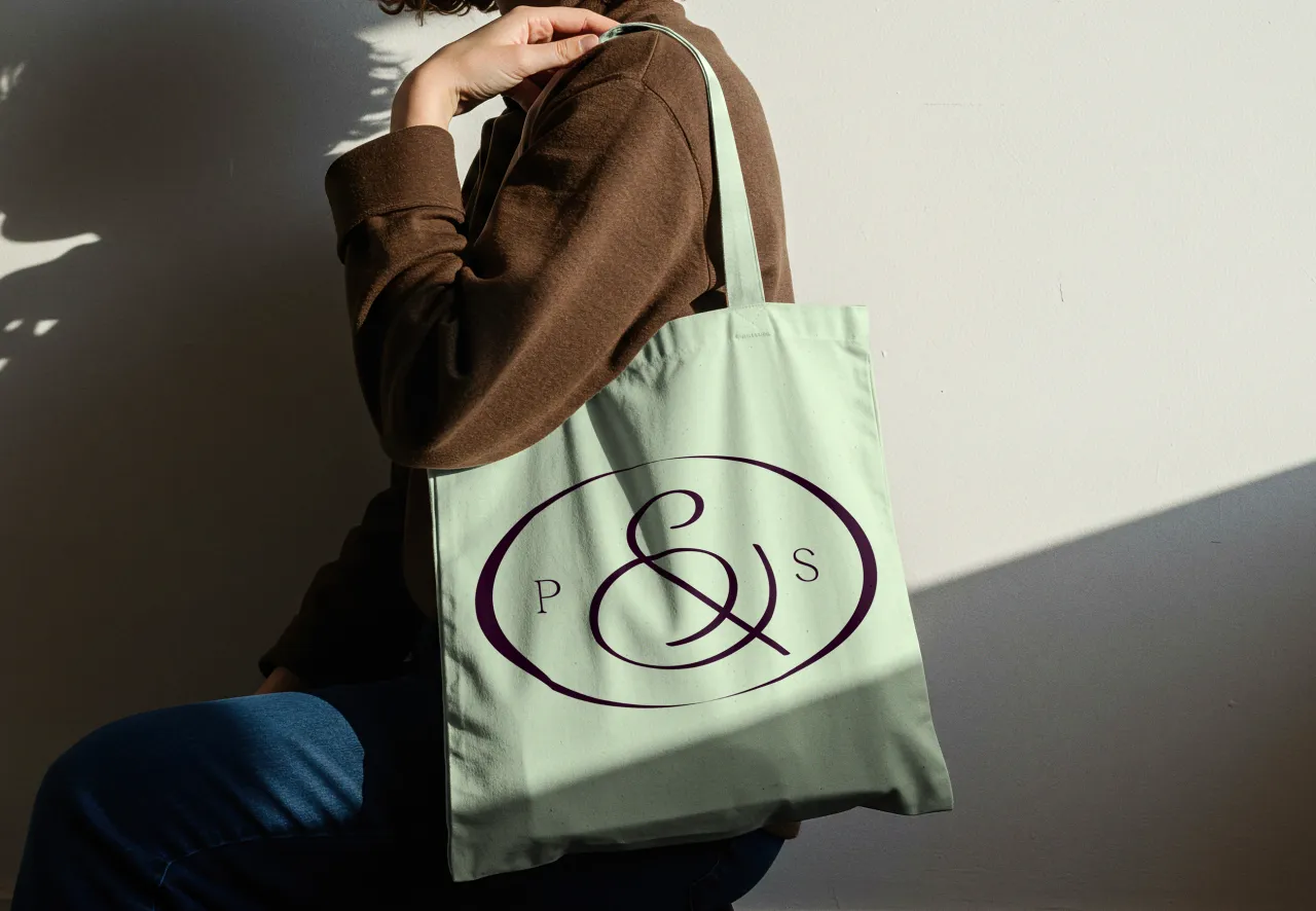
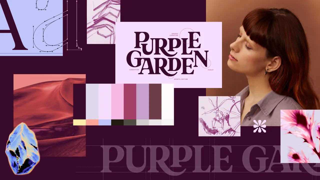
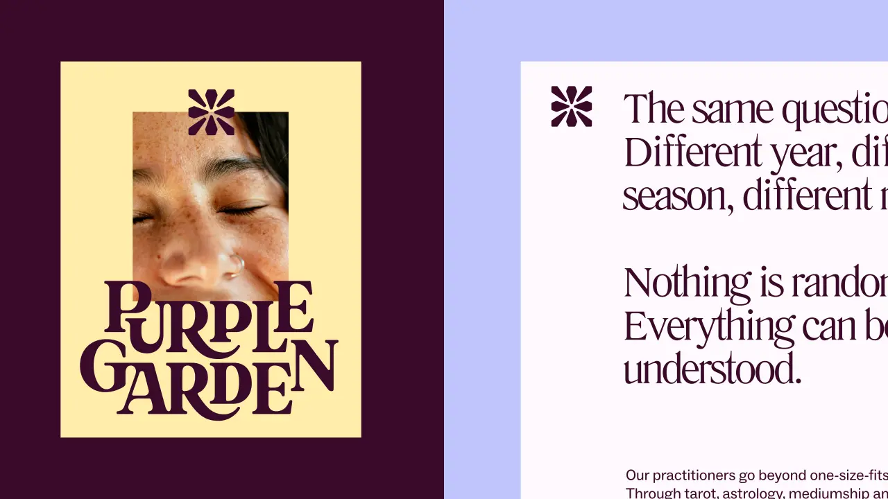
Looking at the outcome, I'll start with the typography because you can see all this play spilling through. The wordmark itself balances modern with whimsical. Elongated serifs and curved corners seem to grow outward. A "digital-first", crystal-like glyph acts as a symbol of guidance and forms the basis of the entire icon system for navigating the platform's many services.
Literatura Present and ABC Social complete the type system. Literatura's flowing descenders and serifs add to that sense of growth, and ABC Social does the functional, sensible stuff so things are easy to read on screen.
I really love the "living type" detail, inspired by cymatic patterns. That's the shape sound makes when it vibrates through a surface, if you didn't know. The subtle message is that Purple Garden helps you to grow, too.
Colour-wise, purple clearly takes the lead. But Mother Design has developed a palette of six warmer purples, deliberately moving away from the cool, blue-toned purples so common in this category. The imagery feels more intimate and tactile, while the motion reinforces the idea of growth.
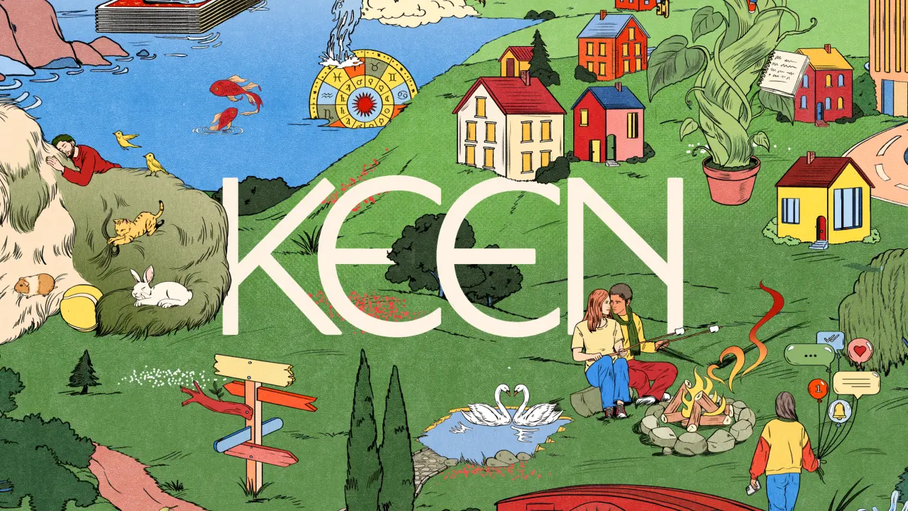
The project follows Mother Design's recent rebrand of Keen, another spiritual guidance brand within the Ingenio portfolio. While Keen targeted a more mainstream, "spiritually curious" audience, Purple Garden is for those already seasoned in this space: two brands, two different jobs.
"Purple Garden is for people who already have a deep connection with spirituality and see it as an active part of how they navigate their lives," says Ariana Hellebuyck, CMO at Ingenio. "We wanted the brand to reflect the depth of the experiences our guides provide and make that connection feel just as powerful in a digital environment.
"Mother Design has created something that feels distinctive to Purple Garden and true to our audience, while giving us a richer and more immersive platform for the next stage of the brand."
The new identity is now being rolled out across Purple Garden's website, app, advertising, and social channels over the coming weeks.
It's got me thinking about how I love to switch off. Admittedly, my rituals are less mystical and don't involve any summoning. I find ironing, getting out on my bike, or spending time in the garden helps me zone out. Not as exciting, but the principle is the same. Just like Hilma, this project reminds us to play and try new things. Don't be afraid to experiment. And let creativity flow. You never know what will come out the other side.

Editor's Picks



Trending

Latest Jobs
Junior 3D Character Animator at Blue Zoo Animation Studio
Full-time·London·£29,000
SEO and GEO Content Strategist at Loom Digital
Full-time·Bristol·£35,000 – £37,000
Manager, Visual Design Art - TFT at Riot Games
Full-time·Los Angeles·$166,600 – $232,800
Creative Services Manager at BIMM University
Full-time·Brighton·£39,000–£50,440
Service Designer at UNSW Sydney
Contract·Sydney·A$153,933 – A$163,338
Associate Web Designer at Planhat
Full-time·London·£30,000 – £35,000