Bolt gets a striking new identity by Koto
Koto has partnered with the one-click checkout platform Bolt on a full rebrand that radically lifts the brand from a sea of blue sameness and strikes the heart of the brand's commitment to lightning-speed service.
Credit: Koto / Bolt
From logo and type to motion principles and photography style, and further to the website and product UI/UX, Bolt and Koto's joint vision was to bring a modern and fresh look to reflect a new chapter for the brand.
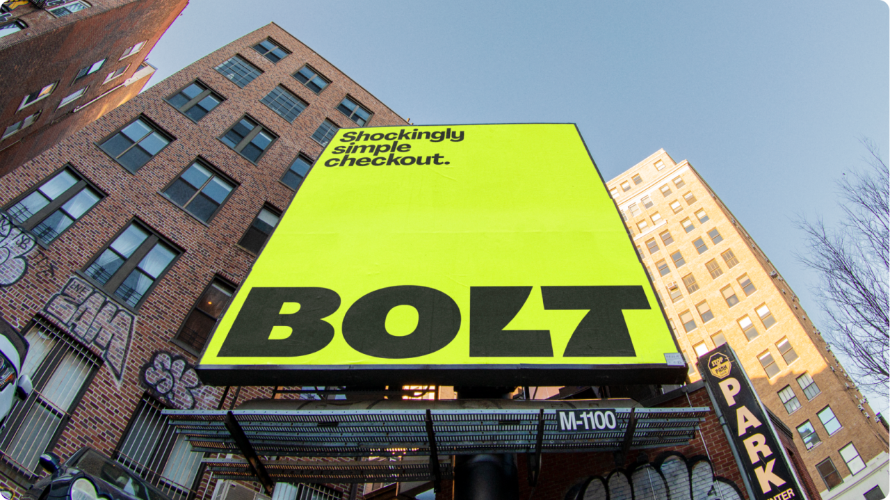
At the heart of the new identity for Bolt is a fresh positioning statement declaring Bolt's services "Shockingly Simple". It's a clever device that ties back to the lighting bolt imagery that has always played a crucial role in Bolt's identity.
Koto has retained the lightning bolt but has given it a serious glow-up. Arthur Foliard, creative director at Koto and lead on the Bolt project, said: "The new logo nods to the brand's original lightning bolt badge – an indicator of the trust, speed and convenience customers and partners have come to associate with Bolt."
Credit: Koto / Bolt
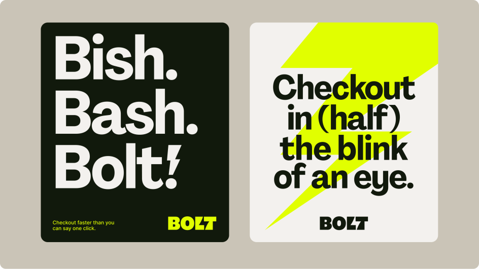
The familiar lighting bolt is now elevated in the new identity through new chunky typography that gives Bolt a much-needed infusion of personality and a night-and-day colour transformation tying back into the lightning bolt motif. Bolt, which had previously leant on a blue palette, is now striking in a new lighting-inspired hero colour: lightning yellow.
Foliard told Creative Boom: "Looking at Bolt's competitors, it was pretty obvious why they needed to move away from the blue. Everyone is using it!" While blue is often the colour most associated with security and trust, Foliard says brands absolutely don't need to be blue to give a 'secured' feel. For him, creating a sense of brand security is much more rooted in a brand's behaviour than its colour. So for him and his team, there was no question that a bolder colour choice needed to be on the cards for Bolt.
"We know the power of colour for a brand," Foliard told Creative Boom. "Colour makes it feel instantly different."
The next step was to identify the most powerful colour route. Foliard explained Koto's process: "In a sea of sameness, there clearly were two opportunities to explore – Orange/Red and Yellow/Lime. We tried both and looked at how they worked with the rest of our brand. The whole brand was built on lightning speed. So in the end, the 'lightning yellow' was the one we all loved, for obvious reasons."
Where previously Bolt's brand presence could be inconsistent, the new system communicates as directly as Bolt's services operate. Foliard told Creative Boom: "The thing I love about the new brand is how expressive, yet simple, it is. From the smallest bits of the brand, iconography, and product behaviour to the beautiful art direction and website, everything makes sense with our core idea: lightning-speed checkout. That's what I'm the proudest of and what will get Bolt to a great place in the future."
The new look has already started to roll out on the brand's website and social media and will continue to extend to various marketing tactics.