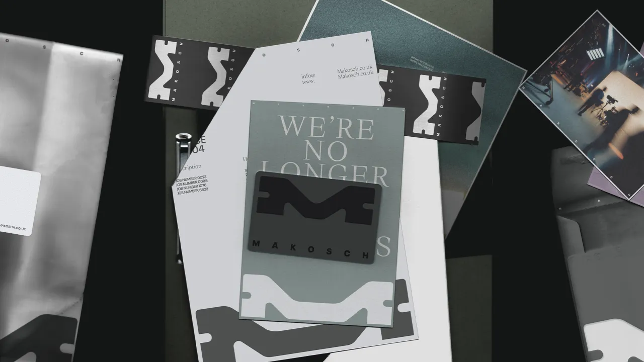
MassiveMusic reveals new identity by Koto
The global creative company has redefined the music partner's brand and website, creating a unified system that blends creativity, technology, and the emotional power of sound.
MassiveMusic has long been known for shaping how brands feel as much as how they sound or behave, and now they have entered a new chapter, marked by a comprehensive new brand and digital evolution by Koto. The new identity arrives as the music and sound partner consolidates a wider suite of B2B services under one go-to-market brand, marking a strategic shift for a company that has spent 25 years pushing sound into the centre of brand experience.
In many ways, this moment feels inevitable. The music landscape has fractured, scaled, and become increasingly technical, while brands are hungrier than ever for coherent, distinctive audio signatures.
MassiveMusic has been at the forefront of that shift, pioneering sonic identities and treating sound as a core strategic tool rather than a decorative flourish. With more music infrastructure and licensing capabilities now under one roof, the team needed an identity and website that could signal that ambition.

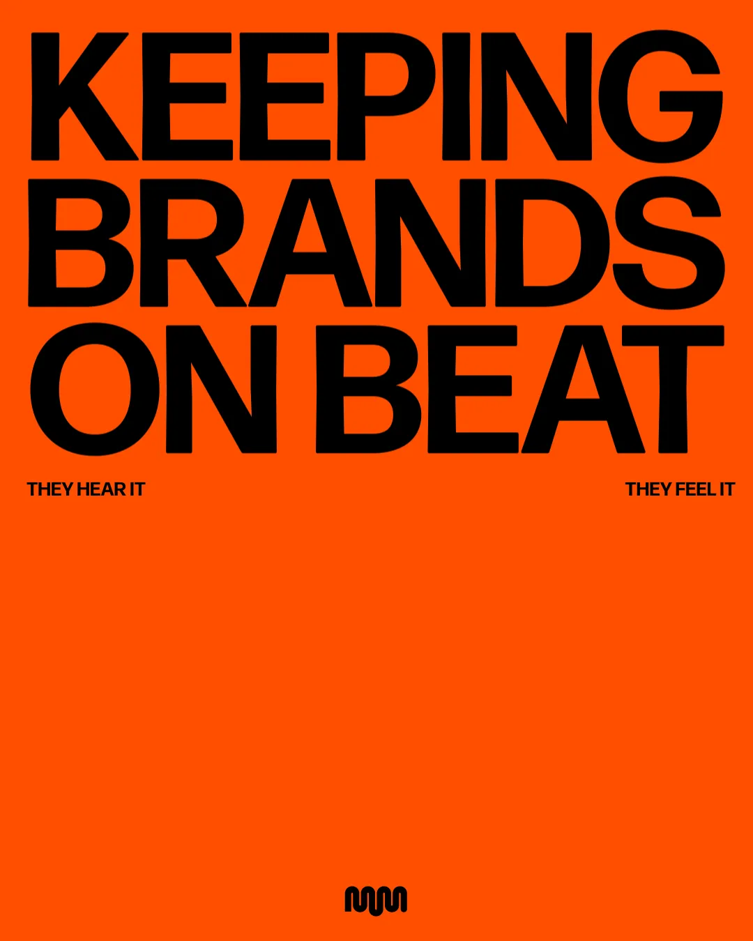

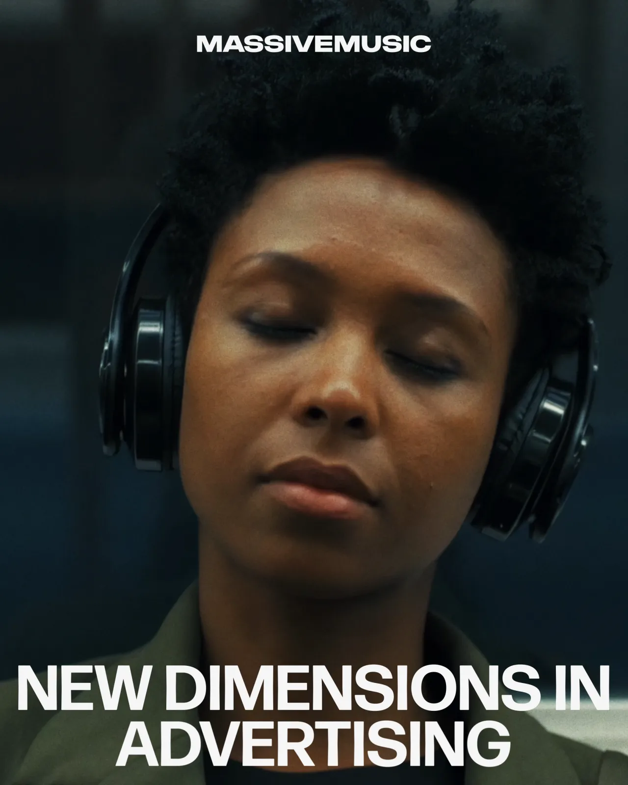
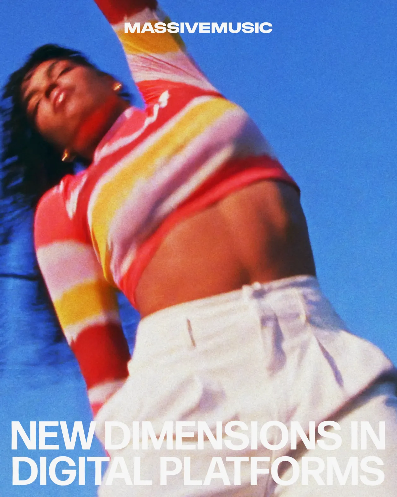
Koto's starting point was strategic. The brief asked them to unite a set of previously distinct business units, each with its own legacy and strengths, without losing the creative character that made MassiveMusic recognisable. To achieve this, a new positioning was built around the expansive idea of 'New Dimensions in Sound', which now anchors the whole system.
Tom Moloney, senior strategy director at Koto, reflects the unusual combination of capabilities now housed within the brand, explaining how this "highly complementary merger of skillsets, technology and expertise opens up lots of exciting potential applications and possibilities for music, sound and audio."
Koto also refined the brand's verbal identity, so it now sits in the space between clarity and creativity, keeping the tone confident and grounded in the emotional reality of working with sound. It was developed to be precise without being sterile and expressive without drifting into abstraction, giving MassiveMusic a language that can flex from artistic collaboration to enterprise-level partnership.
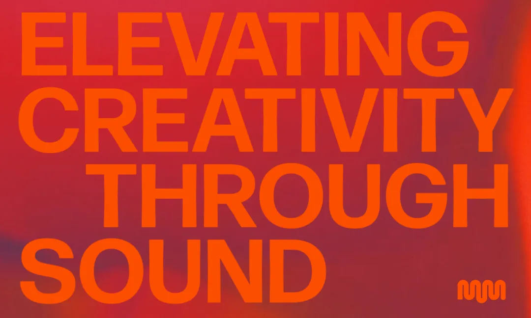
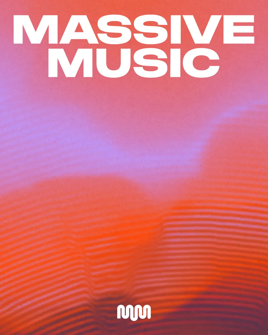
Visually, Koto focused on making sound feel physical. The refreshed logo keeps its asymmetric character but sharpens the lines and posture, giving it more authority without sanding off its personality. The custom wordmark leans into width and weight for presence, while still carrying warmth in its curves.
Colour is handled with restraint, with most applications relying on monochrome, and MassiveMusic's signature orange is used sparingly to cut through when energy is needed.
Typography plays a more active role, shaped around rhythm and volume. Using Forma DJR Display, the system adapts across quiet, medium, and loud modes, demonstrating the neat analogue of how sound behaves in the real world. These typographic shifts underpin everything from internal comms to high-impact marketing moments.

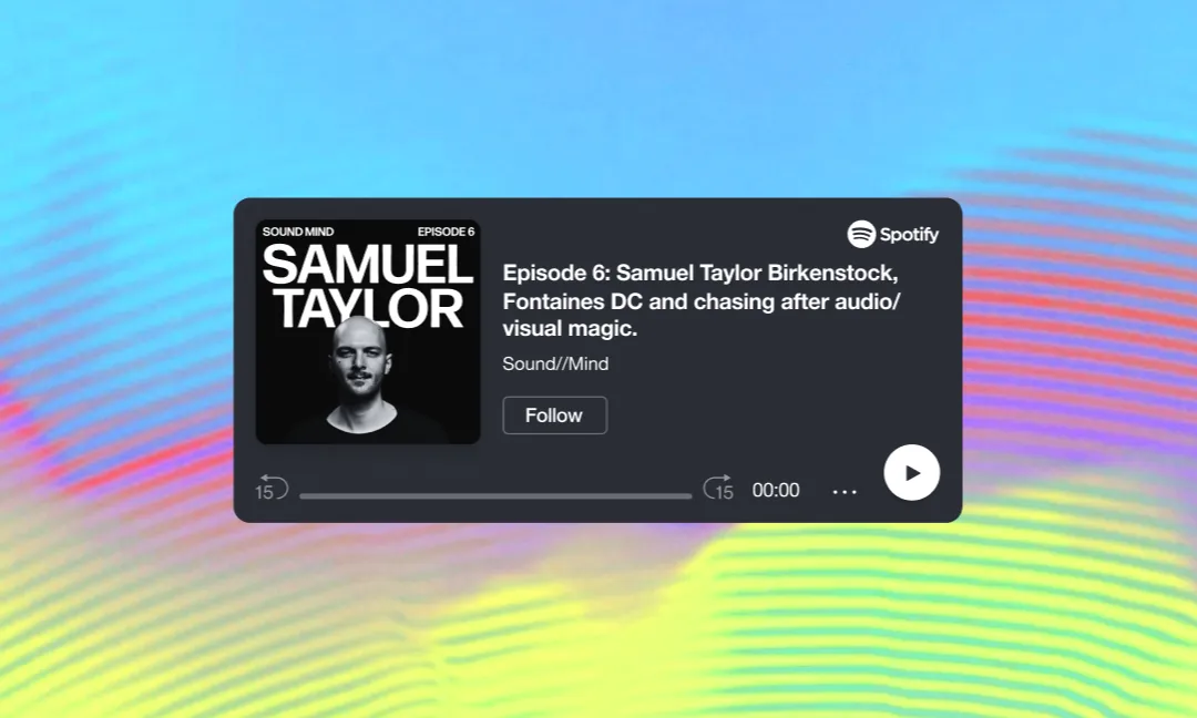
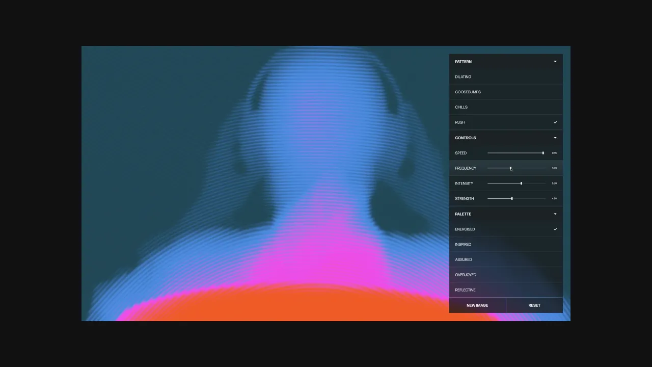
A generative pattern language sits at the heart of the identity, visualising the physiological effects of music, such as goosebumps, tingling spines, and dilated pupils. Rather than treating them as decorative assets, the team rooted each effect in the music itself. Gradients pulse like frequencies, motion reacts to texture, and imagery feels as if it is responding to an unseen beat – all designed to feel sensory on every level.
Expressive moments are used throughout the digital experience as well. Koto rebuilt the website from the ground up with Good City, its development partner, translating motion concepts originally crafted in After Effects into lightweight, browser-native code. This approach ensured the identity didn't flatten out once it reached the web, a common pitfall for expressive brands.
Koto's digital creative director, Anton Martinez, describes the complexity behind this. "We pushed each other — turning visual effects into musical variables, and then into code," he says.
While the creative direction landed early, performance became the real puzzle. Anton adds: "These textures were going to be a big part of the digital experience, so we wanted to make sure everything ran smoothly for everyone – not just on modern browsers or the latest devices."
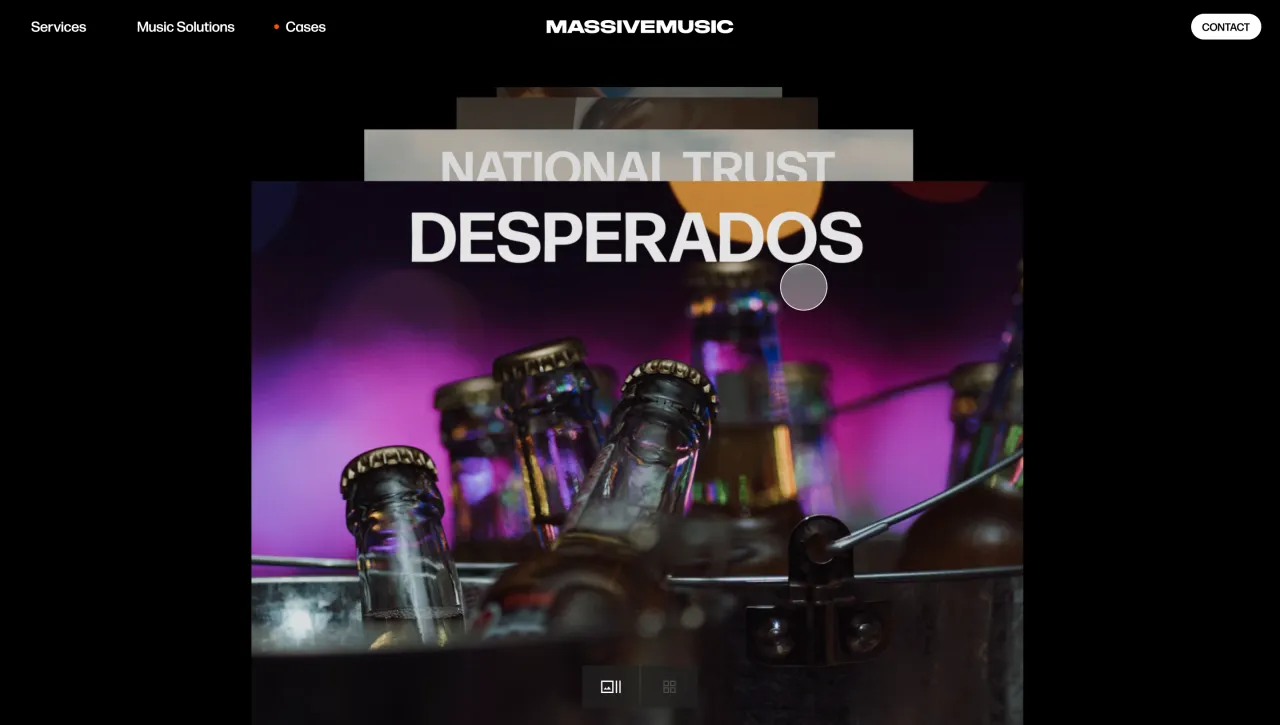
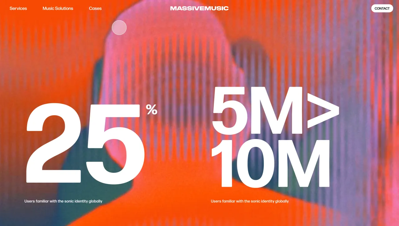
The team optimised shaders, streamlined loading behaviour, and built the effects directly into the CMS, allowing MassiveMusic to generate assets without specialist software. "No extra software, no production team – they just upload an image or video, and the effect gets applied automatically," Anton explains. This kind of back-end craftsmanship ensures the system scales without losing fidelity.
Having that intentional unity between brand and digital was a core focus for Koto's team. "We wanted to bring that same brand volume into the digital experience and make sure the identity holds up on digital, not just in decks," says Koto creative director Sam Howard. "We built the strategy, the system, and the site to work as one."
MassiveMusic also feels that the work accurately sets the tone for its next phase of growth. Paul Langworthy, chief revenue officer of Songtradr and MassiveMusic, says: "Our new brand identity and digital presence expertly capture our creative ambition, technological depth and the true impact our work has on audiences." It's a platform, he adds, for redefining the role of music and sound for today's most ambitious brands.
Sound has always demanded a little more persuasion to earn its place at the top table in branding, but as Tom notes, the evidence is stronger than ever. The growth of AI-driven audio production, new channels for sound, and more sophisticated measurement tools are reshaping what's possible. "The one thing that will always matter is how it makes you feel," he says. Anchoring the brand in that emotional truth gives MassiveMusic a system that feels evergreen and, importantly, one built for the next 25 years, not the last.
Editor's Picks





Trending




Latest Jobs
Marketing Manager at Penguin Random House UK
Full-time·London·£40,000 – £44,000
Design Lead at DoorDash
Full-time·San Francisco·$142,800 – $210,000
Senior Designer at Code and Theory
Full-time·New York·$90,000 – $115,000
Brand Designer at Langdock
Full-time·Berlin·€65,000 – €100,000
Senior Producer, Marcom at Code and Theory
Full-time·New York·$100,000 – $130,000
Social Media Manager at Jam
Full-time·Manchester·Circa £35,000