The best new typefaces for May 2026
May's new fonts have something to say, and the typographic vocabulary to say it—at any size, weight or width you care to mention.
Gotham Variable by Sara Soskolne
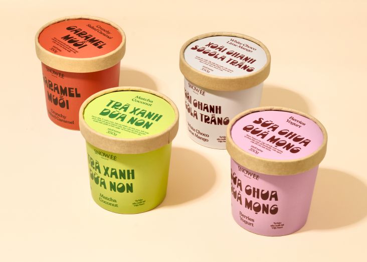
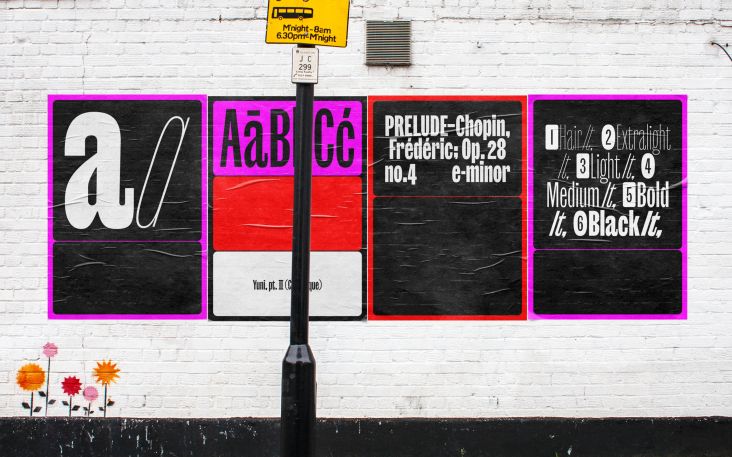
In global terms, much of 2026 has felt like we're teetering on the edge of a precipice. And yet at the same time the world keeps turning, and type designers are still doing what they've always done: making life that little bit better, one character at a time. And May's new releases have a pleasing breadth, from a 500-year-old Bible to a Times Square billboard, a twig in a Swiss forest to a plate of Spanish biscuits. (Yes, really.)
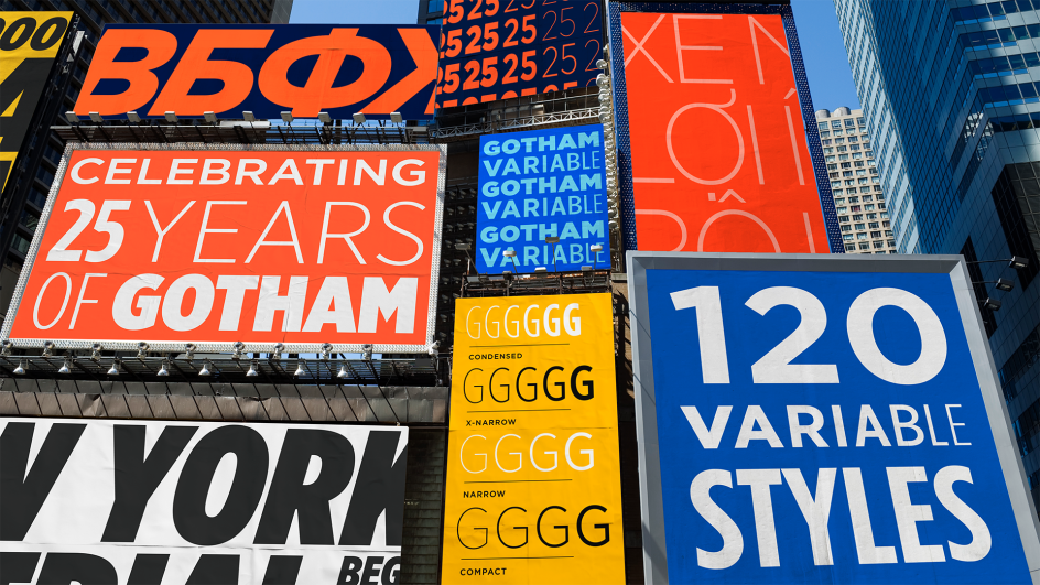
Dalton Maag's Deiverson Ribeiro serves up a food-themed Brazilian script with a jazz-like swagger. Sproviero pushes Art Deco into new territory. But the month's biggest moment arguably belongs to a typeface that's been around for a quarter of a century. Yes, Gotham is turning 25, and Monotype is celebrating with a variable evolution that further broadens what it can offer.
Elsewhere, Jean François Porchez launches the screen-optimised serif he started designing in 2021, Grilli Type releases its monospace industrial tool, and a botanical display font arrives from Switzerland with a philosophy borrowed from Japanese gaming. All in all, fun times are forging ahead in typeland, and there's plenty of fresh inspiration for designers to check out.
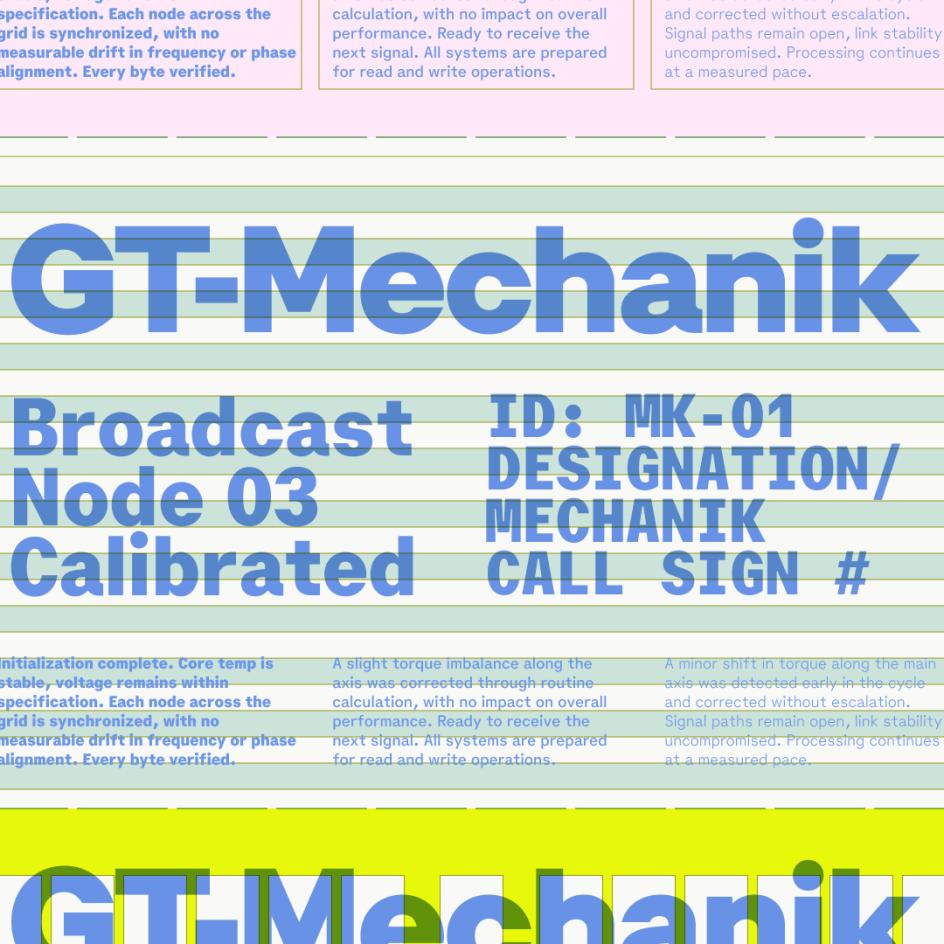
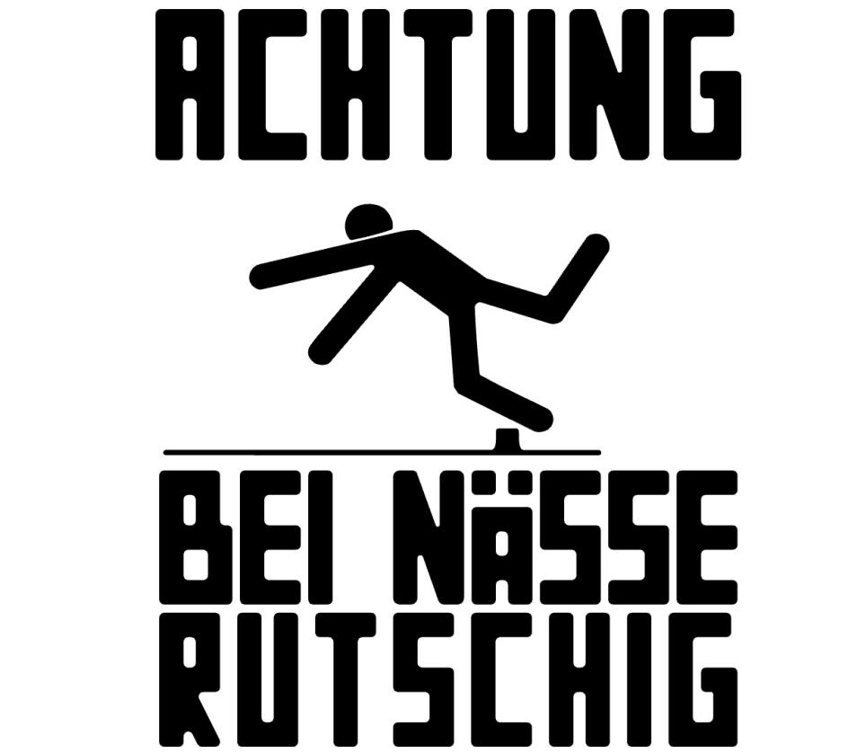
1. GT Mechanik by Shiva Nallaperumal, Reto Moser and Noël Leu
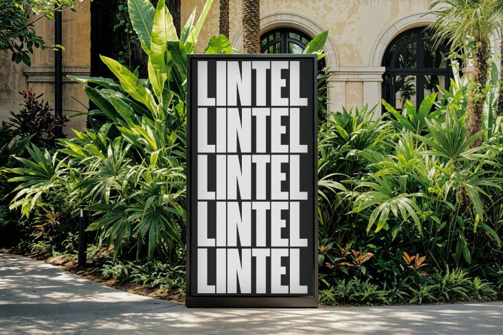
Before monospace typefaces became synonymous with code and terminals, electromechanical text systems used fixed-width type to stamp messages onto physical matter (paper, wood, metal). GT Mechanik, from Grilli Type, takes that old-school analogue logic and runs with it. Essentially, it treats the constraints of fixed-width design not as limitations but as generative principles. Abrupt joints, interrupted connections, oversized punctuation—these give GT Mechanik a sense of character that helps it embody its name.
To get a little technical, the design space is organised into three tones (Mono, Semi, and Poly), each expressing the same underlying logic at different scales and amplifications. Mono is highly mechanical, with inktraps and idiosyncratic details fully present; Semi introduces a more lilting cadence; Poly arrives at a stark, ultra-low-contrast resolution.
Significantly, those details dissolve as you move along the axis, creating a shift in character between settings. Rather than optimising for a single intended use, GT Mechanik allows designers to find the tone that suits their message.
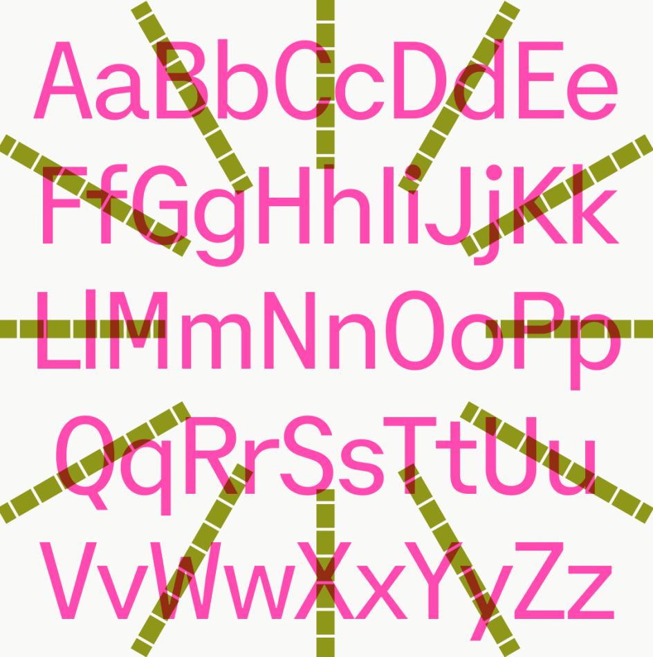
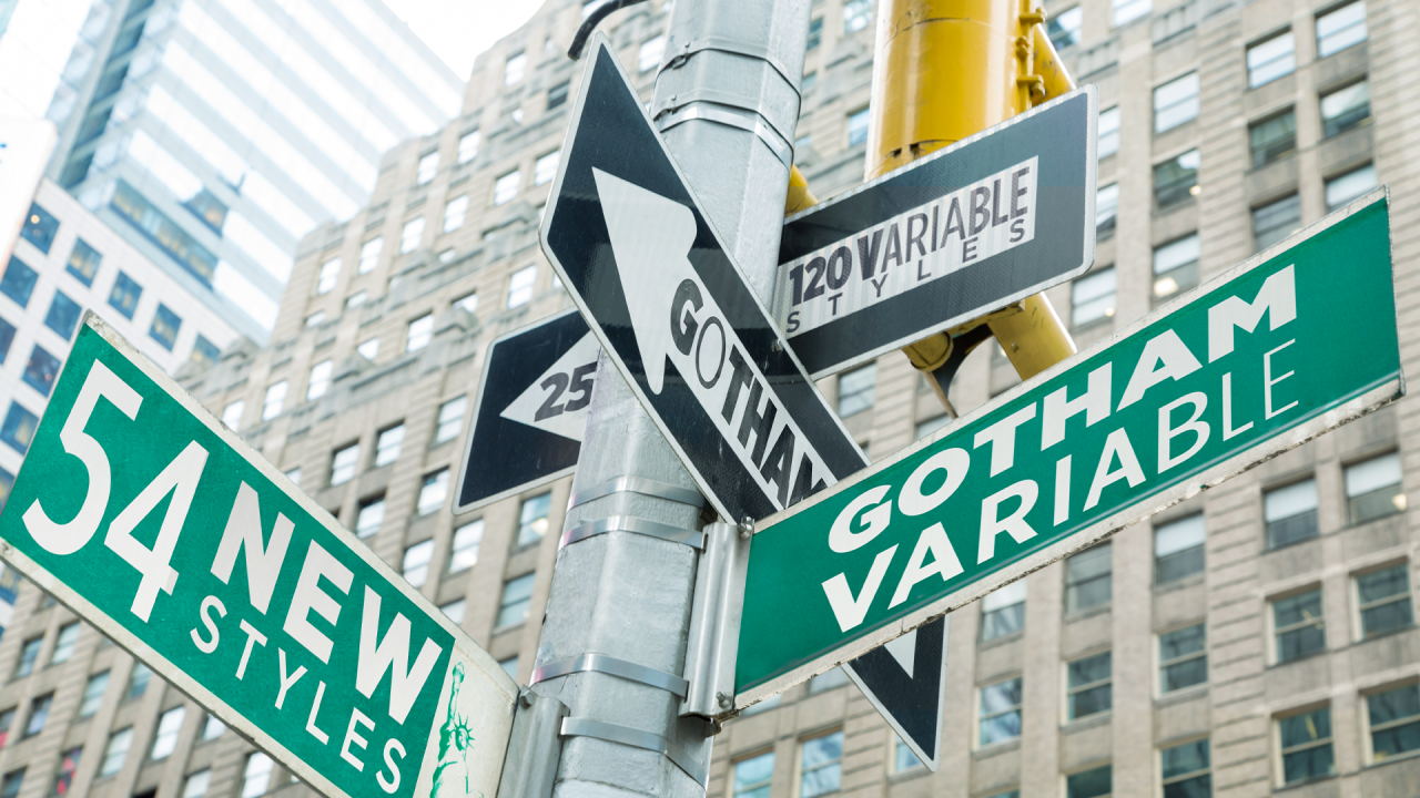
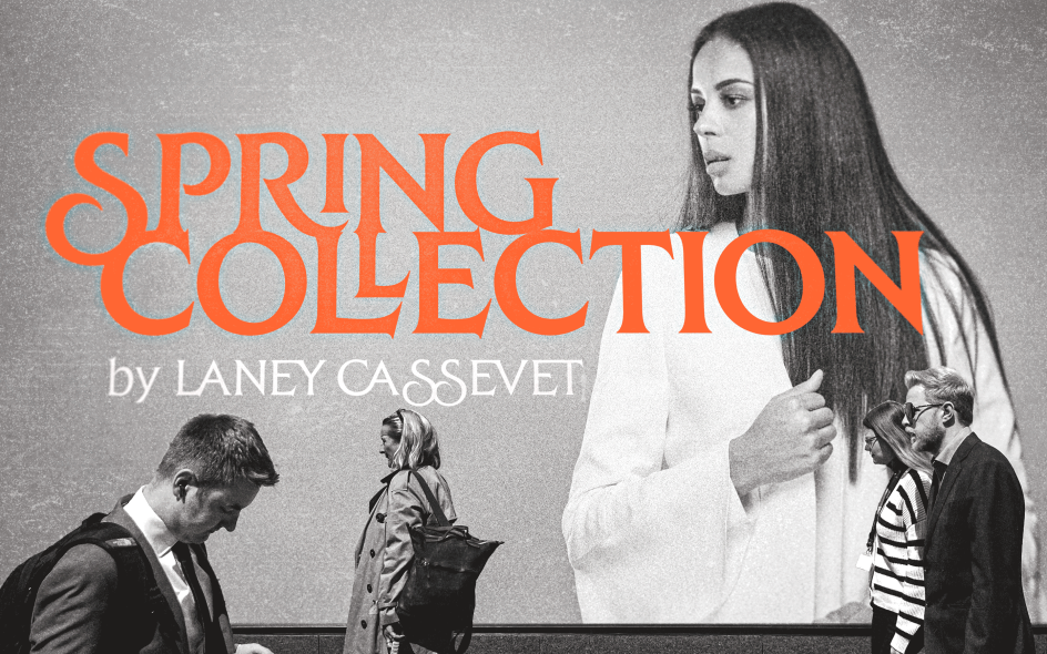
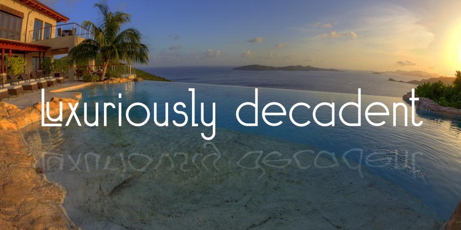
2. Gotham Variable by Sara Soskolne
Think you don't know Gotham? Trust me, you do. Originally designed by Tobias Frere-Jones in 2000, it's since been used on GQ covers, on the Obama presidential campaign posters, on Netflix, on Coca-Cola, on the sides of buildings and on the backs of buses. For a quarter of a century, it's offered authority with a friendly face; geometric confidence without coldness. But how do you evolve a typeface this iconic when the world it was designed for has fundamentally changed?
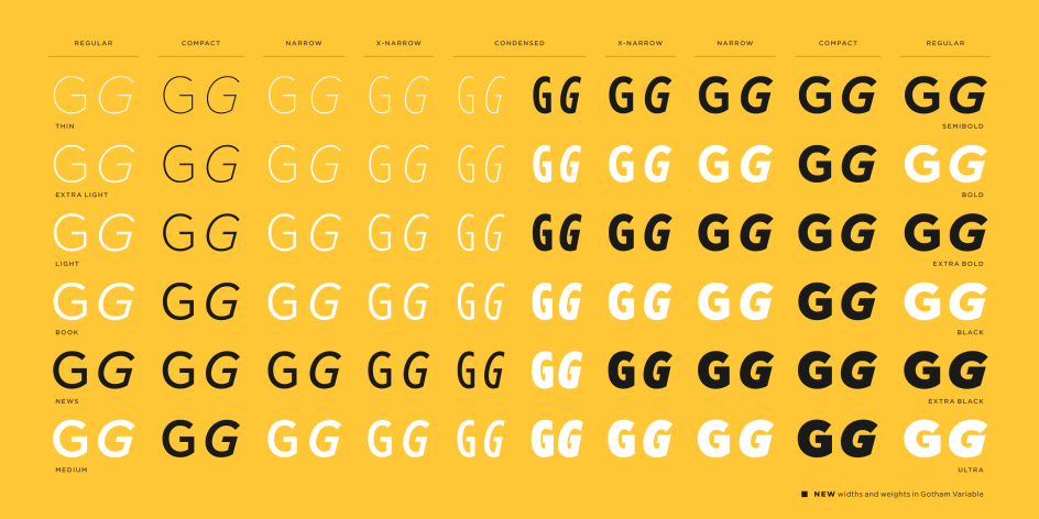
Monotype's brilliant answer to that question is Gotham Variable. Developed by Sara Soskolne, with Jordan Bell handling language support, a single-file architecture introduces continuous control across both weight and width, consolidating what was previously a large family of static files into a single system. Fifty-four new intermediate static styles introduce new shades of weight and a new Compact width, but they've been designed to feel like they always belonged.
Meanwhile, expanded language support adds Vietnamese alongside enhanced Cyrillic and Bulgarian. For brand teams operating at a global scale, this is exactly the kind of flexible, territory-spanning infrastructure they need in 2026.
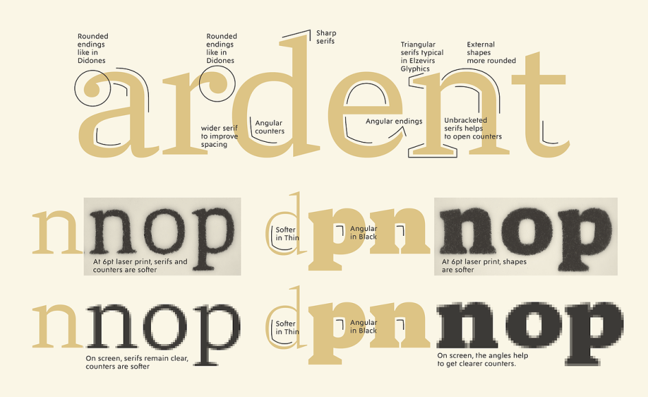
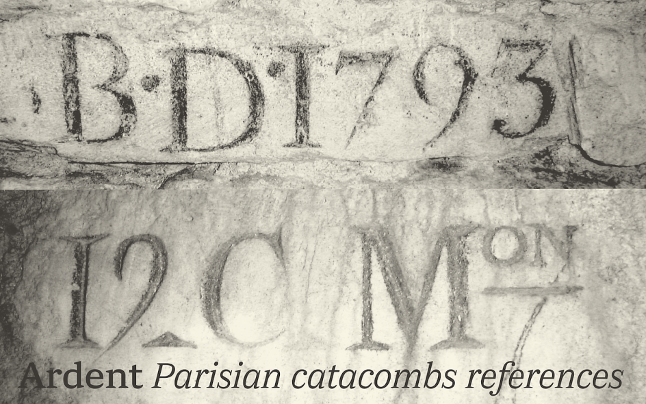
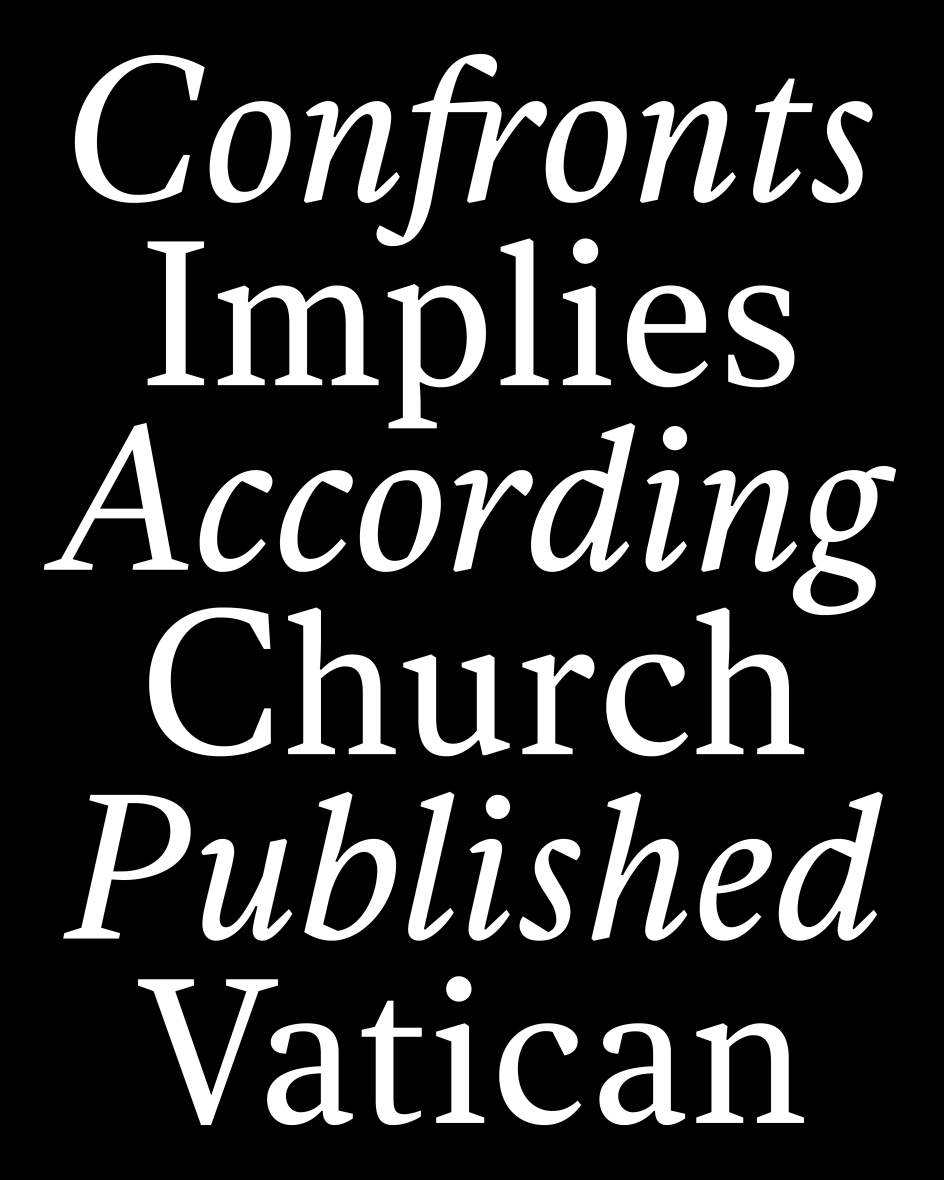
3. Ardent Pro by Jean François Porchez
Imagine you're designing a magazine that's mostly read on phones at 11pm, in bed, with the brightness turned right down. You're going to need a serif that holds up at small sizes on a glowing screen without losing its personality at headline scale. You're going to need something like Ardent Pro.
Jean François Porchez began designing it in January 2021, starting from his earlier Le Monde Journal and asking what that typeface would need to become to serve modern screen reading. The answer involved drawing wider letterforms and more open counterforms, following the research of Ladislas Mandel and Matthew Carter on legibility and apparent size. Serifs in the italics (an unusual, but actually sensible choice) serve readability on screen, rather than print conventions. And although I'm still pining for the days of ink on paper, even I have to admit: it's about time too.
More broadly, the font draws on a rich historical lineage: Elzevirs, Albertus, Vendôme, Meridien, even Verdana. Angular and triangular shapes sit alongside round terminals and both bracketed and unbracketed serifs, creating what Jean describes as a typeface that reveals subtle contrasts invisible at small sizes but gives graphic projects a distinct identity at large ones. It's been five years in the making, and it shows (in a good way).
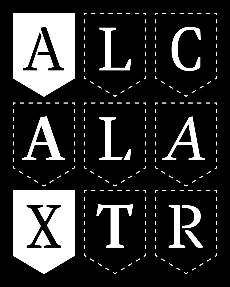
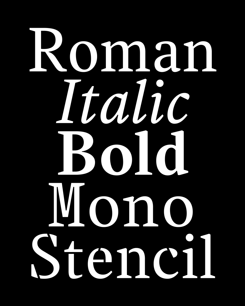
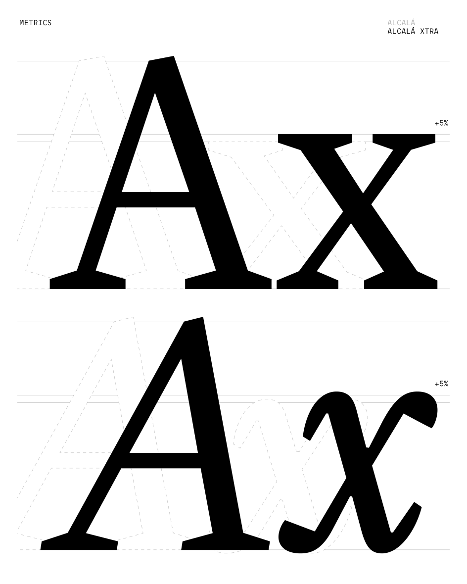
4. Alcalá Xtra by Damien Gautier
If you're seeking a typeface with genuine historical depth, it's hard to beat one that dates back to 1520. Damien Gautier's Alcalá has its roots in the Complutensian Polyglot Bible (the first polyglot edition of the entire Bible, published in Alcalá de Henares, Spain) and has been in continuous development since Gautier first initiated the project in 1995. That's 31 solid years of work on a single typographic idea, each phase adding new dimensions without losing the original's character.
Alcalá Xtra is the latest stage of that long project, optimised for small and very small sizes through a more generous x-height. At the same point size, it reads noticeably larger than most text typefaces. That's an important practical advantage in editorial contexts, particularly the press, where space is always at a premium.
Two new variants join the existing styles: Mono, which introduces a fixed width that sharpens the rhythm and personality of the design, and Stencil, which extends the family into identity and signage applications at larger scales. Gautier's approach—a small, structured family of complementary tools rather than an endless proliferation of styles—gives Alcalá Xtra a focused coherence that many larger families lack.
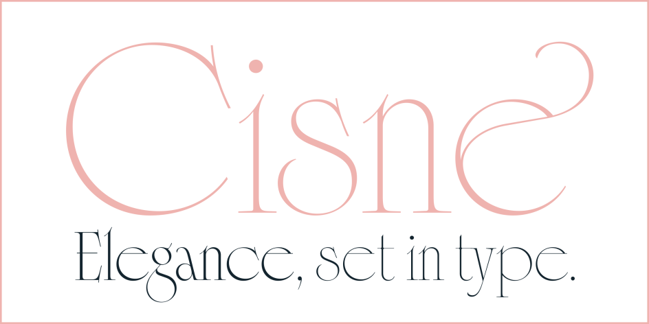
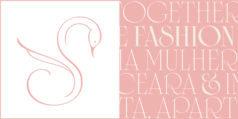
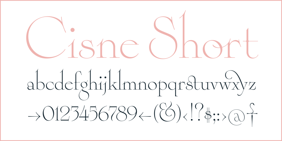
5. SPT Cisne by Maximiliano Sproviero
Some typefaces aim to be largely invisible. Others are designed to make a splash, and there's nothing wrong with that. Ross F. George clearly followed this path when he designed the Stunt Roman alphabet in 1929 for the Speedball Lettering Manual. Characterised by expressive swashes and refined curves, these were letters made, in his own words, "to show off." Maximiliano Sproviero— who recently earned a Communication Arts award for Feline—has taken Ross's Art Deco logic and pushed it further with Cisne, named after the Spanish and Portuguese word for swan.
Cisne arrives with an in-built structural tension: tightly packed vertical strokes set against large, open, near-perfect circular forms. The swashes are explored more deeply than in the source material, the serifs more pronounced, while subtle ligatures appear naturally within the flow of text.
Just like a swan, this font moves smoothly on the surface while holding a more complex structure underneath. As a variable font with both weight and x-height axes, alongside a range of alternates, it offers expressive depth across every size and weight. A good choice for editorial and branding work if you're seeking presence alongside refinement.
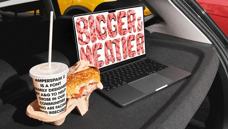
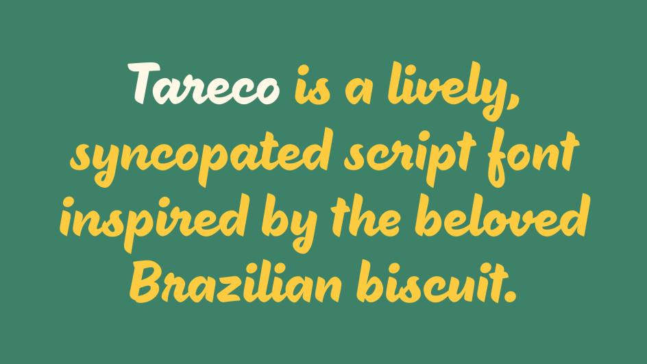
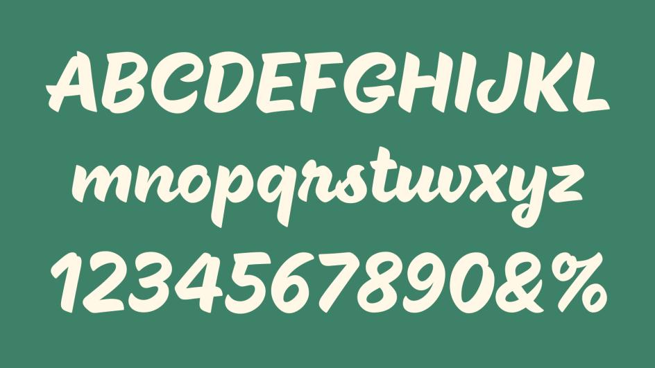
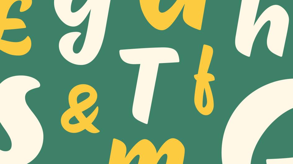
6. Tareco by Deiverson Ribeiro
Ever thought you needed a script typeface inspired by a Brazilian biscuit? Me neither. But actually, Deiverson Ribeiro's pulled off something a bit special here.
Developed at Dalton Maag, Tareco takes the beloved sweet treat of the same name as its starting point. This is not a polite, restrained script, but one with a loud, confident personality. Thick, confident strokes and precise details give these letterforms a jazz-like syncopation: a sense of forward propulsion and playful energy that helps to bring designs to life on the page.
So who should use it? Ultimately, Tareco is built for contexts where presence is the point. That might include, for instance, packaging that needs to stand out on a shelf; posters that need to hold attention at a distance; or expressive headlines where the typography is the message as much as the words.
With support for over 790 languages across the Latin writing system, Tareco has considerably more reach than its exuberant personality might suggest. All in all, it's the kind of typeface that makes you want to find a project worthy of it.
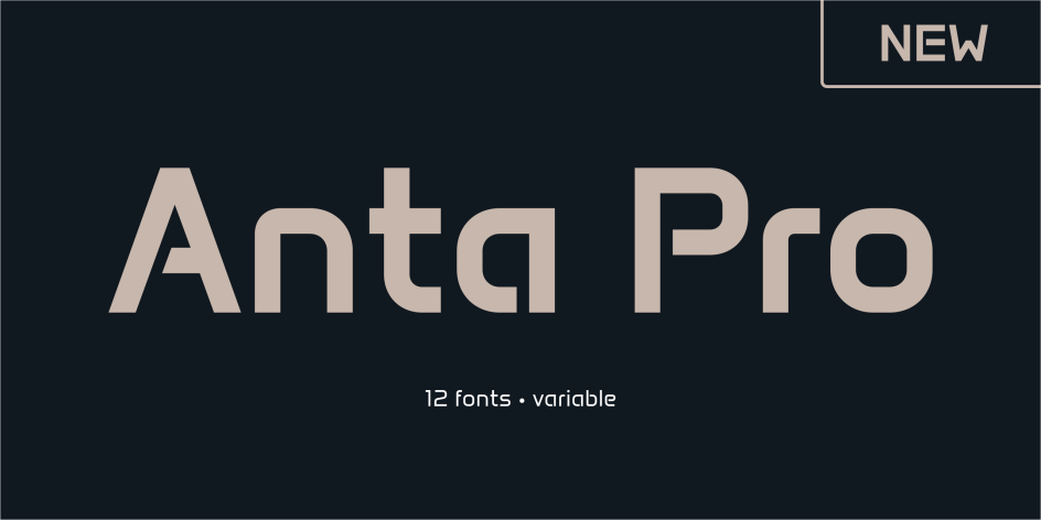
7. Anta Pro by Sergej Lebedev
Imagine you're designing a tech product, an app interface, or a brand identity that needs to feel contemporary—but without tipping into the cold sterility that so many geometric sans serifs deliver when pushed too far. In other words, you want clean geometry but with enough subtle warmth to stop the whole thing from feeling like a mood board for a startup that will close in two years. Anta Pro might well be your saviour.
Designed by Sergej Lebedev, Anta Pro builds on the design principles of Anta (a popular open-source typeface available on Google Fonts) to create a comprehensive, independently developed family. Twelve static fonts and two variable fonts provide the control and flexibility complex design environments require, while a multilingual character set handles global applications.
Finally, refined ligatures and considered OpenType features complete a system that's a good choice for branding, editorial work and digital interfaces where clear hierarchy and consistent performance matter. This is a typeface that earns its place in a serious design system, rather than simply presenting itself as one.
8. Tuig by Guillaume Berry
Tuig is Dutch for twig, and the metaphor is a useful one. We're talking fragile branchlets that eventually grow into strong tree trunks; curves that flex without breaking; forms that bend like bamboo canes. It's the brainchild of Guillaume Berry, a French digital designer based in Lausanne who runs Marmite Defontes as a side project. He describes his philosophy as "Serious Fun". A phrase borrowed from Japanese videogame company Natsume, it delivers on both fronts.
Tuig began in 2023 as a sister project to Guillaume's display font Piggle, with the specific ambition of a wide weight range and genuinely peculiar details. The result is a display typeface with a playful personality, chiselled accents, generous curves, a big x-height, and a handful of adventurous characters that are both friendly and functional.
Variable from the outset (which, can we agree, is nowadays the right way to launch a display typeface?), Tuig's expressiveness works well in bold, sophisticated editorial layouts and dynamic motion graphics. For visual identities and campaign work where a brand wants to feel energetic and distinctive without aggressive strangeness, Tuig is a worthy contender.
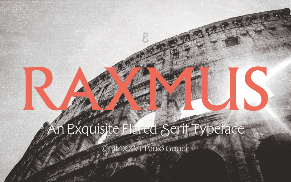
9. Raxmus by Paulo Goode
If you've ever admired Berthold Wolpe's Albertus—that authoritative, slightly unusual flared serif rooted in stone-carving traditions—then Raxmus will feel like familiar territory. Designer Paulo Goode, who's previously released Majesty and Harmonique, sees it as a contemporary counterpart to that legendary font, and the comparison is well-founded. Both share that rare quality of feeling simultaneously classical and modern, without quite belonging to either.
Where Raxmus distinguishes itself is in its versatility. A generous x-height and precise forms mean it works comfortably in body copy for websites and documents, not just titles and headlines. The feature set is unusually generous.
Swash glyphs add elegance to display settings, alongside some non-swash alternates including 'The Prisoner'-style E and e. Discretionary ligatures link pairs of glyphs for extra flair in titles. A third stylistic set combines swash K and R with small caps, and a fourth extends descenders with tapered serifs, producing elegantly curved foot terminals. Small caps, 18 weights from Thin to Black in both roman and italic, and full Latin European language coverage round things out.
10. Simpli by Matthew Gallagher
Sometimes you just need a typeface that's beautiful and uncomplicated. Simpli, from Matthew Gallagher, could be just that font. Drawing on the Arts and Crafts aesthetic tradition, this stroke-based display typeface is built to answer a simple question: what if you took the essential elegance of that style and reduced it to its clearest, most refined expression?
The full Latin character set includes alternates and ligatures, giving you enough flexibility to adjust the tone for different applications. It primarily works as a decorative headline or logo typeface, but unlike purely ornamental display fonts, it reads comfortably when typeset too. For branding, packaging or any context that benefits from handcrafted elegance, Simpli lives up to its name.
11. Etto Bambi by Milos Jovanovic
Here's a typeface that wears its origins proudly on its sleeve. Etto Bambi is the rounded, softened cousin of Milos Jovanovic's Etto typeface. The latter was born in 2016 as a display type for the Etto game, named after Ettore Sottsass, and drawing from the Memphis Design logotype. Now Etto Bambi arrives as a work-in-progress with what its creator describes as "brutalist and mellow at the same time" personality.
Unicase, uppercase-only, and speaking most European Latin and Cyrillic languages, Etto Bambi is exactly the kind of typeface that doesn't fit neatly into a category, which is much of its appeal. The rounded version softens the harder edges of the original Etto whilst retaining the bold, no-nonsense attitude that makes it useful for headlines and concrete messages. Jovanovic's description — "totally no-brainer font. Perfect for bold headlines and concrete messages," — is both accurate and charmingly economical. It's a typeface that knows what it is and has no interest in pretending otherwise.
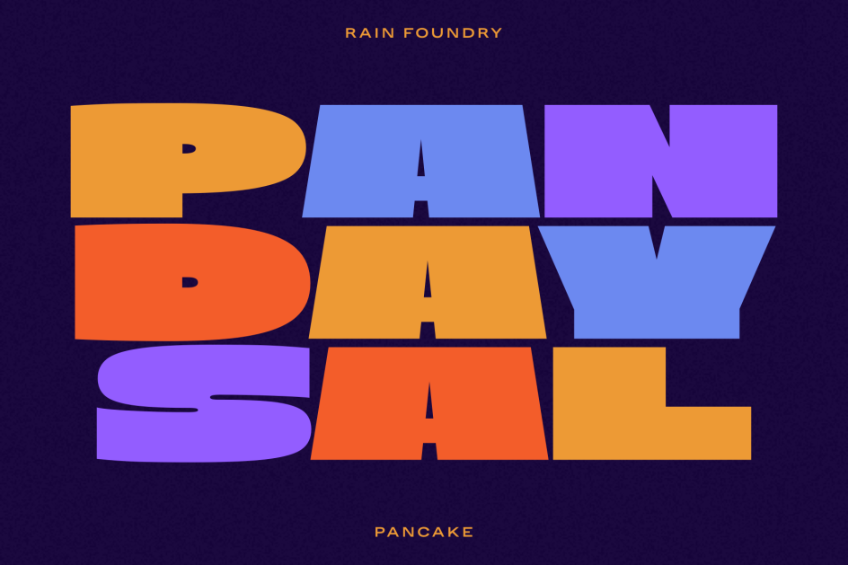
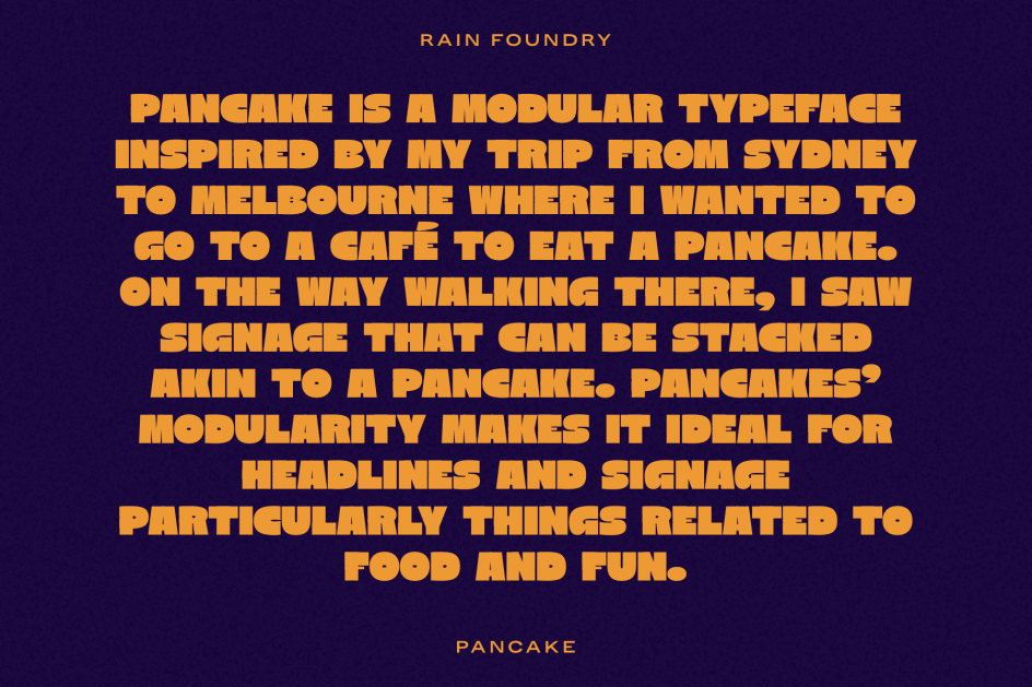
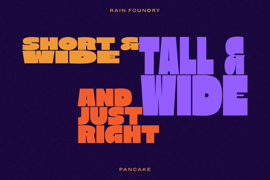
12. Pancake by Carl Rain
Some typefaces, including some on this page, emerge from elaborate conceptual frameworks. Pancake does not. Carl Rain of Rain Foundry was travelling from Sydney to Melbourne and wanted a pancake. He spotted some stackable signage on the way to the café, and went home and made a font. That's the whole story, and it's a better origin than most.
The result? A modular, caps-only display font, made up of chunky, rounded components designed to sit flush against each other. Twelve styles cover small, tall, wide and full variations, and there's a variable font too. Packed with personality, this would be a good option for headlines, signage and any design element that needs to combine bold graphic impact with a casual vibe.
Pancake knows exactly what it is, makes no claims beyond its remit, and delivers on them with no messing about. At AUD $10 per style or $120 for the variable—which Rain cheerfully describes as "a steal"—it's one of the most generously priced in May's round-up.
Want to be featured next time?
Got a new typeface we should know about? Every month, we share the latest fonts for designers. If you've got a new release, drop us all the details via the email address below. Send us all the info, product link, and loads of nice imagery.