More Fire. More Fox. Meet Kit: Firefox's most significant brand evolution in years
JKR had a rare brief: don't fix what's broken, amplify what's already there. The result is a sharper Firefox and its first-ever mascot.
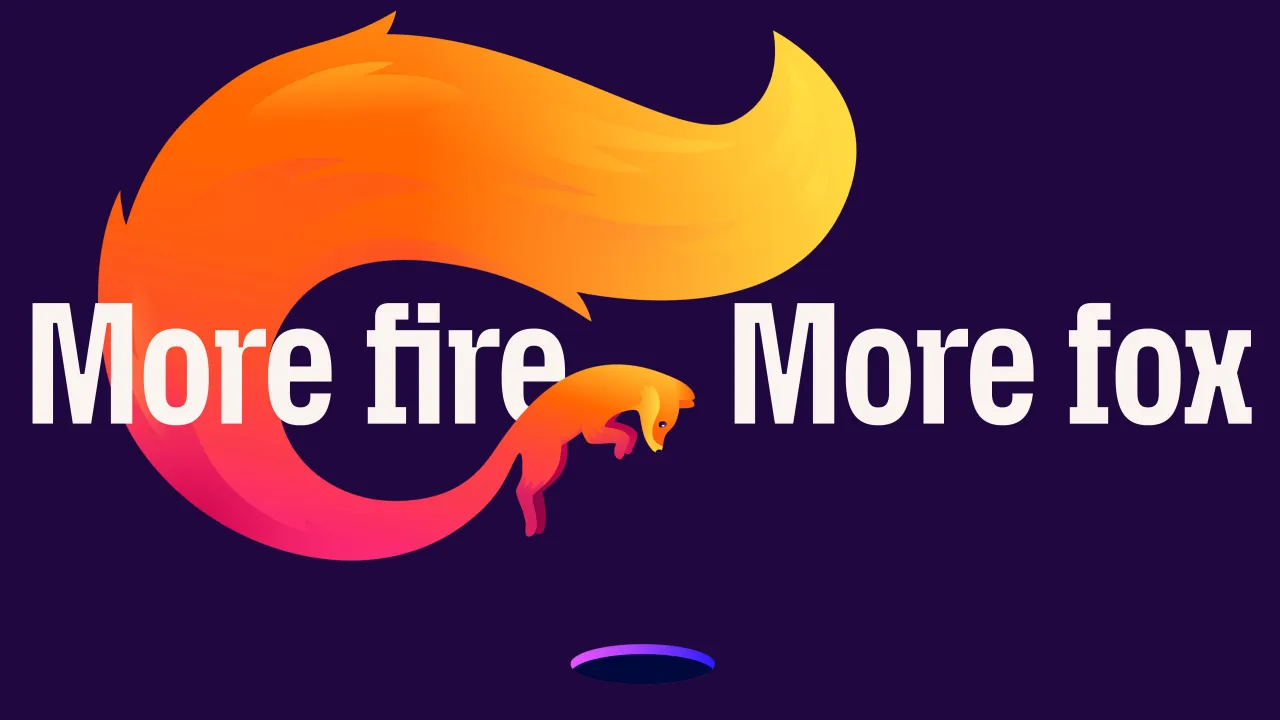
Firefox already had one of the most recognisable logos on the internet, a loyal user base, and a wholesome mission – which is what made the brief to overhaul it so hard. JKR wasn't appointed to fix anything broken; it needed to help it find its voice again.
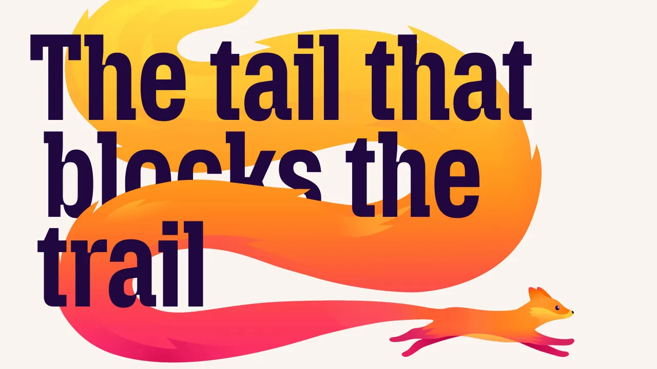
The result is 'More Fire. More Fox.' – a sharper challenger stance, a unified identity system, and the introduction of Kit: Firefox's first-ever official mascot. And yep, it's a fox. Well, why wouldn't it be?
The brief behind the brand
JKR brought together the strategy, creative, and digital teams to assess Firefox's true standing in the category. That meant going back to first principles: what makes Firefox Firefox? What do people associate with it? Why does it exist? Global research with real users identified three core assets that consistently cut through: the logo, the colour, and the Firefox imagery itself. Not abstract values or mission statements – which is interesting – but actual visual memory. (I mean, I'm a Firefox fan and love everything they stand for, but I mostly think of the orange and blue spikiness.)
Anyway, that gave JKR a strong foundation. Rather than starting fresh, the work was about amplifying what was already there, taking a recognisable symbol and making it do way more.
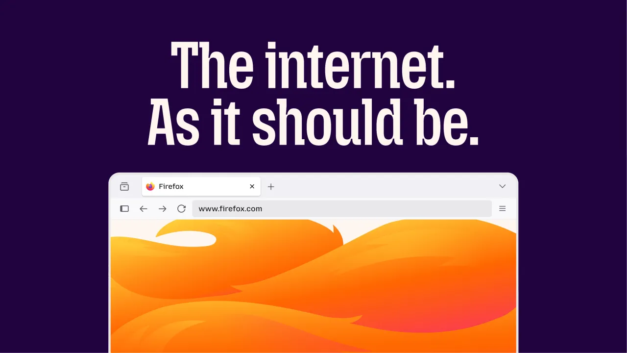
Designing a challenger spirit
The 'More Fire. More Fox.' platform captures a deliberate duality. Fire is the combative energy – Firefox as a genuine alternative to the algorithm-driven, data-harvesting status quo. While Fox is the protective instinct... the thing that has always set Firefox apart, built into the product itself through tracker-blocking, reduced profiling, and now AI Controls that let users choose whether AI plays a role in their browsing experience at all.
It maps directly to a product truth – this isn't a rebrand in search of a strategy. The strategy was always there; JKR made it unmissable.
Meet the mascot
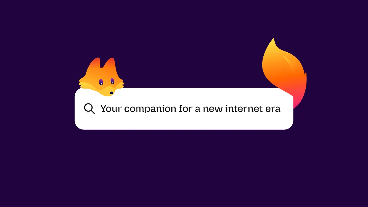
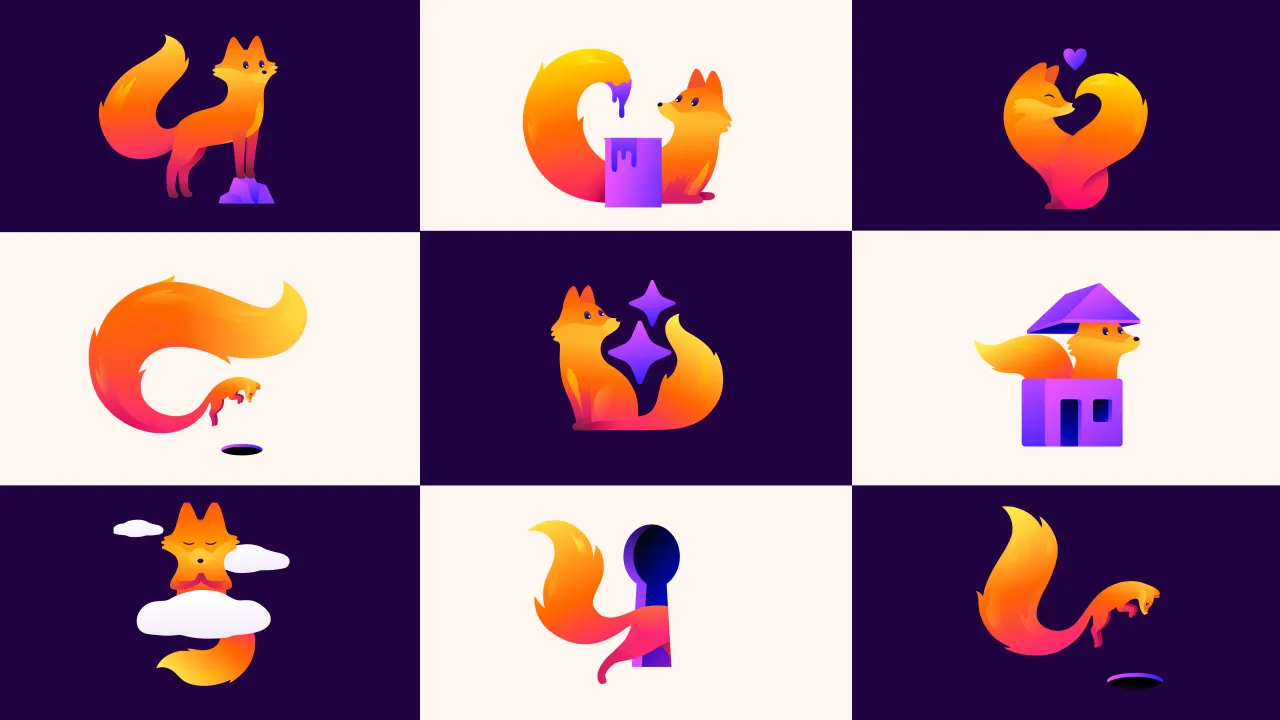
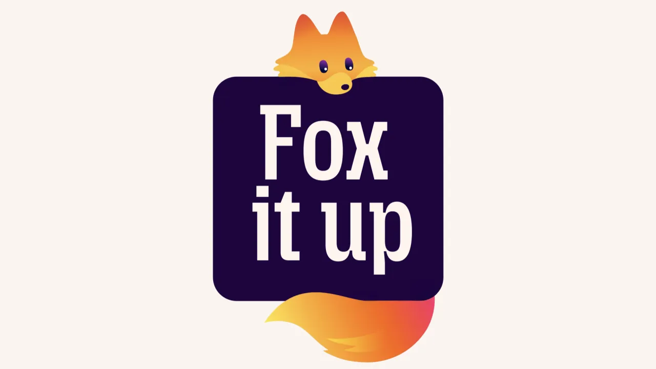
Then there's Kit – a flame-bright fox with "restless energy and a protective streak". Created in collaboration with illustrator Marco Palmieri, Kit is described as both a crusader for the open web and a companion to the user. But Kit didn't arrive from nowhere. The firefox has always been in the logo. (I actually didn't connect the dots on this until now.) JKR formalised and named what was already a latent brand asset, transforming a graphic element into a character with personality and longevity.
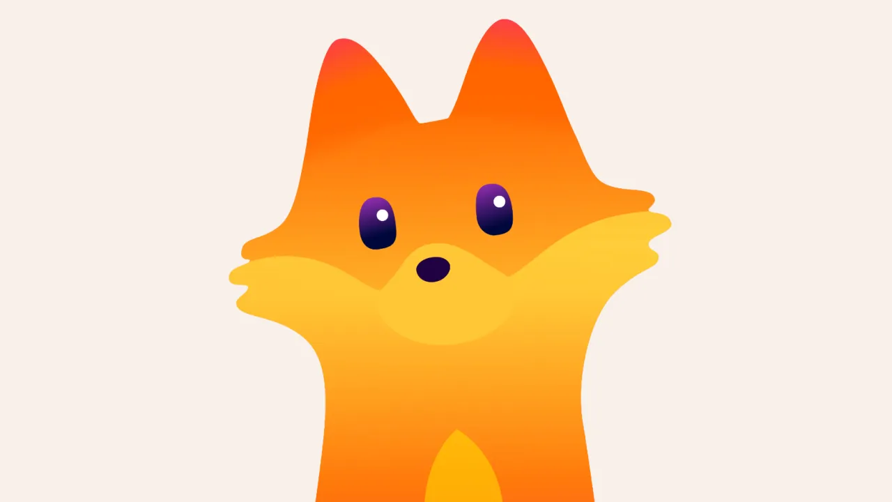
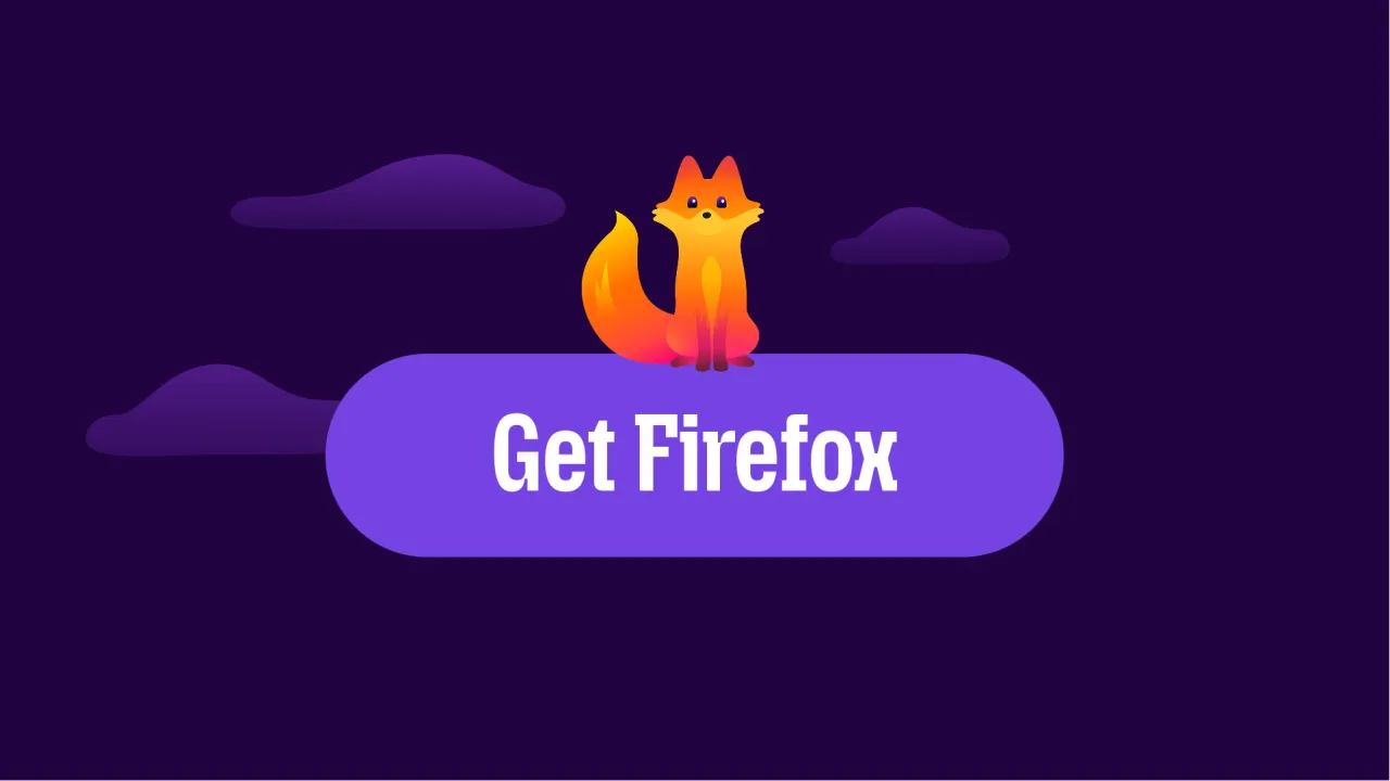
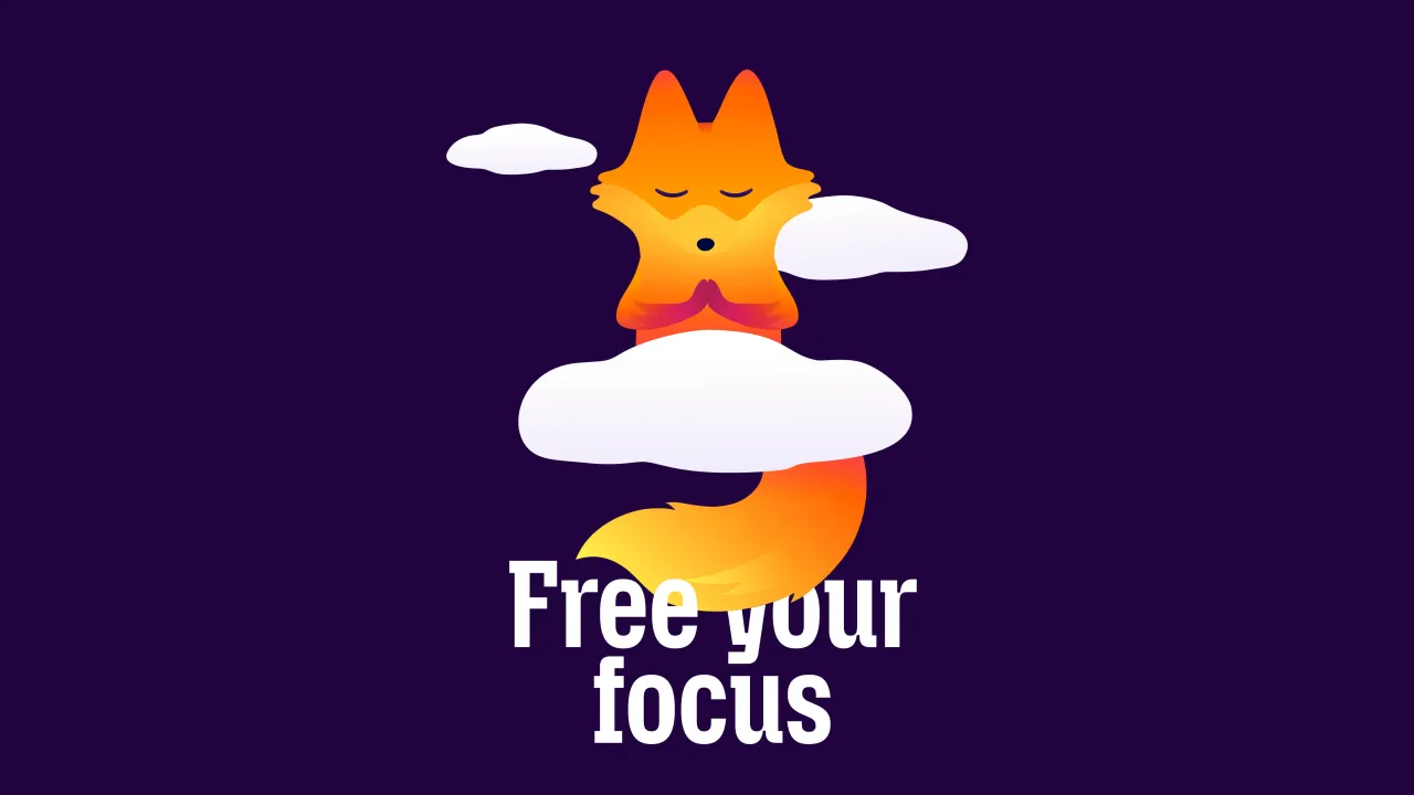
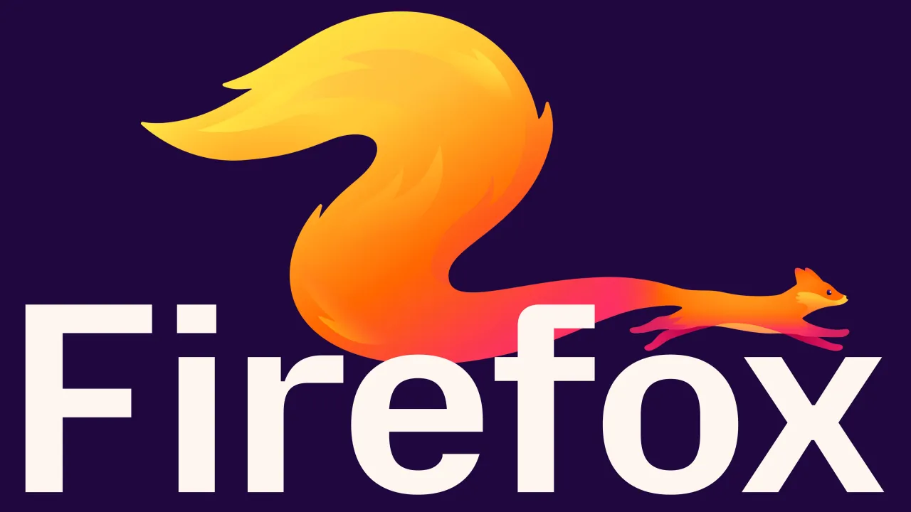
Mascots are a long-term commitment. If you do it poorly, they can age badly or feel corporate and contrived. When done well (like the Michelin Man, the Duolingo owl, the Innocent smoothie characters), they become genuinely beloved, transcending language barriers and building emotional connections over time. Research backs this up: mascots (like Creative Boom's friendly eyes) used consistently alongside other brand assets build recognition faster and create stronger consumer memory.
Kit feels like it belongs in that second category. The brief from JKR's Executive Creative Director, Stuart Radford, was clear: "warmer, more expressive and uniquely Firefox". What we've got is a character that earns its place, rooted in something real.
Why this matters now
As AI reshapes what we see online and a handful of tech giants consolidate control over the web, Firefox's 20-year commitment to the open internet feels less like heritage and more like an urgent imperative. The 'More Fire. More Fox.' platform leans into that... this isn't Firefox coasting on goodwill, it's Firefox stepping forward with a clear POV.
Kit's arrival is only the beginning of a broader rollout planned throughout the year. We'll be watching.
![White text on a dark purple background reads "The quick firefox jumped over the lazy browser [AaBb%&*£123]" demonstrating the new Firefox typography](https://media.creativeboom.com/6c998009-3f39-4159-9ac9-5793bb7a663f/conversions/d754eecbb449073eba3a5609df8ef7fc4c4a6e2f-medium.webp)
Editor's Picks





Trending





Latest Jobs
Design Lead at Madeo
Full-time·New York City·$85k–$120k
Junior Project Coordinator at Colorido Studios
Full-time·Twickenham·£28k–£32k
Agent & Producer at The Jacky Winter Group
Full-time·London·£35k–£40k
Design Director, Opinion at The New York Times
Full-time·New York·$160k–$180k
Digital Marketing Executive at Arise
Full-time·Sheffield·From £23,750
Senior 2D Motion Designer at Art&Graft
Full-time·London·£50k-£65k