Koto's positive and 'anti-boring' identity for Yubo, a video live-streaming app for teens
Global studio Koto has created a fresh identity and international ad campaign for Yubo, a video live-streaming app where young people can hang out and make friends. It's all based on stickers and tags that represent all the random chats, thoughts, and topics of conversation that happen on the platform.
Starting off with the logo, Koto believed it needed to have a super strong personality, one that teenagers could "wear with pride" but that would also stand out next to more established social media networks like TikTok and Instagram.
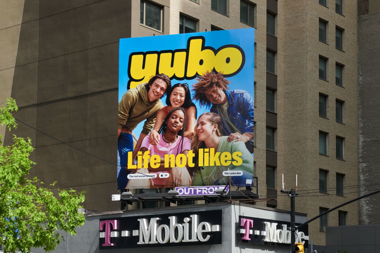
Koto refined the existing symbol and workmark to make it feel "cleaner and friendlier" while the distinctive smile in the wordmark now supports the brand's "fun and energetic personality". The rounded quirky forms of the letters and the vibrant yellow aim to be reflective of the "diverse" Yubo community.
Speaking of the bright palette, Koto wanted to give Yubo a suite of colours that would "express the spirit of its community", so something "young, vivid and full of life". It's made up of six unique colours, all designed to work together as a set, but also to be distinct enough to operate on their own.
Koto also refined the yellow, which is Yubo's main colour – a tone that feels "warmer and more positive" and something that felt "more in line with Yubo's values of inclusivity and positivity", according to the studio. It also helped to steer the brand away from Snapchat, which uses a more acidic yellow in its identity.
Elsewhere, there's 'Bo', a new brand mascot and friendly ally to the community, who guides users through the Yubo world. It also acts as a "reassuring presence" for parents and new signups.
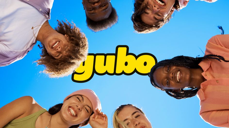
Brand photography, full of diversity and "youthful attitude", only adds to the overall look and feel – all shot on location in Sydney while Koto held the fort in London. "The Yubo user base is incredibly diverse and interesting, so it was important our photography celebrated everyone, following an important value 'whoever you are, wherever you are, you can be yourself on Yubo'," says Arthur Foliard, creative director at Koto. "Authenticity is important to the brand, so we ensured people captured were between the age of 15-21 and used the app themselves."
Another important aspect of the art direction style was blue sky. "It encompasses everything about the Yubo brand," adds Foliard. "It feels positive and brings a real attitude to the page. Blue sky is also geographically agnostic – wherever you are in the world, chances are you will look up and see a blue sky above at some point."
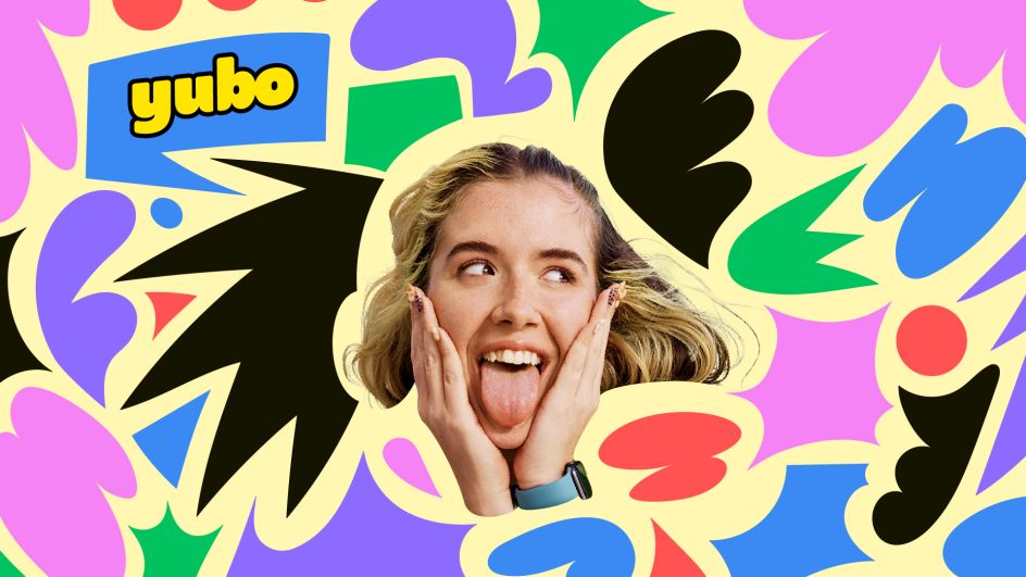
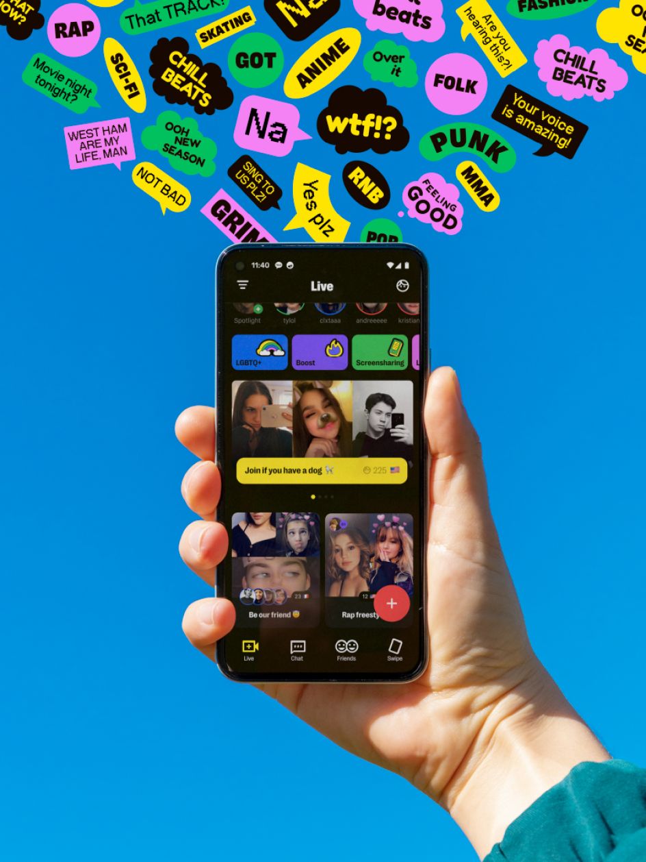
In terms of typography, Right Grotesk felt like the right fit, one that had "enough personality to stand by itself and express the spirit of our brand," adds Koto. Meanwhile, to express the type of interactions which happen on Yubo, the studio used a series of shapes inspired by speech bubbles along with stickers of assorted shapes which resemble sparks to "reflect the idea of users' imaginations".
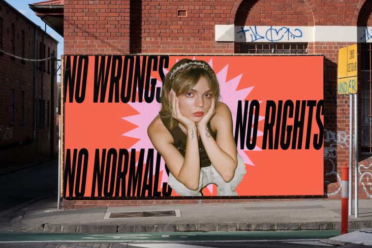
The new identity launched with a global ad campaign earlier this month, lighting up bus shelters and billboards everywhere from Melbourne to Times Square. Koto also rolled out the brand to merchandise, social media, and a new website and app.
Editor's Picks


Trending


Podcasts


Editor's Picks
Further Reading