Koto rebrands Boxy, a French startup turning cargo containers into automated stores
Boxy offers a clever solution to the lack of food shops in outer Paris. Koto recently helped the startup rebrand and explain how the new identity needed to strike a careful balance.
In the UK, we might all be suffering from the cost-of-living crisis, but at least most of us can easily get to a food store. Many suburbs of Paris, in contrast, are severely under-serviced by supermarket chains, which mostly exist out-of-town.
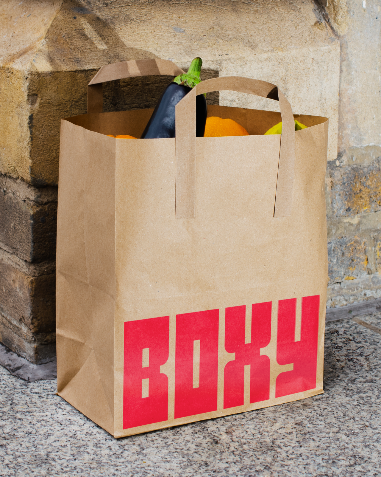
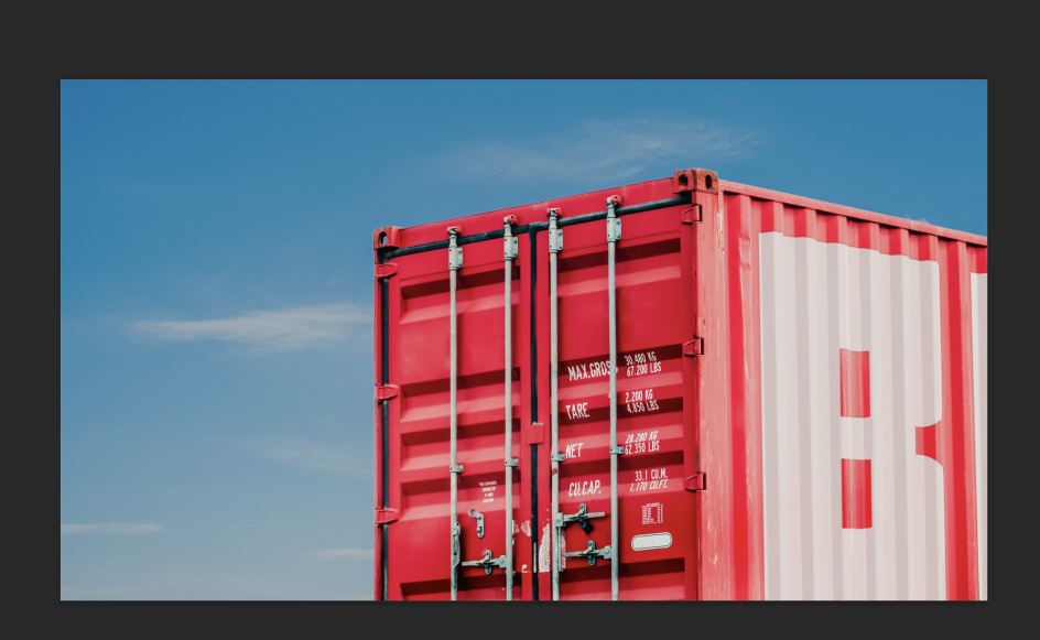
Boxy is an innovative startup with an interesting solution. This French company transforms cargo containers into fully automated, 24/7 grocery stores in the suburbs all over France. The aim is to provide convenient, local shopping experiences in areas with very limited food shopping options.
Boxy recently reached out to creative agency Koto to help them rebrand. We chatted to design director Joe Ling about how they approached the project.
From the outset, says Joe, Boxy wanted something simple and easily replicable that could be rolled out across every current and future Boxy store.
"They were also keen to keep a shade of red as their core brand colour," he adds. "Plus, they wanted the new brand to communicate Boxy's well-placed price point without feeling cheap. That's because it really is a good value option compared to traditional convenience stores or on-demand delivery services."
Strategically, the challenge was to bring a sense of human warmth to a fully automated business, to communicate convenience without it feeling soulless. "As a mass market proposition, the brand system needed universal appeal and to be able to sit comfortably above all the household name FMCG brands that Boxy sells," explains Joe.
In terms of design, this meant celebrating the standardised form of the shipping containers without making something that felt too alien from a traditional shopping experience. "A name like 'Boxy' is a designer's dream because of its visual connotations," Joe points out. "But anything too box-like in form can feel hard and cold. So we constantly had to find ways to subvert that."
Koto rooted the brand in a strategy that reflects Boxy's 'uncompromising convenience' without forgoing the sense of discovery and delight at its heart. "This meant that, when it came to design and tone of voice, we could focus on blending simplicity with humanity," says Joe.
In terms of the design system itself, they aimed to celebrate, rather than fetishise, industrial design. "We ignored the brutal beauty of the corrugated metal – even though it was difficult at times! – and instead embraced the overall form, a bright red rectangle," says Joe. "We put this at the centre of every piece of branded communication to underline how Boxy's an ever-present, dependable force in neighbourhoods across France.
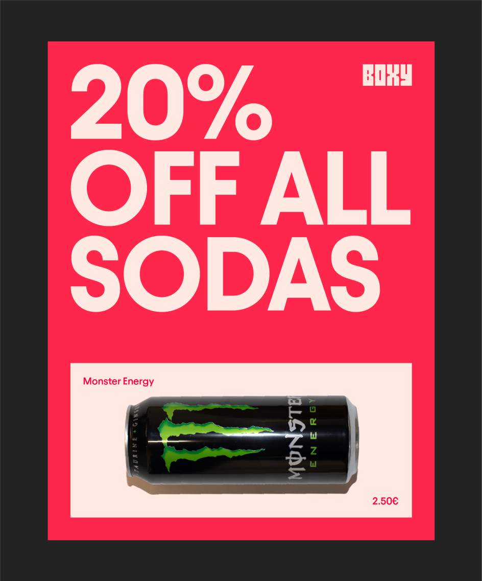
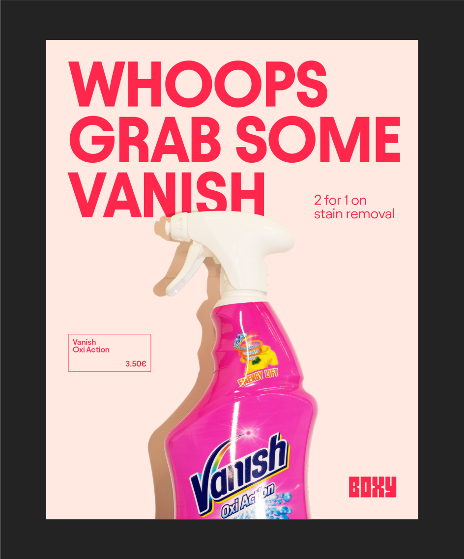
"We then dialled up the warmth and friendliness further with intimate, naturally shot lifestyle photography that reflects real life moments and a fun, inclusive tone of voice that celebrates how Boxy's right there to save the day whenever you need it."
The brand system is based upon a rectangle that's the exact size and width of a Boxy. This made for a very versatile brand asset to sit at the centre of the brand. As Joe points out: "It could hold photography in a social post, it could hold typography in an out-of-home communication, and it could even be a price label on a product in a fridge. The power of this brand comes with the repetition of the core rectangular asset. We are still finding new and interesting ways to use the rectangle now!"
As for the wordmark, Koto found it difficult to capture a sense of 'boxiness' without making the wordmark feel cold, unapproachable or even retro. "We had to constantly remind ourselves that this logo has to sit in a competitor set of chain supermarkets like Carrefour," says Joe. "We had to find the balance of being visually challenging but also having universal appeal.
They decided to make the wordmark the exact same footprint as the boxy rectangle to continue the repetitive thread that runs through the whole brand. "This came with its own challenges around letter widths and kerning, but it creates a really successful consistent thread throughout the whole identity," says Joe.
"As for colour, every Boxy is red, and we didn't feel the need to change that," Joe says. "The moment we first saw a Boxy in real life, we fell in love with the visual impact they have in the context of a French suburb: you can literally see them from a mile away."
So Koto decided to embrace red, retain it as the lead brand colour and truly double down on it. "The accompanying colours of black and white merely act as a support act to provide pacing to communications. Boxy is definitely a red brand!" says Joe
For a relatively minimal brand, they decided they needed a typeface with real character. "We settled on Avant by Displaay because of its incredibly unique forms, but also because it felt approachable," says Joe. "In a very rectangular, bright red brand, we needed a typeface which provided a sense of warmth. It also had to be a real workhorse: something that could perform on every touchpoint, from a price tag to a digital product. So we had to choose a solution optimised for all of these use cases."
Editor's Picks


Trending


](https://www.creativeboom.com/upload/articles/90/908fdb6378db1e95d12595416f54e6336d5e80b8_732.jpg)
Podcasts


Editor's Picks
Further Reading