'We were determined to eat our own dog food': Tom Lloyd and Mike Jordan on rebranding Bluegg as Toward
Cardiff-based branding and design agency Bluegg has overhauled its identity as part of its 20th-anniversary celebrations. Now known as Toward, founders Tom Lloyd and Mike Jordan explain how they approached the rebrand and why the new look echoes their proud Welsh roots.
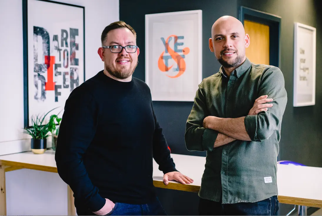
Created 21 years ago by Tom Lloyd and Mike Jordan when they left university, the design agency formerly known as Bluegg has worked for over 300 clients in its time. These include Cardiff City Football Club, Bristol Zoo and Celtic Manor, to name a few. But with two decades under its belt, the founders decided it was time to turn their carefully-crafted branding skills on themselves.
"The old name was a signpost to those younger days – fresh, innocent, youthful, a bit of fun with a touch of irreverence," the pair tell Creative Boom. "Wind forward two decades, and we're a completely different company, with varying types of clients, looking for bigger and better projects.
"The story of our name no longer fitted our ambitions or attitude. Every conversation started with us looking back at our origins. Now we can start them by looking forward to the future."
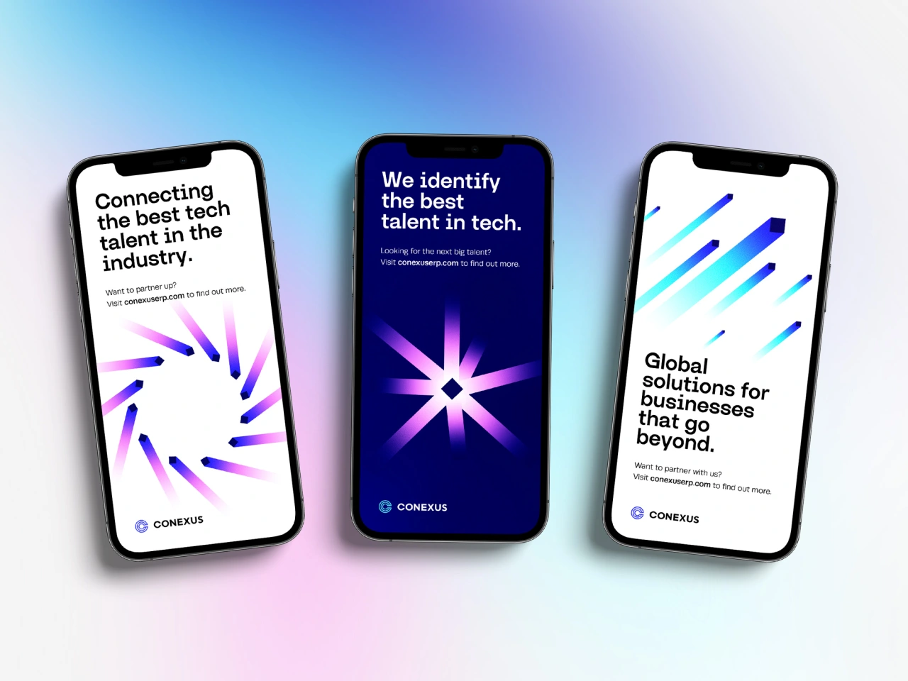
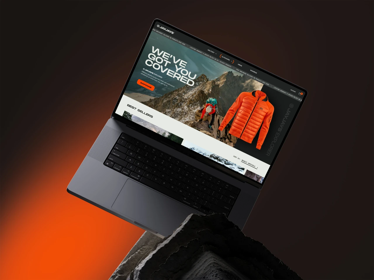
Created over 12 months, the pair revealed their agency's new identity, Toward, as part of the Wales Week celebrations in London. Completed between client work, the major relaunch proved to be a challenge the pair relished undertaking.
Applying the same approaches they usually consider when working for clients, the pair began by asking themselves: 'who are we, and who do we want to be?' Uncovering this authenticity is crucial for Tom and Mike when crafting a business's identity and giving them something to aim for by dialling these elements up to 11.
"We also wanted to ensure that we developed a proper visual language for ourselves, not just a new logo and colour palette," they add. "That's something we do for all our brand projects, so it was important we did it for ourselves. We now have a design system with meaning and flexibility, giving us some great opportunities to evolve over the next few years."
In this spirit of growth and evolution, the creative duo settled on the name Toward because it looks to the future rather than telling a story from the past. "We thought a lot about what we do and why," they reveal. "Essentially, we help businesses prepare for what's next – whether growth, acquisition, to challenge a market or to engage a new audience.
"But we also wanted to show that our work doesn't necessarily have an endpoint. It's always working toward the next goal – a journey with direction, without end. Toward perfectly summed up how we feel about what we do, which is the best reason for giving something a particular name."
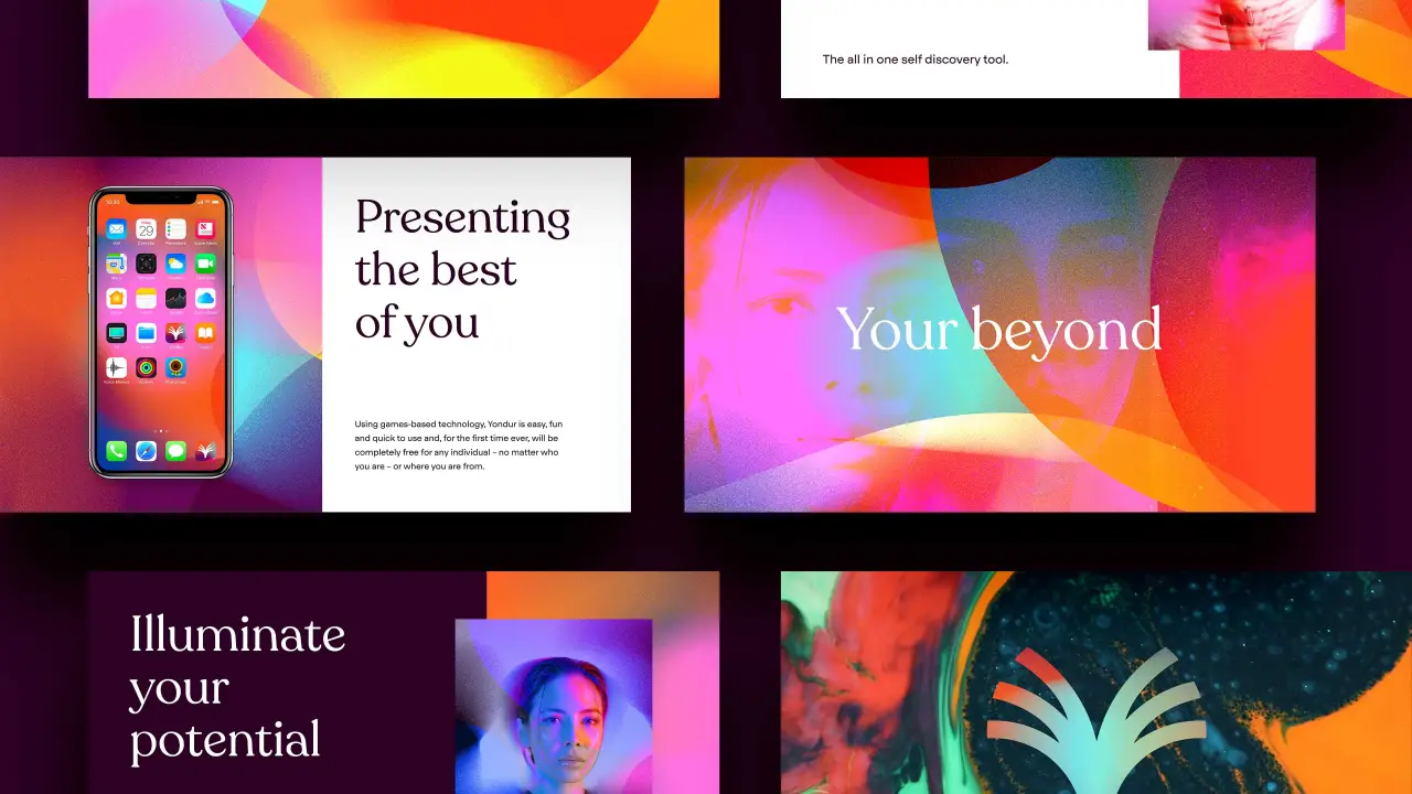
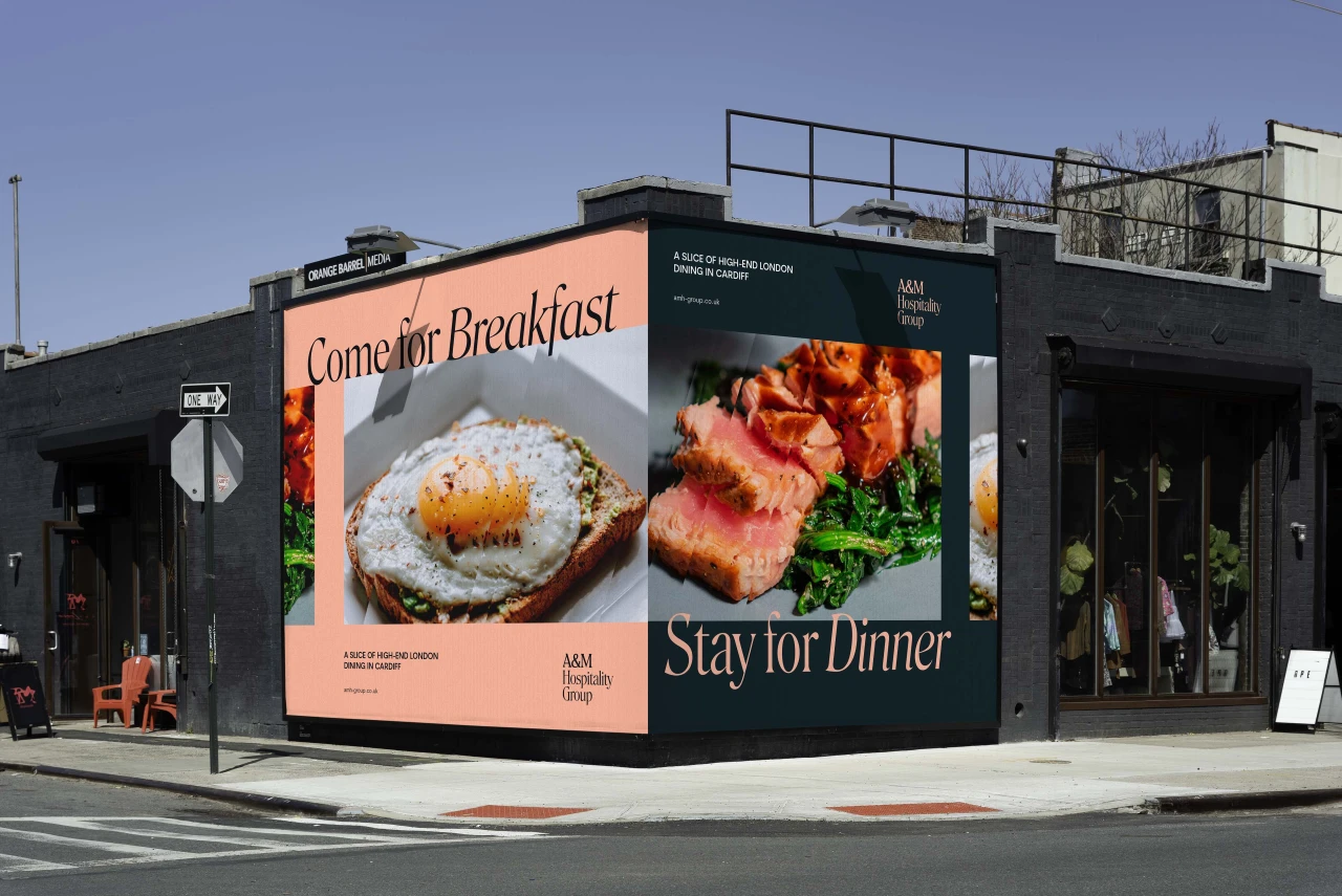
It's a sound logic that has served the agency well. It's also an approach that is in keeping with the normal branding process they put other companies through. "From the start, we were determined to 'eat our own dog food,'" the pair joke. "Just like our client work, we held workshops, spoke to clients and partners and looked long and hard at what we had and needed.
"We applied everything we know about delivering a brand and website to ourselves. It's given us a newfound appreciation of all the stuff that goes on client-side when going through a renaming process."
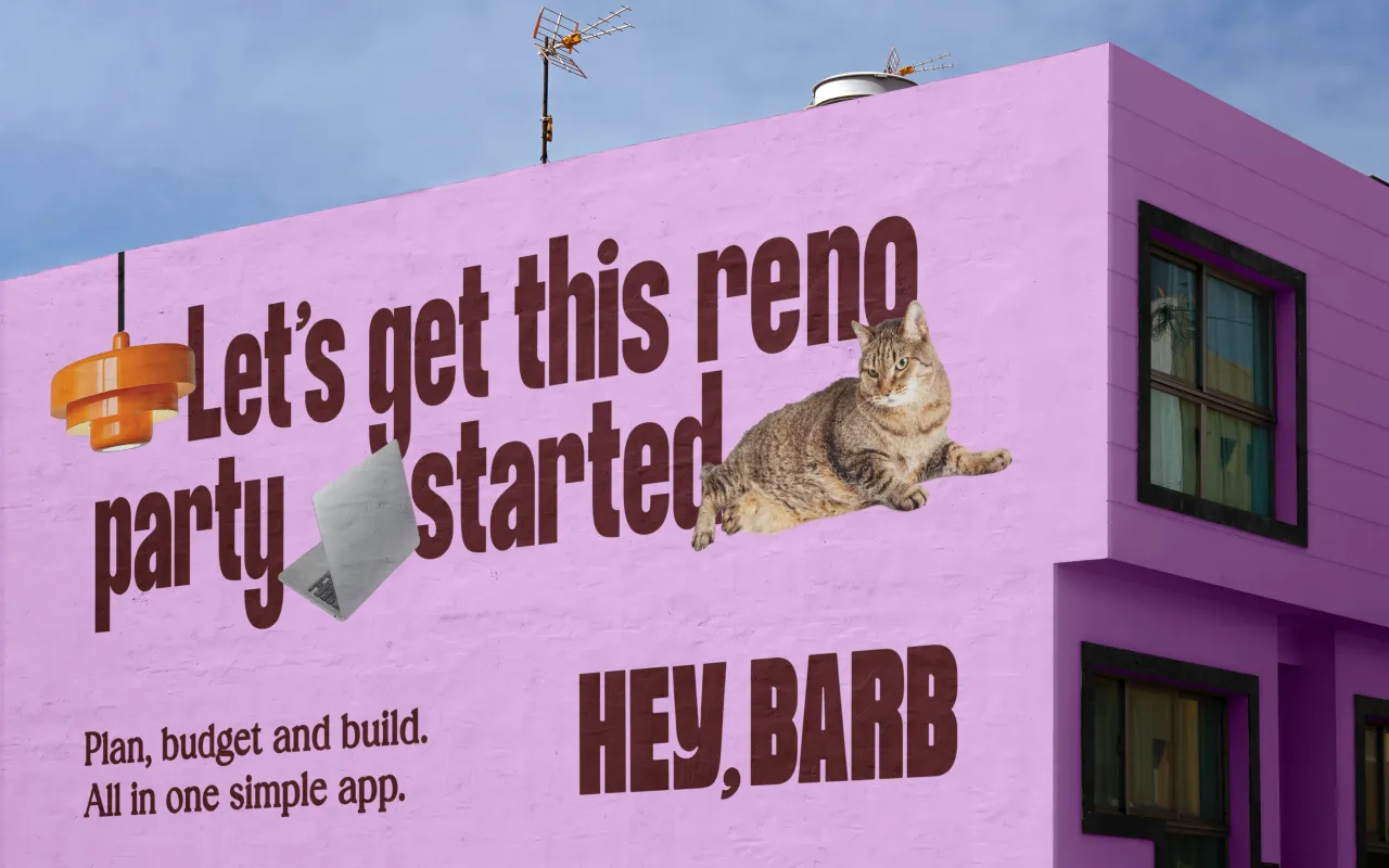
The result is a streamlined identity driven by crisp typography, refreshingly clean graphics, and a straightforward voice that confidently leads the way. In other words, it's the perfect distillation of what the agency offers and where it sees itself going. And while Tom and Mike were determined to look ahead instead of backwards, one important ingredient they've carried over is their location.
"We're a mixed team with roughly two-thirds being Welsh," they explain. "That brings about its own level of pride, as we're generally a nation proud of our heritage. But we've always been cautious not to let that define us. We've always worked with clients outside of Wales and intend to grow that number further, so we wanted to ensure Toward gives us that vehicle."
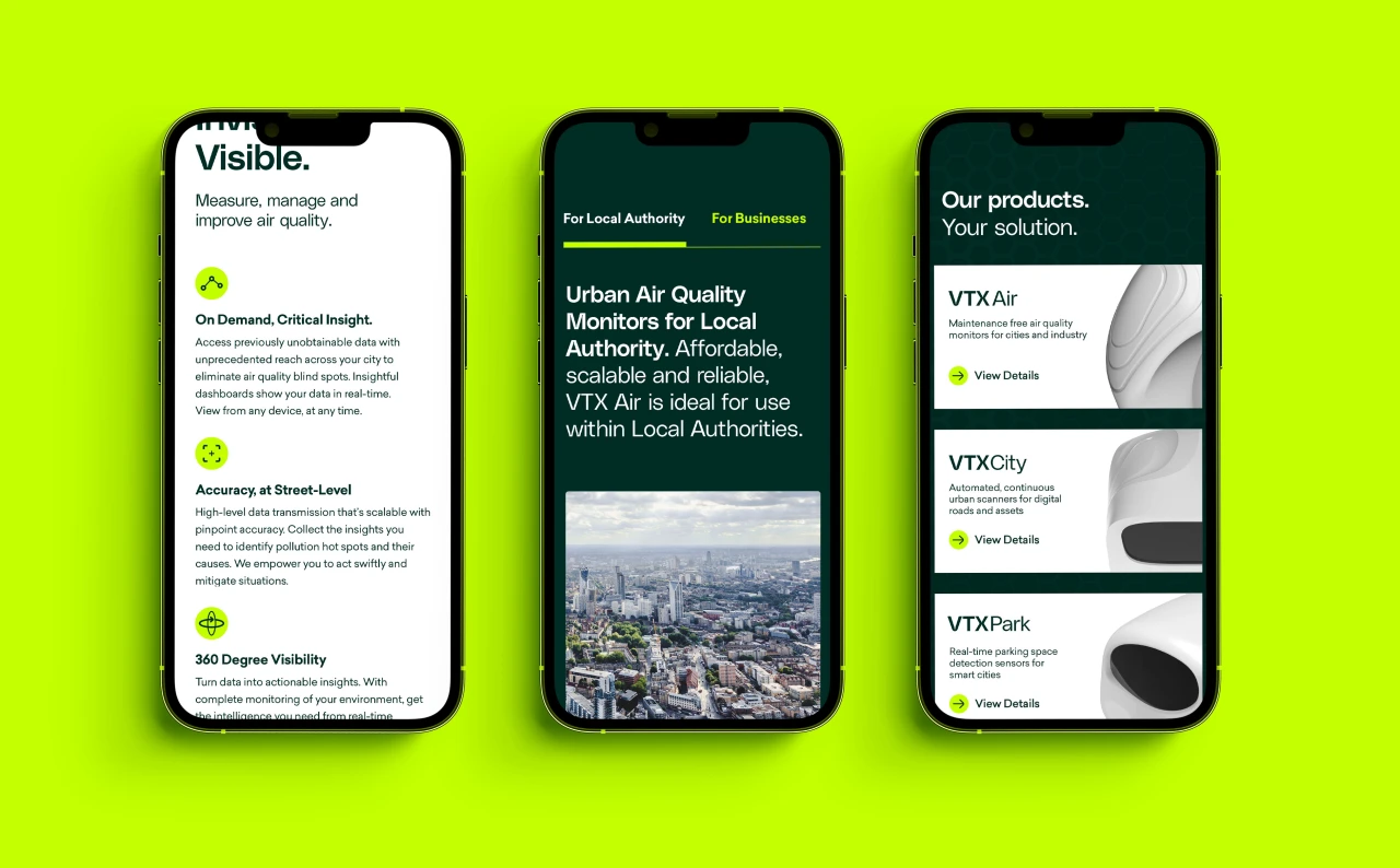
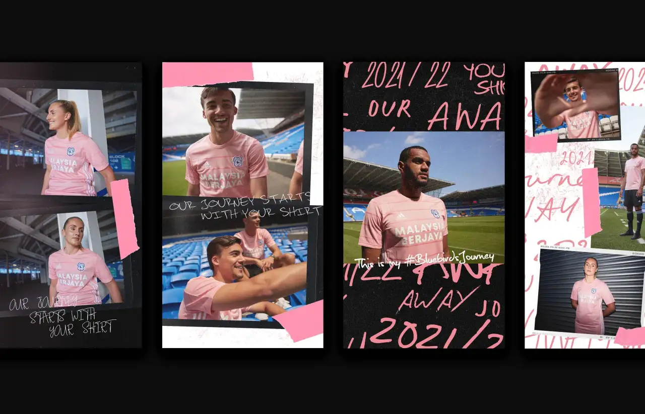
They add: "Our attitude to all brand work, including our own, is inspired by our Welsh roots. As a nation, we're small. But we're tenacious, with big ambitions and loud voices. We're often underestimated, so we must aim higher and push harder to make an impact.
"When we deliver brands, we purposely make them feel appropriate to a company two to four years ahead of the client, so they have something to work towards. Now we have the same."
In recognition of their regional pride, Tom and Mike wisely chose to launch Toward during Wales Week. Having been partners in the initiative since it started, they felt it was a fantastic way to connect to people with similar roots, as well as stay true to their mission statement.
"Launching in London as part of the event was a good way to start our journey to working with more businesses outside of Cardiff," they "We already have a lot of London connections, so it's about strengthening those links.
"In the design industry, I think there's always a challenge to compete with London agencies. Many of the best in the business is based there, so it's understandable. But I feel that the world has shrunk over the last few years. People are far more comfortable doing business remotely with companies further away, and hopefully, that will help all agencies outside of the city."
Editor's Picks





Trending




Latest Jobs
Creative Content Executive at Cognition
Full-time·Birmingham·£28k–£35k
Creative Director at Koto
Full-time·London·£95k-£130k
Senior Designer at Definition
Contract·London·£45k–£50k
Midweight Designer at Catalyst Creative
Full-time·London·£32k-£36k
Brand Designer, Product Launches at Figma
Full-time·New York·$127k–$269k
Creative Project Manager at Analogue
Full-time·Leeds·£28k–£35k