Why HUGO launched a fashion campaign with no fashion in it
What happens when a brand decides the best way to sell clothes is to not show any? HUGO and Uncommon Creative Studio just found out.
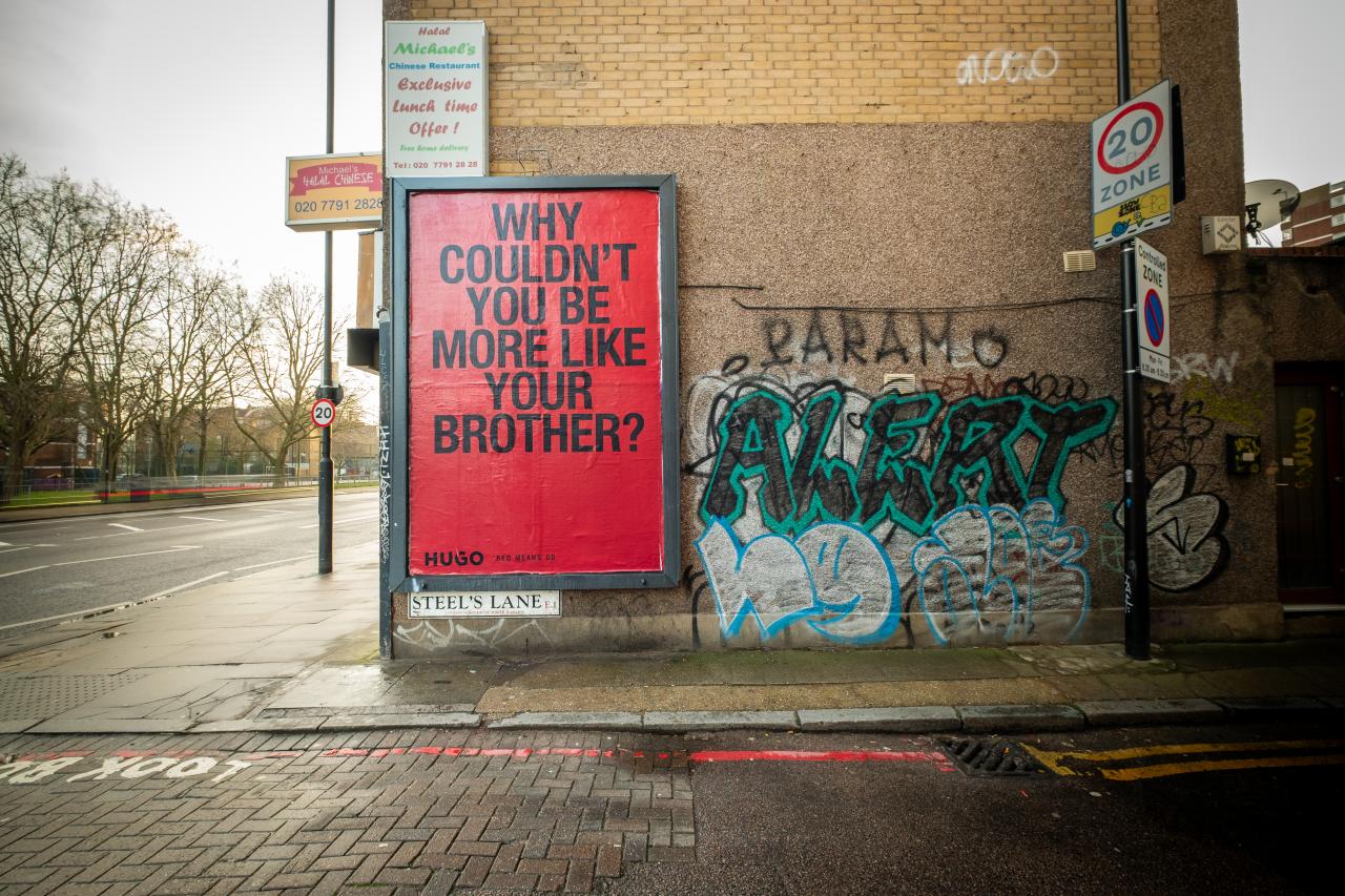
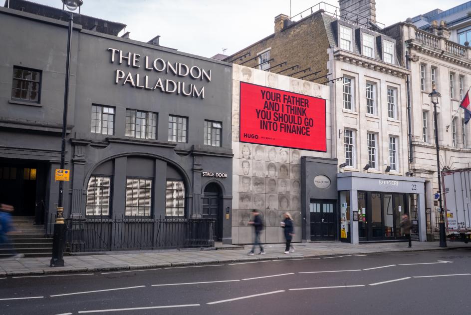
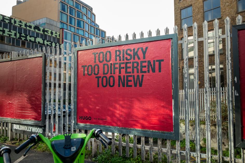
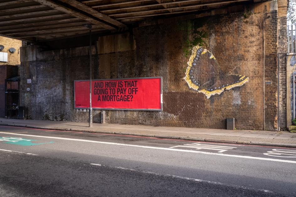
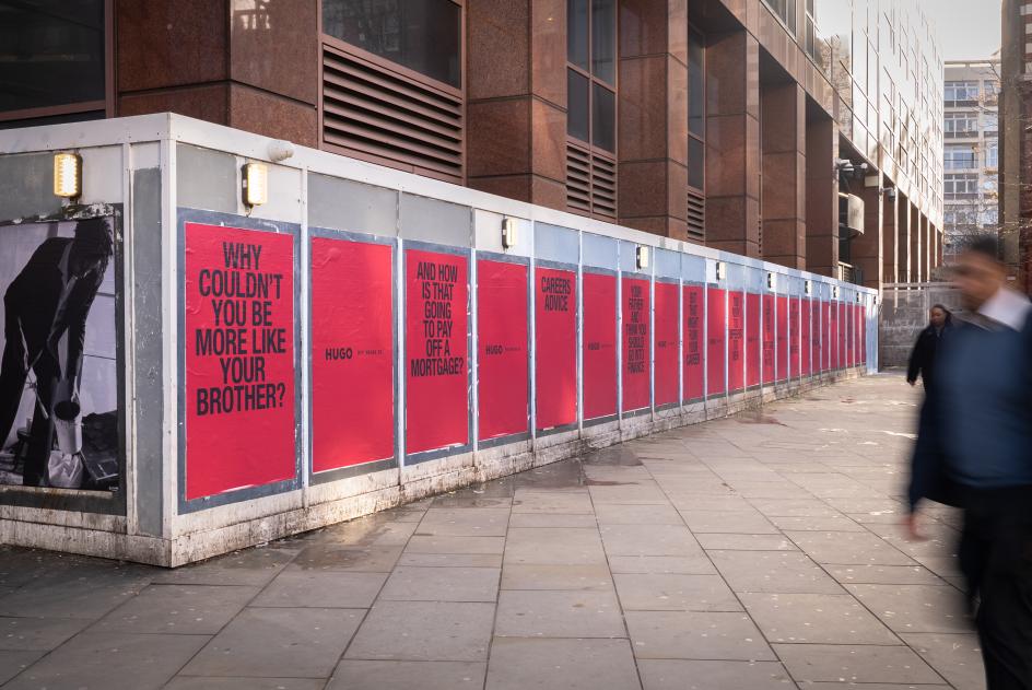
Your father and I think you should go into finance." "Why couldn't you be more like your brother?" "And how is that going to pay off a mortgage?" Such messages have been appearing on billboards across London, New York and Berlin, courtesy of fashion label HUGO. No product shot. No model in a crisp suit. Just a block of HUGO red, and the words your dad said at Christmas dinner that you've spent the last five years trying to prove wrong.
It's a fashion campaign with no fashion in it, and it's one of the more interesting creative decisions you'll see this year.
The brief that got out of the way
When HUGO—the younger and more irreverent of the two HUGO BOSS labels—went looking for a new creative direction, they landed at Uncommon, the London-based agency with a reputation for doing the thing clients say they want, but usually flinch from in practice.
The resulting platform, "Red Means Go", is Uncommon's debut for the brand, and it's worth studying not just as a piece of advertising but as an act of creative confidence on both sides of the relationship. Someone at HUGO had to approve billboards full of parental passive aggression. Someone at Uncommon had to pitch them with a straight face. The fact that both things happened is, frankly, encouraging.
Nick Stanley, creative director at Uncommon, describes the campaign as "unapologetic, confrontational and celebratory," which is a neat summary, but the more revealing part of his quote is this: "a fashion campaign with no clothes in sight." That's not a bug. It's the entire point. The clothes are almost beside the point when the idea is this clear.
The insight that does the heavy lifting
The campaign's central tension is the gap between what ambitious young people want to do with their lives and what the adults around them think they should do instead. They have the texture of an actual conversation, which is why they land.
Uncommon leaned into the specificity hard, and the OOH copy is the campaign's sharpest tool. Seen sequentially across a street or a poster run, the lines read like a greatest hits of discouragement. Taken together, they describe a complete, universal experience of being told no, and then implicitly ask: Did you do it anyway?
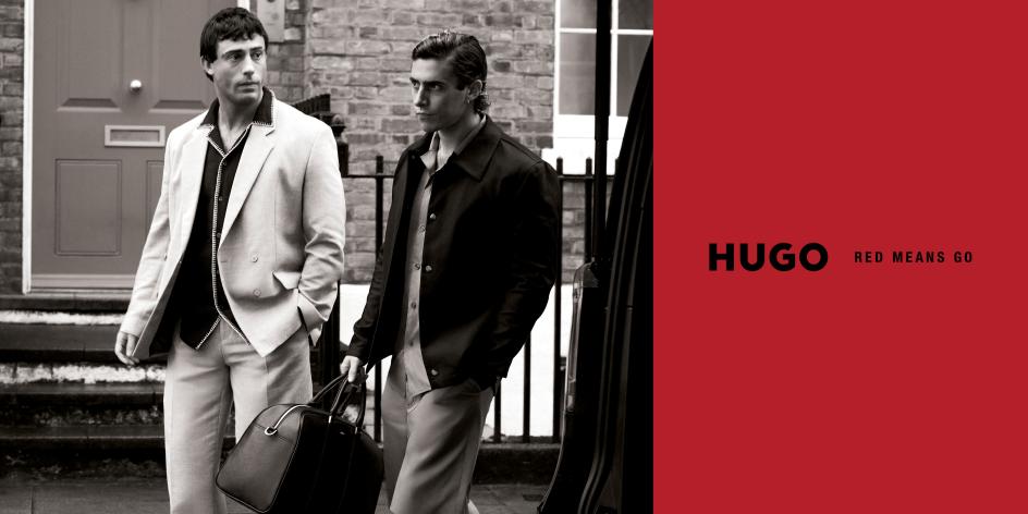
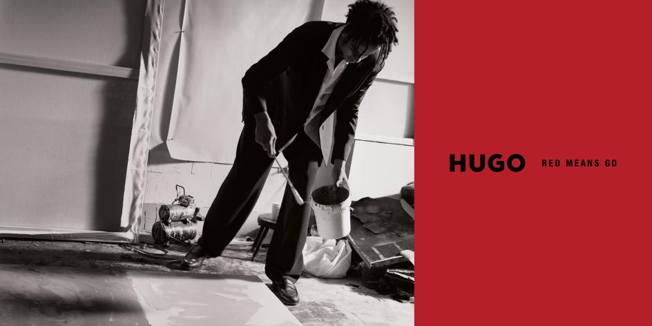
HUGO's red, already the brand's signature colour, earns a new meaning in this context. Red means stop. Except here, it means go. The platform title does a lot of work simply by inverting an assumption.
The talent strategy, done right
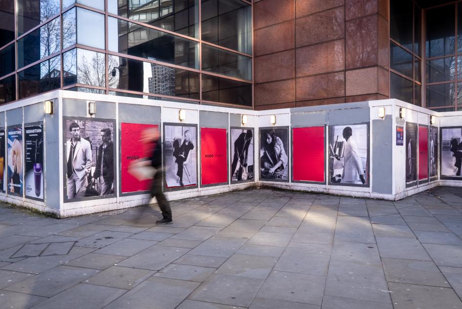
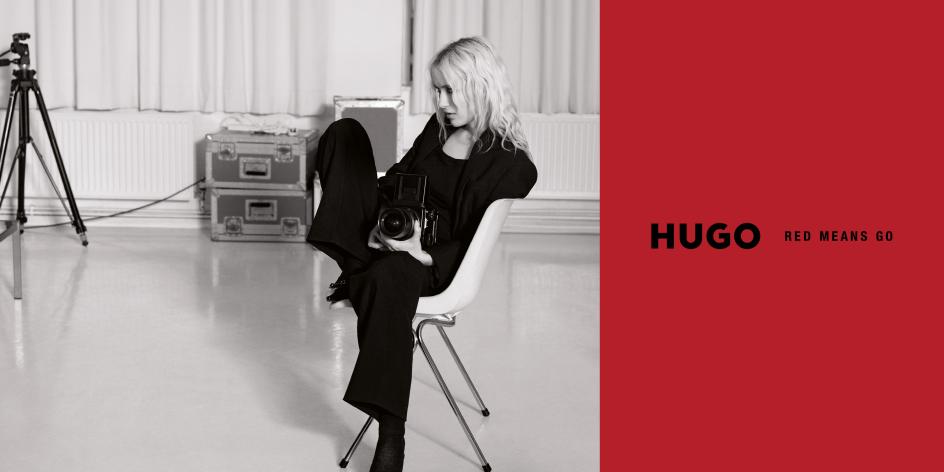
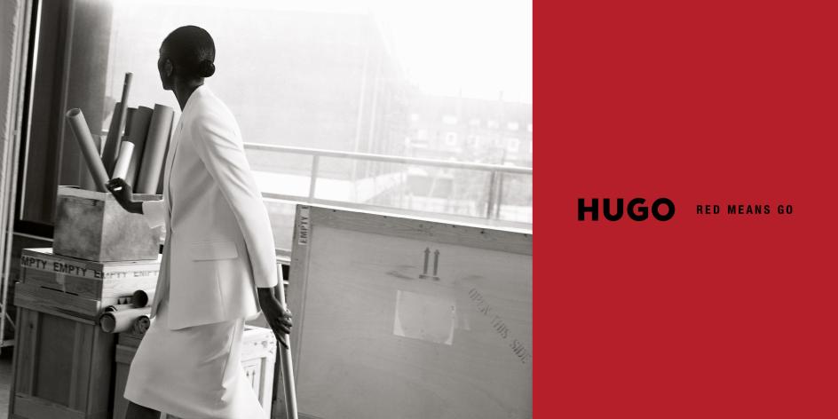
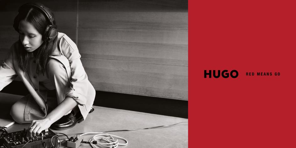
The print and film work, meanwhile, features seven people, none of them household names in the conventional celebrity sense: actors Aaron and Leo Altaras, photographer and director Tereza Mundilová, multidisciplinary artist Cato, DJ Nick Cheo, music curator and radio DJ Margeaux Labat, and art curator Temitayo Famakinwa. All are working creatives with actual practices, actual disciplines and, presumably, actual memories of being told they were making the wrong choices.
This is a smart play for a fashion brand targeting younger audiences, who have a finely tuned radar for inauthenticity. A cast of seven genuinely interesting people doing genuinely interesting things is more credible than one famous face who happens to be available.
The campaign imagery, shot in black and white against that persistent red, frames each of them mid-process: working, thinking, moving, not posing. There's a photographer with a medium-format camera. Someone painting. Someone crouched over a DJ setup on the floor. The clothes are present, yes, but they're not the event.
The OOH as the campaign
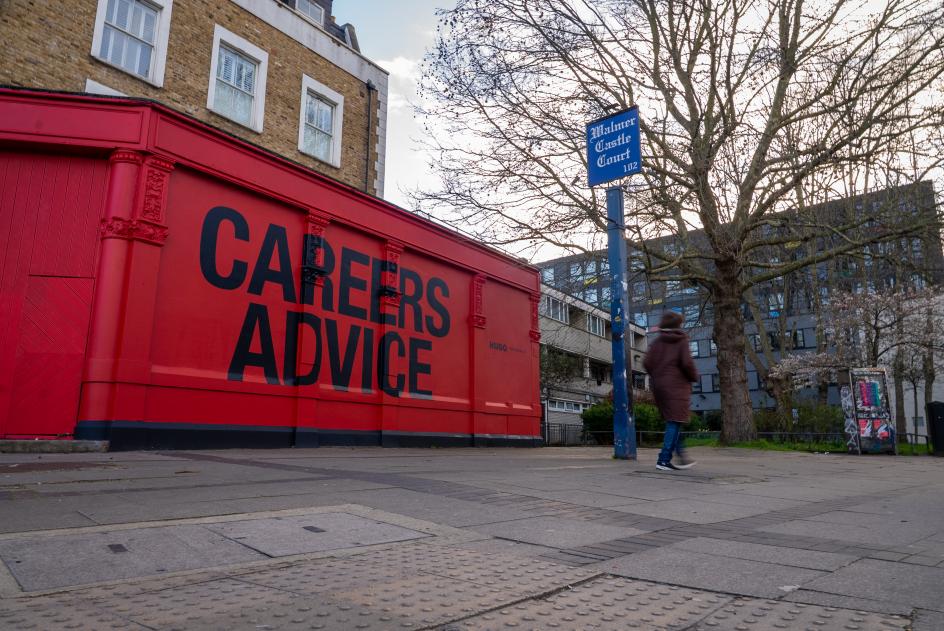
What's particularly well-executed here is the deployment of the out-of-home work across London. This isn't a case of slapping the same poster in 50 locations. The placements feel considered: a building-sized "Careers Advice" wrapping a corner pub in Camberwell, the same copy appearing at the London Palladium alongside a wall of photographed faces, individual billboards scattered through East London where the creative community HUGO is actually courting and where they live and work.
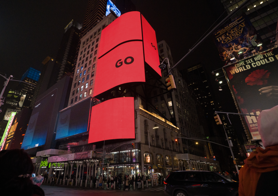
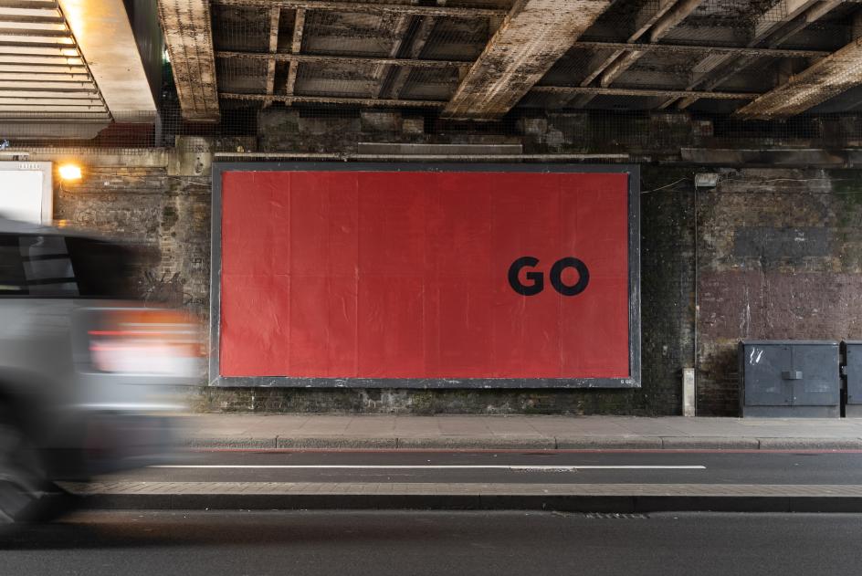
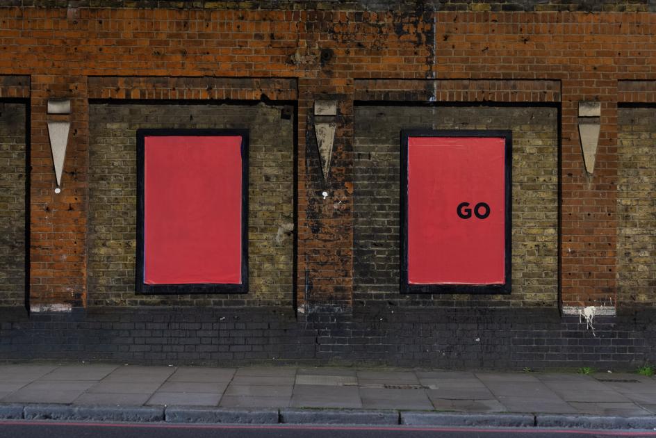
The teaser phase—which ran in early March with just the word "GO" on red, before the full campaign broke—is another small but smart detail. It created a beat of intrigue before the explanation arrived, which is always a good thing if you can pull it off.
Key takeaways
If you work in advertising, design or brand strategy, there are a few things worth pulling from this case study.
First: the power of specificity. "Believe in yourself" is inert. "Your father and I think you should go into finance" is a campaign. Second: restraint in your talent strategy. "More famous" doesn't always mean "more effective" when the brand's story is about people who haven't yet arrived.
Third, and perhaps most importantly: the value of a client who lets the idea be the idea. Uncommon's founding principle, "acts over advertising," only works if someone is willing to commit to it. "Red Means Go" is a reminder that the most interesting creative work usually requires courage from both sides of the table.
Editor's Picks


Trending


Podcasts


Editor's Picks
Further Reading