10 trends that creatives are so over in 2026
We asked you what you're tired of seeing. Your answers were passionate, funny and occasionally furious.
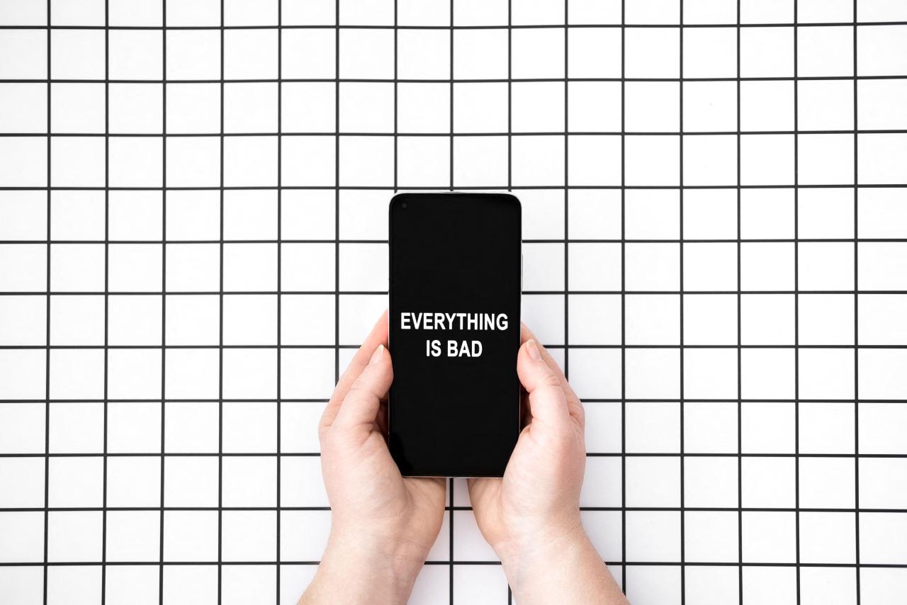
Image licensed via Alamy
There's a particular kind of weary expertise that only comes from spending years steeped in visual culture. You develop an eye not just for what works, but for the precise moment something stops working, when a fresh idea curdles into a cliché.
Usually, there's a bit of a time lag issue here. We creatives are, by nature, early adopters. We spot a new visual language before most people have noticed it exists, use it with skill and purpose… then watch helplessly as it gets flattened and mass-produced. Until, well, it means nothing at all.
This sucks, but it's the occupational hazard of working at the leading edge of culture. We live with trends in a way that most people simply don't, and the fatigue that comes with that is real, specific, and sometimes quite visceral.
Our State of Creativity survey asked you: what's one creative trend you're already tired of? Your responses were candid, specific and, at times, genuinely funny. Here's what you told us.
1. AI slop
"AI slop" is shorthand for the vast quantity of AI-generated content, particularly imagery, that currently floods social feeds, client decks and marketing materials. It's typically technically accomplished and visually consistent, but also devoid of thought or personality.
Let's be clear, though: it's not AI itself that's the problem. It's the laziness it enables and the homogeneity it produces: an endless scroll of competent, hollow, interchangeable output.
You said you hate:
"The 'look at what I made in just two clicks thanks to AI' type of work."
"Things that are polished with AI and templates but lack any sense of intention or perspective."
"[That] every trend-based image always has this overused yellow hue. Makes me feel sick."
2. AI caricatures and portraits
Here's a more specific AI grievance: the recurring waves of people using AI tools to transform their photos into Pixar characters, action figures, Studio Ghibli illustrations or whatever the trend of the moment dictates.
Each new variant spreads virally, peaks within days and disappears, only to be replaced by the next. You're finding it shallow, derivative and, by now, extremely tedious.
You said you hate:
"The AI portraits on LinkedIn."
"Any trend that involves an AI caricature."
"Pointless and personalised generative AI trend of the week (e.g. caricatures, action figures) which reach the general public."
The LinkedIn observation is particularly pointed. Nothing says "I've run out of things to post" quite like a portrait of yourself as a Marvel superhero.
3. Glassmorphism and liquid glass
Glassmorphism is the design trend characterised by frosted-glass panels, blurred backgrounds and translucent, layered UI elements. It emerged as a major aesthetic a few years ago, popularised partly by Apple and widely adopted across app design, web interfaces and branding.
This style creates a sense of depth and softness, which is why designers often reach for it. But like most trends, it's spread far beyond the contexts where it made sense, and things have got messy. Apple's 2025 announcement of its Liquid Glass design language turbocharged the aesthetic at exactly the moment the backlash was already building.
You said you hate:
"Liquid glass."
"Glass everything."
"Holo and bubbles."
Glassmorphism. Image licensed via Alamy
4. Gradients
Gradients, the smooth transitions between two or more colours that were ubiquitous in early digital design, staged a major comeback in the late 2010s as a reaction to years of flat design. Instagram's rebrand was a watershed moment. Suddenly, gradients felt fresh again.
That era is now over. Gradients have been so absorbed into the default toolkit of image generators and design templates that they've lost any sense of intentionality. The fact that AI tools tend to default to gradient-heavy, golden-hued aesthetics has only compounded the problem.
You said you hate:
"Logos with gradients."
"Four-pointed star for AI logos and gradients for everything. Give it a rest."
5. Lazy minimalism
Minimalism has a long and distinguished history. It's a genuine design philosophy based on the idea that every element should earn its place and that nothing should be there without purpose. But the term has increasingly become a cover for something else: work with no visual ideas, passed off as restrained sophistication.
If your work looks minimal because every element is doing exactly what it needs to, great. If it looks minimal because you ran out of ideas and stopped, that's a different thing entirely.
You said you hate:
"Minimalism without soul."
"Lazy minimalist typography."
"Minimalism close to absence of design."
"Forced minimalism."
6. Lazy maximalism
The pendulum swings. After years of stripped-back, minimal design, maximalism arrived as an inevitable counter-movement: bold type, clashing colours, dense layering, more of everything.
At its best, it's exuberant, original and genuinely exciting; think of designers like Zak Group or the playful chaos of contemporary music packaging. At its worst, though, it's just noise dressed up as personality.
You said you hate:
"Super maximalist designs that are hard to read and aren't well done."
"The more-is-more approach: it often feels like many brands design for Gen Alpha or Z, whether that's their target audience or not."
7. Canva and template culture
Canva is a browser-based design tool that makes it easy for non-designers to produce visually presentable work using pre-built templates. For small businesses and individuals with no design budget, it's genuinely useful.
For some designers, though, it might represent something more troubling: the normalisation of templated, lowest-common-denominator visual communication, and the devaluation of what skill can actually bring to the table.
You said you hate:
"All the flesh/beige Canva stuff on Instagram."
"Safe, inoffensive, templated designs, especially in web and layout. I can tell you, I just used Shopify and Canva."
"The mocked-up stationery trend. It's overdone and giving Canva."
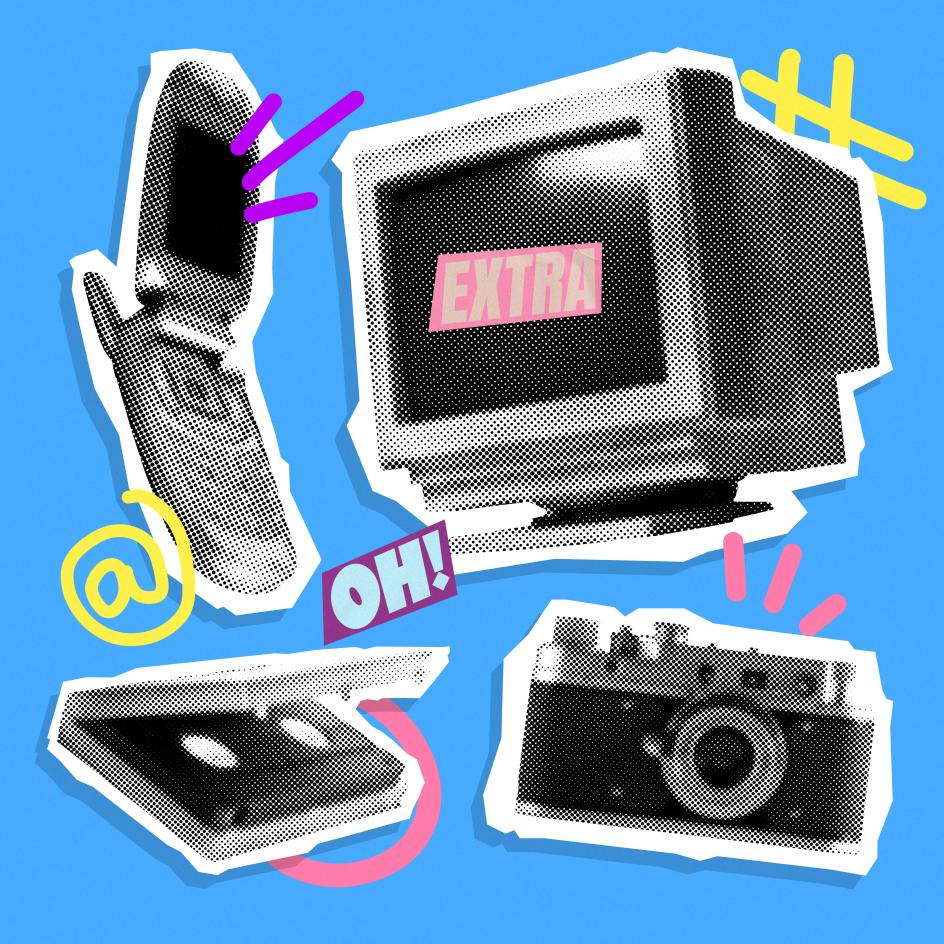
8. Y2K and retro nostalgia
The revival of late-90s and early-00s visual culture—chrome type, pixel fonts, low-fi digital textures, the visual language of the early web and club flyers—has been going on so long that even those who enjoyed it initially are starting to feel fatigue.
The irony is that the original Y2K aesthetic wasn't nostalgic at all; it was genuinely forward-looking, shaped by Millennial optimism about technology and the future. The nostalgic version of this tends to miss that quality entirely.
You said you hate:
"Uniformed Y2K nostalgia."
"Anything related to the 90s."
"Too much Y2K: was it ever really like that? Bring back more futuristic Y2K hopefulness."
Y2K trend. Image licensed via Alamy
9. Bento grids
The bento grid, a modular layout that divides content into neatly boxed, asymmetric tiles, takes its name from the Japanese lunch box with its divided compartments. A while back, it became a dominant format for product showcases, portfolio layouts and social media content, offering a clean way to present multiple pieces of information simultaneously.
Apple used it to particularly influential effect in their product marketing, and from there it spread everywhere. One respondent's honesty deserves recognition here.
"Bento boxes... but can't stop using them."
That's the real creative predicament, isn't it? Knowing something is a cliché and doing it anyway. Because it works, because clients like it, and because you've got a deadline.
10. Motion for its own sake
As animation tools become more accessible and more integrated into design software, the bar for adding motion has dropped dramatically. The result is a proliferation of animated brand guidelines, kinetic typography on social posts and motion-heavy SaaS demo reels that move a great deal while communicating very little.
You said you hate:
"Motion for motion's sake. Clients don't need their colour palette pages in their guidelines animated. Those OOH don't and never will exist. The trend I'm tired of is dishonesty."
That last word lands hard. Animation as decoration, as theatre, as a way of making something look like more than it is: dishonesty is exactly the right word for it.
What this list tells us
There are a few things worth noting about the complaints on this list. First, several of them are in direct tension: minimalism and maximalism both appear, as do hand-crafted authenticity and the convenience of templates. That's not contradictory; it reflects a genuine split in the industry about where design should go next.
Second, AI threads through almost every entry here, not just the ones that name it directly. The frustration with gradients is partly about AI defaulting to them. The frustration with caricatures is entirely about AI. The frustration with template culture and slick, hollow work is inseparable from the ease with which AI tools produce exactly that.
Third, and most importantly: the complaints here aren't really about aesthetics; they're about intention. The work that gets under people's skin isn't bad because it uses gradients, glass effects, or bento grids. It's bad because it uses them without thought, without purpose, without any real sense of why. Which, as it happens, is the one trend that never goes out of fashion.
Further Information
Want to add your voice? The State of Creativity 2026 survey is still open. It takes around five minutes and directly shapes what Creative Boom covers in the months ahead.
Editor's Picks


Trending


Podcasts


Editor's Picks
Further Reading