In many ways, it sounds like a dream brief: ignore everything that's gone before. Throw out the rich mahogany tones, the tartan flourishes and the ancient oak barrels. Forget the misty glens and the portentous founding dates. Just tell us who we actually are.
That was, broadly speaking, what the Tasmanian distiller LARK handed to Manchester-based design agency LOVE when it decided to take its luxury single malt to the world.
Here's the context: LARK isn't a Scotch whisky. It isn't even trying to be. It's Tasmanian, it's proud of the fact, and its founders once had to overturn centuries-old legislation just to distil on the island. Bill and Lyn Lark challenged laws that had stood since 1839. Bill is now referred to as the "godfather of Tasmanian whisky." When your origin story is that dramatic, leaning on borrowed heritage would be a creative travesty.
LOVE, a 60-strong B Corp-certified agency born in Manchester in 2001, rose to the challenge with a rebrand covering everything from naming and a bespoke bottle to a complete brand world and a suite of photography and motion assets.
The result is an identity that doesn't just look different from most whisky on a shelf, it looks like it's arrived from a different dimension.
From the edge of the world
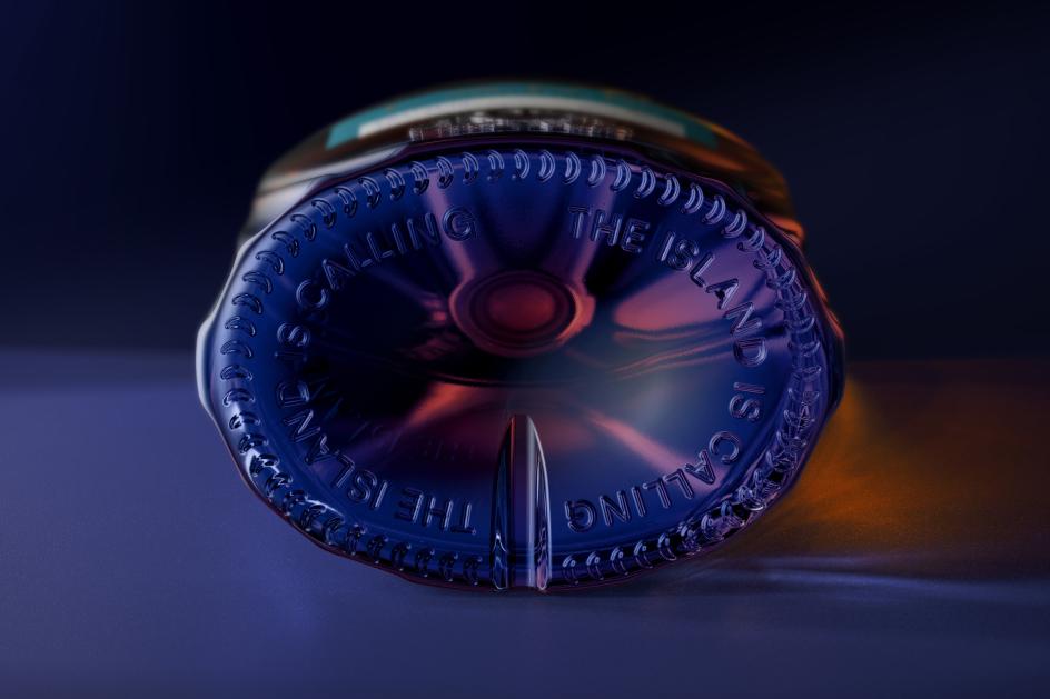
Tasmania isn't somewhere most Brits can picture in any detail. It's remote, it's at the bottom of the world, and its climate is unlike anywhere else. But LOVE's executive creative director, David Palmer, argues that this isn't a problem; in fact, it's the whole strategy.
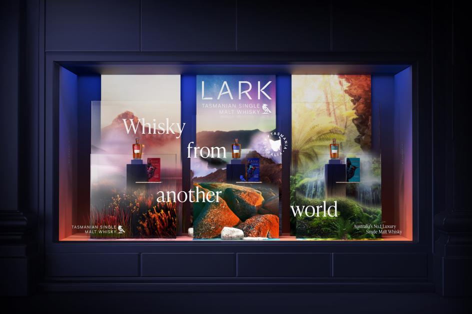
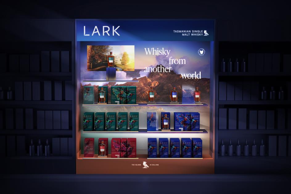
"Tasmania is a wonderfully diverse place, home to ancient rainforests, vast rugged peaks, bioluminescent seas, smooth white sandy beaches and a super-climate that provides the perfect conditions for making world-class whisky," he enthuses. "Our strategy is built around the idea of a 'mystical island', perfectly encapsulating Tasmania's position at the edge of the world.
"We wanted to evoke its culture, ethereal majesty and the very nature of the land and landscape that drives its people's character, passions and quirks. The result is a brand world that truly makes it feel like LARK is a whisky from another world."
That line became LARK's core communication idea, and it's a smart one. It sidesteps the entire question of whether LARK can compete with Scotch on heritage. Instead, it shifts the conversation to a place Scotch simply can't follow.
Two weeks in a tent
Strategic ambition only works if the creative execution is good enough to carry it, and so LOVE did something admirable: commissioned photographer Ben Maze and videographer Ben Coope to go and actually look at the place.
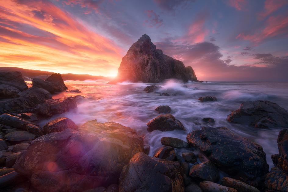
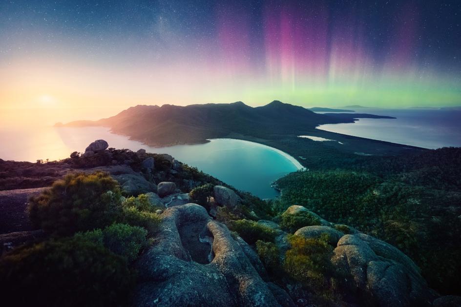
The pair spent two weeks camping across Tasmania, capturing its super-climate, dramatic light and most distinctive vistas. The resulting assets aren't stock-library generic; they're specific, atmospheric and visually unlike anything else in the category. That specificity is what gives the brand world its authority.
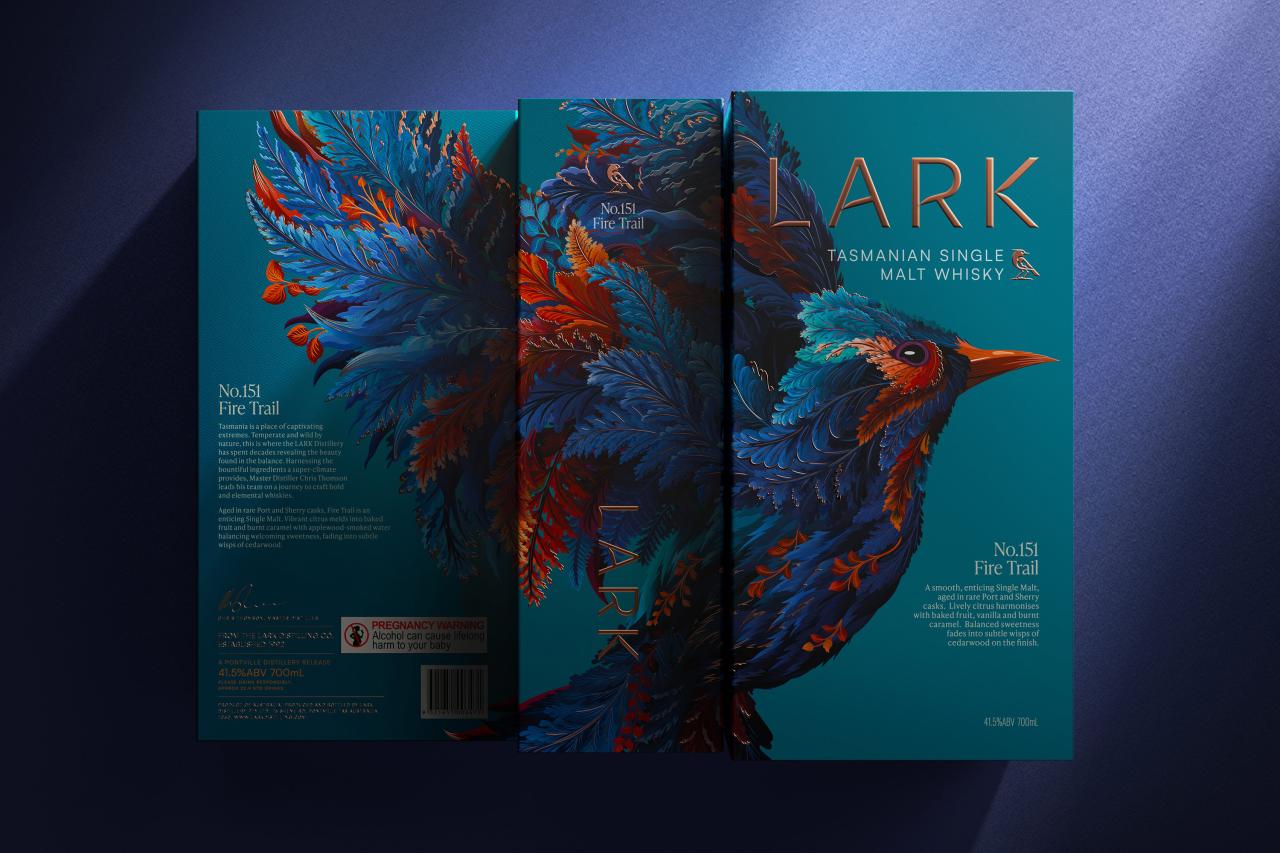
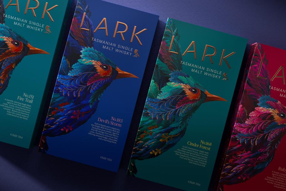
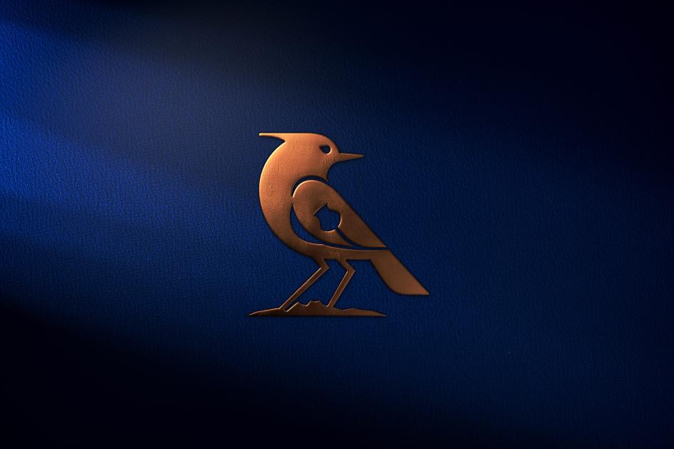
The illustration work went through an equally rigorous process. LOVE commissioned illustrator Martha Olivia, known for her vivid patterns and complex textures, to reimagine the LARK skylark mascot. The bird is depicted with the national flower of Tasmania (the blue gum bud) and the silhouette of Cradle Mountain embedded within its form.
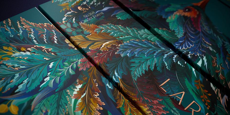
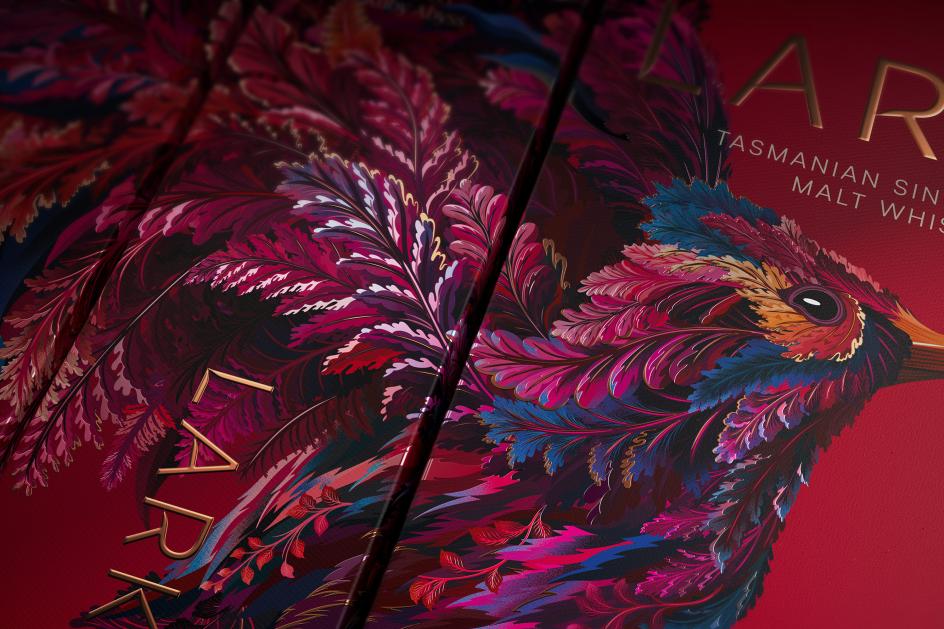
The LARK wordmark, meanwhile, has been redrawn to reflect the tapered forms of Tasmanian leaves and the beak of the skylark itself. These aren't decorative decisions; each one anchors the brand more firmly to a specific place.
Bottle as brief
The bottle makes the same argument in three dimensions. Its broad shoulders nod to LARK's original flask shape, preserving a thread of continuity, while the sweeping silhouette references the elegant form of the lark bird in flight.
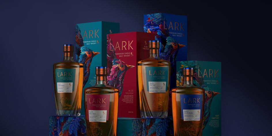
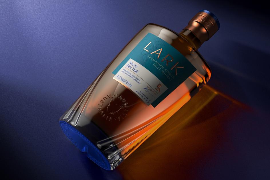
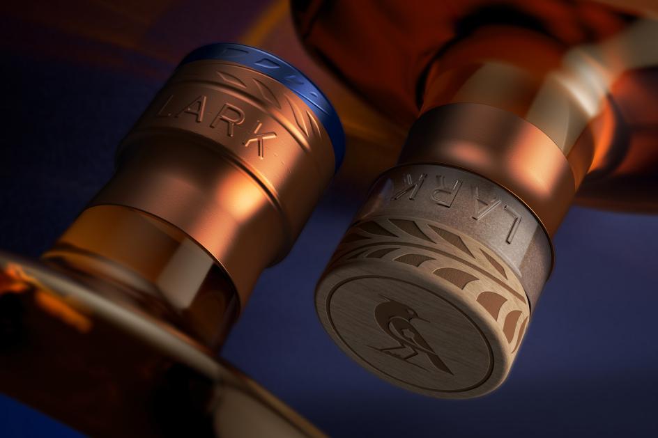
Sculpted facets at the base evoke layered feathers, and a semi-opaque blue coating at the foot creates a gradient effect, referencing Tasmania's extreme and changeable climate. An engraved stopper completes the package as a deliberate signal of quality at the moment of opening.
In short, each design decision is answerable to the strategy, which is in turn answerable to a distinctive client truth. There's no decorative noise, no "here's what whisky bottles look like, let's do that." The bottle earns its form by having something to say.
Breaking the category
LARK's global brand and marketing director, Cleo Smeeth, frames the rebrand as consistent with the distillery's founding spirit. "LARK is a brand born from the unique qualities of Tasmania, its climate, its people and its creative spirit," she says. "This rebrand celebrates those roots while positioning us as a leader in luxury new world whisky. It's a bold step forward for LARK, and we're excited to share it with the world."
The new brand is targeting luxury markets in Asia and Europe alongside its established Australian home market. "In close partnership with LARK, whose team allowed us to truly get under the skin of their heritage and vision, we've built a brand world that represents something unique," says David. "Something that will inform the future of the distillery, its communications and the sector as a whole."
Whisky has long been one of the most visually conservative categories in drinks design: tartan, copper stills and portentous serif type still dominate the shelf. LARK's new identity makes a coherent case that luxury credentials can be built from scratch, grounded in a genuine sense of place, without borrowing from the old world. If it works commercially, expect others to take note.
Editor's Picks


Trending


Podcasts


Editor's Picks
Further Reading